14 min. reading

Yulii Cherevko
CEO paintit.ai
Published:
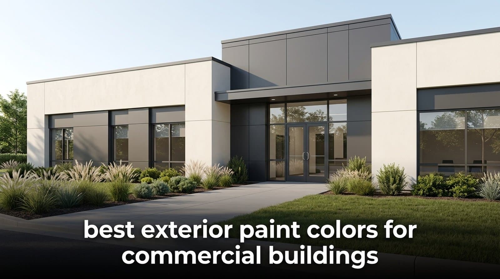
The best exterior colors for commercial buildings are the ones that help an asset feel trustworthy, current, easy to lease, and sensible to maintain. In 2026, that usually points to warm neutrals, soft whites, architectural grays, earth tones, restrained blues, and brand accents used with a light hand.
For commercial property, color is not just taste. It shapes first impressions, tenant confidence, maintenance rhythm, heat absorption, signage visibility, and how easily a board, investor group, or franchise team can say yes. We found that the strongest decisions treat the facade like a business surface first and a decorative surface second.
A commercial facade color should support rentability, visitor trust, and operating discipline. Looking good in one photo is not enough. The practical decision starts with 3 variables: brand fit, maintenance exposure, and Light Reflectance Value, often called LRV, which runs from 0 to 100 and affects how much heat and light the exterior surface absorbs.
A higher-LRV color reflects more light. On a large office or retail shell, that can help reduce heat buildup compared with very dark colors, especially on sun-exposed walls. It will not replace envelope engineering, insulation, or HVAC strategy, but it is a useful early filter when choosing exterior colors for commercial buildings.
Dark charcoal, blackened green, and deep navy can look precise and premium. They also show dust, fading, and uneven substrate repairs faster than mid-tone palettes. Pure white can feel clean, but near highways it may show road film within weeks. The more exposed the building, the more the color needs empathy for real use.
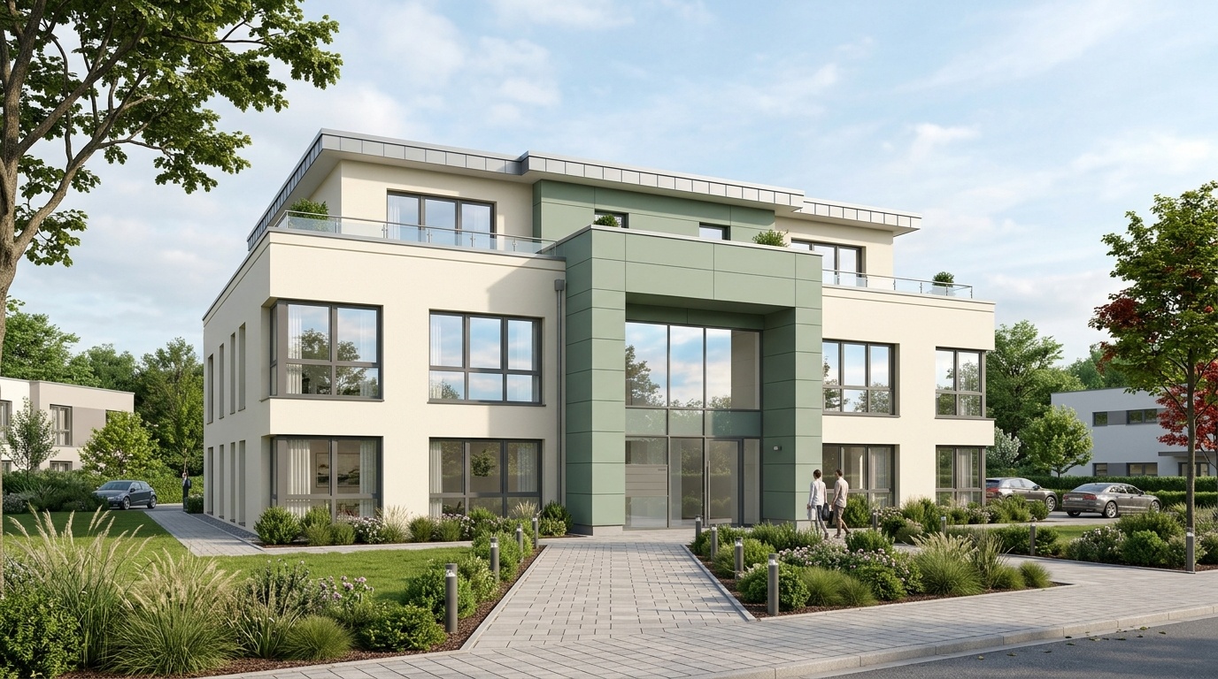
A good commercial palette also helps people find their way. A 2-story clinic with a soft off-white base and sage entry volume feels calmer than the same building in high-contrast red. A 5-unit retail strip with warm beige walls and darker canopy bands lets each tenant keep some identity without turning the whole asset into visual noise.
Based on Paintit.ai user data, commercial-property users tend to compare neutral base palettes against one branded accent option before sharing renders with stakeholders. That rhythm makes sense: the neutral keeps resale and leasing broad, while the accent gives the business a personal and memorable front door.
The in 2026 fall into 5 useful families: warm whites, soft grays, earth tones, deep professional accents, and muted brand colors. Together, they give you curb appeal, maintenance logic, tenant flexibility, and a modern look that does not age too quickly.
Warm whites and off-whites are still the safest base for high-liquidity assets. They work especially well on medical offices, mixed-use retail, and renovated low-rise buildings where the goal is lightness without sterility. Choose cream, ivory, or stone white rather than blue-white if the building sits beside brick, timber, or beige paving.
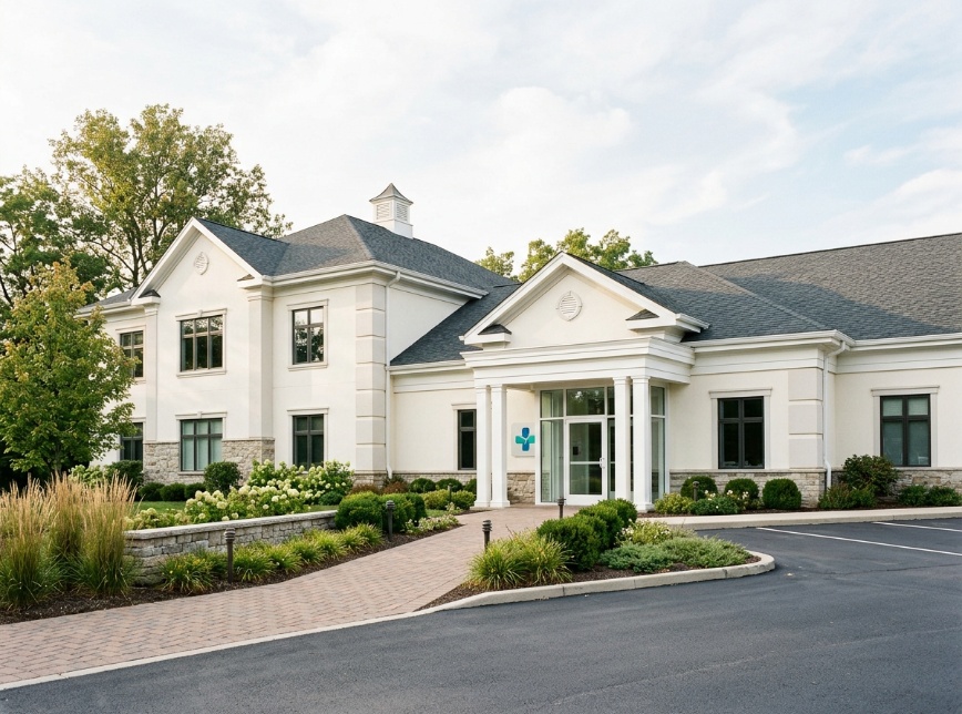
Soft grays remain central to modern commercial building colors, but the better versions are warmer and more architectural than the flat cool grays that filled older office parks. Greige, pewter, and light concrete gray sit well with black window frames, aluminum panels, and glass curtain walls.
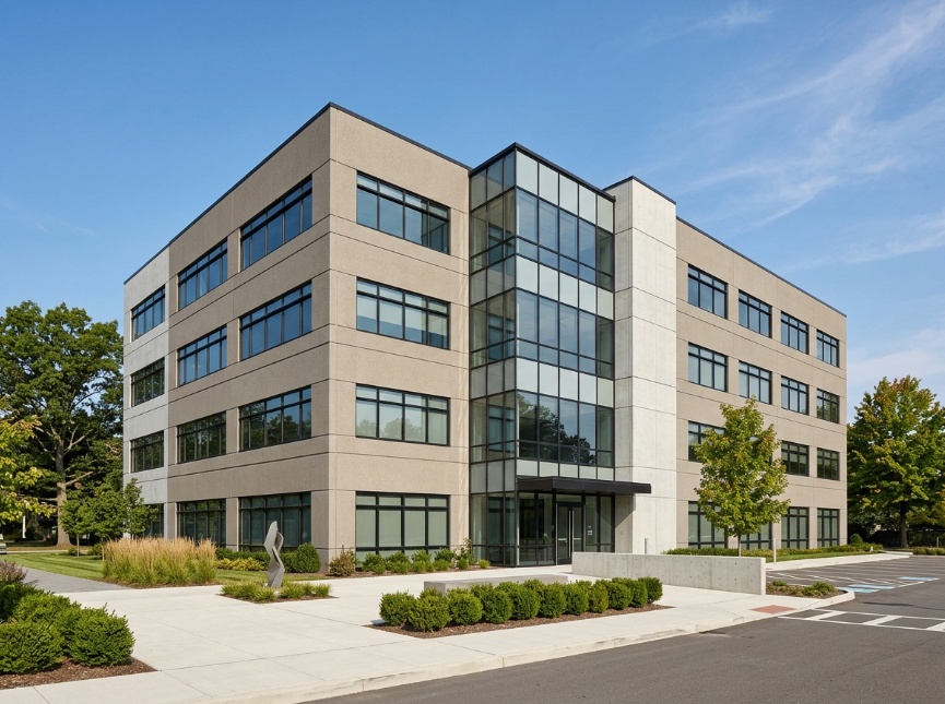
Earth tones are practical for high-traffic corridors. Olive, muted terracotta, dark slate, taupe, and clay brown hide dust better than pure white or glossy black. For warehouses, logistics yards, roadside retail, and service buildings, these commercial building paint colors create a grounded look while reducing the visible rhythm of dirt accumulation.

Deep accents work best in controlled zones. Navy, forest green, oxblood, and graphite can add identity to columns, entry portals, canopy undersides, or upper facade bands. As paint colors for commercial buildings, they should usually support the composition rather than take over the entire exterior.
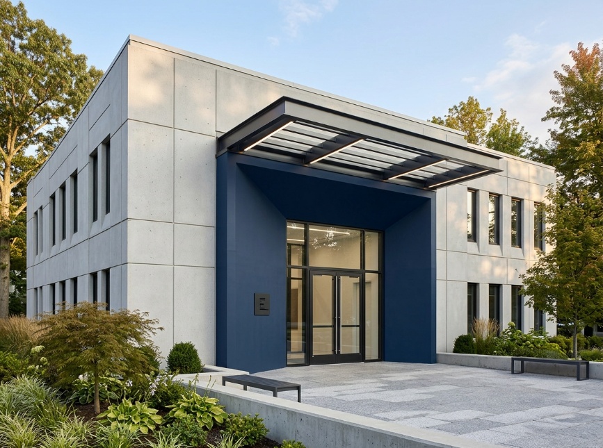
For coating durability, sheen, substrate compatibility, and weather exposure, pair palette planning with material research. We recommend checking a practical breakdown of exterior coating choices before specifying a finish across a large facade.
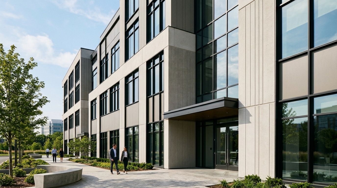
The right palette changes by commercial use because each property type sells a different feeling in the first 5 seconds. Corporate offices need confidence. Clinics need calm. Retail needs approachability, and industrial sites need durability and safety. A single generic beige-and-gray answer misses how business context shapes color performance.
For corporate offices and headquarters, exterior office building colors should feel stable and precise. Slate gray, warm white, charcoal trim, navy accents, and brushed-metal details work well because they suggest professionalism without shouting. The palette also needs to photograph cleanly for leasing decks, recruitment pages, and investor presentations.
For retail and shopping centers, warmer palettes often work better than severe monochrome. Sand, soft terracotta, clay, muted green, and warm gray create a more human entry sequence. Use brighter brand tones around doors, blade signs, awnings, or 1 accent wall instead of saturating the whole facade.
For medical clinics, choose off-white, pale gray, soft sage, light blue, or gentle beige. These colors signal hygiene and calm without making the building feel cold. A 2-color scheme with a clear entry accent can help patients identify the entrance quickly, especially in multi-tenant healthcare parks.
For industrial buildings and warehouses, prioritize practical mid-tones. Dark slate, taupe, olive gray, and beige-brown conceal dust and road film better than crisp white. Add controlled safety accents, such as yellow or orange, on loading edges, bollards, dock doors, or traffic-sensitive corners rather than on large wall areas.
Hospitality and wellness properties can use warmer, more tactile palettes. Think cream stucco, bronze trim, muted green, and natural brown. The aim is not visual drama. It is an intuitive sense that the building is cared for, easy to enter, and aligned with the customer experience inside.
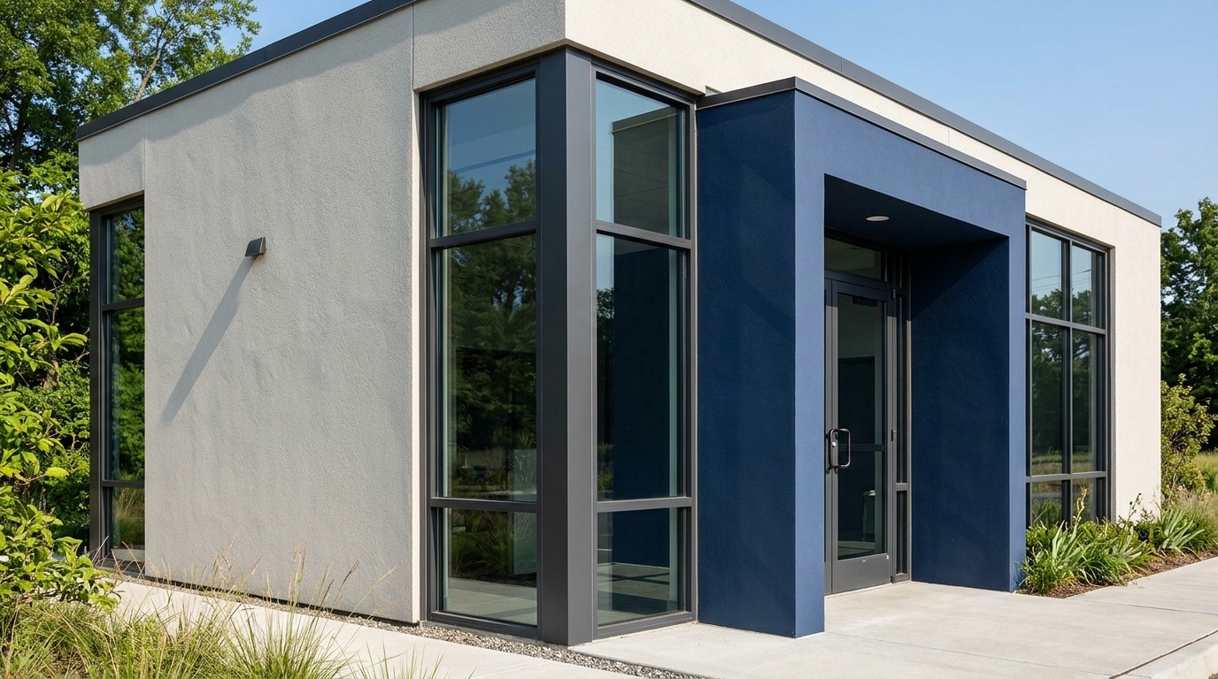
Strong commercial building color combinations usually follow a 60-30-10 structure: 60% dominant base, 30% secondary architectural tone, and 10% accent. This keeps the facade readable from the street while giving investors, tenants, and brand teams a clear system for reviewing options instead of debating isolated swatches.
Here are reliable combinations for common commercial settings:
| Building type | 60% base | 30% secondary | 10% accent | Why it works |
|---|---|---|---|---|
| Office park | Warm light gray | Charcoal | Navy | Professional, calm, easy to lease |
| Medical clinic | Off-white | Soft sage | Light blue-gray | Clean, reassuring, low-stress |
| Retail strip | Sand beige | Terracotta | Deep green | Warm, visible, customer-friendly |
| Warehouse | Taupe gray | Dark slate | Safety yellow | Practical, dust-tolerant, functional |
| Tech office | Cool white | Graphite | Electric blue used sparingly | Contemporary without full-facade intensity |
Modern commercial building paint colors work best when they respect the building’s fixed materials. Glass wants restraint. Red brick often needs warmer whites, mushroom grays, or green-black trim. Raw concrete can handle black, bronze, and clay. Metal panel systems usually look cleaner with fewer colors, often 2 plus signage.
If you are collecting commercial building exterior color ideas for a board presentation, keep each option to one visual rule. For example: “light base with dark frame,” “earth-tone base with green entry,” or “gray shell with navy tenant zone.” Too many ideas in one scheme make approvals slower. Nobody needs that meeting to run longer.
For early testing, use a quick way to compare paint palettes on your own facade photo. It helps you see proportion, not just color. A swatch can look calm at 4 inches wide and overwhelming across 4,000 square feet.
Good commercial building color ideas also consider signage contrast. A white logo on a cream facade can disappear. A black sign on dark charcoal may look premium up close but weak from a moving car. Test at street distance, pedestrian distance, and entry distance before final approval.
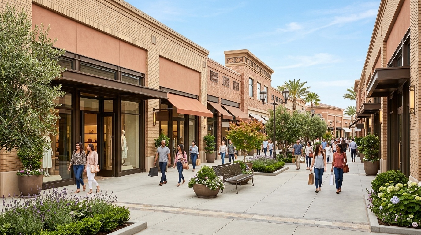
Market preference data is not a direct rulebook for commercial assets, but it gives a useful signal: neutral, light, and moderately cool exterior palettes often feel safer to buyers and tenants. One relevant 5-color reference points to off-white, white, light gray, light brown, and moderate blue as broadly attractive exterior choices.
The National Association of REALTORS® article focuses on residential properties, yet the underlying psychology matters for commercial real estate too. People read light neutrals as clean, maintained, and lower-risk. That helps when a property needs broad appeal rather than a narrow brand statement.
For office, medical, and mixed-use assets, this supports a simple decision rule: use light or mid-tone neutrals for the largest surface areas, then reserve deeper color for architectural framing and tenant identity. The result feels modern, but it still leaves room for future leasing changes.
A moderate blue is especially useful when a building needs trust. On a financial office, dental clinic, or professional-services hub, blue can feel steady and familiar. The risk is overuse. A navy entry bay or blue-gray panel system usually feels more durable than painting an entire 3-story facade in saturated blue.
In our renders, light neutrals also expose architectural flaws less aggressively than stark black-and-white contrast. Misaligned windows, patched stucco, older masonry, and mixed mechanical equipment become easier to integrate when the palette has a soft middle tone.
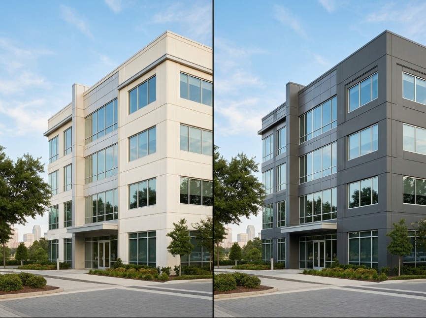
AI visualization is useful because it lets stakeholders compare color direction on the real building before anyone orders paint. The workflow is strongest when you generate several controlled options, review them side by side, and use the renders as a shared decision surface for owners, investors, managers, and tenants.
At Paintit.ai, we understand how layered commercial property decisions can be. Our tools help stakeholders visualize likely outcomes, so the chosen exterior colors can align with aesthetic goals and business objectives before money is spent on materials.
A practical workflow looks like this:
You can start with a facade-focused preview workspace to test styles, materials, and color direction on the real exterior. The key instruction is simple: keep the building form unchanged and adjust only the facade palette, trim, doors, panels, and accents.
In practice, commercial design workflows get messy when several decision-makers are involved. Being able to generate and compare color schemes digitally with Paintit.ai helps the group build consensus faster and reduce expensive revisions later.
AI has limits. It cannot confirm paint adhesion, substrate moisture, local code compliance, or the exact appearance of a manufacturer’s product under every weather condition. Use it to narrow the decision, then confirm with physical samples, coating specifications, and local approvals.
Even strong exterior colors for commercial buildings can fail if the technical checks are skipped. The 6 most common issues are ignoring LRV, choosing dark colors on heat-exposed walls, missing zoning rules, overlooking dirt exposure, mismatching fixed materials, and approving a color from a tiny swatch without full-facade context.
The first mistake is treating dark color as automatically premium. Charcoal and black can look sharp on metal or glass, but on older stucco they may emphasize cracks, waviness, and patch repairs. Dark surfaces also absorb more heat, which can increase stress on some exterior materials.
The second mistake is ignoring zoning laws and design codes. Commercial buildings may sit under sign ordinances, business-park color rules, historic district limits, or landlord criteria. Paintit.ai can help visualize compliant options, but it cannot verify local regulations. That step belongs with your city, landlord, architect, or permitting consultant.
The third mistake is forgetting pollution. A white roadside warehouse may look crisp in a render, then collect gray film near loading zones and traffic edges. A mid-tone earth palette can be more forgiving. This is where empathy for daily operations matters more than a perfect mood board.
The fourth mistake is separating color from material. Brick, glass, aluminum, stucco, concrete, and timber all change how a color reads. A green that feels refined beside bronze trim may feel flat against blue glass. A beige that works on stucco may look weak beside yellow brick.
Before ordering a full coating package, use a repaint preview on the actual exterior and then verify the shortlisted options with physical drawdowns or sample panels. Digital flow should reduce guesswork, not replace professional specification.
Commercial owners usually ask 5 practical questions before repainting: cost risk, heat behavior, brand color limits, tenant appeal, and local approval. The answers below focus on decision quality rather than decoration, because a facade repaint often affects leasing, maintenance, signage, and investor confidence at the same time.
Warm white, light gray, greige, charcoal accents, and muted navy usually create the most professional effect. The safest structure is a light or mid-tone base with a darker architectural frame, then a small accent near the entrance or signage zone.
Dark colors are not bad, but they need more control. They can absorb more heat, show dust and fading, and highlight uneven surfaces. Use charcoal, black, or deep green on trim, panels, canopies, and entry volumes rather than covering every wall.
A full bright facade is risky for most commercial buildings. It may clash with neighboring properties, reduce tenant flexibility, or conflict with local design rules. A better approach is to use the brand color on about 10% of the facade, especially around the entry, signage, or canopy.
LRV means Light Reflectance Value, measured from 0 to 100. Higher values reflect more light, while lower values absorb more. For large commercial walls, LRV helps you think through heat buildup, glare, comfort near entrances, and how the building reads in strong sun.
Check local zoning laws, business-park rules, landlord requirements, and historic district guidelines before approving the color. If the building is in a regulated area, get written confirmation before purchasing materials. AI visualization can help compare options, but it does not replace official approval.
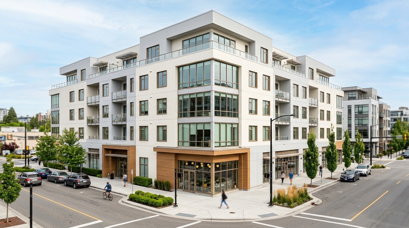
The best commercial facade palette balances 3 checkpoints: business identity, long-term maintenance, and technical fit. Choose a base color that supports leasing, add accents with restraint, test the scheme digitally, then verify samples and local rules before paint is ordered for the full building.
The best choices are rarely the loudest options. They are the colors that make the asset feel current, cared for, and easy to trust. Warm whites, soft grays, earth tones, muted blues, and controlled deep accents give most owners the strongest rhythm from idea to buy.
At Paintit.ai, we see exterior color as a practical design decision with real financial consequences. AI can make that decision more intuitive and seamless by showing possibilities on the actual facade. The final choice still needs human judgment, physical samples, and compliance checks. That balance is where better commercial design happens.