13 min. reading

Yulii Cherevko
CEO paintit.ai
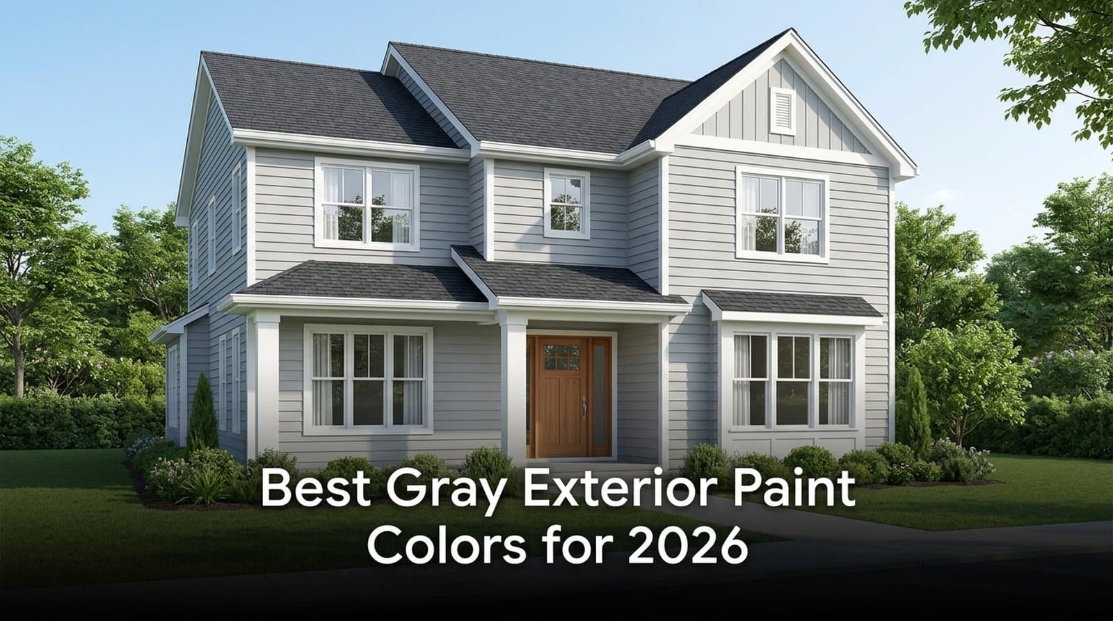
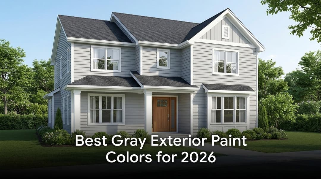
Gray exterior paint colors are not a single neat category. They move from warm greige to silvery cool gray to deep charcoal, and the right one depends on your roof, siding texture, daylight, trim contrast, and how the color behaves on your actual home photo.
At Paintit.ai, we see why gray is so hard to choose with confidence. Based on Paintit.ai data, color is the top modifier in visualization prompts, appearing in 27.6% of all prompts. That says something practical: most homeowners do not begin with a brand code. They begin with a feeling, a style, and a curb-appeal goal.
If you are still at that early stage, that is normal. Test the general idea first, such as light gray exterior paint, before choosing between Sherwin-Williams, Benjamin Moore, or Behr. You can test a broad gray idea on your own façade before buying sample pots.
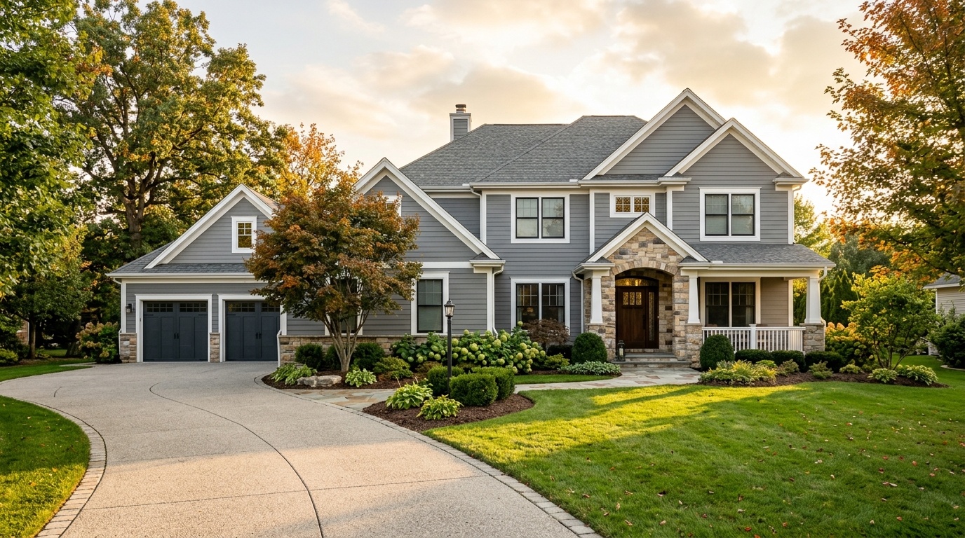
Gray remains a strong exterior choice in 2026 because it sits in a useful middle ground: safe for resale, but not bland when handled well. It can look classic, coastal, modern, or transitional depending on undertone and contrast. A single light-to-medium gray siding color can also coordinate with 3 major fixed elements: roof, trim, and masonry.
According to National Association of REALTORS®, the five most popular exterior siding choices included off-white/cream, white, light gray, light brown, and medium blue. So light gray is not some fragile micro-trend. It sits in a buyer-friendly group.
This is why popular grey exterior house colors tend to cluster around soft grays, greiges, and medium charcoals. They feel current without pushing the house into a narrow trend. A warm gray with white trim can read traditional. Put a cooler silver gray on the same house with black accents, and suddenly it feels cleaner and more modern.
The important word is balance. Gray has enough visual weight to define a home from the street, but not so much that it argues with stone, brick, cedar, or dark roofing. In our renders, the strongest gray exteriors usually have 1 main siding tone, 1 trim tone, and 1 accent tone. More than 3 exterior color roles often starts to feel busy.
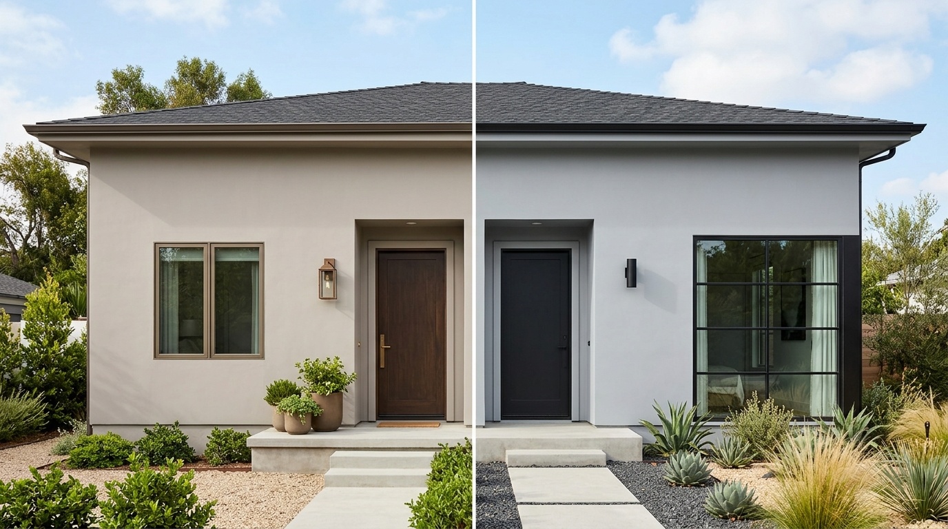
Warm gray leans beige, taupe, yellow, or red; cool gray leans blue, green, or violet. Outside, that undertone matters more than it does on a little paper swatch. Daylight stretches the color across hundreds of square feet of siding, stucco, brick, or board and batten.
LRV, or Light Reflectance Value, runs from 0 to 100. A color near 0 absorbs most light and reads very dark. A color near 100 reflects most light and reads very bright. On exteriors, sunlight makes most paint look lighter than it appears indoors.
That is why an interior “medium gray” with an LRV around 55 or 60 may look like a gentle light gray outside. A shade above 70 can wash out and look nearly white in direct sun. For many homes, the most useful exterior gray paint colors sit between LRV 45 and 60.
Warm gray exterior paint colors are the safer choice when the home has warm fixed elements: brown shingles, red brick, tan stone, bronze hardware, cream trim, or stained wood. These grays feel softer because the beige or taupe undertone connects with what is already there.
Cool gray works best when the fixed elements are also cool: black roofing, dark gray shingles, blue-gray stone, bright white trim, steel doors, or black window frames. It can create a crisp rhythm. Beside orange brick or warm stone, though, it can turn icy fast.
For deeper guidance on finishes, primers, and weather exposure, our finish and durability choices guide is a useful next step after you narrow your color family.
The best gray exterior paint colors fall into 3 practical groups: warm greige, cool silver-gray, and dark charcoal.. That is more useful than a single ranked list, because your best shade depends on roof temperature, daylight direction, siding texture, and how much contrast you want.
Here are the best exterior gray paint colors to shortlist before testing them on your home:
| Paint color | Brand | LRV | Undertone | Best use |
|---|---|---|---|---|
| Sherwin-Williams Repose Gray SW 7015 | Sherwin-Williams | 58 | Warm greige | Versatile siding for modern and transitional homes |
| Sherwin-Williams Agreeable Gray SW 7029 | Sherwin-Williams | 60 | Warm beige-gray | Traditional homes, warm roofs, soft white trim |
| Benjamin Moore Revere Pewter HC-172 | Benjamin Moore | 55 | Warm gray-taupe | Classic siding with brick, stone, or wood |
| Benjamin Moore Stonington Gray HC-170 | Benjamin Moore | 59 | Cool blue-gray | Coastal, modern, or crisp white-trim homes |
| Benjamin Moore Coventry Gray HC-169 | Benjamin Moore | 48 | True cool gray | More body in bright sun, good for lap siding |
| Sherwin-Williams Iron Ore SW 7069 | Sherwin-Williams | 6 | Soft charcoal | Trim, doors, gutters, accent siding |
| Behr Graphic Charcoal N500-6 | Behr | Dark neutral | Charcoal gray | Modern dark siding or high-contrast accents |
Sherwin-Williams Repose Gray SW 7015 is one of the most flexible choices because its LRV of 58 gives enough depth outside while still feeling approachable. It is warm enough to avoid a sterile look, but not so beige that the house stops reading gray.
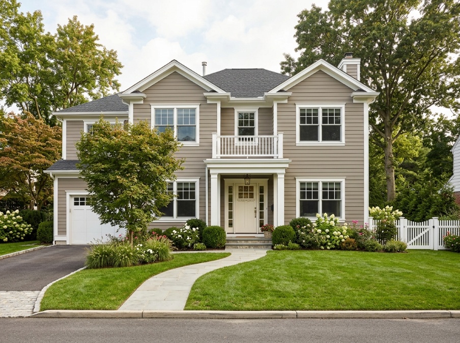
Sherwin-Williams Agreeable Gray SW 7029 is slightly warmer, with an LRV of 60. It works well for a classic suburban exterior, especially when the roof is brown, weathered tan, or warm charcoal. If you want a calm, friendly exterior, this is often the easiest track to try first.
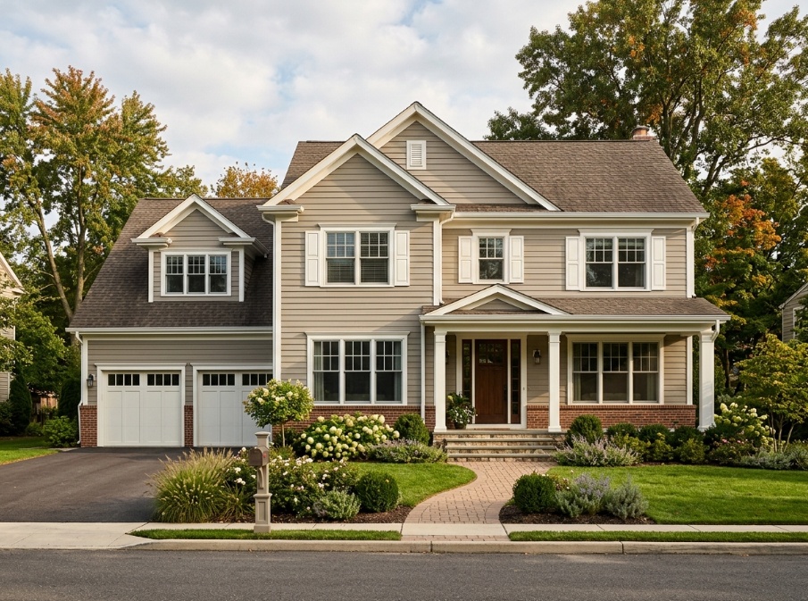
Benjamin Moore Revere Pewter HC-172 has an LRV of 55, which makes it a strong light gray exterior house option when you want more body than a pale gray. It pairs especially well with red brick, stonework, warm white trim, and darker front doors.
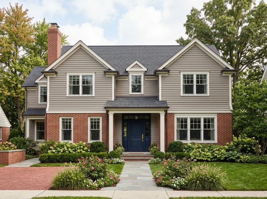
Benjamin Moore Stonington Gray HC-170 has an LRV of 59 and a cooler blue-gray undertone. It looks clean and silvery on siding. It is especially good for coastal homes, white-trim cottages, and houses with black or cool gray roofs.
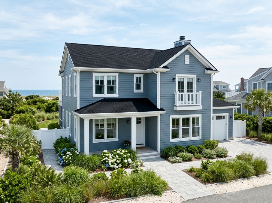
Benjamin Moore Coventry Gray HC-169, with an LRV of 48, is useful when you want the house to remain clearly gray even under strong daylight. It has more depth than Stonington Gray, so it suits broad façades that need visual structure.
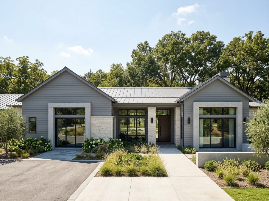
Sherwin-Williams Iron Ore SW 7069 has an LRV of 6, so it is a true dark choice. It is excellent for accent siding, doors, gutters, or trim when pure black feels too hard. On a full exterior, it creates a dramatic modern shell and needs careful trim planning.
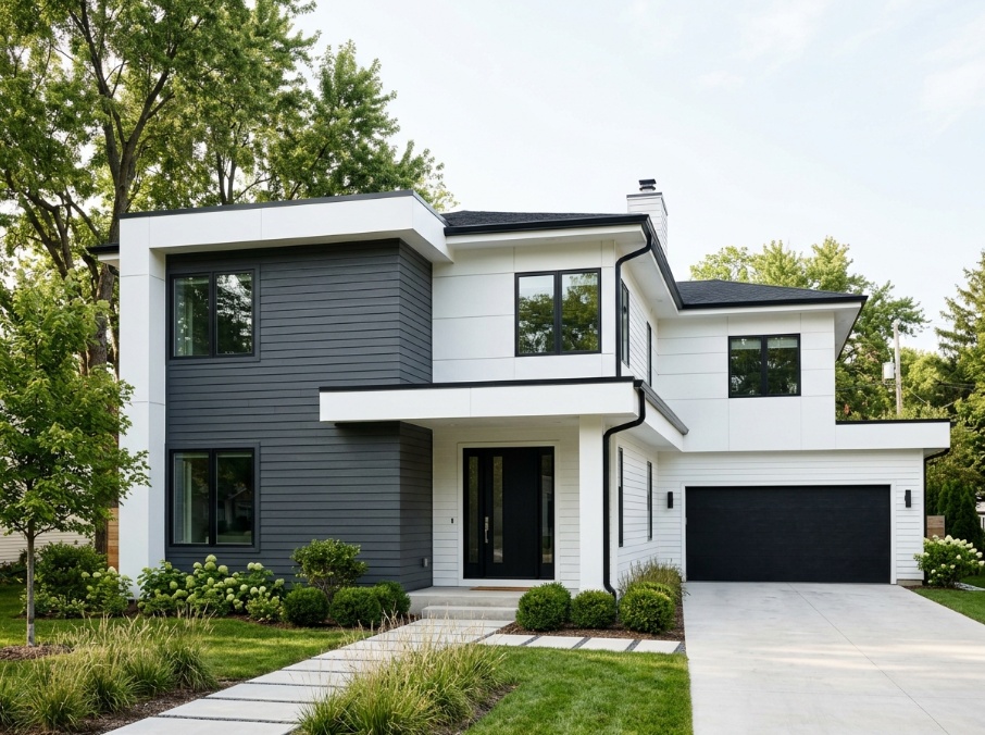
Behr Graphic Charcoal N500-6 is a dark neutral gray often chosen for a clean, contemporary exterior. Use it where you want a bolder façade or sharp contrast against pale stone, white trim, or warm wood.
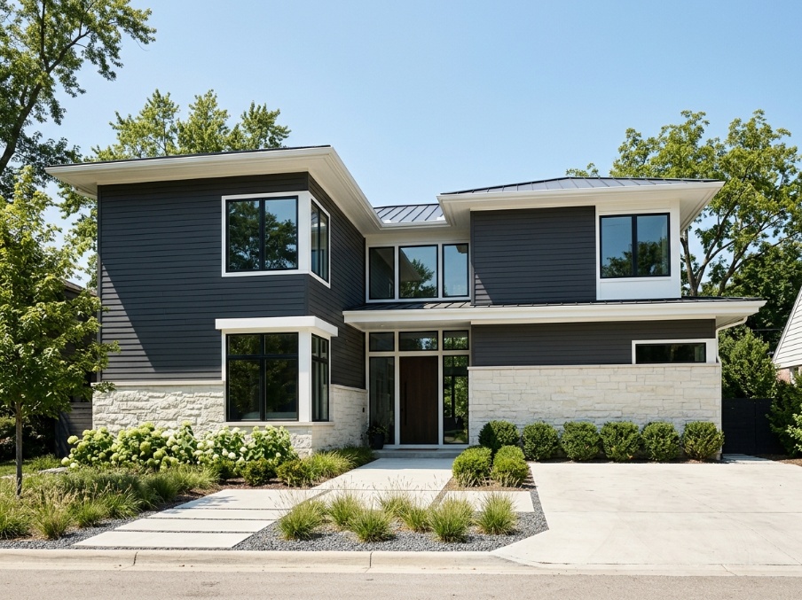
In our analysis of Paintit.ai user prompts, paint/repaint language appears in 13.2% of prompts, but only 2.5% specify a paint brand at the start. That gap is real. Most people begin with a personal idea like “soft warm gray siding,” then match it to a physical product later.
Natural light can make the same gray paint look blue, beige, white, or charcoal depending on orientation. North-facing sides often make gray cooler. South-facing sides wash it lighter. East and west exposures shift more noticeably because morning and evening light bring different warmth and shadow.
A north-facing façade receives cooler indirect light for much of the day. Cool grays can look bluer here, sometimes even violet. If your home faces north and you want softness, start with a warm gray around LRV 50 to 58 rather than a pale cool gray.
A south-facing façade gets more intense sun. This can make gray look 1 to 2 visual steps lighter. A color with an LRV of 60 may appear close to off-white at midday, especially on smooth stucco or wide board and batten.
East-facing walls are brightest in the morning and calmer later. West-facing walls can look warm and golden in late afternoon. If you only test a swatch at 10 a.m., you may miss the color’s strongest shift at 5 p.m.
Siding texture also matters. Stucco catches micro-shadows, so it can make gray feel slightly deeper. Smooth lap siding reflects light more evenly. Brick absorbs color differently again, especially if the paint is used on previously painted masonry.
If you are considering gray siding alongside roof changes, stone updates, or front-entry adjustments, you can preview siding with the roof and front path before committing to a full palette.
The best gray selection process is iterative: start broad, test visually, refine by temperature and depth, then verify with physical swatches. In practical design workflows, especially for homeowners, the perfect shade is rarely found in 1 click. It is usually shaped through 3 to 5 comparisons.
Here is the workflow we recommend at Paintit.ai.
Start with a clean photo of your home. Take it from straight on, in daylight, with as little car, bin, or heavy shadow obstruction as possible. JPG, PNG, PDF, and DWG files are supported, but a clear JPG is usually the simplest starting point.
First, prompt the broad style. For example: “Repaint the siding a warm light gray, keep the roof and windows unchanged, use soft white trim, and keep the front door dark charcoal.” This keeps the flow controlled and avoids changing the whole house at once.
Second, test temperature. Run 2 versions: one warm greige and one cool silver-gray. In our renders, this side-by-side comparison is often more useful than looking at 10 isolated swatches, because it shows how your roof, brick, and trim react to the undertone.
Third, test depth. Ask for “a bit darker,” “slightly lighter,” or “more contrast on the trim.” Based on Paintit.ai user data, 15% of prompts contain iterative refinement language like “a bit darker” or “now make it warmer.” That reflects how people really choose color.
Fourth, map the winning direction to real paint names. If the warm version wins, compare Repose Gray, Agreeable Gray, and Revere Pewter. If the cool version wins, compare Stonington Gray and Coventry Gray. If the dark version wins, test Iron Ore or Graphic Charcoal.
Fifth, buy physical samples and paint them vertically on at least 2 sides of the house. AI helps you narrow the field and make the process more intuitive, but it does not replace real pigment, surface texture, sheen, or local daylight.
You can paint your current siding virtually and move through this sequence in minutes. For more precise uploads and prompt structure, use our cleaner upload routine before generating final options.
If you use Pinterest references, keep the instruction specific: “Use this reference for style, palette, materials, and mood. Do not copy exact composition. Keep my house layout unchanged.” Think of it like choosing a music track for the style, then easing it into your own home’s rhythm.
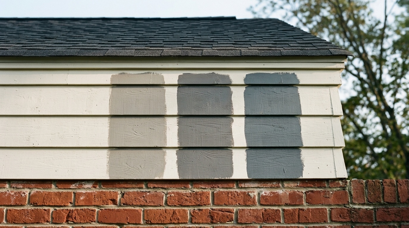
Most gray exterior mistakes come from ignoring fixed materials, testing swatches badly, or choosing a shade that is too pale for direct sun. A good gray palette should account for at least 4 fixed variables: roof color, masonry, window frames, and trim contrast.
Mistake 1: choosing gray before checking the roof. Brown shingles usually prefer warm gray. Black, dark gray, or blue-gray roofing can support cooler gray. If the roof and siding undertones fight each other, the whole façade feels slightly off even when each product is attractive on its own.
Mistake 2: forgetting masonry. Red brick tends to work better with warm greige. Blue-gray paint beside red brick can feel cold and disconnected. Tan stone usually prefers taupe-gray or beige-gray. Cool limestone can handle silver-gray more gracefully.
Mistake 3: selecting a color with too high an LRV. A soft gray above LRV 70 may look almost white outside. If you want the house to read distinctly gray from the street, start closer to LRV 50 to 60.
Mistake 4: testing swatches flat on a table. Exterior paint should be judged vertically, on the same plane as the siding. Sunlight hits a vertical wall differently than it hits a horizontal sample card.
Mistake 5: underestimating trim contrast. A gray house with trim only 2 or 3 visual steps lighter can feel muddy. A clear white, creamy off-white, charcoal, black, or natural wood accent gives the palette a more seamless finish.
The most personal exteriors usually show restraint. One siding gray, one trim color, one accent color. That simple rhythm gives the architecture room to breathe.
These 5 questions come up often because gray is sensitive to light, undertone, and nearby materials. The safest approach is to compare warm and cool options digitally, narrow the field to 2 or 3 real paint samples, then observe them outside at different times of day.
Yes. Light grays with higher LRV values, especially above 60, can look much paler in direct midday sun. If you want the home to read clearly gray, test shades around LRV 50 to 55 before trying very pale options.
Warm grays have beige, taupe, yellow, or red undertones, so they feel softer and work well with brick, brown roofing, and wood. Cool grays have blue, green, or violet undertones, so they feel cleaner and pair well with black, white, and cool stone.
Cool light grays usually look best with crisp white, black, or charcoal trim. Warm light grays usually prefer creamy white, soft off-white, bronze, stained wood, or dark brown accents. The trim should create enough contrast to frame windows, fascia, and porch details clearly.
Avoid grays with strong blue or red undertones if your daylight or nearby materials already push color cool. Test the paint on multiple sides of the house, especially north-facing walls, and compare it beside the roof, masonry, and trim before buying gallons.
Yes. Warm gray and greige shades often look very natural with red brick because they share compatible undertones. Revere Pewter, Agreeable Gray, and Repose Gray are good starting points if your brick has red, orange, tan, or brown variation.