15 min. reading

Yulii Cherevko
CEO paintit.ai
Published:
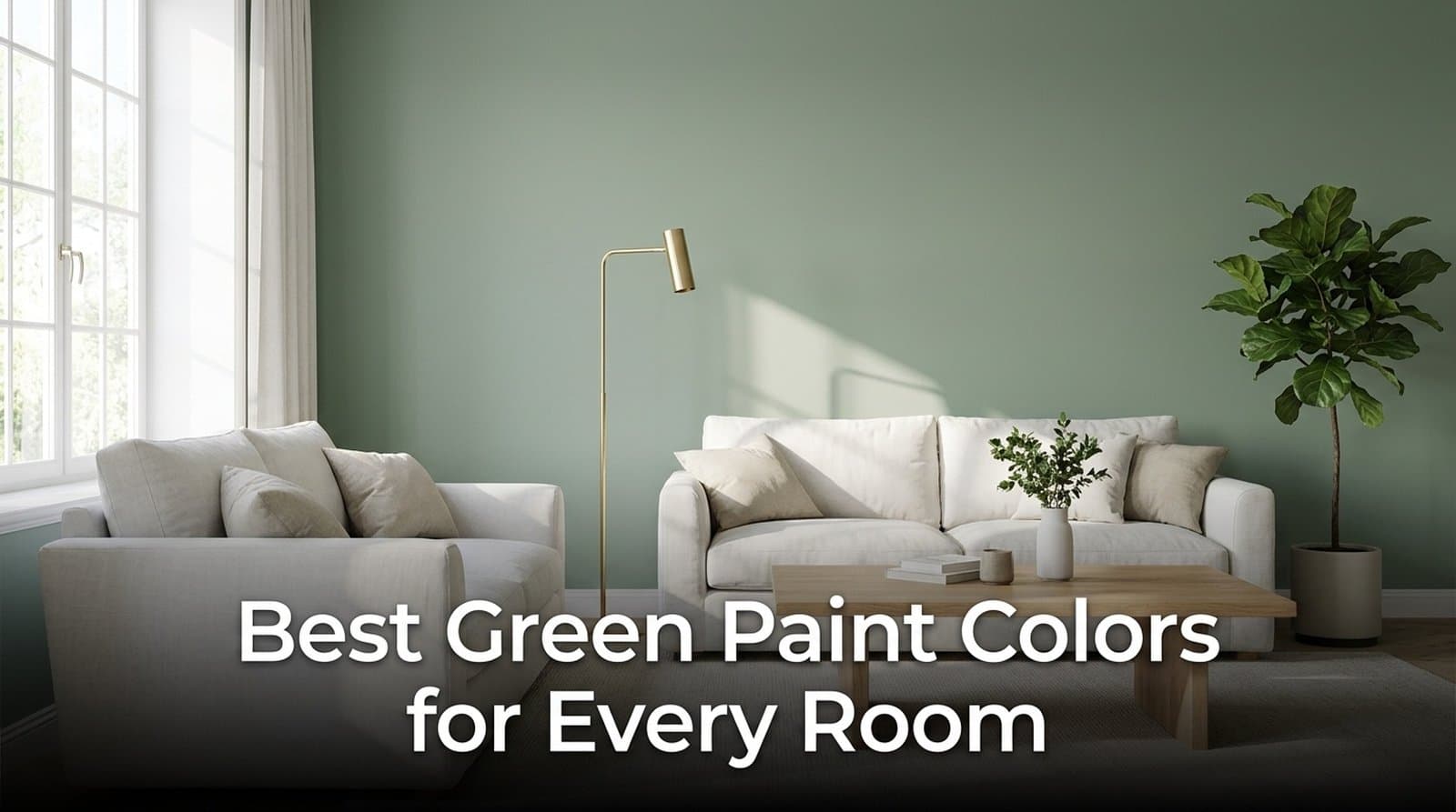
The best green paint colors depend on how light or dark you want the room to feel. Start with Sea Salt or Liveable Green for a lighter look, October Mist or Clary Sage for a midtone, and Evergreen Fog, Pewter Green or Vintage Vogue for more depth. Compare the samples against your actual floor, trim and furniture before choosing one.
A green that works with a cream sofa may look very different beside gray tile. For an interior repaint, choosing the right shade means deciding which materials will stay, how much wall area will change, and what the room looks like when you use it. A photograph is a useful starting point, but the final decision belongs to a physical paint sample.
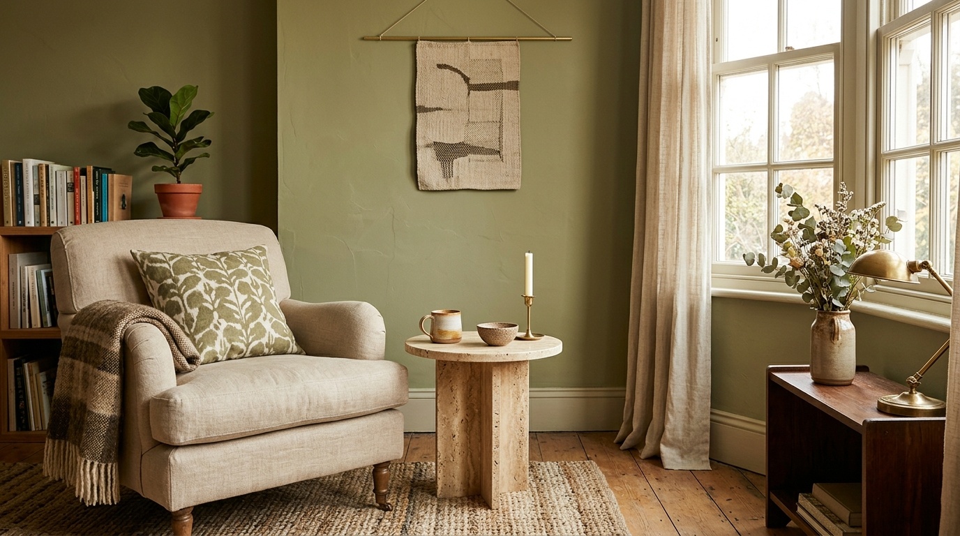
These seven shades offer different starting points rather than a universal ranking. The room suggestions are design recommendations, not manufacturer guarantees. LRV references were checked on October 12, 2026; they compare color lightness, not washability, moisture resistance or paint coverage.
| Color | LRV Reference |
Visual Direction | A Place to Start | Check Against |
|---|---|---|---|---|
| Sea Salt SW 6204 / HGSW6204 |
63 | Light gray-green with a blue-green feel | Bedroom or bathroom walls | Cool tile and evening lighting |
| Liveable Green SW 6176 |
61 | Pale, muted herbal green | A lighter living room or hallway | Yellow tones in flooring and trim |
| October Mist Benjamin Moore 1495 |
46.54 | Soft, shaded sage | Living room or bedroom walls | Cream upholstery and existing whites |
| Clary Sage SW 6178 / HGSW6178 |
41 | Midtone herbal green | Kitchen walls or a laundry room | Oak, cream stone and warm bulbs |
| Evergreen Fog SW 9130 / HGSW9130 |
30 | Deeper gray-green | Office or dining room walls | Shadowed corners and dark furniture |
| Pewter Green SW 6208 / HGSW6208 |
12 | Dark, muted green | Cabinets, built-ins or a full dark scheme | The amount of surrounding light color |
| Vintage Vogue Benjamin Moore 462 |
11.85 | Smoky dark green | A den, library or powder room | Whether the green remains visible at night |
SW and HGSW identify separate Sherwin-Williams product lines. The shared names and corresponding color references do not make their coatings interchangeable. The four HGSW entries above supply the listed LRV references; confirm the color chip and suitable paint product at the retailer you choose.
Sea Salt belongs on a shortlist when you want a light green that can sit beside white trim without a strong color contrast. Its gray component softens the look, while some rooms make the blue-green impression more noticeable.
The Sea Salt HGSW6204 color reference lists LRV 63. Test it beside the bathroom tile or bedroom bedding, especially if you want unmistakably green walls rather than a color that also reads blue or gray.
Liveable Green is another option when the darker sages seem too heavy. Sherwin-Williams lists SW 6176 at LRV 61 in its Colormix 2026 color report. That gives you a lighter comparison point without moving all the way to an off-white.
Put its sample next to the wood you are keeping. If the combination looks too yellow, compare it with a grayer green before blaming the room's lighting. A pale shade still needs enough contrast to look deliberate beside the ceiling and trim.
October Mist offers more visible color than a pale green while keeping the palette subdued. Benjamin Moore's October Mist 1495 color page describes it as a shaded sage and currently lists LRV 46.54.
Use it as a comparison point for living rooms with cream upholstery, natural textiles or wood furniture. Check the shade against your trim rather than choosing a new white independently. A room with several slightly different whites can make a soft green harder to judge.
Clary Sage has more depth than its name might suggest. Its HGSW6178 catalog listing gives LRV 41. Compare it with Liveable Green if you are deciding between a lighter wall and a stronger herbal color.
It is a useful candidate around warm wood or cream materials, but do not assume it will warm every room. View the sample under the bulbs you actually use. The same gray or yellow impression can become more noticeable when neighboring materials change.
Evergreen Fog gives a room a stronger gray-green backdrop than the lighter choices. The Evergreen Fog HGSW9130 listing shows LRV 30. Start here when a light sage seems washed out and you are comfortable with darker walls.
Check a sample behind the largest furniture piece as well as near the window. If the room has dark shelves, a leather chair and limited daylight, the combined effect may be much heavier than a small paint chip suggests.
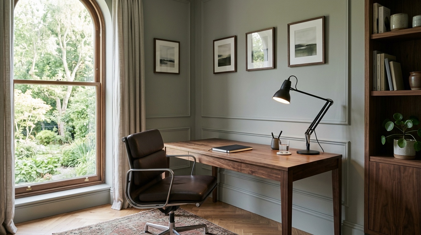
Pewter Green is a dark option with much less light reflectance than the first five shades. The matching Pewter Green HGSW6208 reference lists LRV 12. Try it against the counter, backsplash and hardware before committing to a full run of cabinetry.
Light counters and a pale ceiling can provide contrast around dark green doors. If most surfaces are already dark, decide whether you want that enclosed appearance. For cabinets, choose an appropriate coating system separately from the color.
Benjamin Moore describes Vintage Vogue 462 as an ultra-dark, smoky green that can take the place of black or brown. Its current LRV is 11.85. Consider it when you want a dark backdrop for books, art or lighter furniture.
Vintage Vogue and Pewter Green are close in reflectance, but that does not make them visual duplicates. Compare their samples side by side. If you want to see green rather than an almost-black surface, examine both in the room's least generous lighting.
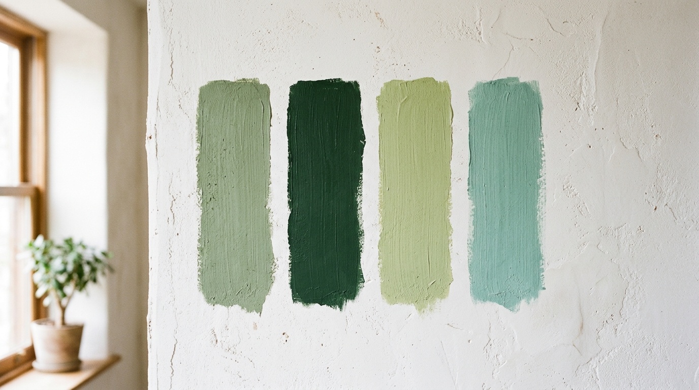
Paint names are difficult to compare until you decide what kind of green you want. Treat the room images here as illustrations of a direction, not exact reproductions of a named manufacturer's shade. A screen image cannot confirm the paint formula or finish.
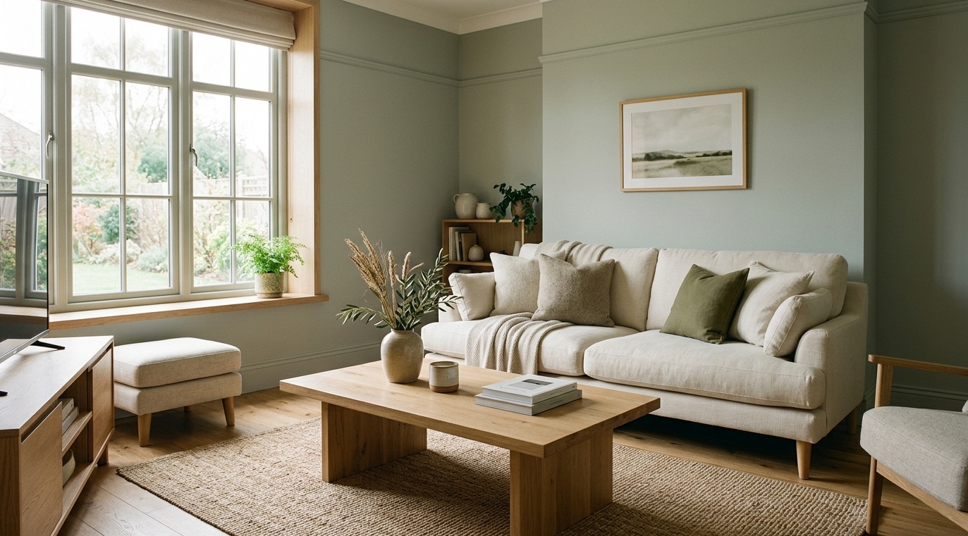
Sage green paint colors are muted rather than sharply saturated. October Mist and Evergreen Fog give you two depths to compare within that broad direction. Sage can be useful when you want colored walls but need them to sit behind a patterned rug or a collection of art.
Gray green paint colors can also look almost neutral in some lighting. Hold a sample next to plain white and the room's existing wood. That comparison helps show whether you prefer a more visible green or a grayer backdrop.
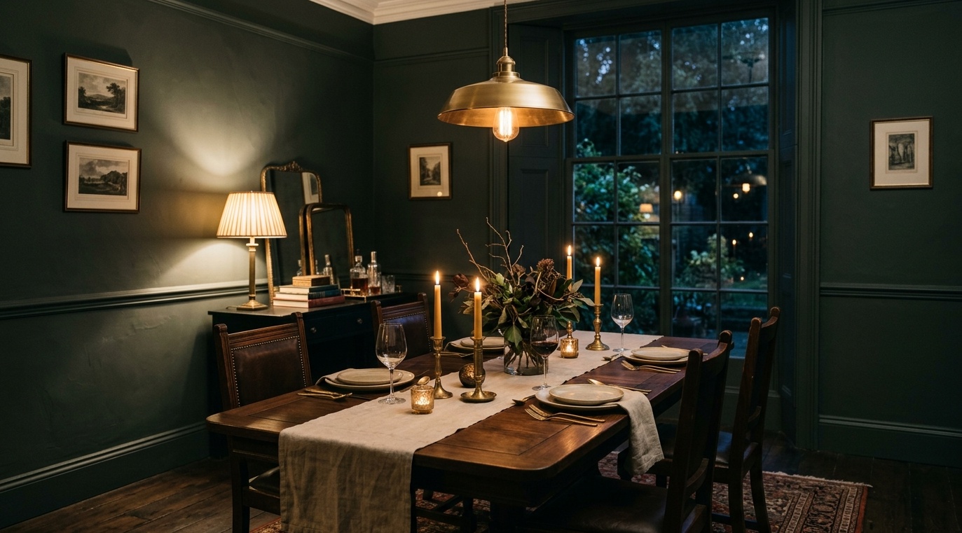
Dark green paint colors create a stronger contrast with pale upholstery, white trim and metal hardware. Olive green paint colors usually suggest a yellow or earthy direction, while other dark greens can look cooler. Compare them against the materials you are keeping instead of relying on those labels alone.
For moody green paint colors, think about the whole room rather than just the wall. Dark walls, dark curtains and dark furniture add up. A smaller painted surface is a useful alternative when you like the color but do not want every wall to have that depth.
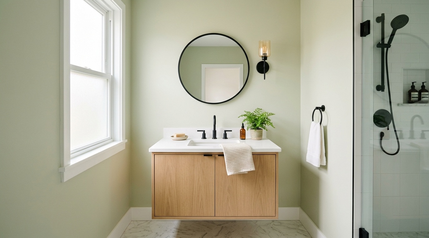
Light green paint colors leave more contrast available for cabinets, furniture and textiles. Liveable Green and Sea Salt are the lighter options in this shortlist. Clary Sage sits lower in reflectance and should not be treated as a pastel simply because it is called sage.
If you are looking for soft green paint colors, compare saturation as well as lightness. A pale but clean mint can look more colorful than a deeper gray-green. Your sample should show the degree of color you want, not merely pass a brightness test.
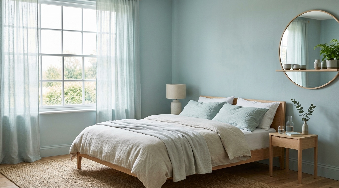
Blue green paint colors are worth considering with white tile, light bedding or a coastal palette. Sea Salt provides a light starting point. Check it beside warm timber too; the contrast may be welcome, or it may make the wall look bluer than you intended.
If you dislike the blue impression, compare a herbal or shaded sage instead of asking for the same color in a darker version. Changing depth does not necessarily remove the undertone you are reacting to.
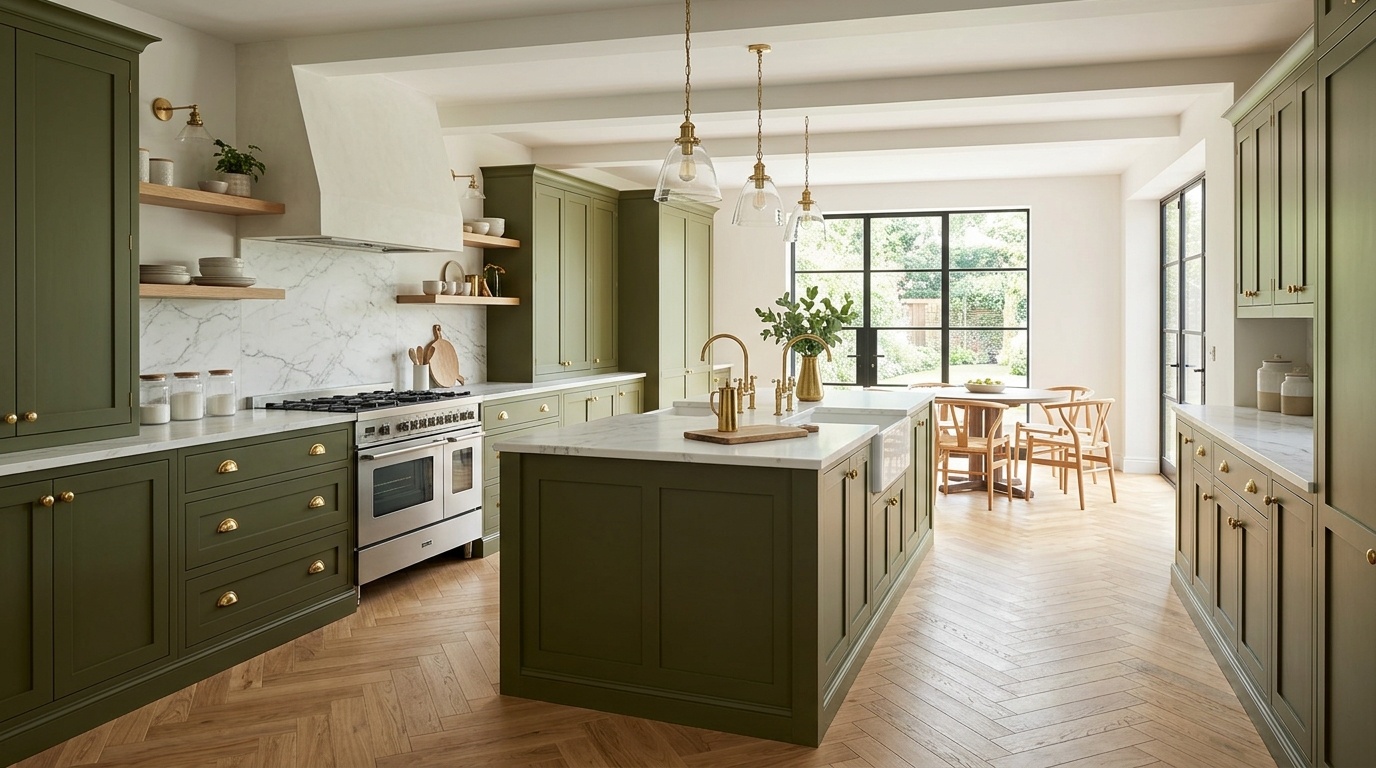
The room's permanent materials matter more than its name. A bedroom with orange-toned wood and cream carpet needs a different comparison from a bedroom with cool gray flooring, even when both owners want sage.
A new sofa changes the paint comparison. In Paintit's paint-and-finish study, 88 of 349 homeowner respondents who selected paint or finish choices also selected furniture or decor placement (25.2%). These were stated interests in Paintit's August and early September 2026 sample, not completed projects. If your sofa is staying, compare greens against its fabric. If you plan to replace it, include the intended upholstery in your palette before settling on a wall color.
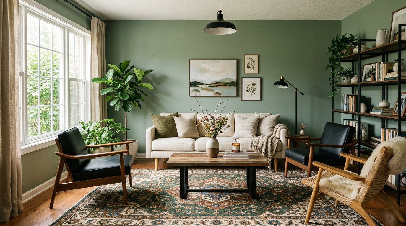
Start with the sofa, rug and floor. October Mist can be a useful midtone comparison beside pale upholstery, while Evergreen Fog lets you test a deeper backdrop. If the sofa is patterned, pull out the quieter colors rather than trying to match its strongest detail.
Consider the adjoining room as well. A green wall viewed through an open doorway needs to work with both spaces. Compare the sample from the place where you normally sit, not only from directly in front of the painted wall.
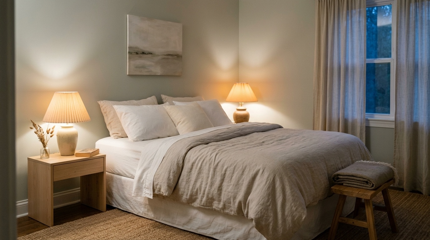
Check the bedding and the lamps you read by. Sea Salt suits a lighter blue-green direction; October Mist gives you a stronger sage comparison. A darker green is also an option if that is the atmosphere you prefer, but inspect the wall behind the headboard after sunset.
For a room with exposed wood or textured linen, the sage bedroom combinations with wood and linen show how the larger palette can work. Keep the paint choice tied to your actual furnishings rather than copying the photograph as a complete room.
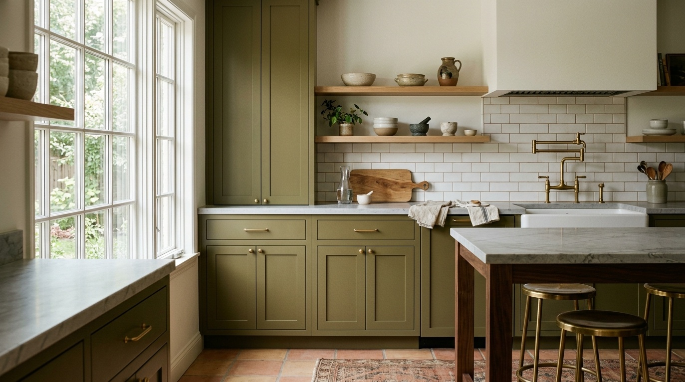
Decide which surface will be green. Midtone Clary Sage on walls creates a different balance from Pewter Green across cabinet doors. Put the counter, backsplash and flooring next to the sample; these surfaces are often more expensive to change than paint.
If the floor is brown, use the cabinet palettes for brown flooring to check the relationship before choosing the shade. Confirm a suitable cabinet coating with the paint supplier; a color recommendation does not establish adhesion or wear resistance.
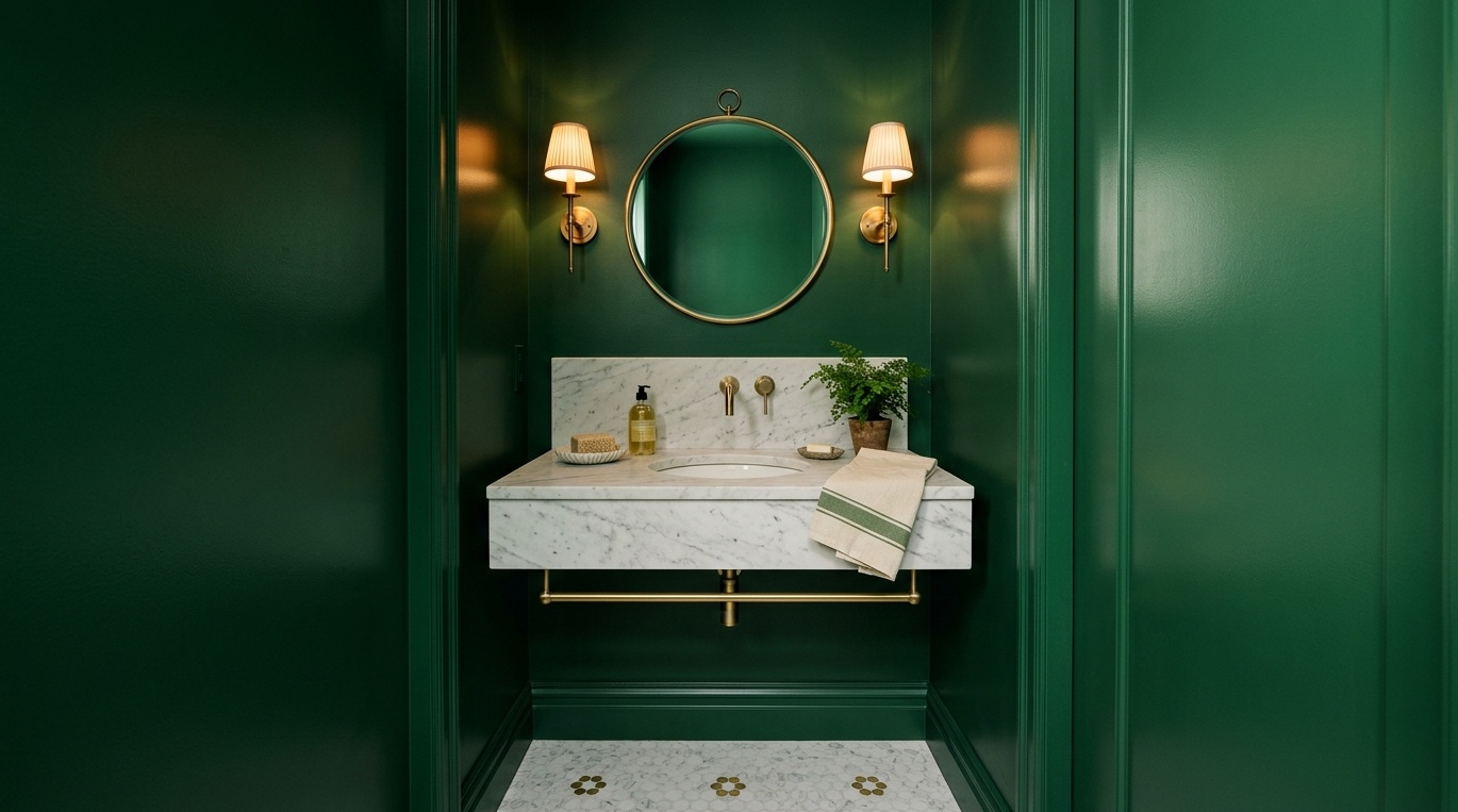
Look at the tile before the towels. A light blue-green can work beside a cool white surface, while a smoky dark green makes a different, more enclosed scheme. Check the color beside the mirror and under the lighting used at the sink.
A powder room gives you room to try a darker color without applying it throughout the home. For a bathroom with a shower, verify the coating's intended use and address ventilation separately. The paint color cannot solve condensation.
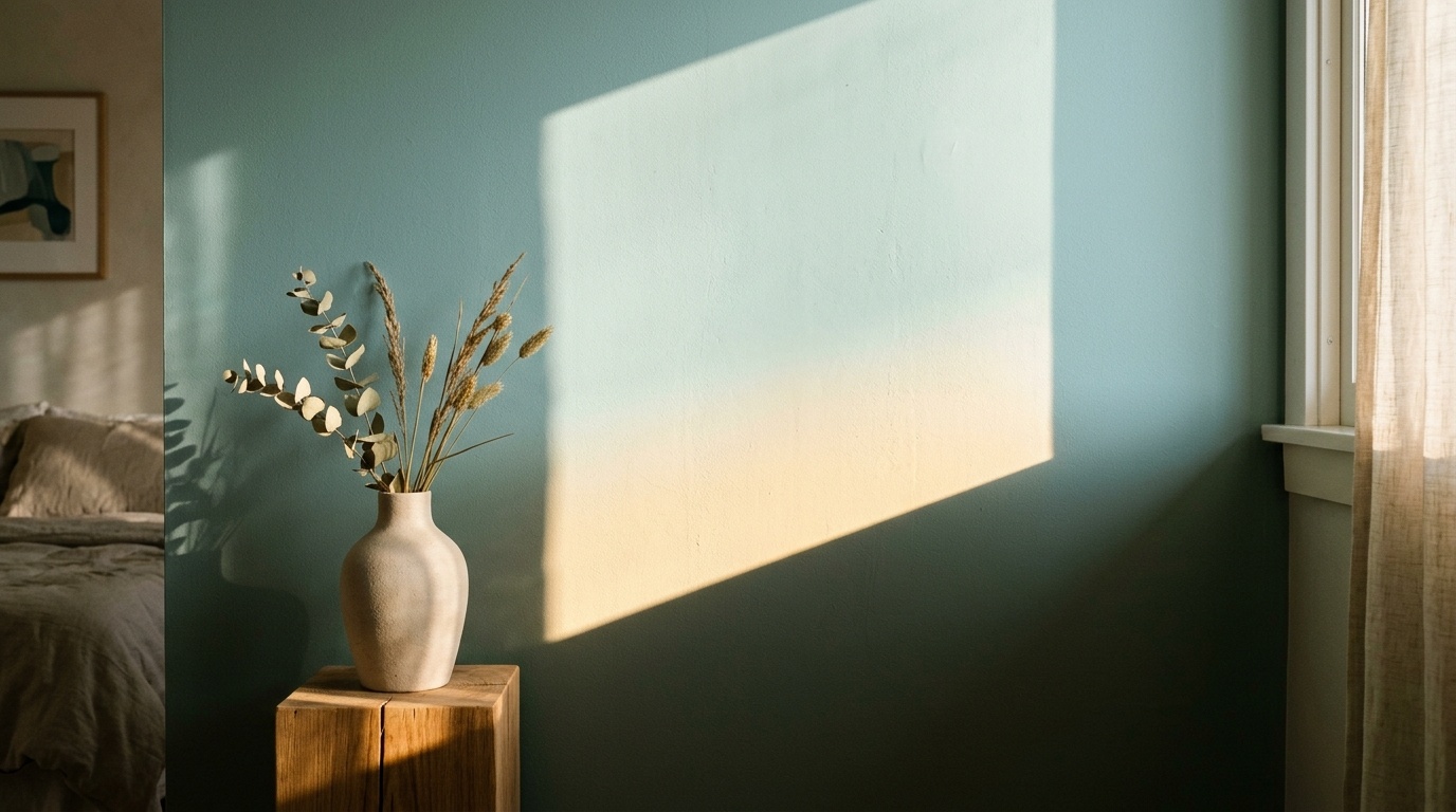
Light reflectance value describes the percentage of visible light a surface reflects, on a scale from 0 to 100. A higher figure helps compare lighter colors, but paint does not create light. A room with a small window still needs a lighting plan, even when its walls have a high LRV.
Sherwin-Williams explains how daylight and artificial lighting affect color in its guide to choosing paint by room orientation. The north/south advice below assumes a Northern Hemisphere location; reverse that sunlight relationship in the Southern Hemisphere.
A room with cool, indirect daylight can make a gray or blue-green feel cooler. Compare a lighter herbal green with a grayer option if you want a softer appearance. Warm green paint colors are a useful direction to test, not an automatic fix for a dark room.
If you prefer deep green paint colors, accept that the walls may feel darker and add usable lighting where you sit or work. Do not choose a dark green on the assumption that it will brighten the space.
Strong direct sun can make differences between yellow-green and gray-green more noticeable. East- and west-facing rooms also change as the sun moves. Check the paint when you normally spend time there, including the evening if that is when the room gets most use.
Window treatments, nearby buildings and reflected light from outdoors can outweigh a simple compass rule. Test more than one wall rather than assigning a guaranteed appearance to each direction.
Begin with two different directions, such as a light herbal green and a midtone sage. A preview of green walls beside your existing furnishings can help compare the overall relationship before you buy samples.
For example, a living room with a cream sofa and oak floor could compare Liveable Green with October Mist. One tests a lighter herbal direction; the other tests a stronger shaded sage. If both clash with the trim, change the shortlist before deciding to repaint the trim too. This is a planning example, not a measured client result.
Do not infer a paint formula from a generated image or an eyedropper HEX. Camera exposure, white balance, the display and the generated result affect color. Paintit's Find Similar Color action can suggest another catalog direction, but it does not establish a manufacturer-approved substitute.
Keep a flooring sample or an exposed section of the actual floor beside the paint comparison. Green that looks neutral in isolation can look much yellower or bluer against wood, tile or carpet. Check the largest fixed materials before shopping for new accessories.
Broad labels help build a shortlist, but they do not settle the choice. Neutral green paint colors can still change their apparent undertone next to different whites. Compare the paint with the ceiling and trim, and decide whether you want those surfaces to contrast or blend.
Use movable sample boards or suitable paint samples on both a brighter wall and a shadowed wall. Follow the sample instructions and view the dried finish. Check it at the times you use the room instead of treating one sunny photograph as the final answer.
Start by deciding whether you want a lighter appearance or a deliberately dark room. Sea Salt and Liveable Green are useful light comparisons. Pewter Green and Vintage Vogue serve a different purpose. Size alone does not decide the color; the window, lighting and surrounding materials matter too.
There is no shade that looks the same in every daylight condition. Test a light option such as Liveable Green against a midtone such as October Mist in your room. Check the sample in direct light and shadow, and include the flooring and trim in the comparison.
Compare the paint against the bedding, headboard and evening lighting. Light sage green paint colors suit a softer palette, while deeper green can provide more contrast. Choose the level of color you enjoy seeing when you wake up and when the lamps are on, rather than treating green as a guaranteed sleep aid.
A low-LRV green reflects less light than a lighter shade. Pale furniture, light counters and well-placed lamps can add contrast around it, but the paint itself does not brighten the room. Choose dark green for its appearance, not as a replacement for lighting.
Use a similar catalog color as a starting point, then compare physical samples from the intended product line. Matching names, HEX codes or digital previews do not guarantee an identical painted result. Record the brand, color code, coating and finish when you make the final selection.