We use essential cookies to make our site work. With your consent, we may also use non-essential cookies to improve user experience, personalize content, and analyze website traffic. For these reasons, we may share your site usage data with our social media and analytics partners. By clicking “Accept,“ you agree to our website's cookie use as described in our Cookie Policy. You can change your cookie settings at any time on your browser preferences.
  • About
  • Prices
  • Blog
  • Contacts
AiEi

Products

  • For Interior Designers
  • For E-commerce
  • For Real Estate

Tools

AI architecture generator
AI concept generator
AI exterior design
AI house generator
AI house painter
AI landscape design
AI rendering
AI room design
Home exterior design tool
AI Virtual Staging
AI bathroom remodel
AI floor plan generator
AI furniture generator
AI furniture placement
Exterior home renovation
AI paint color visualizer
AI kitchen remodel
AI rug visualizer
Real estate photo enhancement
AI Interior Design Rendering
AI Wall Design
AI Door Design
AI Render Floor Plan
AI Flooring Design
Driveway Design Tool
Paver Design Tool
Home Addition Plans
Sketch to Rendering AI
Elevation to Render
AI Cabinet Design
AI Deck Design
AI Garden Planner
AI Remodel Interior Design
AI Window Visualizer
Furniture Paint Visualizer
Kitchen Countertop Visualizer
Landscape Lighting Design Tool
AI Curtain Visualizer
AI Render Enhancer

Use Cases

AI Kitchen Design
AI Living Room Design
AI Bedroom Design
AI Bathroom Design
AI Closet Design
AI Office Design
AI Pool Design
AI Laundry Room Design
AI Restaurant Design
AI Classroom Design
AI Basement Design
  • Terms of Service
  • Privacy Policy
  • Trust
  • Affiliate program
Logo
Paintit.ai - Free AI Interior Design Tool

© 2026

Stand with Ukraine
PAINTITAI LTD, 52 Leytonstone road, London, E15 1SQ, UK
  • English/
  • Español/
  • Português (Brasil)/
  • Deutsch
Paintit.ai - ai home design free
  • Pricing
  • About
  • Blog
  • Contacts
/Blogs/Warm White Paint Colors
Ideas

11 min. reading

7 Warm White Paint Colors for Walls and Trim 

avatar-blog

Yulii Cherevko

CEO paintit.ai

Published: 29 October 2026
Share
  • ChatGPT
  • Perplexity
  • Claude
  • Grok
  • Google AI
7 Warm White Paint Colors for Walls and Trim

Page 
Contents: 

  • 1. Key Takeaways
  • 2. Seven Warm Whites at a Glance
  • 3. Sherwin-Williams Warm White Paint Colors
  • 4. Benjamin Moore Warm White Paint Colors
  • 5. Behr Warm White Paint Colors
  • 6. Choose the Undertone Around What You Are Keeping
  • 7. Check Daylight and Evening Lighting
  • 8. Walls, Trim and Cabinets: Decide What Should Contrast
  • 9. Test a Shortlist Before Buying Gallons
  • 10. Warm White Paint Questions

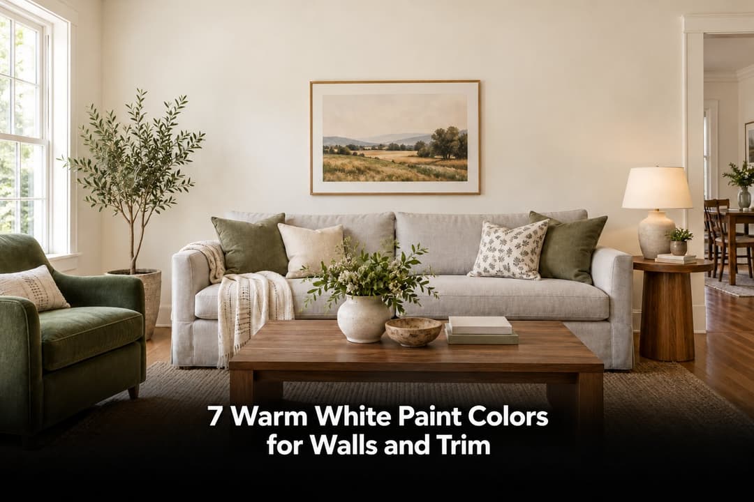
Start your search for warm white paint colors with Alabaster or White Dove for a softly shaded white, Greek Villa or Simply White for a lighter comparison, and Creamy or Swiss Coffee for a creamier direction. The best choice depends on the whites already in your room, especially cabinets, trim and stone. Choose two or three samples, then compare them in daylight and under your usual lamps.

A white wall does not sit in isolation. Beside an ivory cabinet it can look clean; beside a cool white countertop the same paint may look yellow. Before choosing a favorite paint name, decide which finishes are staying. That decision eliminates more unsuitable whites than a longer inspiration list will.

Key Takeaways

  • The best warm white paint colors are compatible with your fixed finishes, not universally flattering in every house.
  • LRV measures light reflectance. It does not tell you a paint's undertone or guarantee a bright room.
  • Benjamin Moore Swiss Coffee OC-45 and Behr Swiss Coffee 12 are different colors, not interchangeable formulas.
  • Compare a creamier white with a less creamy option before deciding how much warmth you want.
  • Use a photo preview to narrow the direction, then approve physical samples in the actual paint product and sheen.

Seven Warm Whites at a Glance

This shortlist covers three brands and several degrees of warmth. The suggested uses below are starting points for sampling, not results from a seven-paint room test. Manufacturer color references were checked on October 29, 2026.

Paint Color LRV Why Compare It? Check Before Choosing
Sherwin-Williams Alabaster SW 7008 82 A softer alternative to a bright white Its contrast with existing white cabinets
Sherwin-Williams Greek Villa SW 7551 84 A lighter comparison beside Alabaster Warmth beside cool stone and trim
Sherwin-Williams Creamy SW 7012 81 A more deliberately creamy direction Whether the yellow impression is welcome
Benjamin Moore White Dove OC-17 83.16* A shaded white to compare with Alabaster The actual sample; see the source note below
Benjamin Moore Simply White OC-117 89.52 A brighter white with a little warmth Whether it looks too bright beside ivory finishes
Benjamin Moore Swiss Coffee OC-45 81.91 A warmer off-white comparison Its relationship with the ceiling and cabinetry
Behr Swiss Coffee 12 84 A cream-based white from a different catalog Use the Behr chip, not another brand's Swiss Coffee

Sherwin-Williams LRV values are rounded to the nearest whole number; the linked listings give 82.215, 84.223 and 81.191. LRV uses a scale from 0 to 100, with higher values indicating greater light reflectance. A small difference does not tell you which sample will look better in your room.

*Benjamin Moore's OC-17 page currently lists White Dove at 83.16, while its PM-19 alias page lists 85.38. Confirm the reference with your supplier rather than choosing between near-whites on this numerical difference alone.

Sherwin-Williams Warm White Paint Colors

1. Alabaster SW 7008: Start Here for a Softer White

Alabaster is worth sampling when a bright white looks too sharp against wood, woven textiles or cream upholstery. Put it beside Greek Villa rather than deciding from a single chip. The comparison helps you judge how much softness you want on a whole wall.

Be more cautious around cabinets that are already a crisp white. If the wall sample looks dingy next to them, repeating Alabaster in the decor will not solve that mismatch. Compare a cleaner-looking sample before committing.

Softer White or Brighter White?

Upload your room photo in Paintit.ai and compare two wall-color directions beside the floor and furniture you already own. Treat the result as a concept, then check real samples.

Compare Whites With My Furnishings

2. Greek Villa SW 7551: Compare When You Want More Lightness

Greek Villa has a higher listed LRV than Alabaster. That makes it a useful lighter comparison, but not a promise that it will rescue a dim room. Check the sample on the wall farthest from the window, where a white is more likely to look shaded.

If your room includes blue-gray stone, place the sample directly beside it. Decide whether the warm-cool contrast looks intentional or whether the wall appears creamier than you wanted.

3. Creamy SW 7012: Choose Cream on Purpose

Creamy belongs in the comparison when you actually want an ivory-like room. Try it beside an existing cream cabinet or a warm stone fireplace. It is a less useful starting point if your first requirement is a white that never looks yellow.

Warm white does not have to mean barely visible warmth. If you like creamy warm white paint colors, keep a less creamy chip nearby as a reference. That makes the choice deliberate instead of discovering the difference after the room is painted.

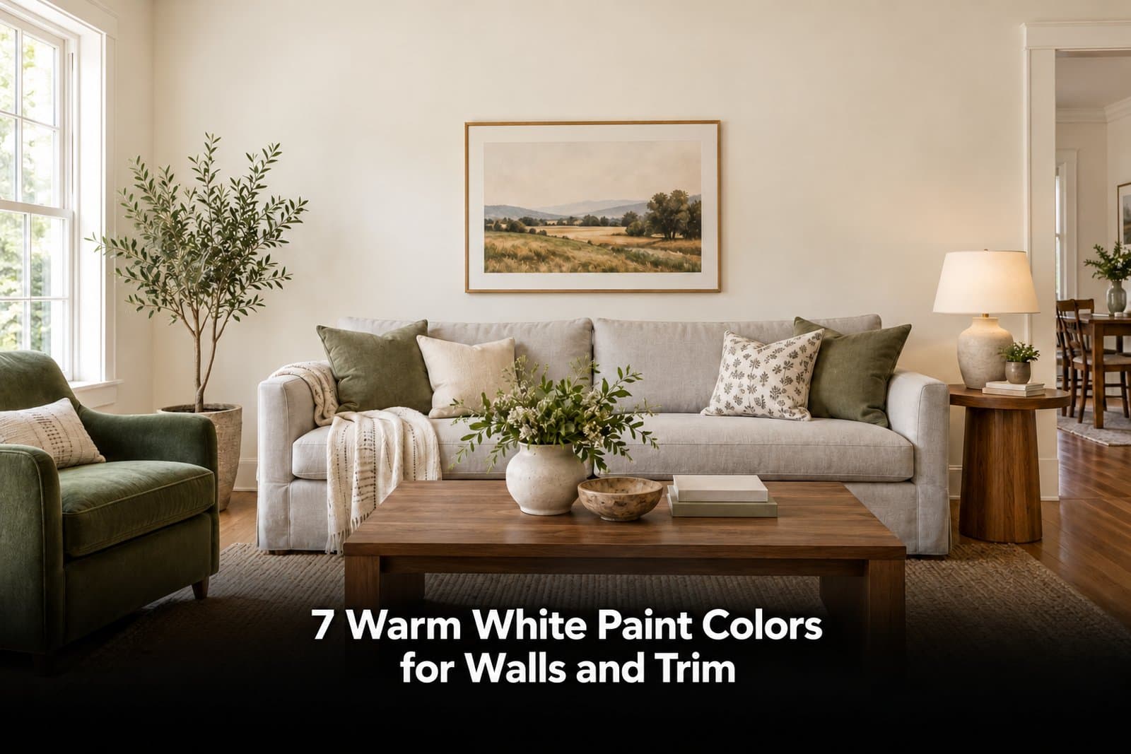
Creamy white living room walls beside white baseboards, oak flooring and a pale gray sofa.
Concept illustration: compare the wall with the finishes that will remain. Not an exact paint-color reproduction.

Benjamin Moore Warm White Paint Colors

4. White Dove OC-17: Compare a Shaded White With Your Trim

White Dove is a useful alternative to sample when you want white walls without a stark effect. Include a piece of the actual trim color in the comparison. Two soft whites can look harmonious, but two nearly matching whites can also make one surface look older or dirtier.

For a White Dove vs. Alabaster decision, compare both beside the same cabinet door or tile. Do not choose from separate online room photographs: their exposure, lighting and adjacent materials are different.

5. Simply White OC-117: For Brightness With a Hint of Warmth

Simply White is the highest-LRV shade in this shortlist. Benjamin Moore describes a small amount of warmth rather than a heavy cream effect. Compare it when you want lighter-looking walls, especially if your current white sample feels too muted.

A high LRV is not an instruction to use it everywhere. In a room with ivory cabinets, a brighter wall may make the cabinetry seem noticeably cream-colored. View both surfaces together and decide which should look whiter.

6. Swiss Coffee OC-45: For a Warmer Off-White Direction

Benjamin Moore Swiss Coffee offers another warm off-white comparison, with a listed LRV below Simply White. Consider it if you want the walls to have more presence than a very bright white.

Start with the standard color. A room photo labeled with a reduced-strength mixture is not a reliable guide to the full formula. If you want a custom mix, have the supplier make a physical sample and record the exact formula before ordering more paint.

Keep the Brand and Color Code Together

Paintit.ai lets you filter manufacturer catalogs and search by color name, code or HEX. Compare named wall-color concepts without treating two brands' Swiss Coffee as the same shade. Physical samples still decide the final color.

Find My Catalog Color

Behr Warm White Paint Colors

7. Swiss Coffee 12: A Cream-Based Behr Option

Behr describes Swiss Coffee 12 as a warm white with a cream base. Its catalog lists LRV 84. Sample it if that creamy direction suits your room, but do not substitute it for Benjamin Moore OC-45 simply because the names match.

For kitchen walls, put the chip next to the cabinet front, countertop and backsplash at the same time. If one of those surfaces looks wrong with it, a matching cushion or wood accessory is unlikely to fix the underlying relationship.

Choose the Undertone Around What You Are Keeping

Warm whites can lean toward cream, beige or a softer shaded white. Those descriptions are useful comparisons, not exact predictions. Benjamin Moore's guide to white paint undertones recommends comparing whites with the room's materials and furnishings.

  • Ivory or cream cabinets: check whether the wall makes the cabinetry look more yellow. Decide whether a tonal relationship or a clearer contrast is preferable.
  • Cool white stone or blue-gray tile: put a less creamy white in the comparison. A warm wall can emphasize the difference between the surfaces.
  • Orange-toned oak: compare beside the actual floor, not a generic wood sample. Check whether you like the combined warmth.
  • White upholstery: bring the fabric into the test. It may be a more important reference than the trim if it fills much of your view.

For example, imagine a kitchen with cream cabinets and a cool white backsplash. One wall color may not make both read as the same white. Choose the surface you want to relate to most closely, then accept a visible contrast with the other. Buying six more similar whites will not remove the difference between the fixed finishes.

Ivory kitchen cabinets beside a cooler white backsplash and a warm off-white wall.
Concept illustration: adjacent pale finishes do not need to match, but their contrast should look intentional.

Check Daylight and Evening Lighting

In the Northern Hemisphere, north-facing rooms generally receive cooler indirect light, while south-facing rooms receive warmer sunlight. Trees, nearby buildings, window treatments and the time of day can change that pattern. A compass direction is a starting point, not the whole lighting assessment.

If you need warm white paint for a north-facing room, compare a softly warm option with a creamier one on both the brightest and darkest walls. In a sunny south- or west-facing room, inspect the same samples when sunlight makes their warmth most noticeable. Sherwin-Williams explains these differences in its room-orientation color guide.

At night, use the lamps and overhead lights you plan to keep. Do not approve a color in daylight and then judge it under a temporary renovation bulb. If the white looks too yellow only at night, check your lighting as well as the paint sample before changing either.

LRV cannot create missing light. If every white looks dull in a deep corner, better lighting may help more than a one- or two-point change in paint LRV.

Walls, Trim and Cabinets: Decide What Should Contrast

Warm white paint colors for walls do not automatically need a brighter white border. Repeating one color on walls and trim can reduce contrast; using a visibly different white can emphasize the molding. Test the intended paint products and sheens, because reflectivity affects how the surfaces look together.

If your trim is staying, choose the wall color against it first. If you are repainting both, test them as a pair. For coating selection, preparation and cure-time considerations, use our guide to choosing a trim enamel; a color name alone does not specify a suitable coating.

For warm white kitchen cabinets, judge the color vertically on a cabinet sample beside the countertop. A wall-paint sample does not establish adhesion, durability or the right application process for cabinetry. Those decisions belong to the coating instructions and the condition of the surface.

Judge the Wall Against the Trim You Have

In Paintit.ai, request a wall-only color change and ask to leave cabinets, flooring and trim unchanged. Inspect the result for unintended changes before comparing the color direction.

Explore a White Wall Repaint

Test a Shortlist Before Buying Gallons

  1. Photograph the room honestly. Include the floor, trim and cabinets. Avoid filters and dramatic exposure changes that hide the differences you need to judge.
  2. Choose two or three directions. For example, compare Alabaster, Simply White and one Swiss Coffee from the brand you intend to buy. Keep the full names and codes with each option.
  3. Preview the overall relationship. Our photo-based wall-color comparison can help you consider the palette with your furnishings. It is not a calibrated reproduction of the physical paint.
  4. Obtain physical samples. Follow the manufacturer's sample instructions, let the paint dry and compare beside the finishes that will stay. Check finalists in the intended coating and sheen before a large purchase.
  5. Move the comparison. View samples near the window, in a shaded corner and beside the cabinet or tile. Check them at the times you actually use the room.
  6. Record why you rejected a color. Too creamy beside the countertop is a useful reason. Less fashionable than another white is not.

If you are still deciding between white and a color, step back to the wider palette first. Our living room color directions compare more than whites; this guide is for choosing within the warm-white family.

Three white paint sample boards compared beside an existing baseboard and oak floor.
Concept illustration: compare dried samples beside fixed finishes, then check finalists in your chosen coating and sheen.

Warm White Paint Questions

What Is the Difference Between Warm White and Cool White?

Warm whites have an underlying warm impression, often cream, yellow, beige or red. Cool whites may read more blue, green or violet. Warm white vs. cool white is a relative comparison: neighboring colors and the room's light affect which undertone you notice.

Can You Find Warm White Paint Colors Without Yellow Undertones?

You can look for a less yellow-looking warm white, but no color is guaranteed to stay visually unchanged in every room. Compare White Dove and Alabaster with a creamier reference, then reject any sample that looks too yellow beside your finishes. A screen image cannot settle this question.

Which Warm White Paint Works in a Living Room?

Start with the largest items you will keep: flooring, sofa and fireplace surround. When choosing warm white paint for a living room, compare a softer white such as Alabaster with a brighter option such as Simply White. Keep the one whose relationship with those materials you prefer in both daytime and evening light.

Are Behr and Benjamin Moore Swiss Coffee the Same?

No. Behr Swiss Coffee 12 and Benjamin Moore Swiss Coffee OC-45 have different catalog references and listed LRVs. Buy the sample from the manufacturer you intend to use; the shared name is not evidence of an exact color match.

Can I Use the Same White on Walls and Trim?

Yes, if you like a lower-contrast scheme. Use suitable coatings for each surface, and sample the chosen sheens together. If you prefer the trim to stand out, compare a noticeably different white rather than assuming a tiny difference will look deliberate.

Choose the Direction Before Ordering Samples

Bring your room photo and two or three named whites to Paintit.ai. Compare the wall-color concepts, note the differences that matter, then test the finalists at home. Free credits are available after registration.

Build My Warm White Shortlist

Trending 

Paintit.ai Guides
6 min read
Lighting Scene Planning: A Practical Worksheet
ai wall paint
6 min read
Paint Color Placement: A Study of 60 Requests
Paintit.ai Guides
6 min read
Before You Choose a Wardrobe: Test Three Layout Conflicts
AI technologies
6 min read
AI Home Editing Research: What Homeowners Change and Keep
AI interior design
6 min read
AI Design Briefs: Lessons From 100 Designer Requests

Related articles 

7 Warm White Paint Colors for Walls and Trim
Ideas
29 october 2026

11 min read

7 Warm White Paint Colors for Walls and Trim

Find a warm white that works with your floor, cabinets and trim. Compare seven named shades and learn which samples to test before buying paint.

avatar-blog

Yulii Cherevko

CEO paintit.ai

Lighting Scene Planning: A Practical Worksheet
Paintit.ai Guidesai room design
28 october 2026

6 min read

Lighting Scene Planning: A Practical Worksheet

Compare living room lighting scenes with a source-by-source worksheet. Separate fixture changes from on/off states and keep daylight and finishes fixed.

avatar-blog

Yulii Cherevko

CEO paintit.ai

Paint Color Placement: A Study of 60 Requests
ai wall paintai house painter
24 october 2026

6 min read

Paint Color Placement: A Study of 60 Requests

A study of 60 Paintit requests separates color choice from painted areas. See the findings, boundary diagrams and a practical paint placement worksheet.

avatar-blog

Yulii Cherevko

CEO paintit.ai

Before You Choose a Wardrobe: Test Three Layout Conflicts
Paintit.ai GuidesAI interior design
21 october 2026

6 min read

Before You Choose a Wardrobe: Test Three Layout Conflicts

Check wardrobe door openings, hanging space and open versus closed storage before buying. Includes annotated examples and a practical planning worksheet.

avatar-blog

Yulii Cherevko

CEO paintit.ai

AI Home Editing Research: What Homeowners Change and Keep
AI technologiesai room design
19 october 2026

6 min read

AI Home Editing Research: What Homeowners Change and Keep

Paintit.ai reviewed 100 homeowner requests: what changes, what stays, and how to check the proposal. Includes a change, keep and verify worksheet.

avatar-blog

Yulii Cherevko

CEO paintit.ai

AI Design Briefs: Lessons From 100 Designer Requests
AI interior designAI technologies
19 october 2026

6 min read

AI Design Briefs: Lessons From 100 Designer Requests

A review of 100 designer requests reveals storage, capacity and must-keep requirements. Use the findings and a practical brief worksheet for client concepts.

avatar-blog

Yulii Cherevko

CEO paintit.ai

  • English/
  • Español/
  • Português (Brasil)/
  • Deutsch