7 min. reading
Yulii Cherevko
CEO paintit.ai

Picking the best living room colors really sets the mood for your whole home. In 2026, it's all about making spaces that feel both stylish and uniquely you, mixing timeless appeal with a bit of fresh inspiration. Maybe you're drawn to the quiet calm of earthy greens, the sophisticated feel of neutral palettes, or you want to make a bold statement with deep jewel tones. Whatever your preference, the right paint color can completely change your living area. Honestly, navigating all the choices out there can feel pretty overwhelming. But with today's tools, seeing your dream space come to life before you start has never been easier. Check out some great ideas, and see how Paintit.AI can help you reimagine your living room before you even open a paint can.
Color isn't just a visual choice; it's a powerful tool that affects how a room feels and how you act in it. The specific interior living room paint ideas you pick can create calm, energy, warmth, or sophistication. Blues and greens, often found in cooler palettes, tend to make a space feel tranquil and open. They're excellent for rooms where you want to relax. Warm neutrals, like beiges and greiges, create a cozy, welcoming vibe—perfect for entertaining or quiet evenings. Earthy tones connect us to nature, making a room feel grounded and comfortable. Understanding these psychological effects is step one in choosing paint colors for living room that truly match the mood you're going for.
| Element | What to Choose | Why it Works | Easy Mistake | Quick Fix |
|---|---|---|---|---|
| Main Color | 2-3 primary hues, balanced undertones | Helps make your space look pulled-together | Clashing warm and cool tones | Pick one dominant undertone (warm or cool) |
| Accent Color | 1-2 complementary or contrasting colors | Adds visual interest, defines different areas | Too many accents, overwhelming the space | Use accents on smaller items (pillows, art) |
| Finish | Matte for hidden imperfections; Satin/Eggshell for durability | Affects how light reflects and how well it holds up | Using high-sheen on imperfect walls | Opt for matte or eggshell for most walls |
| Lighting | Layered ambient, task, and accent light | Makes colors look better, sets the right mood | Single overhead light, poor color rendering | Use warm bulbs (2700-3000K) for coziness |
| Texture | Mix of soft and hard, smooth and rough | Adds depth and interest without adding more colors | Flat, monotonous textures | Incorporate textiles (rugs, throws), wood, stone |
In 2026, the best living room colors are all about creating personal sanctuaries. These spaces should reflect your taste while embracing nature and comfort. To help you see these changes unfold, consider using Paintit.AI's design tool for your living room. You can experiment with different palettes before you commit.
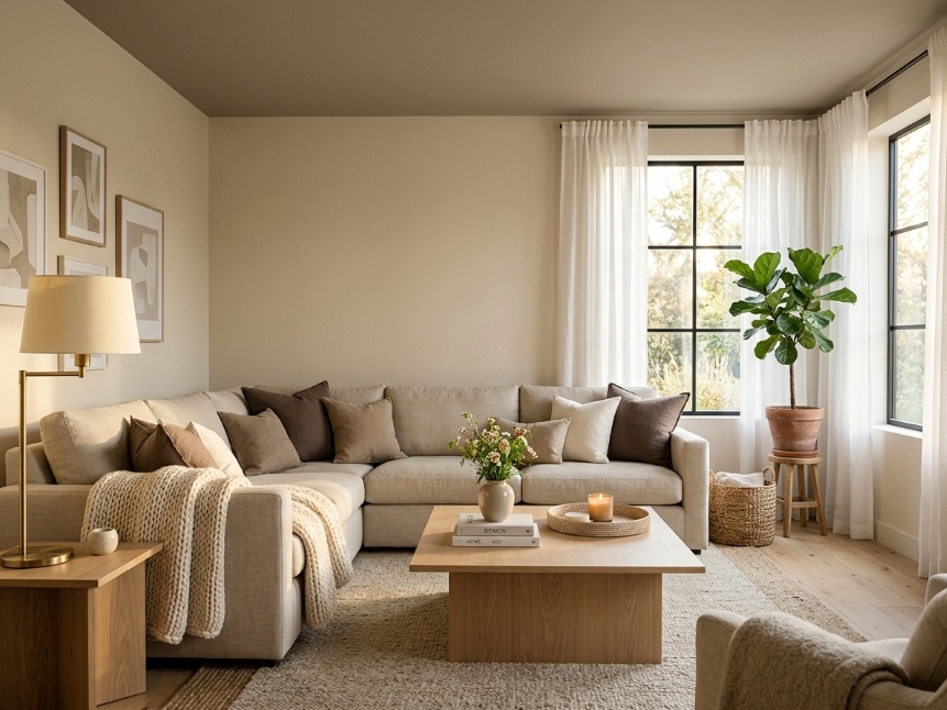
This classic trend still brings that cozy, sophisticated feel.
Vibe: Cozy, inviting, sophisticated, versatile. It creates a serene backdrop that feels both grounded and airy.
Key Elements: Soft, muted tones; layered textures (chunky knits, natural wood); plenty of natural light.
Color Palette: Soft Beige, Creamy White, Greige (gray-beige), Warm Taupe, Mushroom Brown. These make an excellent foundation for any list of best paint colors for living room.
Materials/Finishes: Matte or eggshell paint finishes; light to medium-toned wood furniture; linen and cotton textiles; brass or brushed nickel accents.
Lighting: Maximize natural light. Use warm-toned ambient lighting (table lamps, floor lamps) with soft white bulbs (2700K-3000K).
Common Mistakes: Using one single, flat neutral without texture, which can make the room feel sterile. Relying too much on cool-toned wood that might clash with warm neutrals.
Mistake Fix: Bring in varying textures through rugs, throws, pillows, and artwork. Mix wood tones or add painted furniture to create interest.
Paintit.AI Action: Upload a photo of your living room. Then, use our AI Living Room Design tool to explore various warm neutral shades like "Cozy Cashmere" or "Desert Sand." You'll see exactly how they look with your existing furniture and light.
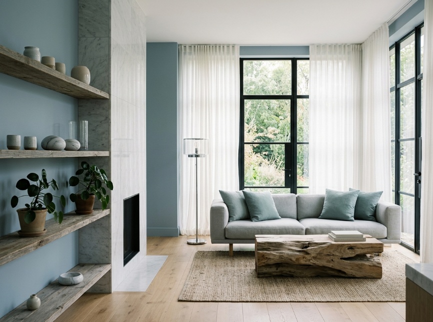
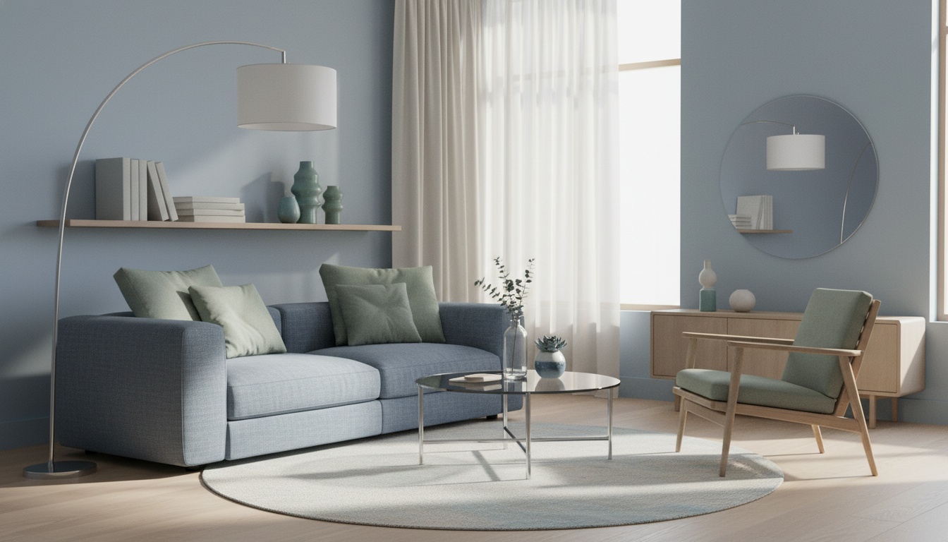
If you're after a peaceful escape, cool tones are always a winner.
Vibe: Tranquil, refreshing, sophisticated, airy, spa-like. It truly brings feelings of calm and clarity.
Key Elements: Muted blues, soft greens, natural elements, minimalist decor.
Color Palette: Dusty Blue, Sage Green, Muted Teal, Soft Gray-Blue, Mint Green. These are popular paint colors for living rooms aiming for a restful feel.
Materials/Finishes: Eggshell or satin paint finishes; driftwood or weathered wood; natural stone accents (marble, slate); glass and chrome details.
Lighting: Lots of natural light is crucial. Complement it with cooler-toned ambient lighting (4000K) or opt for warmer tones to balance the coolness of the walls.
Common Mistakes: Making the space feel too cold or clinical by overusing cool tones without warm accents. Pairing with overly cool-toned furniture can make this worse.
Mistake Fix: Add warmth through wood tones, brass hardware, plush textiles in warmer colors (like ochre pillows), and strategically placed lamps with warm bulbs.
Paintit.AI Action: Try out shades like "Ocean Mist" or "Willow Green" on your living room walls using our AI House Painter tool. You'll see how it all works with your decor before you decide on your best wall color for living room.
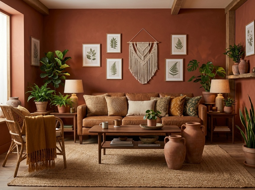
Bringing the outdoors inside is still a big trend for living room colors.
Vibe: Natural, calming, warm, textured, grounded. It really connects you to nature.
Key Elements: Rich, muted colors inspired by the earth; natural materials; botanical elements.
Color Palette: Terracotta, Muted Olive Green, Deep Ochre, Burnt Sienna, Clay Pink, Warm Brown. These deep hues offer excellent paint ideas living room for a natural aesthetic.
Materials/Finishes: Matte or textured paint finishes; terracotta pots; natural wood (walnut, teak); rattan, jute, or woven textiles; leather accents.
Lighting: Soft, warm ambient lighting (2700K-3000K) to enhance the warmth of the colors. Good natural light helps keep deeper tones from feeling overwhelming.
Common Mistakes: Overdoing the "muddy" tones, which can make the room feel dark or drab. Not enough contrast, leading to a monotonous feel.
Mistake Fix: Bring in lighter elements through furniture or decor. Add pops of brighter color (like a vibrant rug or artwork) or use lighter neutrals as trim. Make sure you have good lighting to brighten deeper shades.
Paintit.AI Action: Just upload your living room photo to Paintit.ai. Then, play around with earthy palettes like "Desert Sunset" or "Canyon Clay" to really visualize that cozy, grounded vibe.
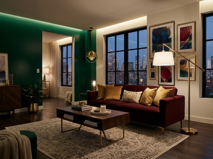
For those ready to make an impact, bold accent colors remain a popular choice.
Vibe: Energetic, confident, artistic, dramatic, unique. It makes a strong visual impression.
Key Elements: Deep jewel tones or saturated brights, often used as accent walls or in specific zones; high-contrast pairings.
Color Palette: Deep Emerald Green, Navy Blue, Rich Burgundy, Mustard Yellow, Teal, Charcoal Gray. These trending living room colors are perfect for creating focal points.
Materials/Finishes: Satin or semi-gloss finishes can add depth; metallic accents (gold, black); velvet or silk textiles; dark wood or sleek finishes.
Lighting: Absolutely crucial for bold colors. Use layered lighting: bright ambient light to prevent darkness, accent lighting to highlight features, and potentially dimmer options for mood setting. Think carefully about color temperature (warmer for jewel tones, neutral for grays/blues).
Common Mistakes: Using too much of a bold color and overwhelming the space. Clashing bold colors without anything to tie them together. Poor lighting that makes the room feel like a cave.
Mistake Fix: Use bold colors thoughtfully as accent walls, furniture pieces, or accessories. Pair them with a strong neutral base. Ensure you have ample, well-balanced lighting.
Paintit.AI Action: Want to try an accent wall? Our AI Room Design tool lets you experiment. Upload your image and check out how, say, a "Midnight Blue" accent wall completely changes the space before you commit.
When you're looking at paint colors for living room, it's never just about the hue itself. It's totally tied to how light interacts with the paint's finish, and how the textures around it play off its visual presence. A matte finish, for instance, will soak up light, making a color look softer and often richer. On the flip side, a satin or eggshell finish will reflect more light, giving it a subtle sheen and making the color feel brighter and more vibrant. Understanding these little details helps you pick not just the color, but how it'll actually look in your home. Think of it this way: a deep forest green with a matte finish can feel incredibly grounding and luxurious when paired with textured bouclé fabrics and warm walnut wood. But that same green in a satin finish might look more energetic and modern next to sleek metal and glass. You can use our AI room design tool to virtually stage your room with different finishes and see how they transform the effect of your chosen color.
Layering textures—from soft linen sofas to rough natural stone accents or smooth brass fixtures—adds depth and interest. It keeps a single color from falling flat. The direction and temperature of your lighting are just as critical. Natural daylight, which shifts throughout the day, will reveal the true undertones of your wall color. And artificial lighting (warm 2700K bulbs versus cooler 4000K bulbs) can drastically change how it appears in the evening. Always test your chosen color samples right there in your actual living room. Observe them under both natural and artificial light to avoid any surprises.
Picking the perfect shade can feel like a huge task, and it's easy to stumble into common traps that can diminish your living room's potential. Here are some frequent mistakes and how to fix them:
| Problem | Likely Cause | Fast Fix | Paintit.AI Try-On Test |
|---|---|---|---|
| Room feels cold/uninviting | Overuse of cool tones without warm balance, inadequate lighting | Introduce warm wood tones, brass accents, plush textiles; add lamps with warm bulbs | Test warm neutral wall colors or warm accent colors within your cool palette |
| Room feels dark/cave-like | Too deep a color for the room's light, lack of contrast | Introduce lighter furniture, light-colored trim, reflective surfaces (mirrors); boost ambient lighting | Visualize lighter shades or add an accent wall with a bright contrasting color |
| Color looks "off" at night | Not testing the color under artificial light, clashing undertones | Change light bulbs to a more suitable Kelvin temperature (e.g., 2700K for warmth, 3500K for neutral) | Preview colors in Paintit.AI and adjust virtual lighting conditions |
| Monotonous or sterile feel | Lack of varied textures, all colors too similar | Layer different materials (bouclé, linen, wood, metal); add artwork and plants for visual breaks | Experiment with different texture overlays on virtual furniture and decor |
| Small room feels smaller | High contrast between walls/trim, dark ceiling | Use continuous wall and trim color, paint ceiling a lighter shade than walls, reflective surfaces | Test monochromatic palettes or lighter cool colors to expand the perception of space |
| Color clashes with furniture/flooring | Not considering existing immovable elements when choosing paint | Introduce a unifying rug or artwork that ties existing elements to the new wall color | Upload your room and existing furniture to Paintit.AI to test color compatibility |
Choosing paint colors for living room from tiny swatches or online photos can be incredibly misleading. The way light hits your actual walls, the texture of your sofa, and even the natural wood of your flooring—all of it dramatically changes how a color really looks. Instead of endless trips to the paint store and hours agonizing over those little squares, Paintit.ai offers a much better way to make decisions.
Here's how you can visualize your living room transformation:
With our AI House Painter tool, you can test countless combinations without the mess or commitment. Just remember, while AI gives you a fantastic preview, real-world light and materials can still cause subtle shifts in color perception. So, if precision is absolutely critical, always consider a final physical swatch test.
Right now, in 2026, people are loving warm neutrals like beige and greige for a cozy feel, serene blues and greens for tranquility, and earthy tones such as terracotta and olive for a natural vibe. Bold accent colors are also still a trend for those wanting a bit of drama. These offer excellent options for anyone looking for paint colors for living rooms.
Think about your room's natural light, your existing furniture and decor, the mood you want to create, and the size of the space. Using a tool like Paintit.AI to see colors in your actual room really helps you decide. Thinking about your best wall color for living room in this way simplifies the choice.
Absolutely, dark colors can make a small living room feel cozier and more intimate. Just use them smartly—maybe as an accent wall—and make sure the room has plenty of good, balanced lighting so it doesn't feel cramped.
Matte finishes have no shine and hide imperfections best, but they're the trickiest to clean. Eggshell offers a slight sheen and is pretty washable. Satin provides a bit more sheen and durability, making it a solid choice for most living rooms.
It's a good idea to buy samples of your top 2-3 color choices. Paint large swatches (at least 1x1 foot) on different walls in your living room and watch how they look throughout the day under various lighting conditions.
Bring in texture through different textiles (rugs, throws, pillows), mix in various wood and metal finishes, add living plants, and use artwork with pops of color. Layered lighting can also add significant depth.
While your personal preference is key, neutral palettes (warm beiges, soft greiges, muted whites) generally appeal to more people and can help with resale value. That said, a unique, well-done color scheme that truly fits your home's style can also be a strong selling point.
Choosing the best living room colors is a journey that combines your personal style, the light in your space, and how different hues make you feel. From the grounding calm of earthy greens to the timeless comfort of warm neutrals, the options are as diverse as individual tastes. Remember, color is hugely affected by the finish, texture, and light quality in your space, so careful consideration is essential for a beautiful result.
In 2026, the goal is to create spaces that feel authentic and welcoming. By using tools like Paintit.AI, you can virtually play around with countless paint ideas living room and visualize your perfect look before you even think about painting. This smart approach empowers you to make confident design choices, turning your living room into a space that truly brings your vision to life. For more inspiration and practical advice, check out more living room wall design ideas on our blog.
Yulii Cherevko
CEO paintit.ai