8 min. reading

Yulii Cherevko
CEO paintit.ai
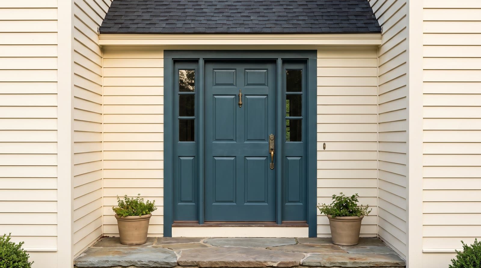
To pick a front door color, begin with the parts of the exterior that are expensive or difficult to change: the roof, brick, stone, siding, window frames, and major trim. Identify their shared warm, cool, or neutral undertone. Then decide whether the door should be a strong focal point or a quieter part of the facade. Test two or three finalists on a full photo of the house and on the actual door at different times of day.
This order is more reliable than starting with a list of popular colors. The same navy can look crisp against cool white siding, dull beneath a deep porch, or slightly purple beside orange-red brick. Context changes the color.
Stand far enough from the house to see the roof, walls, trim, entry, driveway, and main planting beds together. List the surfaces that will remain after the door is painted. Roofing, brick, stone, stucco, siding, metal window frames, and porch flooring already form a palette. The door color needs to join that palette, not compete with every part of it.
Start with the least changeable material. On a brick house, that is usually the brick and mortar. On a stucco house with a tile roof, the roof may be the stronger driver. On a painted house, the roof and window color can matter more than siding that may be repainted in a few years.
Do not try to match every color you see. Find one useful connection. A green door might echo a gray-green note in stone. A navy door might relate to a charcoal roof. A muted red might repeat the warm family of brick without matching it exactly.
| Fixed Surface | What to Observe | How It Guides the Door |
|---|---|---|
| Roof | Charcoal, brown, red, green, or mixed granules | Repeat or balance its dominant temperature |
| Brick | Body color, darker flecks, mortar, and weathering | Pull from a minor tone or choose controlled contrast |
| Stone | Warm beige, cool gray, blue, rust, or green notes | Select one quiet undertone already present |
| Siding or Stucco | Value, saturation, and warm or cool cast | Choose a door that is clearly lighter, darker, or more colorful |
| Windows and Trim | White, cream, bronze, black, or painted color | Use the door to connect with or intentionally separate from the frames |
An undertone is the quieter color that becomes noticeable when a surface is compared with another one. Warm exterior materials may lean yellow, orange, red, or brown. Cool materials may lean blue, green, or violet. Neutral materials can still shift slightly warm or cool, especially beside bright white trim.
Look at the house in indirect daylight and compare the fixed surfaces with plain white paper or several neutral paint chips. The goal is not to diagnose one perfect undertone. It is to avoid an obvious conflict, such as a blue-leaning gray door beside creamy yellow trim or a sharp violet-red beside earthy orange brick.
Mixed brick and stone do not require a multicolor answer. Choose one secondary note that already appears across several units. A deep olive may connect brown mortar, gray stone, and landscaping more calmly than a literal brick red.
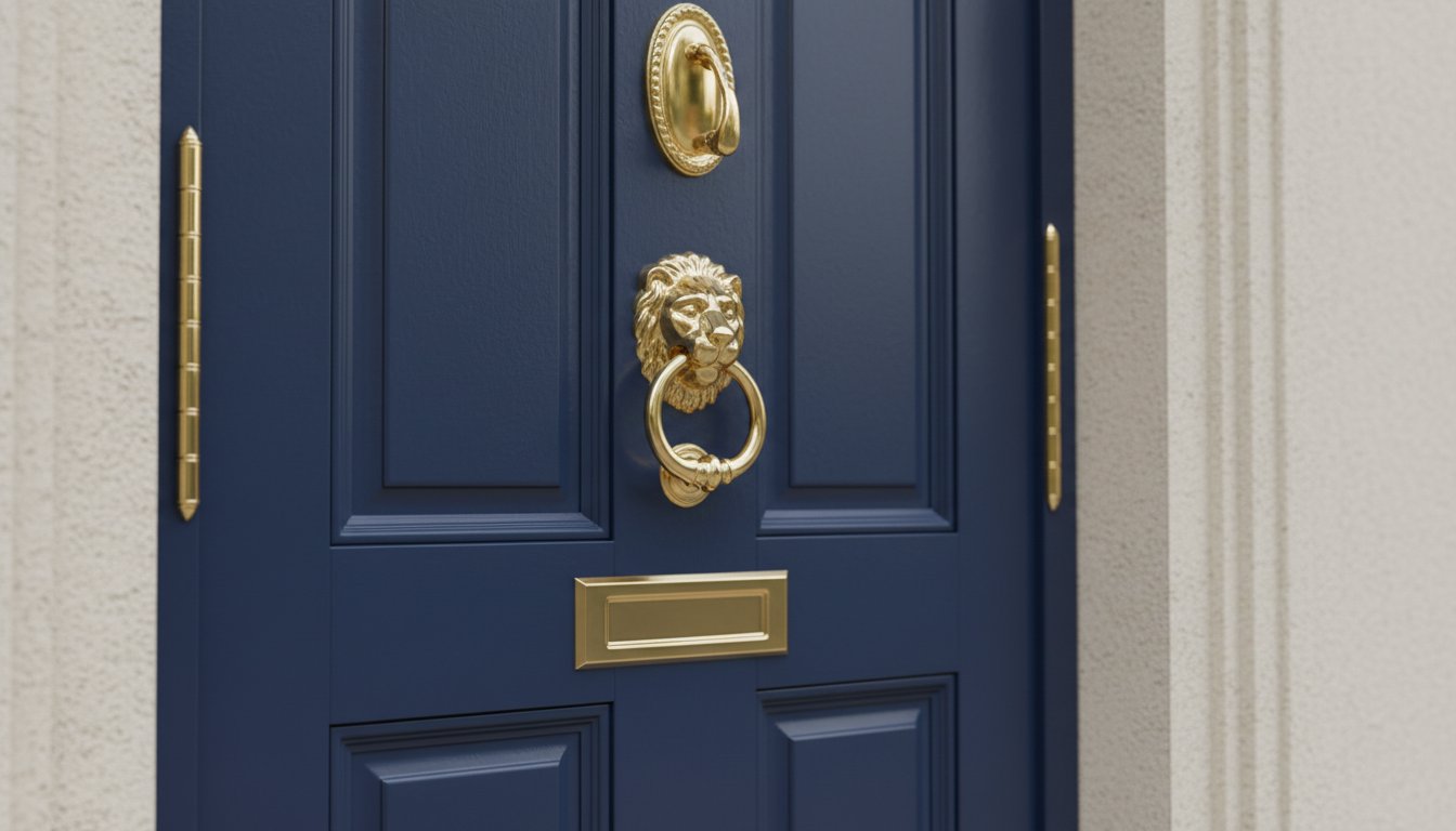
Contrast determines how quickly the eye finds the entrance. High contrast makes the door a focal point. Medium contrast gives it definition without separating it from the house. Low contrast creates a quieter facade and can make detailed architecture, stonework, or landscaping more prominent.
A door does not need to be bright to create contrast. A deep green door on pale siding can be more distinct than a medium yellow door of similar lightness to the wall. Compare both hue and value, which is the relative lightness or darkness of the color.
Exterior light is not consistent. An uncovered door in direct afternoon sun can make a pale color look washed out and can reveal every surface flaw in a high-gloss finish. A door under a deep north-facing porch may make dark blue, charcoal, or burgundy appear almost black for much of the day.
Observe the entrance in the morning, at midday, and in the late afternoon. Note whether the door receives direct sun, reflected light from paving, a green cast from trees, or strong shadow from the roof. Also view it from the street. A color that feels assertive at arm's length may look appropriately scaled from thirty feet away.
Behr's guide to choosing a front door color also treats architecture, trim, accents, finish, regional light, and the door's position as connected decisions rather than choosing a color in isolation.
Use the following pairings as starting points, not guarantees. Brick batches, stone mixes, roof colors, trim whites, and local light vary. Reduce each suggestion to two or three actual candidates and test them on your house.
| Exterior | Reliable Starting Families | Check Before Committing |
|---|---|---|
| Warm White or Cream | Deep green, warm navy, terracotta, burgundy, warm black | Avoid a door white that makes the siding look dirty or yellow |
| Cool White | Clear navy, blue-green, charcoal, black, saturated red | Very earthy colors may look muddy beside a crisp white |
| Gray Siding | Muted blue, forest green, burgundy, ochre, wood stain | Determine whether the gray leans blue, green, violet, or beige |
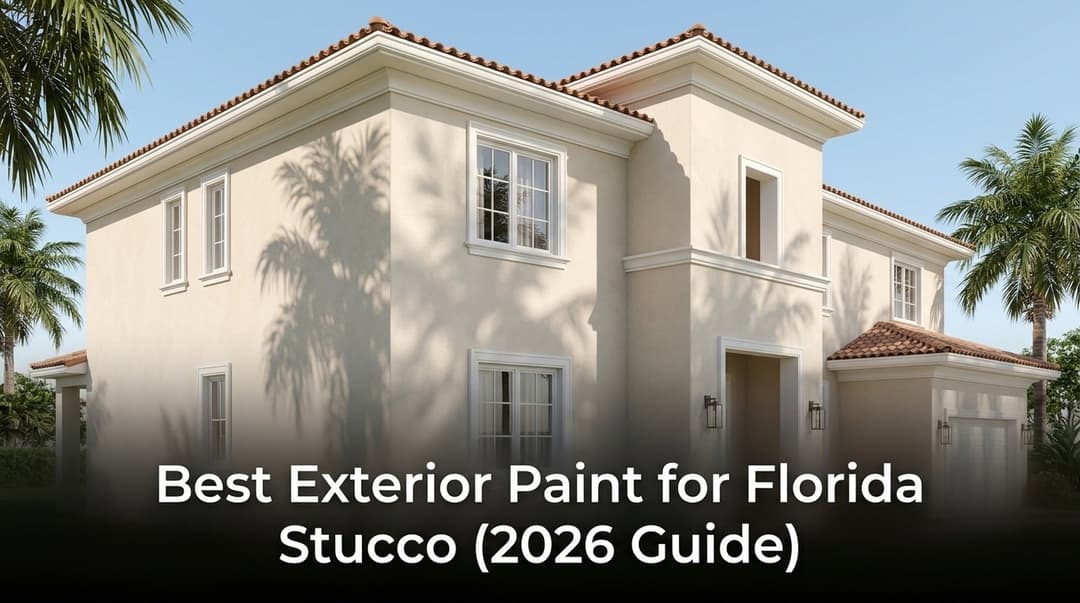
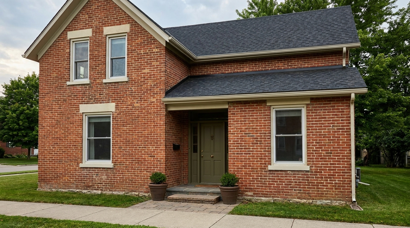
| Red or Orange Brick | Deep olive, blue-green, warm navy, burgundy, soft black | Use the mortar and darkest brick notes to narrow the family |
| Tan or Brown Brick | Dark green, deep teal, warm charcoal, muted red, stained wood | Cool gray can feel detached from warm brown masonry |
| Natural Stone | Pull a quieter green, blue-gray, charcoal, brown, or rust note | Do not compete with a strongly varied stone pattern |
| Blue Siding | Warm white, red, coral, yellow, dark navy, natural wood | Two similar blues can look accidental if their undertones differ |
| Green Siding | Warm black, cream, muted red, ochre, stained wood | Check the relationship with surrounding foliage in summer |
First identify whether the brick is orange-red, blue-red, brown-red, or mixed. Deep olive and blue-green can balance warmer brick. Burgundy can create a layered tonal scheme when it is clearly deeper than the masonry. Warm black and dark navy often work when similar dark notes already appear in the roof, shutters, or brick. Bright white can be successful, but it makes dirt, scuffs, and undertone differences more visible.
White, cream, gray, and taupe exteriors allow more choice, but they are not blank canvases. Use the roof, trim, and hardscape to narrow the temperature. A cool gray house may support blue-green or clear navy, while a warm greige facade may feel more coherent with olive, terracotta, burgundy, or warm charcoal.
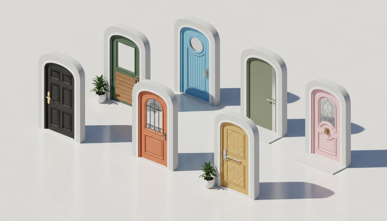
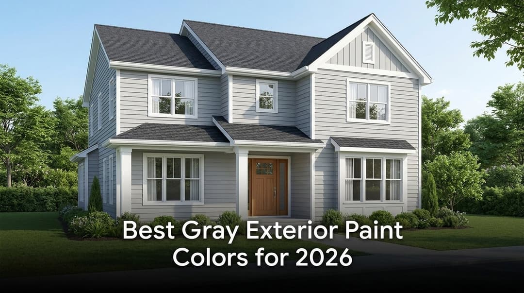
Decide exactly what will receive the new color. Painting only the door slab emphasizes its shape. Painting the slab and frame creates a larger color block. Extending the color across sidelights can make a narrow door feel more substantial, while keeping sidelights in the trim color preserves more contrast around the opening.
A visible storm or screen door needs its own decision. Matching it to the front door reduces visual interruption. Matching it to the trim outlines the entry. Leaving a bright aluminum finish in front of a carefully selected dark color can weaken the result unless that metal already relates to other exterior details.
Hardware should be judged against both the door and nearby metal finishes. Aged brass brings warmth to navy, green, burgundy, and black. Black hardware gives a cleaner graphic edge but may disappear on a very dark door. Brushed nickel or stainless finishes can connect with cool gray frames and contemporary lighting.
The front door does not have to match the garage door. In many facades, matching them gives the much larger garage opening too much attention. A quieter garage color related to the siding or trim lets the entrance remain the focal point.
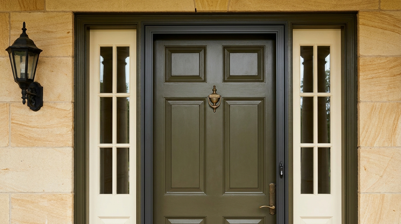
Limit the shortlist to three colors. More options often hide the actual decision: warm or cool, quiet or contrasting, light or dark. Start with a full exterior photo that shows the roof, walls, trim, windows, porch, and landscaping. A tight door crop removes the context needed to judge the color.
A photo-based AI house painter can place each direction on the same exterior image. Keep the crop and surrounding materials unchanged so you are comparing door colors rather than several redesigned facades.
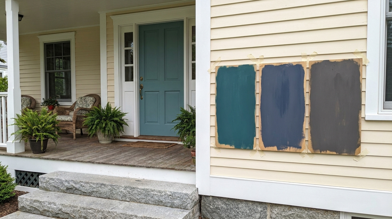
Paint large sample boards with the actual exterior product and recommended number of coats. Move them beside the door, trim, brick, and stone. Check in morning light, porch shade, direct sun, and under the exterior fixture at night. If the door already has a strong color, use the correct primer so the old shade does not distort the test.
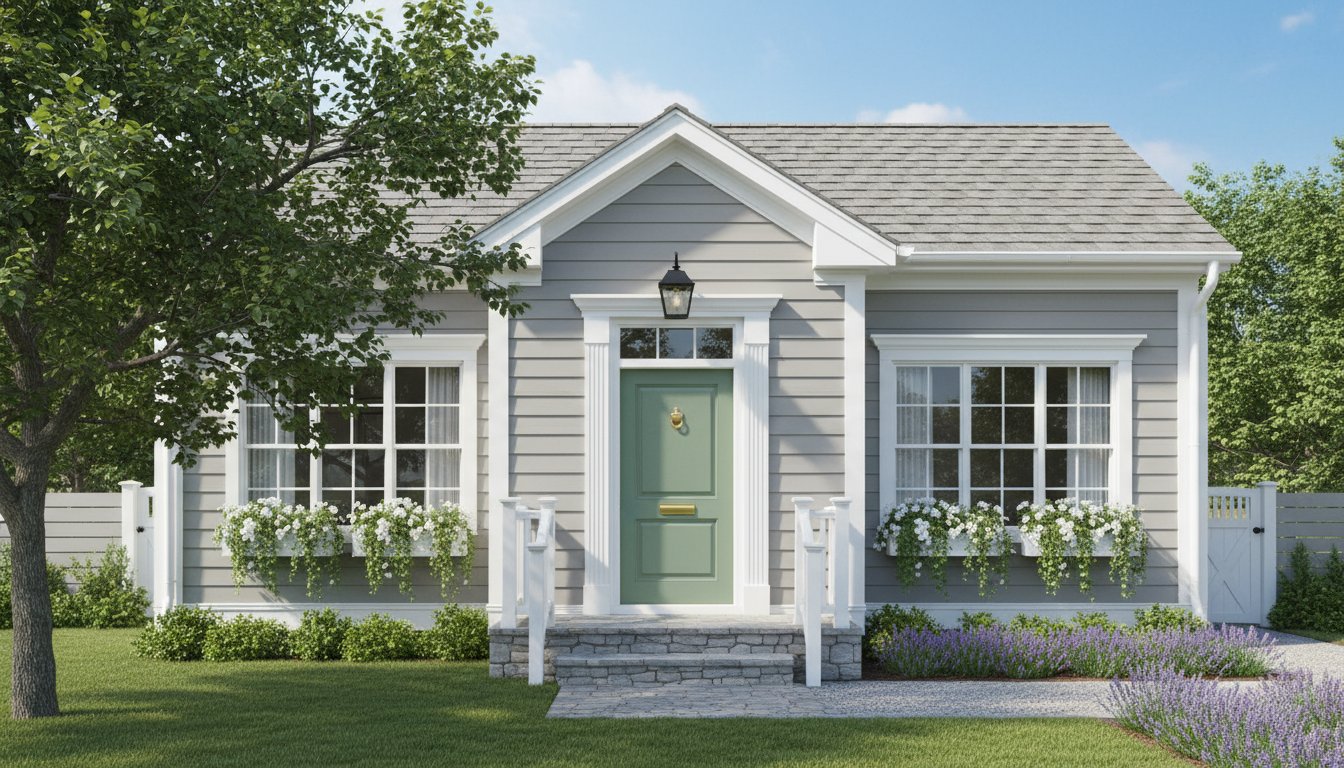
Black creates a clear outline and can connect with dark windows, railings, roofs, or lighting. It may lose detail under a shaded porch, so test a softened black or charcoal if the panels disappear. Dark doors in strong sun can also become hot, making product suitability and the door manufacturer's guidance important.
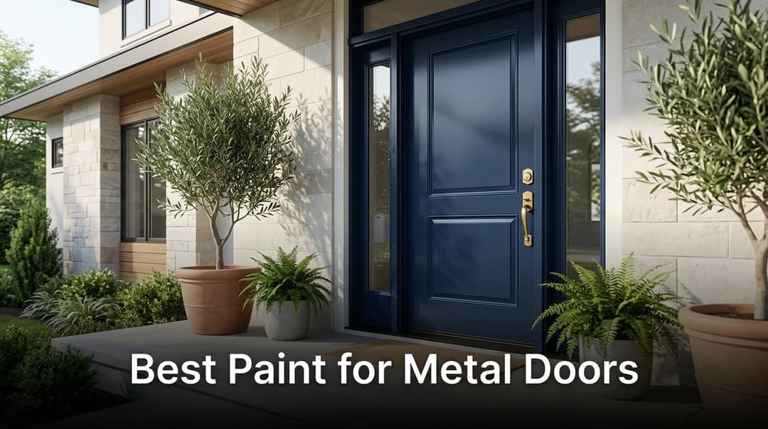
Navy can behave like a color and a neutral. Clearer blues suit cool whites and gray siding, while greener or warmer navies often sit better with cream, tan, and warm brick. Mid-tone and pale blues need enough value difference from the siding to look intentional.
Olive, moss, forest, and blue-green connect naturally with landscaping and many masonry palettes. Muted olive is useful with warm stone and brick. Deeper blue-green can sharpen white or gray exteriors. Check the door against summer foliage so it does not disappear into the background unless that quiet effect is deliberate.
Red draws attention quickly. Orange-red feels energetic and works best when the exterior can support its warmth. Blue-red and burgundy are deeper and often easier to combine with cool gray, dark green, or traditional brick. Test red beside the roof and masonry, because small undertone differences become obvious across large surfaces.
Yellow can make a recessed entry easier to find and add warmth to white, gray, blue, or muted green siding. Clear lemon yellow is more assertive; ochre and mustard are earthier and usually connect more easily with wood, brick, and aged metals. In direct sun, very pale yellow may read close to cream.
These warm accents suit stucco, warm white, blue, and some stone exteriors. Muted terracotta is easier to coordinate than a bright orange and can repeat tones in roof tile or brick. Coral contains pink and may need a cooler surrounding palette to avoid looking overly orange.
Wood introduces grain and warmth instead of a flat color block. Compare the stain with nearby decking, soffits, beams, and flooring. Several unrelated orange-brown woods can make an exterior look fragmented. Exposure, previous coatings, and the door material determine whether a transparent stain is practical.
Front door paint color psychology is better treated as a set of common associations than a design law. Dark colors may feel formal, saturated yellow can feel cheerful, blue may read calm, and red can feel energetic. Those impressions change with culture, architecture, light, finish, and personal experience.
Choose the mood only after the color works with the house. A supposedly welcoming red is not a strong choice if it fights the brick and roof. A black door is not automatically severe if warm wood, plants, lighting, and brass soften the entrance. Avoid claims that one color guarantees luck, value, or a particular emotional response.
If you are asking, "What color should I paint my front door?" answer these five questions before opening a color deck:
Your answers should produce a family, not a paint code. For example: "a medium-dark muted green with a warm undertone and enough contrast to remain visible in shade." That description is specific enough to build a shortlist without pretending a screen can choose the final product.
Confirm the door material, existing coating, surface condition, exposure, and manufacturer requirements before choosing a product. Wood, steel, fiberglass, and previously coated doors do not all use the same preparation or primer. Sheen also changes both appearance and how clearly dents or brush marks show.
For product selection and preparation details, use the separate guide to choosing durable front door paint. Keeping coating advice separate prevents the color decision from being confused with adhesion, corrosion, weather resistance, and application requirements.
Choose a color that relates to the roof, brick, stone, siding, or trim and provides the amount of contrast the entrance needs. For a fast shortlist, consider deep green, navy, burgundy, warm black, muted yellow, terracotta, or a wood finish, then remove any options with conflicting undertones.
It can, but it does not have to. Matching creates a quieter entrance. A contrasting door makes the opening easier to find and adds a focal point. If the trim is bright white and the siding is warm cream, test carefully because repeating that white on the door may emphasize the mismatch.
Painting the sidelights and door the same color creates one larger visual unit. Keeping sidelights in the trim color emphasizes the door slab and usually feels lighter. The choice depends on the proportions of the entry and whether you want a larger or narrower color block.
No. The exterior side should work with the facade, while the interior side can relate to the entry hall. Check the visible door edge when the door is open and decide where the color transition should occur.
Matching the storm door to the painted door makes the frame less noticeable. Matching it to the trim outlines the entry. Either can work, but an unrelated bright metal frame may interrupt a dark or saturated door color.
Satin and semi-gloss are common because they provide some washability and definition without emphasizing every defect as strongly as a high gloss. The right sheen depends on the product, door material, surface quality, exposure, and desired finish. Follow the coating manufacturer's instructions.
No. A front door color visualizer or front door color simulator helps compare broad color directions on the complete facade. Camera processing, generated lighting, screen settings, surrounding reflections, and paint sheen all affect the result. Confirm the final selection with the real exterior product on a movable sample board.
An AI front door color preview can target the door, but the result still needs inspection. Check that the tool has not changed the frame, sidelights, hardware, glazing, steps, or surrounding walls. Use the same source photo for each candidate and reject versions that redesign the entry.
A successful front door color is noticeable for the right reason. It guides the eye toward the entrance, relates to at least one permanent exterior element, and still looks intentional in the light the doorway actually receives.
Build the decision in layers: fixed materials, undertone, contrast, light, adjacent details, digital comparison, and physical testing. That process narrows thousands of paint chips to a small set that makes sense for your specific house.