13 min. reading

Yulii Cherevko
CEO paintit.ai
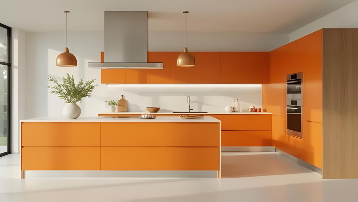
Orange is a warm, energetic color that can shift a kitchen from functional to genuinely inviting. Whether you want a dramatic statement with burnt orange cabinetry or prefer subtler touches through peach-toned accessories, incorporating this hue makes a kitchen feel personal in a way most neutral palettes do not.
Color research consistently links orange and warm-adjacent hues to appetite stimulation and heightened social energy - a well-documented finding in environmental color psychology that explains why these tones appear frequently in both restaurant interiors and home kitchens designed for gathering. At the same time, warm earthy tones - including amber, terracotta, and burnt orange - have dominated residential interior color trends since 2021. Pantone named a peach-orange tone its Color of the Year 2024, reinforcing that the orange family is far from a fleeting choice.
In this guide, we explore 30 creative orange kitchen designs — from bright citrus to deep burnt terracotta — to inspire your next remodel.
Key takeaways:
Light orange kitchen: Peach, apricot and pale clay can cover a larger wall area without carrying the same visual weight as a saturated orange. They are useful when the goal is warmth rather than a focal point. Check the sample beside the countertop and cabinet finish, because a pale orange can shift toward pink, yellow or beige depending on its undertone.
Burnt orange kitchen: Burnt orange sits closer to rust, terracotta and red-brown. It has enough depth to define lower cabinets, an island or a backsplash. Cream, light wood and warm gray keep it grounded; charcoal, navy and black produce a more dramatic result.
Bright orange kitchen: Clear citrus and pumpkin shades attract attention quickly. They are usually easier to control on a single cabinet run, stools, pendant lights or a contained tile area than across every fixed surface.
Finish matters: A matte or eggshell surface absorbs more light and makes orange appear quieter. Glossy lacquer, glazed tile and polished counters reflect light, so their color reads more strongly and changes as you move through the room.
Whether you're renovating a compact cooking space or designing a grand open-plan kitchen, orange kitchen designs can bring warmth and a genuinely stimulating element to your home. From bold cabinetry to considered accents, orange adapts — whether you want high-energy brightness or cozy depth. Here are 30 ways to make it work across any style and size of kitchen.
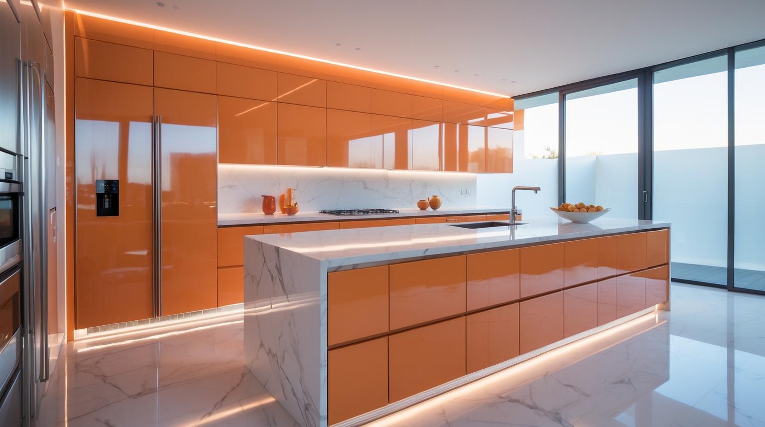
Cabinetry gives orange the largest visual role and is the most expensive application to reverse. Decide whether the color belongs on every door, one cabinet run, lower cabinets only or the island before comparing shades.
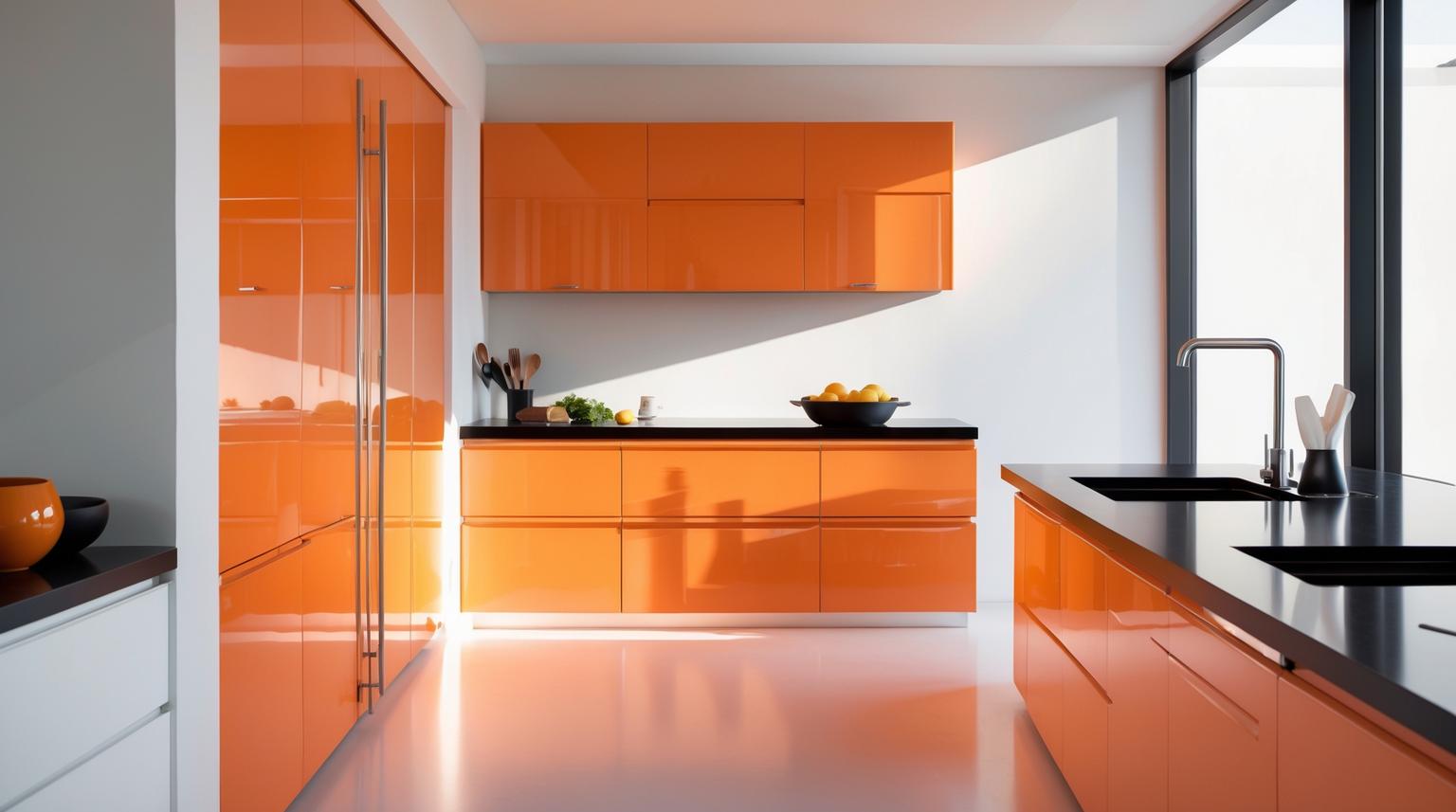
Glossy orange cabinet fronts suit a kitchen with restrained lines and few competing finishes. Keep the backsplash and countertop quiet, and check what the doors reflect from nearby windows. Fingerprints and glare will be more visible than on a matte front, so appearance is not the only selection criterion.
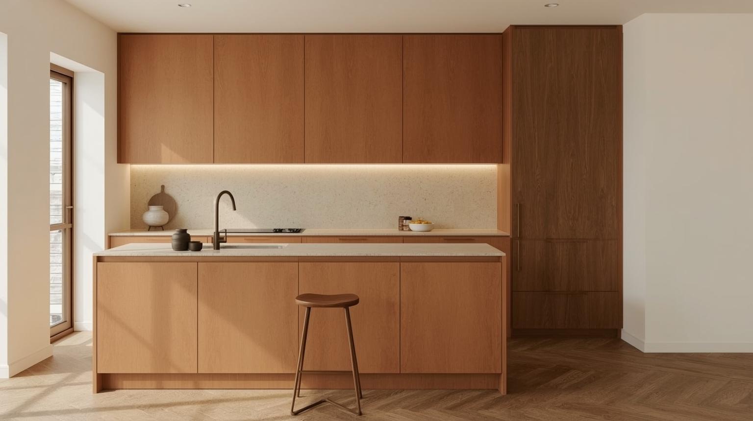
Matte burnt orange feels deeper and less reflective than a bright lacquered finish. Pair it with visible wood grain, honed stone or a low-pattern quartz surface. This is a useful direction when you want orange cabinets without making gloss part of the statement.
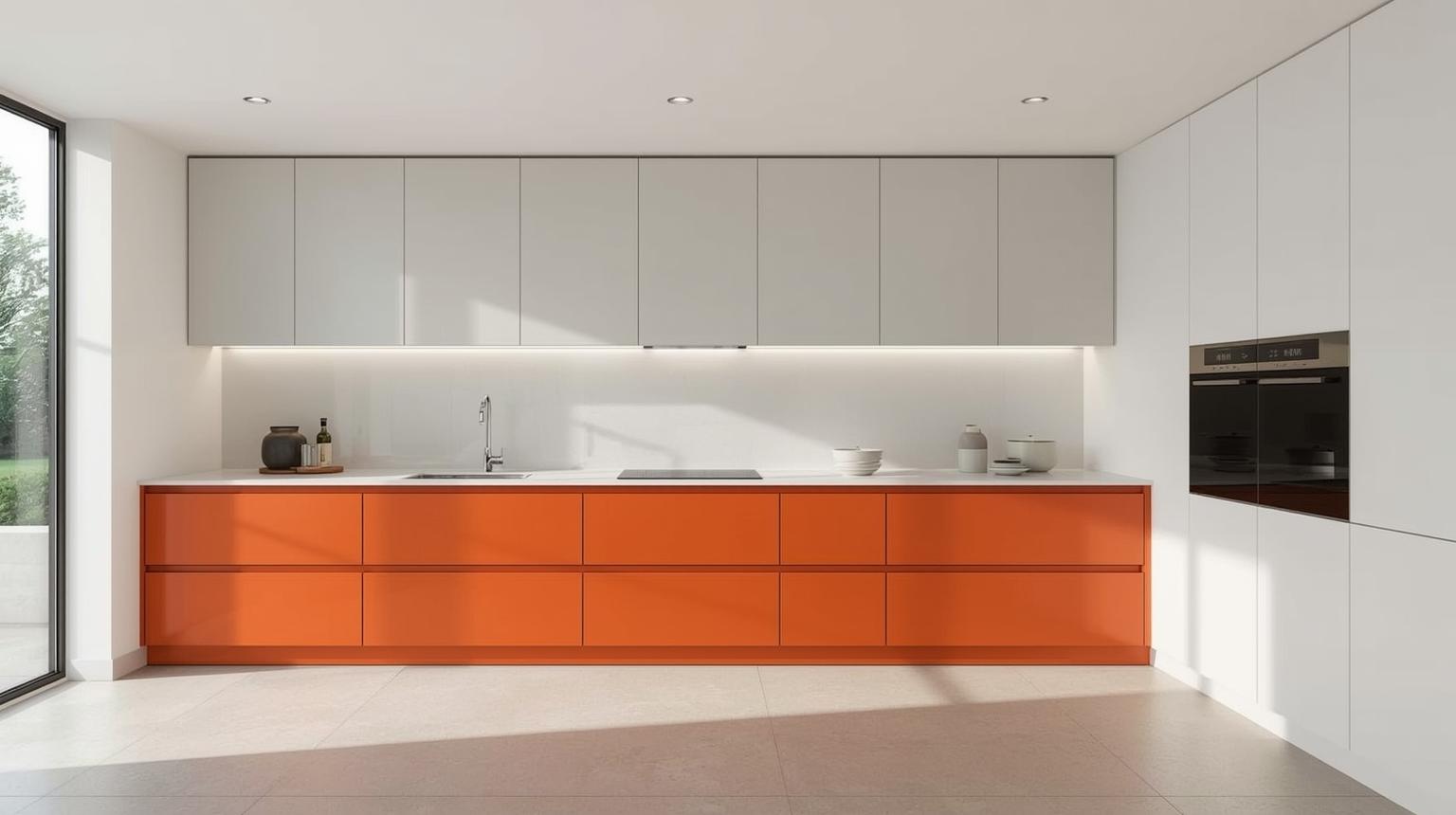
Place orange on the lower units and white or cream on the upper cabinets. The darker color anchors the working area while the lighter upper level prevents the cabinetry from feeling visually top-heavy. Repeat the orange once in a small object so the lower run does not look isolated.
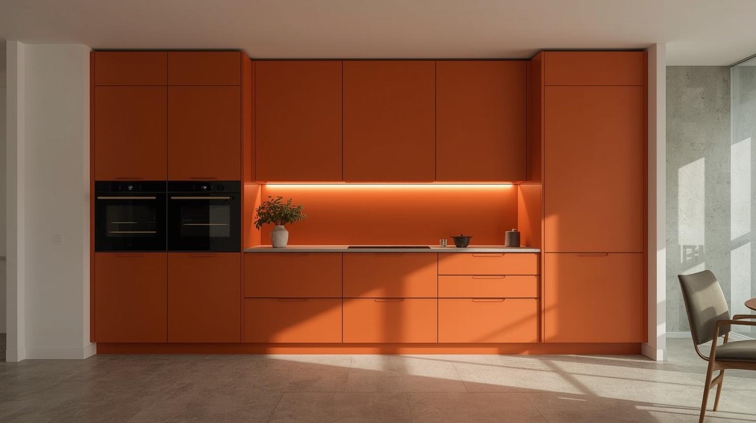
Handleless fronts create an uninterrupted color plane, so the exact orange and finish become especially noticeable. Use integrated pulls or recessed channels that remain comfortable to operate. A minimal appearance should not make frequently used drawers awkward.
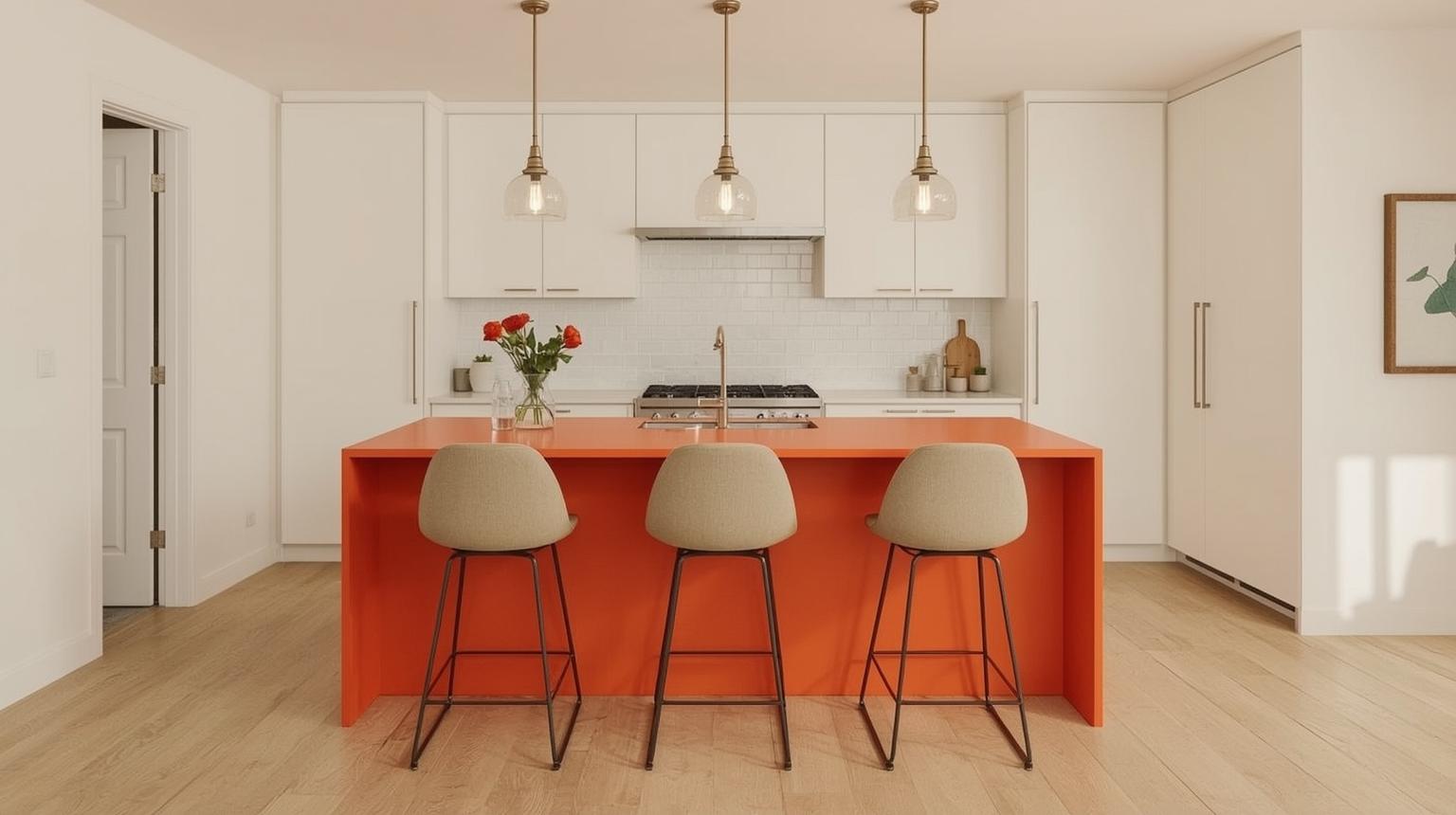
A single fixed feature can deliver the effect of an orange kitchen without applying the color to every cabinet. Islands, counters and backsplashes are natural focal areas because they already organize the room visually.
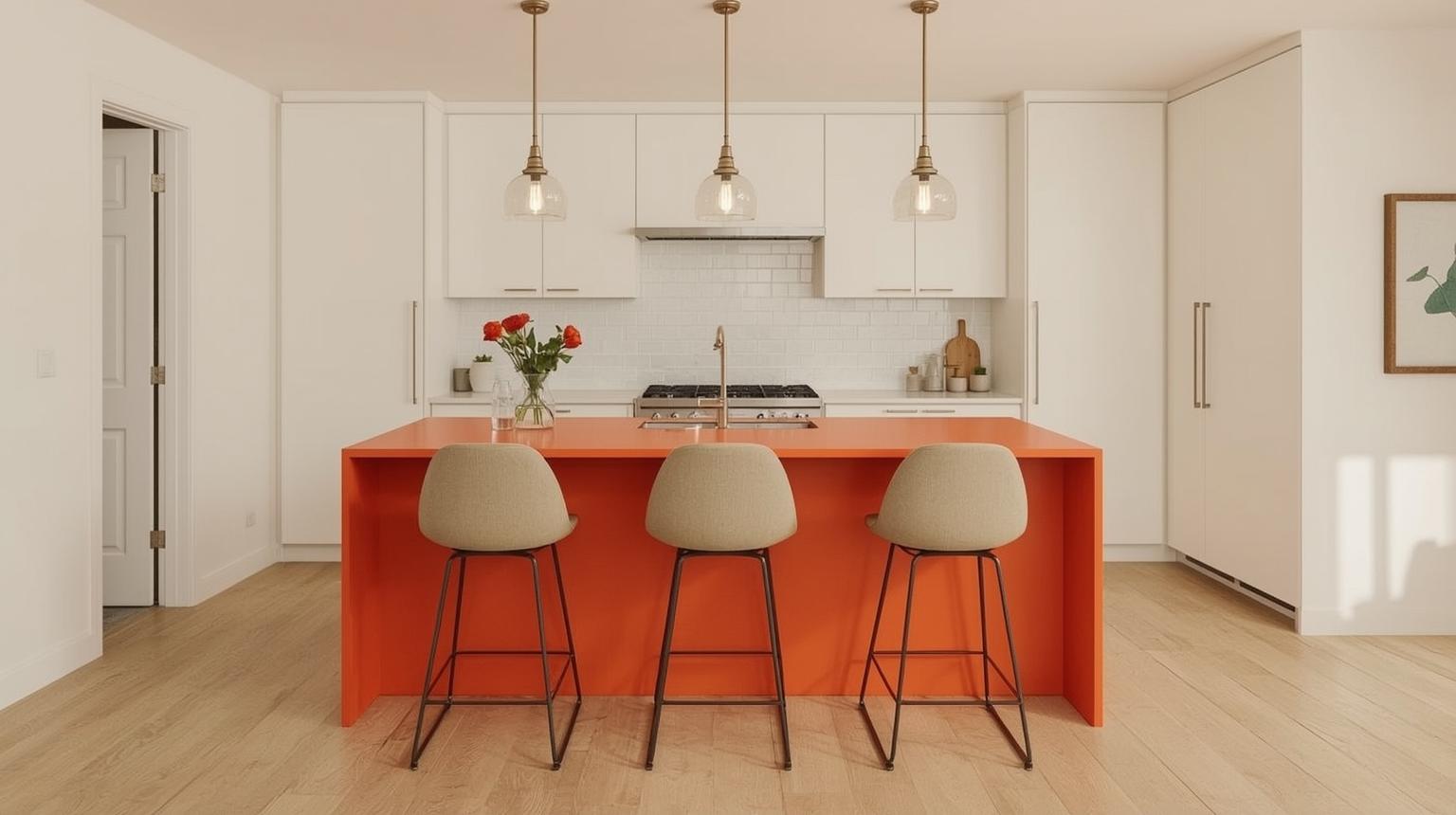
An orange island is a practical compromise when the perimeter cabinetry is staying white, cream or wood. Match the island color to the room's light level: muted rust tolerates a large, bright space, while apricot can prevent a compact island from looking too heavy.
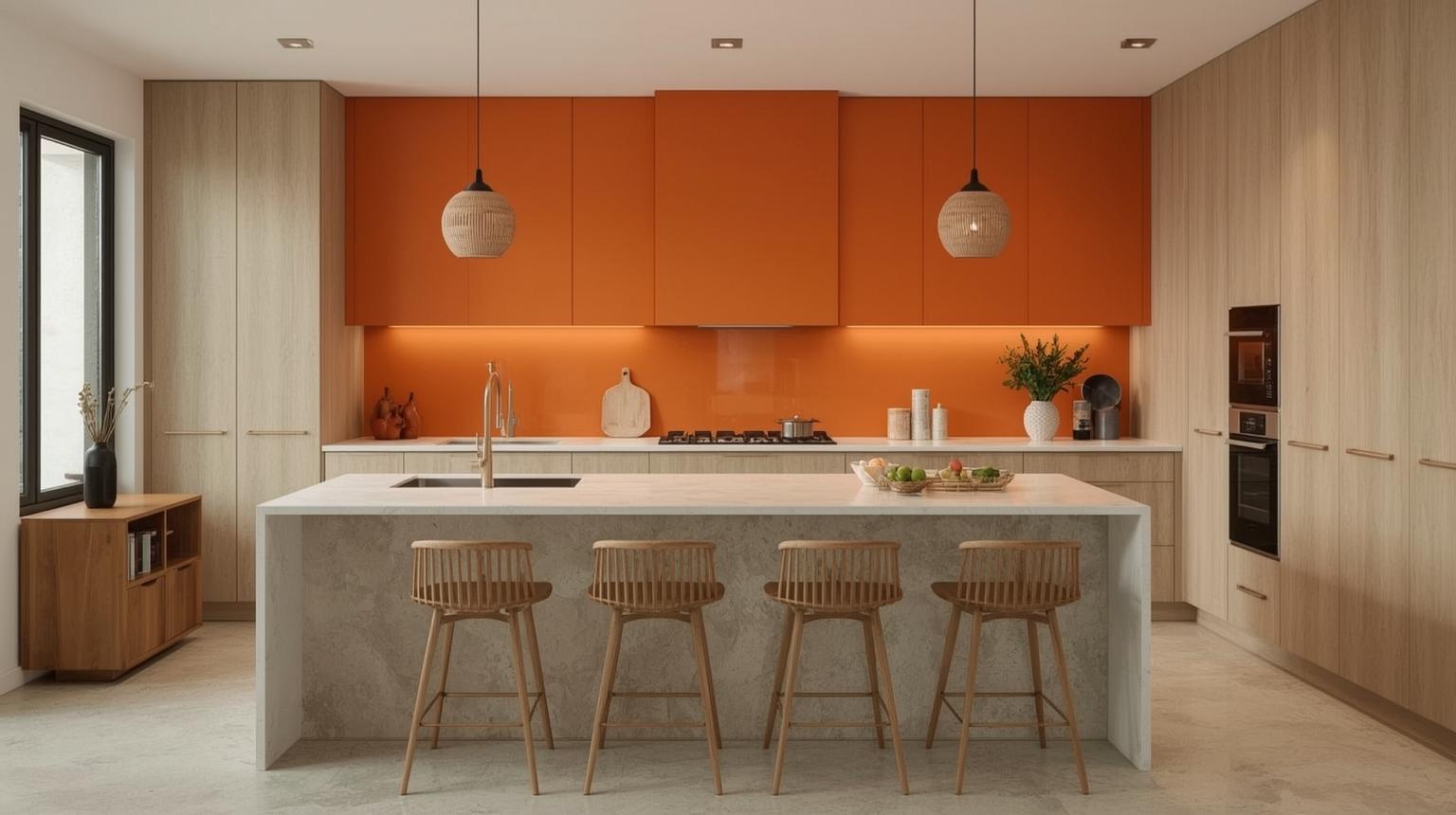
A colored countertop creates a strong horizontal line. Before choosing it, view a full slab or large sample rather than relying on a small chip; pattern, edge profile and joints can alter how much orange is visible. Keep nearby cabinet fronts low contrast so the counter remains intentional.
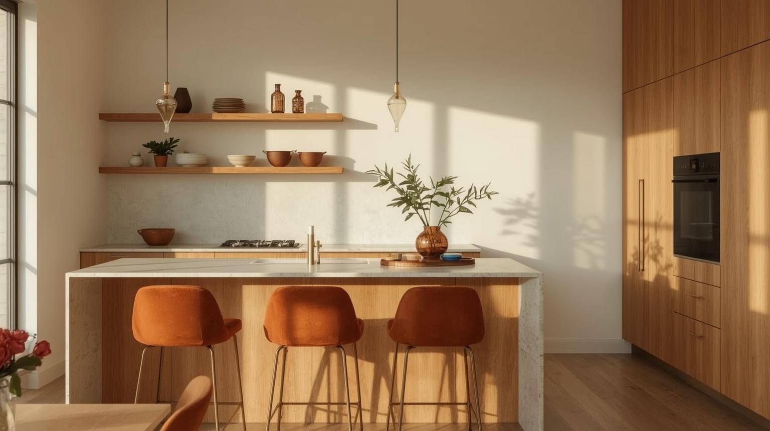
Wood already carries yellow, red or brown undertones, so compare it directly with the orange sample. Muted clay and rust usually sit more comfortably beside pronounced wood grain than a sharp citrus orange. Add a pale counter or wall to keep the warm materials distinct.
For an existing timber floor, the guide to cabinet colors for brown floors offers a separate way to assess undertones before changing the cabinetry.
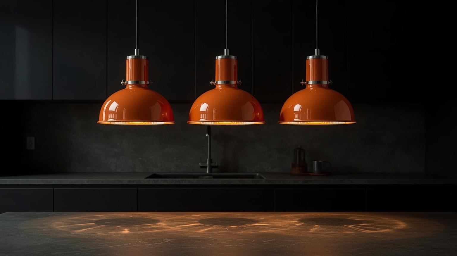
Pendants place orange near eye level without changing the cabinets. Choose a shade shape that directs useful light onto the worktop and check the interior color of the fitting; an orange or metallic inner surface may tint the light below.
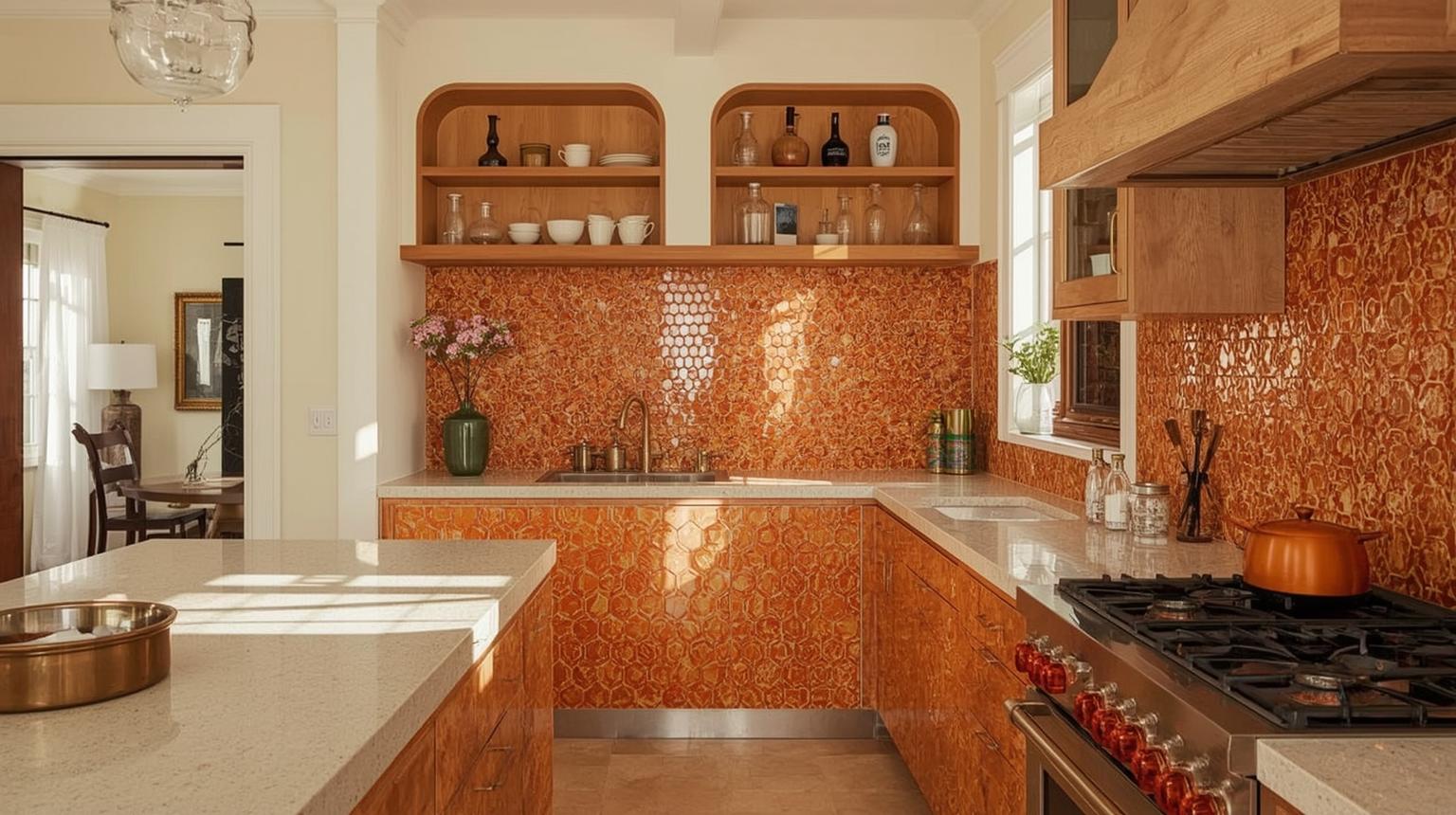
A patterned tile can combine orange with cream, blue or brown in one material. Use it behind the range or sink and allow adjacent walls to remain plain. Before installation, lay out several tiles together because repeats and variation are difficult to judge from one sample.
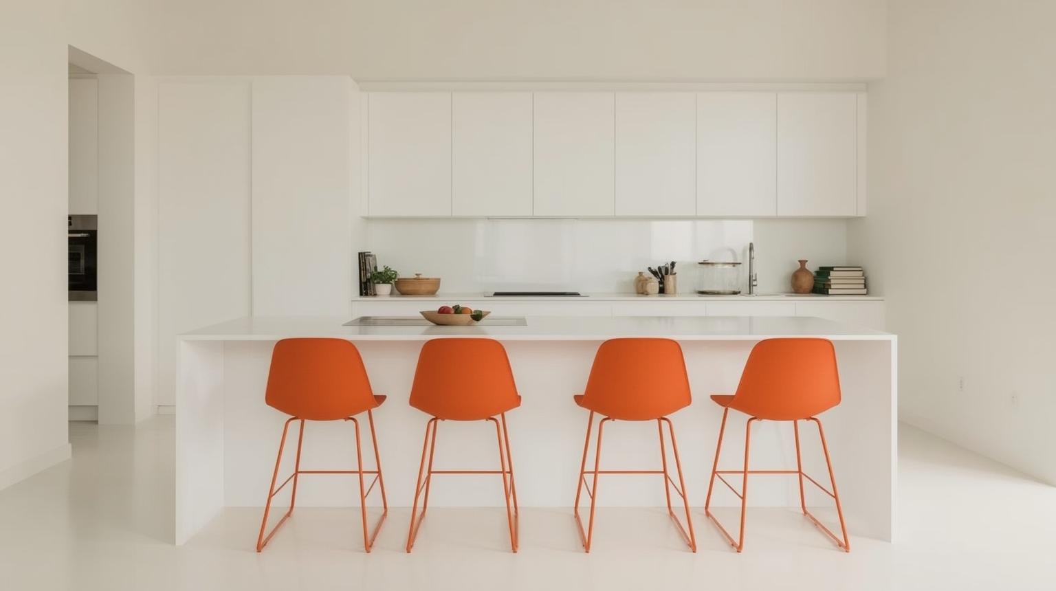
Barstools are visible enough to establish a color direction but easy to replace. Match their seat height and spacing to the counter before considering color. Upholstered rust, painted orange metal and molded citrus seats each create a different level of contrast.
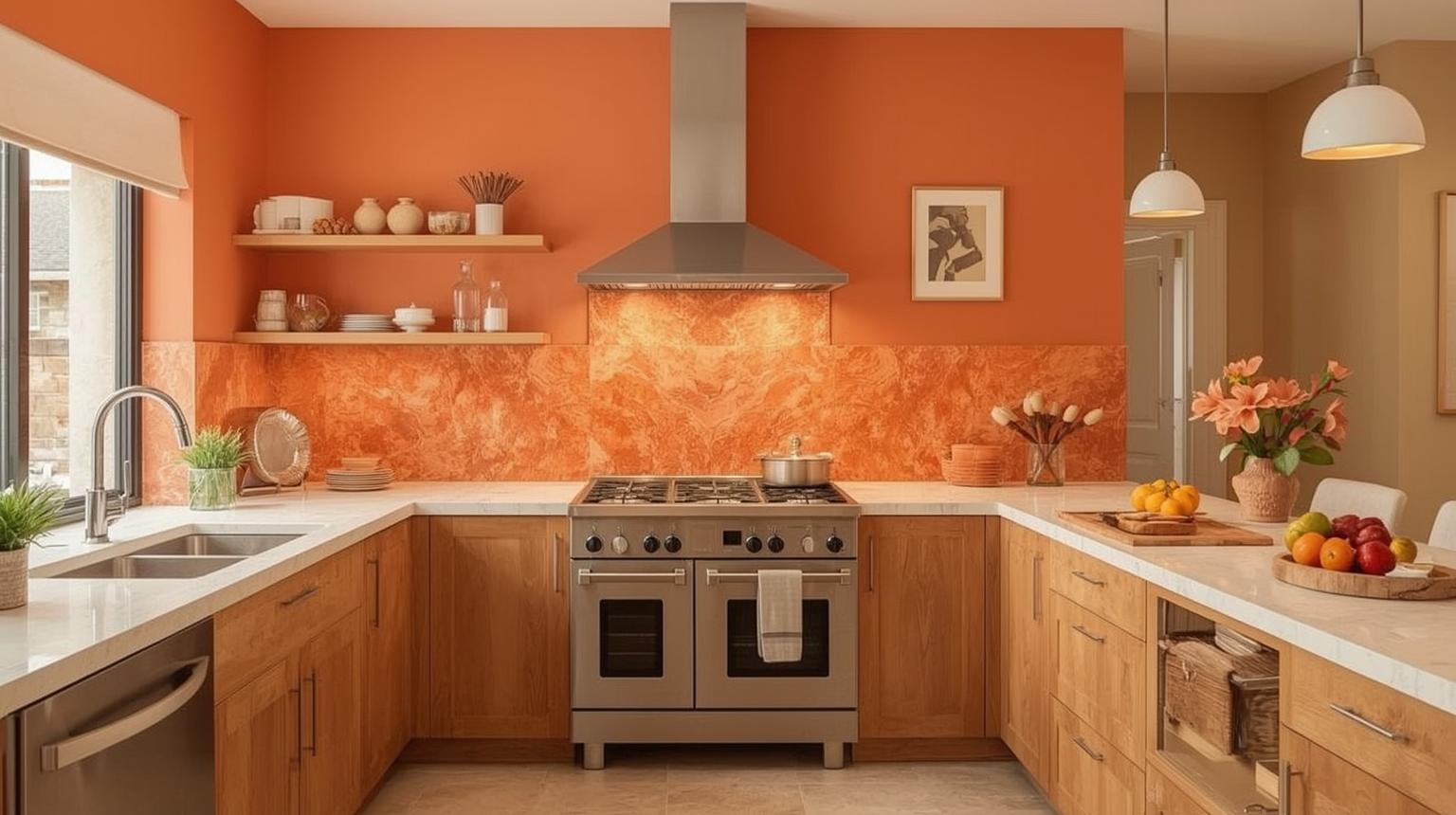
Walls are easier to repaint than cabinets, while tile is a longer commitment. Locate the orange relative to the work lighting, windows and fixed surfaces before deciding how much wall area it should cover.
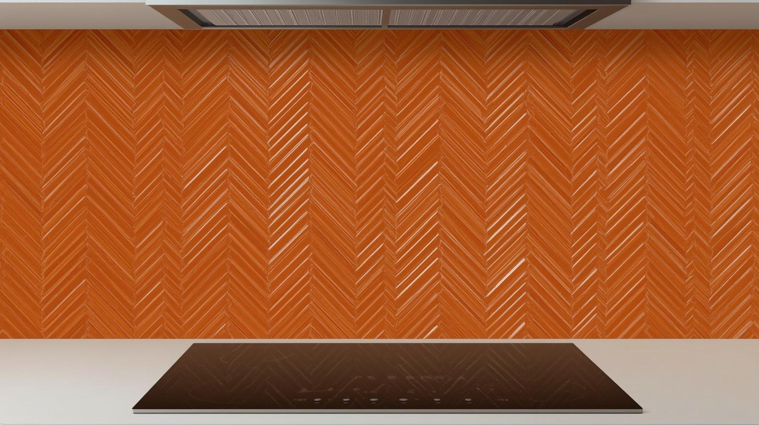
A chevron layout adds movement as well as color. Use plain cabinet fronts and a restrained countertop so grout lines and tile direction do not compete with other patterns. A grout color close to the tile softens the geometry; a contrasting grout makes every joint more visible.
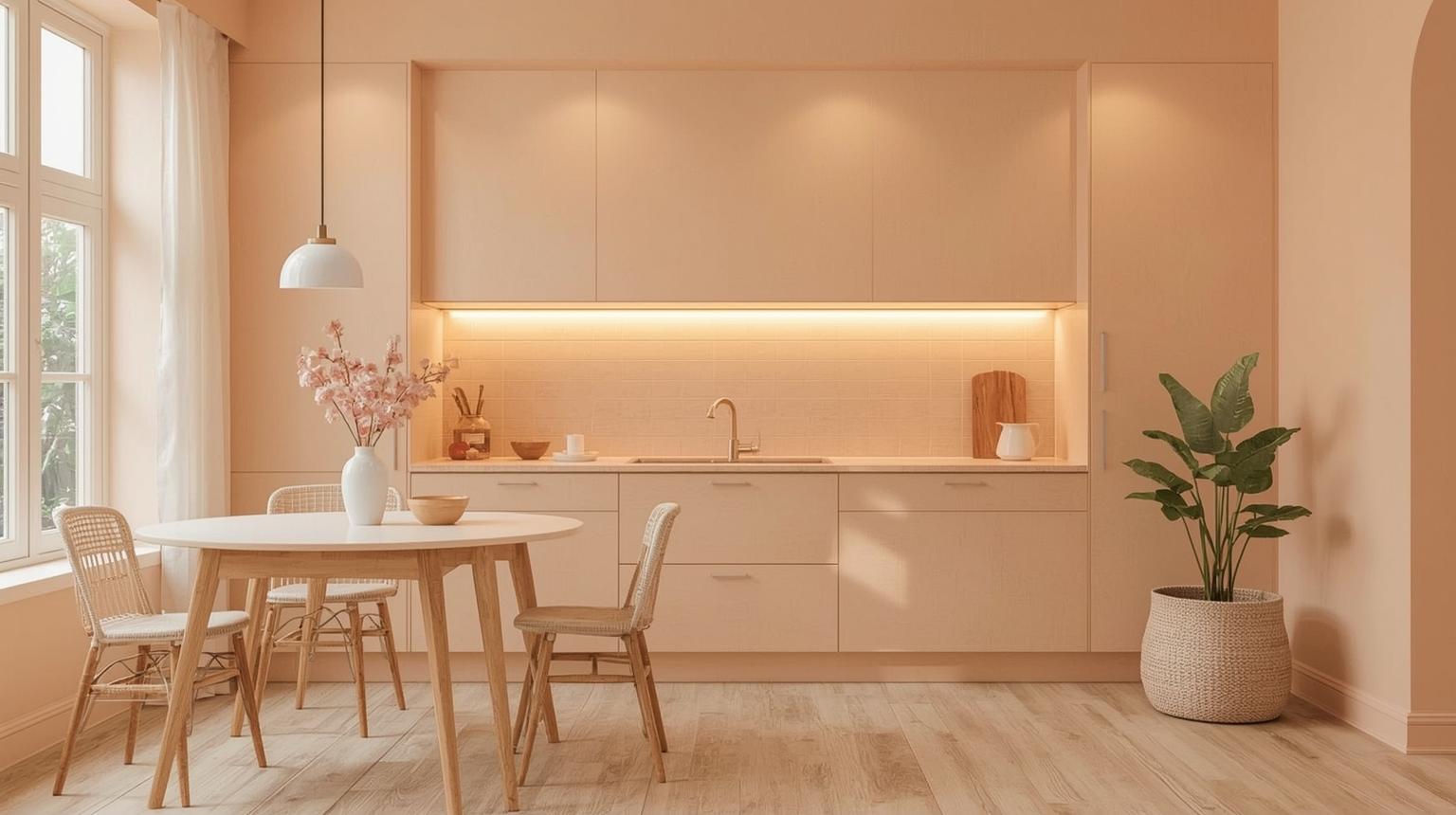
Peach walls provide a light orange kitchen effect without altering the cabinetry. Compare peach beside white cabinets carefully: a cool, blue-white can make a warm peach appear stronger, while cream creates a softer transition. Test more than one undertone before choosing the final paint.
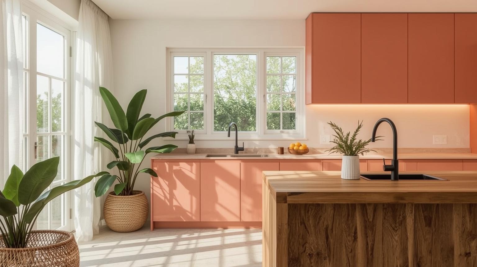
An uninterrupted wall displays color more clearly than a narrow strip broken by cabinets and doors. Use melon orange on the dining or breakfast side of the kitchen, then connect it to the cooking zone through one smaller accent.
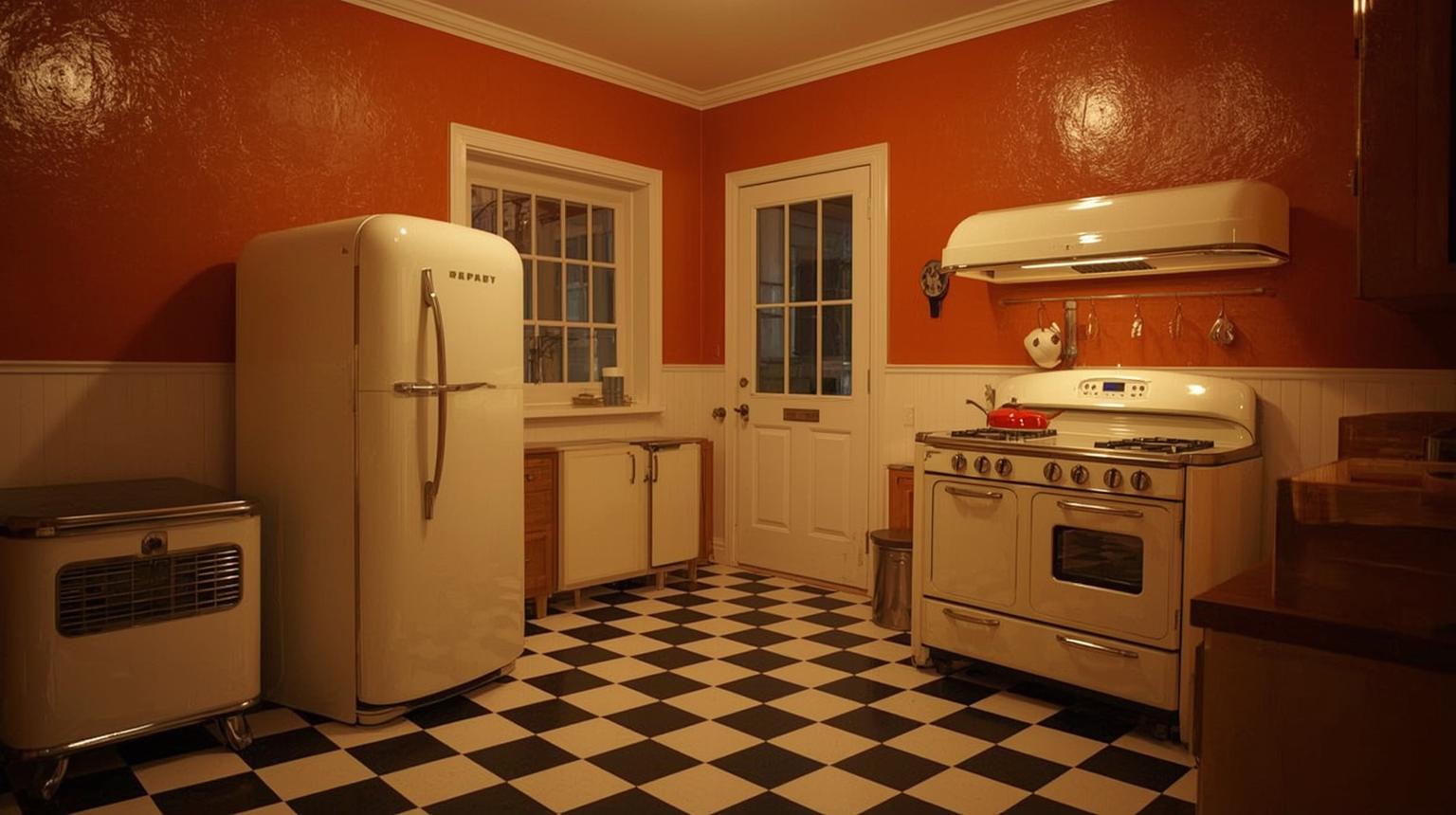
Burnt orange walls can reference 1970s interiors without turning the room into a period set. Combine them with one or two era-aware elements, such as simple globe lighting or a checkerboard floor, and keep modern appliances and storage straightforward.
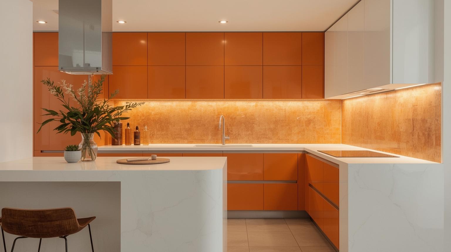
An orange and white kitchen works best when one color clearly leads. In a small room, let white cover the upper cabinets, ceiling and most walls, then use orange below counter height or on the backsplash. Repeat neither color in equal blocks everywhere, which can make the scheme feel fragmented.
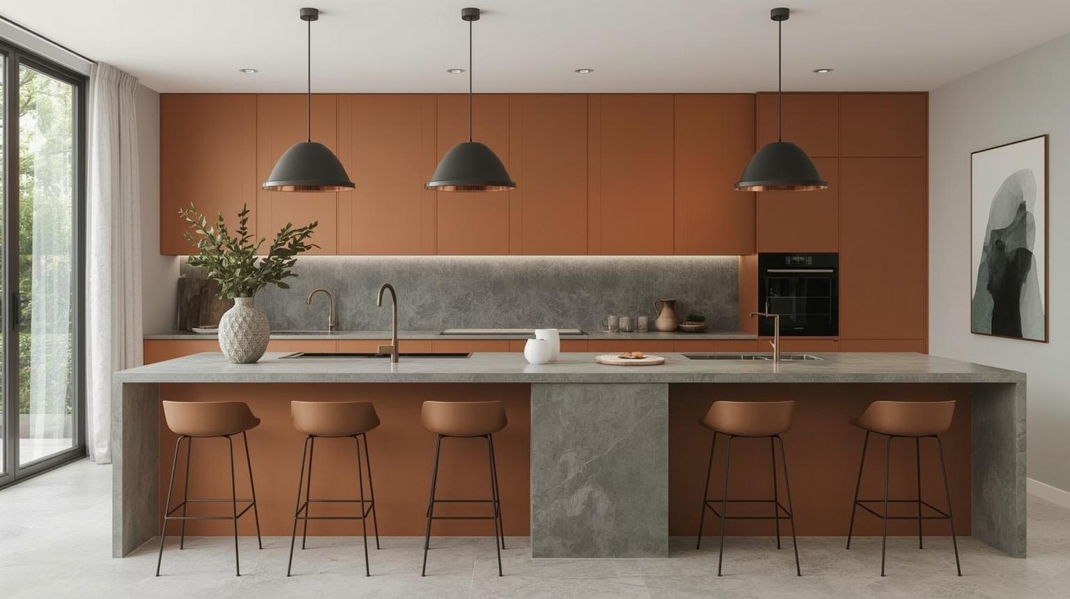
Warm gray moderates burnt orange without creating the stark contrast of white. Check gray undertones in the room: a strongly blue gray may make rust look redder, while greige gives a quieter transition. Use charcoal only where the kitchen has enough light to support two deep colors.
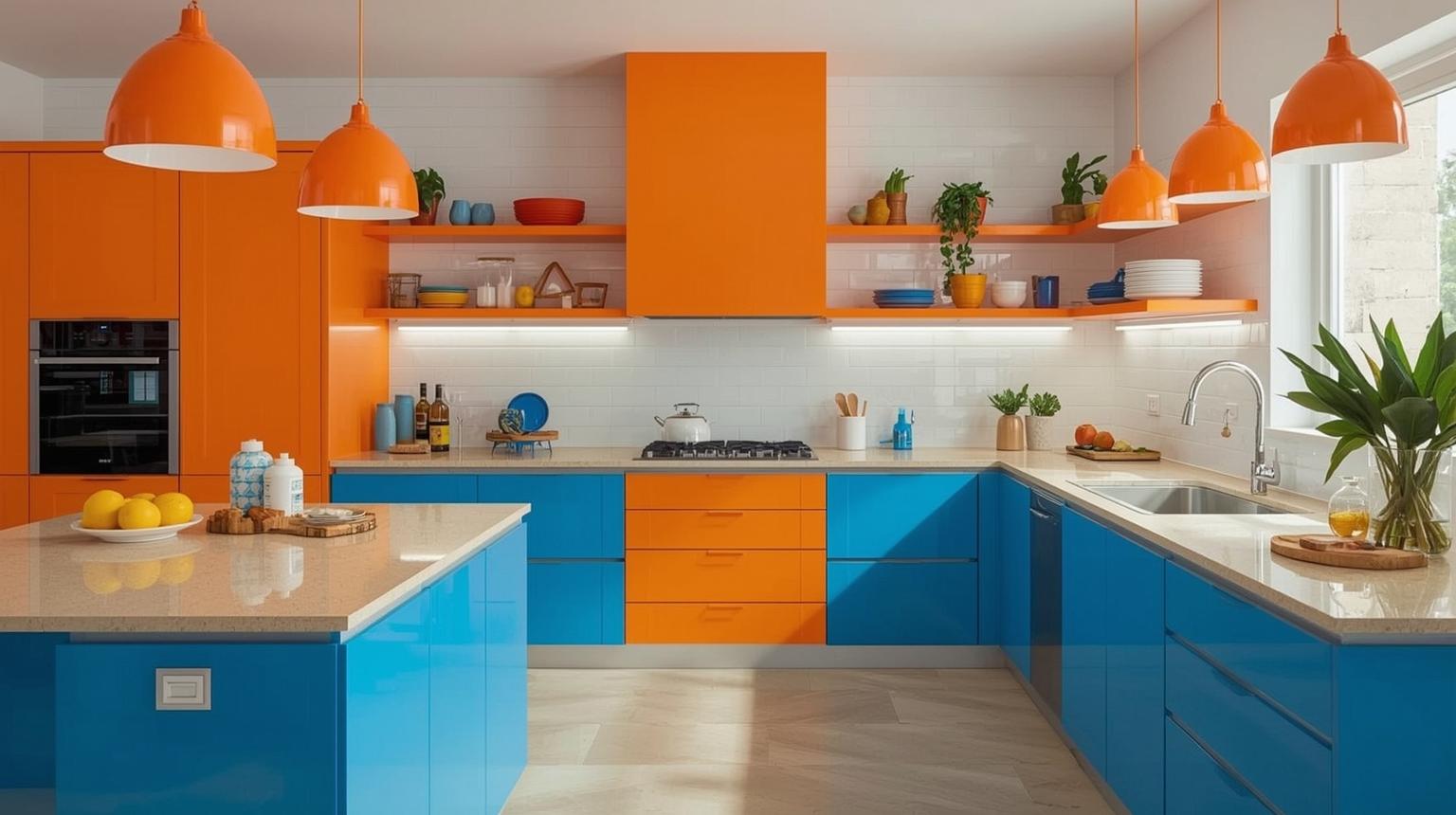
Blue and orange create a clear contrast, so reduce competition by muting at least one side. Burnt orange with slate blue is easier to live with than equally bright citrus and cobalt. Introduce wood, white or stone between the colors so they do not meet at every edge.
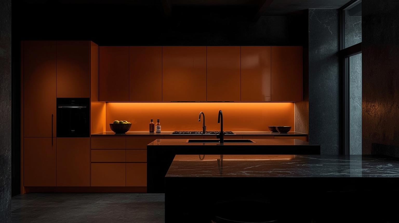
Black and orange produce the highest-contrast combination in this guide. Use black on a counter, frame or limited cabinet run instead of surrounding orange on every side. In a compact kitchen with little daylight, replace some black with pale wood or warm white.
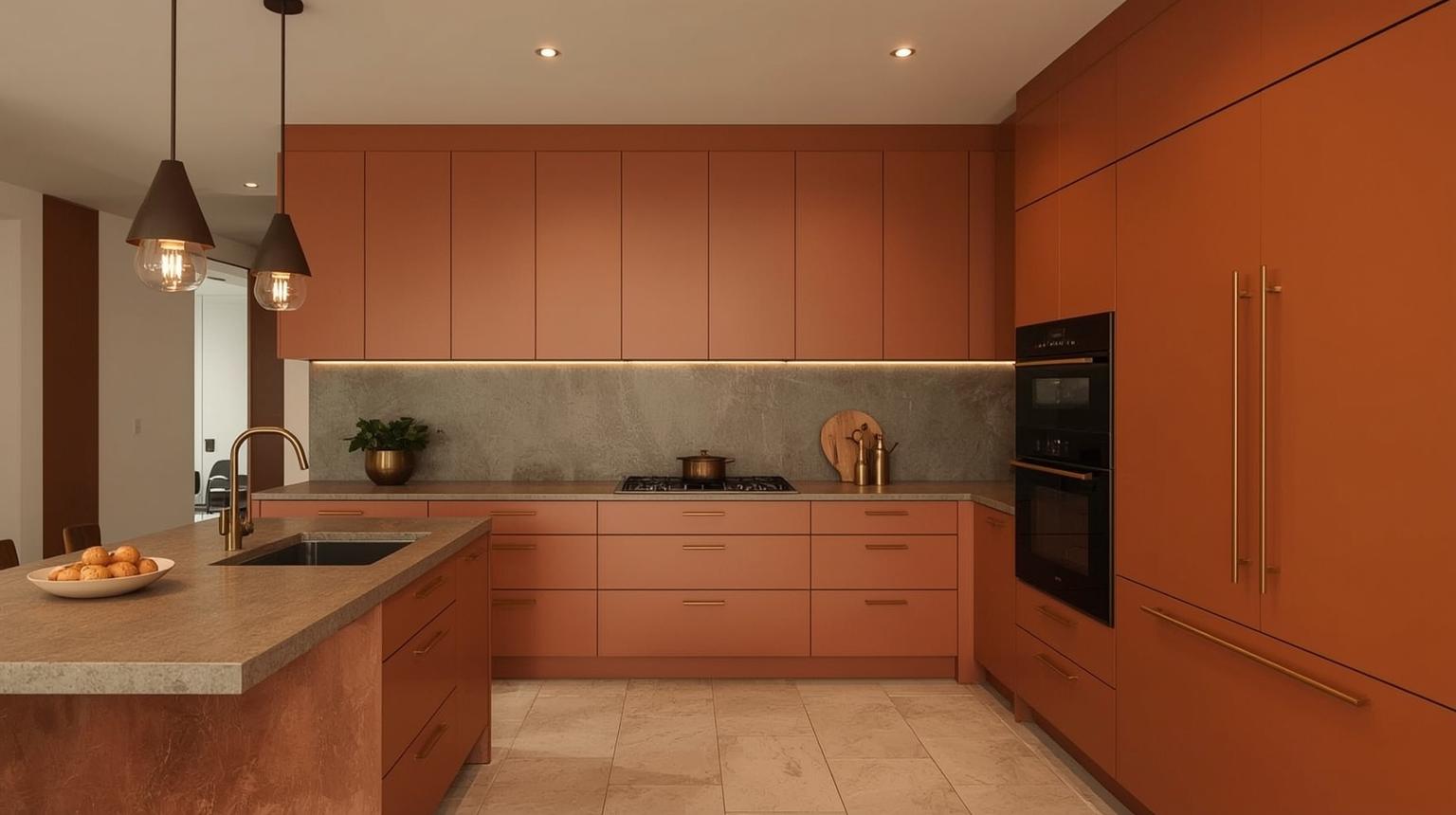
Brass hardware repeats the warmth of orange but should remain a detail. Compare polished, brushed and aged finishes against the cabinet sample. Brushed brass is quieter; polished metal reflects more of the surrounding orange and becomes more noticeable.
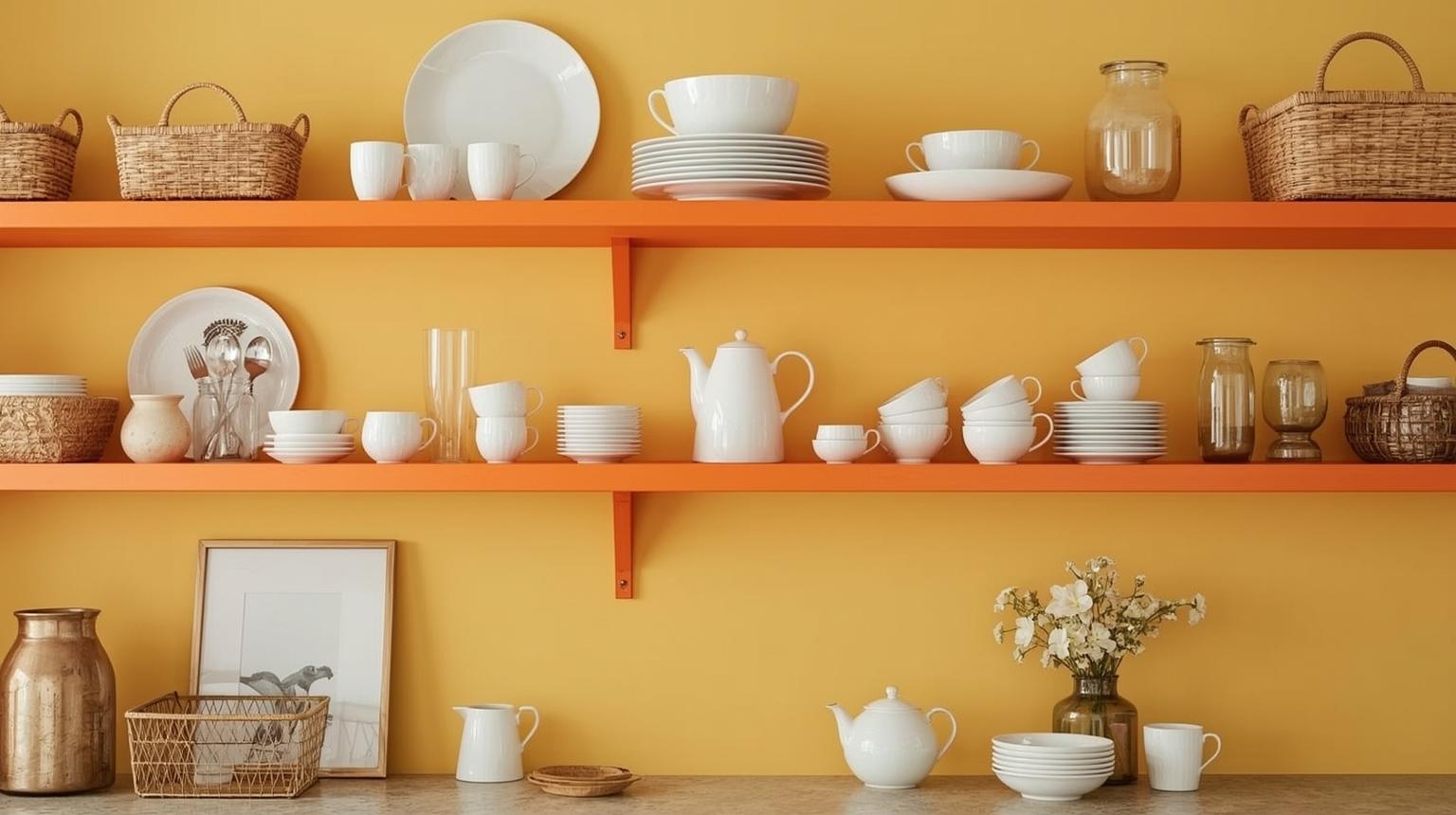
Orange shelving creates a narrow color band without changing the main cabinetry. Keep the displayed group edited so the shelf color remains legible. Frequently used dishes are more practical here than a dense collection of decorative objects near cooking grease.
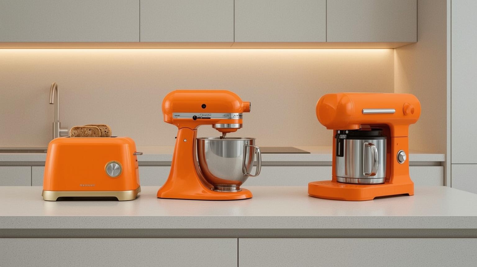
A toaster, kettle or mixer can add orange without construction. Grouping two items in the same zone looks deliberate, but do not sacrifice useful prep space to maintain a theme. Product function, clearance and access to outlets still come first.
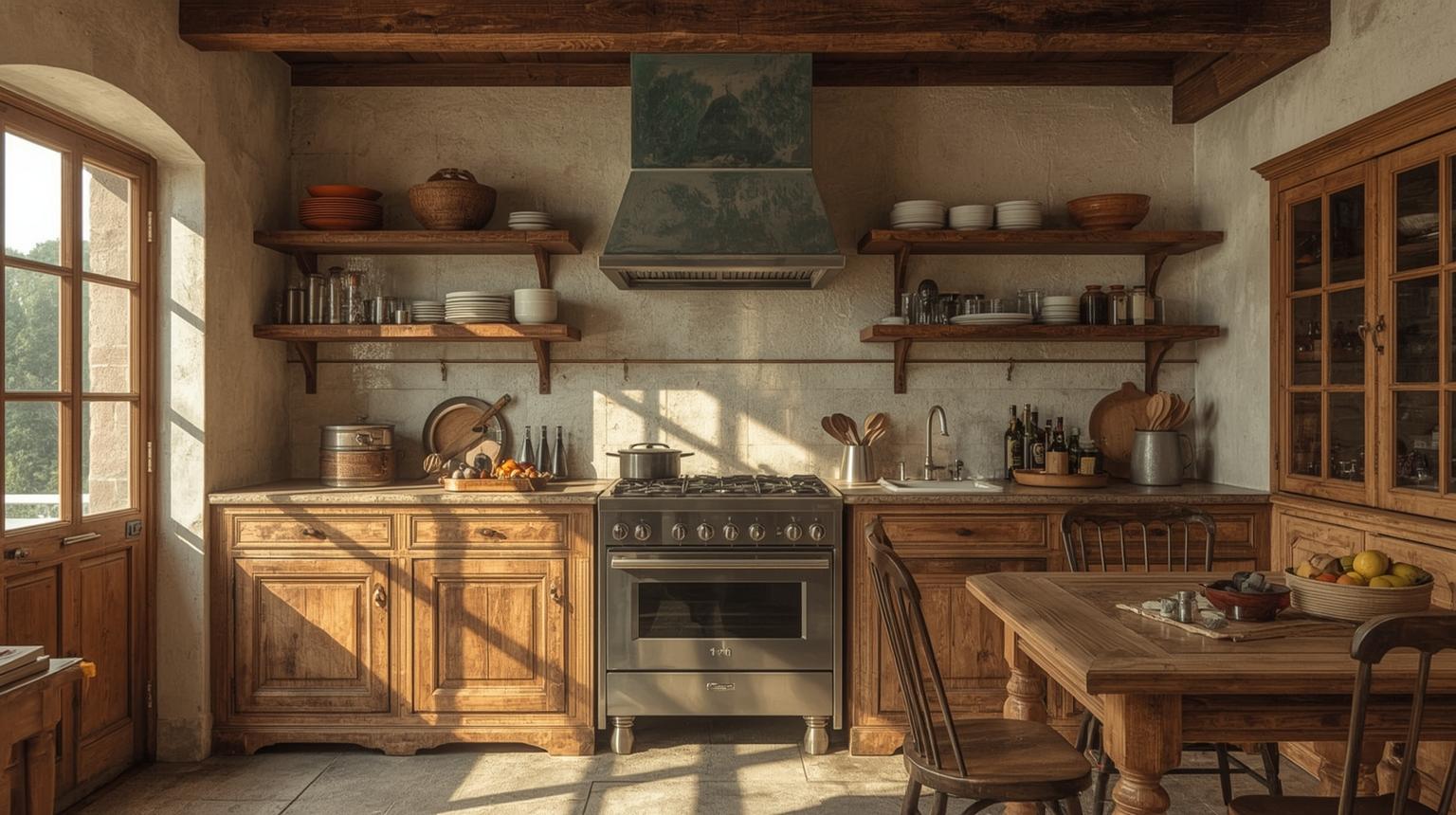
For a rustic orange kitchen, use clay, terracotta, aged timber and linen rather than multiple novelty decorations. Let material variation provide character. A muted rust cabinet or wall can act as the anchor while the remaining surfaces stay natural and functional.
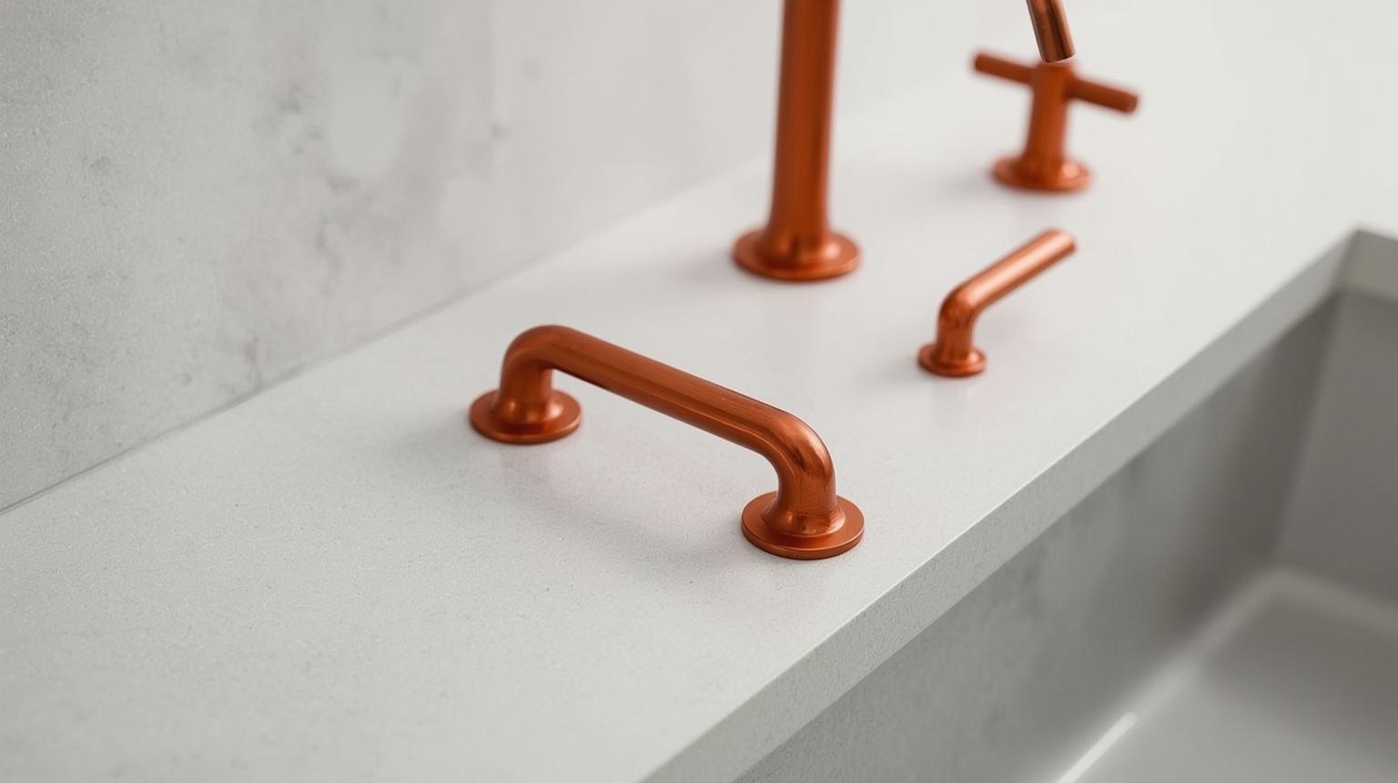
Orange knobs or pulls are one of the smallest reversible changes. Confirm that replacement hardware matches the existing hole spacing and remains comfortable to grip. On a long cabinet run, even a small repeated accent can have a strong cumulative effect.
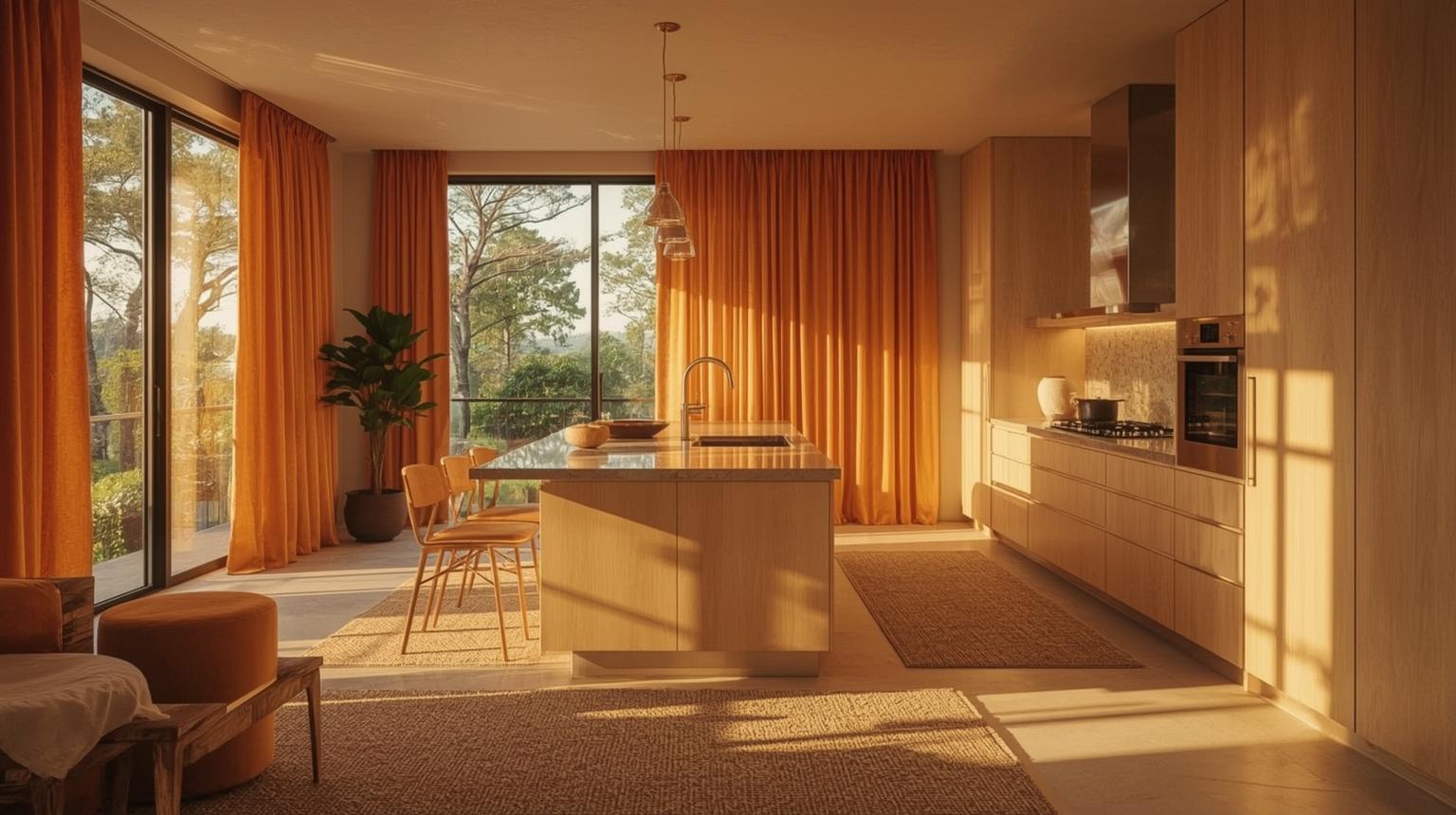
Textiles introduce pattern and a softer surface among cabinets, tile and metal. Choose a rug that is slip-resistant, washable and clear of door swings. Keep fabric away from burners and other heat sources, and do not let a window treatment obstruct ventilation or a working surface.
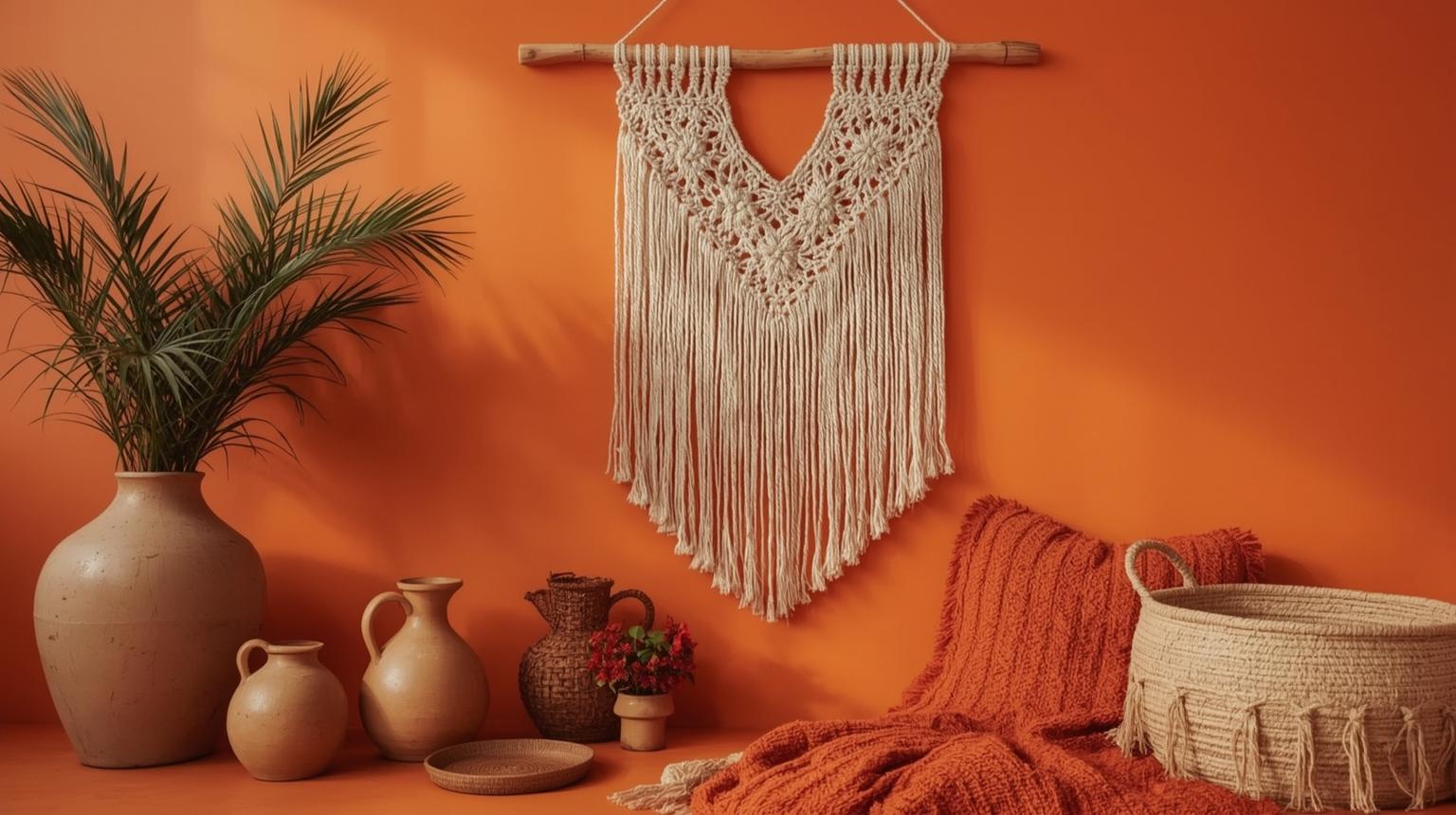
Terracotta pottery brings varied orange-brown tones rather than one flat color. Combine it with woven texture and wood, but keep the worktops mostly clear. A few useful vessels provide more credibility than filling every surface with themed decor.
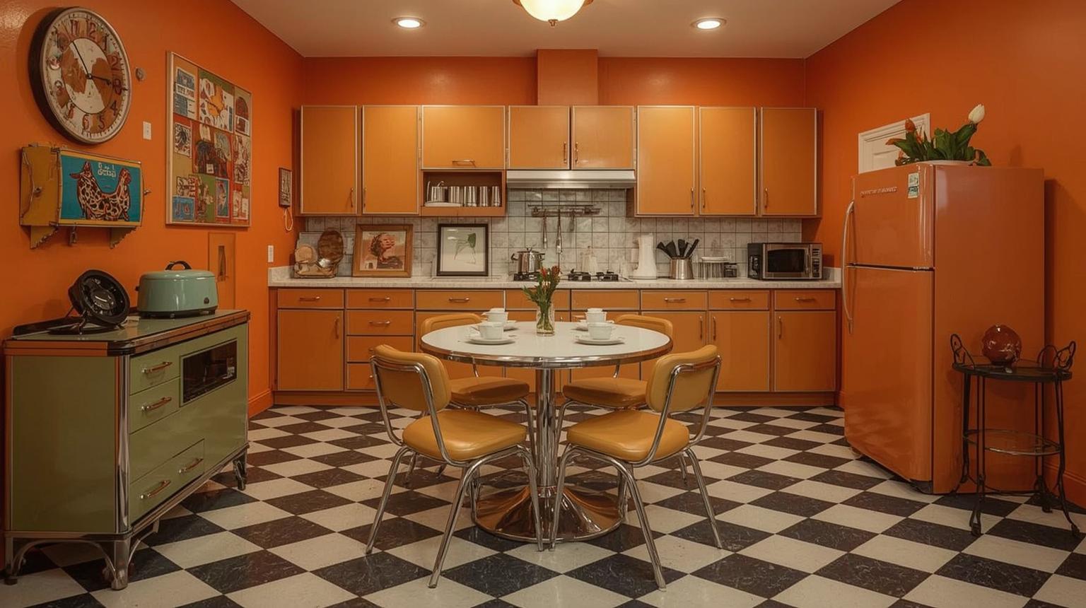
Choose two strong references, such as orange cabinet fronts and checkerboard flooring, then use contemporary storage and lighting elsewhere. This keeps the kitchen functional and avoids turning every fixture into a competing historical cue.
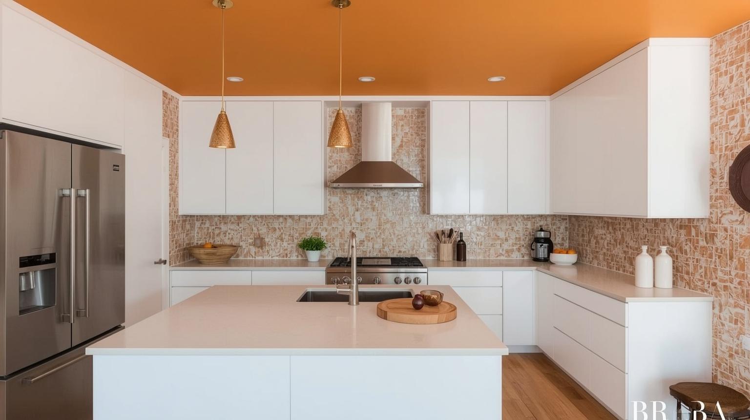
An orange ceiling can visually lower a tall room and reflect warm color onto the upper walls. Test a large overhead sample first. In a low or poorly lit kitchen, a deep orange ceiling may feel heavier than the same color on a vertical accent wall.
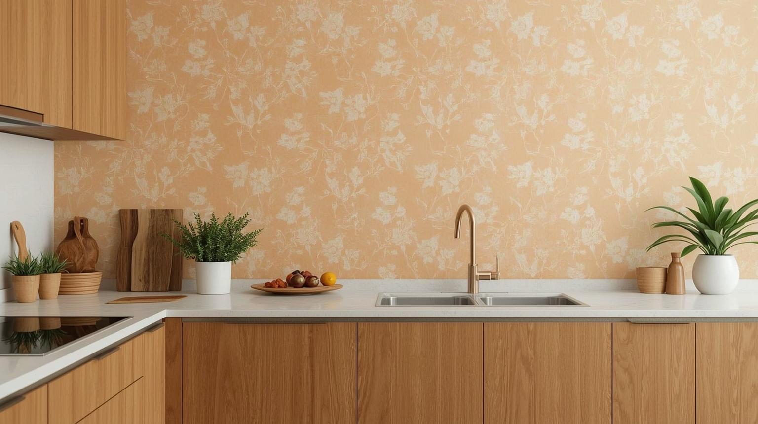
A breakfast nook gives patterned wallpaper a defined boundary away from the busiest splash zones. Choose a product suitable for the room's moisture and cleaning needs, and check the full pattern repeat before ordering rolls.
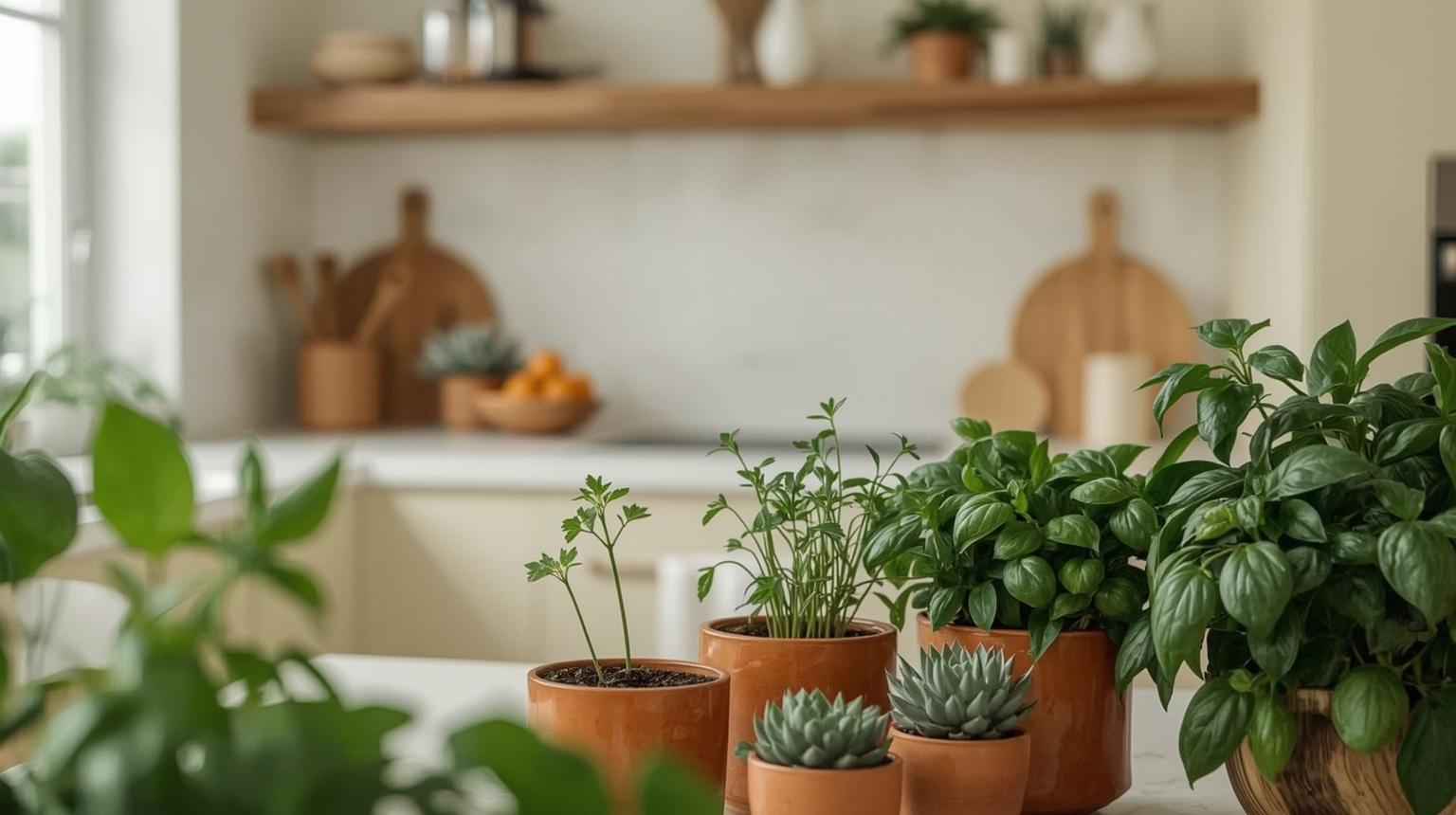
Terracotta planters provide a muted orange accent while foliage introduces a cooler natural color. Select plants for the actual light and humidity near the window, and use saucers so watering does not damage timber shelves or worktops.
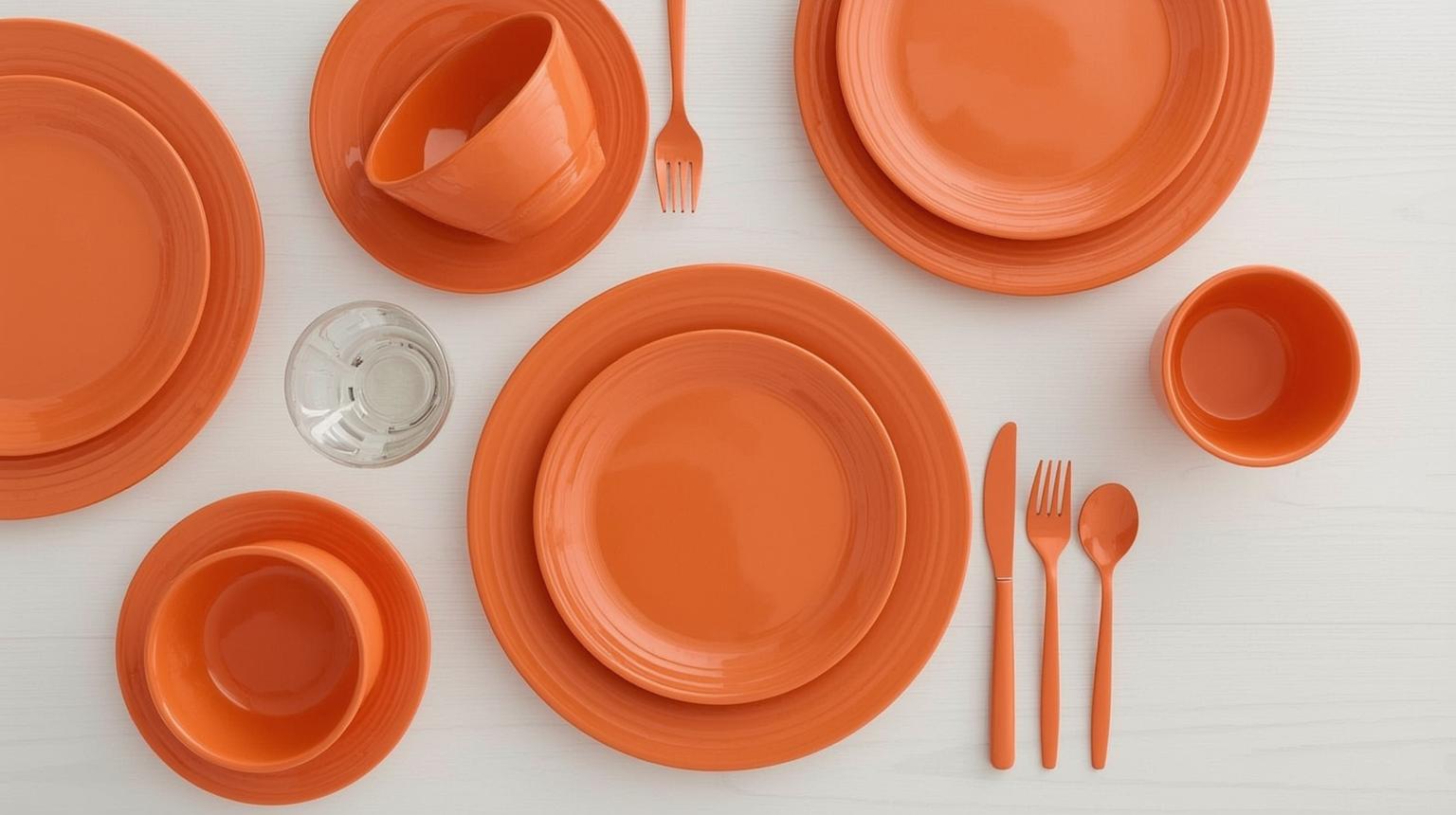
Bowls, mugs and serving pieces can create a consistent orange note when they are already part of daily use. Display a limited group on one shelf and store the rest. Repetition works better than scattering unrelated orange objects across every counter.
Judge an orange sample in daylight, under work lighting and under evening ambient light. The US Department of Energy distinguishes correlated color temperature, which describes the appearance of the light, from color fidelity, which describes how that light affects the appearance of objects. Its LED lighting guidance notes that CRI 80 is a general minimum for interiors and CRI 90 or above indicates excellent color fidelity.
For a kitchen color decision, place a large movable sample vertically beside the cabinet, counter and floor. Observe it at breakfast, in afternoon daylight and after dark. A photograph on a phone or monitor is useful for comparison, but it cannot prove how the installed finish will look under the room's actual lamps.
Use AI kitchen design to compare the visual scale of orange cabinets, an island or an accent wall in a photo of your own room.
An AI paint color visualizer is useful for narrowing directions, but generated images are not color-accurate specifications. Camera processing, screen settings, light sources and the model itself can shift a shade, so confirm the final choice with a physical paint, tile or cabinet sample.
Orange, blue, black and patterned tile can all work together, but not when each demands equal attention. Establish one dominant surface, one supporting neutral and one smaller accent.
A cabinet sample may look balanced in isolation and clash beside a yellow-beige floor or blue-gray countertop. Compare all permanent materials in the same light before approving the orange.
Orange is a design choice, but the surface still needs to suit its location. Tile grout, washable paint, cabinet coatings, textiles and wallpaper have different maintenance limits. Follow the manufacturer's intended use and installation guidance.
A visualization answers composition questions: where the orange goes and whether its scale feels balanced. It does not replace a physical finish sample, measured layout or installer-approved specification.
From bold orange cabinets to considered burnt orange accents, orange kitchens offer more design range than most people expect when they first consider the color. The right shade, the right pairing, and the right level of commitment — cabinet versus accessory versus accent wall — make the difference between a kitchen that feels overwhelming and one that feels exactly right.
Whether you are drawn to a full burnt orange kitchen cabinet scheme or prefer starting with a rust-orange pendant light and a terracotta rug, these orange kitchen ideas cover the full range of how far you can take this color. Use Paintit.ai to visualize your chosen direction on your actual space before you commit.
Orange can work well in a kitchen when its shade and coverage suit the room. Pale peach can warm a wall, burnt orange can anchor lower cabinets, and bright orange can mark a smaller feature. There is no need to rely on broad claims about appetite or mood; judge the choice by the room's light, fixed materials, maintenance needs and your tolerance for a strong color.
Warm white and cream provide a light neutral base. Warm gray makes orange quieter, while charcoal or black creates a stronger contrast. Navy and muted blue contrast clearly with orange; wood and terracotta extend its warmth. Test the exact materials together because undertones matter more than generic color names.
Let one color dominate. In most compact kitchens, white can cover upper cabinets, walls and the ceiling while orange is limited to lower cabinets, the island or backsplash. In a larger bright room, orange can occupy more cabinetry. Use the same white consistently rather than mixing several whites with different undertones.
Yes. Pale peach, apricot and light clay can add warmth without the weight of a deep rust color. Keep the ceiling and some vertical surfaces light, preserve useful task lighting and avoid crowding the room with several orange patterns. A darker burnt orange can still work on one lower run or a compact island.
Burnt orange cabinets pair naturally with cream, warm white, light oak, walnut, warm gray and restrained stone patterns. Navy or charcoal adds drama, while brushed brass or matte black can work as small hardware accents. Avoid stacking too many adjacent rust, amber, gold and reddish wood tones without a neutral break.
Start with barstools, pendant shades, washable textiles, tableware, planters or one small appliance group. A removable or replaceable layer lets you assess orange in the room before making a fixed change. Keep access, cleaning, heat clearance and counter space ahead of the color theme.
Choose matte when you want a quieter color field and less reflection. Choose gloss when the reflective finish is part of a modern design and you accept more visible glare and fingerprints. View full-size samples vertically under the kitchen's real lighting because finish can alter the apparent intensity of the same orange.