6 min. reading
Yulii Cherevko
CEO paintit.ai
Orange is a warm, energetic color that can shift a kitchen from functional to genuinely inviting. Whether you want a dramatic statement with burnt orange cabinetry or prefer subtler touches through peach-toned accessories, incorporating this hue makes a kitchen feel personal in a way most neutral palettes do not.
Color research consistently links orange and warm-adjacent hues to appetite stimulation and heightened social energy — a well-documented finding in environmental color psychology that explains why these tones appear frequently in both restaurant interiors and home kitchens designed for gathering. At the same time, warm earthy tones — including amber, terracotta, and burnt orange — have dominated residential interior color trends since 2021. Pantone named a peach-orange tone its Color of the Year 2024, reinforcing that the orange family is far from a fleeting choice.
In this guide, we explore 30 creative orange kitchen designs — from bright citrus to deep burnt terracotta — to inspire your next remodel.
Key takeaways:
Orange is not a single color in kitchen design — it is a spectrum. Bright pumpkin orange reads energetic and bold. Peach reads soft and welcoming. Burnt orange reads grounded and considered. Understanding which shade you are working with determines everything: which materials complement it, which wall colors balance it, and how much of it the room can carry before it feels overwhelming.
Orange works in cabinetry, backsplashes, walls, and accessories. Each application carries a different level of commitment and visual weight. The most successful orange kitchens tend to anchor one strong orange element — usually cabinets or a feature wall — and let the remaining surfaces stay calm and neutral.
Whether you're renovating a compact cooking space or designing a grand open-plan kitchen, orange kitchen designs can bring warmth and a genuinely stimulating element to your home. From bold cabinetry to considered accents, orange adapts — whether you want high-energy brightness or cozy depth. Here are 30 ways to make it work across any style and size of kitchen.
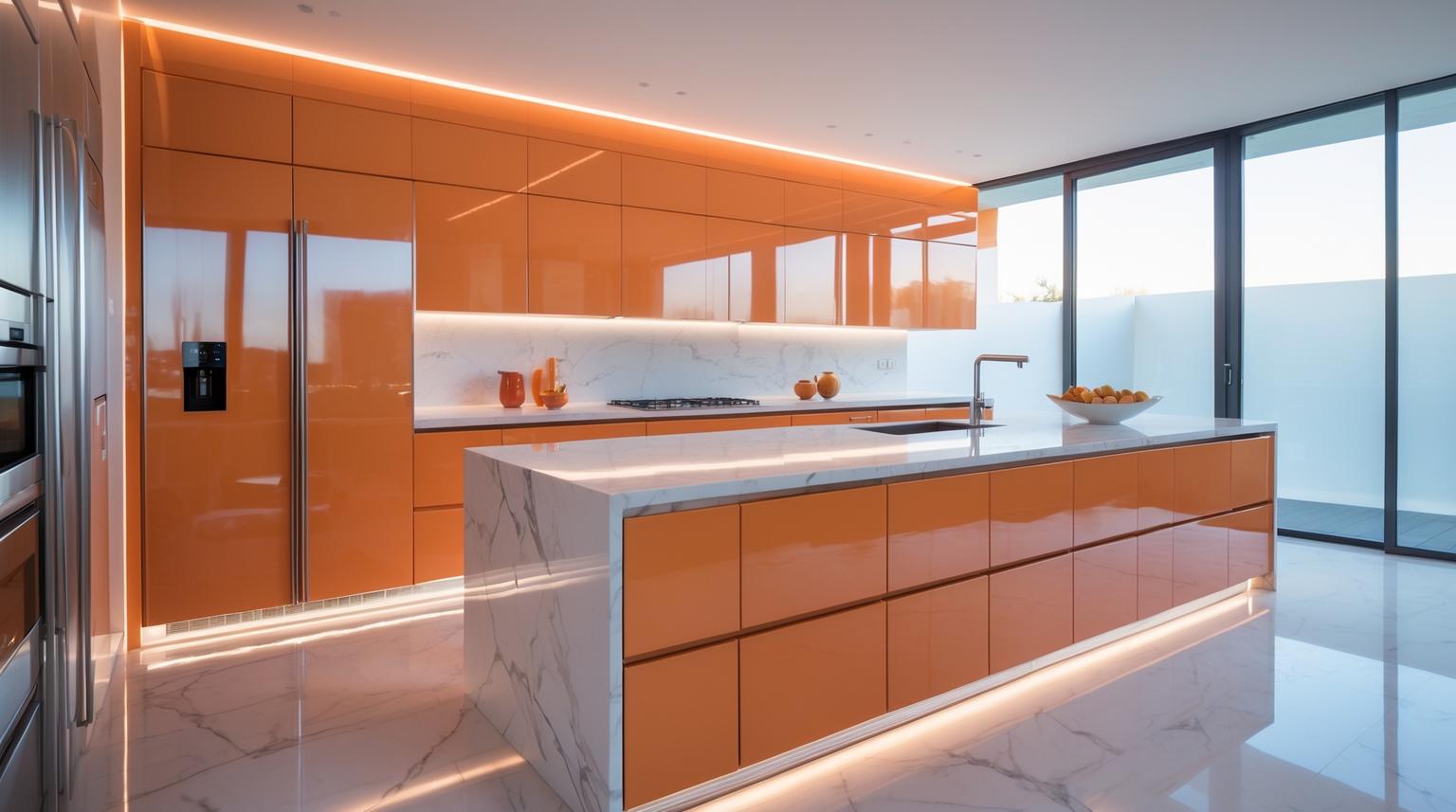
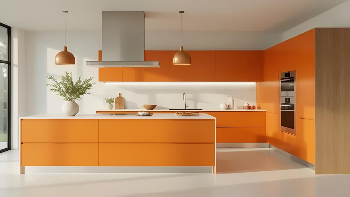
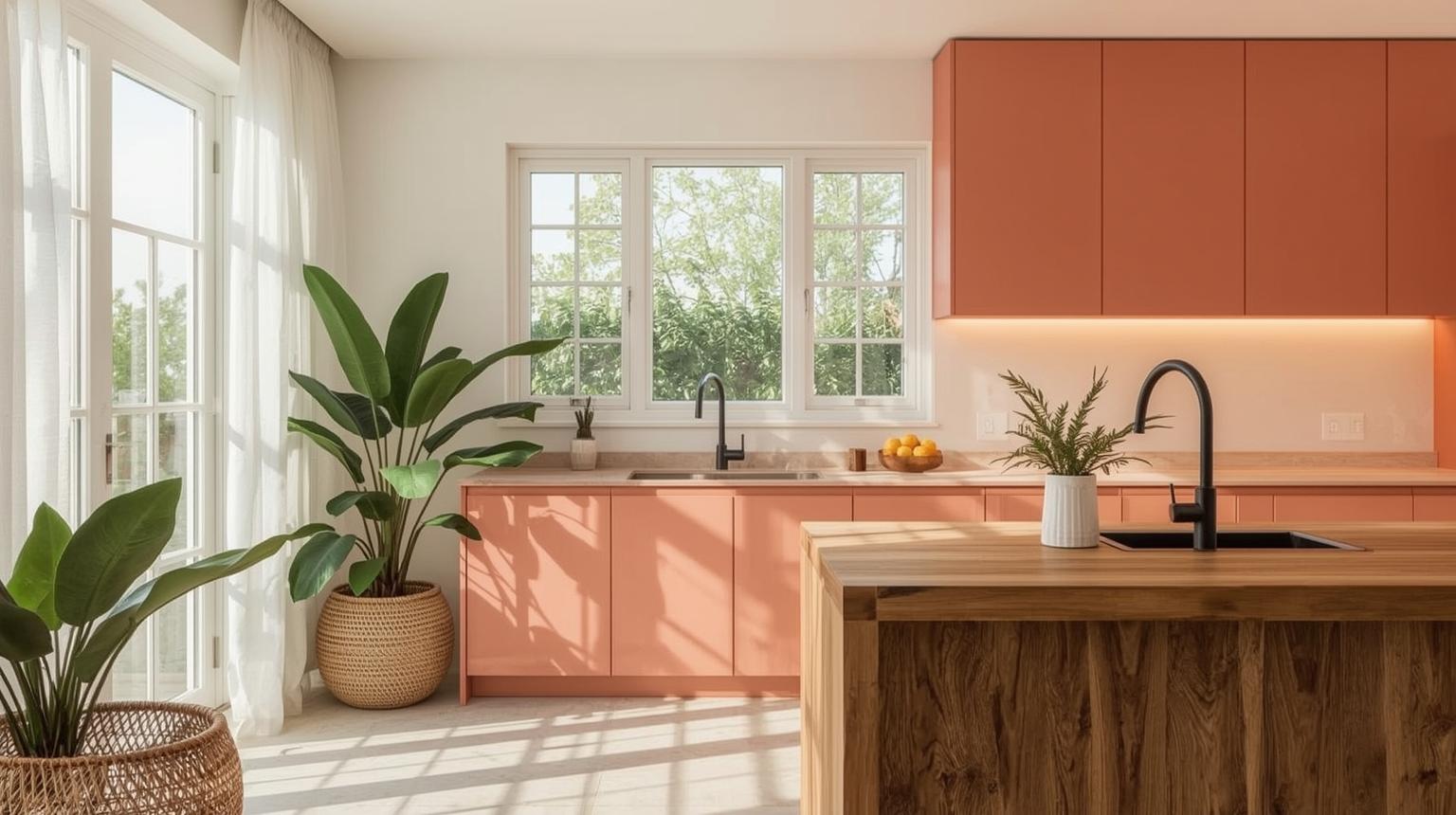
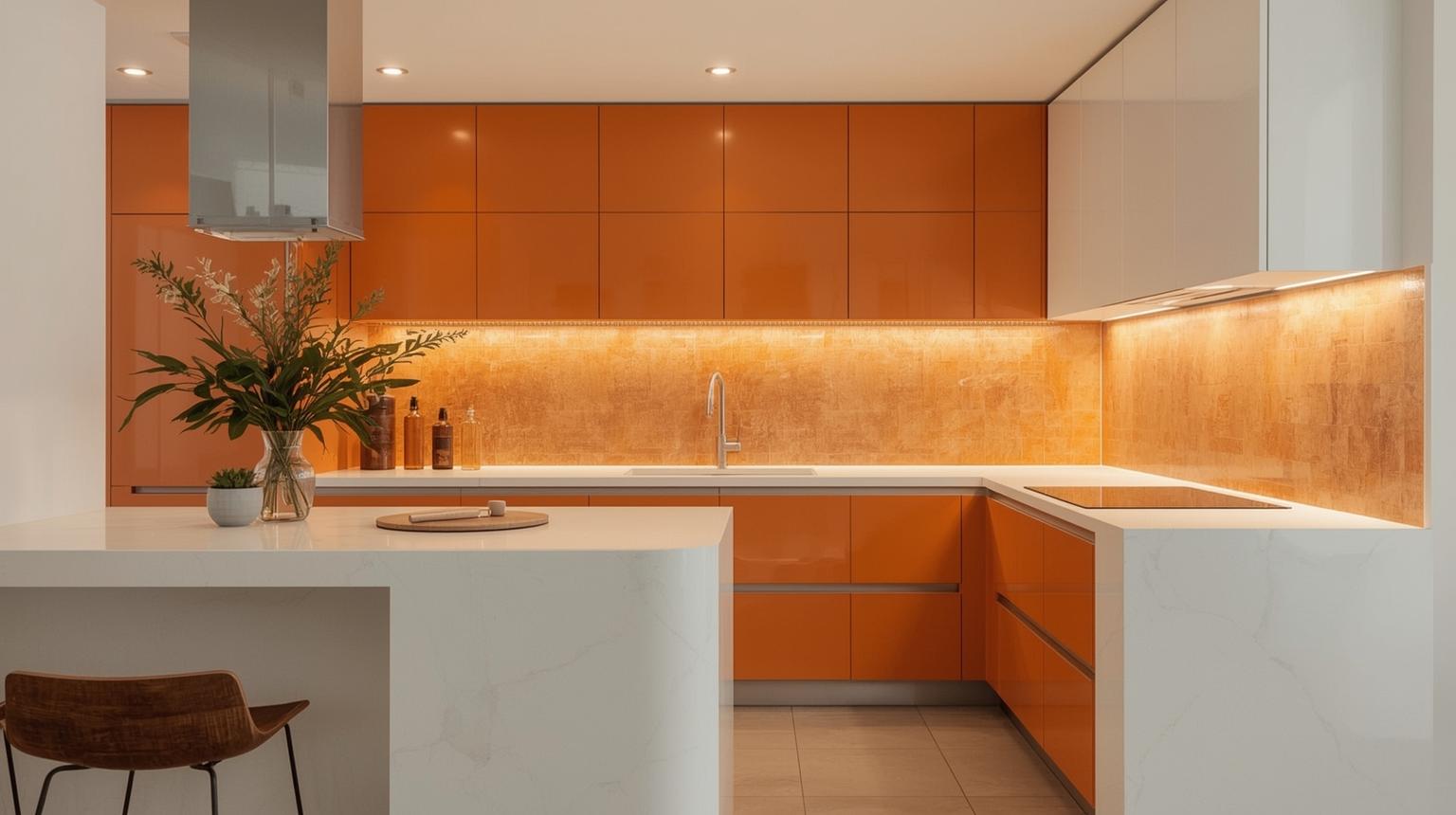
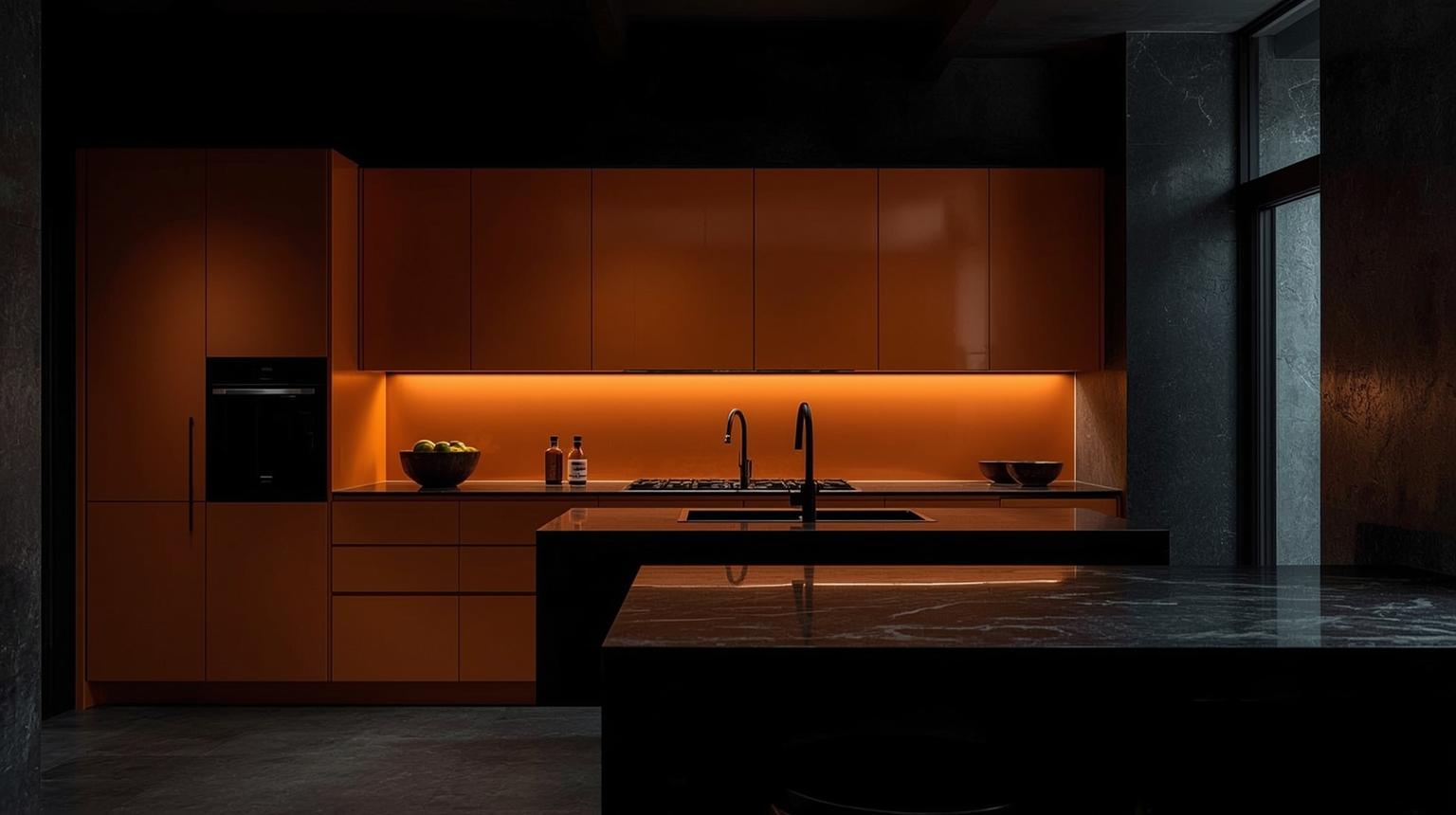
Orange cabinets can serve as the centerpiece of your kitchen, offering a contemporary and bold ambiance. From glossy finishes to matte texture, these cabinets set the visual tone for the whole room. Whether you go for a single-color or two-tone scheme, orange cabinetry brings personality, warmth, and a strong design statement.
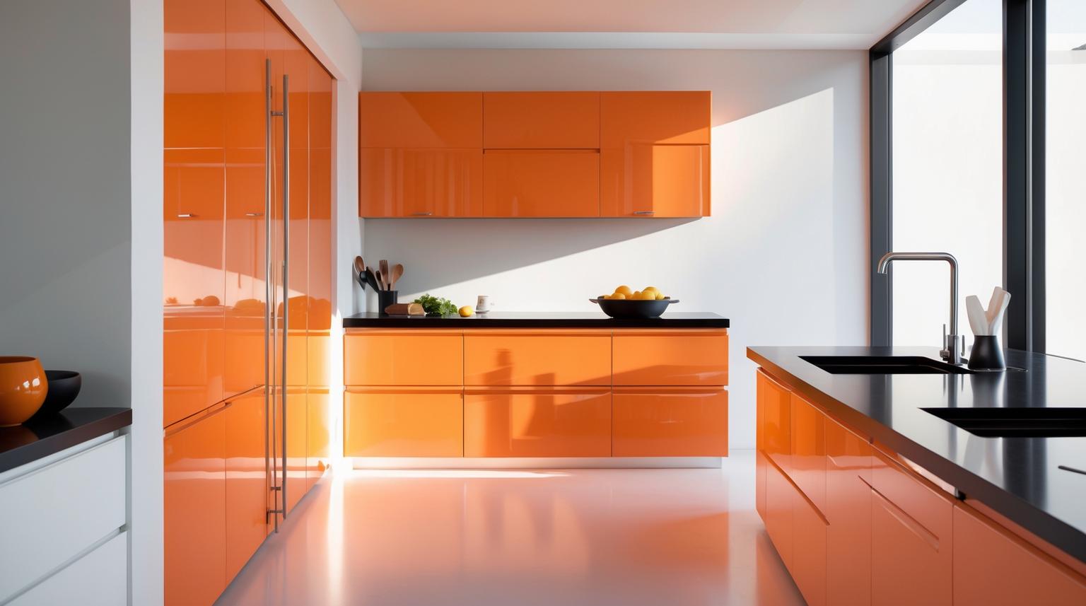
High-gloss orange cabinets catch light well, giving your kitchen a sleek and contemporary look. Pair them with neutral countertops and a simple backsplash to balance the brightness.
For a less intense look, matte orange cabinets offer a sophisticated finish. They complement natural materials like wood and stone particularly well.
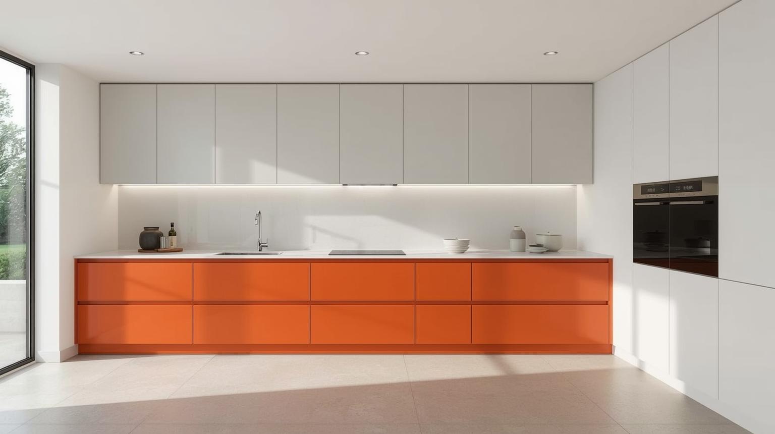
Combine orange with a second color — white or gray work well — to create a two-tone cabinetry effect. This approach adds depth and visual interest without committing the whole kitchen to a single strong color.
Handleless orange cabinets contribute to a minimalist aesthetic that lets the color itself carry the design. Clean lines, no hardware interruptions — the orange does all the work.
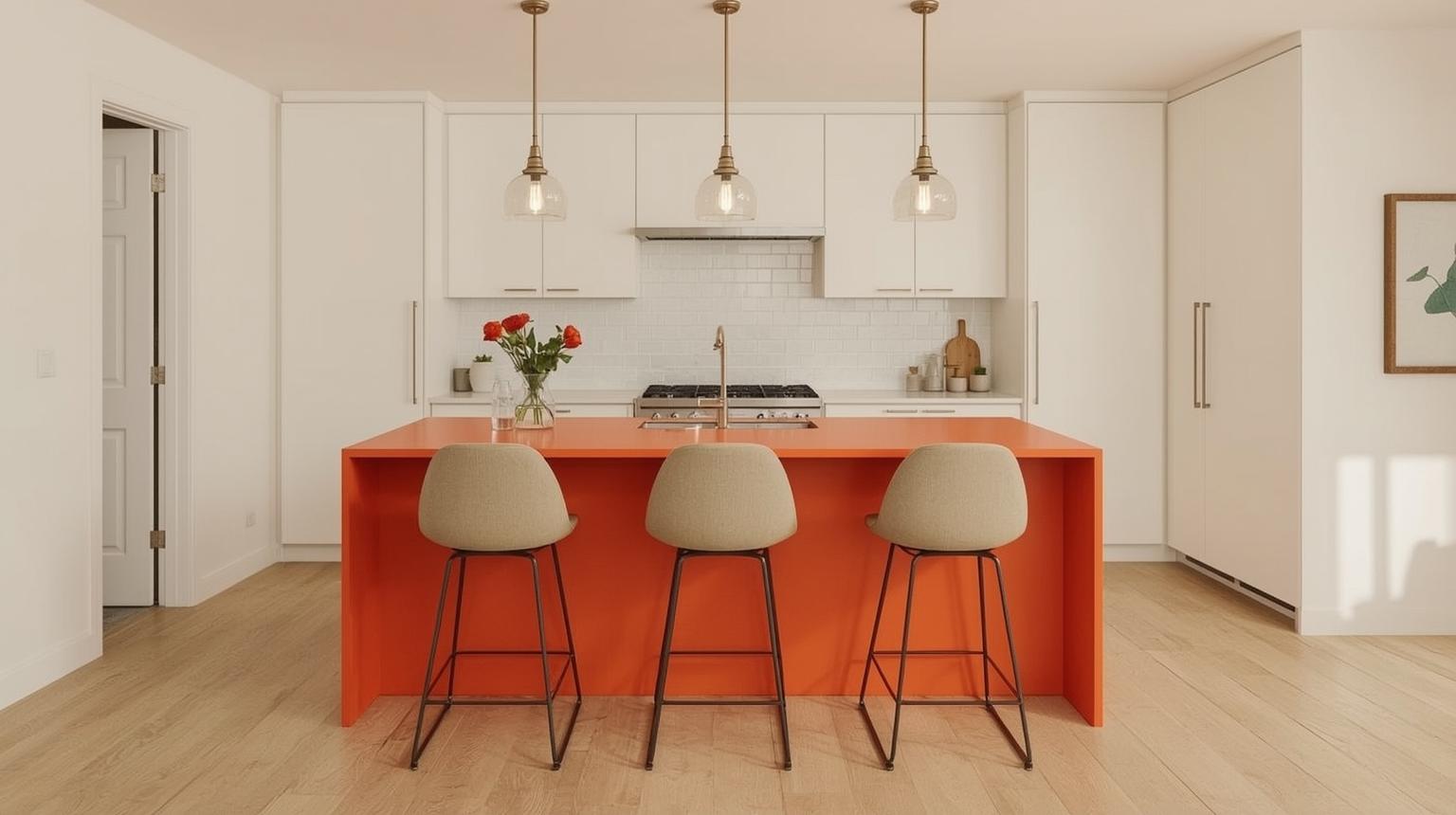
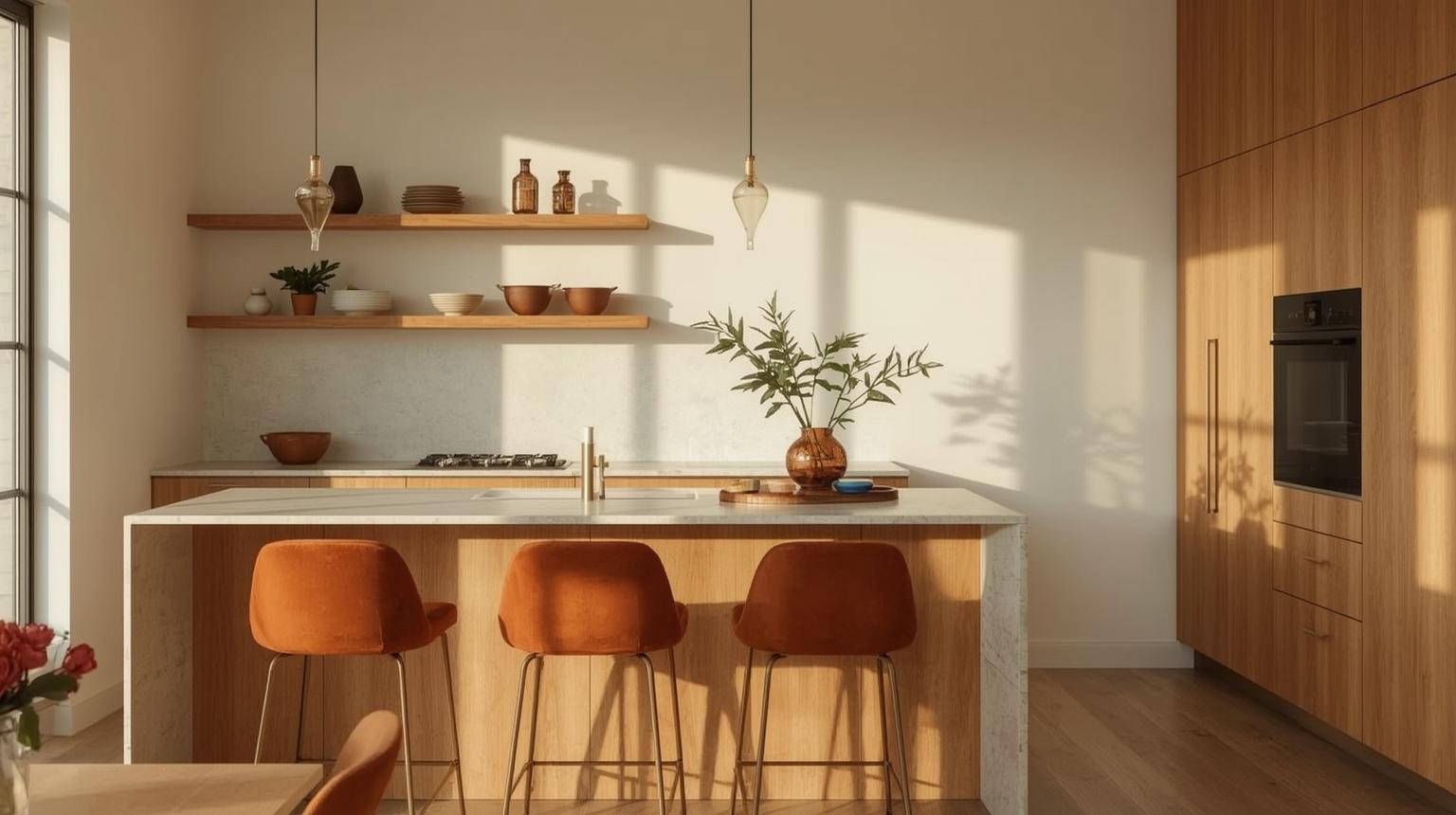
Statement orange pieces — an island, a countertop, a run of open shelving — bring drama and personality to a kitchen without requiring a full-room commitment. They work as natural focal points and conversation starters, and they hold their own even in a predominantly neutral space.

An orange kitchen island introduces a strong pop of color to a monochromatic kitchen. It functions as both a social gathering point and a workspace — the color makes it the natural center of attention.
Bold orange countertops inject energy into a kitchen. Pair them with neutral cabinetry so the countertops become the clear focal point rather than competing with other elements.
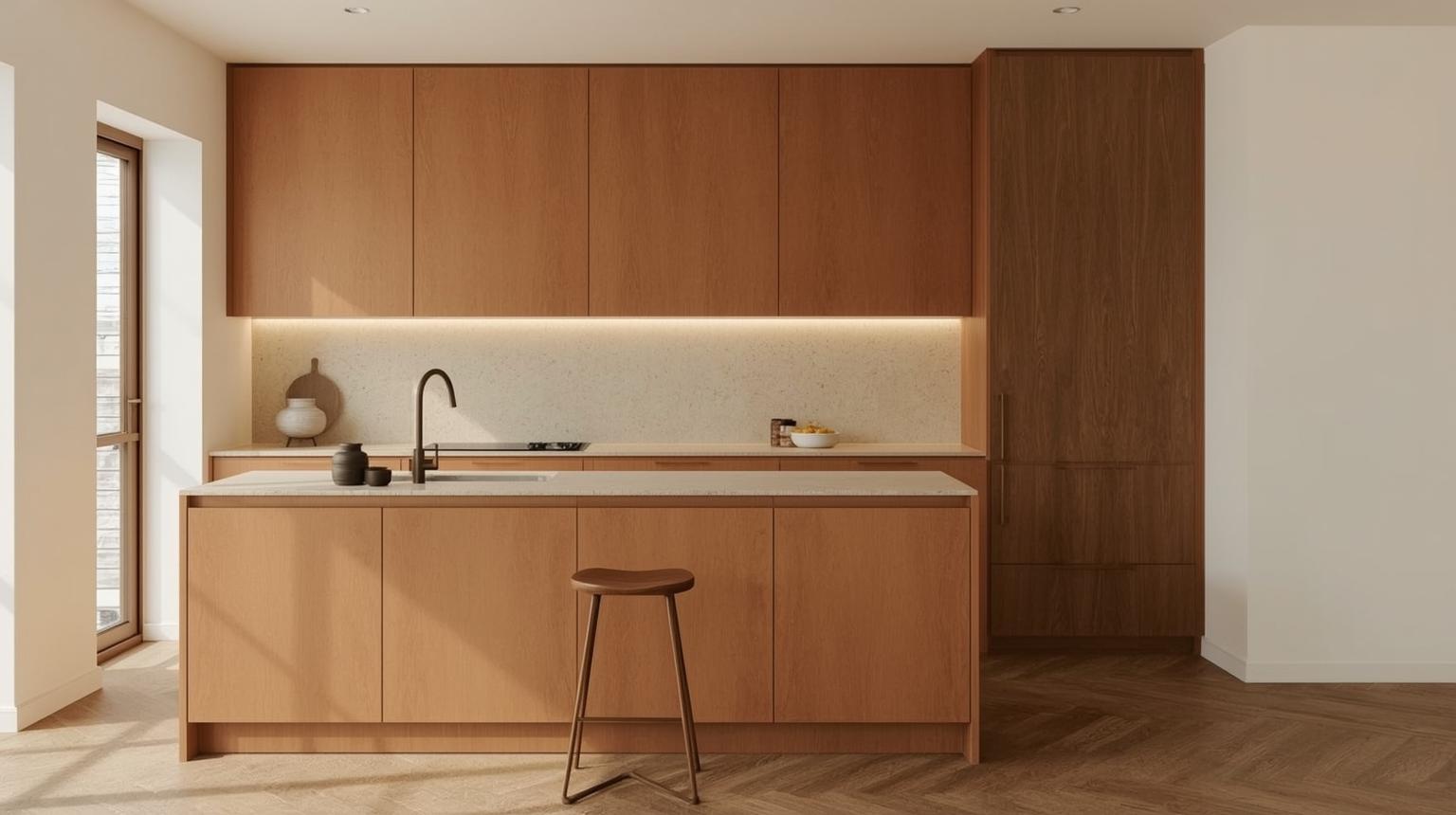
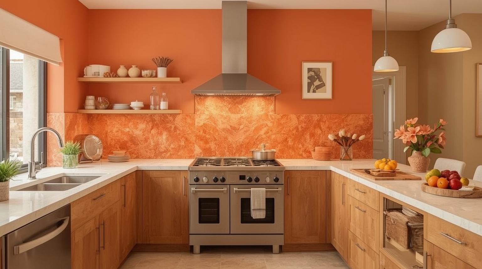
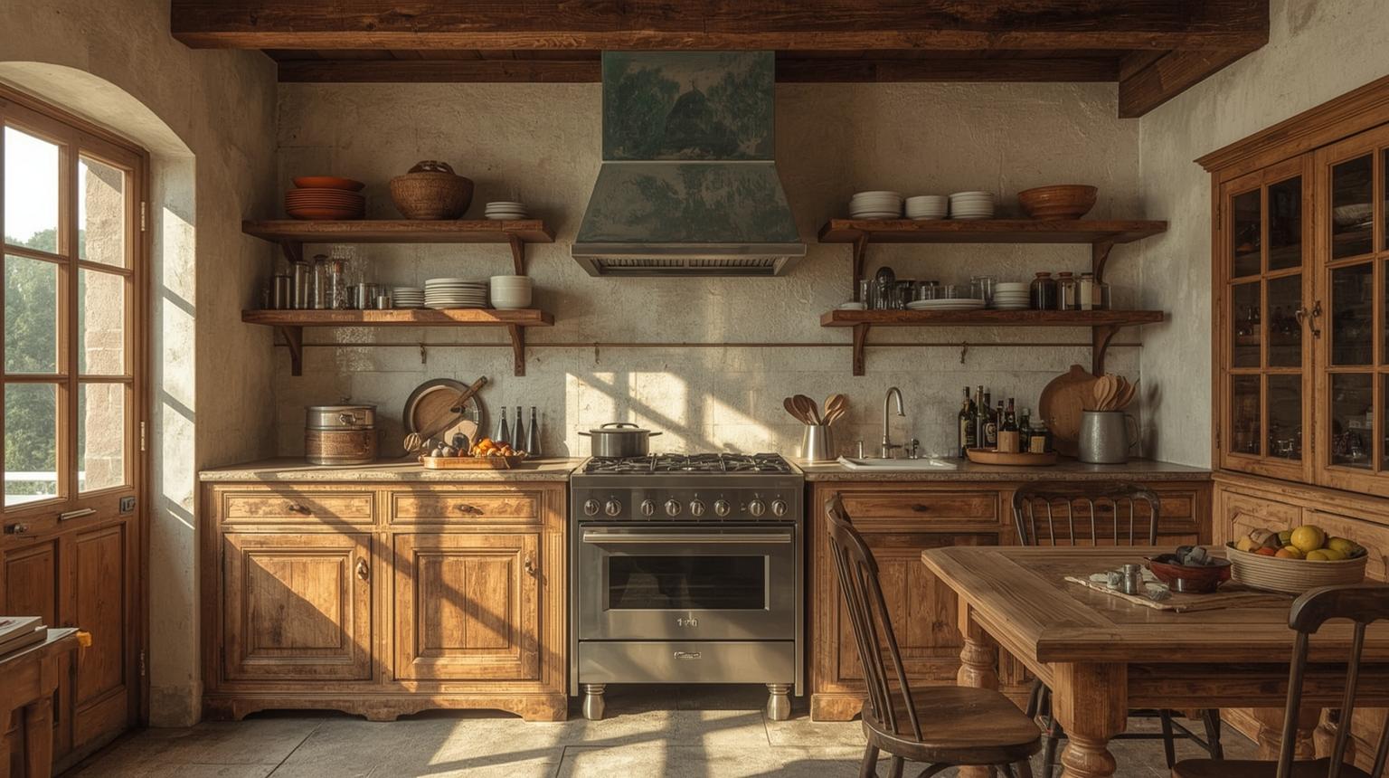
Combining orange with rich wood tones creates a warm and genuinely inviting atmosphere. Consider orange trim or open shelving alongside wooden floors or cabinets — the two materials share enough warmth to feel cohesive.
Accents are a practical, low-commitment way to bring orange into your kitchen. They let you test the color in small doses and can be swapped out if your preferences change — no renovation required.
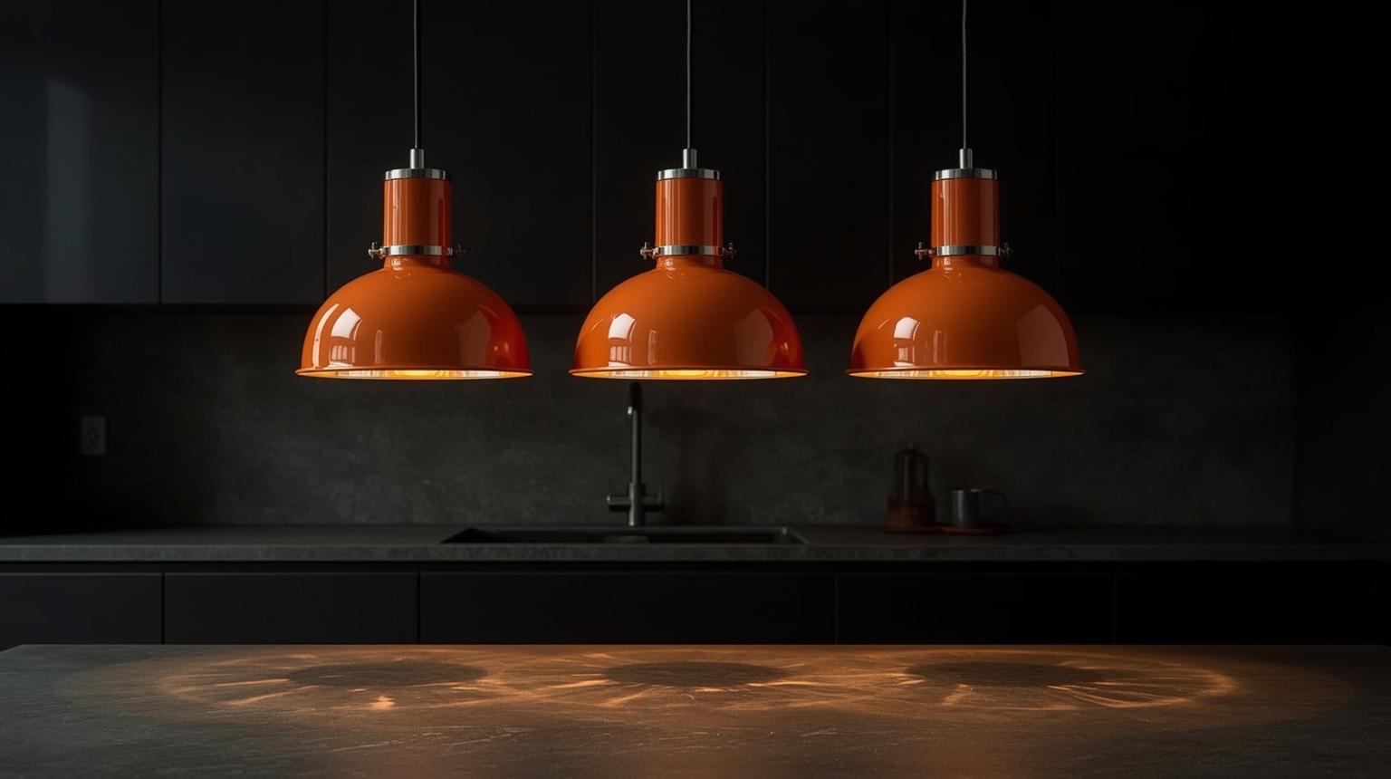
Orange pendant lights serve as both a light source and a decorative statement. They draw the eye upward and add a consistent color note without requiring any structural changes to the kitchen.
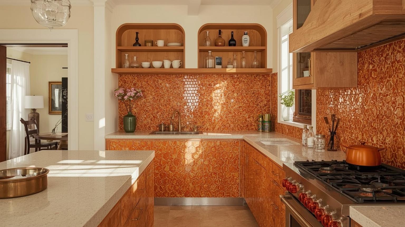
Patterned orange tiles in the flooring or backsplash bring visual texture and character. A small tiled area can carry a significant amount of orange without the room feeling saturated.
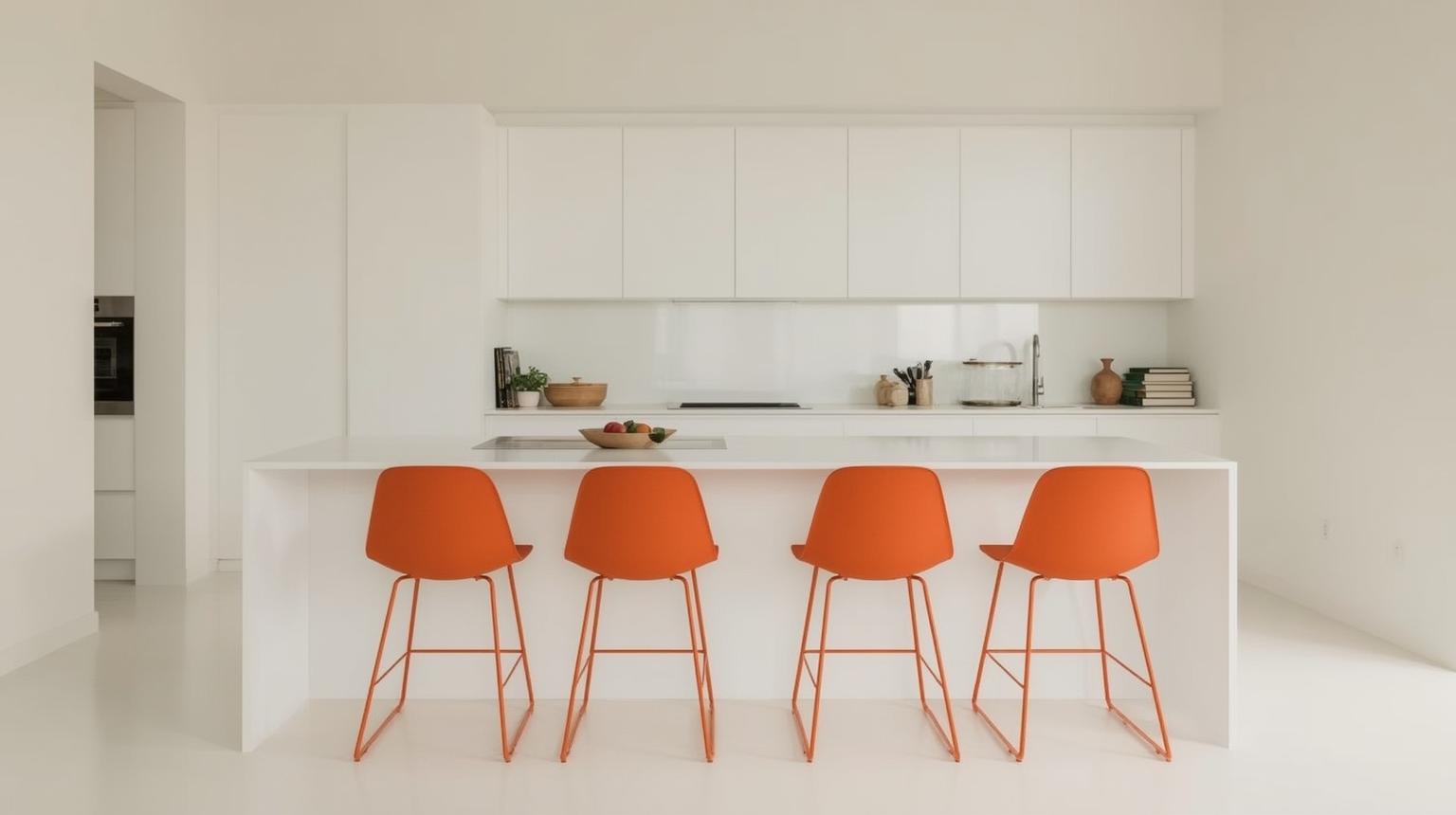
Orange barstools or chairs are one of the easiest ways to introduce color into a kitchen. They are also the easiest to change — if you want to shift the color scheme later, the seating goes first.
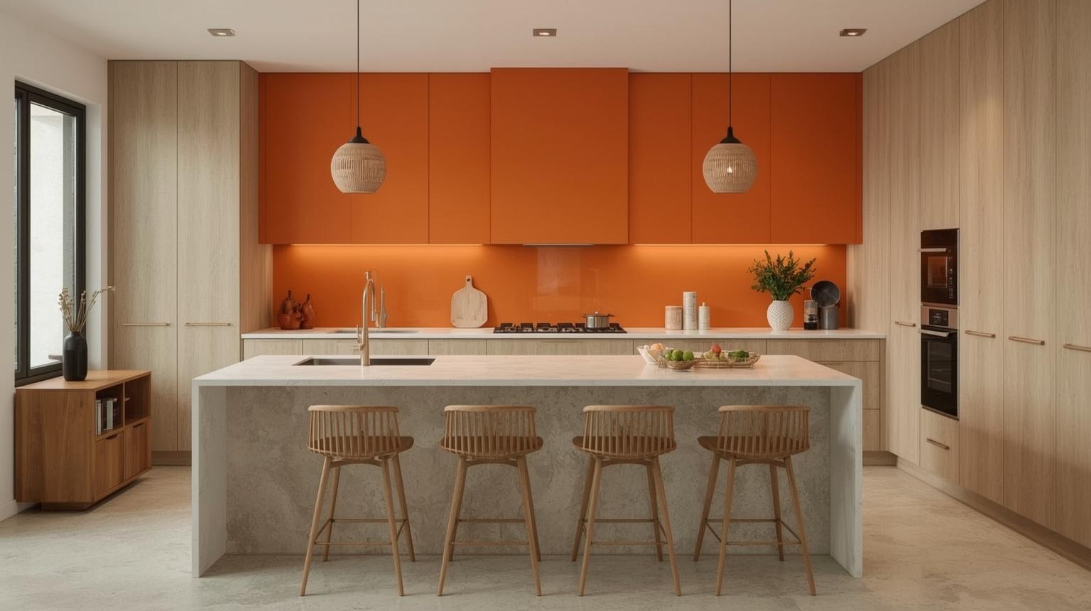
Walls and backsplashes give orange room to breathe. From soft peach to rich burnt tones, these surfaces add depth and dimension — and they work in kitchens where cabinetry is staying neutral.
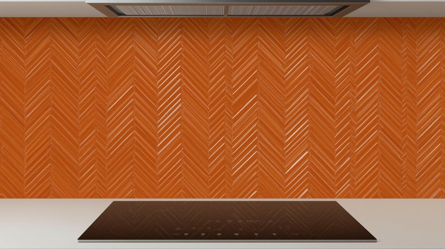
An orange chevron backsplash brings a modern, geometric energy to the kitchen and creates a clear focal point behind the hob or prep area.
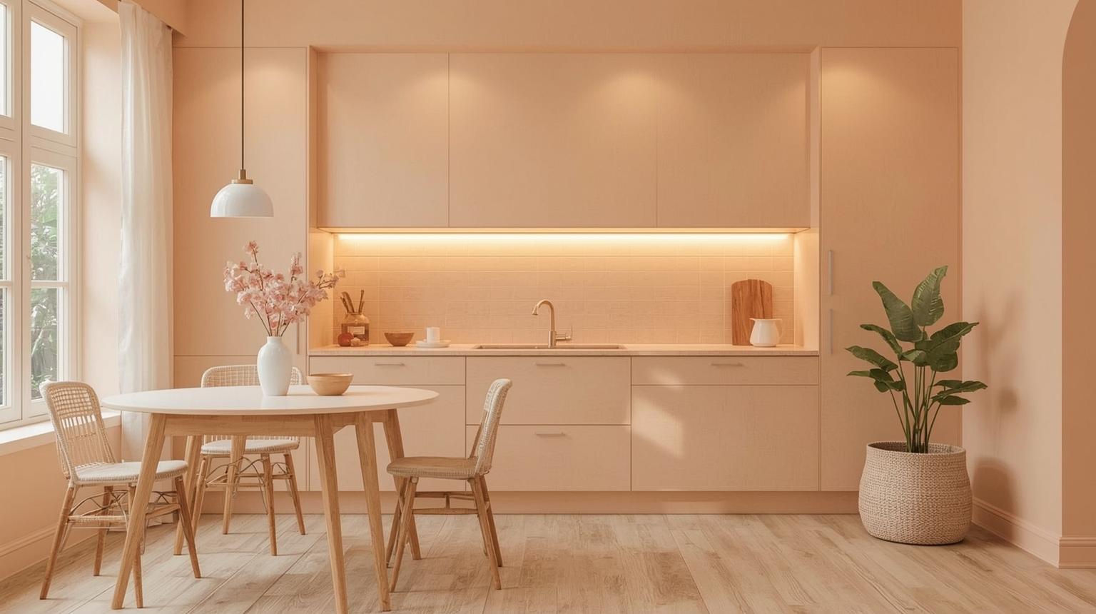
Peach walls sit at the quieter end of the orange spectrum. They add warmth and intimacy without the intensity of a full orange, making them a strong choice for kitchens that need light and openness.
A melon accent wall brings a clean brightness to the kitchen. It balances well with natural materials and neutral cabinetry — enough color presence without dominating.
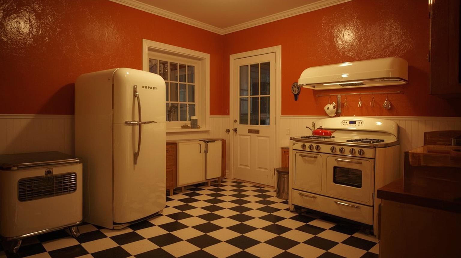
Burnt orange walls bring a retro warmth to the kitchen — earthy, considered, and genuinely different from the all-white standard. They work especially well in kitchens with exposed wood beams, open shelving, or vintage-style hardware.
The right pairing determines whether orange reads bold, cozy, or sophisticated. Complementary and contrasting combinations each produce a different character in the same space.
White and orange produce a clean, high-contrast result. White softens the intensity of orange without washing it out — the kitchen feels bright and light rather than saturated.
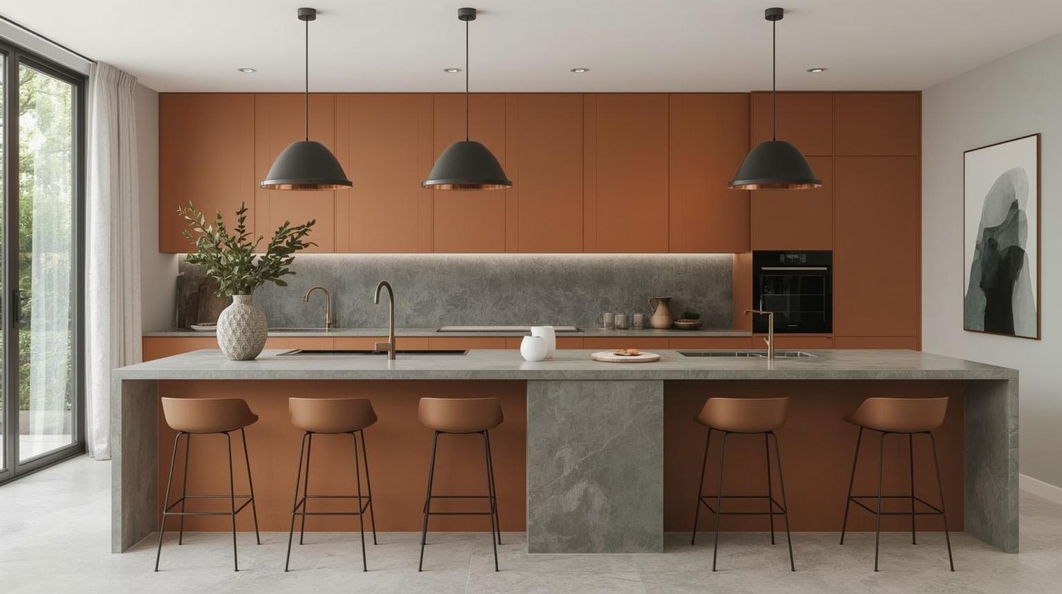
Gray cools the intensity of orange without flattening it. For a burnt orange and gray kitchen specifically, use a warm gray — one with beige undertones — on upper cabinets or walls, and burnt orange on lower cabinets or the island. The combination reads sophisticated and contemporary without feeling clinical.
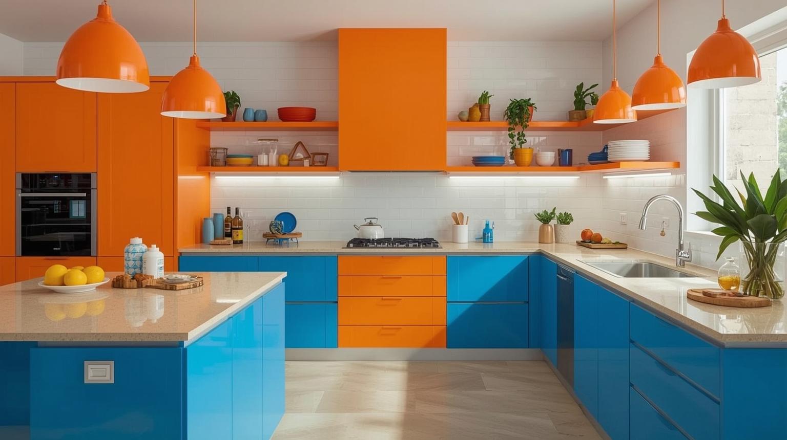
Orange and blue are complementary colors on the color wheel, which means they intensify each other when placed together. The combination works best with a deeper blue — navy or slate — rather than a bright blue, which can feel competitive rather than balanced.
Black and orange produce a high-contrast, dramatic result. This combination suits kitchens that are genuinely designed to make a statement — it is bold by intent, not by accident.
Gold hardware or lighting in an orange kitchen adds a layer of warmth and finish detail. The two tones share enough warmth to feel cohesive rather than competing.
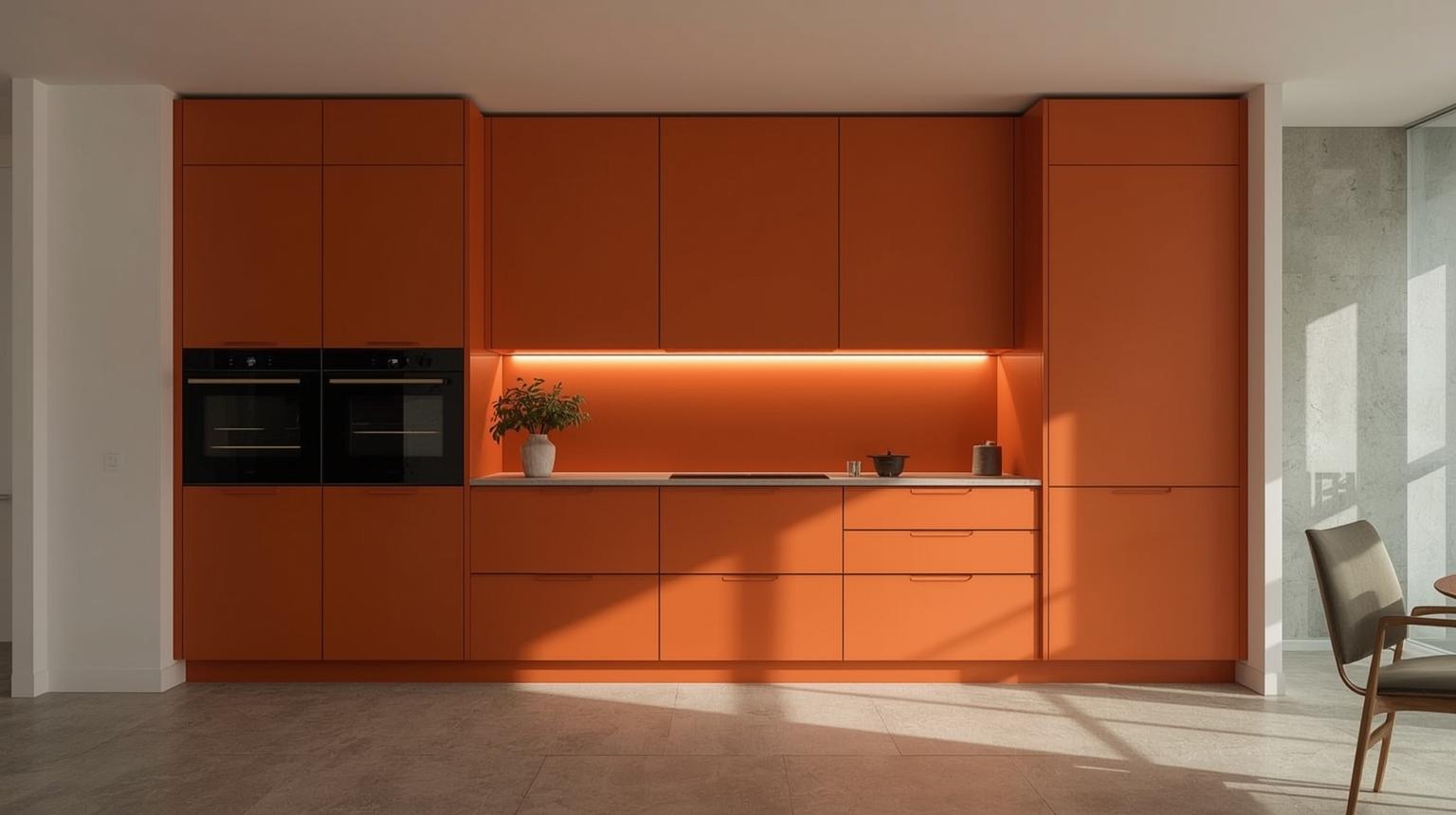
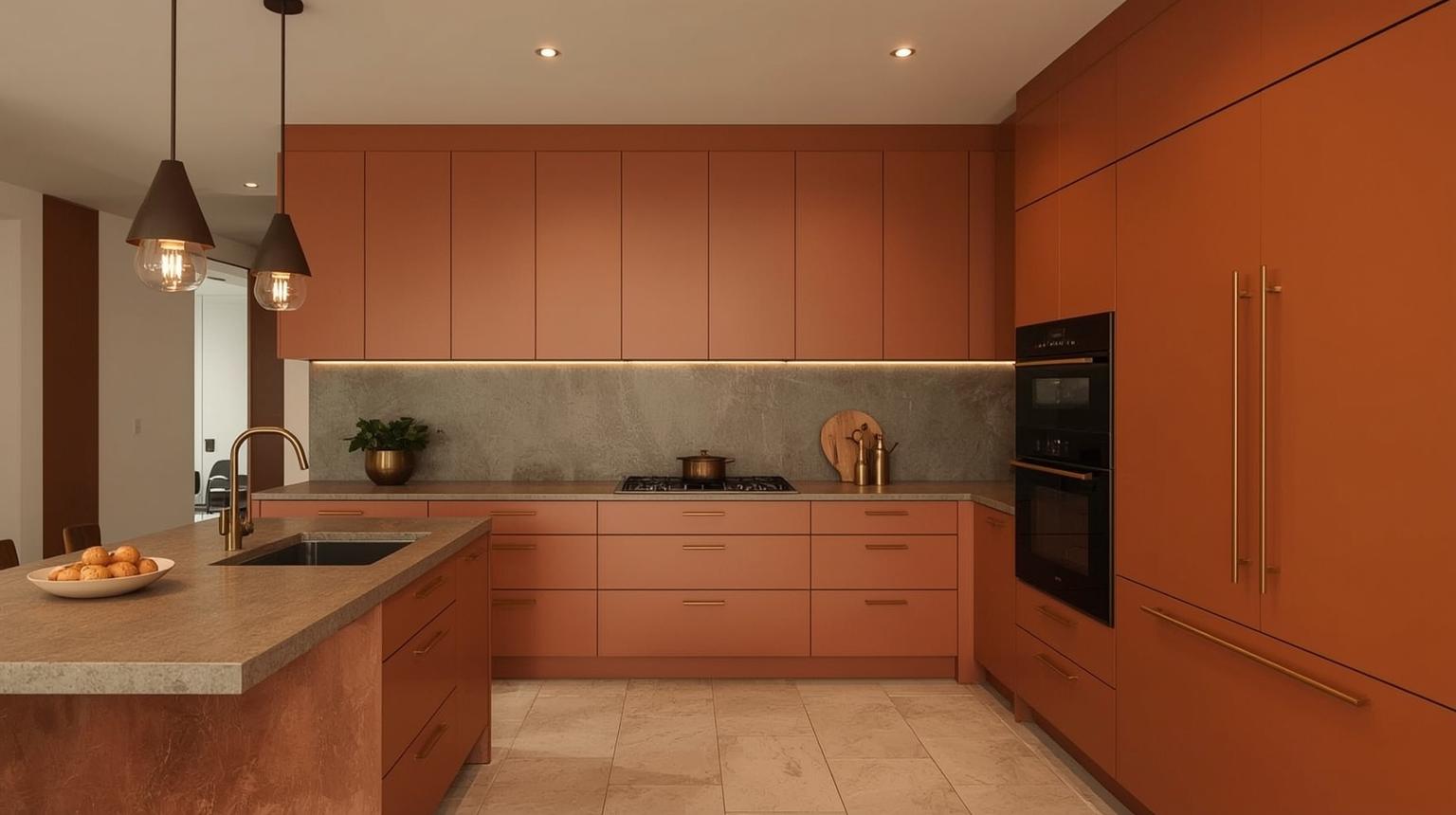
Burnt orange sits between terracotta and rust on the color spectrum — deeper than a standard orange, warmer than brown. In a kitchen, it reads grounded and intentional rather than loud. That is a large part of why it has become one of the most requested kitchen shades in recent years.
According to the 2024 Houzz U.S. Kitchen Trends Study, warm-toned cabinetry — including terracotta, rust, and amber — gained measurable ground against neutral whites and grays, reflecting a broader shift toward kitchens that feel personal and warm rather than purely minimalist. Burnt orange sits squarely in that direction.
Burnt orange kitchen cabinets work particularly well in kitchens with natural wood floors or open shelving. The depth of the color holds its ground against white marble or quartz countertops without competing for attention. Pair with brushed brass or matte black hardware — both finishes complement the warmth of the tone without feeling dated.
On lower cabinets only, burnt orange is a lower-commitment approach that still delivers the full effect of the color. Keep upper cabinets in cream, linen white, or warm gray to maintain visual balance.
The burnt orange kitchen color schemes that work best are those built around a single strong neutral. Warm white (cream or linen, not bright white) gives the color room to read clearly. Charcoal gray produces a moody, contemporary contrast. Forest green creates an earthy, organic pairing that has become increasingly popular since 2022. Navy blue provides a bolder complementary contrast for those who want the kitchen to feel genuinely dramatic.
Avoid pairing burnt orange with too many warm tones simultaneously — terracotta, rust, amber, and gold all in one space tends to feel heavy rather than rich. One warm anchor, one or two neutrals.
The burnt orange and gray kitchen combination is one of the most searched color pairings for good reason: gray cools the intensity of burnt orange without removing its character. Use a warm gray on walls or upper cabinets and burnt orange on lower cabinets or the kitchen island. Charcoal gray countertops or concrete-effect surfaces work well here, reinforcing the depth of the burnt orange rather than competing with it.
For smaller kitchens, keep the gray lighter — mid-tone grays can make a small space feel heavier than intended when combined with a deep orange.
For those who want to explore burnt orange before committing to cabinetry, decor is the lowest-risk entry point. Rust-orange pendant lights over a white or gray island, terracotta ceramics on open shelving, linen cushions in amber tones, and handmade pottery in earthy orange glazes all carry the burnt orange effect without any permanent changes. The advantage is flexibility: as your preferences evolve, individual pieces can be swapped without touching the kitchen structure.
Decor and accessories are well suited to adding orange on a seasonal or trend-driven basis. From curtains to cookware, these items introduce color and warmth in a way that can be updated without a renovation commitment.
Orange-finished open shelving adds color alongside practical storage. Use the space to display dishware or ceramics and the shelving becomes part of the visual composition rather than purely functional.
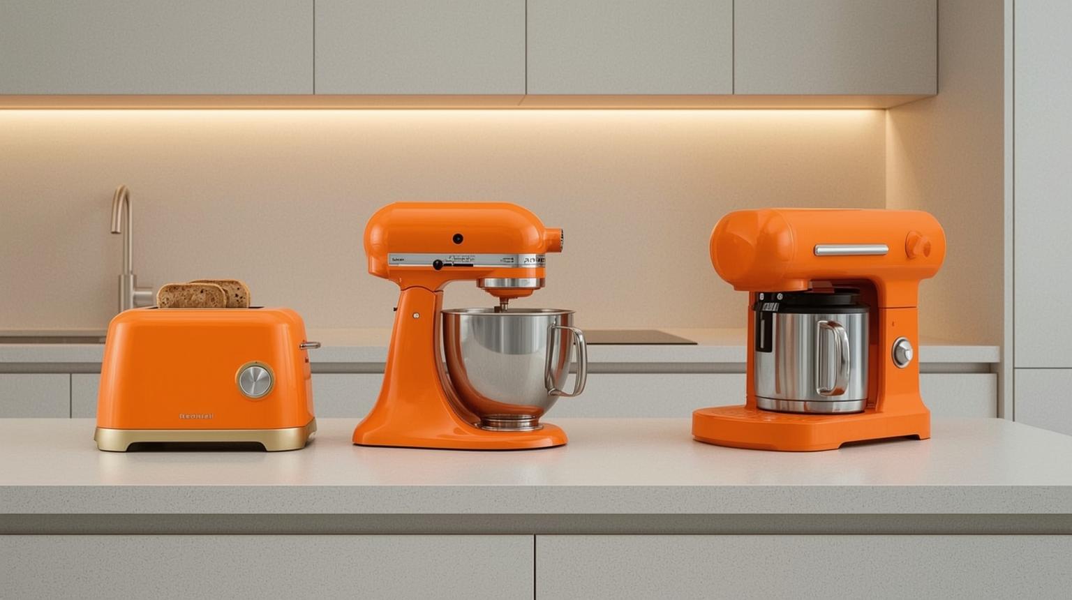
Orange small appliances — a stand mixer, a toaster, a kettle — introduce color on the countertop without any permanent changes. They can be replaced or regrouped as color preferences shift.
Rustic orange accents — vintage signs, distressed furniture, aged terracotta — add warmth and character without requiring a bold commitment. The worn quality of rustic finishes softens the intensity of the orange considerably.
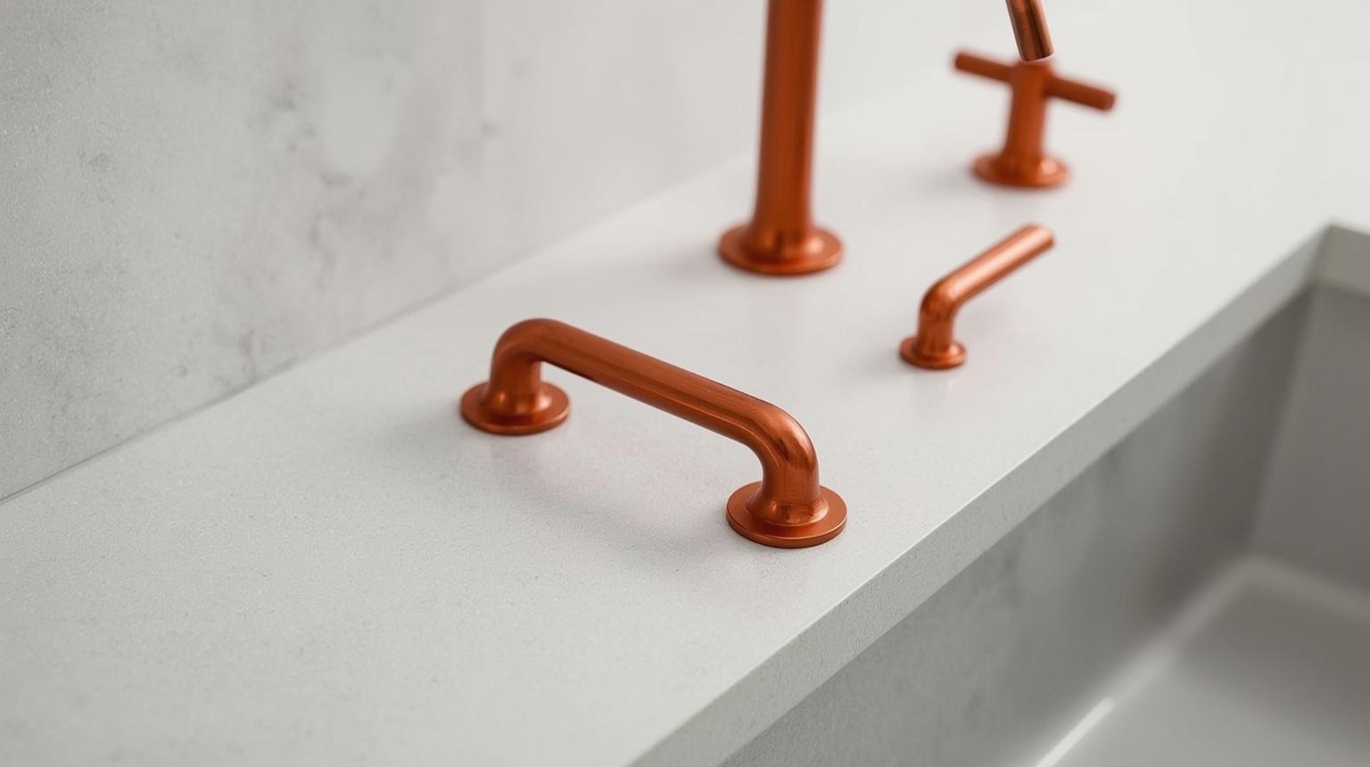
Swapping existing hardware for orange handles or knobs is one of the smallest interventions with a disproportionate impact. A run of orange knobs across plain cabinet fronts changes the character of a kitchen without touching a single surface.
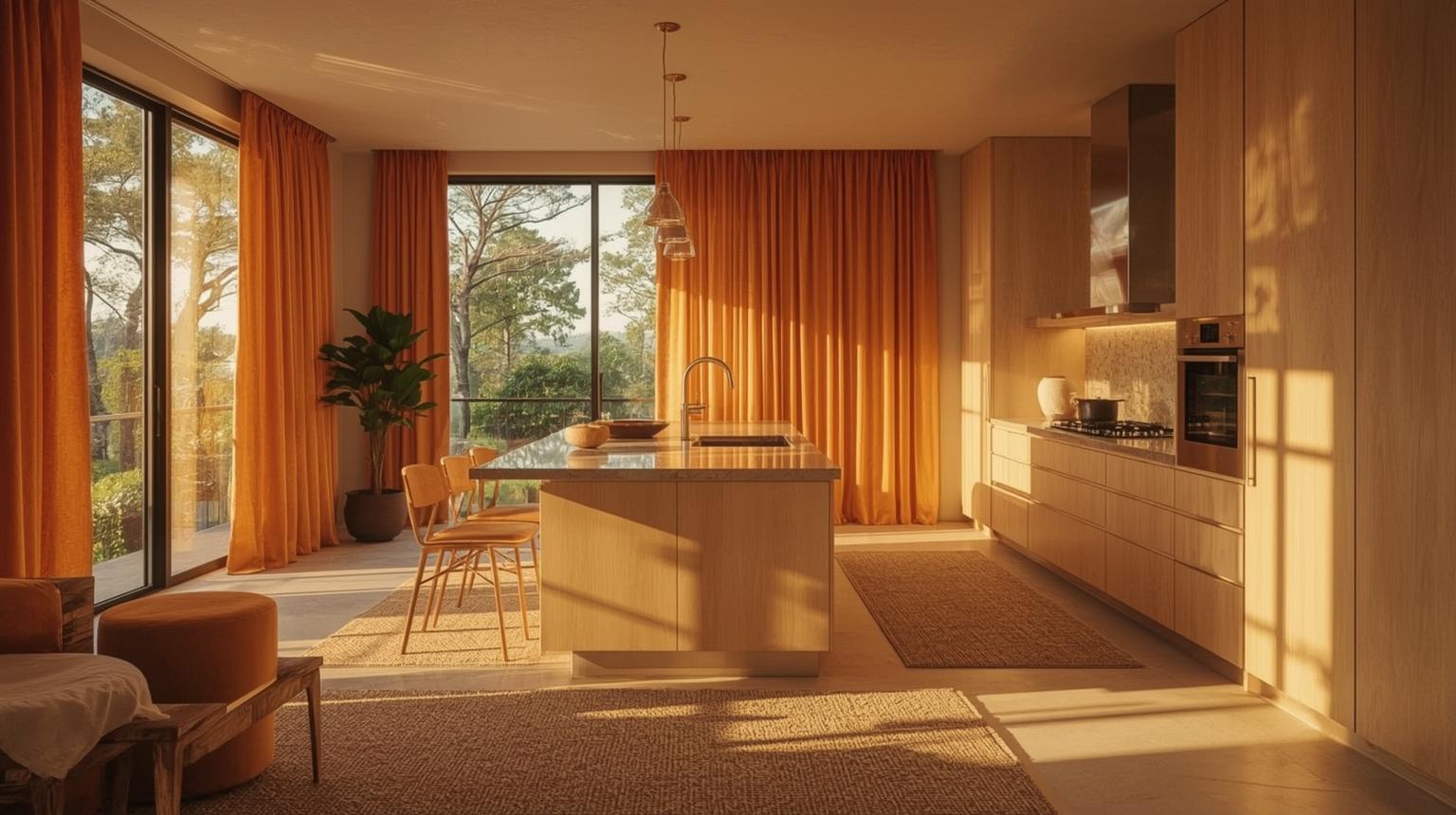
Curtains and rugs in orange tones warm up the floor and window lines and can be changed to fit changing tastes without any structural commitment.
Beyond the standard applications, unique design accents — bohemian textures, statement ceilings, subtle wallpaper — bring personality and distinction that connect the kitchen to a broader sense of personal style.
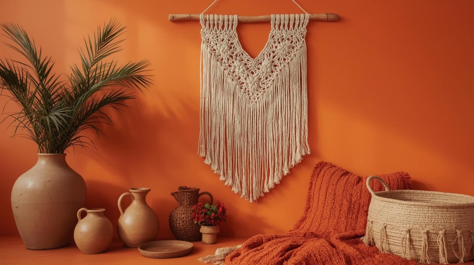
Macramé wall hangings, hand-painted orange pottery, and textiles in rust or terracotta tones give a kitchen a relaxed, artisan feel. These elements work best in kitchens that already have natural materials — wood, rattan, stone — as their base.
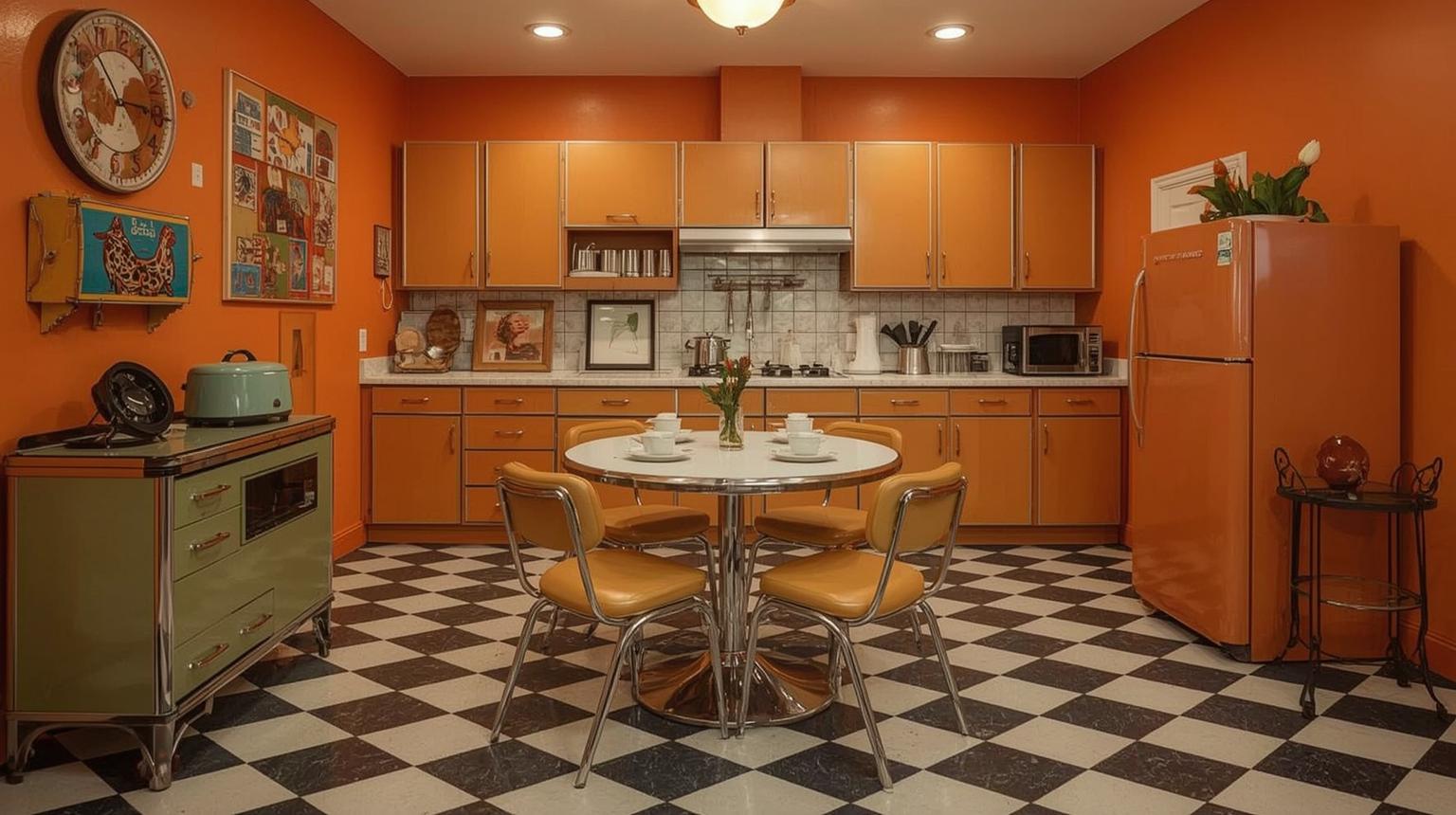
Checkerboard tile floors, bold geometric patterns, and vintage orange appliances build a retro kitchen aesthetic that is nostalgic without feeling costume-like. The key is choosing one or two strong retro elements rather than layering every reference simultaneously.
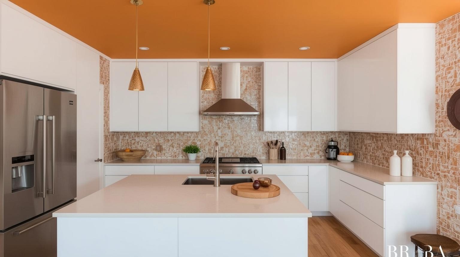
An orange ceiling is an unexpected move — most people do not look up immediately, which means the color registers gradually rather than all at once. It creates warmth and a sense of enclosure without taking up wall or floor space.
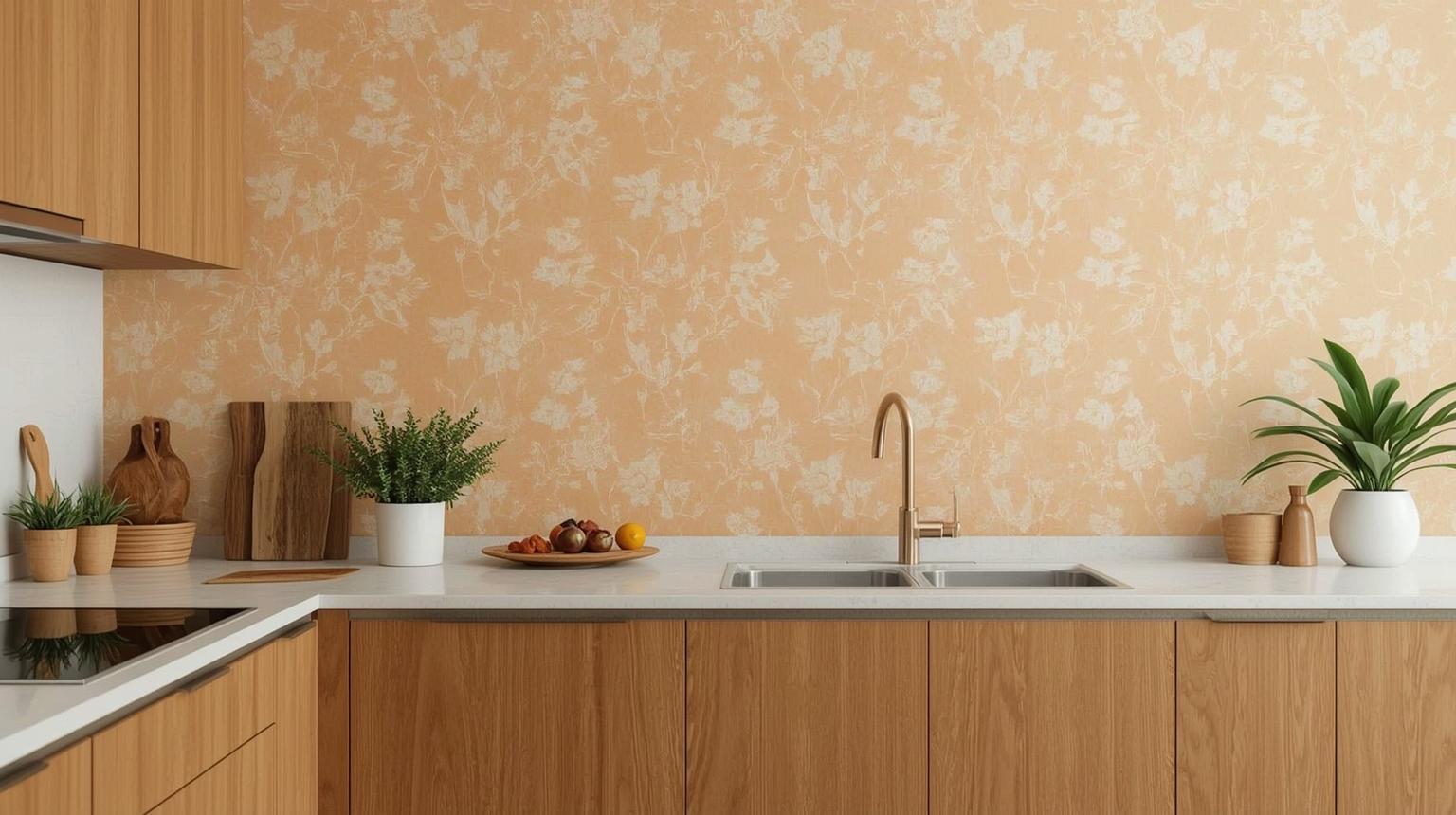
Soft floral or geometric wallpaper with orange tones adds character without intensity. It works on accent walls, in breakfast nooks, or on the ceiling — anywhere you want personality in a contained area.
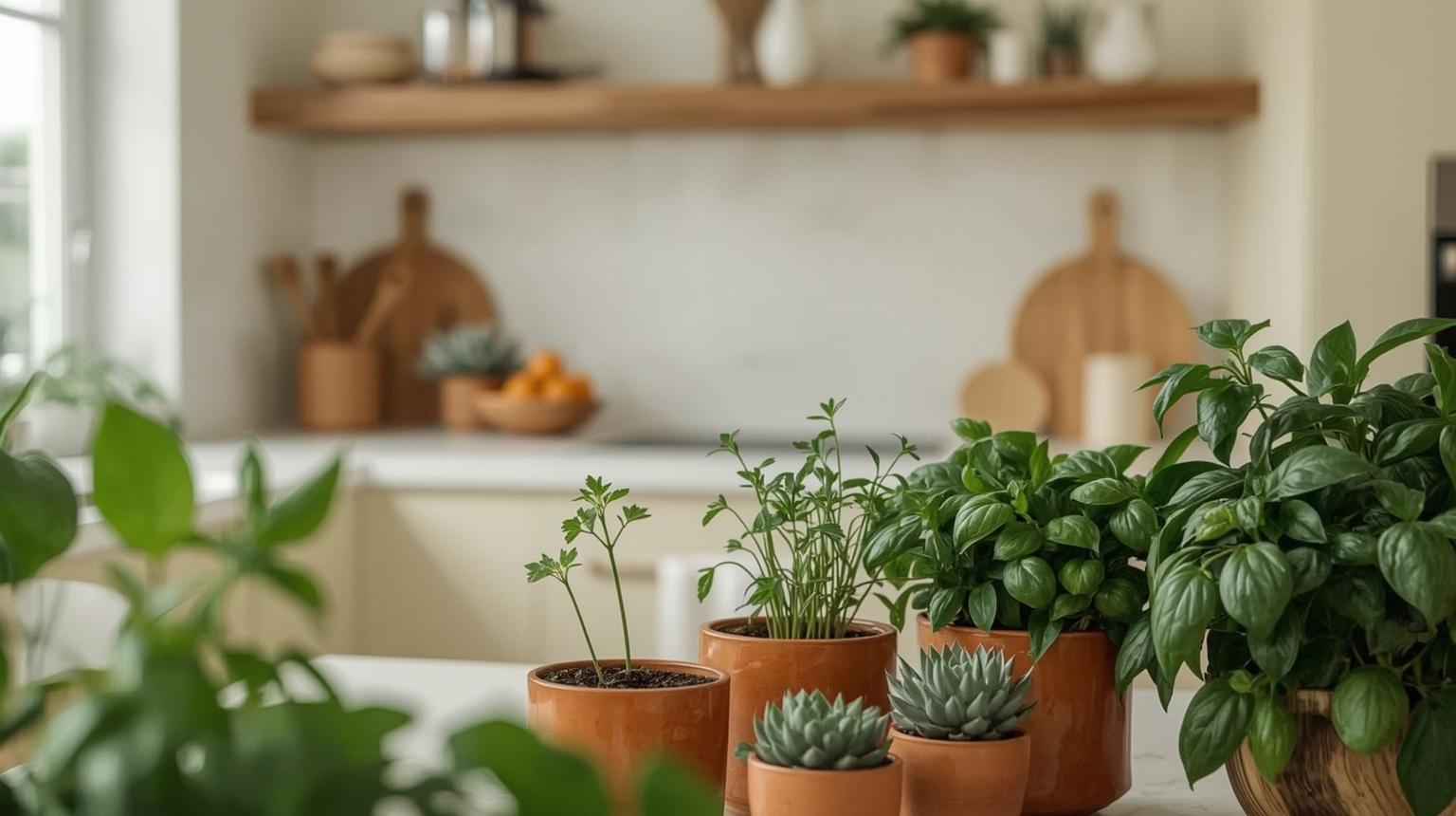
Orange-toned planters or terracotta pots paired with green plants create a color pairing that feels organic rather than designed. The green moderates the orange and prevents the combination from reading too warm.
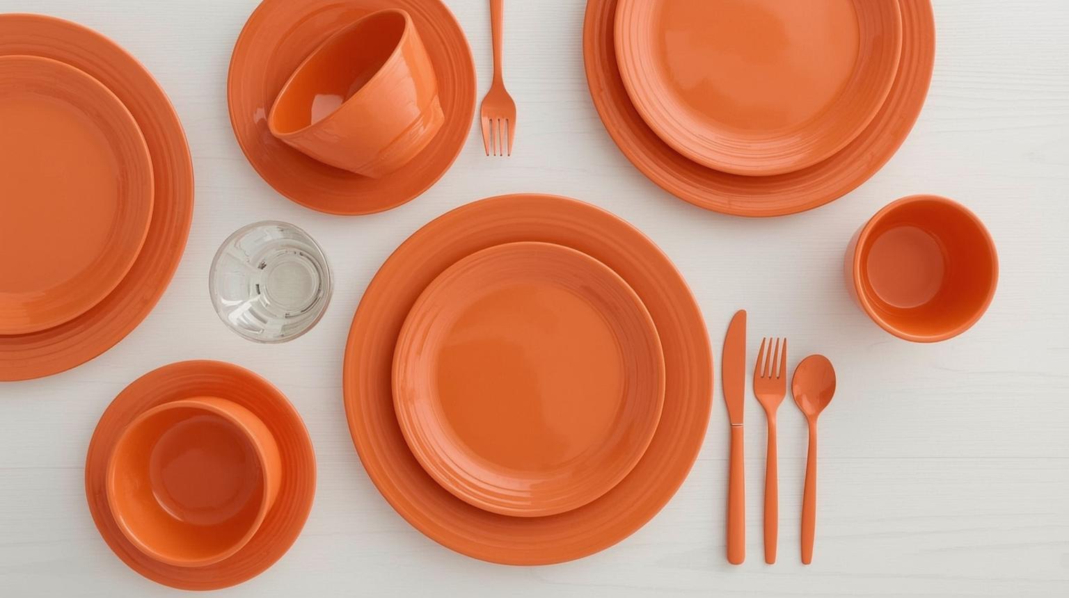
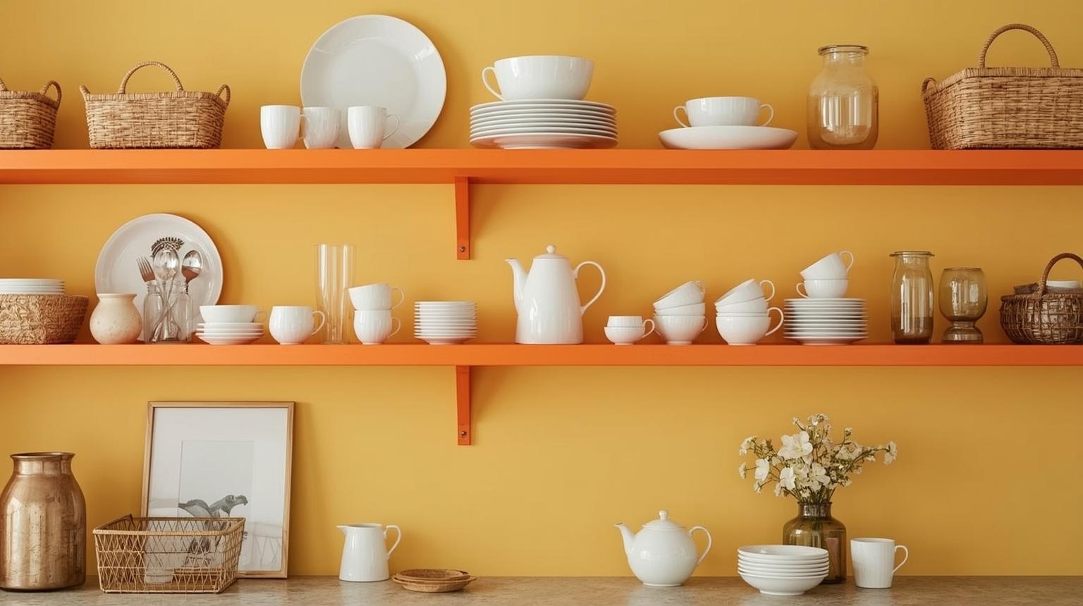
Dishware, bowls, and utensils in orange tones add cohesion to the kitchen styling without any structural change. Grouped on open shelving or displayed on a countertop, they reinforce the color direction throughout the space.
Paintit.ai combines AI-powered visualization with interior design tools to help you test orange kitchen ideas before committing to paint or cabinetry. Upload a photo of your existing kitchen, select a style direction, and experiment with orange kitchen designs — from warm burnt orange cabinets to subtle peach accent walls — in your actual space rather than a generic template.
The platform also suggests color palette pairings, decor combinations, and layout adjustments. You can test how an orange and white kitchen reads in your specific room dimensions, or compare a bright orange island against a burnt orange lower cabinet scheme — before ordering a single can of paint. Paintit.ai removes the guesswork from a decision that is otherwise hard to reverse.
From bold orange cabinets to considered burnt orange accents, orange kitchens offer more design range than most people expect when they first consider the color. The right shade, the right pairing, and the right level of commitment — cabinet versus accessory versus accent wall — make the difference between a kitchen that feels overwhelming and one that feels exactly right.
Whether you are drawn to a full burnt orange kitchen cabinet scheme or prefer starting with a rust-orange pendant light and a terracotta rug, these orange kitchen ideas cover the full range of how far you can take this color. Use Paintit.ai to visualize your chosen direction on your actual space before you commit.
Yes. Orange is well-suited to kitchens because warm hues in the orange-red range are linked to appetite stimulation and social energy in color psychology research. It makes kitchens feel genuinely inviting rather than purely functional. The key is choosing the right shade and applying it at the right scale for your room size.
Orange kitchen designs pair best with neutrals — warm white, gray, and black — to balance the color's intensity. For bolder contrast, deep navy blue or forest green creates a strong complementary look. For a burnt orange kitchen specifically, warm gray on upper cabinets and walls tends to produce the most balanced, contemporary result.
Burnt orange is a deeper, more muted shade of orange — sitting between terracotta and rust on the color spectrum. In kitchen contexts, it covers shades from deep amber and pumpkin-brown through to rust and terracotta. It reads warmer and more grounded than a bright citrus orange and works well in both contemporary and traditional kitchen styles.
The strongest pairings for a burnt orange kitchen are warm white or cream (classic and clean), charcoal gray (moody and contemporary), forest green (earthy and organic), and navy blue (bold complementary contrast). Keep one warm anchor tone and let the remaining surfaces stay neutral — too many warm tones competing in the same space tends to feel heavy rather than rich.
Yes, with the right application. In a small kitchen, avoid painting all cabinets a dark burnt orange — it will make the space feel enclosed. Instead, use orange on a single lower cabinet run, as a backsplash, or through accessories and lighting. Bright, lighter oranges like peach or apricot work better than deep burnt tones in compact kitchens with limited natural light.
For cabinets, burnt orange and rust tones are the most durable design choices — they feel considered rather than trend-driven and hold up over years better than a bright pumpkin orange. Rust orange kitchen cabinets in particular have strong search and design interest because the depth of the color reads naturally alongside wood, concrete, and metal finishes.
Orange pendant lighting, terracotta ceramics on open shelving, an orange kitchen rug, orange barstools, and orange hardware on existing cabinet fronts are all effective ways to bring the color into a kitchen without any structural commitment. These also allow you to test orange in your specific space before deciding whether to take it further.
Yulii Cherevko
CEO paintit.ai