7 min. reading

Yulii Cherevko
CEO paintit.ai
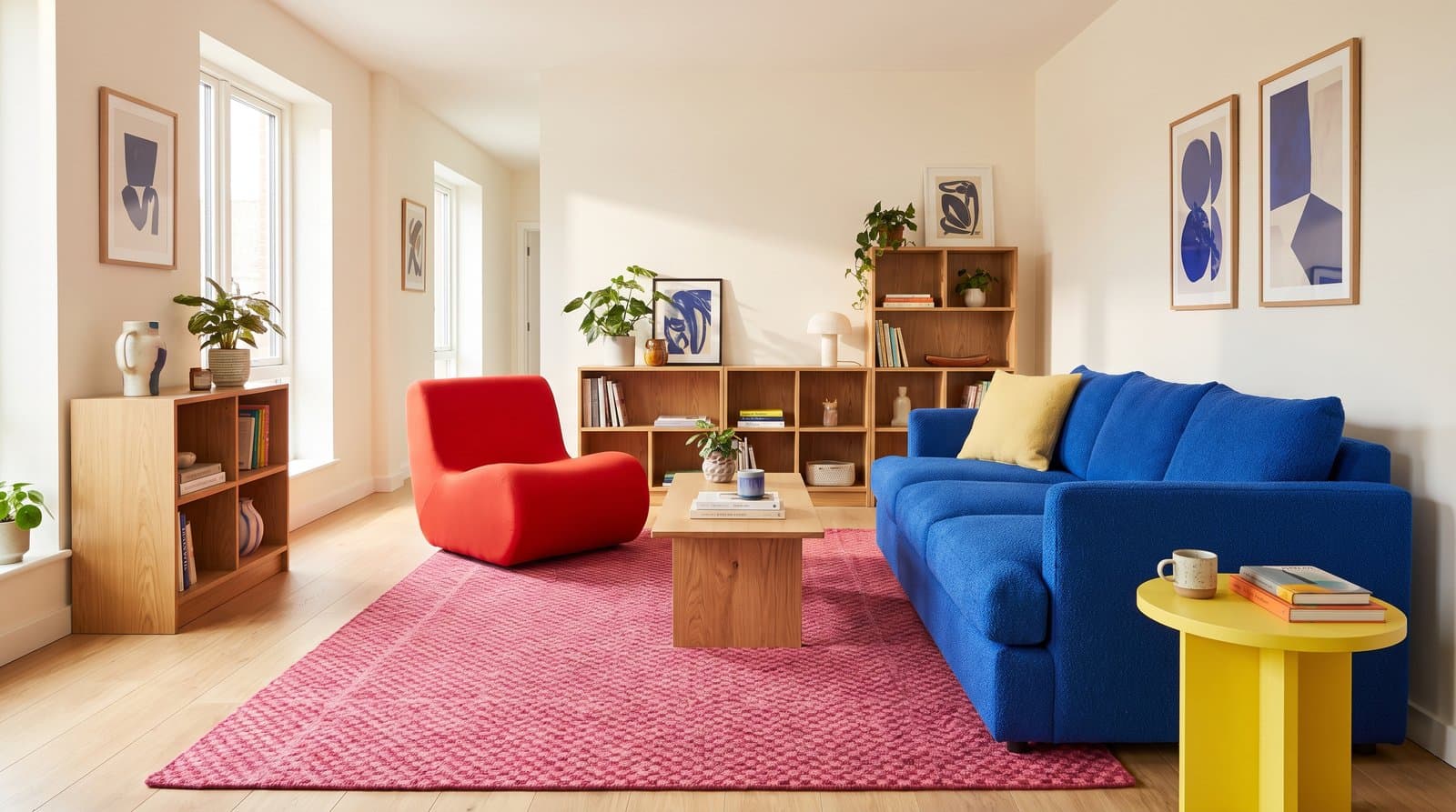
A useful dopamine decor color palette is not a random collection of the brightest shades you can find. It has a dominant color, one or two supporting colors, a sharper accent, and enough visual quiet for each choice to register. The result can be playful without making the room tiring or difficult to furnish.
The seven palettes below are practical starting points rather than fixed formulas. Each includes HEX references so you can build a digital mood board, plus guidance on where the colors could live in an actual room. HEX values describe colors on a screen; they are not exact paint matches. Always compare physical paint, fabric, tile, and wood samples in the space before buying.
This article focuses on color combinations. For the broader style, including furniture, pattern, nostalgia, and decorative objects, read our guide to the dopamine decor trend.
Start with the room, not a trend image. Photograph the space in daylight and list everything that is staying: floor color, wood tone, cabinets, stone, a sofa, or a large rug. These surfaces already occupy visual space, even if you think of them as neutral. A cool gray floor and a honey-oak floor will pull the same pink or blue in different directions.
A simple role system is more useful than forcing every room into a rigid percentage rule. The base covers the largest area. A support color appears on a substantial item such as a sofa, rug, curtains, or cabinetry. The accent creates contrast in smaller doses. The grounding finish connects the palette to wood, metal, stone, white, or another quieter material already present.
| Color Role | Good Places to Use It | What to Check |
|---|---|---|
| Base | Walls, large rug, cabinets, or the biggest upholstered piece | Does it work with the floor and look comfortable in both daylight and evening light? |
| Support | Sofa, curtains, bedding, headboard, or a broad painted zone | Is it distinct from the base without fighting it? |
| Accent | Chair, lamp, art, cushions, side table, or backsplash detail | Can you repeat it once or twice without scattering small objects everywhere? |
| Grounding Finish | Wood, warm white, deep brown, black, stone, chrome, or brass | Does it give the brighter colors a visual boundary? |
Dopamine decor is a design label, not a medical treatment, and no particular wall color produces the same emotional response in everyone. Use your own associations as the filter. A yellow linked to a favorite kitchen may feel welcoming; the same yellow may remind someone else of a workplace. Personal relevance matters more than a universal color-psychology chart.
The HEX values below are original reference palettes for digital planning. Treat them as a way to keep a mood board consistent, then match the idea to physical products rather than asking paint, velvet, ceramic, and a backlit screen to look identical.
| Palette | Core Colors | Best Starting Point |
|---|---|---|
| Pink, Tomato, and Cobalt | #E94F87, #E4472E, #275DAD, #F5F1E8 | Living room or creative studio |
| Mustard, Teal, and Coral | #D9A21B, #147D78, #F26B5B, #FFF4DC | Kitchen or dining room |
| Lavender, Mint, and Cherry | #B89AE8, #A7DCC1, #D9364B, #F7F4F8 | Bedroom or home office |
| Emerald, Sapphire, and Raspberry | #087E5B, #2454A6, #B62E67, #F2E8D8 | Dining room or snug |
| Terracotta, Ochre, and Deep Teal | #C95F42, #D4A62A, #176B6B, #F3E7D3 | Living room or entry |
| Lime, Tangerine, and Hot Pink | #A8C93A, #F47A2A, #E83E8C, #ECEDEA | Small accents or a playful workspace |
| Plum, Peach, and Turquoise | #6B356F, #F3A782, #279C9C, #F5EBDD | Bedroom, reading room, or rental |
Digital references: raspberry pink #E94F87, tomato red #E4472E, cobalt blue #275DAD, and soft white #F5F1E8.
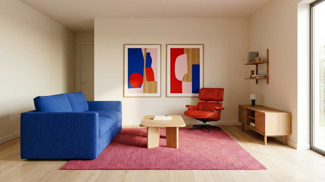
This is the clearest high-contrast palette in the group. Let soft white or pale warm gray handle the walls, then choose either cobalt or pink for the largest colored item. Tomato red works better as a decisive accent on one chair, lamp, or framed artwork than as a trail of tiny accessories.
In a living room, try a cobalt sofa, a pink rug, and one red chair against light walls and oak. If the floor has orange undertones, keep the red slightly cooler or use it farther from the floor. Chrome can sharpen the scheme; oak and off-white make it friendlier.
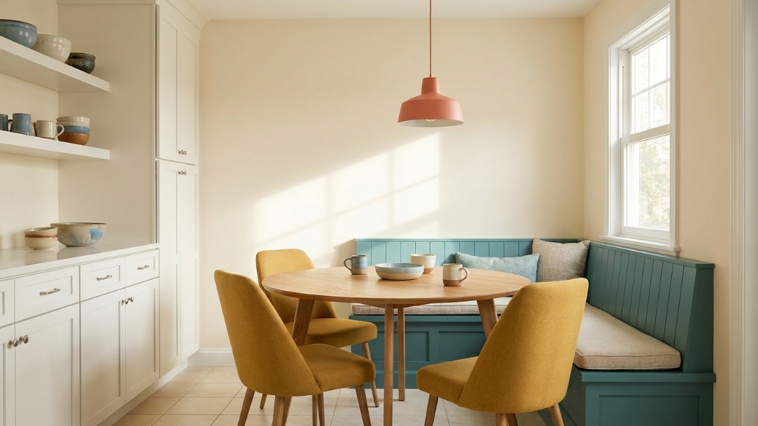
Digital references: mustard #D9A21B, teal #147D78, coral #F26B5B, and warm cream #FFF4DC.
Mustard and teal give each other enough contrast to feel lively without relying on neon saturation. Coral adds warmth between them. This combination suits kitchens and dining rooms because color can be distributed across cabinets, chairs, pendants, ceramics, and textiles instead of depending on one dramatic wall.
For an existing white kitchen, keep the cabinets and counters as the base, use teal on a freestanding cabinet or banquette, then add mustard chairs and a coral pendant or print. If the cabinets are already dark, shift teal to small objects and let warm cream occupy more of the visible area.
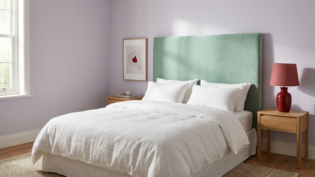
Digital references: lavender #B89AE8, mint #A7DCC1, cherry red #D9364B, and chalk white #F7F4F8.
Lavender and mint create a light base, while cherry red prevents the room from drifting into a conventional pastel scheme. In a bedroom, use lavender on walls or a headboard, mint on bedding or a small dresser, and red on one lamp, cushion, or artwork. The accent should be visible, but it does not need to be large.
Pastels are especially sensitive to light. North-facing daylight may make lavender appear grayer and mint cooler; warm evening bulbs may soften both. Test them beside the actual white trim and bedding because those surfaces affect how clean or muted the palette feels.
Digital references: emerald #087E5B, sapphire #2454A6, raspberry #B62E67, and warm ivory #F2E8D8.
This darker jewel-toned palette feels more enclosed and works well in a dining room, reading room, or snug. Pick one deep color for the broadest surface and keep the other two separate. For example, emerald walls can support sapphire dining chairs and a raspberry artwork, while ivory curtains and a warm wood table keep the room from becoming a single dark block.
Reflective finishes can help, but they need not mean gold everywhere. Clear glass, a mirror placed where it catches daylight, and a satin or eggshell paint finish can return enough light. Check paint sheen on the real wall because surface texture changes how saturated a dark color appears.
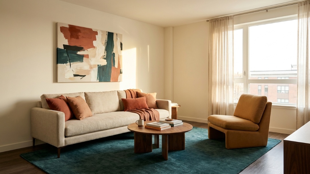
Digital references: terracotta #C95F42, ochre #D4A62A, deep teal #176B6B, and warm plaster #F3E7D3.
This is a good option when a room already contains walnut, oak, brick, leather, or woven natural materials. Terracotta and ochre echo the warm side of those finishes, while deep teal supplies the contrast. Use the teal on a sofa, cabinet, or broad textile instead of scattering it across many small decorative pieces.
A rental version can leave walls untouched: combine a deep-teal rug, terracotta cushions, one ochre chair or throw, and large warm-toned art. Keep some open wall area around the art so the palette reads as intentional color blocking rather than accumulated clutter.
Digital references: lime #A8C93A, tangerine #F47A2A, hot pink #E83E8C, and pale gray #ECEDEA.
This combination has the highest visual energy, so it benefits from a restrained application. Use pale gray or clean white as the large base and select only one bright color for a medium-size object. A lime desk chair, tangerine lamp, and hot-pink artwork may be enough for a home office. Turning all three into walls or large upholstery leaves little room for the eye to rest.
Watch how nearby greenery affects lime. A room full of plants may make the lime feel more integrated, or it may make the difference between natural and synthetic greens distracting. Compare them in one photograph before adding more.
Digital references: plum #6B356F, peach #F3A782, turquoise #279C9C, and warm ivory #F5EBDD.
Plum gives this palette weight, peach makes it warmer, and turquoise provides a cleaner point of contrast. It works in bedrooms and reading spaces where you want color without the visual speed of lime or orange. Try plum curtains or a headboard, peach bedding, and a turquoise chair against warm ivory walls.
If the room already has dark wood, keep plum away from the largest dark surface or separate them with ivory. Otherwise, two visually heavy elements can merge and make one side of the room feel denser than the other.
Choose the largest colored item after deciding whether the sofa or the walls will lead. When both are highly saturated, the floor and rug need to mediate between them. Repeat the accent color in one or two larger places, such as art and a lamp, instead of buying a collection of small matching ornaments.
Place the strongest contrast where it will not dominate the view from bed unless you know you enjoy that intensity. Colorful curtains, a headboard, art, bedding, and a bedside lamp can form a complete palette while leaving the broadest wall quieter. Comfort and sleep habits matter more than making the room resemble a trend photograph.
Count cabinets, counters, backsplash, appliances, and flooring as palette colors before adding anything. A kitchen that appears neutral may already contain several whites and grays with different undertones. Add one new color at a time and check it beside every fixed finish, not just against a separate sample card.
Use fewer, larger color moments. One rug, one chair, and one substantial print usually produce a clearer palette than ten small accessories. Removable textiles and portable lighting also let you carry the scheme to another home without leaving behind a complicated repainting job.
Paint brands also publish their own trend palettes, which can be useful for seeing how a broad idea is translated into purchasable colors. For one current example, compare the combinations in Behr's Dopamine Daze palette. Use it as a reference, then judge every sample against your room's fixed finishes and light.
When every surface competes, there is no focal point. Choose one color to carry the largest visible area, another to support it, and reserve the sharpest contrast for a smaller element.
A palette never enters an empty room. Flooring, wood, stone, metal, and upholstery affect the result. Add their approximate colors to the mood board before evaluating any new combination.
Exact repetition can make a room look assembled from one catalog. Repeat color families rather than demanding a perfect match across paint, fabric, ceramic, and art. A slightly darker teal or softer coral can add depth while keeping the relationship clear.
A render helps with placement and overall balance, but it cannot reproduce every pigment, finish, monitor setting, or light source. Use digital previews to narrow the options, then make the final choice from physical samples in the room.
There is no required list. Common combinations use saturated pink, red, orange, yellow, green, blue, or purple alongside warm white, wood, gray, or another grounding finish. The defining choice is personal, deliberate color rather than one universal shade.
Three active colors plus one or two quieter finishes are enough for most rooms. A base, support, accent, and grounding material create a clear hierarchy. More colors can work, but they need repeated relationships through art, textiles, or pattern rather than isolated appearances.
Yes. Lavender, mint, peach, sky blue, and pink can feel playful without being highly saturated. Add one deeper or sharper accent so the scheme has contrast, and test pale colors against the room's trim because neighboring whites can change how they appear.
No. A neutral wall can support a strong sofa, rug, curtains, art, and lighting. This approach is especially practical for rentals, open-plan spaces, or anyone who wants to change the palette seasonally.
Start with colors you already associate with comfort. A lighter base with one deeper support color and one small high-contrast accent is easier to live with than three equally intense surfaces. Lavender, mint, and cherry red or plum, peach, and turquoise are two workable starting points from this guide.
No. HEX codes identify digital screen colors, while paint appearance depends on pigment, sheen, surface, surrounding colors, daylight, lamps, and application. Use HEX references to organize a digital palette, then select the actual paint from physical samples.
Pick the combination that works with what you already own, then decide where each color belongs. Keep the broadest surface stable, make one support color substantial enough to matter, and use the sharpest accent with restraint. A convincing dopamine decor palette feels personal and energetic, but it still respects the room's light, function, and fixed materials.