
Art gallery interior design ideas: lighting, walls, and visitor flow
An art gallery's design has one job: make the art the only thing people notice. Every decision - wall color, lighting angle, floor material, visitor path - either supports that goal or competes with it.
This guide covers the practical design decisions that make or break a gallery space: from display height standards and lighting beam angles to wall color choices and visitor circulation types.
Upload a photo of your space to Paintit.ai and see a gallery redesign concept in 1-2 minutes - free to start at app.paintit.ai.
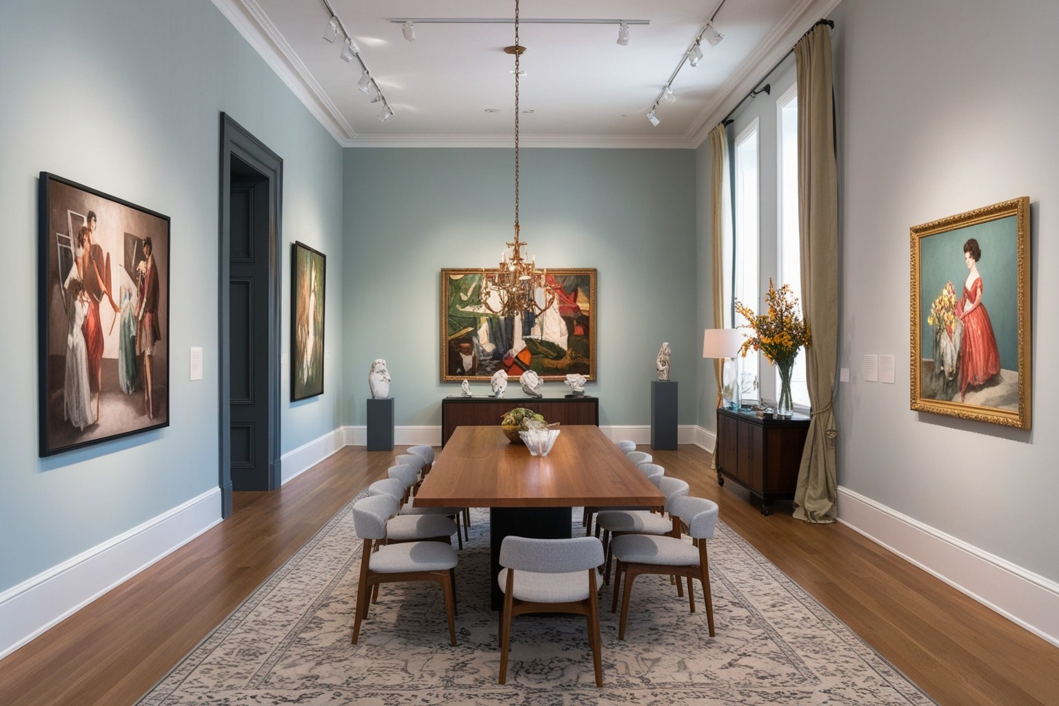
Key design decisions for an art gallery
Every design element in a gallery either draws attention to the art or pulls attention away from it. Here are the decisions that matter most.
-
Wall color
White and off-white remain the standard for most galleries because they reflect light evenly and don't compete with artwork. The practical choice: warm white for paintings with warm palettes; cool grey for photography and mixed-media work. Accent walls work when the art is bold enough to hold its own against a strong background. For small or detailed pieces, neutral walls are the safest option. Avoid glossy wall finishes because gloss reflects light and creates glare on artwork surfaces.
-
Flooring and surfaces
Polished concrete and hardwood are the most common gallery floor choices. Both are durable, easy to clean, and visually recede so the eye moves to the walls. Light floors reflect daylight upward; dark floors absorb it and make the space feel more intimate. Avoid patterned flooring in exhibition areas because it competes with wall-hung work.
-
Furniture and seating
Seating in a gallery serves one purpose: to let visitors pause and look longer. Benches without backs work well because they do not block sightlines and accommodate different body types. One bench per 10-12 linear meters of wall is a practical starting point. Sculptures and installations on plinths need at least 90 cm of walking clearance on all sides.
-
Lighting
Gallery lighting has two jobs: reveal the art and set the room's atmosphere. Track lighting is commonly aimed 30 degrees from vertical to reduce glare and reveal texture. Use 200-500 lux for most paintings and prints, and 50-150 lux for photosensitive works such as watercolors, textiles, and photographs. UV-filtered LED fixtures and adjustable track heads are practical standards for rotating exhibitions.
Stunning Examples of Essential Art Gallery Interior Design Ideas
-
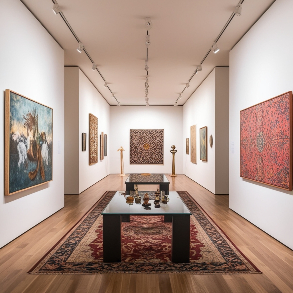
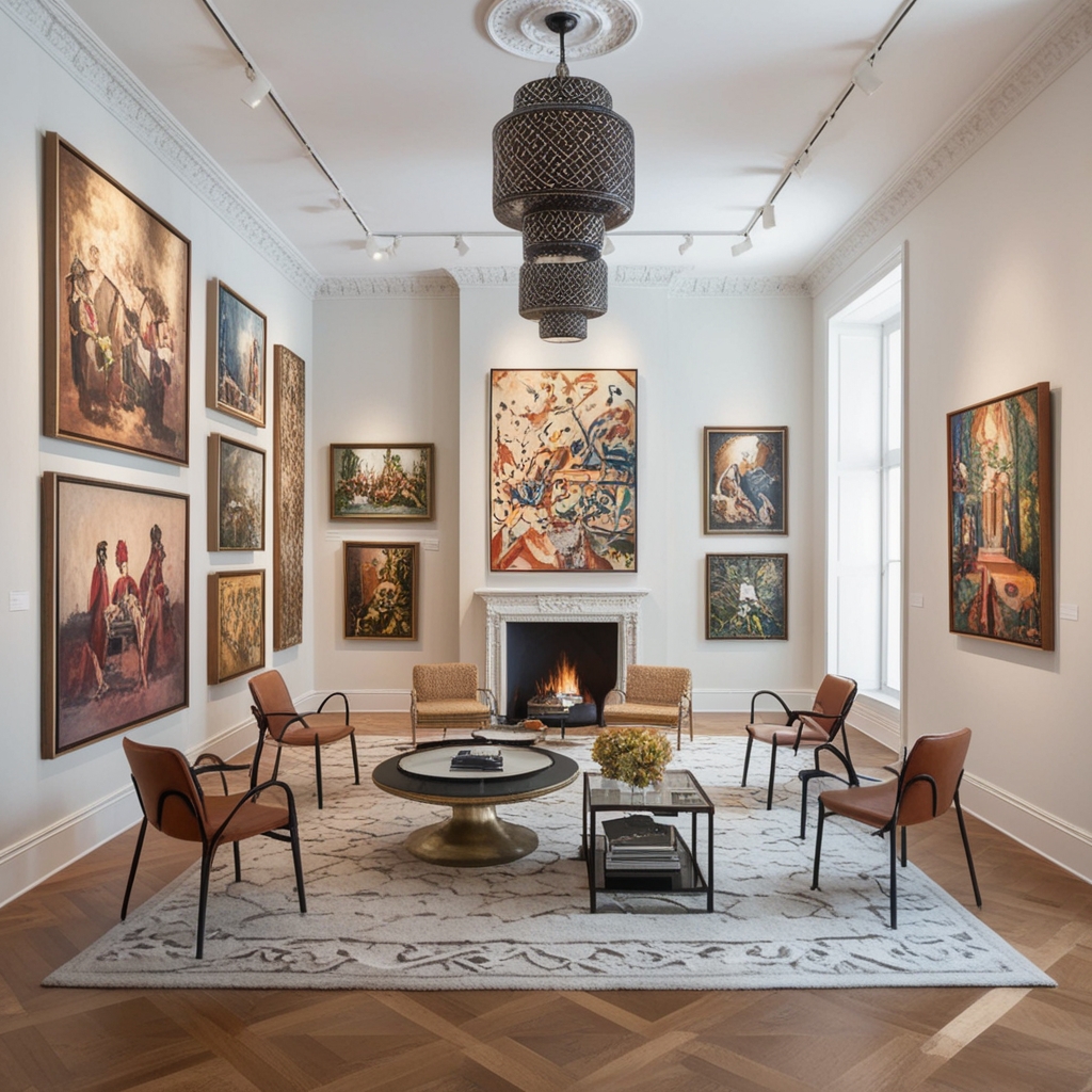
These examples show how specific decisions - wall color, lighting placement, display height, and visitor circulation - work together in real gallery spaces. The goal is not aesthetic variety for its own sake: every element is in service of how the art reads on the wall.
Ready to visualize a gallery concept? Upload a photo to Paintit.ai and see a redesigned render in 1-2 minutes. -
Spatial Layout
-
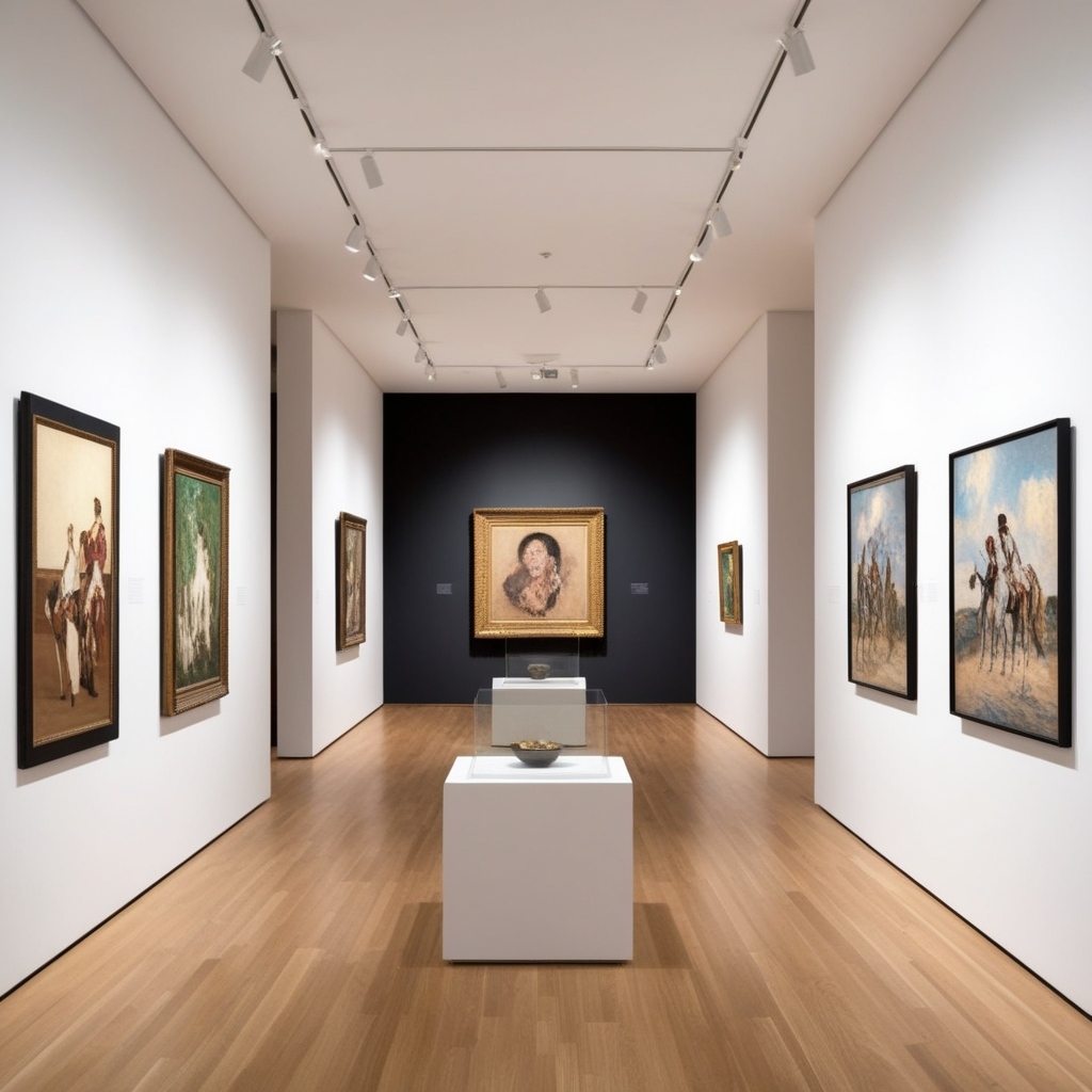
Art gallery interior design demands careful attention to spatial layout as a fundamental component. The exhibition layout needs to appear as a natural progression where visitors can transition smoothly between displays. Art venues must allocate sufficient spatial dimensions to enable viewers to examine artworks from diverse angles which allows them to detect hidden details and nuanced elements that would remain unnoticed. The necessity of proper lighting emerges as a dual function to both present artwork and create spatial atmosphere which directs viewers through the gallery on a curated exploration.
-
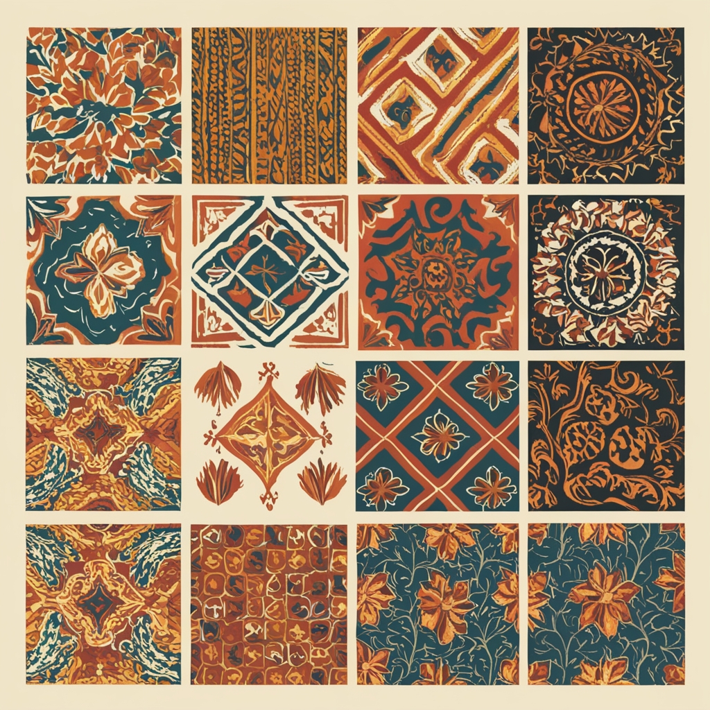
Patterns and Motifs
-
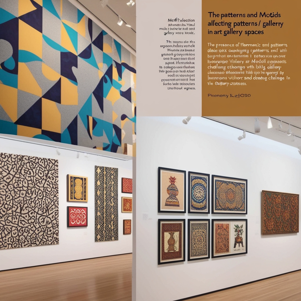
The arrangement of patterns and motifs within an art gallery space exerts powerful control over visitor mood and attention. Thematic patterns create subtle harmony but bold concepts challenge visitors to engage deeply with art. The selection of motifs needs to align with the gallery's thematic focus while simultaneously resonating with the stories presented by its exhibits. The elements function to build a unified visual identity for the gallery space which ensures that the surrounding environment harmonizes with the displayed artwork.
-
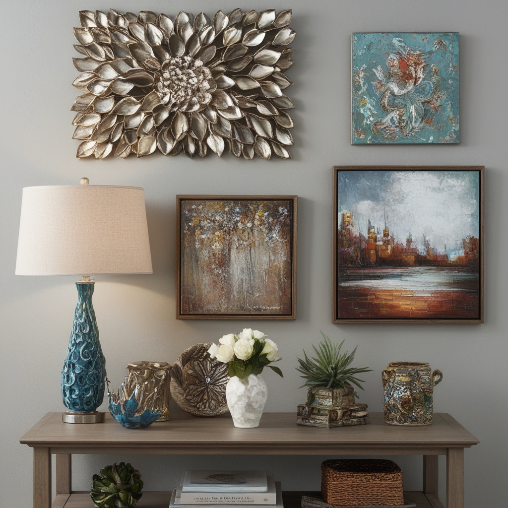
Art and Accessories
-
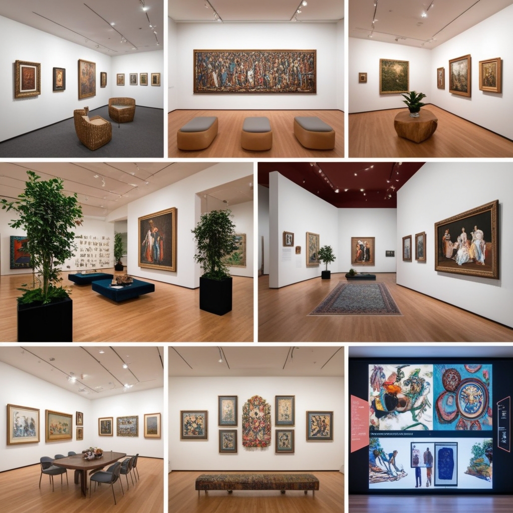
Paintit.ai's Commercial Spaces direction lets you visualize how different wall colors, lighting setups, and floor materials read in your actual space before any renovation work begins. Upload a photo of the room, choose a gallery direction, and see the result in 1-2 minutes.
Visitor circulation and display height
-
Two decisions that most gallery guides skip, and both are critical.
-
Display height
The industry standard is to hang artwork so the center of the piece sits at 145-152 cm from the floor (57-60 inches). This aligns with average eye level and works across most viewer heights. For children's galleries or low-ceiling spaces, drop to 130-135 cm. For large-scale works, the center can go higher, but the bottom edge should stay above 100 cm to avoid crowding.
-
Visitor circulation types
Compulsory flow sends visitors through a set path, free circulation lets visitors move in any direction, and differentiated circulation combines directed zones with free-roam areas. Choose the pattern before placing walls, plinths, benches, or signage.
-
Spacing between works
Minimum 40-50 cm between frames on the same wall. Closer than this and the eye starts grouping pieces together, which can undermine individual impact. Large-scale works often need 80-100 cm of space so each piece can breathe.
Design your gallery space with AI
Tools for gallery concepts, room uploads, client renders, and commercial design planning.
FAQ
-
White and warm off-white are the practical defaults for most galleries. They reflect light evenly, do not compete with artwork, and work across styles and media. Cool white or pale grey suits photography and digital art. Bold accent walls work for large-scale paintings that can hold their own against a strong background. Avoid glossy wall finishes anywhere artwork is displayed because they create glare.
-
The center of the artwork should sit at 145-152 cm from the floor (57-60 inches). This matches average eye level and is the baseline used by many professional galleries and museums. For large-scale works viewed from distance, the center can go slightly higher, but the bottom edge should remain above 100 cm.
-
30 degrees from vertical is the standard recommendation. This angle minimizes glare on flat artwork surfaces and provides enough directional control to reveal texture and detail. Adjustable track heads are preferred over fixed fixtures because exhibition positions change and the lighting needs to follow.
-
Yes. Upload a photo of your gallery space to app.paintit.ai, select a Commercial Spaces direction, and see a redesigned concept in 1-2 minutes. Useful for testing wall colors, material combinations, and layout approaches before committing to any renovation.