10 min. reading

Yulii Cherevko
CEO paintit.ai
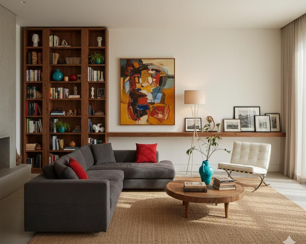
Asymmetrical balance in interior design means arranging different objects so the room still feels visually steady. A sofa does not need an identical chair on each side. One large chair, a floor lamp, and a side table can balance the sofa when their combined size, color, texture, and position carry similar visual weight.
Key takeaways
Asymmetrical balance is an arrangement in which the two sides of a room are different but feel equally weighted. Instead of mirroring the same furniture or decor, it balances a large object against several smaller ones, a dark surface against a lighter grouping, or a tall element against a wider, lower piece.
| Design decision | Symmetrical balance | Asymmetrical balance |
|---|---|---|
| Furniture | Two matching chairs face or flank a sofa | One substantial chair balances a lamp and smaller seat |
| Bedside setup | Matching nightstands and lamps | A desk on one side and a narrow shelf on the other |
| Wall decor | Two equal pictures centered on an axis | One large artwork balances a cluster of smaller frames |
| Overall effect | Orderly and formal | Relaxed and varied, while still intentional |
The University of Florida's guidance on design principles explains that a small, dark visual can carry as much weight as a larger, lighter one. The same practical idea helps with interiors: judge how strongly each object attracts the eye, not only its physical dimensions.
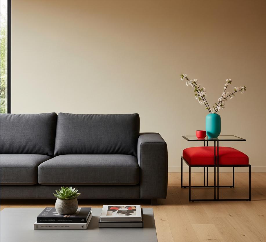
Color is perhaps the most potent tool for manipulating visual weight. The psychological response to color is immediate, and understanding its "gravity" is essential for rooms with asymmetrical balance.
Value Contrast: Dark elements generally carry more visual weight than light elements. A charcoal gray sofa anchors a asymmetrical living room significantly more than a cream sofa of identical dimensions. This is often attributed to the "grounding" effect of darkness, reminiscent of earth or shadow.
Thermal Dynamics: Warm colors (reds, oranges, yellow) "advance" toward the viewer, while cool colors (blues, greens) recede. This advancing quality creates perceived heaviness. A small red cushion may visually counterbalance a large beige wall expanse because the red occupies more cognitive bandwidth.
Saturation: Highly saturated colors demand more attention than muted tones. A single bright turquoise vase can balance a large stack of leather-bound books in muted browns.
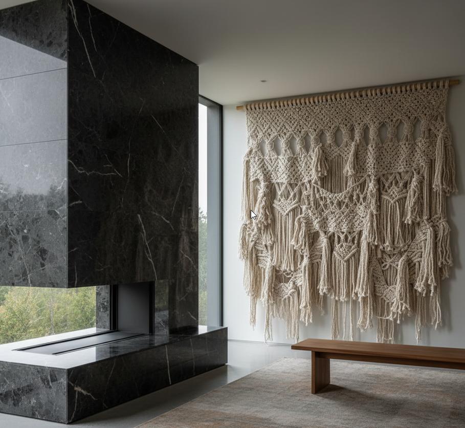
Texture introduces complexity, and complexity increases visual weight. A smooth, glass surface is visually "light" because the eye slides over it without resistance. Conversely, a coarse boucle fabric, a rough-hewn stone surface, or a reclaimed wood wall traps the eye.
This "tactile invitation" creates a physicality that purely visual elements lack. In asymmetrical interior design, a designer might balance a sleek, architectural fireplace (smooth, cold) with a chunky wool wall hanging (rough, warm). The volume of the fireplace is balanced by the textural density of the wool.
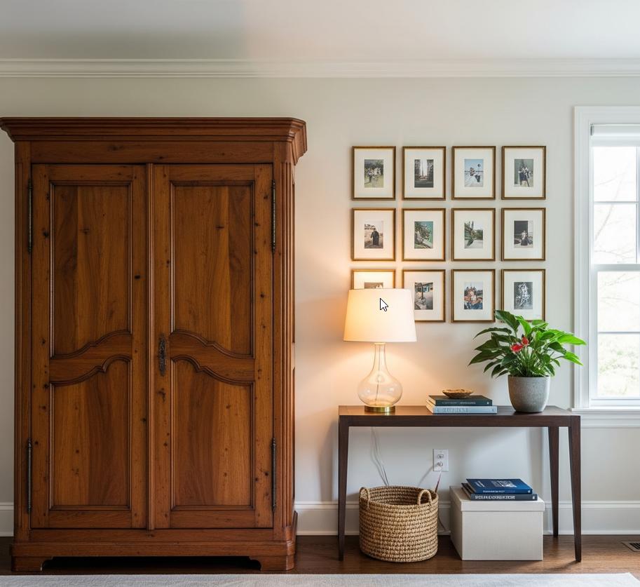
Several small objects can balance one large object if they read as a group. For example, a chair, floor lamp, and framed print can offset a tall cabinet. Keep the smaller pieces close enough that the eye reads them as one composition.
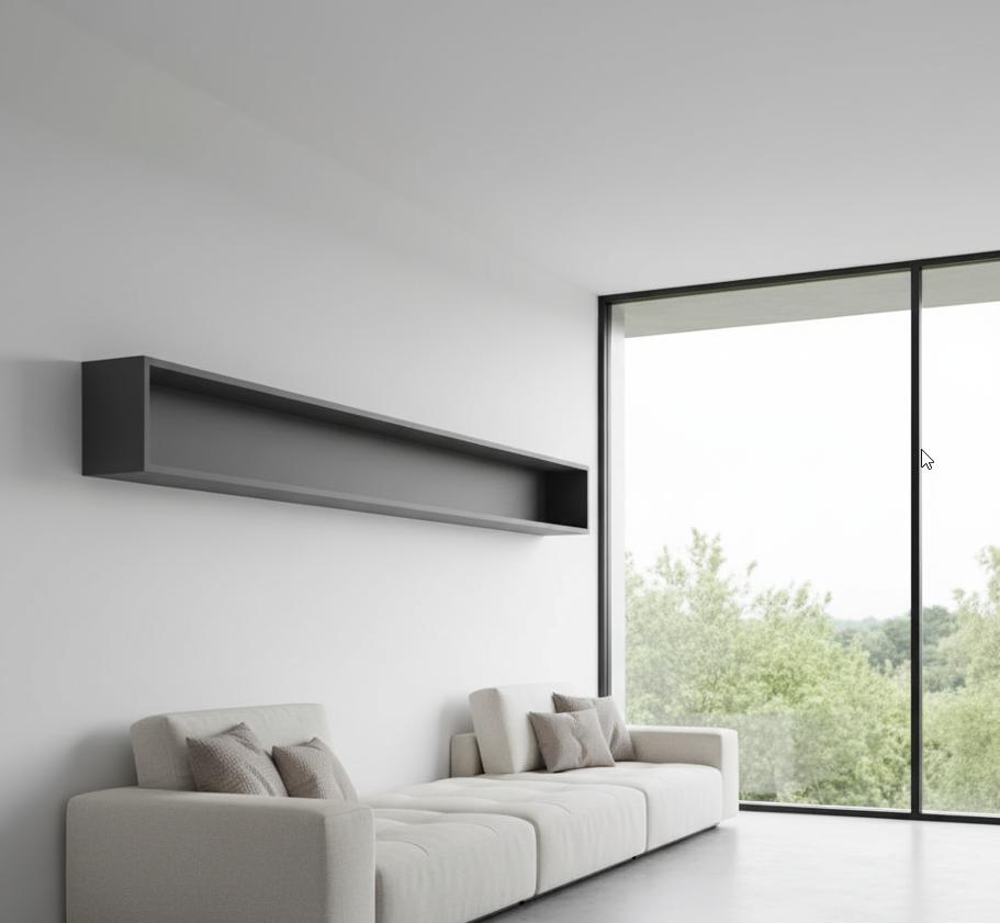
An isolated object attracts more attention than the same object inside a busy group. Position also matters: a tall item near the edge of a wall can make that side feel heavier. Before adding decor, move the existing pieces closer to or farther from the room's focal point.
Photograph the room from its main entrance. For each side of the image, note the objects that are large, dark, saturated, strongly textured, or isolated. If most of those qualities appear on one side, redistribute an existing piece before buying anything new. This is a practical comparison, not a mathematical formula.
The success of asymmetrical balance in interior design examples is not merely aesthetic; it is rooted in the neurobiology of perception. The human brain is wired to seek patterns, a phenomenon central to Gestalt psychology.
When presented with a symmetrical room, the brain instantly recognizes the pattern (mirroring). The processing load is low, resulting in a feeling of calm. However, asymmetrical balance in a room presents a puzzle. The pattern is not immediately obvious. The brain must scan the environment to understand the relationship between disparate elements.
This active scanning creates a state of "cognitive engagement." The viewer is not a passive recipient of the design but an active participant in resolving the visual equilibrium. This is why asymmetrical interior design feels dynamic and memorable.
There is a "Goldilocks" zone of complexity in design. Too much symmetry is boring (under-stimulating); too much asymmetry is chaotic (over-stimulating). The most successful interiors inhabit the middle ground. This state provides enough novelty to trigger dopamine release (rewarding curiosity) without triggering cortisol release (stress from chaos).
While Western tradition has often favored hierarchy and order, Eastern traditions have long embraced asymmetry.
Fukinsei: One of the principles of Zen aesthetics, referring specifically to the beauty of irregularity.
Ma (Negative Space): In asymmetrical interior design, empty space is not a void to be filled; it is an active object. The distance between a chair and a window is as designed as the chair itself.
Wabi-Sabi: This philosophy accepts transience and imperfection, rejecting "showroom" perfection in favor of authenticity-a chipped ceramic bowl placed off-center is the epitome of this style.
These asymmetrical home design examples solve common problems: an L-shaped sofa, an off-center fireplace, uneven space beside a bed, irregular windows, and open shelving that feels heavier on one side.
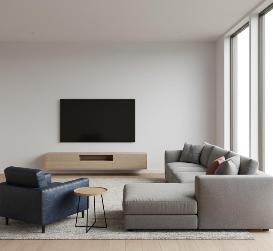
An L-shaped sectional already puts more mass on one side of a living room. Place one substantial chair near the open end, then add a floor lamp or side table if the chair alone feels too light. Keep a clear walking route between the seats.
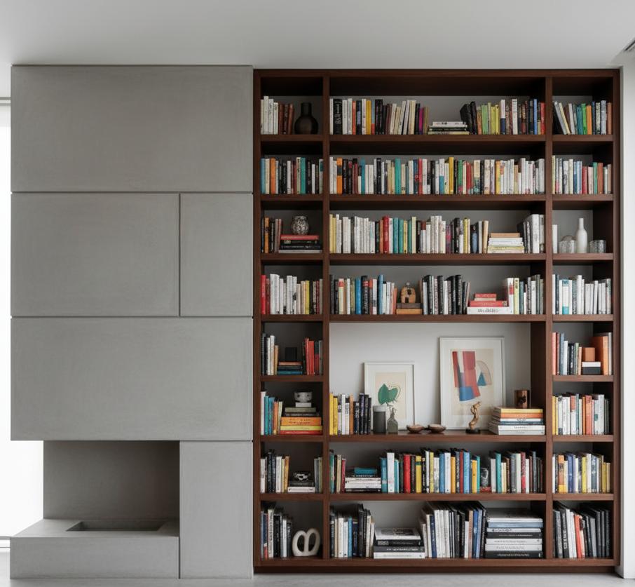
Do not force symmetry around a fireplace that sits close to one corner. A low credenza, bookcase, or group of framed art can fill the larger wall area without copying the fireplace. Align one edge or repeat a material to connect both sides.
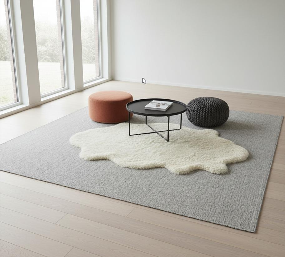
In an open-plan room, center the rug under the seating group rather than under the entire room. At least the front legs of the main seats should connect with the rug. This makes an off-center conversation area look deliberate.
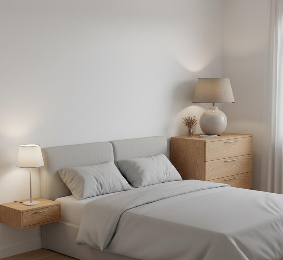
When a bed cannot sit in the middle of the wall, use a slim shelf on the tight side and a chest or small desk on the open side. Repeat the same wood tone or hardware finish so the pieces look chosen together.
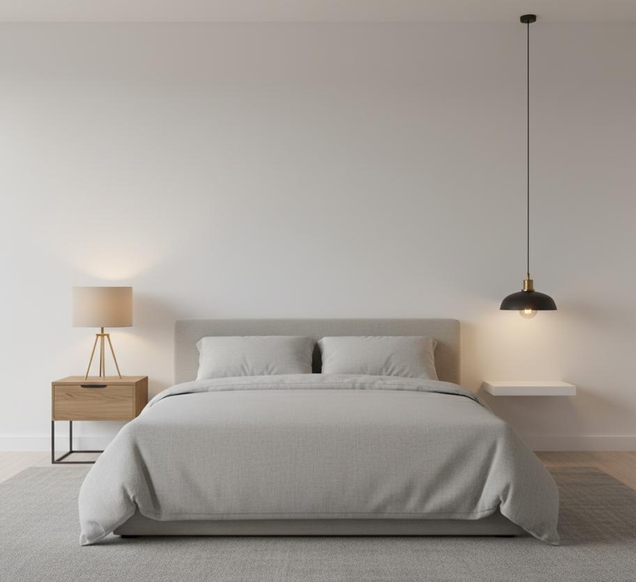
A low pendant can replace a table lamp on one side of the bed and free the surface below. Keep the light sources at a similar practical height and repeat the metal finish, shade color, or bulb temperature.
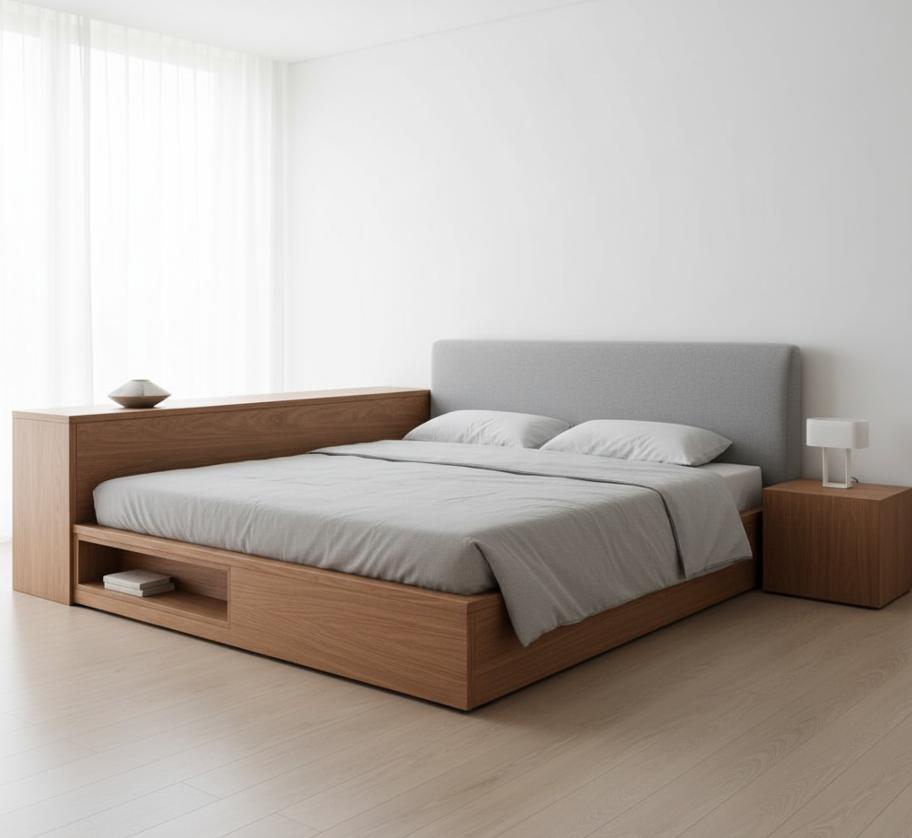
An extended headboard can connect the bed with a desk, shelf, or nightstand on one side. This works especially well when a door or window prevents a centered arrangement. Keep the extension functional so it does not look like an arbitrary panel.
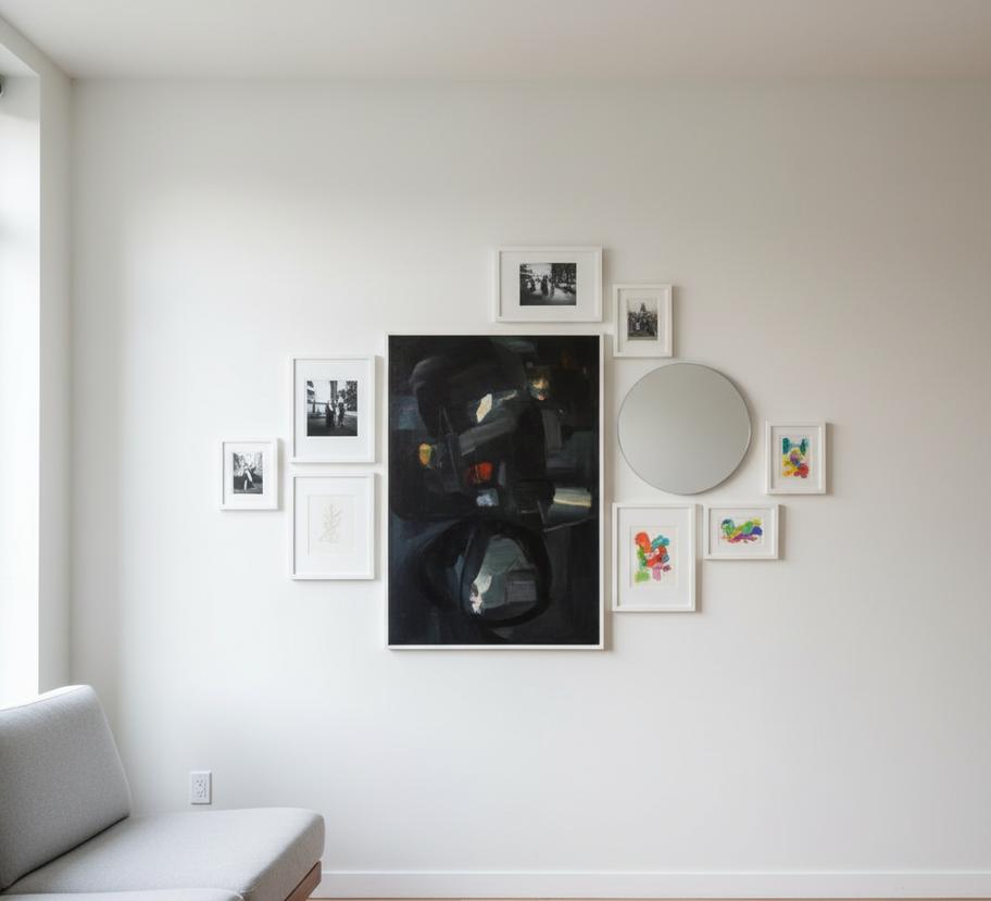
Start with the largest artwork slightly off center. Add smaller frames around it while keeping the gaps reasonably consistent. Lay the arrangement on the floor first and check its overall outline before making holes in the wall.
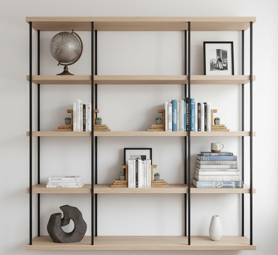
Place a heavier group of books on one side of a shelf, then move the next dense group to the opposite side below. Leave some sections open. The shelves should not repeat perfectly, but one side should not hold every dark or bulky object.
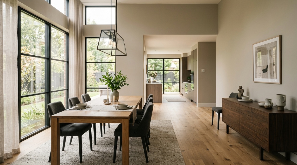
A dining table does not have to follow the geometric center of an irregular room. Center it within the usable circulation area instead. A pendant over the table and a sideboard on the wider wall can make the shifted layout feel anchored.
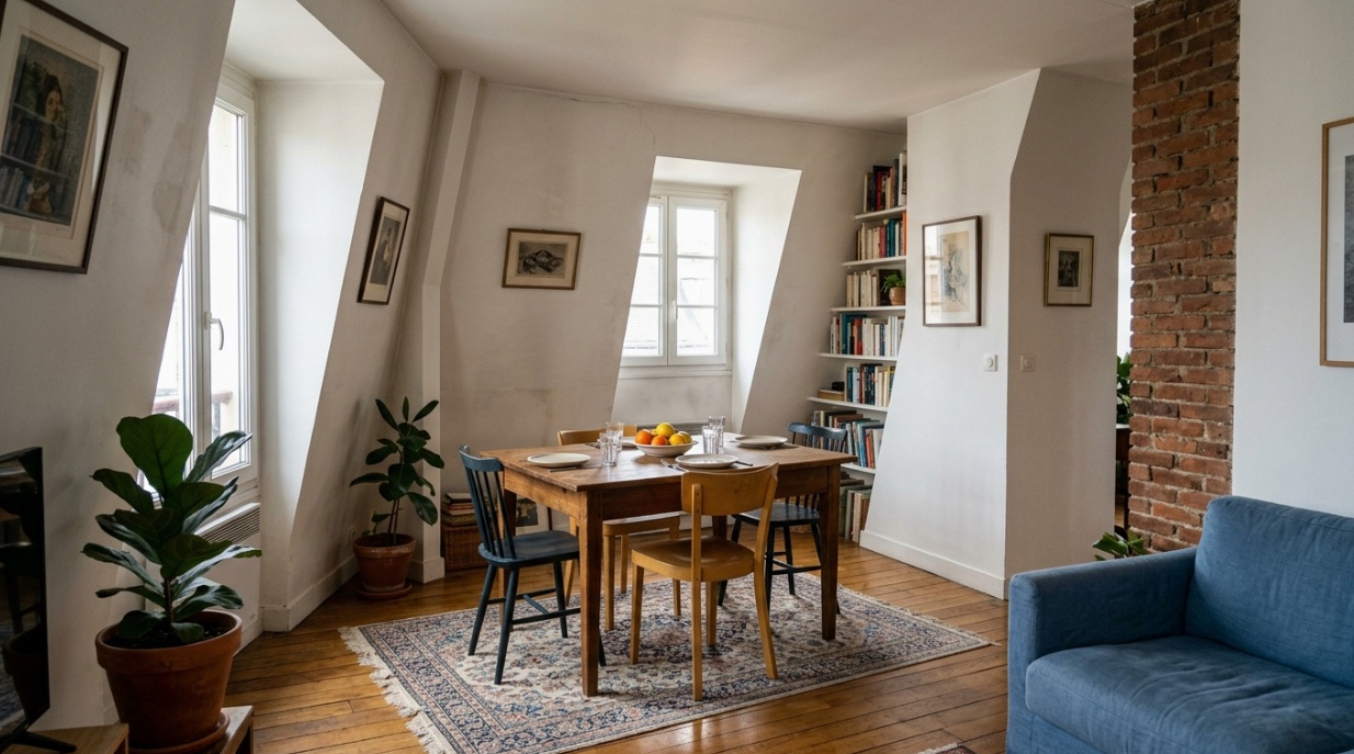
Use a tall plant, narrow bookcase, or floor lamp on the wider side of an off-center window. Hang curtains across the full wall only when the fabric will not block a radiator, door, or needed daylight. The fix should still serve the room.
Useful asymmetrical objects at home include a sectional sofa, chaise, curved chair, irregular mirror, free-form rug, sculptural floor lamp, branch-shaped plant, offset shelf, one-sided desk, and asymmetrical headboard. Use one as an anchor, then balance it with simpler pieces. A room full of unusual shapes gives the eye no clear place to rest.
The major risk of asymmetric design is chaos. The line between "artfully unmatched" and "messy" is drawn by how rigorously the underlying balance is held.
Overloading one side of a room without giving you a counterweight makes it feel like a sinking ship; it is the most common error. This causes real physical discomfort.
Diagnosis: Photograph the room. Taking a photo in the 2-D format flattens the space and will immediately bring weight imbalances to light.
Correction: Add “ballast” to the light side. This could be a floor plant (texture/volume), a standing lamp (vertical line), or a darker paint color on that wall.
Artists use this technique to see masses of light and dark without detail.
Procedure: Stand at the entrance of the room and squint until details disappear.
Analysis: Take a look at the “blobs” of darkness. Are they evenly distributed? Is a giant dark blob on one side and nothing on the other?
Correction: Move the blobs. If a dark sofa is to the left, maybe the dark TV console has to be on the right.
Don't take the asymmetry as clutter; add a unifying layer.
Color Repetition: Repeat a familiar accent color (e.g., ochre) on the sofa cushion (left), the rug detail (center), and the vase on the shelf (right). That takes the eye around and through the path.
Shape Echoing: If the coffee table is round, a round mirror and round pillow should serve to echo the form.
The direction of interior design seems to indicate increasing importance of asymmetrical equilibrium in design theory. As urban development gets richer and sizes become smaller, the ease of an asymmetric design offers pragmatism. It allows for multiple-use zoning and is responsive to the nature of accumulation of belongings.
Moreover, biophilic design is more and more appreciated because of the increased appreciation toward asymmetry. Nature is rarely perfectly symmetrical; trees and mountains are balanced but asymmetric. When imitating these natural geometries, asymmetrical balance in a room alleviates physiological stress as well as enhances well-being.
Asymmetrical interior design is the true discipline of the designer. It does more than simple matching and steps into the shoes of the artist. It demands an intuitive understanding of visual physics—the color’s heaviness, the feel of a texture, the gravity of a void.
If you’re eager to try these things out yourself but want to plan on a digital canvas first, check out our AI Interior Design tools. See how dynamic equilibrium can remodel your space before you lift a single piece of furniture.
A common example is one large sofa balanced by two smaller objects, such as a chair and floor lamp, on the opposite side. The objects are not identical, but their combined size, color, texture, and placement give both sides similar visual weight.
Symmetrical balance mirrors similar objects around a central point, such as matching nightstands beside a bed. Asymmetrical balance uses different objects that feel equally weighted, such as a desk on one side of the bed and a narrow shelf with a pendant on the other.
Yes. Asymmetry can suit a small or awkward room because the furniture does not need equal space on both sides. Use fewer pieces, keep the walking route clear, and balance one larger item with a compact group rather than filling every open corner.
No. The pieces can differ, but they still need a relationship. Repeat a color or material, align one edge, or group smaller items close together. Random placement lacks those connections and often leaves one side carrying most of the visual weight.
Work with the feature's real position. Add a low cabinet, bookcase, artwork, plant, or lamp to the wider side, then repeat one finish near the fireplace or window. Avoid building a false mirror image that reduces storage, light, or circulation.