17 min. reading

Yulii Cherevko
CEO paintit.ai
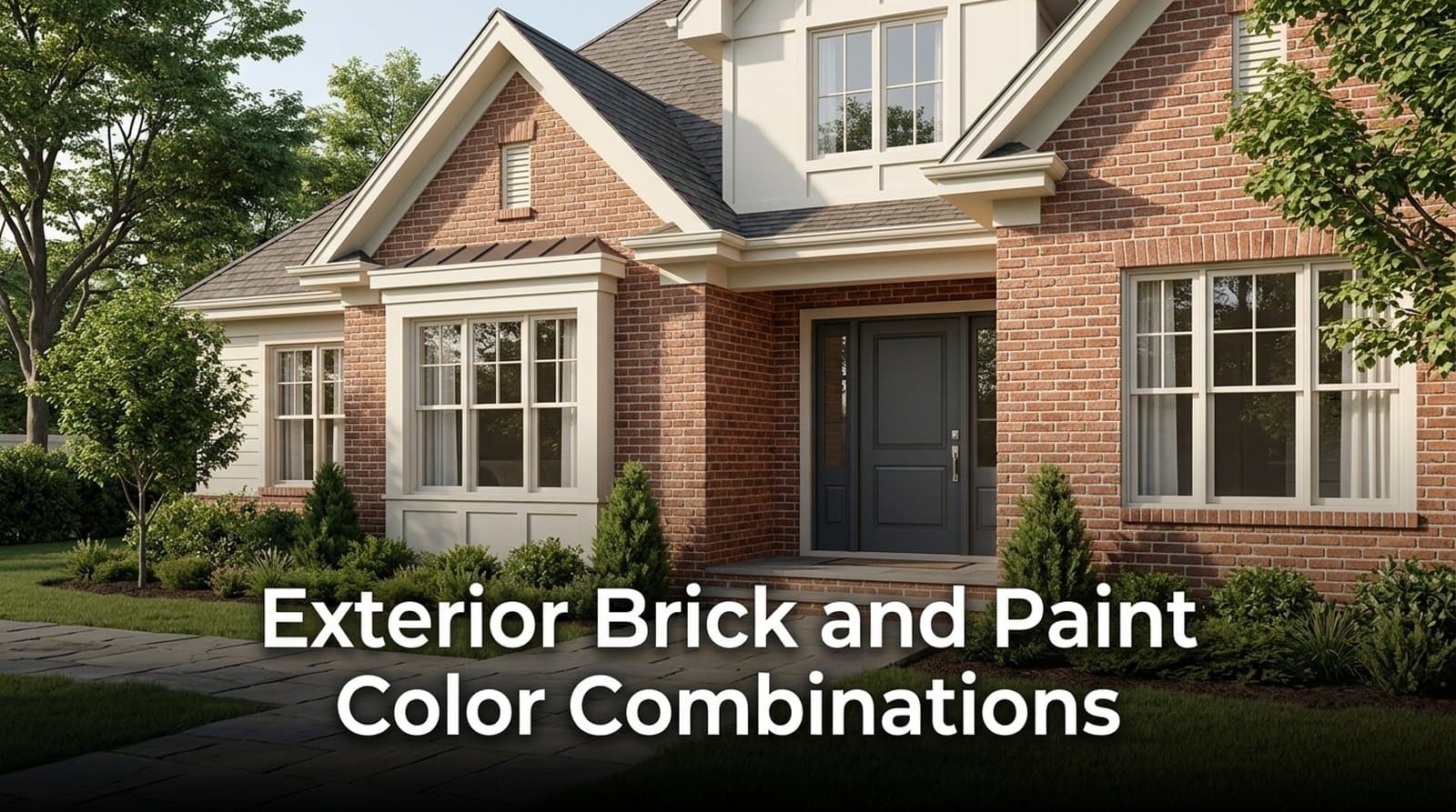
The best exterior brick and paint color combinations start with the brick already on your house, not with whatever paint chip is having a moment. In 2026, the smarter route is simple: read the undertones, work with the mortar, then test trim, siding, shutters, and front door colors digitally before you buy paint.
Most mistakes happen when brick gets treated like one flat color. It rarely is. Real brick has 3 to 6 visible undertones, outdoor light makes paint look 2–3 tones brighter, and mortar can account for up to 15% of what the eye reads on the wall. That is why soft ivory can look calm and refined, while pure white can feel a bit like staring into a lamp.
At Paintit.ai, we often see people trying to imagine how a paint color will behave against their exact brick — and that guessing game gets expensive quickly. My practical rule is simple: build the palette like a playlist. Brick is the main track. Trim is the smooth transition. The door or shutters bring the accent beat.
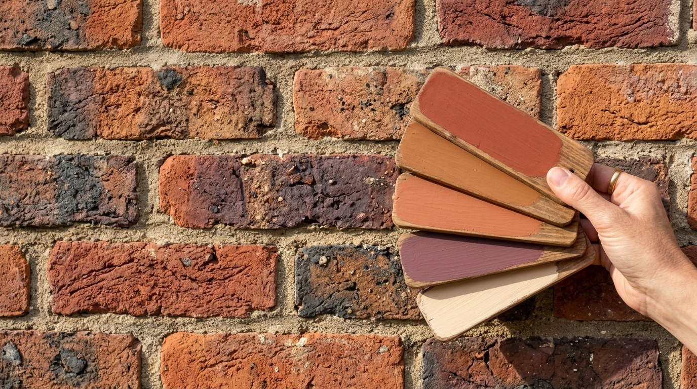
Brick undertones decide which paint colors look natural beside the facade. A red brick with orange, violet, gray, or brown flecks needs a different trim than a flat red sample card would suggest. Before choosing any trim color , identify the dominant brick tone from 10–15 meters away.
The Under-tone Isolation Method is a good place to start. Stand close to the brick and look for the small color notes inside the clay: gray ash, black specks, yellow sand, beige warmth, plum shadows, or brown iron tones. Then choose one of those micro-colors for trim, siding, or shutters.
That is how you build a brick wall color palette that feels personal instead of pasted on. If your red brick has gray flecks, will usually blend more naturally than yellow cream. If your brown brick has olive undertones, deep green or greige may keep the rhythm intact.
Use the Squint Test next:
Outdoor light is the other hard constraint. Exterior paint often appears 2–3 tones lighter and brighter than it does indoors on a small swatch. This is why ultra-bright whites can look sharp, plastic, or blinding next to aged red brick, especially on south-facing elevations.
For red brick, soft whites such as Benjamin Moore White Dove OC-17, Benjamin Moore Swiss Coffee OC-45, or Benjamin Moore Ballet White OC-9 usually sit better than a stark gallery white. They have enough warmth and gray in them to calm the contrast without turning yellow.
Based on Paintit.ai data, users tend to reject very high-contrast white trim after seeing it on their own exterior photo, even when they liked the same color on a sample image. The photo makes the glare real, especially around window frames, gutters, and porch columns.
If you want to test this before buying samples, use Paintit.ai to preview several paint directions on your own facade photo. It is not a replacement for one final physical swatch, but it helps remove the obvious mismatches early.
The 60/30/10 rule gives brick homes a clear color hierarchy. Treat brick as 60% of the visual field, trim or siding as 30%, and accents such as the front door or shutters as 10%. This keeps brick and paint color combinations balanced instead of making every surface fight for attention.
On many brick homes, the brick already owns the main color. So the job is not to overpower it. The job is to choose the second and third notes carefully, so the facade has flow.
A practical exterior split looks like this:
| Facade element | Visual share | Best color role | Example |
|---|---|---|---|
| Brick | 60% | Dominant base | Red, brown, buff, tan, charcoal |
| Trim, soffits, siding, porch columns | 30% | Supporting neutral or related undertone | White Dove, Revere Pewter, Aesthetic White |
| Door, shutters, metalwork | 10% | Controlled accent | Heritage Red, Black Forest Green, Tricorn Black |
This is where many brick color combinations fall apart. People choose 3 strong colors because each one looks good alone. But on a textured facade, red brick, black shutters, bright white trim, stained wood, and a vivid blue door can get noisy fast.
For a red brick house, try this 60/30/10 rhythm:
| Role | Color idea |
|---|---|
| 60% | Existing red brick |
| 30% | Benjamin Moore White Dove OC-17 or Swiss Coffee OC-45 |
| 10% | Benjamin Moore Black Forest Green PM-12 or Heritage Red HC-181 |
For brown brick:
| Role | Color idea |
|---|---|
| 60% | Existing brown or dark brown brick |
| 30% | Benjamin Moore Revere Pewter or Sherwin-Williams Jogging Path |
| 10% | Charcoal, deep forest green, or muted black |
For light brick:
| Role | Color idea |
|---|---|
| 60% | Buff, tan, cream, or pale yellow brick |
| 30% | Sherwin-Williams Drift of Mist or Natural Linen |
| 10% | Sherwin-Williams Peppercorn SW 7674 or Tricorn Black SW 6258 |
If your facade has large siding areas above or beside the brick, treat the siding as the 30% layer, not as a second main event. The paint should connect roof, brick, windows, and door into one readable composition.
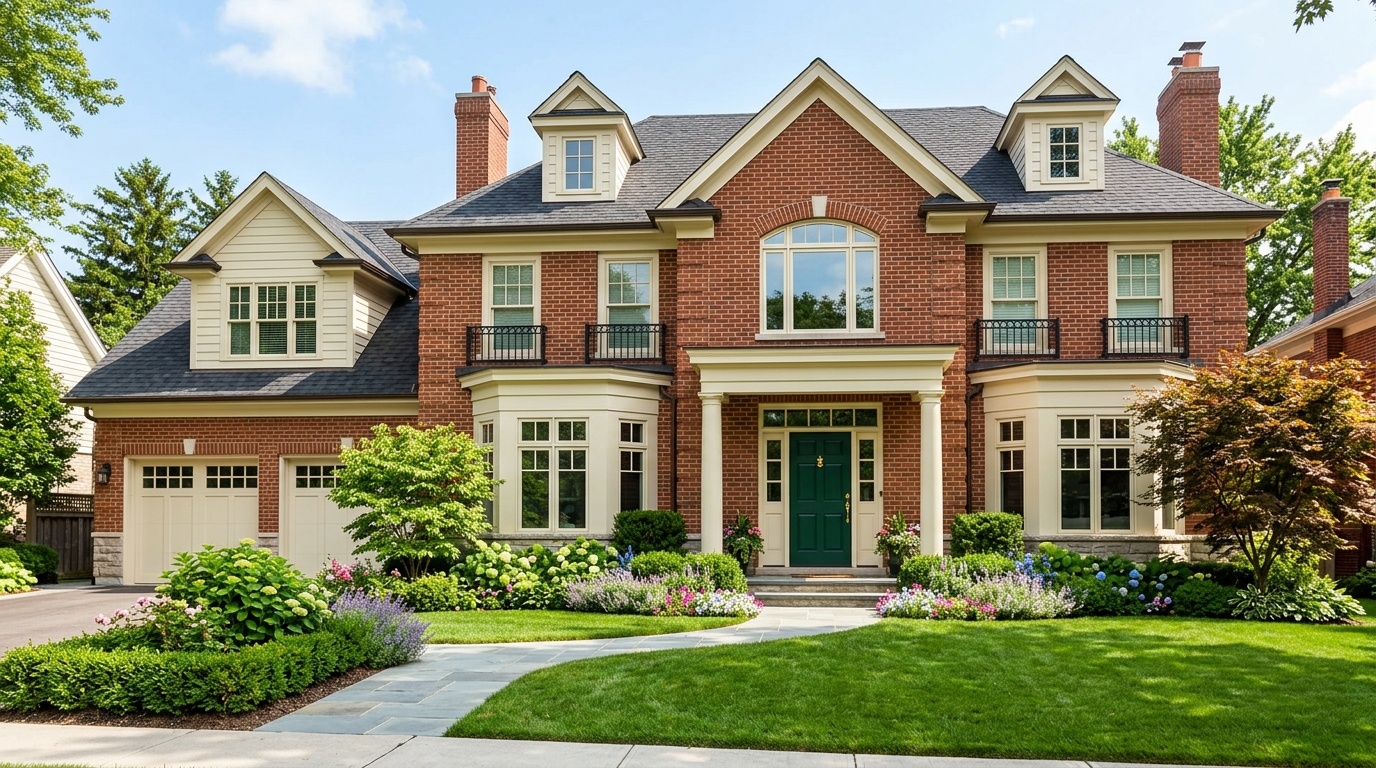
The most reliable colors that go with brick exterior depend on whether the brick reads red, brown, dark brown, tan, buff, gray, or cream from the street. Start with the dominant brick family, then narrow the palette using undertones, roof color, mortar, and the 60/30/10 ratio.
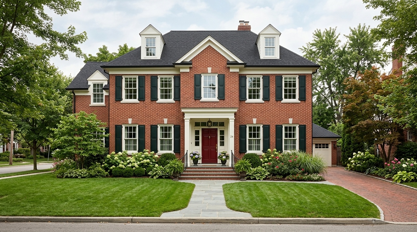
If you are asking what colors go good with brick, red brick usually works with warm whites, muted grays, deep greens, controlled reds, and some navy tones. The exact answer depends on whether the brick leans orange, brown, violet, or burgundy.
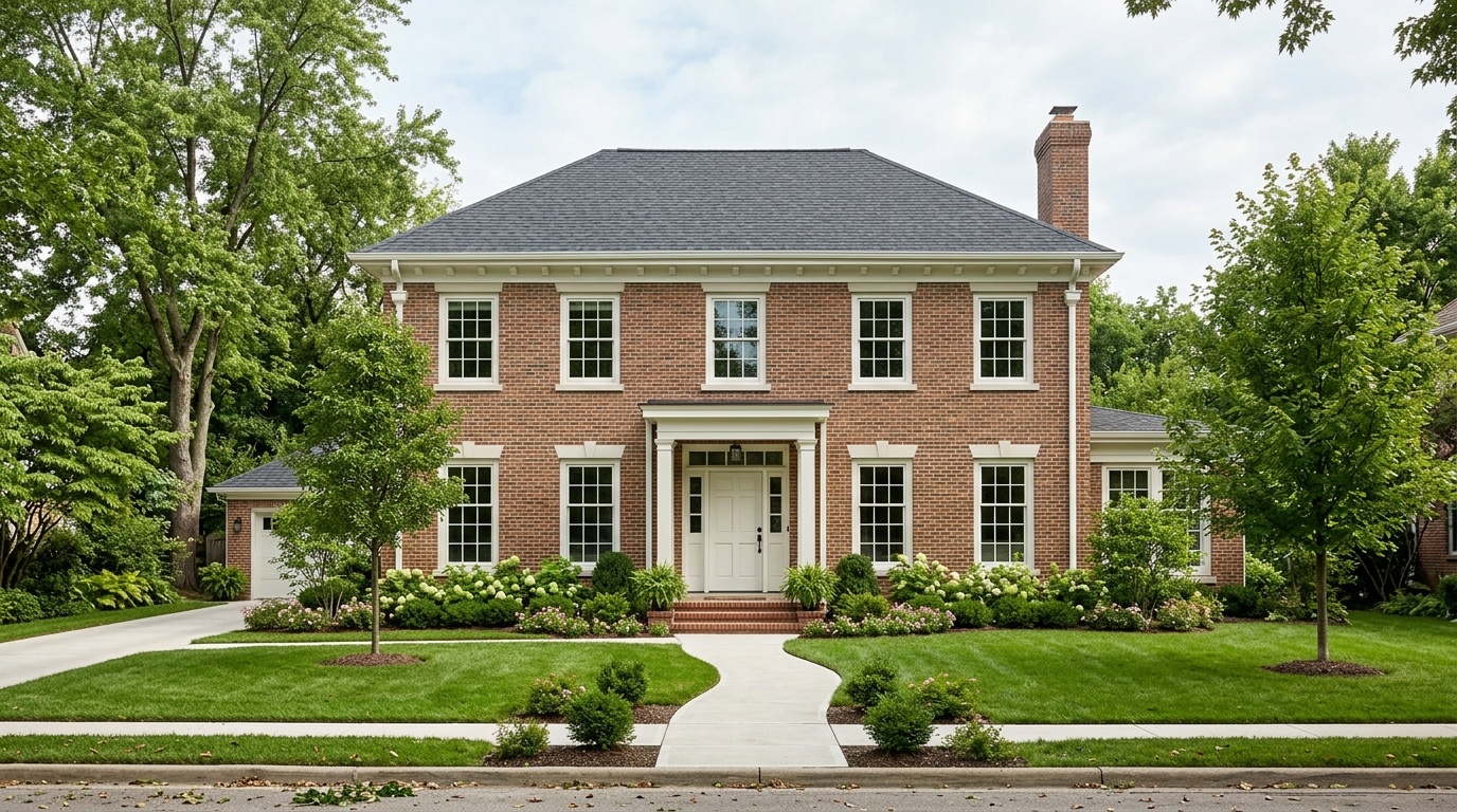
Good exterior brick paint color ideas for classic red brick include:
| Element | Safer choices | Why it works |
|---|---|---|
| Trim | Benjamin Moore White Dove OC-17, Swiss Coffee OC-45, Ballet White OC-9 | Warm enough to avoid glare |
| Gray trim | Benjamin Moore Gray Shower, Pewter | Picks up ash, mortar, and aged brick tones |
| Door | Benjamin Moore Heritage Red HC-181, Caliente AF-290 | Keeps red to the 10% accent zone |
| Shutters | Benjamin Moore Black Forest Green PM-12, Essex Green | Green sits opposite red and adds quiet contrast |
| Metalwork | Soft black, bronze, deep charcoal | Adds definition without shouting |
Avoid pairing red brick with pure white trim and bright red shutters at the same time. From the street, that can start to feel candy-striped. If the roof is black or charcoal, repeat that darkness in small details: lanterns, railings, shutters, or the front door.
A restrained red brick palette might be:
| Surface | Paint |
|---|---|
| Trim | Benjamin Moore White Dove OC-17 |
| Shutters | Benjamin Moore Black Forest Green PM-12 |
| Door | Benjamin Moore Heritage Red HC-181 |
| Railings | Soft black or aged bronze |
For more front-door nuance, our guide on choosing a door shade that fits the facade is useful when the brick already carries a strong color.
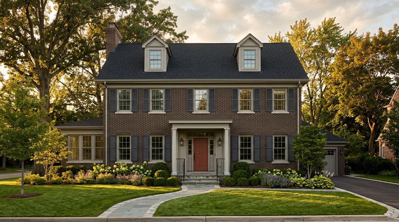
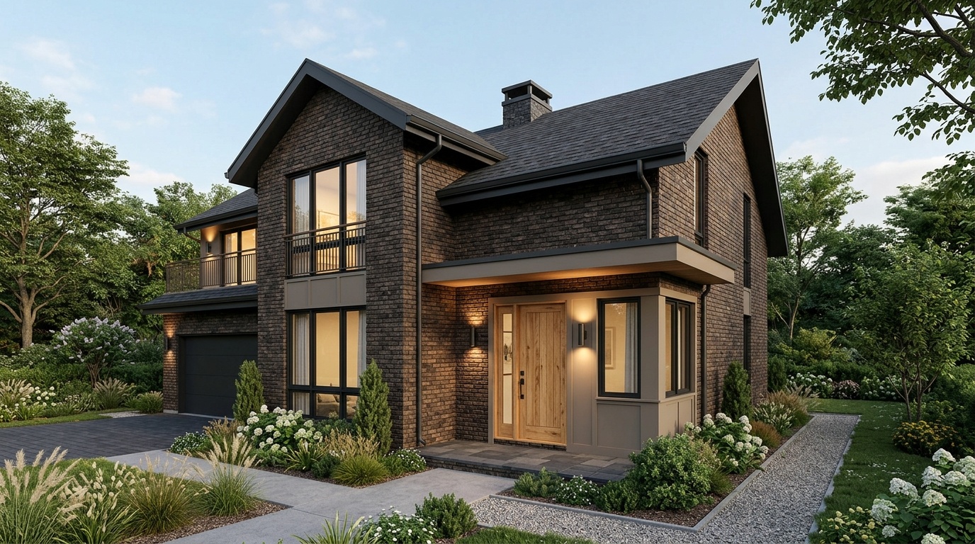
Dark brown brick house color schemes work best when the paint stays earthy, grounded, and slightly muted. Brown brick already has visual weight, so beige, taupe, charcoal, warm gray, olive, and deep green usually work better than crisp white or saturated primary colors.
Brown brick house color schemes can go soft or dramatic:
| Direction | Trim or siding | Accent |
|---|---|---|
| Soft neutral | Taupe, beige, Revere Pewter | Bronze, olive, muted black |
| Deep earthy | Benjamin Moore Kendall Charcoal | Cottage Red or forest green |
| Cool muted | Unusual Gray | Rock Bottom or Riverway |
| Classic contrast | Charcoal | Warm wood door |
For a dark brown brick home with a black roof, a strong palette is Benjamin Moore Kendall Charcoal for shutters, Revere Pewter for trim, and a muted red-brown door. It keeps the warmth of the brick but adds enough depth to feel intentional.
For a brown brick ranch with wide eaves, use trim to lighten the roofline. A taupe or warm gray on fascia, soffits, and garage doors can soften the long horizontal shape without making the house look washed out.
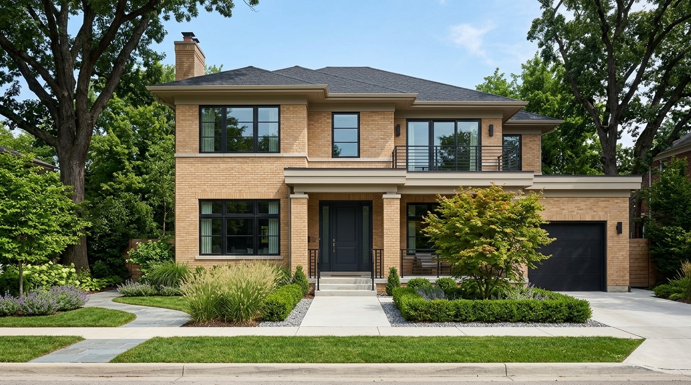
Light brick exterior color schemes need more contrast than red brick schemes because buff, tan, cream, and pale yellow brick can look flat from the street. The best combinations often use soft greige for large painted areas and black, charcoal, bronze, or dark brown for definition.
Try these combinations:
| Light brick type | Trim or siding | Accent |
|---|---|---|
| Buff brick | Sherwin-Williams Natural Linen SW 9109 | Peppercorn SW 7674 |
| Tan brick | Sherwin-Williams Drift of Mist | Tricorn Black SW 6258 |
| Cream brick | Sherwin-Williams Jogging Path | Dark bronze |
| Pale yellow brick | Warm taupe | Deep olive or charcoal |
A light brick house with black trim can look crisp, but the black should be placed with care. Use it on window frames, railings, gutters, or the door rather than turning every line into a heavy outline. If you are considering that contrast, the Paintit.ai article on a white exterior paired with black detailing gives useful reference points.
Light brick also responds well to texture contrast. Smooth painted siding beside sandy brick is often more intuitive than adding another busy material. Keep stone accents simple if the brick is already variegated.
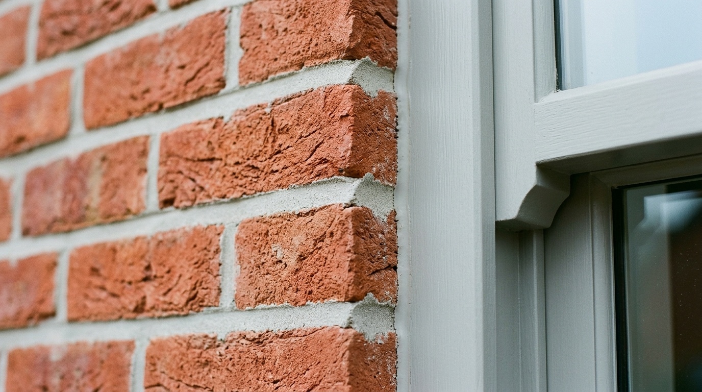
Mortar matching means choosing trim, window, or siding paint that aligns with the color of the mortar between bricks. Because mortar can make up to 15% of a brick wall’s visible surface, matching it can make the whole facade feel calmer, more architectural, and more complete.
This is the detail most quick color guides skip. Mortar is not a background line. From the street, it blends into the brick and changes how the whole wall is perceived.
Here is a practical mortar-to-paint reference:
| Mortar color | Paint direction |
|---|---|
| White mortar | Sherwin-Williams Heron Plume SW 6070 |
| Ivory mortar | Sherwin-Williams Aesthetic White SW 7035 |
| Light ivory and white mix | Sherwin-Williams Natural Linen SW 9109 |
| Ivory buff mortar | Sherwin-Williams Downing Sand SW 2822 |
| Standard gray mortar | Sherwin-Williams Acier SW 9170 |
| Charcoal mortar | Sherwin-Williams Westchester Gray SW 2849 |
To test mortar matching, place a paint chip beside the mortar, not beside the most colorful brick. If the trim color visually connects to the mortar, the windows and roofline will usually sit more naturally.
This method is especially helpful on older homes where the brick is multi-toned. A red brick wall with pale gray mortar may prefer soft gray trim over cream. A tan brick wall with buff mortar may prefer warm linen over white.
In our renders, mortar-matched trim tends to look quieter and more expensive because the eye reads one continuous material system. It is not always the boldest option, but it is often the most personal and real.
Exterior color can affect buyer perception because the facade is the first 5-second read of the house. According to the National Association of REALTORS®, neutral exterior colors such as cream, ivory, white, light gray, light brown, and moderate blue are consistently favored, while large areas of strong red can narrow buyer appeal.
The practical takeaway is not to avoid color. It is to control how much surface area it gets. Red, teal, dark green, navy, and black can work beautifully as 10% accents, especially on doors, shutters, or metalwork. They become riskier when they cover siding, brick, and trim all at once.
A survey of 71 interior designers reported that 59% agreed a red exterior can deter potential buyers. For brick homes, this matters because the house may already contain a large amount of red. Painting additional siding or trim in bright red can push the palette too far.
Use resale-safe colors this way:
| Goal | Better choice | Riskier choice |
|---|---|---|
| Wider buyer appeal | Warm white trim with red brick | Stark white plus bright red accents |
| Calm brown brick | Taupe, greige, charcoal | Yellow-beige that fights the brick |
| Light brick definition | Charcoal or bronze accents | High-contrast black on every edge |
| Historic feel | Deep green or Heritage Red door | Large painted red facade |
If you plan to sell within 3 years, keep the fixed elements calm. Let the front door carry the personality. A door can be repainted in 1 afternoon; a full facade repaint is a much larger decision.
AI visualization helps you test 6–12 palette options on a real photo before committing to gallons of paint. The point is not to replace physical sampling. It is to remove the wrong directions early, compare options instantly, and keep the design workflow moving from idea to buy.
Based on real visualization workflows using Paintit.ai's AI tools, we have observed that testing multiple palettes digitally before committing helps prevent aesthetic missteps. It lets users see how trim, shutters, siding, roof color, and brick interact in one view.
A practical Paintit.ai workflow looks like this:
For global exterior direction, use Paintit.ai to see the whole facade with new materials and color relationships. That is useful when you are comparing brick with wood, stone, siding, porch columns, or updated garage doors.
For more precise repainting, use Paintit.ai to try a focused repaint on trim or siding while preserving the brick. This matters because full brick painting is a bigger commitment than repainting wood, fiber cement, or metal elements.
AI has limits. It can give you an intuitive visual reference and help discard poor combinations instantly, but it cannot fully predict local UV exposure, weathering, surface texture, or how paint sheen behaves on your exact wall. Before buying a large paint quantity, test 1 real patch outside and view it morning, midday, and late afternoon.
Paintit.ai supports JPG, PNG, PDF, and DWG, so both simple homeowner photos and more technical design files can fit into the workflow. Your space. Your rhythm.
Most brick exterior color mistakes come from ignoring light, sheen, texture, and fixed materials. A color that looks calm on a 5-centimeter chip may look too bright on a 5-meter wall, especially beside brick, roof shingles, stone, gutters, and nearby greenery.
The first mistake is choosing high-gloss paint for trim or siding near brick. Glossy finishes emphasize dents, waviness, repairs, and surface irregularities. They also create sharp reflections that can make a traditional brick house feel less real. Flat, eggshell, or satin finishes are usually more forgiving.
The second mistake is adding too many textures. Brick is already active. If you place busy stone, high-grain wood, patterned siding, and ornate shutters beside it, the facade loses flow. Let painted surfaces be simple and quiet.
The third mistake is choosing paint indoors and approving it outdoors. Exterior light shifts color dramatically. View samples outside for at least 3 time windows: morning, midday, and late afternoon.
The fourth mistake is ignoring the roof. A warm brown roof will fight cool gray trim if the brick is also warm. A black roof can support charcoal shutters, bronze lights, and deeper door colors. A weathered gray roof often prefers softer whites, greiges, or muted greens.
The fifth mistake is using black everywhere because it looked good in one reference image. Black trim can be excellent, but on a brick house it should define selected features. Too much black can flatten windows and make the facade feel outlined rather than designed.
Regular exterior paint is not always the right choice for natural brick. Brick needs a coating strategy that suits masonry, moisture exposure, and local conditions. If you plan to paint the brick itself, ask a qualified paint or masonry specialist about breathable mineral or silicate coatings and test a small area first.
Soft warm whites usually look best with red brick. Benjamin Moore White Dove OC-17, Swiss Coffee OC-45, and Ballet White OC-9 are safer than ultra-bright whites because outdoor light makes white paint look 2–3 tones brighter. The best white should relate to the mortar and the brick undertone.
Dark brown brick works well with taupe, warm beige, greige, charcoal, olive, and deep forest green. For more depth, pair dark brown brick with Benjamin Moore Kendall Charcoal or Revere Pewter. For a calmer look, use soft taupe trim and keep the door in bronze, muted black, or dark green.
Match paint to brick mortar by comparing chips directly against the mortar lines, not just the brick face. White mortar may work with Sherwin-Williams Heron Plume, ivory mortar with Aesthetic White, and gray mortar with Acier. This makes trim, windows, and cornices feel connected to the wall.
Shutters and the front door can match, but they do not have to. On a brick house, matching them creates a simple 10% accent, while separating them adds more depth. For example, deep green shutters with a Heritage Red door can work if the trim stays quiet.
The strongest brick and paint color combinations are built from observation, not guesswork. Read the brick from 10–15 meters away, isolate its undertones up close, respect the mortar, use the 60/30/10 rule, and test the palette before paint becomes permanent.
If your brick is red, start with warm whites, soft grays, deep greens, and controlled red accents. If it is brown or dark brown, lean into taupe, charcoal, olive, and earthy neutrals. If it is light or buff, add definition with bronze, charcoal, muted black, or warm greige.
AI makes this process easier because you can move from idea to buy with fewer blind spots. Use it to compare options, keep the natural brick visible, and find the rhythm that feels right before the first brush touches the house.