
Modern Indian Living Room Design
Modern Indian Living Room Design uses accent wall contrast, soft textiles and metal accents in a living room setting.
The best living room accent wall ideas do not start with a trendy color. They start with a job: frame the TV, support the fireplace, define the seating area, or give a plain wall enough weight so the room stops feeling unfinished. Think of the wall as part of the layout, not just a paint decision. In Paintit.ai tests, we often see people begin with “paint the wall,” then tighten the result with notes like “a bit darker” or “now make it warmer.” That is usually the real path to a good accent wall: test the wall with the sofa, rug, daylight, lamps, and floor tone before you commit.
Before choosing navy, sage, wood, wallpaper, or stone, decide which wall actually deserves attention. A strong living room accent wall usually supports something that already matters: the fireplace wall, the tv wall, the wall behind the sofa, or the long wall that anchors the seating group. A small wall cut up by doorways rarely works, because the eye has nowhere to settle.
We see a lot of Paintit.ai users give “keep” instructions before changing a wall: keep the beige sofa, keep the curtains, keep the windows, keep the ceiling beams. That is the right way to think. Accent the surface that helps the room you already have, instead of fighting it. You can also use an AI living room design tool to compare options in your own room photo before buying paint, panels, or wallpaper.
Use the first gallery to look at where the accent wall sits in relation to the sofa, TV, fireplace, windows, rug edge, and main walking path. The strongest rooms usually have one clear feature wall, not several surfaces asking for attention at the same time.
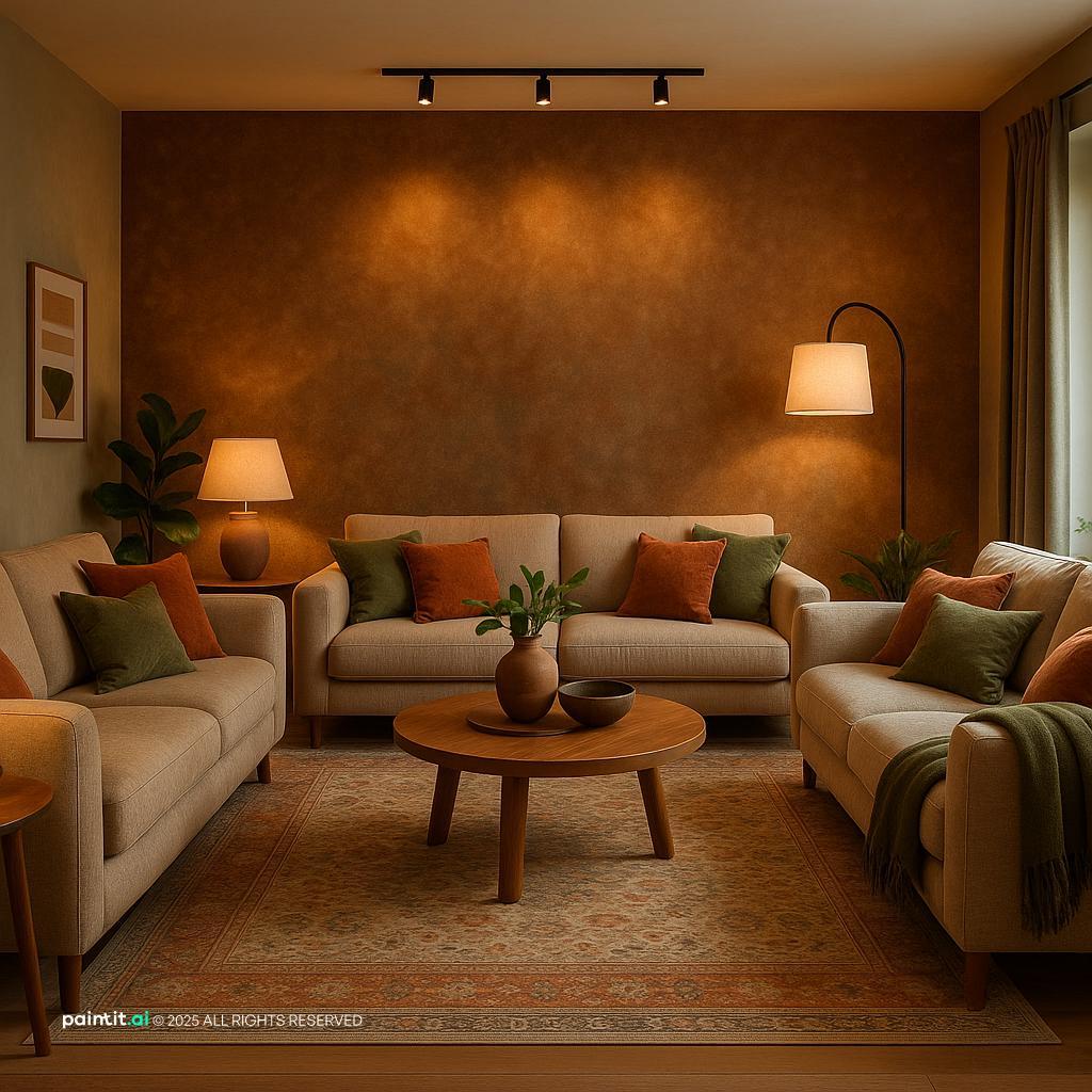
Modern Indian Living Room Design uses accent wall contrast, soft textiles and metal accents in a living room setting.

Modern Gray Living Room Design balances accent wall contrast, warm wood and metal accents in a living room setting.

Elegant Neoclassical Living Room Design pairs accent wall contrast and layered neutrals in a living room setting.

Stunning Ultra-Photorealistic Living Room layers accent wall contrast and natural light in a living room setting.

Vintage Meets Modern: Elegant Living Room Design anchors accent wall contrast, warm wood and soft textiles in a living room setting.

Stylish Mid-Century Modern Living Room softens accent wall contrast, warm wood and soft textiles in a living room setting.

Cozy Contemporary Living Room Design uses accent wall contrast, soft textiles and layered neutrals in a living room setting.

Elegant Modern Living Room Design balances accent wall contrast and natural light in a living room setting.

Tropical Living Room Design Inspiration pairs accent wall contrast, layered neutrals and natural light in a living room setting.

Warm Rustic Living Room Design layers accent wall contrast and plants and greenery in a living room setting.

Tropical Living Room Design Inspiration with Accent Wall Contrast anchors accent wall contrast, soft textiles and plants and greenery in a living room setting.

Charming Rustic Living Room Design softens accent wall contrast and plants and greenery in a living room setting.
Start by standing at the main entry to the living room and noticing where your eye lands first. If the room has a fireplace, built-in shelves, a media unit, or a large window wall, that surface is usually the best candidate. If the sofa faces a blank wall, that wall can become the anchor.
Why it works: an accent wall should make the room easier to read. What to avoid: choosing a tiny side wall simply because it feels “safe.” A weak wall gives you a weak result, especially in an open-plan living room where you see the space from several angles.
A painted accent wall living room scheme is often the most practical starting point because it changes the mood without changing the room structure. In Paintit.ai behavior data, color is the most popular wall-change modifier at 27.6%, and repaint or paint actions appear in 13.2% of prompts. That tracks with real decorating logic: paint is accessible, reversible, and easy to adjust.
For a calm look, try warm beige, mushroom, olive, muted sage, clay, or smoky blue. For stronger contrast, deep navy, charcoal, forest green, or oxblood can work if the room has enough natural light and lighter furniture nearby. For more color direction, see our guide to the best living room colors.
The wall behind the sofa is a reliable accent location when the TV or fireplace is not the main feature. Paint the full width behind the sofa rather than stopping at the sofa edges; the wall should feel like part of the architecture, not like a rectangle sized to furniture. Keep art centered over the seating group, not automatically centered on the entire wall if the sofa sits off to one side.
What to avoid: using a very dark color behind a dark sofa with no separation. If the sofa is charcoal, try warm taupe, plaster pink, muted green, or textured wallpaper instead of another near-black surface. Add a floor lamp or picture light so the wall does not turn into a flat shadow at night.
A deep navy blue accent wall works especially well with camel leather, cream upholstery, brass lamps, walnut furniture, and woven textures. It gives the room depth without feeling as severe as black. Use it on a wall with a simple shape and few openings so the color reads as one clean plane.
Why it works: navy has visual weight but still behaves like a classic neutral when paired with warm materials. What to avoid: cool navy beside icy gray floors and blue-white lighting. That mix can make the living room feel cold and thin. Warm bulbs, tan accents, and natural wood usually fix the balance.
Sage and olive are strong choices when you want color without making the living room feel heavy. They work well behind cream, beige, brown, rust, black, and pale wood furniture. Sage feels lighter and more relaxed; olive feels moodier and more grounded.
Check the undertone before committing. Some greens turn minty in north-facing rooms, while others go muddy under warm artificial light. In Paintit.ai tests, people often move from a bold green to “a bit more muted” once they see it with their actual sofa, floor, and window light.
A wood accent wall living room idea works best when the wood tone has a clear relationship to the floor, coffee table, or media unit. Vertical wood slats can make a low ceiling feel taller and help break up a wide blank wall. Use consistent spacing and stop the panels at a natural boundary, such as the full wall width or the edge of a built-in unit.
What to avoid: matching the wood too closely to the floor. If the floor is honey oak, choose a slightly deeper walnut or a calmer neutral oak so the surfaces do not blur together. Material choices matter here; Paintit.ai data shows material terms such as wood, marble, and brick appear at 19.0%, which is why good living room wall design should go beyond paint color alone.
A tv accent wall living room can make the screen feel integrated rather than stranded on a blank surface. Paint the wall a mid-to-dark tone, add a low console that is wider than the TV, and hide every cable. If you use paneling, keep the pattern simple so it does not compete with the screen.
Why it works: a darker background reduces the hard contrast between the black screen and the wall, so the TV feels less harsh. What to avoid: glossy finishes behind the screen. They catch glare from windows and lamps, especially in evening viewing.
A fireplace wall already has hierarchy, so the accent treatment should support it rather than steal from it. Try limewash, Roman clay, subtle stone veneer, fluted wood, or a deeper paint color around the surround. If the fireplace is traditional, keep the accent finish quieter so the mantel and hearth still lead.
The key is proportion. A small tile strip around the firebox may look timid on a large wall, while full-height stone can overwhelm a low-ceiling room. Use the height of the mantel, ceiling, and nearby shelves to judge how much texture the wall can handle.
Wallpaper is useful when the living room has simple furniture and needs movement on the walls. Grasscloth, linen-look paper, soft geometrics, botanical patterns, and mural-style papers can all work, but the scale has to fit the wall. A large wall usually needs a larger pattern; a tiny repeat can look busy from across the room.
What to avoid: placing a high-contrast pattern behind a TV if you watch often. It creates noise around the screen. Wallpaper usually works better behind a sofa, on a reading-zone wall, or around built-ins where the pattern feels built into the room.
Board-and-batten is a good choice for living rooms that need shape more than drama. Paint it the same color as the wall for a subtle raised texture, or use a slightly deeper tone to make the grid read more clearly. Keep the spacing wide enough for the size of the room; narrow strips on a large wall can feel fussy.
Why it works: the shadow lines add depth even in neutral colors. It is also a useful surface-level update when you want to preserve exact room structure and avoid changing architectural elements. Use it behind a sofa, along a dining-living boundary, or on a long wall that needs rhythm.
Brick, marble, plaster, and stone can be beautiful, but they need breathing room. If you use stone veneer, keep nearby furniture simpler: a plain sofa, clean-lined tables, soft textiles, and fewer small accessories. Let the texture be the detail.
What to avoid: mixing too many strong materials in one view. A brick accent wall, patterned rug, marble coffee table, and busy drapes may all be attractive on their own, but together they compete. One dominant texture is usually enough for a living room focal point.
If your living room has shelves around a TV or fireplace, painting the built-ins and back wall the same color can create a tailored feature wall. This works especially well in dark green, blue-gray, charcoal, greige, or warm white. Use a durable finish on shelves so books, frames, and ceramics do not mark the paint too easily.
Why it works: matching the shelves and wall reduces visual breaks and makes books, ceramics, and art stand out. What to avoid: filling every shelf. Negative space matters; leave room for the wall color to show through.
In an open living-dining space, an accent wall can mark the living zone without adding a divider. Choose the wall that runs behind the sofa or media unit, then repeat one color from that wall in pillows, art, or a chair. Keep the rug large enough that at least the front legs of the main seating pieces sit on it.
The accent wall should not interrupt the traffic path. If people walk directly along that wall to reach a hallway, balcony, or kitchen, avoid fragile finishes or protruding panels. Use paint or flat wallpaper in high-movement zones.
A color that looks perfect online may shift in your room because of window direction, floor undertone, and bulb temperature. Try a lighter, deeper, warmer, and grayer version of the same idea before choosing. This is exactly how many Paintit.ai users refine accent walls: “instead,” “now,” “a bit,” “more,” and “less” appear often in iterative prompt patterns.
What to avoid: deciding from a single swatch at noon. Check the wall in morning light, afternoon light, and evening lamp light. If the accent color only works for one hour of the day, it is probably not the right version.
The second gallery is useful for comparing how different wall treatments change visual weight. Paint feels clean and flexible, wood slats add rhythm, wallpaper brings pattern, and stone or brick creates a heavier architectural effect.

Ultra-Realistic 50s Style Living Room Design uses accent wall contrast and natural light in a living room setting.

Modern Spacious Living Room Design balances accent wall contrast, warm wood and layered neutrals in a living room setting.

Rustic Living Room Transformation pairs accent wall contrast, soft textiles and plants and greenery in a living room setting.

Elegant Living Room Wall Design layers accent wall contrast and natural light in a living room setting.

Modern Minimalist Living Room Design anchors accent wall contrast, soft textiles and clean-lined furniture in a living room setting.

Charming Rustic Living Room Design with Accent Wall Contrast softens accent wall contrast, soft textiles and plants and greenery in a living room setting.

Living Room Accent Wall Ideas with Accent Wall Contrast and Plants and Greenery uses accent wall contrast, plants and greenery and natural light in a living room setting.

Living Room Accent Wall Ideas with Accent Wall Contrast and Soft Textiles balances accent wall contrast, soft textiles and plants and greenery in a living room setting.

Stunning Modern TV Wall Design for Living Rooms pairs accent wall contrast and plants and greenery in a living room setting.

Living Room Accent Wall Ideas with Accent Wall Contrast and Soft Textiles with Plants and Greenery layers accent wall contrast, soft textiles and plants and greenery in a living room setting.

Living Room Accent Wall Ideas with Accent Wall Contrast and Soft Textiles View 3 anchors accent wall contrast, soft textiles and plants and greenery in a living room setting.

Luxury Scandinavian House Interior Design softens accent wall contrast, warm wood and soft textiles in a living room setting.
Start with the fixed elements: flooring, sofa fabric, curtains, fireplace surround, and metal finishes. If the floor is warm, a warm beige, olive, terracotta, or brown-black wall may feel more connected than a cool gray. If the room already has cool stone or chrome, blue-gray, charcoal, or soft white can make more sense.
Why it works: the accent wall becomes part of the room’s palette instead of sitting there as a separate idea. Avoid choosing a paint color only because it looked good in a saved image. Your own undertones decide whether that color feels rich, dull, warm, or cold.
A light sofa against a dark wall can look crisp and grounded. A dark sofa against a dark wall can work too, but only when there is texture, art, or lighting to separate the shapes. If everything has the same value, the furniture outline disappears.
Use contrast where you want attention: behind the sofa, around the fireplace, or behind the media unit. Avoid high contrast on a wall with many small objects, because every shelf, frame, and cable becomes more visible.
Wood slats, brick, marble, and stone all carry more visual weight than paint. In a compact living room, use them on one clean section rather than wrapping multiple walls. In a larger room, full-height paneling or a wide stone fireplace wall can hold the scale better.
Material weight should also relate to furniture weight. A chunky stone wall pairs better with substantial seating and a grounded rug. Thin metal-legged furniture may feel too delicate unless you add heavier textiles or wood pieces nearby.
Matte paint hides small wall imperfections and makes deeper colors feel softer. Eggshell is easier to clean and is often a practical middle ground for family rooms. Satin can reflect more light, but it may show uneven drywall, roller marks, and glare.
Use lower-sheen finishes on TV walls and fireplace walls where light can skim across the surface. Avoid glossy accent walls unless the wall is very smooth and you intentionally want reflection.
An accent wall can look strong in daylight and disappear at night if the lighting is wrong. Add a floor lamp near the sofa, sconces on either side of a fireplace, picture lights over art, or LED strips in built-ins. The goal is to wash the surface gently, not blast it.
Warm bulbs usually flatter beige, sage, wood, and brick. Cooler bulbs can make these same materials look flatter or slightly gray. Check for glare if the accent wall is also the TV wall.
Small art on a large accent wall often looks accidental. Use one large piece, a balanced pair, or a gallery arrangement that covers enough width above the sofa. As a rough rule, art above a sofa often looks best when it spans about two-thirds of the sofa width.
Avoid overcrowding a textured wall. If you already have wood, stone, or patterned wallpaper, fewer objects will usually look better. Let the material breathe.
A good accent wall should have a quiet echo elsewhere. Repeat the wall color in a pillow, vase, artwork, throw, or chair fabric. If the wall is wood, repeat the tone in a tray, frame, or side table rather than adding several large matching pieces.
Why it works: repetition makes the wall feel connected without making the room too coordinated. Avoid copying the accent everywhere. If every accessory matches the wall, the room can feel staged rather than lived in.
In Paintit.ai, you can upload a real living room photo and try paint, paneling, wallpaper, stone texture, TV-wall treatments, and style changes while keeping the room structure intact. This is especially useful when you want to preserve the sofa, windows, beams, or fireplace but change the wall behind them.
Start with one clear instruction, such as “make the wall behind the sofa sage green” or “add wooden panels behind the TV,” then refine the result: warmer, less saturated, darker, lighter, more modern, or closer to beige. Before buying samples, you can also use an AI house painter to test shades directly on a photo of your wall.
Choose the wall with the strongest existing focal point: the fireplace, TV, main sofa wall, built-ins, or a clean wall seen from the entry. Avoid small broken-up walls with several doors or openings.
Yes, when they have a clear purpose. The best current accent walls frame a feature, add texture, or define a zone without changing the room’s structure.
Reliable choices include warm beige, sage, olive, navy, charcoal, terracotta, mushroom, and deep green. The right paint color depends on your sofa, floor undertone, daylight, and bulb temperature.
Paint is best for flexibility and lower cost. Paneling is better when the wall needs texture, rhythm, or architectural depth. In smaller rooms, subtle paint or slim paneling is usually safer.
Yes. Use a mid-to-dark matte finish, simple paneling, or a clean built-in layout. Avoid glossy paint, busy wallpaper, and strong patterns that create glare or pull attention away from the screen.