
Mid-Century Modern Living Room Design
Mid-Century Modern Living Room Design uses orange warmth, warm wood and clean-lined furniture in a living room setting.
Orange can make a living room feel warm, earthy, energetic, or calm. The difference is usually not the color itself. It is the shade, the surface, and how much breathing room you leave around it. The best orange living room ideas start with one honest decision: is orange the main feature, a supporting color, or just a small accent? In Paintit.ai room prompts, color is the most common modifier, used in 27.6% of prompts, while room is the second most popular modifier, used in 22.1% of prompts. That matches what we see in real uploads: people often start with “orange living room,” then quickly realize they need to choose between burnt orange, rust, clay, terracotta, peach, or a much softer neutral-orange.
Orange is not one color once it is inside a real living room. A bright citrus orange behaves nothing like rust, copper, paprika, clay, or burnt orange. In most living rooms, the safer move is to choose an orange with brown, red, or muted terracotta undertones, then balance it with cream, taupe, charcoal, olive, walnut, or black.
Think in layers instead of making one giant color move. Keep a neutral sofa, add rust curtains, repeat the tone in wall art, and test a deeper orange accent wall before painting. That sounds small, but it prevents the most common mistake: one orange idea spreading across every surface. If you are still comparing palettes, Paintit.ai has a practical color overview in Best Living Room Colors that works well alongside this orange-focused direction.
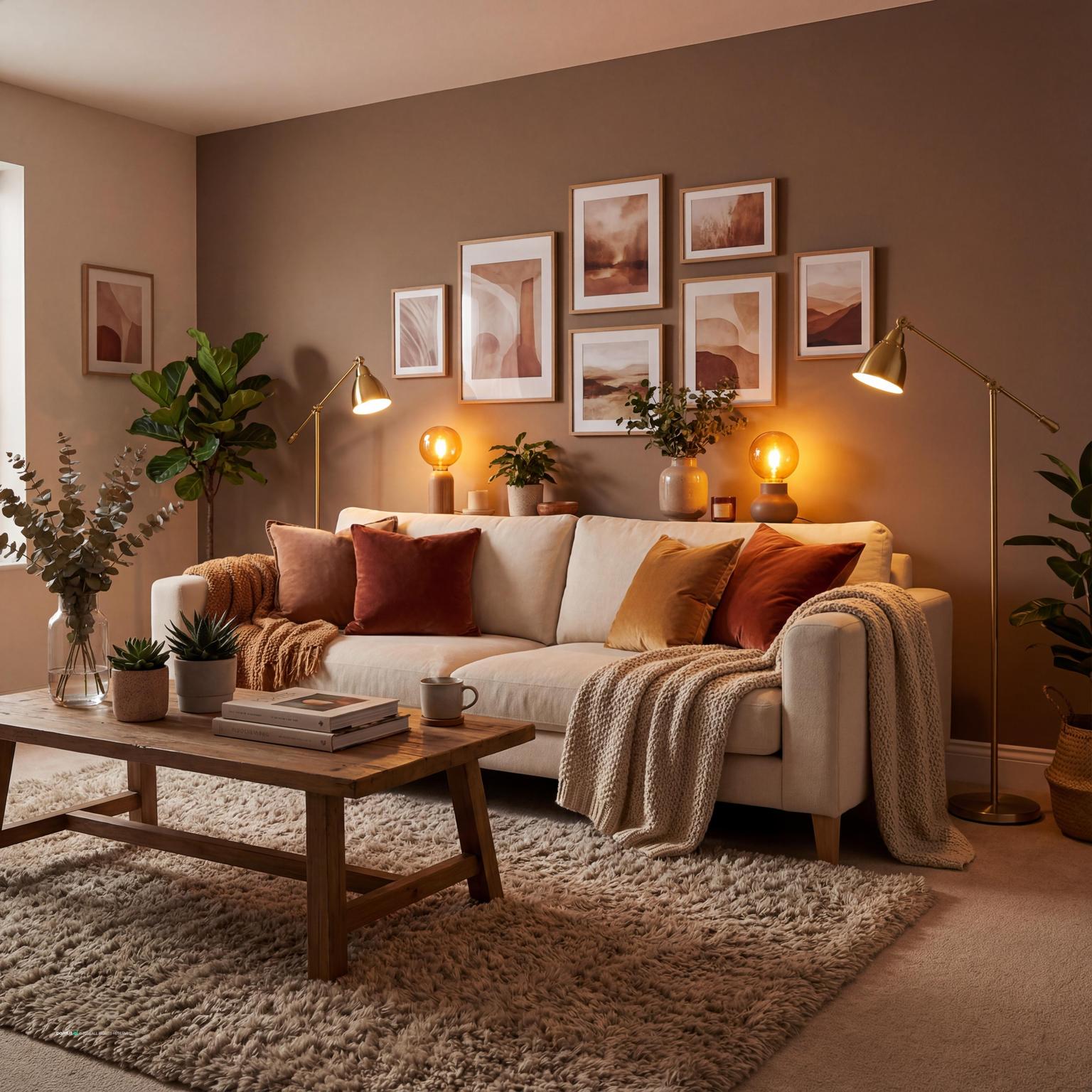
Use the first gallery to judge proportion: how much orange appears on the walls, sofa, rug, curtains, and smaller decor, and whether the room has enough neutral space to let the color settle.
Mid-Century Modern Living Room Design uses orange warmth, warm wood and clean-lined furniture in a living room setting.

Elegant Mid-Century Modern Living Room Design balances orange warmth, warm wood and soft textiles in a living room setting.

Modern Living Room Design for 2025 pairs orange warmth, soft textiles and metal accents in a living room setting.

Mid-Century Modern Living Room Design with Orange Warmth layers orange warmth, warm wood and soft textiles in a living room setting.

Elegant Mid-Century Modern Living Room Design with Orange Warmth anchors orange warmth, warm wood and metal accents in a living room setting.

Orange Living Room Ideas with Orange Warmth and Warm Wood softens orange warmth, warm wood and clean-lined furniture in a living room setting.

Modern Living Room Design Inspiration uses orange warmth, soft textiles and metal accents in a living room setting.

Stylish Midcentury Modern Living Room Design balances orange warmth, warm wood and soft textiles in a living room setting.

Midcentury Modern Living Room Design pairs orange warmth, warm wood and soft textiles in a living room setting.

Contemporary Living Room Inspiration layers orange warmth, soft textiles and natural light in a living room setting.

Orange Living Room Ideas with Orange Warmth and Warm Wood with Layered Neutrals anchors orange warmth, warm wood and layered neutrals in a living room setting.

Midcentury Modern Living Room Design with Orange Warmth softens orange warmth, soft textiles and clean-lined furniture in a living room setting.
Burnt orange living room ideas usually work best when the shade has enough brown or red in it to feel grounded. Use it on a sofa, a pair of lounge chairs, curtains, or one large piece of wall art, then keep the surrounding walls in warm white, oatmeal, mushroom, or pale greige.
Why it works: burnt orange has real visual weight. It can anchor a seating area without needing five other strong colors. The catch is repetition. A sofa, throw pillows, rug, and art all in the exact same orange can look flat, almost like a showroom set. Let the tones vary slightly.
Rust orange living room ideas are especially useful in homes with mid-century, rustic, bohemian, or transitional furniture. Pair rust with walnut, oak, linen, aged brass, black metal, and cream walls. The result feels warm without turning the whole room into one heavy warm block.
When people upload rooms with a lot of wood furniture, we often see the weak point right away: the orange is too close to the wood undertone. If your wood is yellow-heavy, use a redder rust or muted clay. If your wood is dark walnut, a softer terracotta usually feels more relaxed.
An orange accent wall should point to something important: the fireplace wall, the wall behind the sofa, a built-in media wall, or a niche with art. Avoid putting the accent wall on a random side wall with no furniture relationship. The eye will go there, and the seating area may suddenly feel secondary.
Use matte or low-sheen paint so the wall looks rich rather than shiny. If you are testing orange walls around existing furniture, the AI House Painter can compare rust, terracotta, clay, and burnt orange before you commit to a paint color.
Orange sofa living room ideas need a rug that controls the warmth. A cool beige, stone gray, ivory-and-charcoal pattern, faded blue, or taupe neutral rug can stop the seating area from feeling too hot. Also check the size. At minimum, the front legs of the sofa and chairs should sit on the rug.
Why it works: the rug creates a visual break between the orange upholstery and the floor. What usually goes wrong is a small warm-toned rug under an orange sofa, especially on honey oak floors. Then the whole lower half of the room starts reading orange-yellow.
If you rent, move often, or like changing your orange living room decor by season, use orange in throw pillows, curtains, blankets, lampshades, and art instead of major upholstery. A camel leather pillow, rust velvet cushion, and patterned terracotta textile can carry the color without locking the entire room into one palette.
This is also a smart way to work with existing pieces. In Paintit.ai data, 12.0% of prompts include a keep or do-not-change type of direction, which tells us many people are decorating around fixed sofas, floors, fireplaces, or cabinetry rather than starting from an empty room.
In an open-plan living room, orange can separate the sitting area from the dining or kitchen zone. Use an orange rug, a rust sofa, or two burnt orange chairs facing the main sofa. Repeat the tone once across the room, maybe in a small artwork or ceramic lamp, so the color feels deliberate.
Then check the floor plan. Bold color calls attention to layout problems. If a chair blocks the walkway or the coffee table is too tight, orange will make that friction more visible. Leave enough space to move around the seating area without turning sideways.
Green is one of the most reliable colors for an orange living room because it cools the palette without making it feel cold. Try olive pillows on an orange sofa, sage walls with rust curtains, or a deep green chair near terracotta artwork.
Why it works: green and orange both sit comfortably with natural materials such as wood tones, clay, linen, and plants. What to avoid is high-chroma orange with high-chroma lime or emerald unless you want a very bold, graphic room. Most homes need one of those colors softened.
An orange and neutral living room can look considered when the neutral pieces have texture. Use bouclé, woven wool, jute, linen, plaster, ribbed wood, rattan, or matte ceramic. Orange then becomes part of a tactile palette, not just a bright color dropped onto beige.
Paintit.ai prompt data shows material is used in 19.0% of prompts, and orange rooms show why that matters. A velvet burnt orange sofa feels rich and shadowed. A flat orange wall feels more direct. A matte terracotta vase feels earthy, while glossy orange plastic can feel too sharp in a calm living room.
Black metal accents are useful when orange starts to feel too soft, dusty, or earthy. Try a black floor lamp, slim black picture frames, a dark coffee table base, or black fireplace tools. Keep the lines simple so the black adds structure rather than weight.
This works especially well in modern, industrial, and mid-century rooms. Avoid scattering tiny black accessories everywhere. One strong lamp and a clean set of frames will usually do more than a dozen small dark objects.
A south- or west-facing living room can make bright orange feel much stronger in the afternoon. In those rooms, muted rust, clay, or burnt orange is usually easier to live with. In a north-facing room, orange may need more warmth and depth so it does not go flat.
I would treat an orange accent wall as a lighting decision as much as a paint decision. Test the shade in morning, afternoon, and evening light. The same paint color can feel cozy at night and surprisingly sharp at noon.
Wall art is one of the easiest ways to pull orange through a living room. Look for pieces with rust, ochre, clay, tan, black, cream, or muted blue. The art should echo the color palette, not duplicate the sofa or wall color exactly.
Hang art in relationship to the furniture below it. Above a sofa, keep the piece or grouping roughly two-thirds the sofa width, and do not hang it too high. Orange has strong visual pull, so a badly placed piece becomes noticeable fast.
Orange curtains can make a living room feel warmer while adding vertical movement. Choose linen, cotton velvet, or a soft textured weave in rust, cinnamon, or terracotta. Hang the rod wider than the window and close to the ceiling so the window feels taller and more generous.
What to avoid: shiny synthetic orange curtains in a very bright shade. They can bounce too much light around the room and make the color feel theatrical. If the walls are already orange, neutral curtains are usually the better move.
If you have a fireplace, alcove, or built-in shelving wall, clay orange can give it architectural presence. This works especially well with off-white walls, warm stone, simple shelves, and restrained styling.
Keep the objects on the shelves edited. Orange is a high-energy color, and clutter makes it feel busier. In our user behavior data, negative prompts such as no clutter or without certain elements appear in 8.8% of prompts, which reflects a real concern: people want color, but they do not want visual noise.
In a small living room, use orange in concentrated, controlled areas. A rust chair, terracotta lamp, narrow painted niche, or a few strong throw pillows can be enough. Keep the largest surfaces lighter, and choose furniture with visible legs so the room does not feel heavy.
Why it works: orange advances visually, so it can feel closer than pale colors. What to avoid is painting every wall bright orange in a room with low ceilings and limited natural light, unless you are intentionally creating a wrapped, dramatic space.
Use the second gallery to compare where orange should live in the room: on the sofa, behind the sofa, in the rug, in curtains, or only in smaller styling pieces.

Stunning Mid-Century Modern Living Room Design uses orange warmth, warm wood and soft textiles in a living room setting.

Orange Living Room Ideas with Orange Warmth and Natural Light balances orange warmth and natural light in a living room setting.

Orange Living Room Ideas with Orange Warmth and Soft Textiles pairs orange warmth, soft textiles and plants and greenery in a living room setting.

Modern Mid-Century Living Room Design layers orange warmth, soft textiles and clean-lined furniture in a living room setting.

Orange Living Room Ideas with Orange Warmth and Soft Textiles with Metal Accents anchors orange warmth, soft textiles and metal accents in a living room setting.

Stunning Midcentury Modern Living Room Design softens orange warmth, warm wood and soft textiles in a living room setting.

Warm Modern Living Room Design uses orange warmth, soft textiles and plants and greenery in a living room setting.

Orange Living Room Ideas with Orange Warmth and Soft Textiles with Layered Neutrals balances orange warmth, soft textiles and layered neutrals in a living room setting.

Cozy Farmhouse Open Concept Living Room Design pairs orange warmth, warm wood and soft textiles in a living room setting.

Cozy Bohemian Living Room Design layers orange warmth, soft textiles and plants and greenery in a living room setting.

Stunning Rustic-Style Living Room Design anchors orange warmth, warm wood and soft textiles in a living room setting.

Rustic Living Room Design softens orange warmth and plants and greenery in a living room setting.
Start by deciding whether you want orange to lean brown, red, pink, yellow, or clay. Brown-based orange feels grounded. Red-based orange feels richer. Yellow-orange feels brighter and more casual. For most living rooms, rust, terracotta, paprika, and burnt orange are easier to balance than pure orange.
Use brighter orange only where you want energy: a single chair, an artwork, or a small lamp. Avoid mixing too many unrelated oranges unless the room is intentionally eclectic and the rest of the palette is controlled.
Orange works well with cream, taupe, warm white, camel, walnut, olive, charcoal, navy, and muted blue. A good color palette usually includes one cooling note so the warmth does not take over. That cooling note can be a gray rug, blue artwork, black metal, green plants, or stone.
If the room feels too warm, do not remove all the orange immediately. Change one supporting element first: a cooler rug, darker frames, softer curtains, or less yellow lighting. In practice, one adjustment is often enough.
Wood and orange can be beautiful together, but they can also blur into one large warm mass. Honey oak, pine, and golden maple need contrast, so pair them with muted clay, rust, cream, black, or olive. Dark walnut and espresso woods can handle softer terracotta and cinnamon tones.
Avoid choosing an orange that exactly matches the floor. It usually makes the furniture look less defined. A little contrast between upholstery, floor, and wall color is what gives the room depth.
Brass and bronze make orange feel warm and layered, while black metal makes it more graphic. Chrome or brushed nickel can work if the room has cooler neutrals, but they may feel disconnected in a very earthy terracotta scheme.
Use metal accents in functional places: lamp bases, picture frames, table legs, curtain rods, and cabinet pulls. Avoid adding metallic decor just for shine. Orange already carries plenty of visual energy.
A living room with one orange item can feel accidental. Repeat the tone through textiles at different scales: a rust pillow, a patterned throw, a woven rug detail, or curtains with a clay undertone. Vary the fabric so the repetition feels natural rather than matched.
Velvet deepens orange and looks richer in evening light. Linen makes orange feel casual and sun-washed. Wool and bouclé soften the effect, especially when paired with cream or oatmeal seating.
Only 5.9% of Paintit.ai prompts mention lighting, but lighting has a big effect on orange. Warm bulbs can deepen rust and terracotta. Overly cool bulbs can make orange look harsh or flat. Use layered lighting: ceiling light for general brightness, table lamps for comfort, and a floor lamp near reading chairs.
Avoid judging orange paint under one overhead light. Check it with natural light, shaded corners, and evening lamps before deciding if it is too strong. The action repaint/paint is used in 13.2% of prompts, and this is where many people need to slow down before buying the full can.
Orange decor needs space around it. If you have orange walls or an orange sofa, keep shelves, tables, and art arrangements edited. Use larger objects instead of many small pieces: one ceramic bowl, one sculptural lamp, one strong artwork.
This is where negative space does real work. It lets the color feel intentional rather than busy, especially in rooms with patterned rugs, open shelving, or several seating pieces.
Style is used in 17.1% of prompts, and it matters with orange. Modern rooms usually handle cleaner rust, paprika, or orange-red with black and cream. Bohemian rooms can take terracotta, woven fibers, plants, and mixed patterns. Traditional rooms often work better with burnt orange, walnut, brass, and muted floral or geometric textiles.
If you want to compare the same room in several directions, an AI Room Design workflow can test modern, rustic, bohemian, and transitional versions before you move real furniture or buy decor.
Orange is hard to judge from a swatch because it changes with floor color, sofa fabric, window direction, and lamp temperature. With AI Living Room Design, you can upload your real living room and test an orange sofa, rust curtains, terracotta walls, a neutral rug, or a different lighting mood in context.
For a step-by-step project flow, use How to Redesign a Living Room with Paintit.ai to move from inspiration to layout, palette, materials, and styling decisions. In Paintit.ai tests, specifying burnt orange or rust usually gives more controlled results than asking for orange alone. “Make it warmer,” “a bit darker,” “add black metal,” or “change curtains to rust” are often better next steps than starting over.
Cream, taupe, warm white, olive, charcoal, navy, muted blue, walnut, black, and brass all work well. Add one cooler element, such as a gray rug, green accents, or blue wall art, so the room does not become too warm.
Choose one main orange feature, then repeat the color in smaller ways through throw pillows, curtains, art, ceramics, or a rug detail. Add texture with linen, wool, wood tones, stone, and metal accents so the room feels layered instead of flat.
Yes, especially in muted shades like rust, terracotta, clay, and burnt orange. Bright orange can also work, but it needs more neutral space, simpler furniture, and careful lighting so it does not overpower the room.
Use warm lamps, soft textiles, deeper orange undertones, natural materials, and enough contrast from cream, olive, walnut, or charcoal. Avoid cool white bulbs, glossy finishes, and too many small accessories, which can make orange feel harsh.
Choose one orange accent wall if you want warmth without overwhelming the living room. Paint all walls orange only if the shade is muted, the natural light is flattering, and the furniture palette is restrained.