
Contemporary Living Room Design with Bold Accents
Contemporary Living Room Design with Bold Accents uses purple accents and soft textiles in a living room setting.
Purple living room ideas usually go wrong when the color is picked in isolation. A beautiful plum on a paint card can feel heavy beside a dark sofa. A soft lavender can turn flat if the room has cool daylight and grey flooring. The shade has to work with sofa depth, floor tone, rug size, curtains, natural light, and the way people actually use the living room. In Paintit.ai usage, color appears in 27.6% of prompts, more than any other modifier we track. That matches what we often see in real uploads: people start with the color, then slowly realize the room, style, materials, and lighting decide whether purple feels calm, rich, or too loud.
Purple can feel soft, moody, artistic, vintage, modern, or polished depending on its undertone. Lavender reads light and relaxed. Mauve feels quieter and more grown-up. Grape can look playful fast. Plum and aubergine bring weight, which is useful on purpose and risky by accident. Before you choose a paint color, compare it with the pieces you plan to keep: floorboards, trim, fireplace stone, ceiling color, the sofa, and any large rug.
A practical order is color, room, style, then material. We see the same pattern in Paintit.ai prompts: people name the room in 22.1% of prompts, material in 19.0%, and style in 17.1%. That order matters. A purple living room is not the same problem as a purple bedroom or hallway. If you are still deciding whether purple is the right family at all, our guide to best living room colors can help you compare it with warmer neutrals, greens, blues, and earth tones before you buy samples.
Use the first gallery to compare scale. Purple on a pale wall, a bold sofa, a patterned rug, or one strong accent wall creates very different pressure in the room. The best version is not always the darkest one.
Contemporary Living Room Design with Bold Accents uses purple accents and soft textiles in a living room setting.

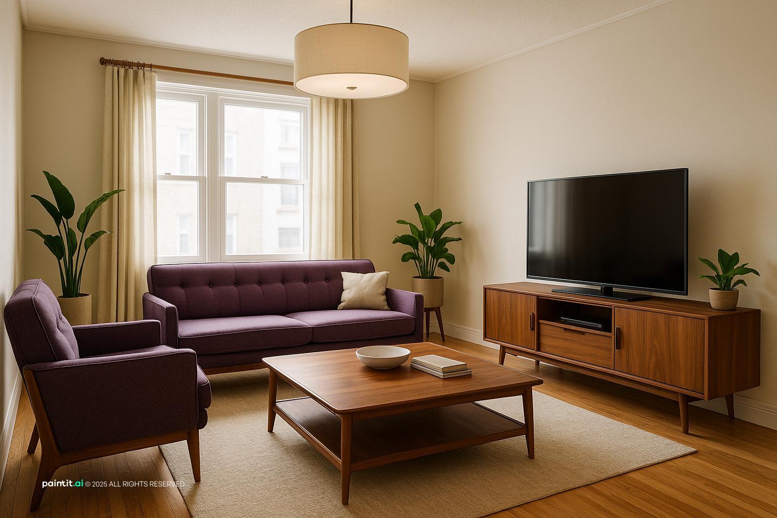
Purple Living Room Ideas with Purple Accents and Soft Textiles balances purple accents, soft textiles and metal accents in a living room setting.

Charming Pugliese Living Area Design pairs purple accents, soft textiles and metal accents in a living room setting.

Purple Living Room Ideas with Purple Accents and Metal Accents layers purple accents and metal accents in a living room setting.
Decide what job purple has in the living room. Is it the main wall color, one statement piece, or a supporting accent? A full-room lavender needs a different plan than a plum sofa or a few violet throw pillows. If the room is small, low, or short on windows, purple on every wall can make the edges feel closer. In that case, test a lighter tint, use purple above wainscoting, or keep it to one wall.
Why it works: a clear role keeps the room from looking crowded. When purple appears everywhere at the same strength, the eye has nowhere to rest. Keep one large neutral surface, such as the ceiling, rug, sofa, or curtains, so the color palette has room to breathe.
A purple accent wall should earn its place. Put it behind the sofa, around a fireplace, behind built-ins, or on the wall that frames the first view from the entry. Do not choose a random short wall just because it is easy to paint. The accent should make the layout feel more intentional.
For a purple accent wall living room, check the flooring undertone before the paint. Red-violet walls usually sit well with warmer oak or walnut. Blue-violet walls can look cleaner against grey flooring, but they may feel cold if the room lacks warm lamps. If you want to repaint before buying samples, the AI house painter tool is useful for checking whether the accent wall feels balanced from the actual camera angle of your room.
Lavender living room ideas are useful for apartments, north-facing rooms, and spaces with low ceilings. A lavender wall, curtain, or large textile adds color without the heaviness of plum. Pair it with cream upholstery, pale oak, and a small amount of matte black or brushed nickel for contrast.
The catch: very sweet lavender with shiny white furniture can drift into a bedroom mood. Ground it with a woven neutral rug, a squared-off coffee table, linen curtains, or simple wall art. Aim for soft, not sugary.
Dark purple living room ideas can look beautiful, but they are not forgiving. Plum, aubergine, blackberry, and deep violet absorb light. They work best with generous windows, warm lamps, or reflective details such as mirrors, glass, brass, and framed art. If you are unsure, use dark purple on one feature wall, built-ins, alcoves, or the lower half of the room before painting every wall.
In Paintit.ai prompts, lighting appears in only 5.9% of requests, even though it often decides whether purple looks rich or muddy. If your living room has weak natural light, make the purple a bit lighter, greyer, or warmer. Add floor lamps near dark corners before you judge the paint color.
Purple sofa living room ideas work best when the sofa has enough visual space around it. A velvet plum sofa can handle a simple cream wall, slim metal accents, and a warm wood coffee table. A softer mauve sofa usually looks better with tonal pillows, pale walls, and quiet artwork.
Keep the rug calm unless you are comfortable with pattern. A neutral rug in wool, jute, or a low-contrast geometric texture lets the purple sofa lead without fighting the floor. If you are staging an empty space or testing a new furniture direction, AI virtual staging can help you see whether a purple sofa suits your room size, window placement, and traffic path.
A purple and white living room can look clean and bright, but hard white can make purple feel sharp. Use warm white, ivory, chalk, or soft stone instead of cold gallery white if the purple has red, berry, or plum undertones. Then add one grounding material: oak, walnut, rattan, leather, or aged brass.
Why it works: white gives purple contrast, while warmer materials stop the palette from feeling thin. Be careful with glossy white surfaces. They bounce glare around the room and can make violet tones look harsher in daylight.
In Paintit.ai data, 12.0% of users explicitly say keep or do not change something. That matters with purple because most people are not starting from an empty white box. They are working around beige sofas, brown floors, grey sectionals, black media units, or rugs they already own. Start by naming the non-negotiables: KEEP oak floor, KEEP beige sectional, KEEP neutral rug, KEEP black media unit.
Then choose the purple that cooperates. Warm wood tones usually like mauve, fig, raisin, and red-violet. Cool grey floors tend to suit lavender, smoky violet, or blue-based purple. What to avoid: forcing a cool purple into a room full of yellow-beige finishes unless you add a bridge color, such as taupe, warm grey, or a rug that contains both notes.
If painting feels like too much, add purple through curtains, throw pillows, a blanket, an ottoman, or a patterned rug. This is the safest route for renters and for rooms with expensive fixed finishes. Repeat purple at least twice so it looks chosen: mauve pillows plus a plum stripe in the rug, or lavender curtains plus violet detail in wall art.
Scale is the thing people miss. One tiny pillow on a large grey sectional will look accidental. Use a larger textile surface, such as full-length curtains, a proper ottoman, or a wide throw, if you want the color to register from across the living room.
Green and purple can be very livable when the green is muted: olive, sage, eucalyptus, moss, or deep forest. Green steadies purple and keeps the room from feeling monochrome. This pairing works especially well with plants, aged wood tones, cream walls, and natural texture.
What to avoid: bright emerald plus bright violet unless you want a theatrical room. In most living rooms, one color should speak more quietly. If the sofa is purple, use green through plants, art, or one cushion. If the walls are lavender, try olive throw pillows or a mossy armchair.
Wall art can fix the common problem of a purple element looking isolated. Choose art that includes purple plus one or two colors already in the room: tan from the sofa, black from the lamp, rust from the rug, cream from the curtains, or brown from the wood frame. Hang it at seated eye level, not floating too high above the sofa.
Why it works: art acts like a visual bridge. It tells the eye that the purple sofa, the wood tones, the neutral rug, and the curtains belong together. Avoid art that matches the wall exactly. A little contrast is what gives the room depth.
Purple carries visual weight, especially in saturated shades. If you use a dark purple wall, keep some furniture silhouettes lighter: raised legs, open side tables, slim floor lamps, and a coffee table that does not cover too much of the rug. If the sofa is purple and bulky, use lighter curtains and a lower-contrast wall color.
Check the traffic path too. A deep sofa in a bold color will feel even heavier if it squeezes the walkway. Leave enough clearance around the coffee table and main passage so the color feels deliberate, not crammed into the room.
Purple is rarely perfect on the first try. In our product behavior data, iterative refinement language appears in 15.0% of prompts, with users asking for versions that are more muted, a bit darker, less saturated, or warmer. That is exactly how purple should be tested in a real living room.
If the room feels too cold, add red or grey to the purple, or bring in warmer lamps and wood tones. If it feels too heavy, lighten the wall color, move purple into textiles, or increase cream and natural texture. For a structured workflow, see how to redesign a living room with Paintit.ai using steps for color, style, material, and lighting.
The second gallery helps you compare where purple has the strongest effect: architecture, upholstery, textiles, or smaller decor. Look for the version that fits your room size, daylight, and existing furniture rather than the image that shouts the loudest.

Elegant French Country Living Room Design uses purple accents, soft textiles and layered neutrals in a living room setting.

Purple Living Room Ideas with Purple Accents and Open Layout balances purple accents, open layout and natural light in a living room setting.

Modern Scandinavian Living Room Design pairs purple accents, soft textiles and layered neutrals in a living room setting.

Stunning Ultra-Realistic Living Room Design layers purple accents, soft textiles and metal accents in a living room setting.
Purple can lean red, blue, grey, or brown. Red-based purples feel warmer and usually suit traditional furniture, brass, cream, and medium wood. Blue-based purples feel cooler and work with chrome, black accents, and crisp white trim. Greyed purples are often the easiest to live with because they have less saturation.
Use matte or eggshell on most purple walls. Shine can exaggerate uneven drywall and create glare, especially with darker paint. Save satin finishes for trim, built-ins, or areas that need more wipeability. Avoid choosing paint from a tiny chip under store lighting; purple can shift dramatically once it is on your own wall.
Wood is one of the most reliable partners for purple. Pale oak keeps lavender fresh. Walnut makes plum feel richer. Reclaimed wood relaxes a more formal violet scheme. Use wood on coffee tables, picture frames, shelving, side chairs, or flooring that you intentionally keep visible.
Why it works: wood adds a natural brown or honey note, which stops purple from feeling synthetic. Do not worry about matching every wood piece perfectly. A little variation looks more natural, but keep undertones compatible so the room does not feel patched together.
Brass and gold warm up plum, mauve, and berry shades. Black metal sharpens lavender and helps pale purple feel more modern. Chrome or nickel can work with cool violet, but too much shiny silver may make the living room feel cold if the bulbs are also cool.
Use metal accents in lamp bases, curtain rods, picture frames, cabinet pulls, and side tables. Keep them controlled. Two metal finishes are usually enough unless the room is large, layered, and already has a clear style direction.
Purple changes a lot by fabric. Velvet deepens the shade and reflects light in soft bands, which is why a purple sofa can look rich without needing a busy pattern. Linen and cotton make lavender or mauve feel more casual. Boucle softens the outline, while wool adds weight and warmth.
Use throw pillows to connect textures rather than repeat the exact same purple. Try one solid, one patterned, and one neutral pillow with a tactile weave. Avoid buying a full matching set. It can flatten the room and make the decor feel too planned.
A purple living room needs ambient, task, and accent light. Ambient light might be a ceiling fixture or recessed lighting. Task light comes from reading lamps near the sofa or armchair. Accent light can highlight shelves, wall art, plants, or a textured purple accent wall.
Warm bulbs usually make plum and mauve feel cozier. Cooler bulbs can make lavender look cleaner, but they may also push it greyer. Place lamps at different heights so purple walls do not fall into shadow. One overhead light is almost never enough, especially in darker rooms.
Purple can handle pattern, but the room needs hierarchy. If the rug has a strong pattern, keep curtains quieter. If the curtains are floral or graphic, use a simpler rug. A patterned cushion or framed textile is a low-risk way to bring in violet, lilac, cream, olive, or rust.
What to avoid: several purple patterns at the same scale. Mix a large-scale pattern with a small texture, or pair a patterned rug with solid upholstery. Repetition should feel steady, not busy.
Purple draws attention, so every surface does not need decor. Leave open space on the coffee table, shelves, and mantel. Use a few stronger objects: a sculptural lamp, a ceramic vase, books with plum or lavender spines, or one large artwork instead of many small pieces.
This matters even more in compact living rooms. Too many accessories make purple feel chaotic. Give the strongest color moments clear sightlines, then let neutral areas rest around them.
Paintit.ai is useful when you want to compare purple as paint, furniture, textiles, or a full redesign using your actual room photo. You can upload the living room, keep the floor or sofa, change the walls, add a purple sofa, adjust the rug, and test whether the space needs warmer lighting or lighter curtains.
For this color family, iteration matters. Start with a clear prompt such as: keep oak floors, add mauve walls, use warm lamps. Then refine it the way people naturally do in Paintit.ai: make the purple a bit greyer, try lavender instead, add brass, remove dark curtains. The AI living room design tool helps you compare those versions visually before spending money on paint, upholstery, or decor.
Cream, warm white, taupe, olive, sage, charcoal, oak, walnut, brass, and soft grey all work well. Use warmer partners for plum and mauve, and cooler partners for lavender or blue-violet.
Start with what you are keeping: floors, sofa, rug, trim, curtains, or a media unit. Then add purple in one main place, repeat it in smaller accents, and balance it with neutral surfaces, wood tones, and layered lighting.
Yes, if the shade matches the light and existing finishes. Pale purples feel airy, muted mauves are easy to live with, and dark purples work best with strong lighting and enough neutral contrast.
Use warm bulbs, soft textiles, a generous rug, wood furniture, and curtains that soften the windows. Avoid relying only on overhead light, because purple can look flat or muddy in shadows.
Use all walls for soft lavender, smoky mauve, or very muted purple. Choose one accent wall for saturated plum, aubergine, or violet, especially in small rooms or spaces with limited natural light.