
Cozy Modern Living Room Design for 2025
Cozy Modern Living Room Design for 2025 uses grey palette, cream tones and warm wood in a living room setting.
Cream and grey living room ideas only work well when the room has more going on than two safe neutrals. You need contrast, texture, warm light, and a clear decision about what stays cream, what becomes grey, and where the eye is supposed to land. In Paintit.ai usage, color appears in 27.6% of prompts and room type in 22.1%, so this is exactly how many people begin: with a color and a room. That is a good start, but the stronger results usually add the next layer quickly — wood, marble, fabric texture, curtains, lighting mood, or a piece they want to keep.
Cream softens grey. Grey gives cream enough structure so it does not become sugary, yellow, or washed out. The part people miss is undertone control. A yellow-based cream beside a blue-grey can feel cold and disconnected, while warm greige, stone grey, or mushroom grey usually sits more naturally with cream.
When you start a new project, an AI living room design tool can help you compare the ratio of cream to grey before you buy paint, rugs, or curtains. Approximately 70% of Homeowners use short, keyword-style phrases and rarely structured prompts at 0.9%, so it helps to turn “cream and grey” into visible choices: wall color, sofa fabric, rug texture, wood tones, metal finishes, and layered lighting.
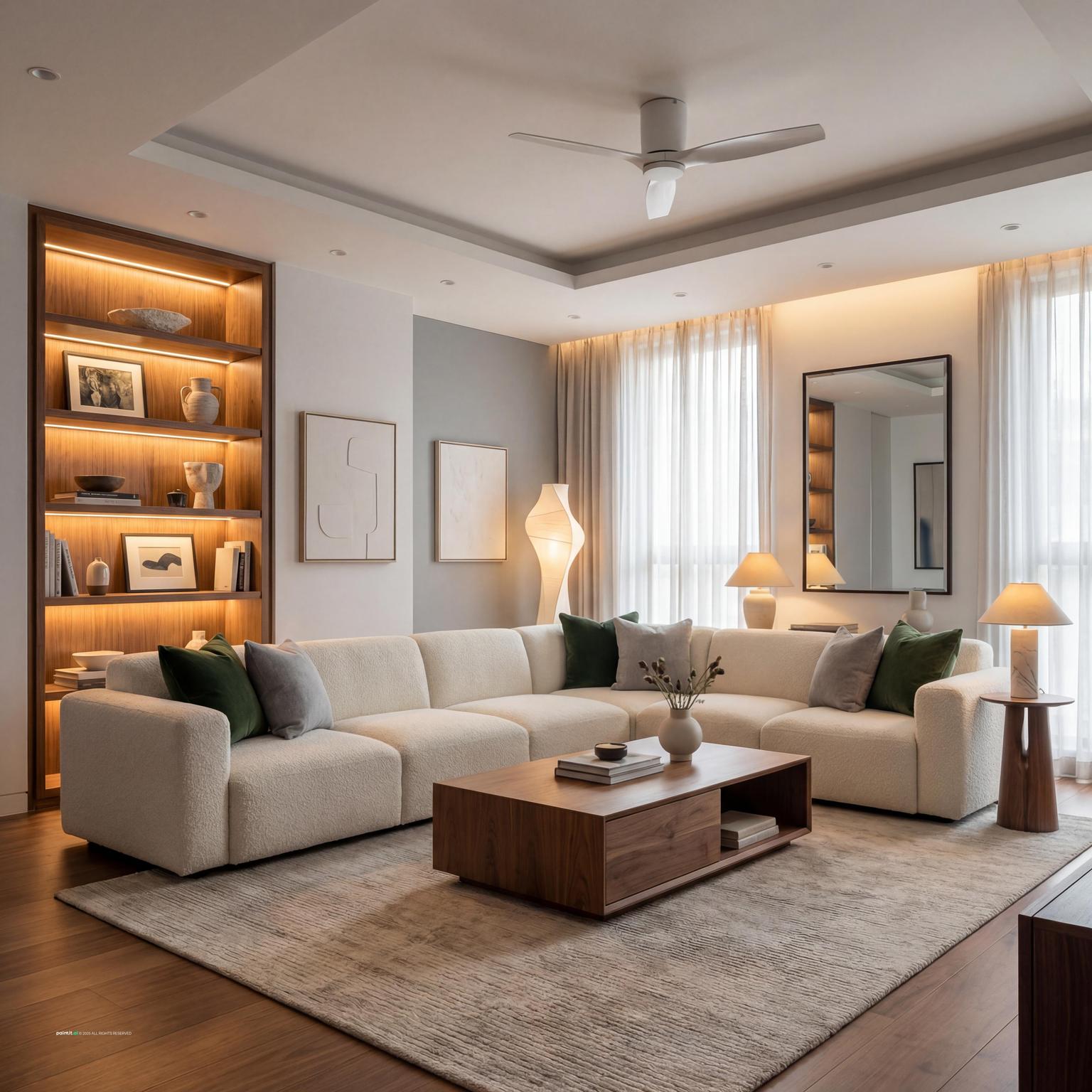
The first gallery looks at the most useful balance shifts: light cream walls with a grey sofa, cream upholstery with darker grey accents, warm wood details, and small black or brass touches that stop the room from looking pale all over.
Cozy Modern Living Room Design for 2025 uses grey palette, cream tones and warm wood in a living room setting.

Cream and Grey Living Room Ideas with Grey Palette and Cream Tones balances grey palette, cream tones and layered neutrals in a living room setting.

Elegant Neoclassical Living Room Design pairs grey palette, cream tones and layered neutrals in a living room setting.

Cream and Grey Living Room Ideas with Grey Palette and Cream Tones with Metal Accents layers grey palette, cream tones and metal accents in a living room setting.

Sleek Contemporary Living Room Design anchors grey palette, cream tones and soft textiles in a living room setting.

Elegant Neoclassical Living Room Design with Grey Palette softens grey palette, cream tones and layered neutrals in a living room setting.

Cream and Grey Living Room Ideas with Grey Palette and Cream Tones with Soft Textiles uses grey palette, cream tones and soft textiles in a living room setting.

Cream and Grey Living Room Ideas with Grey Palette and Cream Tones with Layered Neutrals balances grey palette, cream tones and layered neutrals in a living room setting.

Cozy Contemporary Living Room Design pairs grey palette, cream tones and metal accents in a living room setting.

Cream and Grey Living Room Ideas with Grey Palette and Cream Tones View 5 layers grey palette, cream tones and soft textiles in a living room setting.

Scandinavian Style Living Room Design anchors grey palette, soft textiles and layered neutrals in a living room setting.

Cream and Grey Living Room Ideas with Grey Palette and Cream Tones View 6 softens grey palette, cream tones and layered neutrals in a living room setting.
A living room usually feels calmer when one neutral clearly leads. If the room has weak natural light, let cream carry the walls, larger upholstery, and curtains. Then use grey for the rug, accent chairs, ottoman, built-ins, or a media wall.
Why it works: cream reflects more light, while grey gives the room edges. The problem starts when cream and grey are split evenly on every surface. That often reads patchy, not balanced.
Choose the item you are not replacing first. It might be a cream sofa, a grey sectional, a stone fireplace, oak flooring, or a rug that still works. In Paintit.ai data, 12.0% of prompts use “keep” or “don’t change” modifiers, which matches how real rooms are usually redesigned: people are almost always working around something.
Once the anchor is clear, repeat its undertone at least twice. A warm cream sofa can connect to ivory curtains and a wool rug. A cool grey sofa can connect to charcoal picture frames, a slate side table, or grey-toned wall art.
A cream sofa creates a big visual pause, so the grey accents need to look planned. Add two or three grey elements at different heights: a grey rug under the seating group, smoke-grey throw pillows on the sofa, and grey-toned wall art above it.
What usually goes wrong: every grey item ends up on the sofa. Spread the color through the room so the sofa belongs to the scheme instead of looking dressed after the fact.
North-facing rooms often make cool greys look blue or flat. In that case, use warm stone grey, mushroom grey, or greige instead of sharp silver grey. South-facing rooms can handle cooler greys more easily because the daylight already brings warmth.
Test the grey beside the cream surface it will touch: wall beside curtain, sofa beside rug, paint beside trim. A grey that looks refined on a sample card can turn muddy next to a creamy yellow undertone.
A neutral rug should be large enough for at least the front legs of the sofa and main chairs to sit on it. In many living rooms, that means a rug that extends 6 to 12 inches beyond the coffee table on all sides and does not stop awkwardly in the middle of the seating group.
For a cream and grey palette, look for woven texture, faint striation, or a low-contrast pattern. The rug is the bridge at floor level. Without it, a grey sofa, cream walls, and wood tables can feel like separate decisions.
An accent wall can work behind a sofa, media unit, or fireplace if the rest of the room is very pale. Choose soft charcoal, warm greige, putty grey, or a deeper stone grey rather than a hard cold grey, unless the room has strong daylight and warm floors.
Do not paint a random wall just because the room feels unfinished. The best accent wall frames a focal point, improves the view from the doorway, or balances a large cream sofa.
A flat cream and grey living room is not always a color problem. Very often, it is a texture problem. Combine a boucle chair, linen curtains, a wool rug, matte ceramic lamps, and a smooth stone or wood coffee table.
In Paintit.ai tests, we often see that a simple “cream and grey” prompt without material modifiers such as wood or marble can produce a sterile result. Add texture before you repaint everything. A heavier weave, ribbed fabric, or matte ceramic lamp can change the room faster than another shade of grey.
Wood stops grey from feeling cold and keeps cream from looking too plain. Light oak works well for Scandinavian and casual rooms, walnut adds weight, and weathered wood suits relaxed transitional spaces.
Use wood where hands naturally land: coffee table, side tables, shelving, picture frames, or chair legs. Avoid matching every wood piece exactly. One repeated wood tone plus a small darker note usually feels more natural than a perfect furniture set.
Cream and grey can blur together if every edge is soft. Thin black lines help: a metal floor lamp, curtain rod, picture frame, fireplace tool set, or side table base.
Black gives the eye a stopping point. The catch is quantity. Too much black in a low-light room can make the cream grey living room color scheme feel heavy instead of crisp.
For a modern cream and grey living room, choose fewer pieces with stronger silhouettes: a low cream sofa, a simple grey rug, a slab-style coffee table, and minimal wall art. Keep the palette quiet, but let shape and scale do more work.
The common mistake is stripping the room back so far that it feels empty. Add one tactile element — boucle, ribbed ceramic, veined stone, or a woven shade — so the room still has depth when you sit in it.
Use three layers: ambient light from ceiling fixtures, task light near reading seats, and accent light for art, shelves, or a fireplace wall. Warm bulbs usually flatter cream better than cool bulbs, especially in the evening.
Users frequently include modifiers for materials at 19.0%, style at 17.1%, and lighting at 5.9%. That tracks with what we see in room uploads: lighting is often the first weak spot. Grey can look elegant in daylight and dull at night, so test lamps before blaming the paint.
Cream and grey accept many accent colors, but the most livable choices are muted. Try sage, olive, dusty blue, clay, rust, black, soft blush, or deep brown. Use the accent color in three places, not ten: perhaps throw pillows, one art print, and a vase.
Repetition makes the accent feel designed. A bright accent used only once can look accidental in an otherwise restrained neutral grey and cream living room.
A neutral palette can still feel cluttered if the layout blocks movement. Leave a clear path from the entry to the sofa, balcony, fireplace, or adjoining room. In a typical seating zone, keep about 16 to 18 inches between the sofa and coffee table for comfortable reach and movement.
Use lighter cream pieces where you need visual openness and darker grey pieces where the room needs grounding. This is especially helpful in apartments or narrow living rooms, where one bulky dark piece can pull the whole layout off balance.
Cream and grey living room decor looks better when accessories have a job. Use wall art to connect undertones, throw pillows to introduce texture, curtains to soften vertical lines, and a tray to organize the coffee table.
A common mistake is adding many small grey and cream items because the palette feels safe. Remove weak pieces first. Then add one larger object with presence — a textured lamp, oversized art, or a sculptural bowl.
The second gallery compares practical variations: warmer cream with greige, cooler grey with ivory, a compact apartment layout, a larger family room, and versions where the same sofa changes mood through rugs, curtains, lighting, and accent colors.

Stylish Modern Living Room Design uses grey palette, cream tones and metal accents in a living room setting.

Luxury Modern Hotel Living Room Design balances grey palette, metal accents and layered neutrals in a living room setting.

Modern Living Room Redesign pairs grey palette, cream tones and layered neutrals in a living room setting.

Stylish Minimalist Living Room Design layers grey palette, cream tones and warm wood in a living room setting.

Modern Minimalist Living Room Design anchors grey palette, metal accents and clean-lined furniture in a living room setting.

Stunning Scandinavian Living Room Design softens grey palette, warm wood and soft textiles in a living room setting.

Modern Living Room Design Inspiration uses grey palette, cream tones and soft textiles in a living room setting.

Scandinavian Contemporary Living Room Design balances grey palette, soft textiles and clean-lined furniture in a living room setting.

Cream and Grey Living Room Ideas with Grey Palette and Warm Wood pairs grey palette, warm wood and clean-lined furniture in a living room setting.

Cozy Scandinavian Living Room with Color Accents layers grey palette, warm wood and soft textiles in a living room setting.

Stunning Mid-Century Modern Living Room anchors grey palette, cream tones and warm wood in a living room setting.

Cream and Grey Living Room Ideas with Grey Palette and Cream Tones View 7 softens grey palette, cream tones and soft textiles in a living room setting.
A cream grey living room color scheme should start with undertones, not with individual products. Put the cream, grey, floor color, and trim color together in the same light. If the cream is buttery, choose a warm grey. If the cream is closer to ivory, a cooler grey may work.
This stops the room from feeling like two neutrals borrowed from different houses. For broader palette comparisons, the best living room colors guide can help you see where cream and grey sit beside beige, white, green, and richer tones.
Use linen curtains, wool rugs, boucle chairs, cotton velvet pillows, or a chunky knit throw. These materials catch shadow differently, which matters when the palette is restrained.
Place texture where the room is touched most: sofa, chair, rug, and cushions. Be careful with shiny synthetic fabrics. Under artificial light, they can make cream look yellow and grey look thin.
Wood tones warm the palette. Metal finishes sharpen it. Brass and aged bronze work well with warm cream, while blackened steel, brushed nickel, or pewter can suit cooler grey.
Use one dominant metal and one small secondary metal at most. Too many finishes make a neutral grey and cream living room feel busy even when the colors are quiet.
Stone can be beautiful in a cream and grey room, especially on a coffee table, fireplace surround, side table, or lamp base. Look for veining that includes both warm and cool notes so it bridges the palette.
Avoid very blue marble beside yellow cream unless another cool element nearby supports it. Softer limestone, travertine, or warm marble is usually easier to live with.
Curtains should not be the last thing you choose. Hang them high and wide so the window looks larger, and choose a fabric that relates to either the wall or sofa. Cream curtains can soften grey walls. Greige curtains can make cream walls feel more tailored.
Avoid short curtains that stop at the sill in a formal living room. They break the vertical line and make the wall feel chopped up.
Use a ceiling fixture for general light, table lamps for warmth, a floor lamp near the reading chair, and small accent lights for shelving or art. Warm white bulbs usually make cream more flattering and stop grey from going cold.
Paintit.ai users often refine with words like “a bit,” “more,” “less,” “warmer,” and “darker”; 15.0% of prompts contain iterative refinement language, and 34% of all messages are part of multi-turn chats with 5+ turns. That same thinking applies here. A slightly warmer bulb or dimmer shade can change the room more than another pillow.
On a coffee table, combine one low object, one taller object, and one practical object. For example: a stone tray, a ceramic vase, and a book stack. On shelves, leave negative space so cream and grey items do not merge into visual noise.
The goal is decor balance. Avoid filling every surface with small pale accessories. Use fewer pieces with clearer shape, texture, or color weight.
Start with paint samples, rug options, curtains, and lighting before buying large furniture. If you are struggling to balance a sofa, rug, and wall color, the walkthrough on how to redesign a living room with Paintit.ai is useful because it mirrors the real process: keep one thing, change one thing, compare, then refine.
In Paintit.ai, upload a photo of your living room and test specific moves: paint the walls warm grey, keep the cream sofa, add a neutral rug, change the curtains, remove visual clutter, or make the lighting warmer. This is most useful when you already know what should stay and what can change.
For a new or empty home, AI virtual staging can show whether your existing cream furniture will work with grey walls before you move pieces in. You can also use an AI room design workflow for small refinements — a bit darker grey, more texture, less clutter, warmer wood — because cream and grey often improve through subtle adjustments rather than one dramatic change.
Yes. Cream adds warmth and softness, while grey adds structure. The pairing works best when the undertones agree and the room has texture, wood, and layered lighting.
Choose one dominant color first, then repeat the other through rugs, pillows, curtains, wall art, or accent chairs. Add wood tones and a few darker details so the room has contrast.
Sage, olive, dusty blue, rust, clay, black, brown, and muted blush all work well. Pick one accent color and repeat it in a few places instead of scattering many colors around the room.
Add texture before adding more color: woven rugs, linen curtains, boucle, wood, stone, and ceramic. Then fix the lighting with table lamps, floor lamps, and warm bulbs.
A grey sofa is usually easier for heavy use and pets. A cream sofa feels lighter and softer. Either can work if the rug, pillows, curtains, and wall color connect the palette.