
Bright Modern Living Room Design
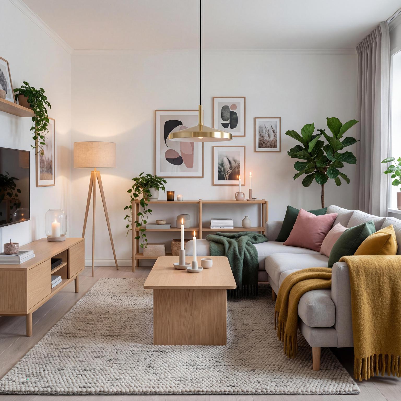
Bright Modern Living Room Design uses grey palette, yellow accents and soft textiles in a living room setting.
Yellow and grey living room ideas usually fail or succeed on balance. Grey gives the room its base. Yellow decides where the eye goes, how warm the space feels, and whether the room looks calm or busy. The common mistake is spreading both colors everywhere. I would start by choosing what stays quiet, what becomes the focal point, and how much yellow the room can carry before it starts shouting.
A yellow and grey color scheme works because it mixes restraint with warmth. Grey can handle the larger surfaces: a sofa, wall, rug, media unit, fireplace, or built-in storage. Yellow usually does better in measured places: cushions, wall art, a chair, flowers, curtains with a small pattern, or one painted feature.
If you are comparing this palette with other best living room colors, look closely at saturation before you buy anything. Pale lemon, butter yellow, ochre, mustard, and golden yellow behave like different colors once they sit next to a grey sofa.
In Paintit.ai behavior data, color is the most common design modifier at 27.6%, and room type appears in 22.1% of prompts. That matches what we see in real uploads: people usually begin with a room and a palette, then adjust the details. For a living room, the useful question is not only “do yellow and grey work together?” It is where each color should sit in the layout, the light, the furniture, and the materials.
Use the first gallery to compare how yellow behaves as pillows, wall art, curtains, rug detail, a chair, or a single accent wall against different grey foundations.
Bright Modern Living Room Design uses grey palette, yellow accents and soft textiles in a living room setting.

Yellow and Grey Living Room Ideas with Grey Palette and Yellow Accents balances grey palette, yellow accents and soft textiles in a living room setting.

Stunning Mid-Century Modern Living Room pairs grey palette, yellow accents and warm wood in a living room setting.

Yellow and Grey Living Room Ideas with Grey Palette and Yellow Accents with Soft Textiles layers grey palette, yellow accents and soft textiles in a living room setting.

Modern Minimalist Living Room Design anchors grey palette, yellow accents and soft textiles in a living room setting.

Contemporary Living Room with Empire Elements softens grey palette, yellow accents and layered neutrals in a living room setting.

Vibrant Home Interior Design with Textiles uses grey palette, yellow accents and warm wood in a living room setting.

Stylish Modern Living Room Design balances grey palette, yellow accents and soft textiles in a living room setting.

Modern Minimalist Living Room with Vintage Touches pairs grey palette, yellow accents and warm wood in a living room setting.

Yellow and Grey Living Room Ideas with Grey Palette and Yellow Accents with Layered Neutrals layers grey palette, yellow accents and layered neutrals in a living room setting.

Yellow and Grey Living Room Ideas with Grey Palette and Yellow Accents with Warm Wood anchors grey palette, yellow accents and warm wood in a living room setting.

Elegant Neoclassic Living Room Design softens grey palette, yellow accents and natural light in a living room setting.
Before adding yellow, list the large pieces that are staying: grey sofa, charcoal armchair, pale grey wall, concrete fireplace, neutral rug, existing flooring, or built-in storage. In Paintit.ai tests, we often see better design directions when people say what to keep first, especially with a grey sofa or fixed flooring.
Treat those pieces as anchors. If the sofa is deep charcoal, use warmer yellows and lighter wood tones so the room does not feel heavy. If the grey is pale and cool, be careful with icy lemon accents unless the room has strong natural light. What usually goes wrong: people buy yellow decor before checking whether their grey has blue, green, beige, or purple undertones.
A safe starting point is 60% grey, 30% white, cream, wood, or stone, and 10% yellow. In a real room, that might mean grey walls and sofa, a light oak coffee table and neutral rug, then yellow throw pillows, art, and one ceramic lamp.
The catch is that yellow has more visual volume than most colors. Ten percent can feel like much more because the eye finds it immediately. If the room feels too quiet, add one larger yellow moment, such as an accent chair or oversized artwork, instead of scattering small yellow objects across every shelf.
A grey sofa is one of the easiest starting points for yellow and grey living room decor. It gives the room a calm center. Add two or three yellow throw pillows, but vary the texture: one velvet, one woven, one patterned with grey, cream, or black. Leave some negative space between cushions so the sofa does not look dressed for a showroom.
For a more finished look, repeat the yellow once across the room, maybe in wall art or a small side table object. Do not repeat it on every surface. A yellow accent grey living room feels intentional when the color has rhythm, not when it appears as a checklist.
A mustard yellow and grey living room is especially useful in spaces with cool daylight, concrete finishes, black window frames, or blue-grey upholstery. Mustard has enough brown and gold in it to soften grey without making the room feel bright or childish.
When people upload a living room with low natural light, the weak spot is often that the grey reads colder than expected. Shifting yellow accents a bit warmer usually helps. Try mustard curtains, an ochre ottoman, or art with golden tones. Avoid pairing mustard with muddy beige walls unless you add clean contrast through white trim, black metal finishes, or a simple rug.
A yellow accent wall can work behind a sofa, shelving unit, or fireplace, but it needs a reason. The best wall is usually the one that already acts as the room’s focal point. If you paint a random side wall yellow, the room can feel pulled in the wrong direction.
Use softer ochre or muted gold for larger walls, especially in small rooms. Bright yellow works better on a narrow chimney breast, alcove, built-in niche, or panel detail. The architecture contains the color. Painting all four walls yellow around a grey sofa is a much bolder choice, and it needs very careful lighting and furniture balance.
If you rent or do not want to paint, oversized wall art can do a lot of work. Choose a piece with grey, yellow, cream, and one grounding tone such as black, walnut, olive, or rust. Hang it low enough to relate to the sofa, not floating near the ceiling.
This is one of the simplest ways to test a grey and yellow living room without changing furniture. The art also gives you permission to repeat colors elsewhere. Pull one yellow from the print for pillows and one darker tone for a lamp, tray, or frame.
A neutral rug is often better than a yellow rug because it gives the eye somewhere to rest. Look for warm grey, ivory, oatmeal, greige, or a subtle pattern that includes both yellow and charcoal. Size matters: at minimum, the front legs of the sofa and chairs should sit on the rug so the seating area feels connected.
Yellow and grey already create contrast, so the rug should usually bridge rather than compete. Avoid a tiny rug floating under the coffee table. It makes the room feel under-furnished and can make yellow accents look random because nothing visually ties the furniture together.
A yellow accent chair can be stronger than ten small yellow accessories. It works especially well opposite a grey sofa or beside a window as a reading spot. Choose a shape that fits the room: a compact barrel chair for a small apartment, a slim mid-century lounge chair for a modern yellow and grey living room, or a soft upholstered armchair for a family space.
Check clearance before you fall in love with the chair. Leave enough room to walk between the chair, coffee table, and sofa without turning sideways. What to avoid: a very bright yellow chair if the room already has yellow curtains, pillows, and art. One main yellow furniture piece usually needs quieter support around it.
If the room feels cold, the answer is not always more yellow. I would treat it as a material balance problem first. Wood tones often do more for a grey-heavy living room than extra decor, especially in coffee tables, picture frames, sideboards, flooring, shelves, and lamp bases.
Light oak gives a cleaner Scandinavian feel. Walnut feels richer and more settled. Reclaimed or rustic wood can soften a sharp modern room. Paintit.ai data shows material language appears in 19.0% of prompts, which makes sense because texture changes how color feels. If you want to test furniture and material swaps before buying large pieces, AI living room design can help you compare options in your own room photo.
Curtains affect both color and light, so do not leave them until the end. In a grey room, warm white, oatmeal, soft taupe, or pale grey curtains are usually safer than bright yellow panels. If you want yellow near the window, try a patterned fabric with a small ochre stripe or a warm lining rather than a full block of color.
Daylight passes through fabric and changes it. Strong yellow curtains can cast a warm tint across the room, which may help in a north-facing space but feel too intense in a sunny one. Hang curtains high and wide so the window feels larger and the wall does not look chopped into short sections.
Metal finishes sharpen a yellow grey living room color scheme. Black metal adds definition and works well in lamp arms, picture frames, curtain rods, and coffee table legs. Brass warms the palette and pairs naturally with mustard or ochre. Chrome or brushed steel can work in a modern yellow and grey living room, but it needs soft textiles nearby so the space does not feel like an office.
Do not mix every metal in equal amounts. Pick one main finish and one supporting finish if needed. Black curtain rods and frames can sit well with a brass floor lamp. Add chrome tables, silver mirrors, and gold accessories on top, and the room may start to feel unsettled.
Yellow is useful for zoning because it attracts attention. In an open-plan living room, use a yellow cushion, small chair, floor lamp shade, or framed print to mark a reading corner. Pair it with a small table and a warm bulb so the corner feels useful, not just decorative.
Keep the zone connected to the rest of the room by repeating grey in the chair legs, rug, artwork, or nearby throw. This is where layout matters. If the nook blocks the path from the doorway to the sofa, the color will make the obstruction more obvious.
Pattern can stop a yellow and grey room from looking flat, but too many small patterns create noise. Use one medium or large pattern, such as a geometric rug, abstract art, or striped cushion, then keep the remaining textiles calmer. A large-scale pattern often looks more relaxed than several tiny motifs competing with each other.
Avoid matching yellow patterned curtains, yellow patterned cushions, and a yellow patterned rug. The repetition can feel like a themed set rather than a lived-in living room. If you love pattern, vary the scale and place plain pieces between them.
Paintit.ai data shows 15% of prompts include refinement language such as instead, more, a bit, or now. That is exactly how this palette should be developed. Start with a base version, then adjust: a bit more mustard, less yellow, warmer grey, darker sofa, softer curtains, or more wood.
The better results usually come when yellow is treated as something to tune, not as a one-time decision. If the first attempt feels too bright, do not abandon the palette. Make the yellow dustier, reduce it to fewer objects, change the bulb temperature, or add texture before replacing everything.
Use the second gallery to compare whether yellow works best in your room as a small accent, a larger upholstery choice, a painted feature, or a repeated detail across textiles and art.

Luxury Modern Living Room Design uses grey palette, yellow accents and soft textiles in a living room setting.

Stylish Teal Sofa Living Room Design balances grey palette, yellow accents and soft textiles in a living room setting.

Yellow and Grey Living Room Ideas with Grey Palette and Yellow Accents View 5 pairs grey palette, yellow accents and soft textiles in a living room setting.

Elegant Neoclassical Living Room Design layers grey palette, yellow accents and layered neutrals in a living room setting.

Stylish Midcentury Modern Living Room Design anchors grey palette, yellow accents and warm wood in a living room setting.

Modern Living Room Design for 2025 softens grey palette, yellow accents and soft textiles in a living room setting.

Elegant Neoclassical Living Room Design with Grey Palette uses grey palette, yellow accents and layered neutrals in a living room setting.

Yellow and Grey Living Room Ideas with Grey Palette and Yellow Accents View 6 balances grey palette, yellow accents and warm wood in a living room setting.

Yellow and Grey Living Room Ideas with Grey Palette and Yellow Accents View 7 pairs grey palette, yellow accents and warm wood in a living room setting.

Yellow and Grey Living Room Ideas with Grey Palette and Yellow Accents View 8 layers grey palette, yellow accents and soft textiles in a living room setting.

Bold Contemporary Living Room Design anchors grey palette, yellow accents and soft textiles in a living room setting.

Elegant Indian-Style Living Room Design softens yellow accents, soft textiles and metal accents in a living room setting.
Grey is not neutral in every room. Blue-grey feels crisp but can become cold. Green-grey feels earthy. Beige-grey is warmer and easier with mustard. Purple-grey can fight with yellow if the light is poor. Check the grey beside your sofa, rug, flooring, and window light before choosing paint or textiles.
Use warmer yellows with cool greys and softer, dustier yellows with warm greiges. Do not choose grey paint from a tiny sample under store lighting. Test it on the wall and look at it in morning, afternoon, and evening light.
Lemon yellow feels fresh and graphic, but it needs restraint. Butter yellow is softer and works well with light grey, cream, and pale wood. Mustard and ochre feel warmer and usually sit better with charcoal, walnut, leather, and brass.
If the room is small, keep yellow on movable pieces first: pillows, art, a throw, a lamp, or a pouf. If the room is large and neutral, a deeper yellow chair or wall detail can hold its own. Avoid using very saturated yellow on every decorative object; it will dominate the sightline.
Textiles are where a yellow and grey room starts to feel comfortable instead of purely graphic. Mix wool, boucle, velvet, linen, cotton, and woven textures. A smooth grey sofa with velvet yellow pillows and a chunky cream throw will feel richer than a room where every surface has the same flat finish.
Use curtains, throw pillows, and upholstery to control softness. If the furniture has hard edges, choose looser fabrics. If the room already has many soft shapes, add structure through a tailored cushion, flatweave rug, or crisp curtain panel.
Wood tones, stone, rattan, ceramic, and plaster help yellow and grey feel less synthetic. A grey sofa beside a pale oak table and a ceramic lamp will usually feel warmer than the same sofa beside only glossy white and chrome.
Where to use it: coffee tables, shelving, sideboards, trays, frames, lamp bases, and fireplace details. Avoid adding too many unrelated wood colors. Two wood tones can work. Five usually look accidental unless the room has a deliberately collected style.
Layered lighting is one of the biggest fixes for a flat yellow and grey room. Use overhead light for general brightness, a floor lamp near seating, table lamps for warmth, and accent lighting for art or shelves. Warm white bulbs usually make yellow richer and grey less harsh.
Paintit.ai behavior shows lighting appears in only 5.9% of prompts, even though it changes the result heavily. If a render or real room looks muddy, check the lighting before changing every color. Avoid relying on one ceiling fixture, especially if it creates glare on grey walls and shadows under furniture.
Yellow decor carries more visual weight than beige, white, or pale grey. A few strong pieces often look better than many small ones. Try one yellow bowl on a coffee table, one artwork, and two pillows instead of yellow candles, books, vases, trays, flowers, lamps, and frames all at once.
This also answers the no clutter concern we often see in room refinements. Paintit.ai data shows negatives such as “without” and “no clutter” appear in 8.8% of prompts, and that instinct is useful here. Leave breathing room around yellow objects so they read as intentional accents. If a shelf looks busy, remove half the yellow items and repeat the color in one larger object instead.
For a cleaner modern look, use slim furniture, black or brass metal finishes, a low-profile sofa, simple curtains, and abstract wall art. Then soften the room with a textured rug, warm bulb temperature, and one rounded piece, such as a pouf or curved chair.
What to avoid: making every element sharp, grey, and high-contrast. Yellow can become harsh in a room with only hard lines and reflective surfaces. Add one tactile element near every major grey surface: a throw on the sofa, a rug under the table, curtains at the window, or wood beside a media unit.
Upload your living room photo and test the palette in steps: keep the grey sofa, add mustard pillows, change curtains to warm white, paint one accent wall, or make the lighting warmer. This mirrors how many users work in Paintit.ai. Imperative prompts such as “Make / Create / Add / Change…” appear in 30.1% of the data, and 15% refine designs with small changes like more, less, a bit darker, or instead.
If you are keeping the layout but want to preview new styling, AI virtual staging can show how yellow accents, wood pieces, art, and lighting changes interact with your existing furniture. If you want to test broader room edits, AI room design is useful for comparing several directions before you commit. For a more complete workflow, use how to redesign a living room with Paintit.ai to move from palette testing into layout, materials, and final details.
Yes. Grey gives the living room structure and calm, while yellow adds warmth and focus. The key is matching undertones and using yellow in controlled places rather than spreading it across every surface.
Start with the largest grey pieces, such as the sofa, rug, walls, or media unit. Then add yellow through throw pillows, wall art, a chair, a throw, curtains with a small pattern, or one accent wall. Repeat the yellow once or twice so it feels connected, not scattered.
White, cream, black, walnut, oak, olive, rust, brass, and soft taupe all work well. Wood tones and black metal are especially useful because they ground the yellow and grey color scheme without adding visual clutter.
Add texture, layered lighting, and material contrast. Use wood, woven textiles, warm bulbs, metal finishes, curtains, varied fabric textures, and wall art instead of relying only on color.
Mustard is usually easier to live with because it warms cool grey and feels less sharp. Bright yellow can work well in a modern yellow and grey living room, but it is best used in smaller accents or very controlled graphic details.