
Scandinavian Style Living Room Design
Scandinavian Style Living Room Design uses grey palette, red accents and soft textiles in a living room setting.
Red and grey living room ideas work when each color has a clear job. Grey should hold the room together. Red should pull the eye to the right places. Then you need a third layer — wood, cream, black, brass, stone, or warm white — so the contrast does not feel stiff. The common mistake is treating red and grey like two paint chips. In real living rooms, the result depends on the sofa depth, rug size, daylight, wall undertone, fabric texture, and where the red accents sit in the sightline. A small red cushion can look sharp in a render and strangely lonely on a big grey sectional.
A good grey and red living room usually starts with one thing you are not replacing: a grey sofa, charcoal rug, red brick fireplace, existing curtains, built-ins, or flooring. I would start there before choosing any shade of red. In Paintit.ai data, 12.0% of prompts use a keep or do not change constraint, which fits how decorating really happens. Most people are not designing from an empty white box.
Color is still where people naturally begin. In our prompt data, color appears in 27.6% of requests, while material appears in 19.0% and lighting in only 5.9%. That gap matters. A red and grey color scheme can look finished when red appears as velvet, wool, brick, lacquer, leather, or wall art. It can look flat when it is only a plain red wall with grey furniture pushed against it. If you want to compare options before buying anything, an AI living room design workflow can help you test whether the room needs more warmth, more texture, or simply less red.
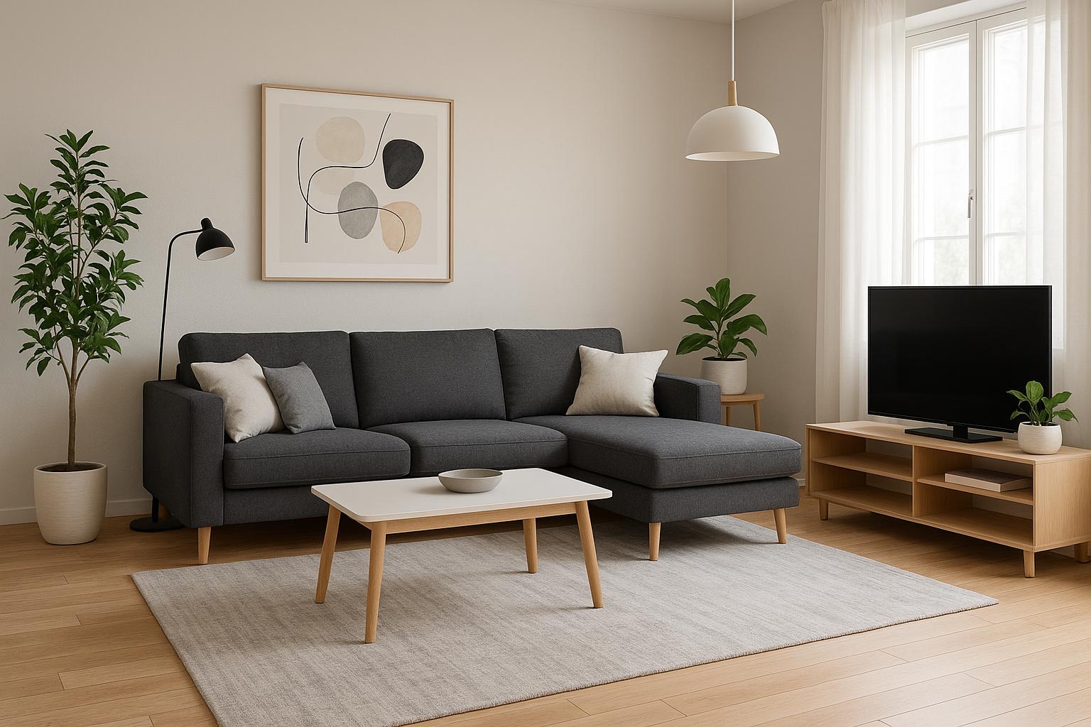
Use the first gallery to check where the red actually lands: pillows, artwork, rugs, chairs, walls, shelving, or built-ins. The best rooms spread red through the sightline instead of leaving one red object stranded in a corner.
Scandinavian Style Living Room Design uses grey palette, red accents and soft textiles in a living room setting.

Stylish Modern Living Room Design balances grey palette, red accents and metal accents in a living room setting.

Stylish Minimalist Living Room Design pairs grey palette, red accents and warm wood in a living room setting.

Red and Grey Living Room Ideas with Grey Palette and Red Accents layers grey palette, red accents and warm wood in a living room setting.

Scandinavian Contemporary Living Room Design anchors grey palette, red accents and soft textiles in a living room setting.

Scandinavian Living Room Design softens grey palette, red accents and warm wood in a living room setting.

Stunning Mid-Century Modern Living Room uses grey palette, red accents and warm wood in a living room setting.

Sophisticated Modern Living Room Design balances grey palette, red accents and metal accents in a living room setting.

Modern Living Room Design with High-Tech Features pairs grey palette, red accents and plants and greenery in a living room setting.

Modern Living Room Redesign layers grey palette, red accents and layered neutrals in a living room setting.

Contemporary Living Room Redesign anchors grey palette, red accents and metal accents in a living room setting.

Luxury Modern Hotel Living Room Design softens grey palette, red accents and metal accents in a living room setting.
If you already own a grey sofa, let it anchor the palette instead of trying to hide it. A medium grey sofa can handle brighter red accents. A charcoal sofa usually looks better with deeper reds such as wine, oxblood, or burgundy. Add red through throw pillows, a patterned rug, one accent chair, or large wall art rather than matching every small accessory.
Why it works: the sofa is usually the largest visual mass in the living room, so it sets the temperature. What often goes wrong is a vivid red pillow placed on a very cool grey sofa with nothing between them. Add a beige throw, walnut table, warm white lampshade, or muted rug to create a middle step.
A useful starting point is 60% grey, 30% warm neutral or wood, and 10% red. In a red accent grey living room, that 10% can be plenty because red carries more visual weight than most colors. Think grey walls and sofa, a neutral rug and wood furniture, then red cushions, artwork, books, or one strong chair.
The exact split depends on the red. Burgundy can cover more surface because it sits back. Tomato red needs more restraint, especially in smaller rooms or spaces with glossy floors, mirrors, or strong afternoon sun.
Not all reds behave the same way. Clear red feels graphic and energetic. Rust red feels earthy. Berry red feels softer. Burgundy feels grounded and a little more formal. A burgundy and grey living room often works well in older homes, rooms with dark wood, or spaces meant to feel calmer in the evening.
Test the red against your actual grey, not against a white sample card. Cool blue-grey can make warm reds jump forward. Greige or taupe-grey makes rust and wine tones feel more settled. The catch: mixing too many reds in one room usually looks messy unless they share the same undertone.
A neutral rug is often the easiest way to stop red and grey from feeling hard. Look for cream, oatmeal, greige, taupe, or warm grey with small red details if you want pattern. The rug should be large enough for at least the front legs of the sofa and chairs to sit on it; otherwise the seating area can look chopped up.
Why it works: the rug gives the palette a bridge. If the rug is pure black, bright white, and red, the room may become too graphic for daily comfort. A textured wool, flatweave, or low-pile rug with mixed yarns is usually more forgiving than a flat solid grey rug.
Red gets noisy fast when it appears as a vase, candle, cushion, tray, blanket, frame, lamp, and book stack all at once. A cleaner move is one confident focal point: a red lounge chair, large abstract painting, red patterned rug, or painted shelving back. Then repeat the color only two or three times in smaller amounts.
This matters even more in open-plan rooms where the living area is visible from the kitchen or dining space. Put the main red moment where it helps the room, not where it attacks the entry. A red chair near a window can feel intentional. Random red accessories on every surface can feel like a theme party.
A red accent wall can work, but it needs a reason. Use it behind a fireplace, media wall, shelving niche, or sofa wall where the color frames something important. If the wall has too many doors, switches, vents, outlets, or awkward corners, red will point to every interruption.
Paintit.ai prompts include repaint or paint actions in 13.2% of cases, and this is one move worth previewing before opening a paint can. If you are deciding whether to change the wall color, test a few versions with how to redesign a living room with Paintit.ai and compare a deep red wall against grey, greige, or off-white. Quite often, the better answer is not a red wall. It is red art on a warmer grey wall.
A modern red and grey living room can look crisp with low-profile seating, black metal legs, clean-lined tables, and large-scale art. The risk is coldness, especially when every surface is smooth: grey sectional, glass coffee table, white walls, polished metal. Add texture through bouclé, wool, linen curtains, ribbed wood, matte ceramics, or a nubby rug.
In Paintit.ai tests, a basic red and grey prompt often pushes toward high contrast unless warm wood tones or warm lighting are added. The practical fix is simple: choose one warm material and repeat it. Walnut side tables plus a tan leather ottoman, for example, can make red look deliberate instead of harsh.
Curtains are not just the final touch in this palette. Grey curtains can calm a room with strong red accents. Warm white or oatmeal curtains can soften a charcoal-heavy scheme. If the room gets cool northern light, be careful with icy grey curtains beside bright red decor because the contrast can feel severe.
Choose fabric with enough body to hang well: linen blend, wool blend, cotton velvet, or a textured weave. Hang the rod high and wide so the window looks larger and the panels do not block daylight. I would avoid thin shiny red curtains unless the room is intentionally theatrical; they can throw red color onto walls and skin in a way that rarely feels flattering.
Decor balance depends on where the eye travels. If every red item sits on the sofa, the color looks accidental. Place red low, middle, and high: a rug detail, a cushion or chair, and artwork or a lampshade.
Keep the repetition loose rather than perfectly matched. A burgundy book spine, rust stripe in a cushion, and red-brown ceramic vase can work together without looking over-coordinated. The important part is spacing. Red should appear across the main sightline, not on every surface.
Grey walls can be beautiful, but they need support. If the walls are cool grey, bring in oak, walnut, brass, camel leather, or warm white textiles. If the walls are warm grey, you can use blackened metal, stone, and deeper burgundy without making the room feel too stark.
Before painting the whole room, sample the grey on two walls and check it morning, afternoon, and evening. Grey shifts more than people expect. A shade that looks soft in a store can turn blue, purple, or flat concrete at home.
Some of the best red and grey living room decor uses red through surfaces you want to touch: a burgundy velvet chair, red-brown leather pouf, clay-toned ceramic lamp, brick fireplace, woven blanket, or patterned wool rug. These materials give red depth, shadow, and variation.
Why it works: texture breaks up the force of red. A flat red painted cube reads louder than a red woven textile with movement in the yarn. What to avoid is using only shiny red finishes. Next to soft grey upholstery, they can feel plastic or too commercial.
Red is strong enough that the rest of the room may need to get quieter. After adding red accents, remove a few unrelated colors or small accessories. Keep the coffee table simple, reduce busy patterns, and make sure black, white, wood, and metal finishes are not all competing.
This is where iteration helps. Paintit.ai prompt behavior shows 15.0% of users use refinement language such as a bit darker, now make it warmer, more, or less. Use the same habit in the real room: add red, step back, remove one competing element, then adjust the lighting before buying more decor.
Use the second gallery to compare intensity. Bright red feels graphic and energetic, while wine, rust, and burgundy create a quieter room that pairs more naturally with wood, stone, and soft grey upholstery.

Cozy Scandinavian Living Room with Color Accents uses grey palette, red accents and warm wood in a living room setting.

Cozy Modern Living Room Design balances grey palette, red accents and warm wood in a living room setting.

Contemporary Living Room Design Inspiration pairs grey palette, red accents and metal accents in a living room setting.

Stylish Modern Living Room Design Inspiration layers grey palette, red accents and clean-lined furniture in a living room setting.

Stylish Modern Living Room Design with Grey Palette anchors grey palette, red accents and warm wood in a living room setting.

Sleek Modern Living Room Design softens grey palette, red accents and clean-lined furniture in a living room setting.

Scandinavian Living Room Design with Grey Palette uses grey palette, red accents and natural light in a living room setting.

Red and Grey Living Room Ideas with Grey Palette and Red Accents with Soft Textiles balances grey palette, red accents and soft textiles in a living room setting.

Cozy Scandinavian Living Room Design pairs grey palette, red accents and soft textiles in a living room setting.

Elegant Modern Living Room Design layers grey palette, red accents and soft textiles in a living room setting.

Chic Scandinavian Living Room Design anchors grey palette, red accents and soft textiles in a living room setting.

Stunning Contemporary Living Room Design softens grey palette, red accents and clean-lined furniture in a living room setting.
A paint name is not enough. Cool grey often has blue or green undertones. Warm grey leans beige, brown, or taupe. Clear red looks sharper against cool grey; rust, terracotta, and burgundy usually sit better with warm grey.
Check the undertone on walls, sofa fabric, flooring, and stone. If the room already has beige carpet or honey oak floors, a blue-grey wall may feel disconnected. Avoid choosing grey in isolation. It is one of the colors most affected by everything around it.
Red velvet, red wool, red leather, and red lacquer all say different things. Velvet and wool soften the color. Leather adds age and warmth. Lacquer makes red feel more contemporary and graphic. Use the strongest red on pieces you can change later, such as pillows, art, lampshades, or a side chair.
For long-term pieces, muted red is usually safer. A red sofa can be excellent in the right room, but it dominates the palette and limits seasonal changes. If you are unsure, keep red on items you can edit without replacing the largest furniture in the room.
Wood tones are one of the best mediators between red and grey. Walnut deepens a burgundy palette. Oak softens medium grey. Black-stained wood supports a more urban look. Use wood on coffee tables, shelving, picture frames, chair arms, or media units.
The mistake is mixing too many unrelated woods. If the floor is orange oak, do not add grey driftwood, espresso wood, and red mahogany all at once. Pick one dominant wood family and let the other finishes support it.
Metal finishes can push the room modern, industrial, warm, or more formal. Brushed brass warms grey and works well with wine red. Matte black makes red feel more graphic. Chrome or polished nickel can work in a modern space, but they need warm textiles nearby.
Limit the main metal finish to lighting, table legs, curtain rods, or frames. Mixing metals is possible, but one should lead. Shiny silver everywhere in a cool grey room with bright red accents can make the whole palette feel harder than intended.
If a red and grey room looks flat, check the lighting before buying another cushion. Use at least three layers: overhead or recessed lighting for general light, floor or table lamps near seating, and accent lighting for art, shelves, or a fireplace. Warm bulbs can make grey feel softer and red look deeper.
A single ceiling light often makes grey dull and red muddy. Place lamps so they create pools of light around the sofa, reading chair, and side tables. Dimmers help because red can feel too intense under bright evening light.
Red accessories need breathing room. A red vase looks stronger on a simple stone, wood, or black table than it does in a crowd of small decor. Use books, ceramics, trays, and greenery to vary height and material without turning every surface into a display.
For wall art, choose one large piece or a tight grouping rather than many small red prints scattered around the room. If you want to compare this palette with softer alternatives, the best living room colors guide can help you see when red should be the accent and when another color may suit the room better.
Pattern can make a red grey living room color scheme feel layered, but scale matters. Use one large pattern, one small pattern, and one solid texture. For example: a large abstract artwork, small red details in cushions, and a solid grey sofa.
Avoid using red floral curtains, a red geometric rug, red striped pillows, and red artwork all together unless the palette is tightly controlled. Too many patterns in the same color can feel busy even when the color count is low. Let grey and neutral pieces give the eye somewhere to rest.
If the living room is empty, decide furniture scale before choosing the red pieces. A red chair that is too small beside a deep grey sectional will look like an afterthought. A red rug that is too narrow will make the seating area feel pinched.
For vacant rooms, AI virtual staging can help test sofa size, chair placement, rug dimensions, and accent color distribution before you buy. Focus on circulation first: leave clear walking paths, keep coffee tables reachable, and do not let a bold red item block the main sightline.
Upload a photo of your living room and start with a simple direction: add red accents, change wall to warm grey, keep the grey sofa, or make the room warmer with wood tones. Then refine the result: a bit darker, less red, add burgundy velvet, use a neutral rug, or add layered lighting.
This matches how people actually use Paintit.ai. Approximately 70% of users write AI prompts using short, keyword-style phrases, and 30.1% of prompts are imperative, with top first words including change, make, add, paint, keep, and design. For a red and grey room, the most useful prompt usually names what should stay, the red shade, the grey undertone, the material, and the lighting mood.
Yes. Grey gives the room structure, while red adds focus and energy. The combination works best when you add a warm bridge such as wood, cream textiles, brass, or soft lighting.
Start with the largest fixed element, often a grey sofa, grey walls, flooring, or curtains. Then add red in controlled places such as pillows, wall art, a rug detail, or one accent chair, and repeat it lightly across the room.
Warm white, cream, taupe, black, walnut, oak, brass, camel, and deep green can all work. Choose one or two supporting accents so the red and grey palette does not become crowded.
Add texture and layered lighting before adding more color. Use wool, velvet, linen, wood, ceramics, and metal finishes, then light the sofa, art, shelves, and corners instead of relying on one ceiling fixture.
Burgundy is usually easier to live with because it feels deeper and less sharp. Bright red can work well in a modern or graphic room, but it needs smaller doses and more neutral space around it.