
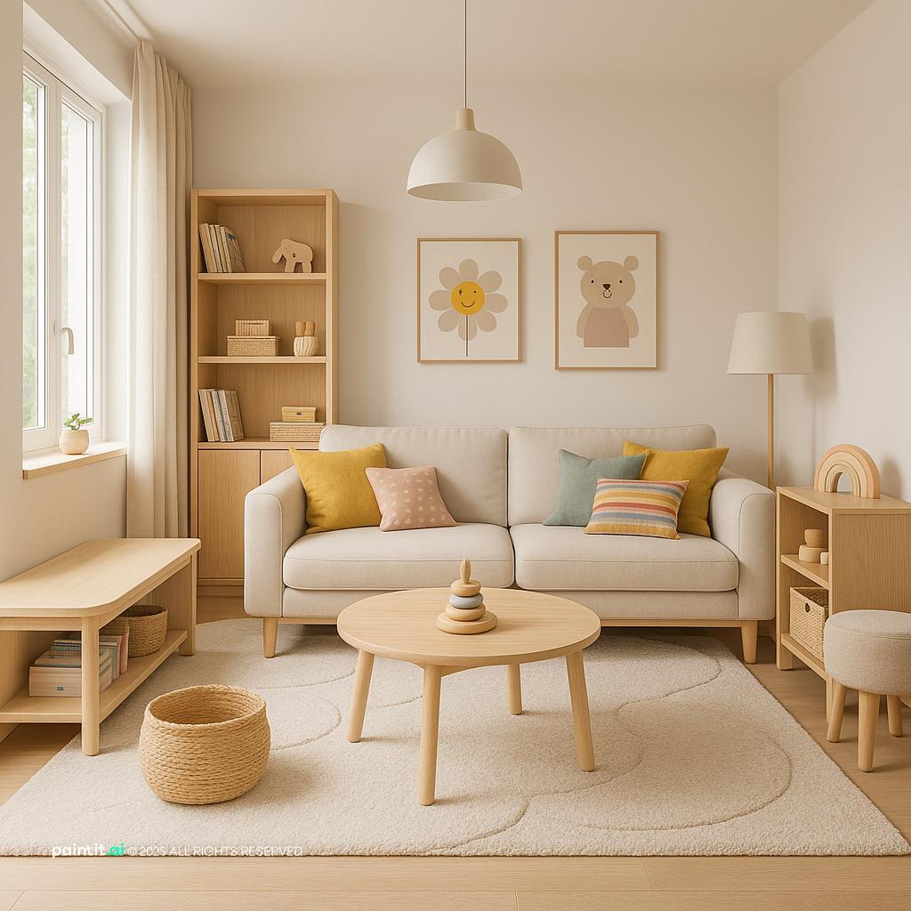
Stunning Mid-Century Modern Living Room
Stunning Mid-Century Modern Living Room uses warm wood, soft textiles and metal accents in a living room setting.
Neutral living room ideas work best when you treat the room as a set of connected choices, not as “beige walls plus a pale sofa.” A neutral room still needs contrast. It needs texture, the right furniture scale, and lighting that keeps the quiet color palette from looking accidental. A strong neutral space can feel modern, relaxed, warm, minimal, rustic, or refined. The shift usually comes from small but important decisions: the undertone of the paint color, the depth of the wood tones, the shape of the neutral living room furniture, and how every surface reacts to natural light.
The best neutral living rooms usually come down to three choices: color, material, and style direction. In Paintit.ai usage, color appears in 27.6% of prompts, material in 19.0%, and style in 17.1%. That lines up with what we see in real uploads: a neutral palette only starts to feel designed when it is tied to touchable finishes and a clear mood.
So don’t choose “beige” and stop there. Build a color palette around undertones. Pair warm ivory with oak, mushroom with black metal, greige with linen, or soft white with pale stone. If you are still deciding where to begin, the best living room colors for a neutral base can help you compare subtle wall colors before you commit to paint.
Use the first gallery to study how neutral walls, rugs, sofas, curtains, wall art, and wood finishes add depth even when the overall palette stays calm.
Stunning Mid-Century Modern Living Room uses warm wood, soft textiles and metal accents in a living room setting.

Modern Scandinavian Living Room Design balances warm wood, clean-lined furniture and plants and greenery in a living room setting.

Neutral Living Room Ideas with Clean-lined Furniture and Layered Neutrals pairs clean-lined furniture, layered neutrals and natural light in a living room setting.

Stunning Scandinavian Living Room Design layers warm wood, soft textiles and metal accents in a living room setting.

Stunning Contemporary Living Room Design anchors clean-lined furniture, layered neutrals and dark contrast in a living room setting.

Neutral Living Room Ideas with Metal Accents and Clean-lined Furniture softens metal accents, clean-lined furniture and plants and greenery in a living room setting.

Stylish Modern Living Room Design uses metal accents, layered neutrals and dark contrast in a living room setting.

Elegant Modern Living Room Design balances layered neutrals and natural light in a living room setting.

Ultra-Modern Living Room Design pairs metal accents, clean-lined furniture and open layout in a living room setting.

Stylish Modern Living Room Design with Soft Textiles layers soft textiles, metal accents and clean-lined furniture in a living room setting.

Neutral Living Room Ideas with Soft Textiles and Clean-lined Furniture anchors soft textiles, clean-lined furniture and layered neutrals in a living room setting.

Elegant Contemporary Living Room Design softens metal accents, clean-lined furniture and layered neutrals in a living room setting.
A neutral wall can lean pink, yellow, green, gray, or taupe. That undertone matters more than the name printed on the paint card. Test the paint against your sofa, flooring, curtains, and daylight at different times of day before repainting the whole room.
Why it works: neutral rooms often go wrong because the undertones fight. A cool gray wall beside a yellow-beige sofa can make both look off. If your floor is warm oak, try ivory, greige, mushroom, or pale taupe before jumping to a crisp gray.
Neutral living room furniture should give the room structure without taking over. A cream, oatmeal, camel, taupe, or charcoal sofa can all work, but the pieces around it need enough contrast to stop the seating area from turning flat.
If you already own a neutral sofa, keep it and change what sits around it. Add a darker wood coffee table, a black metal floor lamp, a textured neutral rug, or wall art with stronger lines. In Paintit.ai, we often see people use “keep” or “don’t change” when they want to protect an existing sofa. The better results usually come from changing the supporting materials, not replacing every large item.
A neutral rug is not only a soft surface. It defines the living area, especially in open-plan rooms. Choose a rug large enough for at least the front legs of the sofa and chairs to sit on it. If the rug floats in the center, the room can look smaller and less settled.
For a cozy neutral living room, look for wool, jute, flatweave, or a low-pile rug with a quiet pattern. Be careful with a rug that is almost identical to the floor color unless it has strong texture. A beige rug on beige flooring can vanish unless the weave, border, or pile gives it visible depth.
Warmth does not have to come from orange paint or heavy decor. Natural oak, walnut, rattan, cane, bamboo, and warm-stained shelving can soften a room while keeping the palette restrained. Wood tones are especially useful when the walls and sofa are pale.
What to avoid: five unrelated wood finishes in one view. If the floor is oak, repeat a similar warmth in one or two pieces, then use black, stone, or upholstered surfaces to break it up. Too much matching wood can make the room feel like a furniture showroom.
A neutral room needs at least one grounding note. That could be a charcoal accent chair, a black picture frame, a dark bronze lamp, a walnut cabinet, or a deep taupe throw. Without a darker element, the eye has nowhere to land.
This matters even more in bright rooms with a lot of natural light. Pale walls, pale upholstery, and pale floors can look washed out in photos and in daily life. A darker element sharpens the edges and makes the lighter tones feel chosen, not leftover.
Curtains are one of the quickest ways to make neutral living room decor feel finished. Hang them close to the ceiling when you can and let the panels reach the floor. Linen, cotton-linen, wool blends, and textured sheers work well because they add movement without making the room busy.
For color, choose curtains that are either slightly lighter than the wall for an airy look or slightly deeper for a more wrapped-in feeling. Avoid short curtains that stop at the sill unless the architecture demands it. In most living rooms, short panels cut the wall in half and weaken the vertical line.
Modern neutral living room ideas usually rely more on silhouette than decoration. Choose a low sofa, sculptural lounge chair, clean-lined coffee table, and simple built-in storage. Let the shapes carry the room instead of adding too many small accessories.
Why it works: a quiet palette makes furniture outlines more visible. A curved sofa, blocky side table, or slim black lamp can make the room feel current without a loud color move. If the room starts to feel too stark, add a woven rug or linen pillows before adding random accent colors.
A neutral accent wall works best when it changes depth, texture, or finish rather than shouting for attention. Try limewash, plaster-effect paint, vertical wood slats, warm taupe paint behind the sofa, or a built-in bookshelf painted one shade deeper than the surrounding walls.
Keep the contrast controlled. A very dark wall in a pale room can look dramatic, but it can also make the sofa wall feel visually heavy. If the living room is small, a soft mushroom, clay, or greige accent is often easier to live with than a deep charcoal wall.
Throw pillows can make a neutral sofa feel styled, but only when they vary in material and scale. Mix boucle, linen, velvet, wool, or slub cotton. Use two larger pillows at the back, one smaller pillow in front, and a throw blanket that connects to the rug or curtains.
What to avoid: six pillows in nearly the same beige fabric. That adds bulk without interest. A better mix might be ivory boucle, tan linen, warm gray wool, and one patterned pillow with a small black or brown detail.
Wall art is a good place to add contrast without changing the whole color palette. Look for abstract line work, sepia photography, charcoal sketches, soft tonal artwork, or textured canvas pieces. The art should relate to the sofa width or the furniture below it.
A common mistake is hanging art too high or choosing pieces that are too small. Above a sofa, aim for artwork or a grouping that feels connected to the furniture, not stranded near the ceiling. The lower edge should usually sit close enough to feel like part of the seating zone.
Neutral rooms can look cluttered quickly because the palette is quiet and every object becomes visible. Use closed storage for remotes, chargers, toys, paperwork, and extra blankets. Keep open shelves for books, ceramics, baskets, and a few sculptural objects.
Why it works: neutral design depends on calm sightlines. Too many small objects break that calm faster than a bold color would. If you have open shelves, repeat materials such as ceramic, wood, glass, and woven baskets instead of filling every shelf from edge to edge.
Lighting is often the missing layer in neutral rooms. In Paintit.ai prompts, lighting is mentioned in only 5.9% of cases, but it can completely change how a neutral color reads. A beige wall under a cool overhead bulb can look dull; the same wall with warm lamps can feel soft and dimensional.
Use at least three light sources: overhead or recessed lighting for general brightness, a floor lamp near seating, and a table lamp or wall sconce for evening mood. Avoid relying only on ceiling lights, especially in rooms with neutral walls and pale upholstery, because overhead light can create glare and flatten texture.
Neutral rooms usually need a few rounds of refinement. We see this in Paintit.ai tests when people start with white or beige, then ask for “now make it warmer,” “a bit darker,” or “more” texture. That is a useful way to decorate in real life too.
Change one layer at a time. Paint the walls, then judge the sofa. Add a rug, then judge the curtains. Add lamps, then judge the accessories. If everything changes at once, it becomes harder to tell whether the room needs more warmth, more contrast, or simply less clutter.
A long narrow living room needs different neutral choices than a square room or a room with huge windows. In a narrow room, use slim arms, lighter chairs, and a rug that supports the length without blocking the traffic path. In a large room, use deeper seating, heavier tables, and larger art so the palette does not feel weak.
If you want to test proportions before buying, you can visualize these neutral living room ideas in your own space with a real room photo. This is especially useful when comparing a pale sofa against darker flooring, testing a new wall color, or checking whether a large rug will make the layout feel more connected.
The second gallery is useful for comparing how the same neutral foundation changes when you shift the paint color, sofa tone, rug texture, lighting temperature, and material mix.

Scandinavian-Style Living Room Design uses warm wood, soft textiles and clean-lined furniture in a living room setting.

Luxury Modern Hotel Living Room Design balances metal accents and layered neutrals in a living room setting.

Sleek Modern Living Room Design pairs soft textiles, metal accents and clean-lined furniture in a living room setting.

Modern Living Room Design for 2025 layers clean-lined furniture, layered neutrals and dark contrast in a living room setting.

Stylish Modern Living Room Design with Warm Wood anchors warm wood, layered neutrals and natural light in a living room setting.

Neutral Living Room Ideas with Clean-lined Furniture and Open Layout softens clean-lined furniture, open layout and layered neutrals in a living room setting.

Scandinavian Style Living Room Design uses soft textiles, layered neutrals and natural light in a living room setting.

Cozy Contemporary Cottage Living Room Design balances warm wood, soft textiles and layered neutrals in a living room setting.

Compact Modern Minimalist Living Room pairs layered neutrals and natural light in a living room setting.

Warm Modern Living Room Design layers soft textiles, plants and greenery and layered neutrals in a living room setting.

Stylish Mid-Century Modern Living Room anchors warm wood, soft textiles and metal accents in a living room setting.

Vintage Scandinavian Living Room Design softens warm wood, soft textiles and clean-lined furniture in a living room setting.
A good neutral palette usually has one main wall color, one upholstery color, one wood or stone tone, and one grounding accent. For example: warm white walls, an oatmeal sofa, oak tables, and black metal accents. Another strong combination is greige walls, a taupe sofa, walnut furniture, and aged brass lighting.
The key is restraint. Do not use every neutral at once. If the walls are creamy and the sofa is camel, avoid adding a cool blue-gray rug unless you want a clear temperature shift.
Neutral living room color ideas should begin with undertone testing. Place paint samples beside the sofa fabric, rug, and floor. Look at them in morning light, afternoon light, and after dark with lamps on.
Warm neutrals usually pair well with oak, brass, cream, clay, and linen. Cooler neutrals work better with black metal, pale stone, chrome, gray wool, and crisp white trim. Be careful with a pink-beige wall next to a yellow-beige sofa unless another material clearly connects the two.
A neutral room becomes more interesting when the surfaces feel different. Combine soft upholstery, woven textiles, matte ceramics, smooth stone, visible wood grain, and a little metal. If the room is all flat fabric and painted drywall, even a good palette can feel unfinished.
When people upload a living room with a neutral sofa, the first weak spot is often lack of material contrast. I would check that before adding a brighter accent color. Add wood, marble, brick, metal, or woven texture and see whether the room already has enough life.
Metal accents should be chosen for temperature and weight. Black metal gives a modern edge, aged brass adds warmth, polished nickel feels lighter and cooler, and bronze sits nicely between traditional and contemporary. Use metal on lamps, curtain rods, frames, table legs, or cabinet hardware.
Avoid scattering too many metal finishes in small pieces. One main metal and one secondary metal is usually enough. For example, black curtain rods and bronze lamps can work together if the rest of the palette stays calm.
For a cozy neutral living room, textiles should vary in density. Use a wool rug, linen curtains, boucle or cotton pillows, and a heavier throw in cooler months. This adds softness without relying on busy pattern.
Scale matters. If the sofa is smooth and plain, choose a chunkier pillow or nubby throw. If the rug already has a strong weave, keep the pillows quieter. Too many textured pieces competing at once can make the room feel visually noisy.
Natural light can make neutral walls look fresh during the day, but the room still needs evening lighting. Use warm-white bulbs in lamps, add a shaded table lamp near the sofa, and place a floor lamp where people actually read or talk. Wall sconces can add depth to blank neutral walls.
If a room has strong sunlight, watch for glare on pale walls and glossy surfaces. Matte finishes, woven shades, and soft curtains help control brightness. If the room is dark, choose warmer paint and reflective accents rather than a cool gray that may look shadowy.
Neutral styling works best when accessories have enough scale. Use a large ceramic bowl, oversized branch arrangement, stacked books, a wide tray, or one substantial vase instead of many tiny objects. Larger pieces read more calmly from across the room.
Leave some surfaces empty. Negative space is part of the design. If every table, shelf, and wall is filled, the room loses the quiet quality that makes a neutral palette appealing.
Paint can change the mood quickly, but it cannot solve every issue. If a room still feels bland after repainting, check the rug size, lamp placement, art scale, and material mix. You may need contrast or texture more than another shade of beige.
If you are choosing between several wall options, you can digitally repaint your walls before buying samples. For a fuller planning process, the guide to redesigning your living room is useful when you want to change layout, furniture, and finishes in a more organized sequence.
Paintit.ai lets you upload a real living room photo and test neutral walls, a new rug, different sofa colors, warmer lighting, wood tones, metal accents, and styling changes before you spend money. It is especially helpful when you want to keep a major piece, such as an existing sofa or floor, and see which palette works around it.
Many homeowners start with short phrases like “make it modern,” “paint beige,” or “add warmth.” In our data, ~70% of users (Homeowners) write short, keyword-style phrases (AEO-score 0-1) and are less structured in their requests compared to professionals. The better next step is simple: try one version with lighter walls, one with a deeper neutral accent wall, and one with warmer materials, then compare the room’s actual sightlines and proportions.
Warm white, ivory, beige, greige, taupe, mushroom, soft gray, sage, clay, camel, black, and brown all work well. The safest approach is to choose compatible undertones and repeat them in paint, textiles, wood, and wall art.
Start with the walls, sofa, rug, and lighting. Then add texture through throw pillows, curtains, wood tones, ceramics, and metal accents. Keep the palette simple, but vary the materials so the room does not feel flat.
Yes. Neutral colors are flexible, calm, and easy to update. They work especially well in a living room because you can change the mood with a rug, lighting, art, curtains, and accessories instead of replacing major furniture.
Use warm lighting, layered textiles, a properly sized neutral rug, wood tones, soft curtains, and deeper accents such as taupe, camel, walnut, or bronze. In practice, texture usually matters more than adding more beige.
The best neutral paint color depends on your natural light, flooring, and sofa. Warm whites and greiges are versatile, while taupe and mushroom add more depth. Always test samples in the room before painting every wall.