
Navy and Grey Living Room Ideas with Grey Palette and Navy Contrast
Navy and Grey Living Room Ideas with Grey Palette and Navy Contrast uses grey palette, navy contrast and layered neutrals in a living room setting.
Navy and grey living room ideas work best when you treat the palette like a room plan, not just a color pairing. Navy gives the living room weight, a place for the eye to land, and a sense of order. Grey softens that weight and makes the space easier to live with every day. The real decision is not simply “navy or grey?” It is where each color should do the work: walls, sofa, rug, curtains, wall art, or smaller navy accents. Once that hierarchy is clear, the room usually starts to feel calmer, more modern, and more layered without sliding into dark or flat.
In Paintit.ai prompt data, color is the most popular modifier, appearing in 27.6% of prompts. That tracks with what we see in room uploads: people often start by changing wall color, but the strongest grey and navy living room results usually come from deciding which surface should carry the visual weight first.
If the room has low natural light, navy may be better as an accent wall, media wall, curtains, or built-in shelving color. If the room is bright and open, a deeper navy wall can anchor pale grey upholstery and a neutral rug. If you are unsure how deep to go, test the shade in an AI living room design workflow before buying paint. Navy can look rich in daylight, almost black in shadow, and surprisingly sharp under cool bulbs.
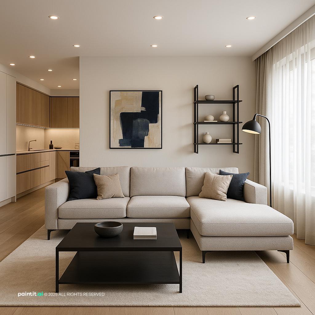
Use the first gallery to compare where the eye lands first: a navy feature wall, a grey sofa, darker curtains, a patterned rug, or a quieter spread of navy accents across the room.
Navy and Grey Living Room Ideas with Grey Palette and Navy Contrast uses grey palette, navy contrast and layered neutrals in a living room setting.

Stylish Modern Living Room Design balances grey palette, navy contrast and soft textiles in a living room setting.

Navy and Grey Living Room Ideas with Grey Palette and Navy Contrast with Layered Neutrals pairs grey palette, navy contrast and layered neutrals in a living room setting.

Stylish Ultra-Photorealistic Living Room Design layers grey palette, navy contrast and warm wood in a living room setting.

Navy and Grey Living Room Ideas with Grey Palette and Navy Contrast View 3 anchors grey palette and navy contrast in a living room setting.

Award-Winning Contemporary Living Room Design softens grey palette, navy contrast and layered neutrals in a living room setting.

Navy and Grey Living Room Ideas with Grey Palette and Navy Contrast with Metal Accents uses grey palette, navy contrast and metal accents in a living room setting.

Navy and Grey Living Room Ideas with Grey Palette and Navy Contrast View 5 balances grey palette, navy contrast and metal accents in a living room setting.

Navy and Grey Living Room Ideas with Grey Palette and Navy Contrast with Warm Wood pairs grey palette, navy contrast and warm wood in a living room setting.

Stylish Contemporary Living Room Design layers grey palette, navy contrast and soft textiles in a living room setting.

Modern Living Room Design for 2025 anchors grey palette, navy contrast and soft textiles in a living room setting.

Elegant Neoclassic Living Room Design softens navy contrast and natural light in a living room setting.
A deep navy blue accent wall works well behind a sofa, fireplace, or media unit because it gives the room a clear focal point. Keep the surrounding walls light grey, warm white, or greige so the navy reads as intentional, not heavy.
Why it works: navy absorbs light, so limiting it to one strong plane gives depth without closing in the whole room. What to avoid: painting the darkest wall opposite the only window without adding lighting. By evening, that wall can turn into a flat shadow.
A grey sofa is often the easiest anchor for this palette because it leaves room for navy throw pillows, curtains, artwork, and side chairs. Choose a sofa grey with a warm undertone if the walls are cool; otherwise the whole room can feel slightly blue, even when the navy itself is beautiful.
In Paintit.ai, 12.0% of prompts include a limitation such as KEEP or do not change, and sofas are one of the pieces people most often want to preserve. If your sofa is staying, treat it as the fixed point. Test the walls, rug, curtains, and navy accents around it with AI virtual staging before you start replacing furniture too early.
A navy sofa grey living room can look strong and clean when the wall color is pale, matte, and slightly warm. Let the sofa be the darkest furniture piece, then balance it with a light rug, a medium wood coffee table, and one or two grey upholstered chairs.
What to avoid: pairing a navy sofa with charcoal walls, dark floors, and black furniture unless the room has excellent daylight and several lamps. Too many dark surfaces at the same height make the seating area feel blocky.
If your room has grey flooring, grey walls, or a grey sectional, a neutral rug can stop the palette from turning into one continuous cool surface. Look for oatmeal, ivory, taupe, or a light patterned rug with a navy border or a thin blue detail.
When people upload rooms with a grey sofa, the first weak spot is often the lack of contrast between the sofa, floor, and rug. A rug that is wide enough to sit under the front legs of the sofa and chairs creates a cleaner seating zone and gives the navy accents somewhere to connect.
A navy and grey color scheme feels more deliberate when navy appears in a triangle around the room: pillows on the sofa, a framed print above the console, and a ceramic lamp on a side table, for example. This keeps the eye moving without making every accessory blue.
Why it works: repetition creates rhythm. What to avoid: buying a matching navy rug, navy curtains, navy cushions, and navy art all at once. The room can start to feel themed instead of designed.
Navy and grey are both cool by nature, so wood tones do a lot of practical work. Oak, walnut, teak, and cane details add temperature and texture, especially on coffee tables, media cabinets, shelving, and picture frames.
In Paintit.ai tests, we often see a navy accent wall prompt become more believable after a second pass adds warm wood textures. This fits the prompt data too: material appears in 19.0% of prompts, which shows that people often refine color schemes by adding surfaces that break up large color blocks.
Brass warms navy and grey, black metal gives a sharper modern look, and brushed nickel keeps the palette cooler and quieter. Pick one primary metal finish for lamps, frames, curtain rods, and table legs. If the room already has mixed hardware, keep the second finish in small doses.
For a modern navy and grey living room, matte black can work well with clean-lined furniture, but it needs warmth nearby. Add a walnut table, textured cream rug, or tan leather chair so the room does not feel too severe.
Curtains can soften or intensify a navy blue and grey living room. Pale grey linen curtains keep the room airy. Navy curtains frame the windows and add drama. Warm beige or oatmeal panels make the palette feel more relaxed.
Check the curtain length and fullness before judging the color. Panels should usually kiss the floor or break slightly, and the rod should sit wider than the window frame so daylight is not blocked when the curtains are open.
Wall art is one of the simplest ways to connect navy, grey, cream, wood, and accent colors. Look for pieces that include navy but also bring in warmer notes such as rust, ochre, sand, blush, or muted green.
What to avoid: choosing only black-and-white art in a room that already has cool grey walls and navy upholstery. It may look crisp in a close-up image, but it often does not add enough depth unless the frames, matting, or lighting bring in warmth.
A navy media wall can make a television feel less dominant because the screen blends into the darker background. This works best when the TV wall is already the natural focal point and there is enough distance between the sofa and screen.
If the room is narrow, use navy on built-ins or lower cabinetry instead of the full wall. The goal is to reduce glare and visual clutter, not make the room feel like a tunnel.
Grey works better when it is not the same finish everywhere. Combine a smooth grey sofa, nubby woven throw, stone side table, soft wool rug, or linen curtains to create depth without adding more colors.
Why it works: texture catches light differently, which keeps grey from looking dull. What to avoid: matching a flat grey wall, flat grey sofa, flat grey rug, and flat grey cushions. Even expensive pieces can look lifeless when their surfaces behave the same way.
Navy and grey pair well with rust, camel, mustard, blush, sage, olive, cream, and warm metallics. Choose one supporting accent and use it in two or three places: a pillow, book stack, vase, lampshade, or artwork detail.
The accent should not compete with navy. If the room already has a strong navy wall or sofa, use the extra color in smaller accessories rather than a large chair or rug.
A navy grey living room color scheme often fails because one tone is slightly wrong, not because the whole idea is wrong. If the grey feels cold, make it warmer. If the navy looks too bright, go a bit darker. If the room feels heavy, use less navy and more off-white.
Paintit.ai data shows iterative refinement phrases such as instead, now, a bit, more, and less in 15.0% of prompts. That is a good decorating habit. Test one change at a time, then judge the room by the full view, not by a swatch in isolation.
Even a beautiful navy and grey living room decor plan can feel wrong if the layout is crowded. Leave a clear walkway from the entrance to the seating area, avoid oversized coffee tables in tight rooms, and make sure side chairs do not block the main sightline.
What to avoid: solving every empty corner with furniture. Negative space matters in a darker palette because it lets the room breathe and keeps the navy elements from feeling too dense.
Use the second gallery to judge the difference between a navy-led room, a grey-led room, and a balanced version where textiles, wood, metal, and lighting carry part of the design.

Navy and Grey Living Room Ideas with Navy Contrast and Warm Wood uses navy contrast, warm wood and soft textiles in a living room setting.

Navy and Grey Living Room Ideas with Navy Contrast and Soft Textiles balances navy contrast, soft textiles and metal accents in a living room setting.

Stunning Modern Contemporary Living Room Design pairs navy contrast, soft textiles and clean-lined furniture in a living room setting.

Modern Living Room Design Inspiration layers navy contrast, soft textiles and plants and greenery in a living room setting.

Luxury Modern Living Room Design anchors navy contrast, metal accents and layered neutrals in a living room setting.

Luxurious Traditional Living Room Design softens navy contrast in a living room setting.

Cozy Boho Living Room Design uses navy contrast, soft textiles and plants and greenery in a living room setting.

Navy and Grey Living Room Ideas with Navy Contrast and Clean-lined Furniture balances navy contrast, clean-lined furniture and layered neutrals in a living room setting.

Stylish Living Room with Jewel-Toned Cushions pairs navy contrast, soft textiles and layered neutrals in a living room setting.

Elegant Neoclassical Living Room Design layers navy contrast, warm wood and soft textiles in a living room setting.

Navy and Grey Living Room Ideas with Navy Contrast and Warm Wood with Metal Accents anchors navy contrast, warm wood and metal accents in a living room setting.

Navy and Grey Living Room Ideas with Navy Contrast and Warm Wood View 3 softens navy contrast, warm wood and metal accents in a living room setting.
Choose deep navy if you want a grounded, architectural look. Choose a slightly brighter navy if the room is casual and sunny. Green-leaning navy can work beautifully with oak and plants, while purple-leaning navy often needs warmer greys and brass to avoid feeling cold.
Use the darkest navy where it has a reason to exist: behind the sofa, on built-ins, on a fireplace wall, or in a large piece of upholstery. Avoid a random navy patch on a small wall with no furniture, art, or lighting to support it.
Many grey paints turn blue beside navy, especially in north-facing rooms. A warm grey, mushroom grey, or soft greige usually creates better decor balance than a stark silver grey.
If you are comparing options, look at how navy sits among other best living room colors and check whether your space needs warmth more than contrast. Do not choose grey from a tiny swatch under store lighting. Test it near the sofa, floor, and window.
Throw pillows, blankets, curtains, and upholstery are where the palette starts to feel comfortable. Mix velvet, linen, bouclé, wool, or cotton instead of relying only on color changes.
A useful formula is one solid navy pillow, one patterned pillow with grey and cream, and one warm accent pillow in rust, camel, or oatmeal. Avoid too many small pillows with busy patterns. They create clutter faster than depth.
A navy and grey room can become upholstery-heavy if every surface is soft. Bring in marble, travertine, ceramic, smoked glass, or a stone-look table to give the seating area a different finish.
Use these harder materials in small or medium pieces: side tables, lamp bases, trays, or decorative bowls. Avoid glossy surfaces directly opposite windows if glare is already a problem.
Only 5.9% of Paintit.ai prompts specify lighting, but lighting is often the reason navy rooms feel too dark or flat. Use layered lighting: an overhead source for general brightness, table or floor lamps for task light, and accent lighting for shelves, art, or a textured wall.
Warm bulbs usually suit navy and grey better than cool white bulbs. Avoid relying on one ceiling fixture. It creates harsh shadows and makes dark blue surfaces look heavier at night.
Pattern gives movement to a navy and grey color scheme, but scale matters. Use one larger pattern, such as a rug or curtain, then keep smaller patterns quieter on pillows or art.
Geometric designs suit a modern room, while faded traditional rugs can make the palette feel warmer and more collected. Avoid using multiple high-contrast patterns at the same size because they fight for attention.
Navy and grey can handle strong styling, but the room still needs air. Use books, ceramics, framed art, wood objects, and one or two sculptural pieces rather than filling every surface.
I would do one final pass after styling and remove one item from each tabletop or shelf. No clutter does not mean bare. It means each object has enough space to be noticed.
With Paintit.ai, you can upload a real living room photo and test navy walls, grey upholstery, rug options, curtains, lighting mood, furniture scale, and material changes before making purchases. This is especially useful if you want to keep an existing grey sofa, flooring, fireplace, or window trim while changing the palette around it.
Try prompts in stages: start with a deep navy blue accent wall, then ask for a bit warmer grey, more wood tones, less clutter, or brighter layered lighting. If you want a step-by-step process, the guide on how to redesign a living room with Paintit.ai shows how to refine a room through several practical versions.
Yes. Navy adds depth and structure, while grey softens the palette. The pairing works best when you add warm materials, varied textures, and enough lighting so the room does not feel cold.
Choose one main anchor, such as a navy wall or grey sofa, then repeat the second color in smaller accents. Add a neutral rug, wood tones, layered lighting, and wall art that connects the palette.
Rust, camel, mustard, cream, blush, olive, sage, and brass all work well. Warm accents are especially helpful because navy and grey can feel cool when used on their own.
Use texture, contrast, and lighting. Mix matte paint, woven textiles, wood, metal finishes, and at least three light sources so the room has depth without clutter.
A navy sofa creates a stronger focal point, while a grey sofa is more flexible. If your room is small or dark, a grey sofa with navy accents is usually easier to balance.