
Modern Living Room Design Inspiration
Modern Living Room Design Inspiration uses wall decor focus, soft textiles and metal accents in a living room setting.
The best living room wall decor ideas usually start before anyone picks up a hammer. Wall color, scale, light, sofa placement, and the shape of the room decide whether a piece of art feels intentional or just stuck onto an empty spot. We see this all the time in Paintit.ai uploads: many people begin with a very simple request like "change the wall color" or "add" one feature. That is not a bad start. It is often the right start. Before you buy paint, panels, shelves, or a large canvas, test a few versions in your own photo with our AI living room designer.
A living room wall is not a blank sheet. It has to work with sofa height, rug size, window placement, ceiling lines, outlets, lamps, doors, and the path people take through the room. If the wall color fights the furniture, if the art is too small, or if every object is trying to be the focal point, the whole seating area starts to feel uneasy.
Paintit.ai prompt data backs up this very practical starting point. Color is the most popular modifier, appearing in 27.6% of relevant prompts, and repaint or paint actions appear in 13.2%. So paint, wallpaper, paneling, and accent treatments are not background decisions. They are living room wall decoration ideas in their own right.
Use the first gallery to check proportion: one oversized piece, grouped frames, floating shelves, a mirror, sconces, and textured wall treatments all put different visual weight on a living room wall.
Modern Living Room Design Inspiration uses wall decor focus, soft textiles and metal accents in a living room setting.

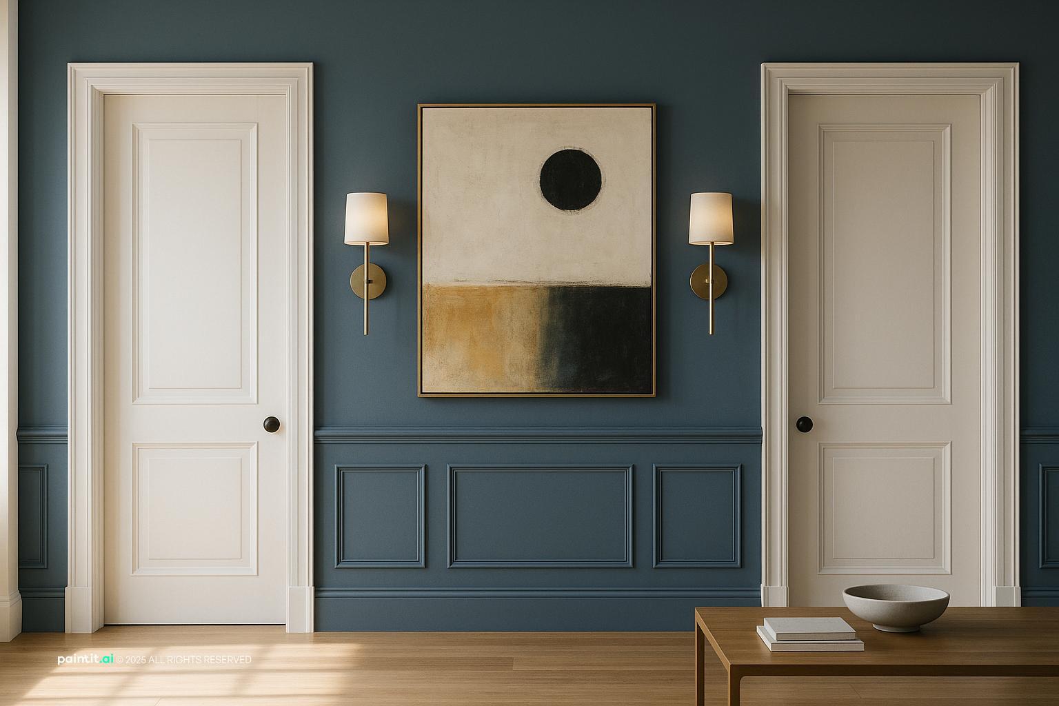
Modern Scandinavian Living Room Design balances wall decor focus, warm wood and clean-lined furniture in a living room setting.

Modern Minimalist Living Room with Vintage Touches pairs wall decor focus, warm wood and clean-lined furniture in a living room setting.

include: - Elegant crown mouldings with a modern twist of geometric patterns - Traditional layers wall decor focus, layered neutrals and natural light in a living room setting.

Modern Minimalist Living Room Design anchors wall decor focus, metal accents and layered neutrals in a living room setting.

Tropical Living Room Design Inspiration softens wall decor focus, soft textiles and plants and greenery in a living room setting.

Stunning Ultra-Photorealistic Living Room uses wall decor focus and natural light in a living room setting.

Living Room Wall Decor Ideas with Wall Decor Focus and Soft Textiles balances wall decor focus, soft textiles and clean-lined furniture in a living room setting.

Stylish NYC Living Room Design pairs wall decor focus and natural light in a living room setting.

Eclectic Beata Heuman Living Room Design layers wall decor focus, soft textiles and natural light in a living room setting.

Steampunk Contemporary Living Room Design anchors wall decor focus, metal accents and layered neutrals in a living room setting.

Elegant Neoclassical Living Room Design softens wall decor focus and layered neutrals in a living room setting.
Paint is often the strongest decor choice in the room. If the sofa, rug, and curtains already bring pattern or texture, a cleaner wall color may solve more than another shelf or another framed print. Warm whites can soften beige upholstery, greige can tie together mixed wood tones, and muted blue or olive can make a seating wall feel grounded without turning it heavy.
Why it works: color changes the whole field behind the furniture, so wall art does not have to fix every problem. In Paintit.ai, many homeowners start with short requests such as "change the wall color." That simple wording points to a good order of work: fix the base first, then decide what the wall still needs.
I would treat the wall above a sofa as a proportion problem before a styling problem. A piece or grouping should usually span about two-thirds the width of the sofa, with breathing room left at both ends. Hang it so the bottom edge sits roughly 6 to 10 inches above the sofa back, depending on cushion height and frame depth.
For above couch wall decor ideas, avoid spreading several tiny pieces across a long wall. They usually look detached from the seating area. A large framed print, textile, triptych, or low horizontal arrangement often feels calmer and more deliberate.
A large canvas is one of the simplest answers for a wide wall, especially in open-plan living rooms where small frames disappear from across the space. Choose a piece with colors already present in the room: a rug accent, curtain shade, wood tone, or pillow color. That one connection keeps the art from floating visually.
What to avoid: do not choose a canvas only because it fills the wall. If the image is too high-contrast for a quiet room, it can take over every view. For large wall decor living room planning, test a few sizes and orientations before buying. The better version usually commits to scale without shouting over the sofa.
A gallery wall can look collected instead of cluttered when it follows a rule. Use the same frame finish, a tight color palette, consistent matting, or one subject family such as family photography, sketches, travel prints, or abstract pieces. Lay the grouping out on the floor first, then treat the whole arrangement as one large shape on the wall.
Why it works: the eye reads the group as one composition when the spacing is consistent. Keep gaps between frames around 2 to 3 inches for a tighter arrangement. If the frames drift too far apart, the wall can look spotty rather than finished.
Floating shelves help when a living room wall needs dimension. Books, ceramics, small framed art, plants, and boxes can add layers that flat prints cannot. Keep shelf depth modest in narrow rooms, and check the walking path so no one brushes against corners.
Style the shelves with fewer, larger objects instead of many tiny pieces. Leave some open space. The catch: shelves above a sofa that are too deep, too high, or loaded with fragile decor can feel both visually heavy and physically awkward.
A mirror works best when it reflects something worth seeing: a window, a lamp glow, a fireplace, greenery, or an open part of the room. Over a console, fireplace, or sofa, choose a mirror large enough to relate to the furniture below it. A small decorative mirror on a big wall often looks lost.
Check glare before you hang it. A mirror facing a harsh window or bright TV area may create uncomfortable reflections. In darker rooms, place it where it can catch side light instead of direct glare.
Sconces are not just task lighting. They can frame art, balance a fireplace, or make an empty wall feel more architectural. Use pairs for symmetry around a large artwork, or a single swing-arm sconce beside a reading chair where the wall supports a real activity.
Paintit.ai users who mention lighting tend to be thinking at a more advanced level, because light changes both the object and the wall surface. A glossy photo may reflect too much, while textured plaster or wood paneling can look richer under a warm wall light. Use dimmable bulbs when possible.
Material matters. In Paintit.ai data, material appears in 19.0% of relevant prompts, and a common request we see is "Make wooden panels on the walls." Wood slats, picture-frame molding, beadboard, or flat paneling can give a plain wall structure without asking for much extra art.
For more on creating a focal point, see our guide to living room wall design. What to avoid: busy wood grain on every wall in a small room. One feature wall, partial-height treatment, or paneling behind the sofa is usually easier to balance.
Wallpaper works well when the furniture is simple and the room needs pattern. In a living room, try it behind the sofa, inside built-in shelving, or on the fireplace wall. Grasscloth adds texture, small geometrics suit tailored rooms, and painterly patterns can soften modern furniture.
Why it works: wallpaper covers a large surface but still behaves like decor. Keep the surrounding pieces quieter so the wall is not competing with patterned pillows, a busy rug, and complex curtains all at once.
A wall sculpture can be metal, ceramic, carved wood, woven fiber, or plaster. It is especially useful on a narrow wall, between windows, or above a console where a framed print would feel too predictable. Look at the shadow it casts too; that shadow becomes part of the design.
What to avoid: protruding pieces in tight walkways or behind active seating where heads and shoulders may hit them. Wall sculpture should add depth without interrupting movement through the room.
For blank living room wall ideas, start by asking what the wall is doing. Is it the main seating wall, a pass-through wall, a TV wall, or the first thing seen from the entry? A long empty wall behind a sofa may need art or paneling. A wall along a walkway may need a slim console and mirror instead.
Paintit.ai users sometimes describe these areas as empty or ask to declutter first. That instinct is useful. Remove visual noise, then add one clear layer: a large artwork, shelves, molding, mirror, or lighting. Do not try all of them in one spot.
If the TV is on the main wall, treat it as part of the composition. Use a low media cabinet wider than the screen, add vertical elements such as sconces or narrow art on the sides, and consider a darker wall color if you want the black rectangle to recede.
Why it works: the TV feels less isolated when it has visual anchors around it. Avoid placing tiny frames too close to the screen. They can look like afterthoughts and make the wall feel busier while people are trying to watch.
Modern living room wall decor often works best when it is restrained: one large abstract piece, a slim picture light, a plaster-like paint finish, or simple oak shelves with fewer objects. A traditional room may suit molding, framed art, antique mirrors, or symmetrical arrangements.
Style is a common user modifier in Paintit.ai prompts, but the best results usually keep one or two existing features. If the curtains, ceiling beams, windows, or sofa already define the room, let the wall decor support them rather than replacing the whole personality of the space.
Not every inch of wall needs filling. A living room can feel more finished when one wall carries the main visual weight and another stays quieter. This is especially true in rooms with strong windows, built-ins, fireplaces, or views.
What to avoid: adding decor just because a wall is open. If the room already has a patterned rug, sculptural lighting, and tall bookcases, a calm painted wall may be the better choice. Empty space can be a design decision when it balances the rest of the room.
The second gallery helps you compare how the same living room changes with a painted accent wall, oversized art, paneling, shelves, mirrors, and lighting, so the choice is based on the actual room instead of the idea alone.

Living Room Wall Decor Ideas with Wall Decor Focus and Plants and Greenery uses wall decor focus, plants and greenery and natural light in a living room setting.

Elegant Art Nouveau Living Room with Industrial Touch balances wall decor focus, soft textiles and metal accents in a living room setting.

Classic IKEA Living Room Design pairs wall decor focus and natural light in a living room setting.

Vibrant Bohemian Living Room Design layers wall decor focus, soft textiles and plants and greenery in a living room setting.

Elegant Art Deco Living Room Design anchors wall decor focus, metal accents and clean-lined furniture in a living room setting.

Modern Living Room Design softens wall decor focus, clean-lined furniture and plants and greenery in a living room setting.

Elegant Contemporary Living Room Design uses wall decor focus, warm wood and soft textiles in a living room setting.

Living Room Wall Decor Ideas with Wall Decor Focus and Soft Textiles with Clean-lined Furniture balances wall decor focus, soft textiles and clean-lined furniture in a living room setting.

Elegant Classic Living Room Design pairs wall decor focus, metal accents and natural light in a living room setting.

Stylish Living Room Redesign for Efficiency layers wall decor focus, soft textiles and natural light in a living room setting.

Elegant Neoclassical Living Room Design with Wall Decor Focus anchors wall decor focus, metal accents and layered neutrals in a living room setting.

Living Room Wall Decor Ideas with Wall Decor Focus and Metal Accents softens wall decor focus, metal accents and clean-lined furniture in a living room setting.
Start with three references already in the room: the sofa fabric, rug, and floor or main wood tone. Wall decor should borrow from at least one of them. A charcoal frame can echo a black lamp base, while terracotta art can connect to warm oak or leather.
Avoid choosing art colors in isolation. A print that looks beautiful online may feel wrong if its undertone fights the wall paint. Cool gray art on a creamy wall, for example, can make both look slightly off.
White walls are not all the same. Some lean blue, some yellow, some pink. If your living room has warm flooring or beige upholstery, a cold white wall can make the furniture look dull. If the room has crisp black, chrome, and cool stone, a very creamy wall may look muddy.
Use frame finishes to bridge undertones. Walnut warms a pale wall, black sharpens soft neutrals, brass adds warmth to blue and green paint, and pale oak keeps a room relaxed.
Metal frames, glass, mirrors, and stone surfaces add crispness, but too many hard finishes can make a living room feel sterile. Balance them with fabric shades, woven art, linen curtains, textured pillows, or an upholstered sofa nearby.
Where to use it: pair a mirror with a soft textile or a framed print with a woven basket below. Avoid placing only shiny surfaces on a wall that already receives strong daylight, because glare can flatten the room.
Wood panels, slats, shelves, and frames should relate to the floor or furniture, but they do not need to match exactly. A slightly darker shelf can add depth; a lighter oak frame can soften a dark wall. Keep the undertone family consistent.
What to avoid: mixing too many wood species on the same wall. If the floor is red-toned, the media cabinet is gray-washed, and the shelves are yellow oak, the wall may look patched together.
Wall decor changes under daylight, table lamps, sconces, and picture lights. A matte painting can handle direct light better than glossy photography. Textured wallpaper, plaster, and wood paneling often benefit from side lighting because it brings out shadow.
Use warm, dimmable light in living rooms unless the room needs task-level brightness. Avoid placing a picture light too close to highly reflective glass, because the hot spot may become more noticeable than the art.
For shelves, vary height, shape, and material: a vertical book stack, a low bowl, one framed piece, and a small plant can feel complete. Repeat one color or finish so the shelf does not become a row of unrelated objects.
Leave at least one open area on each shelf. That sounds small, but it gives the eye somewhere to rest and helps individual pieces read clearly from across the room.
A dark gallery wall on one side of the living room may need a floor lamp, tall plant, or darker textile elsewhere to keep the room from feeling lopsided. Likewise, a huge mirror can feel too bright unless there is warmth nearby through wood, fabric, or art.
Step back and check the room from the entry, the sofa, and any open-plan dining or kitchen sightline. Good living room wall art ideas should support the whole room composition, not only look good from one angle.
Upload a photo of your living room and test paint color, framed art, floating shelves, paneling, mirrors, sconces, wallpaper, or a cleaner wall with fewer objects. You can also keep existing features, such as windows, curtains, ceiling beams, or the sofa, while changing only the wall treatment.
This is especially useful when comparing living room wall art ideas that depend on size and placement. In practice, the version that looks best in a product photo is not always the one that fits your sofa, ceiling height, or window line. Ready to try a few options? Here is how to redesign a living room with Paintit.ai, or use the broader AI room design tool if you want to test the wall along with furniture and layout changes.
Start with scale and function. A large artwork, mirror, gallery wall, floating shelves, paneling, or sconces can work, but choose one main idea first so the wall does not become cluttered.
Use decor that is about two-thirds the width of the sofa. Hang art 6 to 10 inches above the sofa back, and keep the arrangement visually tied to the seating area.
As a general rule, hang art so the center is about 57 to 60 inches from the floor. Above furniture, adjust slightly so the piece relates to the sofa, console, or mantel.
For a wide empty wall, one large piece often feels more intentional. Several small pieces can work if they are grouped tightly and read as one composition.
It does not need to match exactly. It should repeat or complement one or two room elements, such as the sofa tone, rug color, wood finish, or metal accents.