
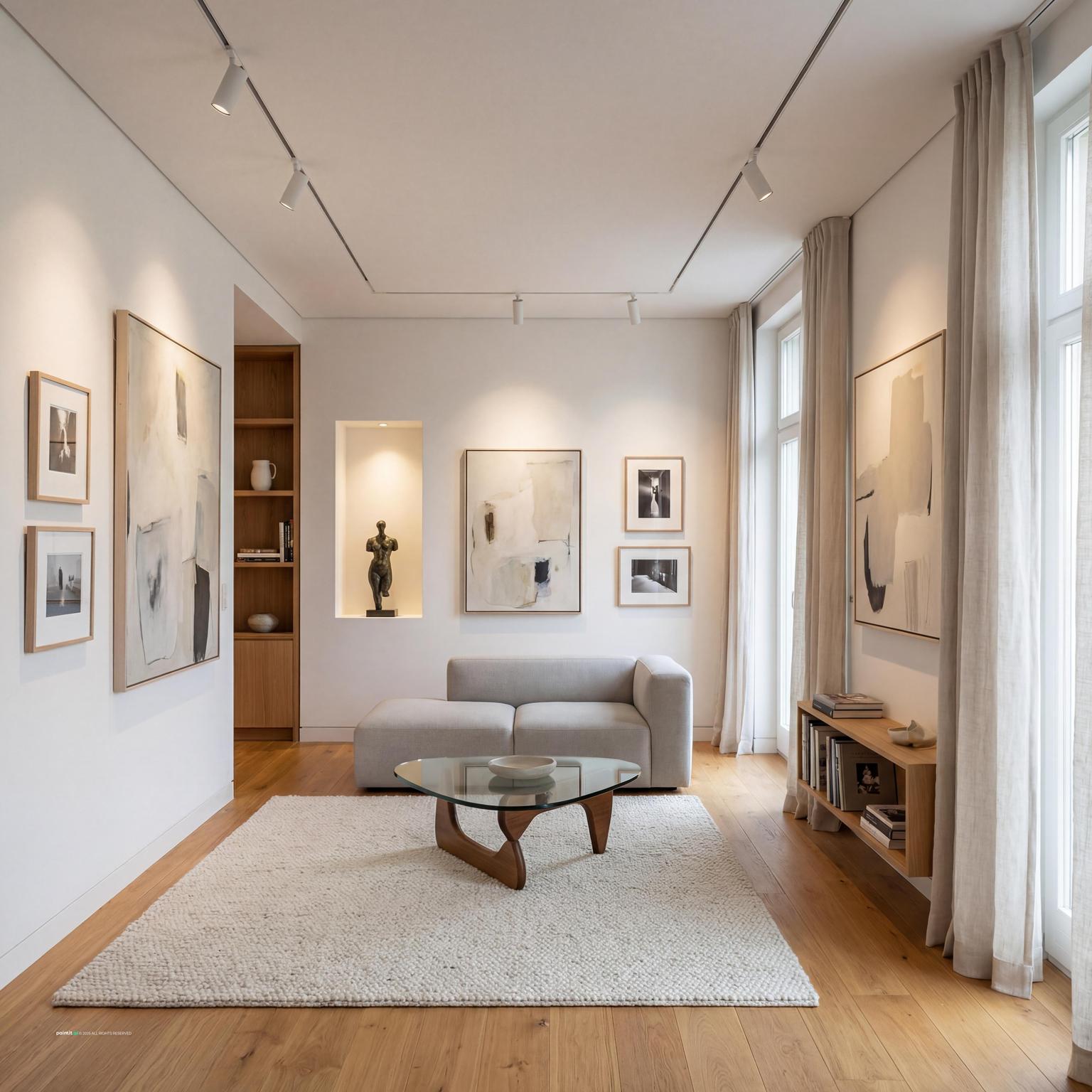
Cozy Farmhouse Living Room Design Inspiration
Cozy Farmhouse Living Room Design Inspiration uses gallery wall artwork, soft textiles and layered neutrals in a living room setting.
The best living room gallery wall ideas start with the room you already have: sofa width, lamp placement, wall color, traffic flow, and the pieces you do not want to replace. A strong living room gallery wall is not just a set of art prints. It is a measured group of picture frames that makes the seating area feel intentional without turning the wall into noise.
Most homeowners start with a short phrase like living room gallery wall or gallery wall ideas. We see the same pattern in Paintit.ai: 39.5% of users provide "naked" intent prompts (AEO-score 0), and 31.2% provide basic prompts (AEO-score 1). The majority of users (approx. 70%) start with short, keyword-style phrases, similar to a Google search. That is a normal first step, but it rarely gives enough direction for a wall that feels finished.
The better starting point is simple: name the room, color, material, and style. In our prompt data, "Кімната" (room) is a modifier in 22.1% of prompts; "Колір" (color) in 27.6%; "Матеріал" (material) in 19.0%; "Стиль" (style) in 17.1%. For a gallery wall, that means deciding whether the frames are black metal, pale oak, brass, white lacquer, or mixed before you choose every print. If you want to test scale against your actual sofa, windows, and lighting, AI room design can help you compare options before you start making holes in the wall.
Use the first gallery to check proportion: how far the art spreads across the sofa, whether the layout feels centered, and how frame color changes the weight of the wall.
Cozy Farmhouse Living Room Design Inspiration uses gallery wall artwork, soft textiles and layered neutrals in a living room setting.

Bohemian-Style Living Room Design balances gallery wall artwork, soft textiles and metal accents in a living room setting.

Elegant Minimalist Living Room Inspiration pairs gallery wall artwork, soft textiles and metal accents in a living room setting.

Cozy Modern Living Room Design layers gallery wall artwork, warm wood and soft textiles in a living room setting.

Modern Living Room Design Inspiration anchors gallery wall artwork, soft textiles and metal accents in a living room setting.

Stunning Ultra-Photorealistic Living Room softens gallery wall artwork and natural light in a living room setting.

Cozy Living Room Design uses gallery wall artwork, plants and greenery and layered neutrals in a living room setting.

Elegant Vintage Living Room Design balances gallery wall artwork, warm wood and metal accents in a living room setting.

Living Room Gallery Wall Ideas with Gallery Wall Artwork and Metal Accents pairs gallery wall artwork, metal accents and clean-lined furniture in a living room setting.

Stunning Contemporary Living Room Design layers gallery wall artwork, clean-lined furniture and layered neutrals in a living room setting.

Living Room Gallery Wall Ideas with Gallery Wall Artwork and Plants and Greenery anchors gallery wall artwork and plants and greenery in a living room setting.

Scandinavian Style Living Room Design softens gallery wall artwork, soft textiles and layered neutrals in a living room setting.
A gallery wall above a sofa usually works best when it spans about two-thirds to three-quarters of the sofa width. Smaller than that, it can look like a lonely island. Wider than the sofa, it can make the seating area feel top-heavy.
Start by marking the outside boundary with painter’s tape. Center the arrangement on the sofa, not automatically on the full wall, especially if the room has an off-center window, side table, or floor lamp. What to avoid: a small cluster of frames above a long sectional. When people upload a living room photo in Paintit.ai, scale is one of the first weak spots we notice—the art is often simply too small for the furniture below it.
Choose one larger piece as the anchor, then place smaller frames around it. The anchor can sit in the center, slightly off-center, or lower on one side if you want the arrangement to feel more relaxed.
This works because the eye needs a place to land. Without an anchor, even good wall art can feel scattered. A useful rule: make the largest piece at least twice the size of the smallest piece. That gives the wall hierarchy instead of a row of similar little rectangles competing for attention.
For gallery wall ideas above couch areas, a horizontal arrangement is usually safer than a tall vertical stack. The sofa is already a long shape, so the art should answer that line instead of fighting it.
Leave about 6 to 10 inches between the top of the sofa back and the lowest frame. If your sofa has loose back cushions that rise when people sit down, use the cushion top at rest as your guide and give yourself a little extra clearance. If you are not sure how a modern arrangement fits your current setup, AI virtual staging can help you swap art styles while keeping the same furniture.
A symmetrical layout is a good choice for rooms with patterned rugs, open shelving, bold curtains, or a busy view outside the window. Use identical picture frames, equal mat sizes, and consistent frame spacing to calm the wall down.
Keep 2 to 3 inches between frames for a cohesive look. Wider gaps can work in a large room, but they often make a small wall look unfinished. The grid gives structure when the rest of the room already has plenty of visual movement. What to avoid: using a strict grid with frames that are almost, but not quite, the same size. Small mismatches show immediately.
A modern gallery wall living room often works better with five to seven larger frames than with fifteen small ones. Choose simple frames, generous mats, and art with a limited palette: black-and-white photography, abstract shapes, architectural prints, or quiet nature studies.
Keep the layout crisp. Align the top edges, bottom edges, or centerline so the wall looks intentional. Avoid adding too many tiny objects between frames. They may look charming in a close-up image, but in a real room they can make a modern wall feel fussy instead of clean.
A family photo wall living room feels strongest when the photos share one treatment. Use all black-and-white images, all warm-toned color images, or all similar matting. The memories can vary. The presentation needs discipline.
Mix close-up portraits with wider travel or candid shots so the wall has rhythm. Too many faces at the same size can feel intense above a seating area. What to avoid: printing every photo in a different finish. Matte or satin prints usually look softer in living rooms than glossy prints, especially near windows or lamps.
Mixed media can make a gallery wall feel collected rather than bought as a set. Add a small textile, ceramic wall piece, slim mirror, woven tray, or sculptural object between framed pieces.
Depth is the catch. Anything too bulky can cast heavy shadows or get in the way when people walk past a narrow seating zone. This works well in a relaxed living room with linen upholstery, wood tables, and handmade textures. What to avoid: placing fragile or protruding pieces where shoulders, bags, or kids can hit them.
Choose one color from the room and repeat it in at least three places across the gallery wall. It might be rust from a rug, navy from a cushion, cream from curtains, or green from a plant.
This is one of the easiest living room picture wall ideas because it connects the art to the furniture without forcing everything to match. The color does not need to be exact, but the undertone should feel related. If the sofa is cool gray, be careful with yellow-toned frames and prints unless you balance them with other warm accents in the room.
Picture ledges are useful for renters, seasonal decorators, and anyone who wants to adjust the wall without patching holes every time. Use two or three ledges stacked vertically, or one long ledge above the sofa with layered frames.
The trick is overlap. Place larger frames at the back and smaller ones in front, leaving enough negative space so the ledge does not become a shelf full of clutter. In Paintit.ai behavior data, 15.0% of users refine designs with language like instead / now / a bit / more / less. A ledge wall fits that habit: you can change one print, make the spacing a bit tighter, use more family photos, or remove a frame without rebuilding the whole composition.
Before hanging anything, watch how light hits the wall in the morning, afternoon, and evening. Glass over dark art can reflect windows, lamps, or the TV, which means the piece looks good from one angle and disappears from the sofa.
Use non-glare acrylic or matte glass if the wall receives strong light. If you have sconces, keep frames clear of the fixture spread and avoid placing a reflective piece directly under the bulb. Lighting decides whether the wall feels layered or irritating. A beautiful print with glare becomes visual noise.
Many homeowners are not trying to redesign the whole room. They want to keep the sofa, rug, media unit, or lamps and make the wall above them work harder. Paintit.ai data shows "Обмеження «keep / don't change»" is in 12.0% of prompts; "Негативи («without», «no clutter»)" in 8.8%. That is a smart way to think about a gallery wall.
Design around what stays. If the sofa is deep and dark, use lighter mats or frames to reduce visual heaviness. If the room already has black metal legs and a black floor lamp, black frames may connect the wall to the furniture. What to avoid: choosing a gallery wall style in isolation, then realizing it fights the pieces you never planned to replace.
Organic gallery walls can look warm and personal, but they still need structure. Decide on an invisible outer rectangle or oval, then keep all pieces inside that boundary.
Lay the frames on the floor first and photograph the arrangement from above. Adjust until the gaps feel consistent. Good gallery wall layout ideas often come down to spacing discipline: 2 to 3 inches between most frames, with slightly larger gaps only where the composition needs breathing room.
Not every photo wall belongs above the sofa. A vertical strip of frames can work beside a fireplace, near a reading chair, or along the edge of a built-in bookcase.
Use this approach when the main sofa wall is already taken by windows, a TV, or paneling. Keep the narrow wall simple: three to five frames stacked with equal spacing usually works better than a scattered arrangement. What to avoid: pushing frames too close to doorway trim. Leave enough margin so the wall does not feel squeezed.
Once the gallery wall is installed, remove or simplify nearby tabletop decor. Too many candles, vases, books, and small objects below a frame cluster can create a cluttered sightline.
In Paintit.ai tests, we often see cleaner layouts when people specify no clutter or without extra decor. Let the wall do the visual work. Keep one strong table lamp, one low bowl, or one plant nearby, then stop. That sounds small, but it is often the difference between a finished wall and a crowded corner.
The second gallery helps compare tidy grids, relaxed family photo walls, ledge arrangements, and mixed-media groupings so you can see how each choice changes the mood of the living room.

Modern Scandinavian Living Room Design uses gallery wall artwork, warm wood and clean-lined furniture in a living room setting.

Mediterranean Stairwell Design balances gallery wall artwork and metal accents in a living room setting.

Stylish Mid-Century Modern Living Room Design pairs gallery wall artwork, warm wood and clean-lined furniture in a living room setting.

Living Room Gallery Wall Ideas with Gallery Wall Artwork and Soft Textiles layers gallery wall artwork, soft textiles and clean-lined furniture in a living room setting.

Living Room Gallery Wall Ideas with Gallery Wall Artwork and Metal Accents with Plants and Greenery anchors gallery wall artwork, metal accents and plants and greenery in a living room setting.

Modern Living Room Redesign Inspiration softens gallery wall artwork, soft textiles and plants and greenery in a living room setting.

Modern Minimalist Living Room with Vintage Touches uses gallery wall artwork, warm wood and clean-lined furniture in a living room setting.

Mid-Century Modern Living Room Design balances gallery wall artwork and warm wood in a living room setting.

Vintage Meets Modern: Elegant Living Room Design pairs gallery wall artwork, warm wood and soft textiles in a living room setting.

Tranquil Modern Living Room Design layers gallery wall artwork and open layout in a living room setting.

Modern Industrial Living Room Design anchors gallery wall artwork, soft textiles and metal accents in a living room setting.

Living Room Gallery Wall Ideas with Gallery Wall Artwork and Warm Wood softens gallery wall artwork, warm wood and soft textiles in a living room setting.
A gallery wall is only as good as the surface behind it. Warm white walls flatter oak, brass, sepia photography, and earthy art. Cooler whites and pale grays work well with black frames, chrome, charcoal sketches, and crisp photography.
If the wall color feels flat, consider painting before you hang anything. "Дія «repaint/paint»" is in 13.2% of prompts, and I understand why: the background can make the entire arrangement read as polished or accidental. For more color direction, see these living room wall design ideas before choosing your frame finish.
Look at coffee table legs, curtain rods, lamp bases, cabinet hardware, and side tables. If the room already has black metal, black frames will feel connected. If it has pale wood, oak or maple frames may soften the wall.
Material matters because frames are small but repetitive. A dozen mismatched finishes can make the wall feel noisy fast. Avoid mixing too many metals unless the room already has a layered, collected style and the other finishes support that choice.
Wide white mats make small art feel more important and give the arrangement breathing room. Narrow mats feel more casual and work well for family photos, vintage prints, or smaller rooms where large white borders might look too formal.
Use consistent mat color if you want order. If the wall feels too stark, try warm ivory instead of bright white. Avoid mixing pure white mats with cream mats unless the difference is intentional; under warm lighting, that mismatch can look like an ordering mistake.
Black or dark walnut frames can ground a wall, but they also add visual weight. Balance them with a light rug, pale curtains, linen pillows, or a lighter throw on the sofa.
This matters most above sofa walls, where the art sits directly over a large upholstered mass. If both the sofa and frames are dark, use lighter art or wider mats so the whole zone does not become one heavy block.
A gallery wall usually looks better with soft side lighting than with only overhead light. Use a floor lamp near the sofa, a picture light above a formal grid, or wall sconces if the layout allows.
Avoid placing strong bulbs where they reflect directly into glass. Warm bulbs usually flatter wood frames and family photography, while neutral light can work better for modern black-and-white art. Test the wall at night before you decide the lighting is finished.
If the gallery wall sits above a console, keep objects low enough that they do not overlap the lowest frames. Use one lamp, a stack of books, a bowl, or a plant with a soft shape.
The goal is visual balance, not a second gallery on the tabletop. Avoid tall branches or oversized vases that cut across the art unless the whole composition is deliberately asymmetrical.
Frames do not all need to match, but shapes should relate. A mix of vertical rectangles, horizontal rectangles, and one small square can feel natural. Too many unusual shapes can make the wall hard to read.
If you include a round mirror or oval object, repeat its curve somewhere else with a lamp base, side table, or cushion pattern. This keeps the gallery wall tied to the room instead of looking like a separate decoration project.
With Paintit.ai, you can upload a photo of your living room and test different frame layouts, wall colors, art styles, and materials before buying prints or drilling holes. This is especially useful when you want to keep the sofa, rug, or lamps but change the wall above them. For broader room direction, AI living room design can help you compare the gallery wall against the full seating area, not just the blank wall.
Homeowners have an average AEO-score of 1.08 and use structured prompts in only 0.9% of cases. So start simple, then refine: add black metal frames, make the spacing a bit tighter, change to oak frames, use less clutter, keep the gray sofa. Top-20 first words include "add," "make," "create," "paint," "change," "modern," "design." Those are useful verbs, but the result improves when you also name what should stay and what should not change. For a bigger room update, this guide on how to redesign a living room with Paintit.ai shows how to connect wall art decisions with layout, palette, and furniture direction.
Start with the furniture that stays, mark the wall boundary, choose one anchor piece, then build around it with consistent spacing. Test the layout on the floor or in a room visualizer before hanging.
Leave about 6 to 10 inches between the sofa back and the lowest frame. The whole arrangement should feel connected to the sofa, not floating near the ceiling.
They can, but they do not have to. Matching frames suit modern or formal rooms. Mixed frames work best when the materials still relate to the furniture, lighting, and other finishes.
Use 2 to 3 inches between most frames for a cohesive look. Larger rooms can handle slightly wider gaps, but inconsistent spacing often makes the wall feel messy.
Yes. Keep one unifying element, such as black-and-white printing, matching mats, or similar frame material, so personal photos and art prints feel like one composition.