
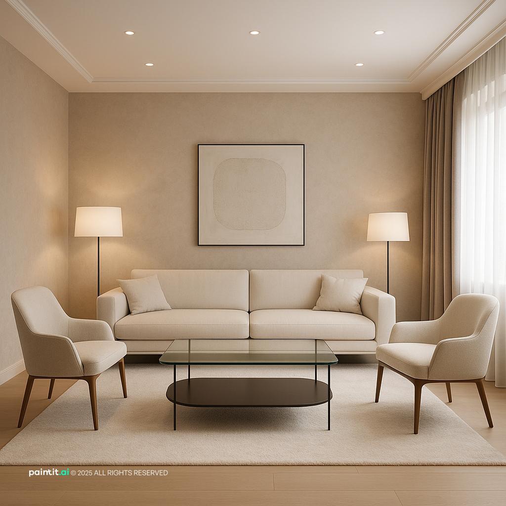
Vintage-Style Living Room Design Inspiration
Vintage-Style Living Room Design Inspiration uses natural light in a living room setting.
Living room color ideas usually begin with one paint color. In real rooms, that is rarely enough. The wall shade has to sit next to the sofa, rug, trim, wood floor, fireplace stone, metal finishes, and the light that changes all day. In Paintit.ai use, "Колір (white, beige, sage…)" is the most popular modifier, present in 27.6% of prompts. That tracks with what people actually do when they start a room: they know they want white, beige, sage, navy, or something warmer. The harder part is choosing the version that works with the room they are not replacing.
Before you choose a paint chip, look at the fixed pieces: flooring, fireplace stone, window frames, built-ins, the sofa you are keeping, and the rug that already controls half the mood. We see this constantly in Paintit.ai redesigns: "Обмеження «keep / don't change»" is present in 12.0% of prompts. Most people are not decorating an empty white box. They are trying to make a new color behave with old decisions.
Think in three moves: main wall color, one accent color, and trim color. Then check those choices against the largest materials in the room. You can test the combination with an AI living room designer before you buy paint, curtains, or a new sofa fabric.
Use the first gallery to compare how warm, cool, pale, saturated, and dark palettes change the same living room shell. Watch the rug edge, sofa fabric, window light, and the contrast around doors, trim, built-ins, and the fireplace.
Vintage-Style Living Room Design Inspiration uses natural light in a living room setting.

Tropical Modern Living Room Design balances warm wood, plants and greenery and natural light in a living room setting.

Scandinavian Style Living Room Design pairs soft textiles, layered neutrals and natural light in a living room setting.

Stylish Modern Living Room Design layers metal accents, layered neutrals and dark contrast in a living room setting.

Stylish Minimalist Living Room Design anchors warm wood, clean-lined furniture and layered neutrals in a living room setting.

Ultra-Modern Living Room Design softens metal accents, clean-lined furniture and open layout in a living room setting.

Stunning Art Deco Living Room Design uses metal accents, dark contrast and natural light in a living room setting.

Stunning Contemporary Living Room Design balances layered neutrals and natural light in a living room setting.

Modern Living Room Redesign pairs layered neutrals and natural light in a living room setting.

Stunning Modern Living Room Design layers metal accents, clean-lined furniture and open layout in a living room setting.

Elegant Classy Living Room Design anchors clean-lined furniture, plants and greenery and layered neutrals in a living room setting.

Modern Ultra-Photorealistic Living Room Design softens metal accents, clean-lined furniture and open layout in a living room setting.
Warm white works best when it is slightly creamy instead of stark. Use it on the walls with off-white trim, a linen sofa, oak or walnut tables, and a rug with beige, ivory, or muted clay running through it. If your living room has honey oak floors, a warm white usually connects better than a blue-white because it respects the yellow in the wood.
Why it works: the color stays quiet, but the room does not feel blank because texture does the work. The catch is pairing warm white walls with icy gray upholstery. That can look accidental unless you repeat the cool tone somewhere else, such as blackened metal lamps, charcoal frames, or a cool stone table.
Greige earns its place when you need to bridge brown wood, gray stone, and a sofa that is not clearly warm or cool. Choose a soft gray-toned beige for the walls, then keep the trim a little lighter so doors and windows still look clean. This is one of the most forgiving living room color schemes for homes with open sightlines into dining rooms or kitchens.
What to avoid: choosing greige from a tiny swatch under store lighting. Put the sample beside the floor, the sofa arm, and the fireplace material. If it turns purple, pink, or muddy next to those pieces, adjust it warmer, cooler, or a bit lighter before committing.
A sandy beige is not the same as flat builder beige. It has a soft golden or tan undertone that works with rattan, woven shades, travertine, brass, cream upholstery, and medium wood furniture. It is especially useful in living rooms that feel visually cold because of large windows, pale flooring, or sparse furniture.
Why it works: warm neutrals make the seating area feel settled without shouting. In north-facing rooms, test a beige with enough warmth so it does not turn gray and dull. In south-facing rooms, be careful with yellow undertones, because strong afternoon natural light can make them look heavier than expected.
Sage is one of the best bridge colors for a living room because it connects plants, wood, leather, stone, cream textiles, and black accents. Use it on all walls for a soft enclosed feeling, or keep it to built-ins if the room already has strong furniture color. A gray-green sage tends to work with cool stone fireplaces, while an olive-leaning sage fits tan leather and darker woods.
In Paintit.ai refinements, we often see users ask for a slightly darker sage green or to make it warmer. That is a smart instinct. The first green you like is usually only the starting point; the final shade should answer the room's natural light, floor color, and existing materials.
A deep navy or ink blue can make a living room feel composed, especially behind a sofa, on built-ins, or around a media wall. Balance it with off-white walls elsewhere, warm wood furniture, a textured rug, and lamps with warm bulbs. If the room has strong daylight, blue can look crisp and architectural.
What to avoid: treating dark blue as a universal fix. I would treat a dark room as a lighting problem before a color problem. In a north-facing room, navy can read almost black, so test a lighter blue-gray or add more layered lighting before repainting the whole space.
Terracotta works well when a living room already has cream upholstery, jute, aged brass, walnut, leather, or warm stone. Use it on one wall, in a large piece of art, on pillows, or inside a painted niche rather than scattering small orange objects everywhere. It feels calmer when paired with bone, taupe, olive, and dark brown.
Why it works: clay tones add warmth without relying on bright red or orange. Avoid terracotta beside very pink beige unless you want the whole room to drift peachy. If the floor is already orange-toned wood, choose a muted clay with brown in it instead of a saturated rust.
Light gray can work in a living room, but it is less forgiving than many people expect. It looks best with clean white trim, black accents, cool stone, chrome, pale oak, or blue-based textiles. If the sofa is warm beige and the floor is honey or cherry-toned, many gray paint colors will look disconnected.
When someone uploads a room and simply asks to paint it gray, the result often feels flat. Versions that work better usually specify warm gray, soft gray-green, or a gray accent wall with clear lighting direction. Add table lamps, fabric texture, and warmer bulbs so the gray does not go cold in evening shadows.
A two color combination for living room walls works best when each color has a job. Use the lighter color on the main walls and the deeper color on built-ins, the fireplace wall, wainscoting, or a reading corner. Good pairings include cream with olive, warm white with taupe, pale gray with slate blue, and beige with chocolate brown.
What to avoid: splitting walls randomly just to use two colors. The darker shade should reinforce architecture or furniture placement. If it stops in the middle of a sightline with no reason, the room can feel cut into pieces.
If the sofa is the largest item in the room, treat it as a fixed color block. A charcoal sofa can handle warm white, mushroom, olive, or pale blue walls. A beige sofa often needs a little depth around it: sage, taupe, clay, or a warmer white than the sofa fabric.
Why it works: wall color is not chosen in isolation; it is chosen against the object you see most. This is where many living room paint color ideas fail in real homes. A beautiful paint sample can still look wrong if it fights the sofa undertone.
Dark green, brown, charcoal, or blue can be beautiful in a living room with good lamp placement, pale upholstery, reflective art glass, or a light rug. Dark walls work especially well when the room is used in the evening, because the color can make lamplight feel richer. Keep the ceiling lighter unless you intentionally want a cocooning effect.
What to avoid: choosing a dark color to hide a room's problems. If the seating layout is cramped, the rug is too small, or the only light source is one ceiling fixture, dark paint will make those issues more obvious. Fix the lighting layers and furniture spacing first.
Color does not have to cover the whole room. Painting built-ins smoky blue, interior doors olive, or trim soft taupe can give the room character while leaving the walls flexible. This is useful for renters with partial permission, cautious decorators, or rooms connected to several other spaces.
Why it works: architectural color feels intentional and is often easier to coordinate with furniture than a loud all-wall choice. To see how a specific shade from a brand such as Benjamin Moore, Dulux, or Farrow & Ball might sit on your actual walls, an AI house painter can give you a realistic preview before you buy samples.
Some of the best colors for living room updates are not bright. They are controlled, deep accents: a black coffee table, dark brown velvet chair, burgundy pillow, or espresso media console against lighter walls. These shades add visual weight and keep pale rooms from feeling thin.
What to avoid: placing all dark accents on one side of the room. Balance them across the space: a dark lamp near the window, a dark frame over the sofa, and a dark table near the chairs. The eye should move through the room instead of getting stuck on one heavy object.
The second gallery is useful for comparing how wall color behaves with different sofa fabrics, rug patterns, wood tones, and lighting moods. Look for the version where the largest surfaces agree, not just the one with the most dramatic single shade.

Charming French Country Living Room Design uses soft textiles and natural light in a living room setting.

Sleek Contemporary Living Room Design balances clean-lined furniture, plants and greenery and open layout in a living room setting.

Modern Minimalist Living Room Design pairs metal accents, clean-lined furniture and layered neutrals in a living room setting.

Charming Pugliese Living Area Design layers soft textiles, metal accents and plants and greenery in a living room setting.

Stylish NYC Living Room Design anchors natural light in a living room setting.

Contemporary 40-Meter Living Room Design softens metal accents and layered neutrals in a living room setting.

Elegant Vintage Living Room Design shows one possible living room interpretation generated in Paintit.ai.

Stylish Modern Living Room Design with Clean-lined Furniture balances clean-lined furniture, open layout and layered neutrals in a living room setting.

Cozy Scandinavian Living Room for Families pairs warm wood, soft textiles and layered neutrals in a living room setting.

Modern Living Room Redesign Inspiration layers soft textiles, plants and greenery and layered neutrals in a living room setting.

Bold Modern Interior Design for Ground Floor anchors soft textiles and layered neutrals in a living room setting.

Modern Living Room Design softens clean-lined furniture, plants and greenery and open layout in a living room setting.
Start with the wall shade, then choose a supporting neutral, a darker grounding tone, and one accent color. For example: warm white walls, mushroom upholstery, walnut wood, and muted green accessories. This gives the room flexibility without making it look undecided.
Avoid using equal amounts of every color. One color should dominate, one should support, and one should appear in smaller moments. If every shade has the same visual strength, the room feels busy even when the colors are individually calm.
Wood, stone, brick, and tile all have undertones. Oak may lean yellow, cherry can lean red or pink, slate can lean blue, and limestone may lean cream or gray. Place your chosen color palette beside those materials before making a decision.
This is where many repaint projects go wrong. The wall color may be attractive on its own but clash with a fireplace or floor that is not changing. If the fixed element is warm, either harmonize with it or create deliberate contrast and repeat that contrast elsewhere.
If you choose saturated walls, soften them with tactile materials: boucle, linen, wool, washed cotton, velvet, or a rug with broken color. A dark green wall with a flat gray sofa can feel severe. The same wall with oatmeal linen, walnut, and brass feels much easier to live with.
Avoid shiny synthetic fabrics next to intense wall colors unless the room is intentionally high contrast. Matte and nubby surfaces absorb light and make strong colors calmer in daily use.
Brass, bronze, and aged gold usually flatter beige, cream, clay, olive, and warm brown palettes. Chrome, nickel, blackened steel, and pewter often suit blue, gray, white, and sharper black-and-white rooms. Mixed metals can work if one finish is clearly dominant.
Do not let every small object introduce a new finish. If the lamp, curtain rod, cabinet pull, coffee table frame, and picture frames are all different metals, the color story becomes harder to read.
Natural light changes color more than most people expect. A creamy wall may look soft in the morning and yellow in late sun. A pale blue may feel fresh by day and chilly after sunset if the bulbs are too cool.
"Освітлення" is present in 5.9% of prompts, but professional-style requests often specify daylight or evening mood because lighting changes the result so much. Test large samples near the window, behind the sofa, and in the darkest corner. Then check them with the lamps you actually use.
White trim is not always the answer. Soft white trim can calm warm walls, crisp white can sharpen gray-blue rooms, and same-color trim can make low-contrast rooms feel more continuous. In traditional rooms, trim contrast can highlight moldings; in simpler rooms, lower contrast often looks cleaner.
Avoid picking trim after the wall color is already final. The wrong trim color can make a good wall shade look dirty, too yellow, or too cold. Test both together, especially around doors and windows where the contrast is most visible.
Repeat the main colors in small but visible places: a book spine, ceramic vase, lampshade, throw, art mat, or tray. Repetition makes the palette feel deliberate without requiring matching sets. If your walls are sage, one green-gray ceramic piece and a patterned pillow may be enough.
Avoid buying all accessories in the exact same accent color. Real rooms look better when the shade varies slightly: a bit darker, warmer, grayer, or softer. 15.0% of prompts contain iterative refinement language like "Like cement color a bit darker" or "now make it warmer", and that mirrors how good rooms are actually tuned.
"Дія «repaint/paint»" is present in 13.2% of prompts, which makes sense: paint is one of the fastest ways people try to change a living room. Paintit.ai is most useful when you are choosing between close shades, not only completely different looks. Upload your living room photo, mark what should stay, and test wall color, trim, furniture direction, lighting mood, and material changes together in an AI room design workflow. If the first result feels almost right, refine it the way designers do: make it warmer, a bit darker, less gray, or more muted.
For a deeper process, see how to redesign a living room with Paintit.ai, or compare more options in our article on the best living room colors. The strongest results usually come from describing the full room: keep the sofa, keep the oak floor, repaint the walls warm white, add a muted olive accent, and use warm evening lighting. Paint brands matter too, but they are usually the final step; "Бренди фарб (Dulux, Benjamin Moore…)" are mentioned in 2.5% of prompts, while the bigger win is getting the room, style, material, and light working together first.
The best color depends on natural light, flooring, furniture, and how you use the room. Warm white, greige, sage, taupe, and soft beige are reliable starting points because they work with many materials and are easier to adjust warmer, cooler, lighter, or darker.
Light warm whites, pale greige, soft beige, and muted light gray can make a living room feel bigger, especially with low-contrast trim and a rug large enough for the seating area. Avoid sharp color breaks on every wall if the room is already small.
Start with fixed elements: floors, sofa, fireplace, rug, and anything you plan to keep. Then choose a main wall color, trim color, darker grounding tone, and small accent color. Check undertones before you buy paint.
Warm rooms feel comfortable with beige, cream, clay, olive, and wood tones. Cool rooms can feel crisp with gray, blue, white, and black, but they need strong lighting and enough texture so they do not look flat.
Yes, if it supports the architecture or layout. Use an accent wall behind a sofa, fireplace, built-ins, or media area, then repeat the accent color in smaller details so it feels connected to the whole room.