
Modern Scandinavian Living Room Design
Modern Scandinavian Living Room Design uses grey palette, green accents and warm wood in a living room setting.
Grey and green living room ideas work best when you treat the palette like a set of decisions, not just two colors you happen to like. Grey can hold the room steady. Green can soften it, add depth, and connect it to wood, plants, stone, and fabric. The part people often underestimate is temperature. Pale sage does not behave like forest green. A cool concrete grey needs different support than a warm greige. Before you paint or buy anything large, check how the green looks beside the sofa, rug, flooring, and the light you actually use at night.
A living room has to do more than look good in one saved image. It needs a seating layout that makes sense, light that feels comfortable, textiles that can handle daily use, and enough warmth that the room feels lived in rather than staged. A grey and green color scheme works because it gives you a calm neutral base and a natural color that still has weight.
In Paintit.ai prompt data, Color appears in 27.6% of prompts, and specific shades such as sage show up because people rarely want just “green.” They want the right green. Room is specified in 22.1% of prompts too, and that matters here: a living room palette has to work around a sofa, rug, TV wall, curtains, shelves, and traffic paths. If you want to compare options quickly, AI living room design is useful for testing how different greens react to your real grey flooring, walls, and furniture.
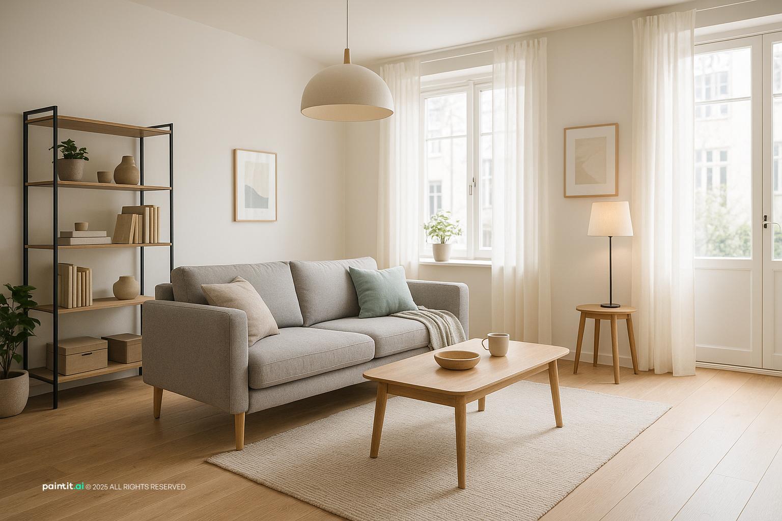
Use the first image set to check where the green sits: walls, cushions, curtains, art, plants, or one main furniture piece. The rooms that feel most settled usually repeat green in at least two places while letting grey stay as the anchor.
Modern Scandinavian Living Room Design uses grey palette, green accents and warm wood in a living room setting.

Elegant Contemporary Living Room Design balances grey palette, green accents and warm wood in a living room setting.

Scandinavian Living Room Design pairs grey palette, green accents and warm wood in a living room setting.

Elegant Classy Living Room Design layers grey palette, green accents and clean-lined furniture in a living room setting.

Contemporary Living Room Design for 2025 anchors grey palette, green accents and metal accents in a living room setting.

Grey and Green Living Room Ideas with Grey Palette and Green Accents softens grey palette, green accents and metal accents in a living room setting.

Stunning Scandinavian Living Room Design uses grey palette, green accents and warm wood in a living room setting.

Stunning Mid-Century Modern Living Room balances grey palette, green accents and warm wood in a living room setting.

Grey and Green Living Room Ideas with Grey Palette and Green Accents with Clean-lined Furniture pairs grey palette, green accents and clean-lined furniture in a living room setting.

Grey and Green Living Room Ideas with Grey Palette and Green Accents with Soft Textiles layers grey palette, green accents and soft textiles in a living room setting.

Scandinavian-Style Living Room Design anchors grey palette, green accents and warm wood in a living room setting.

Cozy Scandinavian Living Room with Color Accents softens grey palette, green accents and warm wood in a living room setting.
Most living rooms already contain grey somewhere: a sofa, carpet, tile floor, fireplace stone, media unit, or wall paint. Before adding green, work out what kind of grey you have. Is it cool, warm, pale, charcoal, blue-toned, or beige-toned? A cool grey pairs cleanly with blue-green, eucalyptus, and deep pine. A warmer grey usually sits better with sage, olive, moss, and muted khaki.
What to avoid: choosing green from a paint chip without holding it next to the existing grey. In daylight, a green can look fresh; under warm bulbs, it may turn yellow. Put samples against the sofa arm, rug edge, and wall corner before you commit. That small check prevents a lot of expensive second-guessing.
A sage green and grey living room is usually the most forgiving version of this palette because sage already carries some grey inside it. It blends, but it still brings color. Use sage on curtains, a painted alcove, cushion covers, a low cabinet, or a single wall if you want a clear change without repainting the whole room.
Why it works: sage bridges neutral and color. In Paintit.ai tests, we often see people move from a plain grey room to something warmer by asking for sage or a warmer green. It adds life without creating a hard contrast line, which is why it works so well in everyday living rooms.
A grey sofa green accents living room is one of the most practical routes because it lets you keep the biggest, most expensive piece. Add two or three green elements around it: throw pillows, a textured throw, a ceramic lamp, framed botanical wall art, or curtains with the same undertone.
Keep the proportions under control. If the sofa is large and dark, use lighter green accents and a neutral rug so the seating area does not feel heavy. If the sofa is pale grey, deeper olive or forest cushions can give it a clearer edge. You can also use AI virtual staging to test green accents around furniture you do not want to replace.
Green wall paint can look beautiful, but it absorbs light differently from grey. A single accent wall behind the sofa, fireplace, shelving, or TV unit often works better than wrapping the whole room in green. It gives the eye somewhere to land while keeping the other walls flexible.
What to avoid: painting the darkest wall dark green if it already gets little daylight. The color may collapse into shadow. If the room is north-facing, test a warmer green first, or use green on a half wall, built-in shelves, or a panelled section instead. Paint is easy to buy, but annoying to redo.
A dark green and grey living room can feel rich and grounded when there is enough contrast. Pair charcoal grey with deep forest green, then add warm oak, brass, cream, or textured linen so the room does not become dense. Dark green is especially strong on a fireplace wall, bookcase back, or velvet armchair.
Why it works: deep green gives visual weight, while grey keeps the palette controlled. The risk is low contrast. If the sofa, wall, rug, and curtains are all medium-dark, the room can look flat even if the colors are technically different. Add one pale surface or one warm material before adding more decor.
A green sofa works best when the rest of the room gives it breathing space. Choose soft grey walls, a warm neutral rug, simple curtains, and restrained metal finishes. Then repeat the green once in artwork or a small accessory so the sofa does not feel stranded.
What to avoid: adding too many competing greens. A velvet emerald sofa, olive curtains, mint cushions, and lime art can fight each other. Pick one main green family and vary texture instead of hue. Velvet, linen, wool, and ceramics will do more for the room than four unrelated greens.
Grey and green can turn cool if every hard surface is painted, lacquered, glass, or metal. Wood tones solve that problem quickly. Try oak nesting tables, walnut shelving, a rattan chair, a timber picture frame, or a wood media console.
Warm wood works especially well with sage and olive because it pulls out the earthy side of the palette. Pale ash or light oak keeps the room airy; walnut or smoked wood makes it moodier. Avoid grey-washed wood if the room already has a lot of grey, because it can make the whole space feel drained.
The rug is where many grey and green rooms either come together or fall apart. A neutral rug in wool, jute, oatmeal, soft taupe, or warm ivory can stop the palette from feeling too literal. If you prefer pattern, choose one with small hints of green and grey rather than a large high-contrast print.
For sizing, the front legs of the sofa and main chairs should sit on the rug. In a compact living room, leave a visible floor border around the rug so the room can breathe. Too small a rug makes even good colors look accidental, especially when the sofa and coffee table are floating around it.
Curtains carry a lot of vertical color, so they can change the whole mood of the room. Grey curtains on grey walls may disappear unless the fabric has texture, while green curtains can become a strong design feature. Sage linen, olive cotton, or soft grey-green drapery can be a balanced middle ground.
Why it works: curtains affect both color and light. A lined curtain in a deeper green can make evening light feel cozy, but it may darken the room during the day. If the room is small, hang curtains high and wide to make the wall feel taller and the window more generous.
A modern grey and green living room needs clean lines and deliberate spacing. Use a low-profile sofa, slim coffee table, simple floor lamp, and one strong green move such as an accent wall or upholstered chair. Keep decorative items edited so the color scheme feels intentional, not collected by accident.
In Paintit.ai behavior data, Material appears in 19.0% of prompts and Style in 17.1%, which reflects what works in real rooms: color alone rarely finishes the space. Think in terms of matte paint, wood grain, woven fabric, stone surfaces, and lighting temperature, not only shade names.
Wall art should relate to the room without copying it too closely. Abstract art with grey, cream, black, rust, and small green notes can be more interesting than a print made only of green leaves. If your walls are grey, use art with a light mount or frame so it does not visually sink.
What to avoid: buying art only because it includes green. Check scale first. One large piece above a sofa should usually be about two-thirds the sofa width, or you can group two to three smaller frames with consistent spacing. A tiny print over a large sofa will make the whole wall feel unfinished.
Metal finishes help define the room. Black metal makes grey and green feel sharper, brass warms them up, and chrome or brushed nickel keeps the look cooler and cleaner. Use metal on lamp bases, side tables, curtain rods, cabinet handles, and picture frames.
Keep it consistent enough to avoid clutter. You do not need every finish to match, but two main finishes are usually enough. For example, black curtain rods and brass lamps can work. Black, brass, chrome, copper, and gold in one small room usually looks busy.
A green and grey living room color scheme can look flat when the shades are too close in value. If both colors sit in the same middle range, nothing leads the eye. Make one element a bit darker, one element lighter, and add texture through boucle, linen, wool, velvet, timber, or stone.
This matches a pattern we see in Paintit.ai refinements: people often ask for a color to be a bit darker, warmer, more muted, or less intense after seeing the first version. Do the same in real life. If the room feels dull, do not immediately add more accessories. Adjust contrast first.
Grey and green living room decor can quickly become over-themed if every cushion, vase, candle, and print repeats the palette. Start with the big layers: sofa, rug, wall color, curtains, lighting, and one wood or metal finish. Then add smaller decor only where it improves balance.
A good rule is to decorate the coffee table, side table, and shelves differently. If the coffee table has a green vase, let the shelves carry books and wood, not more green objects. For a step-by-step way to plan changes without guessing, redesigning a living room with Paintit.ai can help you compare Make, Add, Change, and Paint options in sequence.
The second image set is useful for comparing mood. Pale sage makes grey feel lighter, olive adds warmth, charcoal gives contrast, and forest green creates a deeper evening feel.

Scandinavian Living Room Design 2025 uses grey palette, green accents and plants and greenery in a living room setting.

Modern Minimalist Living Room Design balances grey palette, green accents and plants and greenery in a living room setting.

Grey and Green Living Room Ideas with Grey Palette and Green Accents with Metal Accents pairs grey palette, green accents and metal accents in a living room setting.

Grey and Green Living Room Ideas with Grey Palette and Green Accents with Warm Wood layers grey palette, green accents and warm wood in a living room setting.

Modern Living Room Redesign Inspiration anchors grey palette, green accents and soft textiles in a living room setting.

Luxury Minimalist Living Room Design softens grey palette, green accents and clean-lined furniture in a living room setting.

Stylish Modern Living Room Design Inspiration uses grey palette, green accents and clean-lined furniture in a living room setting.

Ultra-Modern Living Room Design Inspiration balances grey palette, green accents and metal accents in a living room setting.

Grey and Green Living Room Ideas with Grey Palette and Green Accents View 6 pairs grey palette, green accents and soft textiles in a living room setting.

Scandinavian Contemporary Living Room Design layers grey palette, green accents and soft textiles in a living room setting.

Stylish Modern Living Room Design anchors grey palette, green accents and soft textiles in a living room setting.

Modern Living Room with Light Grey Loveseat softens grey palette, green accents and metal accents in a living room setting.
Cool grey has blue or silver undertones, so it works with eucalyptus, pine, and blue-green shades. Warm grey, greige, and taupe-grey usually work better with sage, olive, moss, and khaki. Use fixed elements, such as flooring or a stone fireplace, as your guide before choosing paint or fabric.
Avoid mixing a very blue grey with a yellow olive unless you add a bridge tone, such as warm white, oak, or tan leather. If you are comparing grey with other palettes, living room color ideas can help you judge whether grey and green is the calmest route or whether you need a warmer base.
A room feels more resolved when the green shades are related. Sage walls, olive cushions, and moss art can work if they share a muted, earthy quality. Mint, emerald, lime, and khaki in the same room are much harder to control.
Use texture for variety instead: matte paint, velvet upholstery, linen curtains, glazed ceramics, and leafy plants. This gives the eye movement without making the room look like a color sample board. In practice, texture often fixes what people try to fix by buying more cushions.
Materials are the difference between a colored room and a designed room. Oak warms a pale grey and sage palette. Walnut gives depth to charcoal and forest green. Stone, travertine, or concrete can work if you balance them with soft textiles.
Metal finishes should support the mood. Brass and aged bronze warm the room; black sharpens it; brushed nickel suits a cleaner, cooler interior. Avoid too many shiny surfaces if the room already has a TV, glass table, or large windows, because glare can make the palette feel harsh.
Start with the rug, then curtains, then upholstery, then throw pillows. This order matters because the largest textile areas control how the colors read. A warm ivory rug will make the room feel softer, while a dark grey rug can make green accents look more dramatic.
For cushions, mix one green, one neutral, and one texture rather than using a matching set. Try sage linen, cream boucle, and a small black-and-white pattern. Avoid five identical green pillows on a grey sofa; repetition without texture often looks stiff.
Grey and green shift strongly under light. Use ceiling lighting for general brightness, table lamps for warmth near seating, a floor lamp for reading, and accent lighting for shelves or artwork. Warm white bulbs can make sage and olive feel more inviting, while very cool bulbs may make grey walls look sterile.
I would treat a muddy grey-and-green room as a lighting problem before treating it as a styling problem. Lighting appears in 5.9% of Paintit.ai prompts, but in real rooms it often decides whether the palette succeeds. Check the room in morning light, evening light, and with lamps on before you judge the paint.
The best decor balance usually comes from a few objects with different heights and materials. On a coffee table, pair a low tray, a stack of books, and one ceramic or glass object. On shelves, mix books, framed art, woven baskets, and negative space.
What to avoid: filling every surface with green accessories. If the palette is already on the wall, curtains, or sofa, small decor can be neutral, black, wood, or off-white. That restraint keeps the room from feeling cluttered without making it feel bare.
Stand at the living room entrance and look at what the eye sees first. Ideally, it should be a balanced composition: a green wall with a grey sofa, a grey fireplace with green art, or a seating area tied together by a rug and lamp. If the first view is a blank grey wall or a cluster of small objects, the room may feel unfinished.
Move one strong green element into that sightline. It could be a chair, artwork, plant, curtain panel, or painted built-in. Keep the traffic path clear so the color moment does not compete with awkward furniture placement.
Paintit.ai lets you upload a real living room photo and test grey walls, sage accents, dark green paint, new curtains, a different rug, lighting mood, or a staged furniture layout before spending money. This is especially helpful if you need to keep a grey sofa, existing flooring, or current shelving and only want to change the palette around it.
Try prompts that are specific: make the wall sage green, keep the grey sofa, add warm oak, use a neutral rug, make the lighting warmer, or change the accent wall to a bit darker forest green. Users frequently write in direct actions like Make, Add, Change, and Paint, and that is a good way to think through the room one decision at a time. You can also use AI room design to compare several versions without committing to paint, upholstery, or large furniture first.
Yes. Grey gives the room structure, and green adds warmth, softness, or depth. The key is undertone: pair cool grey with blue-green or pine, and warm grey with sage, olive, or moss.
Start with the largest fixed item, such as a grey sofa, rug, or flooring. Add one main green feature, then repeat green in smaller details like throw pillows, wall art, curtains, or plants.
Warm white, cream, black, tan leather, oak, walnut, brass, and soft terracotta all work well. Choose one or two accent colors so the room stays balanced instead of busy.
Change the value, texture, and light. Use one shade a bit darker, add a lighter neutral, bring in wood tones or metal finishes, and plan layered lighting before adding more decor.
Sage is easier in small or low-light rooms because it feels softer and reflects more light. Dark green works well when the room has good daylight, pale flooring, or enough warm materials to balance it.