
Cozy Scandinavian Living Room with Color Accents
Cozy Scandinavian Living Room with Color Accents uses green accents, pink accents and warm wood in a living room setting.
Pink and green living room ideas work when the colors are planned like a room, not picked like wrapping paper. The shade, the size of each color block, the furniture weight, the rug, and the lighting all decide whether the room feels calm or a little too sweet. Pink softens a living room. Green gives it depth and something to lean on. Before you buy paint or a sofa, it helps to compare this pairing with other best living room colors so you can see whether you want soft, botanical, modern, or more dramatic.
Pink and green have natural contrast, but a living room needs more than contrast. A sage wall with blush textiles can feel quiet. A deep green sofa with dusty rose curtains feels heavier and more grown-up. Mint and coral can work too, but they ask for cleaner lines and more editing.
In Paintit.ai prompts, color is the most common modifier we see, appearing in 27.6% of prompts, and room appears in 22.1%. That is exactly how most people approach a redesign: first the color feeling, then the question, “Will this work in my living room?” With a pink and green color scheme, the answer is yes, if you control undertone, scale, and where the eye lands first.
Use this first gallery slowly. Notice which color leads, where your eye goes first, and how the neutral rug, wood tones, wall art, throw pillows, and curtains stop the palette from feeling too sugary or too busy.
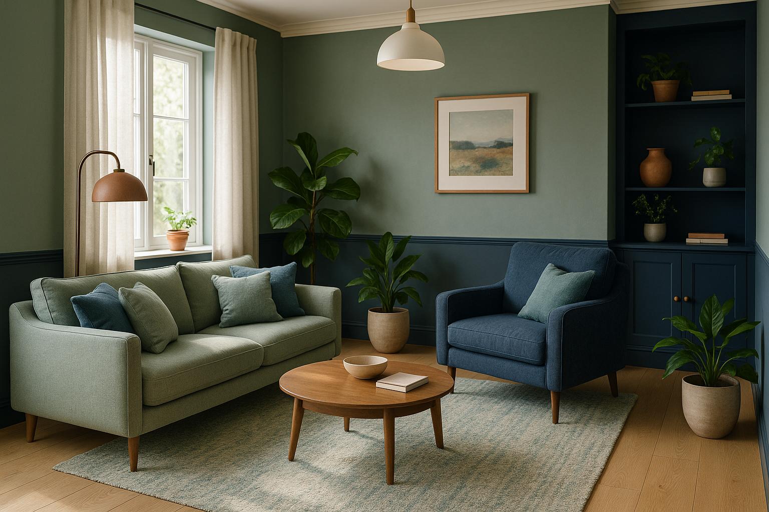
Cozy Scandinavian Living Room with Color Accents uses green accents, pink accents and warm wood in a living room setting.

Pink and Green Living Room Ideas with Green Accents and Pink Accents balances green accents, pink accents and soft textiles in a living room setting.

Vibrant Lilly Pulitzer Inspired Living Room pairs green accents, pink accents and soft textiles in a living room setting.

Modern Brazilian Living Room Design layers green accents, pink accents and soft textiles in a living room setting.

Vintage-Style Living Room Design Inspiration anchors green accents, pink accents and soft textiles in a living room setting.

Cozy Boho Living Room Design softens green accents, pink accents and soft textiles in a living room setting.
Choose whether pink or green will do the heavier work. A green and pink living room usually feels more grounded when green takes the larger surface: a sofa, an accent wall, built-ins, or a large rug pattern. Pink can then come in through a chair, cushions, art, curtains, or a small upholstered bench.
Why it works: green can behave almost like a neutral when it sits in sage, olive, moss, or forest tones. Pink has more emotional volume. Too much of it, especially on big shiny surfaces, can take over the room fast. If you want a quieter room, use green for about 60% of the visual field, pink for 30%, and a neutral, wood, or metal accent for the remaining 10%.
A blush pink and sage green living room is one of the easiest versions to live with because neither color shouts. Try sage walls, a cream or oatmeal sofa, blush pillows, and a pale oak coffee table. If you already have beige carpet or a neutral rug, this palette usually settles in well instead of fighting the floor.
The catch: do not make every surface pale and powdery. Add one deeper note, such as an olive side table, charcoal picture frame, dark bronze floor lamp, or walnut tray. Without that anchor, the room can look washed out at night, especially under weak ceiling light.
A green sofa gives the room a clear center, which makes the rest of the pink and green living room decor easier to place. In Paintit.ai tests, we often see that people get more balanced results when they start with a green sofa than when they start with pink walls. Forest, olive, and deep sage sofas handle pink accents especially well.
Check the sofa shape before choosing the pink around it. A low modern green velvet sofa can take a sharper blush wall or abstract art. A rolled-arm sofa usually looks better with soft pink linen curtains, botanical prints, and warmer wood tones. Leave space around the sofa too. A strong color needs breathing room, or it starts to feel wedged into the layout.
Pink accents are safer when they arrive in small, repeatable moments. Start with two or three pieces: throw pillows, a ceramic lamp, a framed print, or one occasional chair. Then repeat the same pink family across the room so it feels intentional, not like separate items bought on different days.
This is where iteration helps. Paintit.ai data shows that 15.0% of prompts use iterative refinement language, including “instead / now / a bit / more / less”. We see the same logic in real rooms. Add one pink note, check it in daylight and evening light, then decide whether it should go a bit darker, now make it warmer, softer, or less saturated.
An accent wall works when it supports the architecture. Use the wall behind the sofa, fireplace, media unit, or a pair of bookshelves. A muted green accent wall with blush and cream furniture is easier to live with than a bright pink wall behind a television, where glare and color intensity can become tiring.
For a pink green living room color scheme, test paint on more than one wall before committing. Green can turn gray in north-facing rooms. Pink can turn peachy under warm bulbs. If you are unsure, use a removable sample or preview the change with how to redesign a living room with Paintit.ai before buying paint for the full room.
A neutral rug is one of the best tools for keeping pink and green from competing. Look for ivory, oatmeal, warm gray, jute, sisal, or a faded Persian-style rug with small touches of rose and green. The rug should be large enough for at least the front legs of the sofa and main chairs to sit on it.
Why it works: a large quiet surface gives the eye somewhere to rest. Many uploaded rooms already have flooring or rugs people want to keep; 12.0% of prompts include “keep / don't change” restrictions. If your rug is staying, build the pink and green around its undertone instead of forcing a separate palette over it.
A botanical pink and green living room can look beautiful when the plant references are edited. Use one strong leaf-patterned fabric, one piece of botanical wall art, or real plants in sculptural planters. Then keep the rest of the room calmer with solid upholstery, plain curtains, and simple lamps.
What usually goes wrong: too many leaf prints at the same scale. If the curtains, pillows, rug, and art all have foliage, the room loses hierarchy. Pair one large botanical pattern with smaller textures such as bouclé, linen, cane, ribbed glass, or matte ceramic.
For a modern pink and green living room, reduce pattern and sharpen the shapes. Think a straight-lined green sofa, blush plaster-look walls, black-framed art, a simple marble or travertine coffee table, and slim metal lighting. The color can be expressive, but the furniture needs discipline.
This version works especially well in apartments and open-plan spaces because it does not depend on lots of decorative objects. Keep the traffic path clear, choose a sofa depth that fits the room, and avoid oversized accent chairs if they block the view from the entry, kitchen, or dining area.
Curtains are not just background. In a pink and green living room, they can soften contrast, warm the daylight, and make the palette feel finished. Blush linen curtains look gentle against sage walls. Warm white curtains can quiet a strong green sofa and pink wall art.
Hang curtains high and wide so the window feels larger. If the room gets harsh afternoon sun, use lined fabric or sheers layered with drapery. That sounds small, but it matters: flat or glaring light can make pink look chalky and green look dull.
Wall art should connect the colors without repeating them too literally. A large abstract with muted rose, olive, cream, and charcoal can bridge a green sofa and pink chair. Botanical prints can work too, but choose frames that match the room’s wood tones or metal finishes.
Avoid art that is too small above a sofa. A single piece should be roughly two-thirds the width of the sofa, or you can use a pair or grid. If the art contains strong pink and green, keep nearby pillows simpler so the wall does not compete with the seating.
Wood tones can warm the palette or make it feel disjointed. Pale oak and ash work well with sage, blush, and cream. Walnut suits dusty rose, olive, and forest green. Red-toned cherry or mahogany usually needs a warmer pink, not a cool lavender-pink.
When people upload a living room with heavy timber, the weak spot is often choosing a pink that is too cool. Warmer blush tones usually sit better with existing floors, beams, or vintage furniture. If you want to test a new sofa, paint color, or rug around pieces you plan to keep, AI room design can help you preview the combination first.
Pink and green already bring personality, so every shelf, tray, and corner does not need styling. Keep some shelves partly open, limit coffee table objects, and use fewer but larger accessories. This creates decor balance and helps the palette look designed rather than crowded.
Paintit.ai prompts often include “without” and “no clutter” language; negative requests appear in 8.8% of prompts. That is a useful design instinct. If the room feels busy, remove one pattern, one small object group, or one extra accent color before changing the main palette.
The second gallery helps you compare how the same pink and green color scheme changes when the lead shade, furniture style, pattern scale, and lighting mood shift.

Modern Spacious Living Room Design uses pink accents, warm wood and layered neutrals in a living room setting.

Ultra-Realistic 50s Style Living Room Design balances pink accents and natural light in a living room setting.

Pink and Green Living Room Ideas with Pink Accents and Soft Textiles pairs pink accents, soft textiles and layered neutrals in a living room setting.

Charming French Country Living Room Design layers pink accents, soft textiles and natural light in a living room setting.

Elegant French Country Living Room Design anchors green accents, pink accents and soft textiles in a living room setting.

Elegant Neoclassical Living Room Design softens pink accents, metal accents and layered neutrals in a living room setting.
Do not rely only on color names like blush, sage, mint, or olive. A cool pink can look sharp beside a yellow-green sage, while a peachy blush can fight with a blue-green mint. Put samples next to the sofa, rug, flooring, and curtains before deciding.
The safest pairings are warm blush with sage or olive, dusty rose with forest green, and pale pink with soft eucalyptus. Avoid bubblegum pink with lime green unless you deliberately want a very playful room and you are ready to keep the rest of the decor tight.
Cream, warm white, oatmeal, taupe, greige, and soft mushroom shades help pink and green breathe. Use them on large surfaces such as rugs, lampshades, ceiling paint, or the main sofa if the walls and accessories already carry the color.
Why it works: neutrals reduce contrast and make the palette easier to live with every day. Avoid stark white if your pink is warm and your green is muted. It can make both colors look dusty by comparison, especially in rooms without much natural light.
Materials matter more than people expect. In Paintit.ai prompts, “Матеріал” is used in 19.0% of prompts, “Стиль” in 17.1%, “Дія «repaint/paint»” in 13.2%, and “Освітлення” in 5.9%. That order makes sense: once the color idea is set, the room succeeds or fails through surfaces, finish, and light.
Wood tones add warmth, metal finishes add definition, and stone adds visual weight. Brass and antique gold work well with blush and olive. Blackened steel can make a modern palette feel cleaner. Travertine, limestone, marble, and terrazzo can all work if their undertones echo the room instead of introducing a new color argument.
Textiles are where this palette becomes touchable. Combine linen curtains, velvet or chenille seating, wool rugs, cotton cushions, and maybe one nubby bouclé chair. Pink often feels more grown-up in matte or textured fabrics than in shiny synthetics.
Use pattern carefully. A green velvet sofa with plain blush pillows may need a striped or embroidered cushion for movement. A patterned rug may need solid curtains. The goal is contrast in texture, not visual noise.
Only 5.9% of Paintit.ai prompts mention lighting, but lighting often decides whether pink and green look rich or muddy. Use layered lighting: ceiling light for general brightness, floor or table lamps for seating, and a picture light or wall sconce for art or shelves.
Warm bulbs usually flatter blush, rose, olive, and forest green. Cooler bulbs can work with mint or sharper modern schemes, but they may make beige upholstery and wood look lifeless. I would treat flat color as a lighting and layout problem before assuming the whole palette is wrong.
Pink and green decor works best when accessories vary in height, shape, and material. Try a pink ceramic vase, a green glass bowl, a stack of neutral books, and one dark metal object. Leave gaps between groups so the eye can read each color.
Avoid buying every accessory in matching pink and green. A room feels more collected when some objects are neutral, wood, black, brass, or clear glass. The color should repeat, not shout from every corner.
Stand where you enter the living room and look at the first view. The strongest pink or green element should make sense from that angle. If the room feels lopsided, move a pillow, lamp, plant, or artwork so color is distributed across the sightline.
This is especially important in open-plan homes. A green sofa may look balanced from the seating area but too heavy from the kitchen. Use smaller pink or neutral elements across the room to pull the composition together without adding clutter.
A pink and green palette is easiest to refine visually. With AI Living Room Design, you can upload your current living room and test sage walls, blush curtains, a green sofa, different rug tones, or warmer lighting while keeping the pieces you do not want to change.
Use it the way people naturally refine rooms: try one version, then ask for a bit darker green, warmer pink, less clutter, or more natural light. Paintit.ai data also shows that 509 chats have 5+ turns, which matches how design decisions usually happen: first the broad direction, then the small corrections. If you are staging a listing or planning furniture before purchase, AI virtual staging can also help compare layouts and color direction before you commit to physical pieces.
Yes. Pink and green work well because they have natural contrast. For an easier living room, start with muted shades like blush, sage, olive, dusty rose, or forest green instead of very bright versions.
Pick one lead color, repeat the second color in smaller accents, and ground both with neutrals, wood tones, and simple metal finishes. Then check the room in daylight and evening light before adding more.
Warm white, cream, taupe, walnut, oak, brass, antique gold, black, and soft gray all work well. Choose accent colors that match the undertone of your pink and green, not just the color name.
Add layered lighting, deeper contrast, varied textiles, and one grounding material such as wood, stone, black metal, or a textured neutral rug. If it still feels flat, adjust one thing at a time: a bit darker green, warmer pink, or less clutter.
It can work for both. Botanical rooms use plants, leaf prints, sage tones, and natural texture. Modern rooms use cleaner furniture lines, stronger contrast, fewer patterns, and more deliberate negative space.