
Minimalist Japandi Living Room Design
Minimalist Japandi Living Room Design uses black contrast, cream tones and warm wood in a living room setting.
Black and cream living room ideas usually work when the contrast has a job. Cream gives the room light, softness, and breathing space. Black gives it edges, rhythm, and a clear place for the eye to land. The question is not whether black and cream can work together. They can. The real question is where the black should go: frames, table bases, lamps, curtains, an accent wall, furniture legs, or one larger focal point. If you are not sure how much contrast your room can take, test the ratio first in an AI room design workflow before buying paint, a rug, or a new sofa.
A living room carries more visual weight than a bedroom or kitchen. It often has seating, a TV wall, storage, lamps, curtains, side tables, art, books, and daily mess all in one view. A black and cream palette gives those pieces a shared structure. Cream keeps the bigger surfaces calm. Black stops the room from looking washed out.
In Paintit.ai prompts, color is the most popular modifier, appearing in 27.6% of prompts, and room type is specified in 22.1%. That matches what we see in real uploads: people often know they want a cream and black living room, but the finished result depends on scale, undertone, material, and which part of the room becomes the focal point.
In the first gallery, look at where black actually appears: thin chair legs, picture frames, curtain rods, lamp shades, fireplace surrounds, low tables, or cabinet pulls. The strongest rooms usually repeat black at several heights instead of dropping one heavy black object into a pale corner.
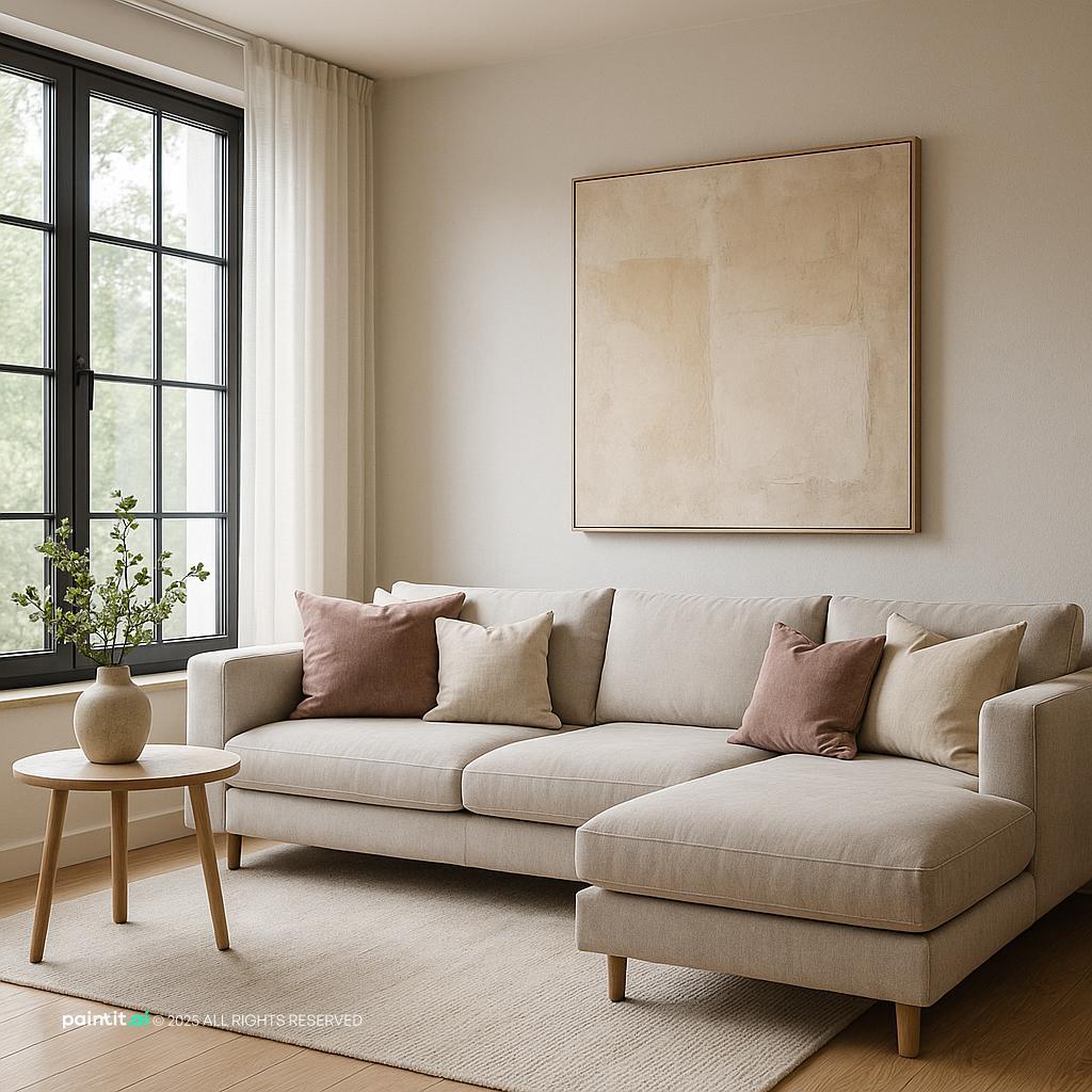
Minimalist Japandi Living Room Design uses black contrast, cream tones and warm wood in a living room setting.

Modern Minimalist Living Room with Japandi Flair balances black contrast, cream tones and warm wood in a living room setting.

Black and Cream Living Room Ideas with Black Contrast and Cream Tones pairs black contrast, cream tones and metal accents in a living room setting.

Modern Minimalist Living Room Design layers black contrast, cream tones and warm wood in a living room setting.

Chic Art Deco Living Room Design anchors black contrast, cream tones and metal accents in a living room setting.

Black and Cream Living Room Ideas with Black Contrast and Cream Tones with Warm Wood softens black contrast, cream tones and warm wood in a living room setting.

Black and Cream Living Room Ideas with Black Contrast and Cream Tones with Layered Neutrals uses black contrast, cream tones and layered neutrals in a living room setting.

Elegant Neoclassic Living Room Design balances cream tones, layered neutrals and natural light in a living room setting.

Stylish Mid-Century Modern Living Room pairs black contrast, cream tones and warm wood in a living room setting.

Black and Cream Living Room Ideas with Cream Tones and Layered Neutrals layers cream tones, layered neutrals and natural light in a living room setting.

Elegant Neoclassical Living Room Design anchors cream tones and layered neutrals in a living room setting.

Black and Cream Living Room Ideas with Cream Tones and Layered Neutrals with Natural Light softens cream tones, layered neutrals and natural light in a living room setting.
Use cream on the largest surfaces first: walls, the main sofa, full-height curtains, or a broad neutral rug. Then use black for the 20% that gives the room definition, such as a coffee table, lamp, frame, shelving unit, hardware, or accent chair.
Why it works: black carries a lot of visual weight. A small amount can organize the whole room. If you use equal parts black and cream in a small living room, the space can start to feel broken into pieces. In most homes, cream should be the base and black should be the punctuation.
A cream sofa can look calm and expensive, but it can also float if everything around it is pale. Add black-framed wall art above it, a black floor lamp beside it, or throw pillows with black piping so the sofa feels connected to the rest of the room.
This is especially useful for a cream sofa black accents living room where the sofa is already owned and you do not want to replace it. In Paintit.ai behavior, 12.0% of prompts use a keep or do not change modifier, often around large pieces. If you are keeping the sofa, design the contrast around it instead of pretending it is separate from the redesign.
For black and cream living room furniture, slim black legs often work better than large black blocks. Try a cream sectional with black metal legs, a light upholstered chair on a dark frame, or a wood media unit with black pulls.
What to watch: too many solid black pieces at floor level. A black sofa, black media console, black coffee table, and black rug border can make the lower half of the room feel heavy. If you want drama, choose one dominant black piece and keep the others lighter, slimmer, or lifted on legs.
A focal point could be a black fireplace surround, a painted alcove, a media wall, a large cabinet, or one oversized piece of art. Let that element lead the room, then repeat smaller black details elsewhere.
This keeps the decor balance readable. If every wall has a black feature, the eye has nowhere to rest. A single dark focal point works especially well when the seating faces it and the rest of the room uses cream, beige, warm white, or pale wood.
A plain cream rug can work, but a rug with a soft black line, border, or abstract pattern often ties the room together faster. Size matters here. The rug should be large enough for at least the front legs of the sofa and chairs to sit on it.
Why it works: the rug is the bridge between furniture pieces. If it is too small, the contrast makes every item look isolated. For a normal conversation area, keep a consistent rug edge around the seating zone and avoid a tiny rug that sits only under the coffee table.
Spread black vertically: a low coffee table, a mid-height side table, black-framed art, and a dark pendant or floor lamp. This keeps the eye moving through the room instead of stopping at one dark object.
When people upload rooms with a cream base, we often see the same weak spot: all the black is on the table, and nothing is happening at eye level. A black tray is not enough if the walls, lamps, and curtains are all pale. Add at least one black detail above sofa height.
A black and cream color scheme can feel stark if every surface is painted, glossy, or flat. Add oak, walnut, cane, warm shelving, or a wood coffee table to soften the contrast. Wood is especially helpful in scandinavian, japandi, and transitional rooms.
In Paintit.ai tests, rooms described only as black and cream can come back feeling a bit sterile. Materials are specified in 19.0% of prompts, and they matter here. A wood table, linen curtains, marble detail, brick texture, or bouclé chair often improves the room more than adding another decorative object.
A black accent wall can look strong behind a fireplace, bookcase, or TV, but it needs enough natural light and cream contrast nearby. If the room is narrow or north-facing, try a charcoal-black niche, half wall, or built-in backdrop instead of painting the largest wall fully black.
What to avoid: placing a black wall behind dark furniture with no separation. Add cream art mats, brass or matte metal finishes, or warm wood shelves so the wall has layers. Black needs edges and highlights; otherwise it turns into a flat patch.
I would treat this palette as a layout problem before a styling problem. If the sofa, chairs, and tables are too far apart, the black pieces start to look like scattered marks around the room.
Pull seating closer, keep a clear traffic path, and place the coffee table within easy reach of the main sofa. Leave enough walking clearance around the seating group while still making the rug feel connected to every seat. The stronger the contrast, the more obvious awkward spacing becomes.
Cream curtains can make the room feel taller and quieter, especially when they are hung close to the ceiling. Black curtain rods, rings, or a thin leading edge can repeat the palette without making the windows feel heavy.
For a more tailored look, choose linen or a linen-blend fabric instead of shiny synthetic panels. Avoid very short curtains in this palette. They cut the wall visually and make black accents feel abrupt. Let the fabric skim the floor for a cleaner sightline.
Black-framed wall art is an easy way to add structure, but the art itself should not be too dense. Look for abstract prints, photography, line drawings, or mixed-media pieces with cream, white, taupe, or beige negative space.
Why it works: the frame gives contrast, while the art keeps the wall breathable. Several dark prints in a row can make the whole wall feel heavy. For a modern black and cream living room, use fewer, larger pieces with clean lines; AI living room design can help compare art scale, sofa size, and wall proportions before you commit.
Black lamps, sconces, pendants, and picture lights create useful contrast while also improving mood. A black floor lamp next to a cream sofa usually feels more intentional than another small accessory on the coffee table.
Lighting is specified in only 5.9% of Paintit.ai prompts, but it is often the reason black and cream rooms look muddy in renders and real life. Use warm bulbs, avoid harsh glare on cream walls, and place light at more than one height. One ceiling fixture rarely does enough.
An empty room makes it hard to judge how much black is too much. If you are starting from scratch, AI virtual staging can show how a cream sofa, black tables, a pale rug, and wood storage might fill the floor plan.
This is useful before buying large pieces because black furniture has strong visual weight. Test sofa depth, chair clearance, and media unit size first. A piece that looks balanced online may dominate once it sits against a cream wall.
High contrast makes clutter louder. Remote controls, visible cables, mixed baskets, too many small frames, and random accent pillows stand out more in black and cream rooms than they do in layered beige spaces.
Use closed storage where possible, repeat materials, and keep tabletops edited. That does not mean the room has to feel minimal. It means each visible item should support the palette, the texture story, or the way the room is actually used.
Use the second gallery to compare how the same palette changes with proportion. Softer rooms lean on cream upholstery and pale wood. Modern rooms use sharper black lines. More dramatic rooms bring in deeper walls, stronger wall art, and heavier metal finishes.

Elegant Neoclassic Living Room Design with Cream Tones uses cream tones, warm wood and metal accents in a living room setting.

Black and Cream Living Room Ideas with Cream Tones and Layered Neutrals View 3 balances cream tones and layered neutrals in a living room setting.

Elegant Neoclassic Living Room Design with Layered Neutrals pairs cream tones and layered neutrals in a living room setting.

Cozy Cabin Living Room Design layers black contrast, soft textiles and plants and greenery in a living room setting.

Black and Cream Living Room Ideas with Cream Tones and Layered Neutrals View 4 anchors cream tones, layered neutrals and natural light in a living room setting.

Stylish Modern Living Room Design softens black contrast, cream tones and metal accents in a living room setting.

Elegant Neoclassical Living Room Design with Cream Tones uses cream tones, metal accents and layered neutrals in a living room setting.

Modern Living Room Design Inspiration balances cream tones, soft textiles and metal accents in a living room setting.

Stunning Contemporary Living Room Design pairs black contrast, cream tones and clean-lined furniture in a living room setting.

Elegant Neoclassic Minimalist Living Room Design layers cream tones, clean-lined furniture and layered neutrals in a living room setting.

Sleek Modern Living Room Design anchors black contrast, clean-lined furniture and layered neutrals in a living room setting.

Elegant Traditional Living Room Design softens cream tones and layered neutrals in a living room setting.
Cream controls the temperature of the room. A warm cream with beige or sand undertones feels relaxed with oak, brass, and linen. A cooler cream works better with crisp white trim, blackened metal, gray stone, or a cleaner modern shell.
Be careful with yellow-cream next to a blue-black finish. That mismatch can make the cream look old rather than intentional. In Paintit.ai refinement patterns, 15.0% of prompts ask for changes such as warmer, darker, more, or less. For this palette, making the room warmer usually starts with the cream, not the black.
The best versions of this scheme usually use black to outline architecture and furniture. Think window frames, lamp silhouettes, table bases, fireplace trim, shelves, and picture frames.
If you want a black cream living room color scheme that still feels livable, do not default to black walls everywhere. Use black where you want definition. Keep cream on surfaces that need to reflect light, especially in compact rooms or spaces with limited windows.
A color-only plan can look flat. Combine matte black metal, cream bouclé, woven linen, natural wood, marble, ceramic, or a nubby wool rug. The goal is to give the room shadow, softness, and grain.
What to avoid: all smooth surfaces. A glossy black table, flat cream sofa, shiny curtains, and polished tile can feel cold together. Add one tactile textile and one natural material before you add more accessories.
Black metal is the easiest finish for this palette, but it should not be the only one. Add aged brass, bronze, or brushed nickel in small amounts if the room needs warmth or a little reflection.
Use metal on lamp stems, cabinet pulls, side table frames, or a mirror. Avoid mixing too many metal finishes in a small space. Two finishes are usually enough: one dominant finish and one accent finish.
Use a ceiling fixture for general light, a floor lamp for reading, table lamps for softer pools of light, and sconces or picture lights for wall detail. Cream walls can look beautiful in warm light, while black details need highlights to show their shape.
If the room feels dull, do not rush to add another color. Adjust the lighting first. For more help comparing undertones and how light changes them, see Paintit.ai’s guide to the best living room colors.
Throw pillows, curtains, blankets, and upholstery keep black from feeling severe. Use cream, ivory, beige, taupe, and a small amount of black pattern. A stripe, grid, or organic print can connect the palette without overwhelming the sofa.
Avoid using only high-contrast pillows if the sofa is already light. Mix one black-and-cream pattern with two quieter textures. The seating will feel designed, not busy.
Black and cream do not need an accent color, but a small amount can help if the room feels too strict. Sage, olive, rust, camel, terracotta, or muted blue can work, depending on the undertone of the cream.
Use accent color in one or two places: a pillow, vase, artwork detail, or plant. Do not add five accent colors at once. The main palette should still read clearly from the doorway.
Stand at the living room entrance and check where the dark pieces collect. If all the black is on one wall, the room can feel tilted. Add a black frame, lamp, or side table on the opposite side to balance the view.
This is where black and cream living room decor often goes wrong. Small accessories cannot fix a room if the main visual weight is uneven. Start with the large shapes first, then finish with trays, books, ceramics, greenery, and smaller decor.
With Paintit.ai, you can upload a real living room photo and test black accents, cream walls, sofa options, rug scale, wood tones, lighting mood, and styling direction before changing the room. Try versions that keep your existing sofa, change only the wall art, add a black accent wall, or make the cream warmer.
For a more structured process, follow the step-by-step workflow on how to redesign a living room with Paintit.ai and compare several refinements side by side. In this palette, small changes in undertone, lamp placement, and material can change the whole feel of the room.
Yes. Cream softens the room and reflects light, while black adds structure. The combination works best when cream is the main base and black is repeated in smaller, deliberate accents.
Start with cream walls, upholstery, or a rug, then add black through frames, lighting, tables, hardware, and wall art. If you need to keep an existing cream sofa, build the black accents around it instead of replacing the largest piece first.
Sage, olive, camel, rust, muted blue, and warm wood tones all work well. Choose one accent color and repeat it lightly so the room still reads as a black and cream palette.
Mix textures and lighting. Use matte metal, bouclé, linen, wood, ceramic, and layered lighting so the room has depth, shadow, and tactile contrast without adding clutter.
Yes, but use them carefully. A black fireplace wall, niche, or built-in backdrop is usually safer than painting every wall black, especially if the room has limited natural light.