
Modern Scandinavian Living Room Design
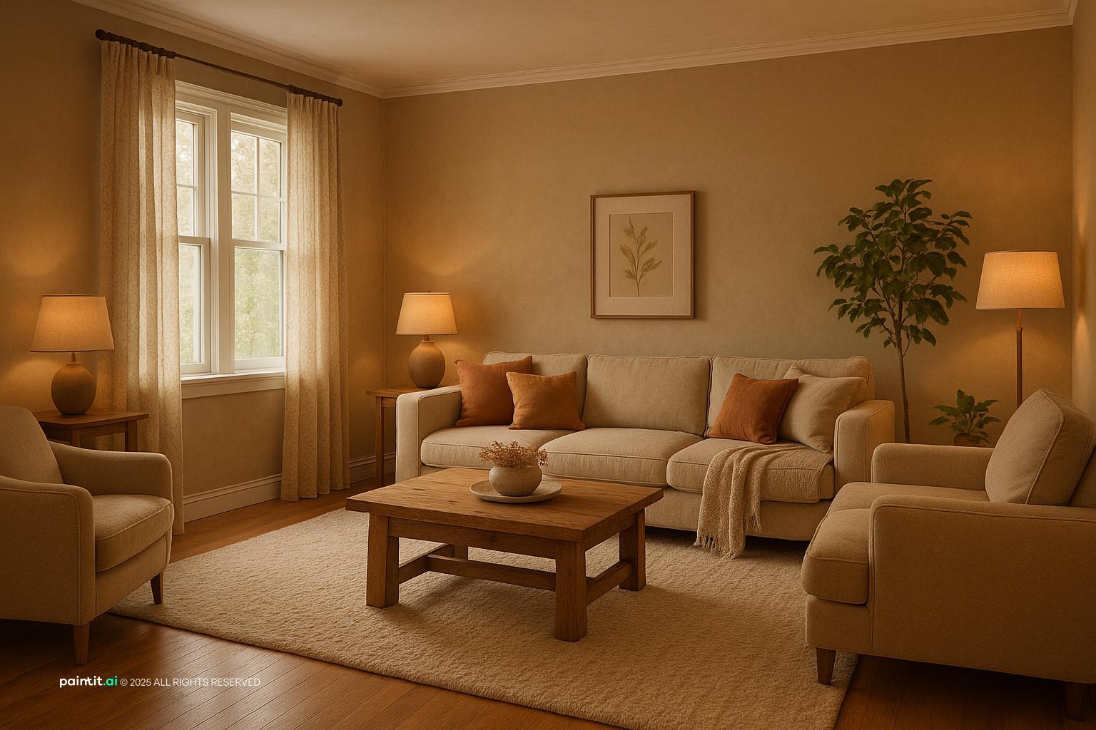
Modern Scandinavian Living Room Design uses beige foundation, cream tones and soft textiles in a living room setting.
Cream and beige living room ideas only work when you treat the palette as a family of tones, not one safe color. A yellow-cream wall, a greige sofa, and a sand-colored rug can look calm and expensive. They can also look slightly off, and that usually comes down to undertone, texture, and the light in the room. In Paintit.ai usage, color is the most common design modifier at 27.6%, and room type appears in 22.1% of prompts. That lines up with what we see in real uploads: people do not just want “neutral.” They want a living room-specific answer for paint, upholstery, rugs, curtains, wood tones, and lighting that makes cream and beige feel chosen, not leftover.
Most beige and cream living room projects start with something that is not changing: a sofa, floor, fireplace stone, wall color, or large rug. Start there. Decide whether that fixed piece leans warm, chalky, sandy, taupe, pink-beige, or softly greige before you buy anything else. If every item is picked in isolation because the label says cream or beige, the room often ends up close, but not quite right.
We often see people test one beige direction, then refine it with words like more warm, a bit darker, or softer. That small shift matters. A cream wall can go yellow at night, and a beige sofa can look gray beside the wrong rug. If you want to compare several versions quickly, an AI living room design tool can help you preview paint, furniture, and layout combinations before you commit to a full room update.
Use the first gallery to study where the contrast comes from. The strongest cream and beige rooms rarely rely on loud color. They use darker wood legs, ribbed ceramics, woven shades, linen curtains, black picture frames, a deeper rug border, or one strong table shape to give the eye somewhere to land.
Modern Scandinavian Living Room Design uses beige foundation, cream tones and soft textiles in a living room setting.

Cream and Beige Living Room Ideas with Beige Foundation and Cream Tones balances beige foundation, cream tones and soft textiles in a living room setting.

Cozy Bohemian Living Room Design pairs beige foundation, cream tones and soft textiles in a living room setting.

Cozy Contemporary Cottage Living Room Design layers beige foundation, cream tones and warm wood in a living room setting.

Modern Minimalist Living Room with Japandi Flair anchors beige foundation, cream tones and warm wood in a living room setting.

Minimalist Japandi Living Room Design softens beige foundation, cream tones and warm wood in a living room setting.

Modern Cottage Living Room Design for Relaxation uses beige foundation, cream tones and soft textiles in a living room setting.

Cream and Beige Living Room Ideas with Beige Foundation and Cream Tones with Layered Neutrals balances beige foundation, cream tones and layered neutrals in a living room setting.

Cozy Modern Living Room Design for 2025 pairs beige foundation, cream tones and warm wood in a living room setting.

Modern Minimalist Living Room Design layers beige foundation, cream tones and warm wood in a living room setting.

Cream and Beige Living Room Ideas with Beige Foundation and Cream Tones with Soft Textiles anchors beige foundation, cream tones and soft textiles in a living room setting.

Harmonious Nature-Inspired Living Room Design softens beige foundation, cream tones and warm wood in a living room setting.
Start with the largest piece you are not changing. It might be a cream sofa, beige carpet, oak floor, stone fireplace, or existing wall color. Hold every new sample against that anchor in daylight and evening light, because cream can turn yellow and beige can turn pink once lamps are on.
Why it works: a neutral room needs a clear order. If every surface tries to be the main beige, the space looks accidental. Let one element lead, then choose nearby tones that are clearly lighter, darker, warmer, or cooler.
Paint names are not reliable enough. One cream may have a buttery yellow base, while another may read like chalky white with a gray cast. Beige can lean sand, mushroom, camel, taupe, or pink. Put samples next to your flooring, sofa fabric, and curtains instead of judging them alone on a screen or paint card.
For a warm room, pair ivory walls with tan, honey oak, and oatmeal textiles. For a quieter modern room, use off-white walls with greige upholstery and pale stone. If you are comparing neutrals with other options, the Paintit.ai article on best living room colors is useful for seeing where cream and beige sit beside white, gray, green, and deeper earth tones.
If your furniture is good but the room feels cold or unfinished, wall color is often the cleanest first move. A warm beige wall can soften white trim, while a creamy off-white wall can freshen a room with darker beige upholstery. Test a few shades on different walls, especially near windows, corners, and TV areas where glare changes the color read.
Paintit.ai data shows repaint or paint actions appear in 13.2% of prompts, which makes sense for this palette. Small shifts do a lot here. Use a workflow like redesigning a living room with Paintit.ai to compare a warmer wall, a lighter trim, or a slightly deeper accent before you start moving furniture.
A cream sofa can look beautiful against beige walls, but it needs grounding so it does not float. Add a rug with a tan, taupe, or woven jute base that reaches at least under the front legs of the sofa and chairs. A coffee table in medium wood, travertine, smoked glass, or dark metal will give the seating area a real center.
What to avoid: a cream sofa on a small pale rug, against pale walls, with a pale coffee table. The eye has nowhere to rest. If the room is small, use slim dark legs, a framed print, or a deeper side table instead of bringing in bulky dark furniture.
A neutral rug is not just background. In a cream and beige room, it often decides whether the space feels coastal, modern, rustic, or traditional. A flatweave jute rug feels casual and textured; a wool rug in oatmeal and taupe feels softer; a faded Persian-style rug brings pattern without loud color.
Check the size before you fall in love with the pattern. In most living rooms, the rug should be large enough to connect the sofa, chairs, and coffee table. If only the coffee table sits on it, the seating zone can look like scattered furniture instead of one conversation area.
Wood is one of the easiest ways to stop a neutral cream living room from feeling flat. Light oak works well with airy cream walls, walnut adds definition, and reclaimed wood brings texture to simple upholstery. If the floor is already light oak, do not match every table to it exactly. Use a slightly deeper or more grained wood so the pieces do not blur together.
In Paintit.ai prompts, materials appear in 19.0% of requests, and neutral rooms show why. People often try more throw pillows first, but the real fix is usually material contrast: linen next to wood grain, boucle next to blackened metal, smooth stone next to woven fiber.
Curtains can make a beige room feel finished even when the furniture is simple. Choose linen, cotton-linen, or textured weave panels in warm white, oatmeal, or a shade slightly darker than the wall. Hang the rod higher and wider than the window frame so the room feels taller and the window looks more generous.
Why it works: curtains add a vertical soft surface, which balances the horizontal weight of sofas and rugs. Avoid shiny synthetic panels in bright white unless the rest of the room is crisp and cool. They can make cream walls look dingy by comparison.
Cream and beige can take accent color, but the best choices are usually muted rather than sharp. Try sage, olive, clay, rust, chocolate, charcoal, dusty blue, or muted black. Use them in throw pillows, a single chair, a ceramic lamp, wall art, or a patterned rug.
Keep the accent ratio modest. One large sage chair may be enough, or three small black accents can define the room. Too many accent colors will break the calm of the palette and make the beige look like a compromise instead of a decision.
An accent wall in a cream and beige room can work behind a sofa, fireplace, built-in shelves, or a media wall. Choose a deeper taupe, limewash beige, plaster-effect finish, or warm mushroom shade rather than a random dark rectangle. The wall should frame something important.
What to avoid: painting one short, empty wall darker just to add interest. It can make the room feel chopped up. If the architecture is plain, I would solve that first with large wall art, a textured console, or full-height curtains before reaching for a feature paint color.
If you are starting from a blank room, the sofa dimensions matter as much as the color. A deep, low cream sofa gives a relaxed lounge feel, while a tighter beige sofa with raised legs works better in a compact or formal room. Leave a clear traffic path of about 30 to 36 inches where people walk through the room.
For an empty listing, rental, or new home, AI virtual staging can help compare a cream sofa, beige chairs, rug scale, and coffee table shape without guessing. The key is to stage around real circulation, not just the prettiest view from one corner.
Flatness is the main risk with cream and beige living room decor. Check for at least three texture families: a nubby throw, a smooth ceramic lamp, a grained wood table, a woven shade, a wool rug, or a linen curtain. The colors can stay quiet if the surfaces catch light differently.
Why it works: texture creates shadows. Shadows give pale colors depth. Avoid using only smooth fabrics and glossy surfaces, because the room may look washed out in photos and under ceiling lights.
Not every cream and beige room starts from scratch. Paintit.ai users use keep or do not change constraints in 12.0% of prompts, often because they want to preserve a sofa, table, floor, or cabinet. If you have dark wood or black furniture, bridge it with mid-tone beige, camel leather, patterned pillows, or a rug that contains both light and dark threads.
What to avoid: putting dark furniture directly against very pale walls with no middle value. The contrast can look harsh. A tan lamp shade, walnut frame, or taupe curtain can make the old and new pieces feel related.
Cream and beige need light from more than one direction. Use an overhead or semi-flush fixture for ambient light, a floor lamp near the sofa for reading, and a table lamp or picture light to create glow at eye level. Warm bulbs usually suit this palette better than cool white bulbs.
Only 5.9% of Paintit.ai prompts mention lighting, but lighting is often the missing piece between a basic neutral room and one that feels finished. It creates the small shadows that make fabric, wall color, and wood tones visible.
A pale neutral room shows clutter quickly because every object interrupts the soft color field. Use fewer but larger accessories: one oversized vase, a stack of books, a sculptural bowl, or two framed pieces instead of many tiny objects. Closed storage is especially helpful if the living room also holds toys, remotes, chargers, or work items.
Why it works: cream and beige look best when the eye can move across broad surfaces. If the room feels busy, remove small decor first before buying anything new. Very often, the answer is less visual noise, not more styling.
The second gallery is useful for spotting small decisions that change the whole mood: warm beige walls versus creamy white walls, boucle versus linen, light oak versus walnut, soft accents versus stronger black details, and matte finishes versus anything too shiny.

Cream and Beige Living Room Ideas with Beige Foundation and Cream Tones View 4 uses beige foundation, cream tones and layered neutrals in a living room setting.

Cream and Beige Living Room Ideas with Beige Foundation and Cream Tones with Warm Wood balances beige foundation, cream tones and warm wood in a living room setting.

Elegant Neoclassic Living Room Design pairs beige foundation, cream tones and layered neutrals in a living room setting.

Serene Organic Style Living Room Design layers beige foundation, cream tones and warm wood in a living room setting.

Cream and Beige Living Room Ideas with Beige Foundation and Cream Tones View 6 anchors beige foundation, cream tones and layered neutrals in a living room setting.

Elegant Photorealistic Living Room Design softens beige foundation, cream tones and warm wood in a living room setting.

Bright and Airy Living Room Design uses beige foundation, cream tones and metal accents in a living room setting.

Cozy Farmhouse Open Concept Living Room Design balances beige foundation, cream tones and warm wood in a living room setting.

Mid-Century Modern Living Room Design pairs beige foundation, cream tones and warm wood in a living room setting.

Calm Neutral Living Room Design layers beige foundation, cream tones and soft textiles in a living room setting.

Sleek Modern Living Room Design anchors beige foundation, cream tones and layered neutrals in a living room setting.

Cream and Beige Living Room Ideas with Beige Foundation and Cream Tones View 7 softens beige foundation, cream tones and warm wood in a living room setting.
Use a light tone, a middle tone, and a grounding tone. For example, cream walls, a beige sofa, and walnut or taupe accents. This keeps the room readable without depending on bright color. Avoid choosing five nearly identical beige fabrics; in a real room, they tend to look mismatched rather than layered.
Cream often leans yellow, while beige can lean pink, gray, green, or brown. A yellow-cream wall beside a pink-beige sofa can make both look wrong. Test samples vertically on the wall and horizontally near upholstery, because undertones shift with angle, daylight, and lamp temperature.
Oak, walnut, travertine, limestone, and rattan all work well with this palette. Use them where the room needs structure: coffee tables, side tables, fireplace surrounds, trays, shelves, or picture frames. Avoid too many fake wood finishes with different orange tones; they can make a warm beige living room ideas board look better than the real room.
Warm metal finishes such as brass, bronze, and aged gold sit naturally with cream accents, while black metal gives a modern edge. Use one finish for repeated pieces like lamp bases and curtain rods, then add a second finish sparingly. Too many metals make a quiet palette feel scattered.
Combine linen curtains, wool or jute rugs, cotton pillows, boucle upholstery, and a knit throw. Put softer textures where people touch them and sturdier textures where the room gets traffic. Avoid delicate pale fabrics on high-use seating if the living room is used by children, pets, or frequent guests.
Layered lighting should include ceiling light, task light, and accent light. Place lamps near textured surfaces so they catch weave, grain, and plaster movement. Avoid relying only on recessed lights, which can flatten cream walls and create glare on pale tabletops.
If you use a round coffee table, repeat a round vase or lamp shade. If you use black in a frame, repeat it in a small table leg or hardware detail. This kind of decor balance makes the room feel connected without adding clutter.
A pale sofa needs something to hold it down visually: a deeper rug border, wood coffee table, dark art frame, or substantial floor lamp. Use the darker elements low and around the seating area. Avoid placing all dark accents on one side of the room, or the layout will feel tilted.
Paintit.ai is useful for this palette because the differences are subtle. Upload a living room photo and test warmer beige walls, cream upholstery, rug scale, curtain color, wood tones, lighting mood, or a no clutter version while keeping the pieces you do not want to change.
You can also use an AI room design tool to compare style directions: minimal, modern organic, transitional, coastal, Japandi, or soft traditional. For cream and beige, the most useful tests are usually small refinements: a bit darker, warmer, more texture, less clutter, or more contrast. That is where neutral rooms usually get better.
Yes. Cream and beige work well together when the undertones agree. Pair warm cream with sandy or tan beige, and cooler cream with greige or taupe.
Start with one anchor piece, then layer a rug, curtains, wood tones, throw pillows, lamps, and wall art in related but not identical shades.
Sage, olive, rust, clay, chocolate, charcoal, muted blue, and black all work well. Use accents in small, repeated touches so they feel intentional.
Use at least three textures, add wood or metal contrast, and layer lighting with floor lamps, table lamps, and ambient light. Flat neutral rooms usually need shadow and material contrast, not more beige.
Choose oatmeal, taupe, jute, a muted pattern, or a rug with both cream and tan threads. Avoid a rug that matches the sofa exactly.