
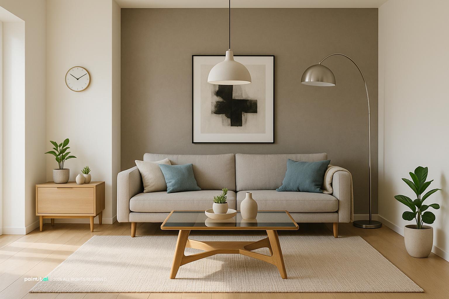
Stunning Contemporary Living Room Design 2025
Stunning Contemporary Living Room Design 2025 uses beige foundation, blue accents and metal accents in a living room setting.
Beige and blue living room ideas work when beige does the quiet structural work and blue gives the room focus. Beige can hold the walls, sofa, rug, and larger surfaces. Blue can bring in contrast through curtains, art, pillows, a chair, or one stronger painted moment. The part people often miss is placement. The same blue can feel fresh on curtains, heavy on a wall, or random on tiny accessories. A good beige and blue living room starts with deciding where each color belongs before you buy another pillow.
Beige gives a living room softness and room to breathe. Blue gives it a point of view. In Paintit.ai usage, color is the most popular modifier, appearing in 27.6% of prompts, and that fits what we see every day: people usually know the palette they want before they know how to make it work in the actual room. Since "Room" is specified in 22.1% of prompts, the advice has to stay grounded in the living room itself: seating, sightlines, daylight, rug size, traffic paths, and the pieces you already own.
A useful starting point is simple: treat beige as the base layer and blue as the active layer. If you are testing proportions, an AI Room Design workflow can help compare warm beige walls with navy curtains, a blue sofa on a neutral rug, or pale blue accents around existing tan upholstery without guessing from a paint chip.
Use the first visual set to compare where blue actually earns its place: seating, rugs, curtains, wall art, or a single accent wall. The strongest rooms usually have large beige surfaces and a few confident blue decisions, not blue sprinkled everywhere.
Stunning Contemporary Living Room Design 2025 uses beige foundation, blue accents and metal accents in a living room setting.

Cozy Living Room in Repose Grey and Oceanside Blue balances beige foundation, blue accents and warm wood in a living room setting.

Stylish Modern Living Room Design pairs beige foundation, blue accents and soft textiles in a living room setting.

Cozy Farmhouse Open Concept Living Room Design layers beige foundation, blue accents and warm wood in a living room setting.

Cozy Boho Living Room Design anchors beige foundation, blue accents and soft textiles in a living room setting.

Modern Minimalist Living Room Design softens beige foundation, blue accents and clean-lined furniture in a living room setting.

Cozy Blue and Beige Living Room Design uses beige foundation, blue accents and soft textiles in a living room setting.

Beige and Blue Living Room Ideas with Beige Foundation and Blue Accents balances beige foundation, blue accents and layered neutrals in a living room setting.

Stunning Modern Condo Living Room Design pairs beige foundation, blue accents and layered neutrals in a living room setting.

Beige and Blue Living Room Ideas with Beige Foundation and Blue Accents with Soft Textiles layers beige foundation, blue accents and soft textiles in a living room setting.

Elegant Moroccan Living Room Design anchors beige foundation, blue accents and metal accents in a living room setting.

Beige and Blue Living Room Ideas with Beige Foundation and Blue Accents with Metal Accents softens beige foundation, blue accents and metal accents in a living room setting.
Use beige for roughly 60% of the room through walls, a large sofa, a textured rug, built-ins, or other broad surfaces. Let blue take about 30% through curtains, accent chairs, a rug pattern, a painted cabinet, or larger decor. Keep the final 10% for wood, brass, black, white, stone, or one muted accent color.
Why it works: it stops the room from feeling accidental. A blue beige living room color scheme gets messy when every object tries to be equally important. Decide what leads before you start shopping. In a small or north-facing living room, I would usually keep beige as the bigger share and use medium blue rather than deep navy on the largest pieces.
A beige sofa is usually the piece worth keeping. It is expensive, large, and flexible. Add blue through throw pillows in two scales: one solid denim pillow and one patterned pillow with beige, cream, and indigo, for example. Then repeat the blue once more in wall art, a vase, curtain trim, or a lamp base so the sofa does not look like it was decorated at the last minute.
In Paintit.ai tests, the strongest beige sofa blue accents often happen when users lock the beige furniture and change only the blue layers. That matches a wider behavior pattern: 12.0% of prompts use keep or don't change modifiers. The mistake to avoid is relying on tiny blue objects on a large beige sofa. It reads as speckles, not design.
A navy and beige living room feels more tailored than a pale blue one because navy adds weight. Use it where the room needs an anchor: curtain panels, a large ottoman, a media wall, a patterned rug, or one proper armchair. Navy is especially helpful when the architecture is plain and beige walls need definition.
The catch is light. Navy absorbs it. If the room has weak lamps or dark corners, navy can look heavier than expected. Balance it with warm wood tones, cream lampshades, a lighter rug edge, and enough light near the navy surface so the color feels deliberate.
A coastal beige and blue living room works best with sandy beige, warm white, faded denim, misty blue, rattan, linen, and light oak. Keep the shapes relaxed and unfussy. A slipcovered beige sofa, blue-gray pillows, woven shades, and pale wall art can suggest the coast without shells, anchors, rope knots, or obvious signs.
What usually goes wrong: too much crisp white with bright royal blue. That combination can feel more like a short-term rental than a settled living room. Use slightly grayed blues and textured beige accents to soften the contrast.
A neutral rug can make beige and blue feel calm, but it still needs texture or pattern. Look at wool, jute-wool blends, flatweave stripes, or a low-pile rug with blue and taupe variation. In most living rooms, the front legs of the sofa and chairs should sit on the rug, or the rug should be large enough to hold the main conversation area.
Why it works: the rug defines the zone. It also stops beige flooring, beige walls, and beige upholstery from melting into one flat field. If you already have a blue sofa, choose a beige, oatmeal, or ivory rug with a small blue thread instead of placing a large blue block under another large blue piece.
A blue sofa, blue armchair, or blue cabinet can give a beige living room a clear center. This move works best when the surrounding materials stay restrained: beige walls, simple curtains, a wood coffee table, and art that repeats the blue once or twice. Let the statement piece be the strongest color in the room, not one loud object among many loud objects.
Check scale before committing. A saturated blue sofa already has visual weight. If it is also oversized, it can crowd the room even when the floor plan technically works. Leave real clearance around coffee tables, side chairs, and walkways so the color choice does not make the layout feel tight.
Curtains are one of the cleanest ways to bring blue into a beige room because they sit vertically and affect the whole sightline. For a soft room, use blue-gray linen panels. For a sharper room, use navy panels with beige walls and brass or black curtain rods. Hang them high and wide so the windows look larger and the fabric does not steal daylight.
Avoid curtains that match the wall too closely unless the fabric has a strong weave, border, or trim. Beige-on-beige can look unfinished. If the room already has several blue pieces, choose beige curtains with a blue border or subtle stripe instead of adding another large blue surface.
Wall art can connect beige and blue better than almost any small accessory. Choose pieces that include sand, cream, clay, slate blue, indigo, or soft sky tones. The frame matters too: light oak feels casual, walnut feels grounded, black feels graphic, and brass adds warmth.
For a large sofa wall, one oversized piece often looks cleaner than many small frames. If you prefer a gallery wall, repeat either the frame finish or the blue tone so the arrangement has order. This is where beige and blue living room decor can feel collected rather than bought as one matching set.
If beige and blue feel cold, do not rush to add a third accent color. Add wood first: oak, walnut, cane, or a warm-stained coffee table. We often see in Paintit.ai tests that a beige and blue room feels cold until someone adds a material instruction like warm oak, linen, or brass finishes.
That lines up with user behavior too: 19.0% of prompts include material language such as wood, marble, or brick. Materials change the palette more than people expect. A navy pillow on a beige sofa can look crisp; the same pillow beside a warm wood side table looks richer and less stark.
An accent wall can work in a beige and blue living room when it has a clear job. Use blue behind a media console, fireplace, built-in shelves, or the main sofa if that wall needs focus. Muted navy, slate, or smoky blue is usually easier to live with than a bright blue.
What to avoid: painting the smallest random wall because it is available. The wall should support the layout. If the room has low natural light, consider blue built-ins, a large art piece, or curtains instead of a full dark wall.
Start with the beige base: walls, sofa, rug, or major upholstery. Add one clear blue layer, such as pillows and curtains, or a chair and wall art. Then refine with a bit more depth: darker piping, a patterned rug, a ceramic lamp, or a throw that includes both colors.
This staged approach mirrors how many Paintit.ai users work. 15.0% use refinement language such as more, less, or a bit, and it is a smart way to handle this palette. It is much easier to add a bit more navy than to recover from an overpowering blue sectional or a wall color that makes the whole room feel dim.
Color will not fix a weak living room layout. Arrange seating so people can talk comfortably, keep the coffee table within easy reach, and make sure blue accents are visible from the room’s main entry. If all the blue sits in one corner, the palette will feel lopsided no matter how good the colors are.
For open-plan rooms, repeat beige and blue across zones without copying every item. A beige living area can use blue pillows, while the adjacent dining area uses blue artwork or a runner. If you are planning a bigger update, the step-by-step process in how to redesign a living room with Paintit.ai is useful for testing layout and palette together.
Use the second visual set to make the shade differences obvious. Pale blue feels airy, denim feels relaxed, slate feels more modern, and navy feels architectural. The beige may stay the same, but the room will not.

Stylish Modern Living Room Design with Beige Foundation uses beige foundation, blue accents and metal accents in a living room setting.

Boho Scandinavian Living Room Design balances beige foundation, blue accents and plants and greenery in a living room setting.

Beige and Blue Living Room Ideas with Beige Foundation and Blue Accents View 4 pairs beige foundation, blue accents and soft textiles in a living room setting.

Modern Living Room Design Inspiration layers beige foundation, blue accents and soft textiles in a living room setting.

Beige and Blue Living Room Ideas with Beige Foundation and Blue Accents with Layered Neutrals anchors beige foundation, blue accents and layered neutrals in a living room setting.

Modern Living Room Design Inspiration with Beige Foundation softens beige foundation, blue accents and soft textiles in a living room setting.

Bright Modern Living Room Design uses beige foundation, blue accents and soft textiles in a living room setting.

Stunning Mid-Century Modern Living Room balances beige foundation, blue accents and warm wood in a living room setting.

Elegant Neoclassical Living Room Design pairs beige foundation, blue accents and metal accents in a living room setting.

Vibrant Home Interior Design with Textiles layers beige foundation, blue accents and warm wood in a living room setting.

Cozy Modern Contemporary Living Room Design anchors beige foundation, blue accents and layered neutrals in a living room setting.

Beige and Blue Living Room Ideas with Beige Foundation and Blue Accents View 6 softens beige foundation, blue accents and metal accents in a living room setting.
Warm beige has yellow, peach, or tan undertones and usually pairs well with denim, teal-blue, slate, and navy. Cooler beige has gray or greige undertones and works better with blue-gray, dusty blue, or inky navy. Test the pairing in daylight and lamplight because beige can shift more than people expect.
Why it works: undertone control keeps the palette clean. If a beige wall turns pink at night, a greenish blue can look muddy beside it. For broader palette context, the best living room colors guide can help compare neutrals before you commit.
Use at least three textile textures: linen curtains, a wool rug, velvet pillows, cotton throws, bouclé chairs, or a nubby woven ottoman. Texture gives light somewhere to land, especially in a quiet palette. A smooth beige sofa with smooth blue pillows can look thin; add a ribbed throw, a woven cushion, or a patterned fabric to create depth.
Do not match every fabric weight. If the curtains, sofa, pillows, and rug all have the same matte finish, the room may feel dull even when the colors are technically right. This is one of the most common reasons beige and blue rooms look better in a mood board than in a real photo.
Wood tones are the natural bridge between beige and blue. Light oak keeps the room casual, walnut makes it richer, and weathered wood supports coastal or farmhouse influences. Stone can work too: creamy marble, limestone, travertine, or a blue-gray slate detail can connect the palette without adding another strong color.
Where to use it: coffee tables, side tables, fireplace surrounds, lamp bases, trays, and shelving. Be careful with very orange wood if the beige is already yellow. The room can become too warm, and the blue may start to look separate from everything else.
Brass and antique gold warm up beige and soften dark blue. Polished nickel and chrome feel cooler and cleaner, especially with blue-gray tones. Matte black is useful when the room needs sharper lines around curtain rods, picture frames, or lighting.
The best rooms usually limit metal finishes to one dominant finish and one minor supporting finish. Too many metals interrupt decor balance, especially in a calm beige and blue color scheme where small details are easy to notice.
Use a ceiling fixture for general light, floor lamps near seating, table lamps at conversation height, and possibly picture lights or sconces for art. Warm white bulbs usually flatter beige better than cool bulbs. If navy is used on curtains, a wall, or a sofa, place light nearby so the blue reads as intentional rather than heavy.
Lighting appears in 5.9% of Paintit.ai prompts, but in real rooms it often decides whether the final palette works. One overhead fixture is rarely enough. It creates glare in the center and leaves blue corners looking flat.
Repeat blue in a few deliberate places: one book stack, one ceramic bowl, one art detail, or one patterned pillow. Then use beige, cream, wood, and a little metal to fill out the composition. Leave empty space around objects so the eye can read the palette.
Avoid buying every small blue accessory you find. A room with ten tiny blue objects can feel less designed than a room with three stronger blue moments. This is also where the "without" and "no clutter" mindset helps; negatives appear in 8.8% of prompts, and they are useful for keeping the room edited.
If the rug is beige and the sofa is beige, carry blue upward with curtains, wall art, or lamps. If the sofa is blue, keep some beige at eye level with art mats, shades, shelves, or wall color. The goal is to avoid a room where all the color sits low or all the contrast sits on one wall.
This matters even more in a blue and beige living room with open sightlines. Stand at the doorway and check where your eye goes first. If it jumps to one dark object and stops, repeat a small amount of that tone elsewhere.
Upload a photo of your current living room and test the palette in specific steps: KEEP: beige sofa. ADD: navy curtains, warm oak coffee table, textured neutral rug, and blue-gray pillows. REMOVE: visual clutter. MATERIALS: linen, wool, brass, oak. LIGHTING: floor lamp and warm table lamps. This structure works because it separates what stays from what changes.
You can use Paintit.ai’s living room tool to compare pale blue, denim, slate, and navy before buying paint or furniture. If the room is empty or you are preparing a listing, AI Virtual Staging can also help test beige and blue furniture direction without moving physical pieces.
Yes. Beige softens the room, while blue adds contrast and focus. The pairing works best when one color leads and the other repeats in a few clear places, such as pillows, curtains, art, or a chair.
Start with the largest fixed pieces: walls, sofa, rug, and flooring. Then add blue through pillows, curtains, wall art, chairs, or one accent wall. If you need to keep existing furniture, build around it instead of changing everything at once.
Warm wood, cream, brass, black, soft white, clay, and muted green can all work. Choose one or two accents only, so the beige and blue remain the main story.
Use texture and materials: linen, wool, velvet, oak, stone, and metal finishes. In Paintit.ai data, 19.0% of prompts mention materials, and that detail often makes beige-blue rooms feel more finished.
Not if it is balanced with light surfaces and good lamps. Use navy on curtains, a chair, art, or one wall, then offset it with beige, warm wood, a neutral rug, and layered lighting.