
Midcentury Modern Living Room Design
Midcentury Modern Living Room Design uses brown warmth, orange warmth and soft textiles in a living room setting.
Burnt orange and brown living room decor works when the warmth is controlled. Brown gives the room weight. Burnt orange gives it pulse. The problem starts when both colors are used at full strength everywhere. The rooms that look best usually have a clear order: a brown sofa or wood tone as the anchor, burnt orange accents where you want the eye to land, a neutral rug to break up the heat, and layered lighting so the whole space does not turn heavy after sunset.
When people compare the best living room colors, burnt orange and brown stand out because they already belong together. Think clay, leather, walnut, rust, cognac, terracotta, tobacco, and dark chocolate. They share the same warm base, so matching is not the hard part. Controlling the visual weight is.
In Paintit.ai prompts, 27.6% of users include color specifications, which makes color the most common modifier we see. That makes sense with this palette. People often know they want a warm earthy living room decor direction, but the real decisions are more specific: which brown stays, how much orange is enough, where the contrast comes from, and what needs to stay light so the room does not look muddy.
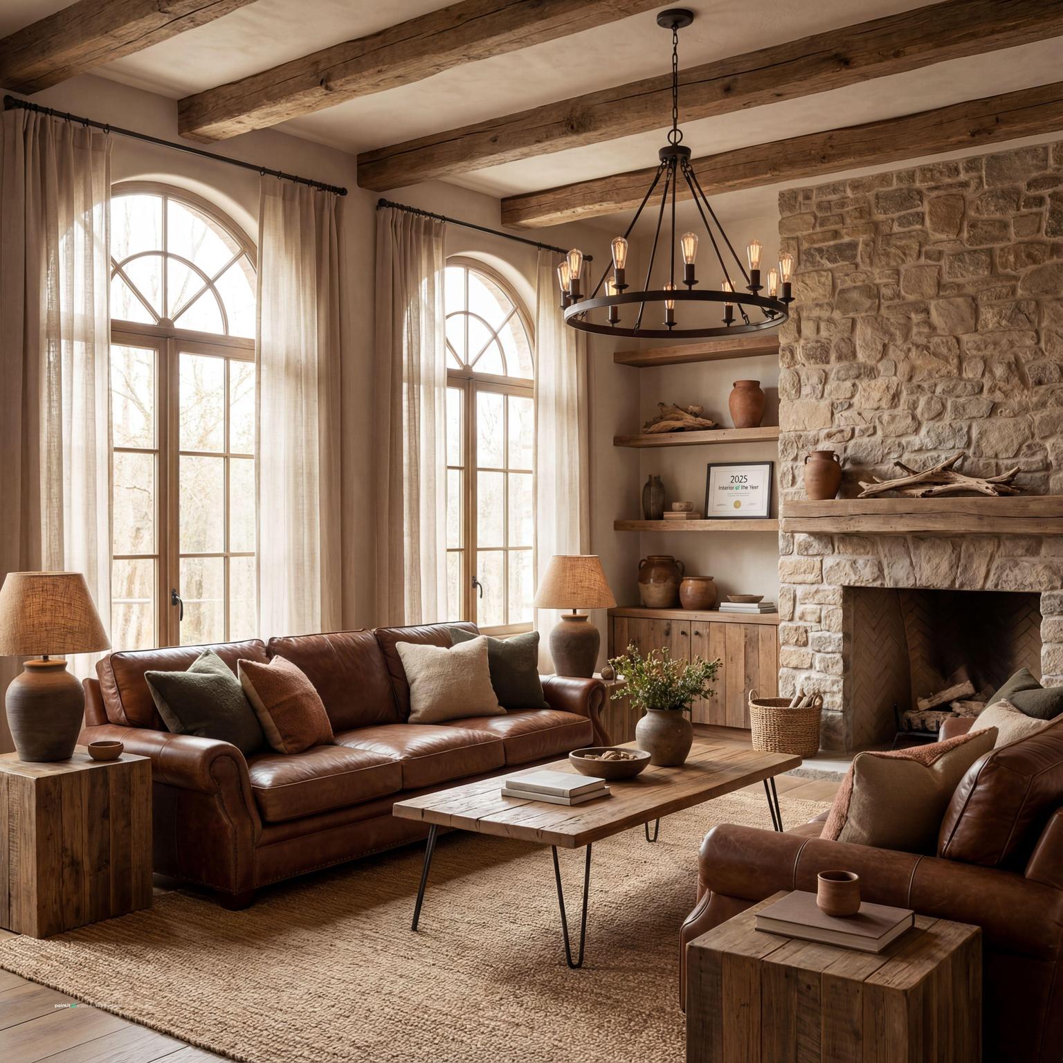
Use this first gallery to compare the brown anchors before you choose the orange. A chocolate leather sofa, walnut media unit, espresso shelf, tan rug, or caramel chair will all change how strong the burnt orange accents feel.
Midcentury Modern Living Room Design uses brown warmth, orange warmth and soft textiles in a living room setting.

Modern Living Room Design Inspiration balances brown warmth, orange warmth and soft textiles in a living room setting.

Stunning Mid-Century Modern Living Room Design pairs brown warmth, orange warmth and warm wood in a living room setting.

Burnt Orange and Brown Living Room Decor with Brown Warmth and Orange Warmth layers brown warmth, orange warmth and warm wood in a living room setting.

Elegant Mid-Century Modern Living Room Design anchors brown warmth, orange warmth and warm wood in a living room setting.

Cozy Rustic Living Room Design for Narrow Spaces softens brown warmth, orange warmth and soft textiles in a living room setting.

Warm Modern Living Room Design uses brown warmth, orange warmth and soft textiles in a living room setting.

Contemporary Living Room Inspiration balances brown warmth, orange warmth and soft textiles in a living room setting.

Burnt Orange and Brown Living Room Decor with Brown Warmth and Orange Warmth with Soft Textiles pairs brown warmth, orange warmth and soft textiles in a living room setting.

Burnt Orange and Brown Living Room Decor with Brown Warmth and Orange Warmth View 3 layers brown warmth, orange warmth and soft textiles in a living room setting.

Burnt Orange and Brown Living Room Decor with Brown Warmth and Orange Warmth with Natural Light anchors brown warmth, orange warmth and natural light in a living room setting.

Midcentury Modern Living Room Design with Brown Warmth softens brown warmth, orange warmth and warm wood in a living room setting.
Use brown for the pieces that carry the most visual weight: the sofa, wood floor, coffee table, media unit, built-in shelving, or leather chair. Then bring burnt orange into layers you can change without regret, such as throw pillows, a ceramic lamp, an ottoman, a woven blanket, or framed wall art.
Why it works: brown settles the room, while orange gives the eye somewhere to go. In Paintit.ai tests, we often see burnt orange and brown living room decor work best when the brown behaves like the base and the orange behaves like the spark. If both colors compete at the same intensity, the room can feel dense fast.
If you already have a brown sofa, do not treat it as a problem by default. A dark chocolate leather sofa can look intentional with rust velvet pillows, a cream throw, a neutral rug, and a black or aged brass floor lamp. A lighter tan sofa can handle deeper burnt orange accents because it has more air around it visually.
KEEP: the sofa, floor, or wood trim if they are in good condition. Then add orange in layers you can test. This reflects a common Paintit.ai behavior pattern: 12.0% of prompts include keep or do not change modifiers, because many people want the room to feel new without replacing the largest pieces.
A useful starting point is 60% brown and warm neutrals, 30% burnt orange or terracotta, and 10% accent color. That accent might be cream, olive, deep teal, soft black, muted gold, or clay pink, depending on whether you want the room calmer, moodier, or sharper.
What to avoid: giving every element the same strength. If the sofa is dark brown, the curtains, rug, and wall color should not all be dark too. Let one piece carry the depth. Let the other surfaces create breathing room.
Not every burnt orange behaves the same way. In a north-facing room, muted rust, clay, or terracotta usually looks safer than a saturated pumpkin tone. In a sunny room, deeper paprika or earthy orange can hold its color without looking harsh.
Paint cards are only a first check. Look at the shade in morning light, afternoon light, and evening lamplight. A rust orange and brown living room can change a lot after sunset, especially if the bulbs are cool or the room has only one overhead fixture.
If you have brown floors and brown furniture, the room often needs a rug that interrupts the warmth. Try oatmeal wool, warm ivory, jute, beige with black linework, or a faded vintage pattern with small terracotta details.
Why it works: the rug creates a pause between the sofa and the floor. It also keeps the orange brown living room color scheme from becoming one solid warm block. Check the size carefully. At minimum, the front legs of the main seating should sit on the rug, or the whole arrangement may look disconnected.
Walnut, oak, teak, and medium-stained woods can all work with brown and burnt orange decor, but they need to speak the same temperature. Warm brown woods with red, honey, or golden undertones usually support burnt orange better than gray-brown woods.
What to avoid: too many unrelated stains in a small living room. If the floor is orange-toned oak, choose a darker walnut coffee table or a black metal side table instead of adding another wood that fights for attention.
Wall art is one of the easiest ways to make brown and burnt orange decor look planned. Look for pieces that include clay, umber, cream, charcoal, ochre, muted blue-green, or soft black. Avoid art that is only orange and brown unless the rest of the room has plenty of contrast.
Hang art in relation to the furniture, not just the empty wall. Over a sofa, keep the bottom edge close enough to feel connected, usually around 6 to 10 inches above the back. One oversized piece can work better than five small pieces because it reduces visual noise.
A burnt orange accent wall can look strong behind a sofa, fireplace, or media wall, but it needs daylight or proper evening lighting. In a dim room, the wall may flatten into a dark rust-brown block.
Why it works when done well: one saturated wall gives the palette a clear focal point. What to avoid: painting all four walls burnt orange in a small living room with dark furniture unless you intentionally want a wrapped, cozy effect and you have lighter textiles to keep it from feeling closed in.
Instead of buying four identical orange pillows, mix one rust velvet pillow, one patterned cream-and-brown pillow, one tan linen pillow, and one dark umber cushion. Change the sizes too, so the sofa does not look like a catalog set.
This is where small adjustments matter. Paintit.ai data shows 15.0% of prompts use refinement language such as a bit, more, less, or instead. That is exactly how I would handle pillows: start with a bit of orange, then add more only if the sofa still feels underdressed.
Warm rooms need definition. Use black picture frames, an oil-rubbed bronze lamp, a dark metal coffee table base, or slim black curtain rods to give the living room a cleaner outline.
Why it works: brown and orange can both look soft, especially in matte fabrics and wood. A darker metal finish adds contrast without pulling the room cold. Be careful with bright chrome unless the rest of the room already has a crisp modern direction.
Curtains can either calm the palette or make it stronger. Warm ivory linen curtains keep the room lighter. Tobacco brown or muted terracotta drapery creates a more enclosed, lounge-like feeling. If the walls are already orange, choose lighter curtains.
Check the stack width before buying. Heavy brown curtains that cover too much glass will make a warm room feel smaller. Hang rods wider than the window so the fabric clears the glass during the day and the room gets all the light it can.
Olive, eucalyptus, sage, deep teal, and muted blue-green all work well with burnt orange because they counter the heat without shouting. Use them in a vase, art detail, single chair, plant life, or patterned textile.
What to avoid: bright primary blue or neon green unless the room is intentionally bold. Soft, grayed accent colors are easier to live with and help keep the palette grounded.
A warm earthy living room decor plan can become crowded if every corner gets another table or chair. Use a floor lamp beside the sofa, a small lamp on a console, and a picture light or wall sconce near art to create zones without filling the floor.
Only 5.9% of Paintit.ai prompts include lighting modifiers, but lighting often decides whether this palette works. Add more warm light when brown tones look muddy. Use warm bulbs, but avoid relying only on a harsh ceiling light.
If you are not sure whether the room needs a burnt orange wall, a rust rug, or just better pillows, test the direction visually first. An AI virtual staging tool can help you keep the existing brown sofa or wood floor while trying new textiles, paint colors, and furniture shapes.
For a more step-by-step process, the guide on how to redesign a living room with paintit AI is useful for learning how to ask for changes in stages. Start with Add, Change, and KEEP: instructions instead of replacing the entire room at once.
Use the second gallery to compare intensity: pale walls with cognac leather, dark brown furniture with terracotta walls, rustic wood with woven texture, or a cleaner modern version with black accents and cream textiles.

Stylish Midcentury Modern Living Room Design uses brown warmth, orange warmth and warm wood in a living room setting.

Mid-Century Modern Living Room Design balances brown warmth, orange warmth and warm wood in a living room setting.

Cozy Modern Living Room Design pairs brown warmth, orange warmth and soft textiles in a living room setting.

Mid-Century Modern Living Room Design with Brown Warmth layers brown warmth, orange warmth and warm wood in a living room setting.

Burnt Orange and Brown Living Room Decor with Brown Warmth and Orange Warmth View 5 anchors brown warmth, orange warmth and soft textiles in a living room setting.

Cozy Farmhouse Basement Living Room Design softens brown warmth, orange warmth and soft textiles in a living room setting.

Stunning Modern Rustic Living Room Design uses brown warmth, orange warmth and soft textiles in a living room setting.

Elegant Mid-Century Modern Living Room Design with Brown Warmth balances brown warmth, orange warmth and warm wood in a living room setting.

Burnt Orange and Brown Living Room Decor with Brown Warmth and Orange Warmth View 6 pairs brown warmth, orange warmth and soft textiles in a living room setting.

Charming Rustic Living Room Design layers brown warmth, orange warmth and soft textiles in a living room setting.

Burnt Orange and Brown Living Room Decor with Brown Warmth and Orange Warmth View 7 anchors brown warmth, orange warmth and soft textiles in a living room setting.

Cozy Rustic Living Room Design softens brown warmth, orange warmth and soft textiles in a living room setting.
Choose browns with warm undertones if the room will use burnt orange accents. Cognac, walnut, espresso with red undertones, camel, tobacco, and warm chocolate usually sit comfortably with rust and terracotta. Gray-brown can still work, but it often needs cream, black, or stone to bridge the gap.
Check undertones on the largest surfaces first: floor, sofa, wall color, and rug. Do not choose orange from a tiny swatch without holding it near the actual brown pieces in the room. That tiny mismatch is what later makes a room feel off.
This palette needs texture or it goes flat. Try a leather sofa, a wool or jute rug, velvet pillows, matte ceramic decor, and a smooth wood table. The goal is not to add clutter. The goal is to give the eye different surfaces to read.
When people upload this kind of room to Paintit.ai, the weak spot is often material sameness. A brown leather sofa beside a flat orange wall can look dated if there is no woven, matte, polished, nubby, or stone surface to break it up. This also matches how people think in prompts: 22.1% of prompts specify the room, 19.0% specify material, and 17.1% specify style.
Aged brass, bronze, blackened steel, and antique gold usually work better than shiny silver in this palette. Use metal finishes in lamps, curtain rods, frames, cabinet pulls, side tables, and table legs.
Keep the finish consistent enough to feel intentional. One or two metal finishes are usually enough. Too many competing finishes can make the living room feel busy, especially when the color palette is already warm and saturated.
Travertine, limestone, warm marble, concrete, and matte ceramic pieces can keep the room from feeling too soft, leathery, or heavy. A stone-topped coffee table, ceramic lamp, or simple clay vessel gives the eye a different kind of surface.
Avoid too many glossy orange accessories. A few glazed ceramics are fine, but a room full of shiny orange pieces can make burnt orange look synthetic instead of earthy.
Use overhead lighting for general brightness, a floor lamp for reading, and smaller lamps or sconces for evening atmosphere. This kind of layered lighting matters with brown furniture because dark upholstery absorbs light.
Choose warm bulbs, but do not make everything amber. If every bulb is too yellow, burnt orange can become too saturated and brown can look dull. Test lamp shades as well. Tan or linen shades warm the light, while white shades keep it clearer.
On shelves, mix books, pottery, framed art, and small sculptural objects in cream, black, rust, and wood. Leave open space around darker items so the shelves do not become one brown mass.
A good rule: if the shelf unit is dark wood, use lighter objects and only a few orange accents. If the shelf is light oak or painted cream, you can bring in deeper brown ceramics or rust-colored books for weight.
Burnt orange living room decor can lean cozy, rustic, or retro very quickly. To keep it current, pair soft upholstery with straighter tables, simple lamps, and clean-framed art. If the sofa is bulky, choose lighter side tables or chairs with exposed legs.
What to avoid: too many rounded, overstuffed, heavy pieces in the same seating area. The color palette is already warm, so the shapes need to provide some structure.
If you are unsure how this palette will behave in your actual layout, use AI living room design to upload a photo and test paint, furniture, rug, and lighting changes before buying anything. This is especially useful when you want to keep a brown sofa, wood floors, or existing curtains.
For broader experiments, the AI room design tool can compare a lighter terracotta version, a moodier chocolate-and-rust version, or a cleaner modern scheme with black metal and cream textiles. Make small prompt changes such as a bit more orange, less dark brown, or keep the existing sofa to refine the decor balance.
Yes. They share warm earthy undertones, so they work naturally together. The room still needs contrast from cream, black, green, texture, and layered lighting so it does not feel too heavy.
Start with brown as the base, usually through the sofa, floor, or wood furniture. Then add burnt orange through throw pillows, wall art, ceramics, a rug detail, or one accent wall.
Cream, warm white, olive, sage, deep teal, black, brass, and muted gold all work well. Softer accent colors usually make the room easier to live with.
Mix materials such as leather, wool, linen, wood, metal, stone, and ceramic. Then add layered lighting so the brown pieces do not absorb all the light.
Accessories are safer in a small or dim living room. Use burnt orange on walls only when the room has enough light, enough neutral surfaces, and furniture that will not make the palette feel too dense.