
Luxury Modern Living Room Design
Luxury Modern Living Room Design uses black contrast, grey palette and soft textiles in a living room setting.
Black and grey living room ideas look strongest when the palette is treated like a set of design decisions, not just a dark mood board. Grey can hold the room together, black can define the edges, and lighter materials stop the space from feeling boxed in. We see this a lot in real room uploads: the first question is rarely “Should I use black?” It is usually “Where can I use black without making the room feel smaller?” If you are starting with a photo of your own space, AI living room design can help you test whether your sofa, rug, wall color, curtains, and lighting actually support the look before you buy anything.
A strong grey and black living room depends on proportion. Too much grey can turn dull fast; too much black can shrink the room, swallow corners, or make the TV wall feel like a blank hole. The better versions usually bring in white, cream, pale wood, glass, metal, stone, or textured fabric so the eye has somewhere to land.
In Paintit.ai usage, 27.6% of prompts include a color modifier, and that matches what we see in real design choices. People are not just asking for a dark room. They are trying to choose the right kind of dark. Charcoal, ash grey, warm greige, matte black, soft off-white, and deep graphite all behave differently once they sit next to flooring, daylight, and furniture.
Use the first gallery to study proportion, not just style. Look at how much black is used, where the grey appears, how the rug changes the weight of the room, and whether the lightest surfaces are on the walls, floor, curtains, ceiling, or upholstery.
Luxury Modern Living Room Design uses black contrast, grey palette and soft textiles in a living room setting.

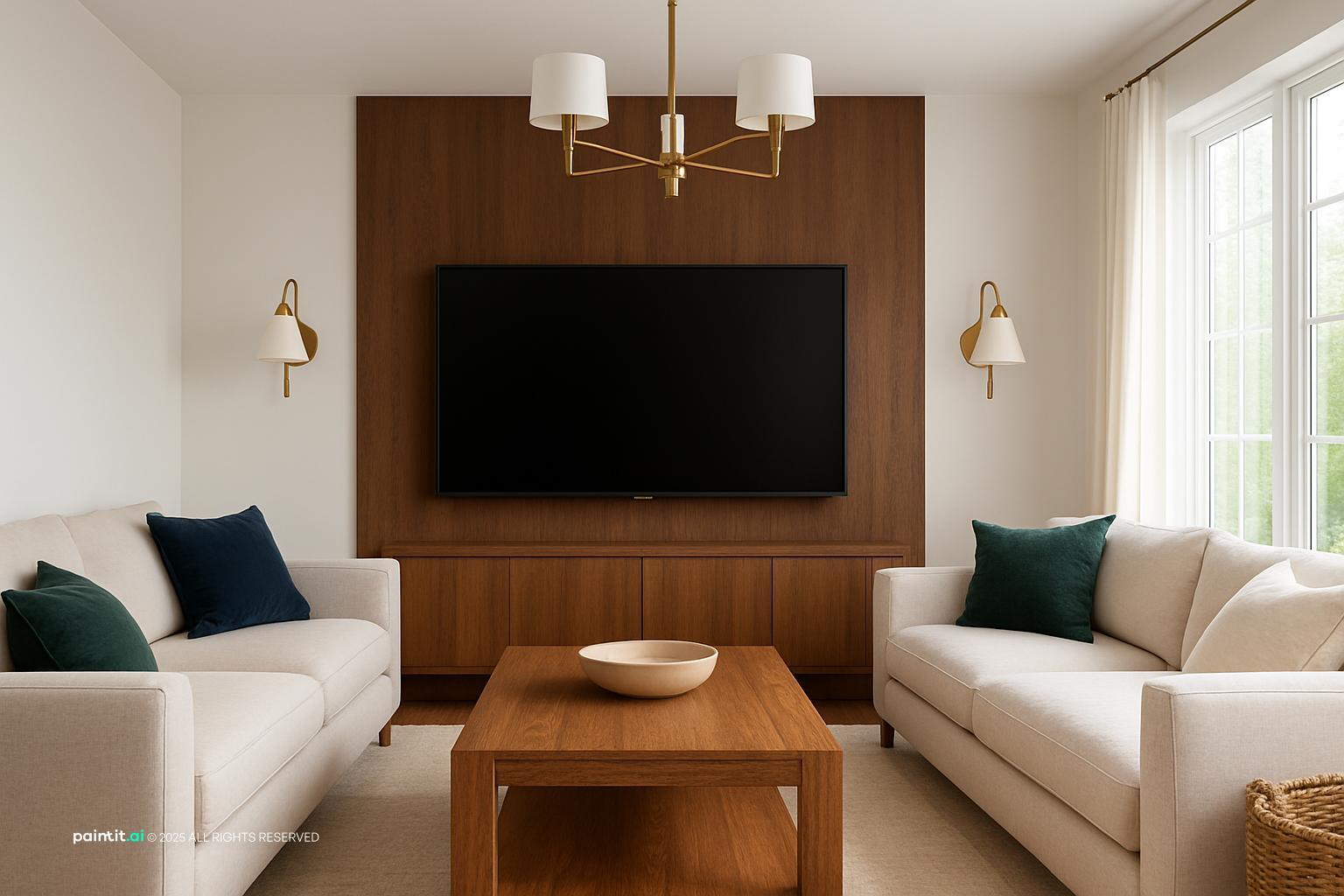
Sleek Modern Living Room Design balances black contrast, grey palette and soft textiles in a living room setting.

Elegant Modern Living Room Design pairs black contrast, grey palette and soft textiles in a living room setting.

Black and Grey Living Room Ideas with Black Contrast and Grey Palette layers black contrast, grey palette and metal accents in a living room setting.

Modern Minimalist Living Room Design anchors black contrast, grey palette and soft textiles in a living room setting.

Sleek Modern Living Room Design with Black Contrast softens black contrast, grey palette and clean-lined furniture in a living room setting.

Stunning Scandinavian Living Room Design uses black contrast, grey palette and warm wood in a living room setting.

Black and Grey Living Room Ideas with Black Contrast and Grey Palette with Soft Textiles balances black contrast, grey palette and soft textiles in a living room setting.

Modern Indian Living Room Design pairs black contrast, grey palette and soft textiles in a living room setting.

Stylish Modern Living Room Design layers black contrast, grey palette and soft textiles in a living room setting.

Black and Grey Living Room Ideas with Black Contrast and Grey Palette with Clean-lined Furniture anchors black contrast, grey palette and clean-lined furniture in a living room setting.

Stylish Modern Living Room Design with Black Contrast softens black contrast, grey palette and metal accents in a living room setting.
If you already own a grey sofa, use it as the anchor instead of designing around it as if it were a problem. Add black through a slim floor lamp, framed wall art, cushion piping, a coffee table base, curtain rods, or a single accent chair. This keeps the room flexible and saves you from replacing the biggest, most expensive piece too early.
We often see the same pattern in Paintit.ai uploads: people want to keep one major item and change the atmosphere around it. That fits the 12.0% of prompts that include keep or do not change limitations. The mistake is adding a black sofa, black rug, and black wall all at once. Unless the room has excellent daylight, pale flooring, and strong lighting, that combination usually feels heavy before it feels stylish.
For a balanced black and grey living room color scheme, try 60% grey, 30% white or off-white, and 10% black. Grey can sit on the sofa, larger rug, or painted walls. White can show up on ceilings, trim, curtains, lampshades, or side tables. Black works best on legs, frames, lamps, hardware, accent chairs, and a few strong decor pieces.
The reason this works is simple: black carries more visual weight than most colors. A little goes a long way. If the room feels too pale, add black in small repeatable elements. If it feels heavy, change the largest dark surface first. In practice, that usually means the rug, curtains, wall color, or media unit.
A black accent wall, black media unit, black fireplace surround, or black bookcase can look intentional. Five competing black features can make the room feel blocked off. Pick the one surface that improves the sightline from the entry or the main seat in the room.
For a small living room, the safest hero element is often a black media console, coffee table, or built-in shelf detail rather than a full wall. What to avoid: painting the wall behind a large dark TV black if the rest of the wall is empty and unlit. Add shelving, wall art, sconces, ribbed texture, or a lighter console so the wall has depth instead of turning into a flat black rectangle.
A neutral rug is one of the fastest ways to make black furniture and grey upholstery feel lighter. Look for ivory, oatmeal, stone, taupe, pale grey, or a soft mixed weave. The rug should usually reach under the front legs of the sofa and chairs so the seating area feels connected, not scattered.
This matters even more if your floor is dark. A lighter neutral rug creates breathing room between dark pieces and stops the coffee table from visually sinking into the floor. Avoid tiny rugs floating under a coffee table. They make the living room look smaller and break the furniture grouping, even if the colors are right.
A black grey white living room works best when white appears as a rhythm, not as one random bright object. Use white on the ceiling, window trim, lampshades, marble side tables, ceramic vases, a large art mat, or a pale throw. These lighter breaks keep the darker palette from looking muddy.
The catch is undertone. One blue-white accessory can look harsh in a room with warm grey walls and soft bulbs. Several consistent white or off-white moments feel more deliberate. If your lighting is warm, choose softer whites instead of icy ones.
Black and grey are material-hungry colors. Without wood tones, woven fibers, stone, leather, or reflective metal finishes, the palette can become too graphic and cold. Light oak, walnut, smoked ash, and medium brown leather all soften a dark scheme without pushing it into beige.
Paintit.ai data shows that 19.0% of prompts include material modifiers such as wood, marble, or brick, and that instinct is right for this palette. Try matte black metal with light oak for a modern black and grey living room, or charcoal upholstery with walnut and aged brass for something warmer. Avoid using only black metal, grey fabric, and glass unless you truly want a cool, minimal room.
Black accents are useful because they draw clean lines. A black picture frame, curtain rod, lamp stem, shelf bracket, or chair leg can make grey upholstery look sharper. In an open-plan home, black can also define the living zone without building a wall or changing the layout.
Use repetition, but do not sprinkle black everywhere. If the coffee table has a black base, repeat black once across the room in artwork, a floor lamp, or cabinet hardware. Too many tiny black objects create visual noise. A few clear black accents create structure.
A modern black and grey living room depends on silhouette as much as shade. Think low sofa, simple armchairs, a round or rectangular coffee table, storage with flat fronts, and fewer pieces with cleaner lines. The color scheme alone will not make a room feel modern if every item has a different shape language.
Modern rooms also need negative space around furniture. Leave a real traffic path, ideally wide enough that people can move past the seating without turning sideways. If the room starts to feel sterile, add one textured item first: a boucle chair, ribbed cabinet, wool rug, or linen curtain. Do that before reaching for a new accent color.
Dark palettes need at least three light sources: ambient light overhead, task light near seating, and accent light on art, shelves, or a textured wall. One ceiling fixture usually creates glare in the middle and shadow at the edges, which makes the room feel smaller.
When people upload a room with a dark grey sofa, the first weak spot is often lighting. The corners disappear, the wall color reads flat, and the black details feel heavier than intended. Add a floor lamp behind the sofa, a table lamp near the reading chair, and a small picture light or wall washer near the darkest surface. Avoid cool bulbs unless the room is meant to feel crisp and high-contrast.
Curtains can change the whole read of a black and grey room. Pale grey linen, warm white cotton, charcoal wool, or sheer off-white panels can all work, depending on how formal or relaxed you want the room to feel. Hang them close to the ceiling and wide enough that the fabric clears most of the glass when open.
Curtains add vertical softness, which dark furniture often needs. In rooms with black window frames, lighter curtains keep the windows from looking too heavy. Avoid short curtains that stop at the sill unless the architecture forces it. They can chop up the wall and make the ceiling feel lower.
A matte black coffee table, matte charcoal wall, and matte grey sofa can each look refined on their own. Together, they may absorb too much light. Add reflection through glass, satin metal, polished stone, a mirror, or a ceramic lamp base. The goal is not shine everywhere. It is just enough light bounce to keep surfaces from going dead.
In Paintit.ai tests, we often see that prompts specifying matte versus glossy materials create more convincing black and grey results. Decide where you want softness and where you want reflection. I would avoid glossy black on large sunny surfaces unless you are ready for fingerprints, dust, and glare to become part of the room.
Wall art is a practical bridge between the palette and the personality of the room. Black-and-white photography, charcoal sketches, abstract prints, line drawings, or muted color studies can all work. If you want an accent color, test it in art before committing to pillows, rugs, or paint.
Scale matters in a dark grey and black living room. One large piece above the sofa often looks calmer than a cluster of small frames. Art that is too small makes the furniture below feel visually heavier. If the sofa is wide, the art needs enough width, breathing room, or a strong frame to hold the wall.
If your room looks flat, it may not need a different grey. It may need velvet, linen, wool, boucle, ribbed wood, woven baskets, leather, or a stone surface. Black and grey rely on texture because the color range is intentionally narrow.
This is where black and grey living room decor becomes more personal. Try throw pillows in different fabrics but related tones: charcoal velvet, pale grey linen, and a black-and-white woven pattern. Add a wool throw or a nubby rug before repainting the whole wall. Avoid using the same smooth fabric on every surface, because the room will photograph and feel one-dimensional.
Instead of simply trying to make the room darker, structure the project. KEEP the pieces that already work, such as the sofa, floor, windows, or layout. REMOVE the items that fight the palette, such as orange-toned clutter, mismatched beige pillows, or a rug that is too small. MATERIALS might include oak, black metal, wool, stone, and linen. LIGHTING might include a floor lamp, dimmable ceiling fixture, table lamp, and shelf lighting.
This mirrors how more advanced users approach room redesign prompts. Users work in an "imperative + iteration" mode ("make X" → "now change Y a bit"). 30.1% of prompts are imperative ("Make / Create / Add / Change…"), and 15.0% use iterative refinement language ("instead / now / a bit / more / less"). If you want a clearer workflow, how to redesign a living room with Paintit.ai is useful for testing changes in rounds: make the palette, add texture, then adjust lighting a bit more.
The second gallery helps you compare three common directions: pale walls with black details, charcoal walls with lighter furniture, or a stricter black-and-white contrast softened by grey upholstery and textiles.

Stunning Minimalist Living Room Design uses black contrast, grey palette and clean-lined furniture in a living room setting.

Black and Grey Living Room Ideas with Black Contrast and Grey Palette with Layered Neutrals balances black contrast, grey palette and layered neutrals in a living room setting.

Modern Living Room Design for 2025 pairs black contrast, grey palette and layered neutrals in a living room setting.

Stylish Modern Living Room Design with Grey Palette layers black contrast, grey palette and metal accents in a living room setting.

Black and Grey Living Room Ideas with Black Contrast and Grey Palette View 5 anchors black contrast, grey palette and clean-lined furniture in a living room setting.

Contemporary Minimalist Living Room Design softens black contrast, grey palette and metal accents in a living room setting.

Elegant Modern Living Room Design 2025 uses black contrast, grey palette and metal accents in a living room setting.

Sophisticated Modern Living Room Design balances black contrast, grey palette and metal accents in a living room setting.

Modern Living Room Design for 2025 with Black Contrast pairs black contrast, grey palette and clean-lined furniture in a living room setting.

Stylish Modern Living Room Design with Clean-lined Furniture layers black contrast, grey palette and clean-lined furniture in a living room setting.

Modern Minimalist Living Room Design with Black Contrast anchors black contrast, grey palette and layered neutrals in a living room setting.

Contemporary Living Room Design softens black contrast, grey palette and warm wood in a living room setting.
Grey is rarely neutral once it is inside a real room. Blue-grey feels crisp and urban. Green-grey can look calm and architectural. Greige feels warmer beside wood floors. Charcoal can feel elegant or heavy depending on daylight, ceiling height, and the size of the wall.
Compare paint, fabric, and rug samples in morning light, afternoon light, and lamplight before choosing. For more palette context, the guide to best living room colors is helpful when deciding whether your grey should lean cool, warm, pale, or charcoal. Avoid pairing a cool blue-grey sofa with a warm brown-black cabinet unless a rug, artwork, or wood tone clearly connects them.
Matte black is softer and hides glare, so it works well on hardware, lamp bases, frames, and some accent walls. Satin black is practical for cabinets, doors, or painted trim because it reflects just enough light. Glossy black is best in small doses: a tray, vase, lacquered side table, or small decorative object.
Finish changes the mood as much as the color does. Matte black feels grounded. Glossy black feels sharper and more formal. Avoid large glossy black surfaces near windows unless you are comfortable with reflections, fingerprints, and dust showing clearly.
A strong black and grey room needs contrast between hard and soft surfaces. Pair a wool rug with a metal coffee table, a stone fireplace with linen curtains, or a leather chair with a boucle pillow. This mix makes the room feel tactile instead of flat.
This matters because black and grey do not give you much color variation on their own. Materials have to do more work. Avoid using only smooth synthetics. Even if the colors match, the room can feel thin, temporary, and a bit showroom-like.
Black metal is the obvious choice, but it is not the only one. Brushed nickel, gunmetal, chrome, pewter, and aged brass can all sit well with grey, depending on the undertone. Use metal finishes on lamps, table legs, curtain rods, cabinet pulls, picture frames, or shelving.
Choose one dominant metal and one supporting metal at most. For example, use black metal for structure and aged brass for warmth. Avoid mixing every finish in the same sightline. A reduced color palette makes finish changes more noticeable, so the room can look busy even without much color.
Throw pillows, blankets, rugs, curtains, and upholstery are where the room becomes livable. Use different textures within the same range: a charcoal knit throw, pale grey linen pillow, black velvet cushion, and ivory wool rug. Pattern can be subtle, such as a stripe, grid, herringbone, or small geometric weave.
The common mistake is using too many high-contrast patterns in a small room. They fight the calm structure of the palette. If you want pattern, keep the largest textile quieter and use stronger contrast on smaller pieces like throw pillows or a single chair.
Layered lighting is essential in this palette. Use warm white bulbs for a softer evening mood, dimmers where possible, and lampshades that diffuse light instead of throwing harsh beams. A dark corner can often be fixed with a floor lamp, uplight, or small table lamp on a console.
Only 5.9% of Paintit.ai prompts include lighting modifiers, but in black and grey rooms lighting often decides whether the design feels finished. Avoid relying on one overhead light. It flattens grey surfaces, makes black details look heavier, and leaves the edges of the room under-designed.
A dark neutral room does not need clutter to feel complete, but it does need scale. Use fewer, larger styling pieces: a wide bowl, a stack of books, a tall branch arrangement, a sculptural lamp, or one large framed print. Leave open surface around each piece so the objects can breathe.
The 8.8% of prompts using negative modifiers, such as without clutter, points to a real concern: people want dark rooms that do not feel oppressive. Remove small random objects first, then add back pieces with clear shape, texture, or purpose. Decor balance comes from spacing as much as from color.
A black and grey scheme changes dramatically depending on window size, floor tone, ceiling height, and the pieces you want to keep. In Paintit.ai, upload your living room photo and test versions such as keep the grey sofa, add matte black accents, change the rug to warm ivory, brighten the curtains, or add layered lighting.
If you want to compare options from your actual photo, AI room design is useful for quick visual tests. If the room is empty or you are planning furniture from scratch, AI virtual staging can help compare sofa depth, chair placement, rug scale, and decor balance before you commit. Work iteratively: create one version, change one thing a bit, then compare whether the room feels lighter, warmer, cleaner, or more modern.
Yes. They work well when the room has contrast, texture, and enough light. Use grey as the main base and black as a controlled accent, then add lighter surfaces so the room does not feel closed in.
Start with the largest pieces: sofa, rug, walls, curtains, and media unit. Then add black through lamps, frames, tables, hardware, and throw pillows so the palette feels connected rather than scattered.
Warm wood, ivory, taupe, brass, olive, rust, and muted blue all work well. Choose one accent direction and repeat it in two or three places, such as art, pillows, and a small decor piece.
Add texture before adding more color. Mix wool, linen, velvet, wood, stone, glass, and metal, then use layered lighting so the black details and grey surfaces have depth.
Not if it is used carefully. Keep black to accents or one focused feature, use a lighter rug and curtains, and make sure the room has several light sources instead of one ceiling fixture.