
Stunning Contemporary Living Room Design
Stunning Contemporary Living Room Design uses red accents, clean-lined furniture and layered neutrals in a living room setting.
Red living room ideas work best when the color has a clear job. It can anchor the seating area, warm up a neutral room, frame a fireplace, or turn a plain sofa wall into the place your eye naturally lands. The catch is control. Red can feel rich, cozy, modern, or bold, but only when the layout, color palette, materials, and lighting support it. Without that, the room starts to feel loud fast.
A red living room should start with one practical decision: is red the background, the furniture statement, or the accent? In Paintit.ai prompt data, color appears in 27.6% of prompts, and room is specified in 22.1% of prompts. That fits what we see in real uploads: people often know they want a strong red living room before they know how much red the space can actually carry.
Compare red against other best living room colors before you commit. A room with low natural light usually needs a softer brick, wine, or terracotta red. A bright room can handle a cleaner tomato or lacquered red, but often in smaller doses. Keep the ceiling, floor, and at least one large surface neutral if you want the red to look intentional instead of heavy.
Use the first gallery to compare what changes when red appears as paint, upholstery, art, curtains, or small decor. Not every red room needs red walls.
Stunning Contemporary Living Room Design uses red accents, clean-lined furniture and layered neutrals in a living room setting.

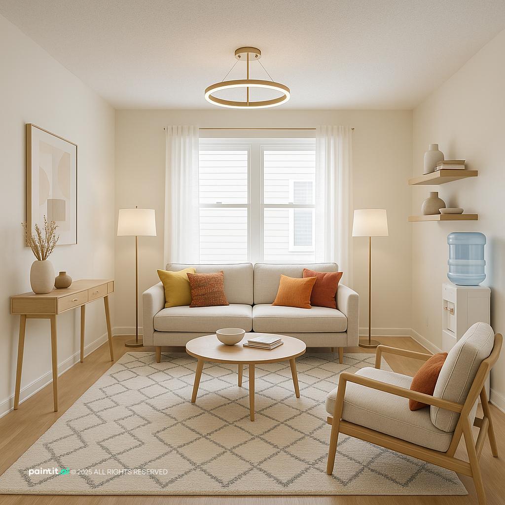
Stylish Minimalist Living Room Design balances red accents, warm wood and clean-lined furniture in a living room setting.

Stylish 60m² Living Room Design pairs red accents, warm wood and soft textiles in a living room setting.

Cozy Modern Living Room Design layers red accents, soft textiles and metal accents in a living room setting.

Cozy Scandinavian Living Room for Families anchors red accents, warm wood and soft textiles in a living room setting.

Warm Modern Living Room Design softens red accents, soft textiles and plants and greenery in a living room setting.

Harmonious Living Room TV Area Redesign uses red accents, clean-lined furniture and plants and greenery in a living room setting.

Modern Spacious Living Room Design balances red accents, warm wood and layered neutrals in a living room setting.

Elegant Neoclassical Living Room Design pairs red accents and layered neutrals in a living room setting.

Sleek Contemporary Living Room Design layers red accents, clean-lined furniture and plants and greenery in a living room setting.

Cozy Living Room Redesign anchors red accents, soft textiles and plants and greenery in a living room setting.

Red Living Room Ideas with Red Accents and Warm Wood softens red accents, warm wood and soft textiles in a living room setting.
A red accent wall living room works best when the wall already has a reason to matter: behind the sofa, around a fireplace, behind built-ins, or at the end of the main sightline. Do not choose a random side wall just because it is empty. Red will pull the eye there even if the furniture layout says the room should face somewhere else.
Keep the other walls warm white, greige, mushroom, or pale taupe. A neutral rug and simple curtains help the red accent wall sit into the room instead of shouting over it. Before picking up a brush, test several shades with the AI House Painter because red paint can shift hard between morning light, shaded corners, and warm evening lamps.
Red sofa living room ideas need restraint around the sofa. Choose one large neutral around it, such as a cream wall, jute rug, beige sectional companion, or pale oak floor, so the red sofa has room to breathe. If the sofa is deep cherry or oxblood, pair it with walnut, blackened metal, and ivory textiles. If it is a brighter red, give it fewer competing colors.
What usually goes wrong: matching every accessory to the sofa. Red throw pillows on a red sofa often flatten the whole composition. Instead, use patterned throw pillows with rust, cream, brown, charcoal, or a small amount of blue to create depth.
A red and neutral living room is usually the safest way to bring in the color. Start by naming two or three elements to keep: oak flooring, a beige sofa, white trim, a stone fireplace, or a large neutral rug. In Paintit.ai data, 12.0% of prompts include “keep” or “don’t change,” and that is a useful design habit, not just a software behavior.
Once the fixed elements are clear, add red in one controlled layer: wall art, curtains, a lounge chair, or a painted cabinet. Neutrals absorb the intensity and make red feel like a decision rather than a reaction. If the room still feels flat, add texture before adding more red.
Burgundy living room ideas are especially strong in rooms with darker wood tones, exposed beams, leather, bookcases, or lower natural light. A blue-based burgundy can feel quiet and tailored, while a brown-based wine red feels warmer and more traditional. Both are easier to live with than a high-saturation primary red.
When people upload a living room with heavy wood tones, we often see the same weak spot: the red they choose is too bright. Deeper burgundy usually respects natural grain better. Use it on a velvet chair, painted shelving, a large artwork, or one wall behind warm lamps.
Terracotta, clay, and brick reds suit relaxed spaces with linen upholstery, woven shades, handmade ceramics, and matte wood finishes. They are less sharp than cherry red and can work almost like a warm neutral. Use them where you want comfort without making the room feel formal.
For implementation, try terracotta curtains, a painted media wall, or a large patterned rug with cream and rust. What to avoid: pairing terracotta with very cool gray walls unless the gray has a warm undertone. The contrast can make the red look dusty and the gray look cold.
If your windows are tall, symmetrical, or placed behind the seating area, red curtains can create drama without repainting. Choose a fabric with weight, such as velvet, brushed cotton, wool blend, or heavy linen, so the color hangs with depth rather than looking thin. Hang the rod high and wide to keep the window generous.
This works well when the walls are pale and the furniture is simple. In a small room, choose a muted red or patterned curtain instead of a flat bright panel. Strong red fabric near daylight can glow more than expected, so check it in natural light before ordering full-length panels.
A rug is a practical way to introduce red because it connects the seating pieces and reduces the need for many small red accessories. Look for patterns that include red, tan, cream, brown, black, or faded blue. The rug should be large enough for at least the front legs of the sofa and chairs to sit on it.
This works because the red becomes part of a wider color story rather than one loud note. Avoid tiny red rugs floating under a coffee table. They chop up the seating area and can make red seem accidental.
Red becomes more contemporary when it meets blackened steel, bronze, aged brass, or gunmetal. Use metal accents in lamp bases, picture frames, coffee table legs, cabinet pulls, or a slim floor lamp. Keep the shapes clean so the palette does not drift into costume.
Paintit.ai prompt data shows that material appears in 19.0% of prompts, and red is one of the colors where material choice really changes the result. Matte black makes red graphic. Brass warms it. Chrome can work, but it needs a more polished, urban room to avoid looking harsh.
If you are nervous, start with red living room decor that can move: throw pillows, a lamp shade, a tray, art, books, a footstool, or a small side chair. Add one red piece, then repeat the color once across the room so the eye understands it. Two or three touches are usually stronger than ten small ones.
This mirrors the way many Paintit.ai users refine rooms. About 15.0% of prompts contain language such as “a bit,” “more,” or “less,” and that is exactly how red should be tested. Add less first. If the room asks for more, increase the scale.
Large wall art is a good option if you rent, dislike repainting, or want a flexible seasonal room. Choose artwork with red plus two supporting tones already present in the room, such as cream from the sofa and brown from the floor. The art should be large enough to relate to the furniture below it.
What to avoid: small red prints scattered across several walls. They create visual noise. One oversized piece above the sofa, or a tight pair over a console, usually looks more composed.
If you want full red walls, reduce clutter before adding decor. Red walls intensify every outline in the room: book stacks, chair legs, cables, frames, and shelf objects all become more noticeable. Use closed storage where possible and keep the coffee table edited.
A good check is to leave some uninterrupted red surface visible. It lets the paint color act as atmosphere instead of competing with every object. Avoid placing many small black frames on red walls unless you specifically want a high-contrast gallery effect.
In an open-plan space, red can help mark the living zone without building a wall. Paint the media wall, use a red area rug, or place a red chair at the edge of the seating group. The key is to repeat one material or neutral from the adjacent dining or kitchen area so the zones still connect.
For example, if the kitchen has walnut stools, use a walnut coffee table in the living area. If the dining chairs are black metal, repeat black in the living room lamp or frame. Red defines the zone; shared finishes keep the plan from feeling split.
A red living room color scheme should include one red, two neutrals, one material tone, and one small contrast. For instance: oxblood, warm white, camel, walnut, and aged brass. Or: brick red, cream, charcoal, oak, and black iron. Write the palette down before buying pillows or paint.
This prevents the common mistake of collecting several reds that do not agree. Blue-red, orange-red, rust, coral, and burgundy can fight each other when used casually. If you mix reds, vary the texture and keep one shade dominant.
Red changes under bulbs more than many people expect. Warm bulbs can make it feel cozy and brownish; cool bulbs can make it look sharper or even slightly pink. Since lighting appears in 5.9% of Paintit.ai prompts, it is a smaller but important part of how people judge the final mood.
Use at least three light sources: an overhead fixture on a dimmer, a table lamp near seating, and a floor or picture light to wash a wall or artwork. Avoid relying on one ceiling light. It can create glare on red paint and harsh shadows around dark furniture.
The second gallery helps you compare whether your room needs a permanent red move, like paint or upholstery, or a flexible layer such as rugs, art, curtains, and accessories.

Modern Living Room Design with High-Tech Features uses red accents, plants and greenery and layered neutrals in a living room setting.

Tropical Modern Living Room Design balances red accents, warm wood and plants and greenery in a living room setting.

Stylish Modern Living Room Design pairs red accents, metal accents and clean-lined furniture in a living room setting.

Charming French Country Living Room Design layers red accents, soft textiles and natural light in a living room setting.

Elegant Neoclassic Living Room Design anchors red accents, layered neutrals and natural light in a living room setting.

Bold Contemporary Living Room Design softens red accents, soft textiles and metal accents in a living room setting.

Elegant Neoclassic Minimalist Living Room Design uses red accents, clean-lined furniture and layered neutrals in a living room setting.

Bold Modern Interior Design for Ground Floor balances red accents, soft textiles and layered neutrals in a living room setting.

Red Living Room Ideas with Red Accents and Soft Textiles pairs red accents, soft textiles and open layout in a living room setting.

Contemporary Living Room Design Inspiration layers red accents, metal accents and clean-lined furniture in a living room setting.

Mid-Century Modern Living Room Design anchors red accents, warm wood and clean-lined furniture in a living room setting.

Stunning Mid-Century Modern Living Room softens red accents, warm wood and soft textiles in a living room setting.
Blue-based reds, such as cranberry, wine, and oxblood, feel more formal and pair well with charcoal, walnut, navy, and brass. Orange-based reds, such as tomato, brick, clay, and paprika, feel warmer and work well with oak, cream, tan, and woven textures. Use the undertone already present in your floor or sofa as the guide.
Avoid choosing a paint color from a tiny chip only. Red expands visually on a wall. Test it near trim, flooring, and the largest upholstered piece in the room.
Red usually looks better with warm white, oatmeal, stone, camel, taupe, mushroom, or soft beige than with flat cool gray. A cool neutral can work if the red is deep and blue-based, but bright red beside cold gray often feels hard. The neutral should calm the room without draining the red.
Use warm neutrals on large surfaces: rug, ceiling, sofa, main walls, or curtains. Save sharper contrast for small details such as frames, lamp bases, or a side table.
Light oak and ash suit terracotta, brick, and paprika. Walnut and darker stained woods suit burgundy, oxblood, and merlot. Mid-tone woods are the most flexible, especially if the room includes cream textiles and black accents.
Avoid mixing too many wood finishes when red is already strong. If the floor is warm oak, repeat that warmth in one other place, such as a coffee table or picture frame, then let the red do the visual work.
Aged brass and bronze make red feel warmer and more layered. Matte black makes it cleaner and more architectural. Polished chrome or nickel can look crisp with a modern red sofa, but it should be supported by sleek shapes and uncluttered surfaces.
Use metal accents in limited repetition: one floor lamp, one frame finish, and one table detail may be enough. Avoid scattering many shiny objects around red walls, because glare can make the room feel busy.
Velvet, boucle, wool, linen, leather, and woven cotton all change how red reads. A red velvet chair feels saturated and plush; a faded red wool rug feels collected and softer; red linen curtains feel relaxed. The fabric surface matters as much as the shade.
Use throw pillows to bridge colors rather than repeat the exact red. A pillow with cream, rust, brown, and a little black can connect a red wall to a neutral sofa more gracefully than a solid red cushion.
Red needs adjustable lighting. Use dimmers where possible, and choose bulbs that make skin tones and wood finishes look natural. Place lamps at different heights so the room has glow at sofa level, not just light from above.
Avoid placing a strong cool bulb directly on a red wall unless you want a crisp, high-contrast effect. For cozy rooms, shaded lamps and warm wall washing are more forgiving.
Red already carries visual weight, so the styling should be deliberate. Use a large ceramic vase, one stack of books, a substantial bowl, or oversized art instead of many small pieces. Let each surface have space around the objects.
What to avoid: collecting every red item you find. I would rather see one red wall, one patterned textile, and one small repeated red note than a room filled with scattered red decor. That is usually enough.
A red room is easier to judge when you see it on your own walls, with your sofa depth, window direction, rug size, and existing wood tones. If you are unsure whether to keep the current layout or change the focal point, learn how to redesign a living room with Paintit.ai and compare versions before buying furniture or paint.
For broader layout and style testing, AI Room Design is useful when you want to compare red against neutral, modern, cozy, or minimalist directions. For a room-specific pass, AI Living Room Design can help test red walls, a red sofa, new curtains, different lighting moods, and material swaps while preserving the pieces you want to keep. In our renders, the strongest red rooms usually keep the ceiling and floor quiet while concentrating red on one confident focal point.
Warm white, cream, taupe, camel, charcoal, walnut, black, aged brass, and soft blue can all work. Choose warmer neutrals for brick or terracotta reds, and deeper neutrals for burgundy or oxblood.
Decide what to keep first, such as the floor, sofa, rug, or curtains. Then add red in one main place and repeat it lightly through art, pillows, or a small chair.
Yes, if it matches the room’s purpose. Red is strong and social, so it works well in rooms meant for conversation, warmth, reading, or evening use.
Use warm lighting, textured fabrics, wood tones, soft rugs, and muted reds like brick, wine, or burgundy. Avoid too many glossy surfaces or cool white bulbs.
Start with one wall if the room is small, dark, or already full of furniture. Full red walls can work, but they need simple styling, good lighting, and plenty of neutral balance.