
Modern Moroccan Living Room Design
Modern Moroccan Living Room Design uses curtain softness, window framing and metal accents in a living room setting.
Good living room curtain ideas do more than cover a window. They change how tall the room feels, soften hard corners, cut glare on the TV, and tie the sofa, rug, wall color, and window trim into one cleaner picture. Start with the room in front of you: window size, ceiling height, furniture layout, trim color, and the kind of light that hits the room during the day. A curtain can look beautiful in a product photo and still feel wrong at home if it is too short, too heavy, too narrow, or fighting the wall undertone.
Curtains sit at the edge of the room, but your eye reads them almost like a wall finish. They can make a low ceiling feel taller, stretch a narrow window, calm a busy palette, or add fabric texture where the room has too much glass, metal, stone, or flat drywall. So the first decision is not pattern versus plain. It is simpler: what does this living room need most — height, softness, privacy, contrast, warmth, or better daylight control?
In Paintit.ai prompt data, 27.6% of users include a color modifier, which makes color the most common starting point. That tracks with what we see in real uploads: people often start with beige, white, green, gray, or navy before they think about weave, lining, or curtain rods. Color matters, but color by itself can look thin if the fabric has no weight or movement. We also see a lot of testing and adjustment: 15.0% of prompts include refinement language such as more, instead, or a bit. Curtains are exactly the kind of choice worth refining, because a small change in curtain length, fullness, opacity, or rod height can shift the whole wall.
Use the first gallery as a comparison exercise, not just inspiration. Look at how the same living room changes when the rod moves higher, the panels widen, or the fabric gets heavier. Check where the curtain rods sit, how much wall the drapes cover, and whether the daylight feels filtered, gloomy, or still too sharp.
Modern Moroccan Living Room Design uses curtain softness, window framing and metal accents in a living room setting.

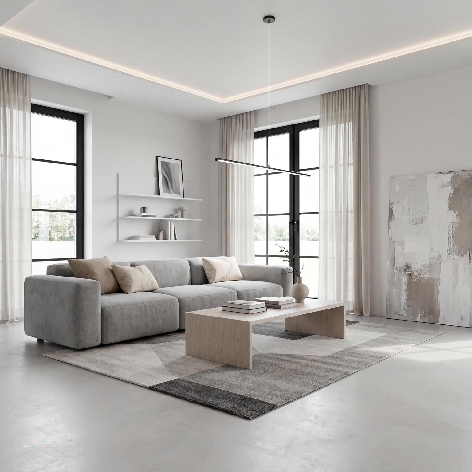
Modern Scandinavian Living Room Design balances curtain softness, window framing and soft textiles in a living room setting.

Scandinavian Living Room Design 2025 pairs curtain softness, window framing and plants and greenery in a living room setting.

Modern Living Room Redesign layers curtain softness, window framing and layered neutrals in a living room setting.

Living Room Curtain Ideas with Curtain Softness and Window Framing anchors curtain softness, window framing and soft textiles in a living room setting.

Modern Scandinavian Living Room Design with Curtain Softness softens curtain softness, warm wood and clean-lined furniture in a living room setting.

Scandinavian Style Living Room Design uses curtain softness, window framing and soft textiles in a living room setting.

Charming French Country Living Room Design balances curtain softness, window framing and soft textiles in a living room setting.

open, airy space with clean lines and simple forms . neutral color palette: whites, pairs curtain softness, window framing and soft textiles in a living room setting.

Stylish Modern Living Room Design layers curtain softness, window framing and metal accents in a living room setting.

Contemporary Living Room Redesign anchors curtain softness, window framing and metal accents in a living room setting.

Contemporary Minimalist Living Room Design softens curtain softness, window framing and metal accents in a living room setting.
Mounting the rod closer to the ceiling is one of the most dependable ways to make a living room feel taller. A good rule is to place the rod 4 to 8 inches above the window frame, or just below the crown molding if the room has it. In Paintit.ai tests, we often see that people who ask for ceiling mounted curtains get a clearer sense of height than people who simply ask to add basic curtains.
Why it works: the eye reads the long fabric drop as part of the wall height, not just the window height. What usually goes wrong is placing the rod directly on top of the trim. That cuts the wall in a strange place and makes even expensive drapes feel cramped, unless the ceiling is extremely low and there is no wall space to use.
Curtains should usually stack on the wall, not sit in front of the glass when open. Extend the rod 8 to 12 inches past each side of the frame so the panels can clear the daylight opening. This makes the window look wider and keeps the living room brighter during the day.
This move matters most when the sofa faces the window, when the window is the main view from the entry, or when the room already feels narrow. Avoid rods that stop exactly at the window edge. They shrink the opening and force the fabric to bunch over the glass, which is the fastest way to lose light.
For most living rooms, floor-length panels look more intentional than curtains that stop at the sill. The cleanest curtain length is either a slight kiss at the floor or a very small break of about half an inch. In a formal room, a soft puddle can work, but it collects dust and often looks untidy in a busy family space.
What to avoid: panels that hover several inches above the floor. They visually chop the wall and make the ceiling feel lower, especially near a tall bookcase, floor lamp, fireplace surround, or full-height media unit.
Sheer curtains are useful when you need daytime privacy but still depend on natural light. They soften glare on a TV wall, blur a harsh exterior view, and make strong daylight feel less clinical. For street-facing windows, choose a slightly textured sheer rather than a perfectly transparent one.
Why it works: the fabric diffuses light without closing the room down. The catch is nighttime privacy. If people can see into the room after dark, pair sheer curtains with heavier side panels or a shade mounted inside the frame.
A double rod or track lets you use sheers during the day and heavier fabric at night. This is a strong choice for living rooms that need softness, privacy, and light control, especially when the seating area sits close to the windows. It also gives the window treatment more depth because there is a foreground and background layer.
Paintit.ai data shows that 19.0% of prompts include material modifiers, while only 5.9% include lighting modifiers. In practice, fabric choice is often how people control light, even when they do not describe it as a lighting decision. Linen, voile, velvet, and blackout lining all change the light before they change the style.
A slim sofa, open-leg chairs, and a light coffee table usually work better with linen, cotton, or soft woven panels. A deep sectional, thick rug, and dark wood furniture can handle heavier fabric such as velvet or lined drapery. The point is not to match every item. It is to keep the visual weight of the window wall in balance with the furniture.
What to avoid: very heavy blackout curtains in a room where everything else is light and airy. They can turn the window wall into a dark block unless the room has enough size, ceiling height, and repeated dark accents to support them.
Curtain color should relate to at least one large surface: the wall, sofa, rug, or accent chair. If the room already has strong color, choose curtains one or two steps lighter or darker than the wall for a calmer effect. If the room is mostly beige, gray, or white, muted clay, olive, blue-gray, mushroom, or warm taupe can add direction without taking over.
For deeper palette planning, compare curtain tones with the wall and sofa using our guide to the best living room colors. This helps avoid a common mistake: choosing a fabric that looks good alone but turns flat, yellow, or cold against the real wall undertone.
Tonal curtains sit close to the wall color but do not have to match exactly. A warm white wall with oatmeal linen panels, or a pale greige wall with mushroom-colored drapes, can make the window feel built into the room. This works especially well when the rug, art, or furniture already brings enough contrast.
Why it works: the window wall becomes a soft backdrop instead of a separate feature. Avoid a perfect color match in a flat fabric, though. Without visible weave, folds, or shadow, tonal curtains can look unfinished instead of deliberate.
Dark charcoal, deep green, navy, chocolate, or rust panels can frame a view and create a stronger focal point. This works best when the room already has other dark notes, such as a black fireplace surround, bronze lamp, dark wood table, patterned rug, or metal window frames. Contrast needs a second place to land.
What to avoid: one isolated dark curtain color in an otherwise pale living room. It can look accidental unless it is echoed through pillows, art, trim, furniture legs, or a repeated metal finish.
Patterned curtains can work beautifully, but scale is where many rooms go wrong. In a large living room, a tiny print may read as fuzz from across the room. In a compact room, an oversized print can dominate the window wall and fight the rug or artwork.
Use pattern when the rest of the room is fairly quiet. If the sofa, rug, and pillows already carry several motifs, choose a textured solid instead. A woven stripe, subtle herringbone, slubbed linen, or small tonal pattern often gives enough movement without adding another loud graphic layer.
For small living room curtain ideas, treat the window as if it is bigger than it is. Hang the rod high, extend it beyond the frame, and choose panels that reach the floor. Light to mid-tone fabrics usually work better than very dark panels because they keep the wall from feeling compressed.
When people upload a small living room, the weak spot is often easy to spot: curtains that are too dark, too narrow, or cut off at the sill. For empty or newly purchased spaces, AI virtual staging can help you check whether full-height panels make the room feel taller before you buy rods, brackets, or fabric.
Not every room needs new hardware. If the curtain rods are sturdy, well placed, and match the room’s metal finishes, changing the panel fabric may be enough. If the rods are too low, too short, or too thin for the panel weight, replacing the hardware will do more than buying a more expensive fabric.
Paintit.ai users often include keep or do not change instructions; 12.0% of prompts use this kind of constraint. I would treat that as a useful design habit, not a technical detail. Before choosing curtains for living room windows, decide what must stay: wood trim, black frames, brass rods, blinds, shutters, radiator covers, or the view itself.
The second gallery is for checking mood and function side by side: pale linen against stronger color, sheer panels against lined fabric, and simple rods against ceiling tracks. Watch how each choice changes the sofa wall, daylight, window height, and the balance between hard surfaces and fabric.

Living Room Curtain Ideas with Curtain Softness and Window Framing with Metal Accents uses curtain softness, window framing and metal accents in a living room setting.

Scandinavian Living Room Design balances curtain softness, window framing and warm wood in a living room setting.

Living Room Curtain Ideas with Curtain Softness and Window Framing with Soft Textiles pairs curtain softness, window framing and soft textiles in a living room setting.

Cozy Modern Living Room Design layers curtain softness, window framing and warm wood in a living room setting.

Living Room Curtain Ideas with Curtain Softness and Window Framing with Plants and Greenery anchors curtain softness, window framing and plants and greenery in a living room setting.

Living Room Curtain Ideas with Curtain Softness and Window Framing View 5 softens curtain softness, window framing and soft textiles in a living room setting.

Scandinavian Living Room Design with Curtain Softness uses curtain softness, window framing and natural light in a living room setting.

Cozy Contemporary Cottage Living Room Design balances curtain softness, window framing and warm wood in a living room setting.

Modern Living Room Design for 2025 pairs curtain softness, window framing and layered neutrals in a living room setting.

Elegant Neoclassical Living Room Design layers curtain softness, window framing and warm wood in a living room setting.

Living Room Curtain Ideas with Curtain Softness and Window Framing with Warm Wood anchors curtain softness, window framing and warm wood in a living room setting.

Cozy Contemporary Living Room Design softens curtain softness, window framing and warm wood in a living room setting.
Curtain color ideas for living room spaces should start with undertones. A cool gray sofa often works better with stone, blue-gray, cool white, or muted charcoal panels than with yellow beige. A warm cream wall usually prefers oatmeal, sand, tobacco, terracotta, warm taupe, or muted olive.
This is where neutral living room curtains either look rich or bland. The versions that tend to work better in our renders combine a quiet color with visible fabric texture, such as heavy linen, raw silk, or a nubby cotton blend. Avoid choosing a neutral fabric from a tiny swatch without checking it beside the wall in daylight and at night. Warm bulbs can change beige into yellow very quickly.
If the living room has leather, glass, metal, polished stone, or smooth painted built-ins, curtains can add the softness the room is missing. Linen, cotton-linen blends, wool-look weaves, and slubbed fabrics break up hard reflections. If the room already has a chunky rug, boucle chairs, woven baskets, and open shelving, a smoother panel may feel cleaner.
The mistake is treating texture as a close-up detail only. From across the room, texture controls how shadows fall on the folds and whether the window wall feels layered or flat. That sounds small, but it is often the difference between neutral curtains looking calm and neutral curtains looking cheap.
Blackout curtains are practical for media rooms, apartments with streetlights, or living rooms that double as guest sleeping areas. They also add body, so panels hang in stronger vertical folds. But full blackout lining can make the room feel closed during the day if it is the only layer.
A better solution is often a layered system: a sheer or light-filtering shade for daytime and lined panels for evening. This keeps the living room usable in different lighting conditions instead of forcing one fabric to solve every problem.
Curtain rods, rings, brackets, and track systems should relate to the metals already in the room. Matte black works well with black window frames, modern lamps, or dark furniture legs. Brass can connect to warm wood, cream walls, and vintage pieces. Brushed nickel or pewter is useful when the room has cooler grays, chrome details, or stainless accents.
Avoid choosing shiny hardware by default. A reflective rod can catch glare and pull attention away from the fabric, especially on a bright window wall. If the hardware is not meant to be a feature, let it sit quietly.
Modern living room curtain ideas usually rely on fewer visible details: ceiling tracks, ripple-fold panels, simple black rods, or wall-colored linen. The look works when the folds are regular, the fabric is full enough, and the hardware follows the architecture instead of fighting it. If you are using an AI living room design tool, compare a simple track with a traditional rod and check which one fits the room’s lines.
What to avoid: ornate finials, tiebacks, and high-contrast trim in a room with clean furniture and minimal millwork. Those details can feel borrowed from a different room. Modern does not have to mean plain, but every visible detail needs a reason.
Curtains should be judged from the main seating position. Check whether the fabric color relates to the rug edge, sofa upholstery, throw pillows, artwork, and lamp shades. A curtain that looks good beside the window can still feel wrong if it makes the wall behind the furniture feel lopsided.
Use repetition in small amounts. If the curtains are warm taupe, repeat a related tone in a pillow, ceramic vase, lamp shade, or rug detail. Do not match everything exactly. Rooms usually feel better when the colors speak to each other without becoming a set.
Curtains need enough fabric to form soft vertical folds when closed. For most ready-made panels, the combined fabric width should be about 1.5 to 2 times the width of the window or rod span. Sheers often need more fullness because thin fabric looks skimpy when stretched flat.
Avoid buying two narrow panels for a wide window just because the package technically covers the measurement. Coverage is not the same as a good drape. Fullness is what makes the window treatment look finished, especially in photos and from the sofa.
Curtains are hard to judge from a product photo because the result depends on your ceiling height, window frame, wall color, sofa depth, flooring, and daylight. In Paintit.ai, you can upload your living room and test curtain length, rod height, sheer curtains, blackout curtains, heavier drapes, fabric color, and whether existing hardware should stay.
If the first result feels close but not quite right, refine it the way real users do: make the panels more sheer, keep the black window frames, use warmer linen, add floor-length drapes, remove the dark fabric, or change only the curtain color. For a step-by-step workflow, see how to redesign a living room with Paintit.ai before you commit to fabric, rods, or installation.
Floor-length curtains with enough fullness usually look best in a living room. Choose linen or cotton blends for relaxed rooms, velvet or lined drapes for heavier furniture, and sheer curtains when daylight matters most. The best choice should match the room’s scale, not just the window.
In most cases, yes. A slight touch or tiny break at the floor looks intentional and keeps the wall line clean. Curtains that stop several inches above the floor often make the ceiling feel lower and the window treatment look unfinished.
Warm white, oatmeal, greige, taupe, mushroom, olive, clay, and soft blue-gray all work well with neutral living rooms. Pick a color that fits the wall and sofa undertone, then choose fabric texture with visible weave so the curtains do not look flat.
Sheers are enough if you mainly need daylight filtering and daytime privacy. If the room is visible from outside at night, gets strong glare, or needs better insulation, layer them with lined panels, shades, or blackout curtains.
Aim for total panel width around 1.5 to 2 times the rod width. Extend the rod past the window frame so open panels stack on the wall instead of blocking daylight. This is especially important for wide windows and small living rooms.