
Modern Scandinavian Open-Plan Living Room Design
Modern Scandinavian Open-Plan Living Room Design uses zoned seating, warm wood and soft textiles in a living room setting.
Awkward living room layout ideas only work when they respect the room in front of you: the doorway cutting through the best wall, the corner fireplace, the off-center window, the long narrow footprint, or the TV wall that never quite lines up. The answer is not to pretend the geometry is normal. It is to protect traffic flow, build a clear conversation area, and make the fixed parts of the room look chosen instead of awkward.
A difficult living room usually has one thing you cannot move: a fireplace, a walkway, a radiator, a diagonal wall, a large opening, or a TV connection in the wrong place. In Paintit.ai prompts, 12.0% of users use keep or don't change language, and that matches what we see in real uploads: most living rooms are not blank boxes. The better plan is to keep the existing architecture and build around it.
Before buying anything, name the problem in one plain sentence, such as long narrow living room with fireplace or odd-shaped living room with two entrances. That first sentence matters. It stops you from solving the wrong issue, like shopping for a bigger sofa when the real problem is the walkway. Then test one change at a time. For visual planning, AI Living Room Design can help compare furniture direction, palette, and layout without relying on a floor plan alone.
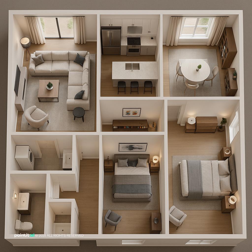
Use the first gallery to look closely at how sofas, chairs, rugs, shelves, and lighting can turn strange corners, broken walls, and offset focal points into a room that still feels comfortable and easy to move through.
Modern Scandinavian Open-Plan Living Room Design uses zoned seating, warm wood and soft textiles in a living room setting.

Budget-Friendly Small Apartment Design balances clear furniture layout, layered neutrals and natural light in a living room setting.

Luxury Modern Hotel Living Room Design pairs clear furniture layout, metal accents and layered neutrals in a living room setting.

Cozy Cabin Living Room Design layers clear furniture layout, soft textiles and plants and greenery in a living room setting.

Stunning Scandinavian Living Room Design anchors clear furniture layout, warm wood and soft textiles in a living room setting.

Stylish Apartment Design for Small Families softens clear furniture layout, warm wood and soft textiles in a living room setting.

Awkward Living Room Layout Ideas with Clear Furniture Layout and Zoned Seating uses clear furniture layout, zoned seating and warm wood in a living room setting.

Modern Open-Plan Interior Design balances clear furniture layout, zoned seating and clean-lined furniture in a living room setting.

Cozy Modern Living Room Design pairs clear furniture layout, soft textiles and layered neutrals in a living room setting.

Stylish Open-Concept Living Room Redesign layers clear furniture layout, warm wood and metal accents in a living room setting.

Stylish Interior Floor Plan with Furniture Layout anchors clear furniture layout in a living room setting.

Stylish Mid-Century Modern Living Room Design softens clear furniture layout, warm wood and clean-lined furniture in a living room setting.
Start by drawing the route people actually use through the living room. In many awkward rooms, the first mistake is putting the sofa exactly where the body wants to walk. Keep a main walkway of about 30 to 36 inches where possible, especially between the entrance, sofa edge, media wall, and any route to another room.
Why it works: traffic flow decides whether a room feels calm or annoying. If guests have to squeeze behind chairs or step around an ottoman every time they enter, even good furniture will feel wrong. Do not ask the center of the room to be both the seating zone and the corridor.
Floating furniture is often the fastest fix for an awkward living room furniture arrangement. Pull the sofa forward, place a console behind it, and use the rug to define the seating zone. This works especially well when walls are interrupted by doors, windows, built-ins, or angled corners.
What to avoid: do not float furniture just because it looks stylish in a photo. The back of a sofa should still relate to something, such as a walkway, console table, low bookcase, or lamp pair. A floating sofa without a reason can look abandoned in the middle of the room.
Rug placement is critical in an odd room because the rug tells the eye where the living area begins and ends. Choose a rug large enough for at least the front legs of the sofa and chairs to sit on it. In a small room, a rug that nearly fills the seating zone often looks more organized than a small rug floating in the middle.
Why it works: the rug becomes the room's quiet grid. It gives the furniture one shared logic, so the seating can follow the rug instead of chasing every strange wall angle.
When people upload a long, narrow room, the weak spot is usually the bowling-alley effect. The room may have enough square footage, but it still feels like a hallway with a sofa in it. Solve that with zoning before styling. Place the main seating area in one section, then use the far end for a reading chair, desk, game table, storage wall, or small library moment.
Keep the walkway on one side rather than splitting the room down the middle. A shallow-depth sofa, open-base chairs, and a rectangular rug can help the narrow room breathe. In Paintit.ai behavior, 8.8% of users ask for no clutter or without extra furniture; in a narrow room, subtraction is not emptiness. It is part of the design.
A fireplace does not always have to be the only focal point, but it cannot be ignored. In Paintit.ai tests, we often see that users who try to pretend a corner fireplace is not there end up with a room that feels permanently tilted. Start by anchoring the rug or primary chair angle to the hearth, then decide whether the TV belongs above, beside, or on an adjacent wall.
What to avoid: do not force every seat to face both the fireplace and TV perfectly. That usually creates stiff diagonal furniture or bad neck angles. Choose a primary focal point, then let secondary seating rotate slightly.
An awkward living room with tv often fails because the screen is placed where it looks centered in an image but feels uncomfortable from the sofa. The best TV wall is the one that can be viewed from the main seat without twisting the neck. If the wall is off-center, balance it with art, shelving, a plant, or a vertical floor lamp instead of dragging the sofa into the wrong place.
Why it works: sightline matters more than formal symmetry. A slightly off-center TV can look intentional if the wall around it has enough visual weight and rhythm.
Odd corners often need flexible seating, not another large upholstered piece. Try two swivel chairs, a compact lounge chair with a drink table, or a single reading chair angled toward the sofa. Swivel chairs are especially useful when the room has both a fireplace and a TV because they can turn between focal points.
Best use case: this works in rooms with a corner fireplace, bay window, angled wall, or open-plan connection to a dining area. Avoid oversized accent chairs with deep arms if they eat into the walkway.
For a living room with odd shape layout, the physical boundaries are not suggestions. They are the room. If a wall runs diagonally, let one piece acknowledge it: a slim console, a bench, a custom shelf, or a rug angle that lightly echoes the line. Only one or two elements need to respond; everything else can stay square to the main seating zone.
Paintit.ai data shows only 0.7% of users know to use keep_geometry-style requests, but preserving the real room shape is essential for realistic results. I would treat a diagonal wall as a feature to organize, not a flaw to cover with a massive rectangular sectional jammed into the wrong corner.
Sectionals can be excellent in awkward rooms, but only if the chaise or return lands away from the main path. In a room with several openings, a sofa plus two chairs may work better than an L-shaped sectional. Measure the chaise depth and check whether someone can still walk past the coffee table without turning sideways.
What to avoid: buying the largest sectional that fits wall-to-wall. Fitting is not the same as functioning. Leave breathing room at the ends so the room does not feel packed into its outline.
An empty nook can become a reading corner, bar cabinet, plant cluster, small desk, record storage, or display shelf. The key is to give the nook one job. If you are starting from a room with too many undefined corners, How to Furnish an Empty Room is useful for thinking through function before adding pieces.
Why it works: awkward corners look worse when they are half-used. A chair, lamp, and small table can make a strange recess feel designed. Random baskets, spare stools, and leftover furniture usually make it read as overflow storage.
If a living room has several short wall segments, low storage can create a calmer horizontal line. Consider a long media console, low bookcases, or closed cabinets under windows. Closed storage is especially helpful in awkward rooms because clutter makes irregular architecture feel busier.
What to avoid: tall, mismatched storage pieces scattered across multiple walls. They interrupt sightlines and add visual weight in all the wrong places. Keep storage lower when the room already has a lot of architectural movement.
In awkward living rooms, ceiling lights are often centered on the room, not the seating area. Use floor lamps, table lamps, sconces, or picture lights to bring light to the real conversation area. If the sofa floats, place a floor lamp behind one corner or a table lamp on a console behind it.
Why it works: lighting tells people where to gather. One overhead light makes every odd edge more visible. Layered lighting creates depth, softens strange proportions, and helps the furniture plan feel intentional.
If one side of the room feels empty, resist filling it immediately. Add weight through a large artwork, tall plant, textured curtain, darker side table, or a pair of lamps. Sometimes the room needs a stronger vertical element, not another chair.
This is where iterative testing matters. Paintit.ai users refine prompts with words like more, less, instead, and now in 15.0% of cases, and 34% of messages come from chats with 5+ turns. That pattern fits awkward layouts: the first version usually exposes the next problem.
Stand where someone first sees the living room. The first sightline should reveal a clear seating zone, not the back of a bulky chair, a tangle of cords, or the side of a TV. If the room opens directly from a hall or kitchen, use a sofa back, console, rug edge, or plant to create a soft boundary.
Why it works: an awkward room feels more balanced when the first view is controlled. You do not need perfect symmetry, but you do need a readable composition.
The second gallery is for comparing real tradeoffs: centered versus off-center TV placement, sofa-against-wall versus floating furniture, one large seating zone versus two smaller zones, and how much open floor to leave in a narrow room.

Awkward Living Room Layout Ideas with Clear Furniture Layout and Layered Neutrals uses clear furniture layout, layered neutrals and natural light in a living room setting.

Awkward Living Room Layout Ideas with Clear Furniture Layout and Zoned Seating with Soft Textiles balances clear furniture layout, zoned seating and soft textiles in a living room setting.

Awkward Living Room Layout Ideas with Clear Furniture Layout and Zoned Seating View 3 pairs clear furniture layout, zoned seating and soft textiles in a living room setting.

Charming Rustic Living Room Design layers clear furniture layout, soft textiles and plants and greenery in a living room setting.

Modern Cozy Living with Natural Light anchors clear furniture layout and natural light in a living room setting.

Modern Cottage Living Room Design for Relaxation softens clear furniture layout, soft textiles and layered neutrals in a living room setting.

Charming Pugliese Living Area Design uses clear furniture layout, soft textiles and metal accents in a living room setting.

Scandinavian-Style Living Room Design balances clear furniture layout, warm wood and soft textiles in a living room setting.

Stylish Living Room Layout with Fireplace Focal Point pairs clear furniture layout and natural light in a living room setting.

Awkward Living Room Layout Ideas with Clear Furniture Layout and Zoned Seating View 4 layers clear furniture layout, zoned seating and soft textiles in a living room setting.

Luxury Modern Minimalist Living Room Design anchors clear furniture layout, zoned seating and warm wood in a living room setting.

Mid-Century Modern Living Room Design softens clear furniture layout, warm wood and clean-lined furniture in a living room setting.
When a room has odd angles, short walls, or multiple openings, a consistent wall color helps the eye read the space as one volume. Soft warm white, muted greige, pale taupe, smoky beige, or a restrained green-gray can work well. Use bolder color on movable pieces or one intentional accent, not every architectural interruption.
Avoid high-contrast paint on every niche unless the room is large and well lit. Too many color breaks make the shape feel busier, and the furniture has to work harder to calm it down.
Awkward rooms often already have visual complexity, so undertones matter. If the floor is warm oak, repeat warmth in a wood coffee table, woven shade, or tan leather chair. If the room has cool stone, black window frames, or gray tile, bring in cooler metals or walnut to keep the palette grounded.
Why it works: consistent undertones reduce visual friction. Mixing warm, cool, red, yellow, and gray finishes without a plan can make the layout problem feel like a styling problem.
In narrow rooms or layouts with tight walkways, furniture with visible legs can lighten the room. A raised sofa, slim-frame chairs, and an open-base coffee table let more floor show, which makes circulation feel easier. Use heavier pieces only where you need anchoring, such as a media console or storage wall.
Avoid too many skirted or blocky items in a small odd-shaped room. They can make the floor plane disappear and make the room feel stuffed, even when the measurements technically work.
If the room has two zones, repeat texture rather than duplicating furniture. For example, use a wool rug in the seating area, linen curtains near the reading corner, and a woven basket beside the fireplace. The materials can relate without being identical.
This works because texture creates continuity at a softer level than color. It is especially useful when the architecture prevents perfect symmetry.
Choose one dominant metal finish, such as black, aged brass, bronze, or polished nickel, then use a secondary metal sparingly. In an awkward living room, hardware, lamp bases, curtain rods, and fireplace tools can become visual clutter if every finish competes.
Where to use it: repeat the dominant metal in at least two places across the room. Avoid tiny scattered accents that do not connect back to the main furniture plan.
Use low light from table lamps, mid-height light from floor lamps or sconces, and overhead light only as support. This is especially important in rooms where the ceiling fixture is not centered over the seating. Put light near tasks: reading chair, sofa corner, fireplace wall, or console.
Why it works: layered lighting pulls attention toward the functional zones. It also reduces glare from a TV and softens shadows around angled walls.
Odd layouts usually look better with edited styling. Use a large tray on the coffee table, one substantial vase, stacked books, or a sculptural bowl instead of many small objects. On shelves, leave some negative space so the eye has a place to rest.
This connects to the no clutter pattern we see in user requests. In difficult rooms, empty space is not wasted space. It is what lets the layout breathe.
A sofa that is 6 inches too deep can ruin a tight walkway. A rug that is 2 feet too small can make the seating area feel disconnected. If you are comparing furniture sizes or staging options, AI Virtual Staging can help you preview scale and visual weight before ordering pieces.
Avoid judging furniture by showroom comfort alone. In an awkward room, proportion is part of comfort.
With Paintit.ai, upload a real living room photo and test furniture placement, palette, rug size, lighting mood, fireplace treatment, TV wall options, and style direction while preserving the room's actual geometry. For awkward rooms, start with a specific prompt: keep the existing architecture, do not change windows or fireplace, improve traffic flow, no clutter.
Then refine in small steps. Try the sofa a bit closer, make the rug larger, move the TV instead, reduce chair size, or add more light near the corner. That sounds small, but it is usually how awkward rooms get solved: not in one perfect pass, but through clear adjustments. If you want a broader planning process after choosing a direction, How to Redesign a Living Room walks through the next decisions.
Start with the walkway, fixed features, and main focal point. Keep 30 to 36 inches for movement where possible, then use a rug to define the seating area.
Place the TV where the main seat can watch without neck strain. If it is off-center, balance the wall with art, shelving, a lamp, or a plant.
Use one clear seating zone, a large enough rug, repeated materials, and controlled lighting. Balance visual weight rather than forcing perfect symmetry.
Choose a shallower sofa or apartment-size sectional that does not block the walkway. Pair it with slim chairs or stools instead of oversized armchairs.
Design around it. Treat the fireplace as a fixed anchor, then use chair angles, rug placement, and lighting so it feels intentional rather than ignored.