Pharmacy interior design ideas for modern wellness spaces
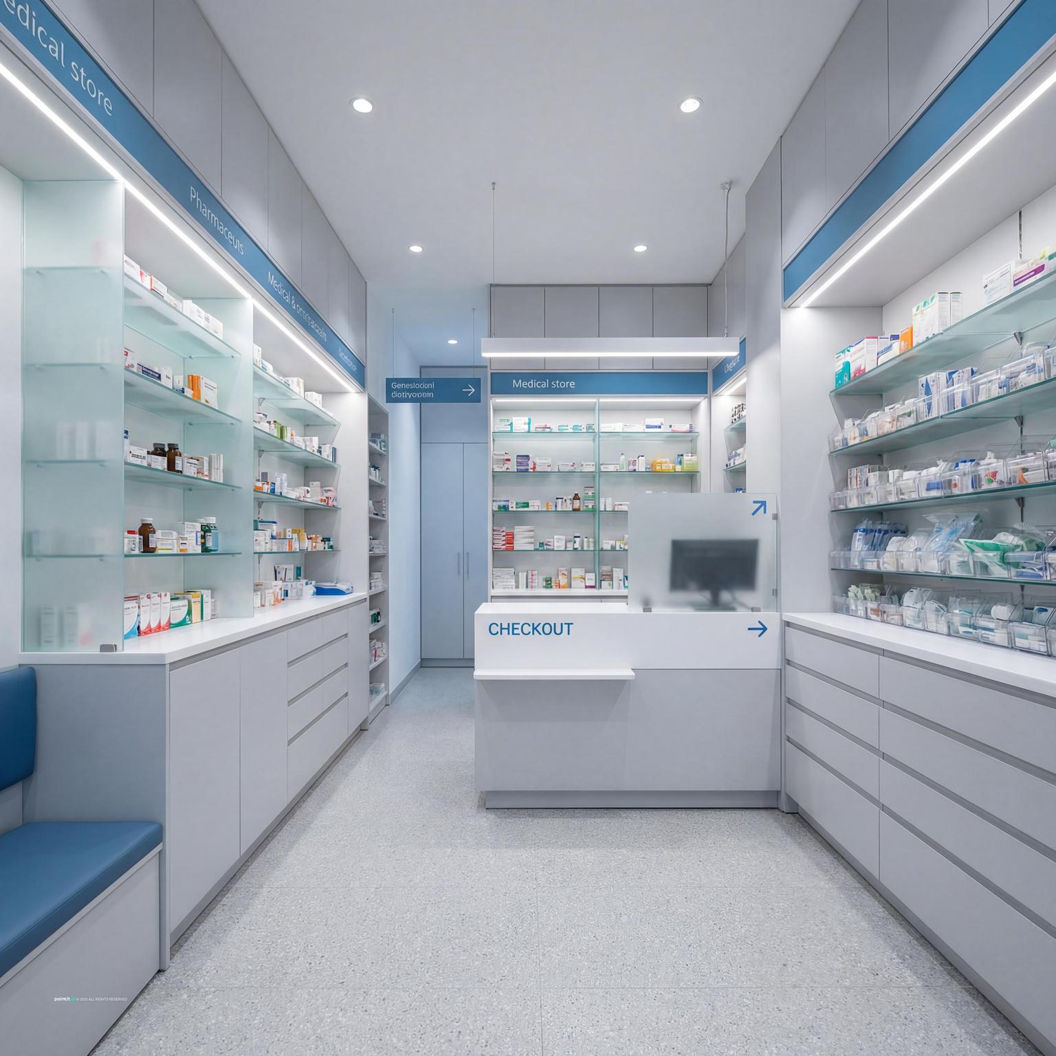
Pharmacy interior design should make health-related decisions feel clear, private, and calm. The layout needs to support quick purchases, prescription pickup, consultation, waiting, and product discovery without making customers feel exposed or confused.
These 28 pharmacy interior design ideas cover consultation zones, shelving, counter layout, wayfinding, lighting, acoustics, and customer flow for modern wellness spaces.
28 pharmacy interior design ideas
A pharmacy is more than rows of neatly stocked shelves. It is a service space where people need clarity, privacy, and trust. Good design helps customers find products, ask questions, wait comfortably, and move through the store without confusion.
-
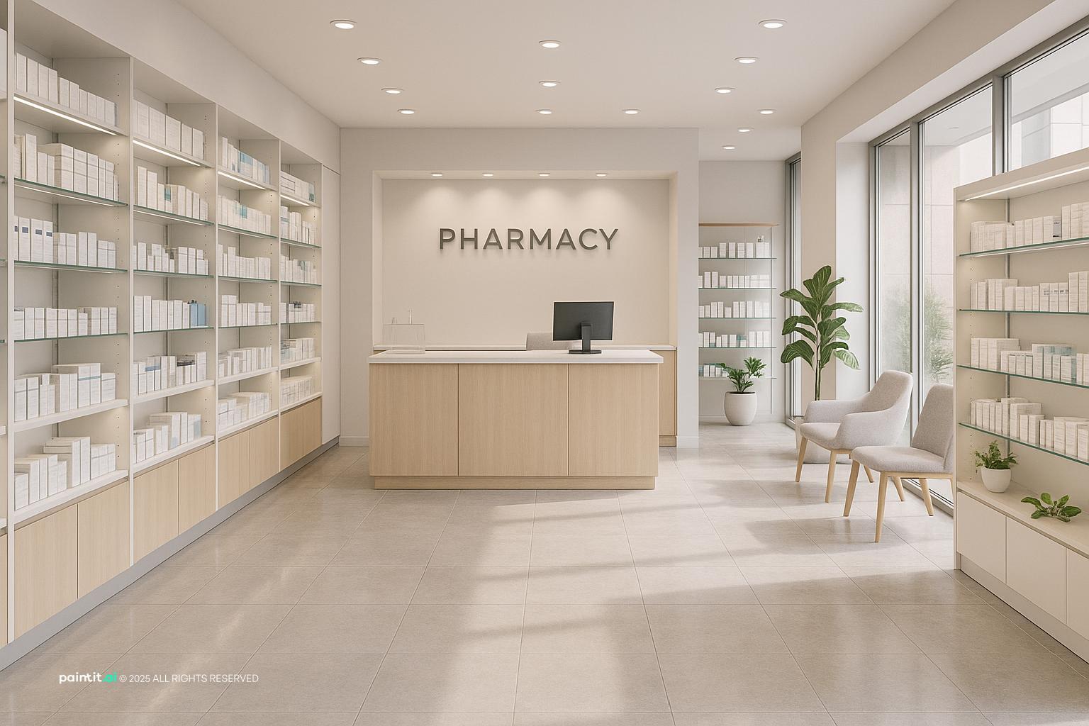
Designing a pharmacy that feels welcoming, functional, and efficient can have a huge impact on customer experience and staff morale. Here are 28 innovative ideas to help you create a space that both serves your community and stands out from the crowd.
-
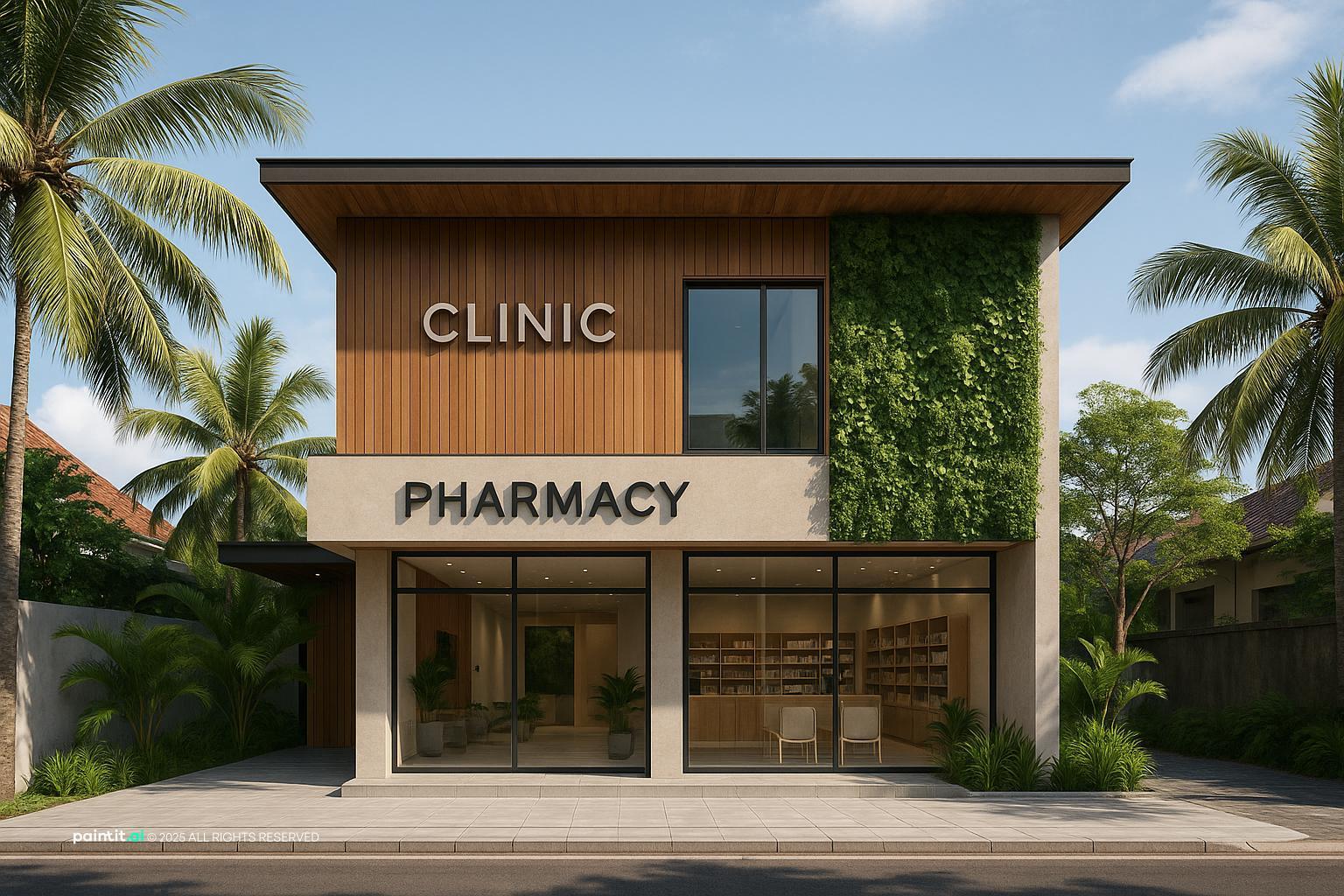
Maximize natural light near the entrance with large windows or glass doors to instantly create an airy, inviting first impression. Customers are drawn to clear, bright spaces that signal cleanliness and transparency.
-
If privacy is a concern, consider frosted decals on lower panes or strategically placed planters without blocking too much light.
-
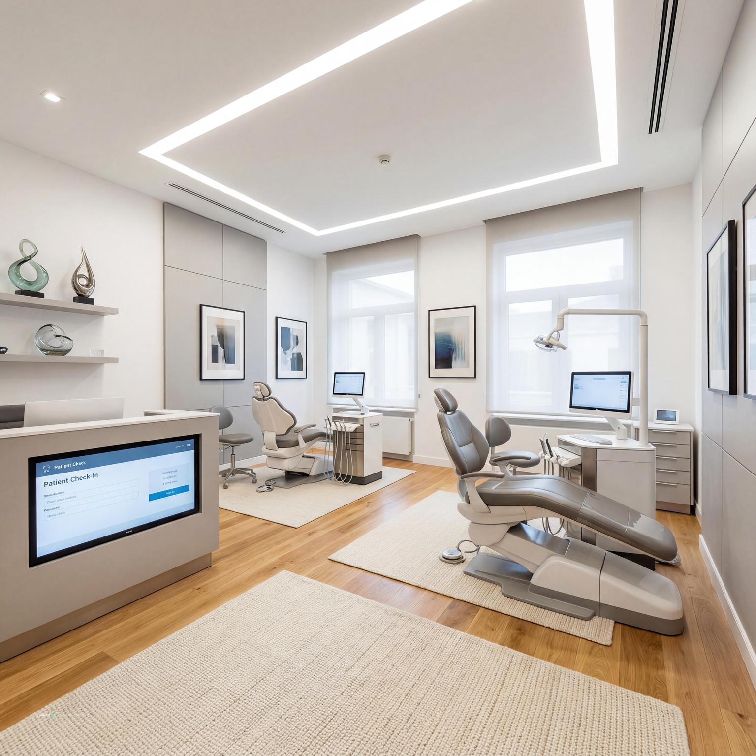
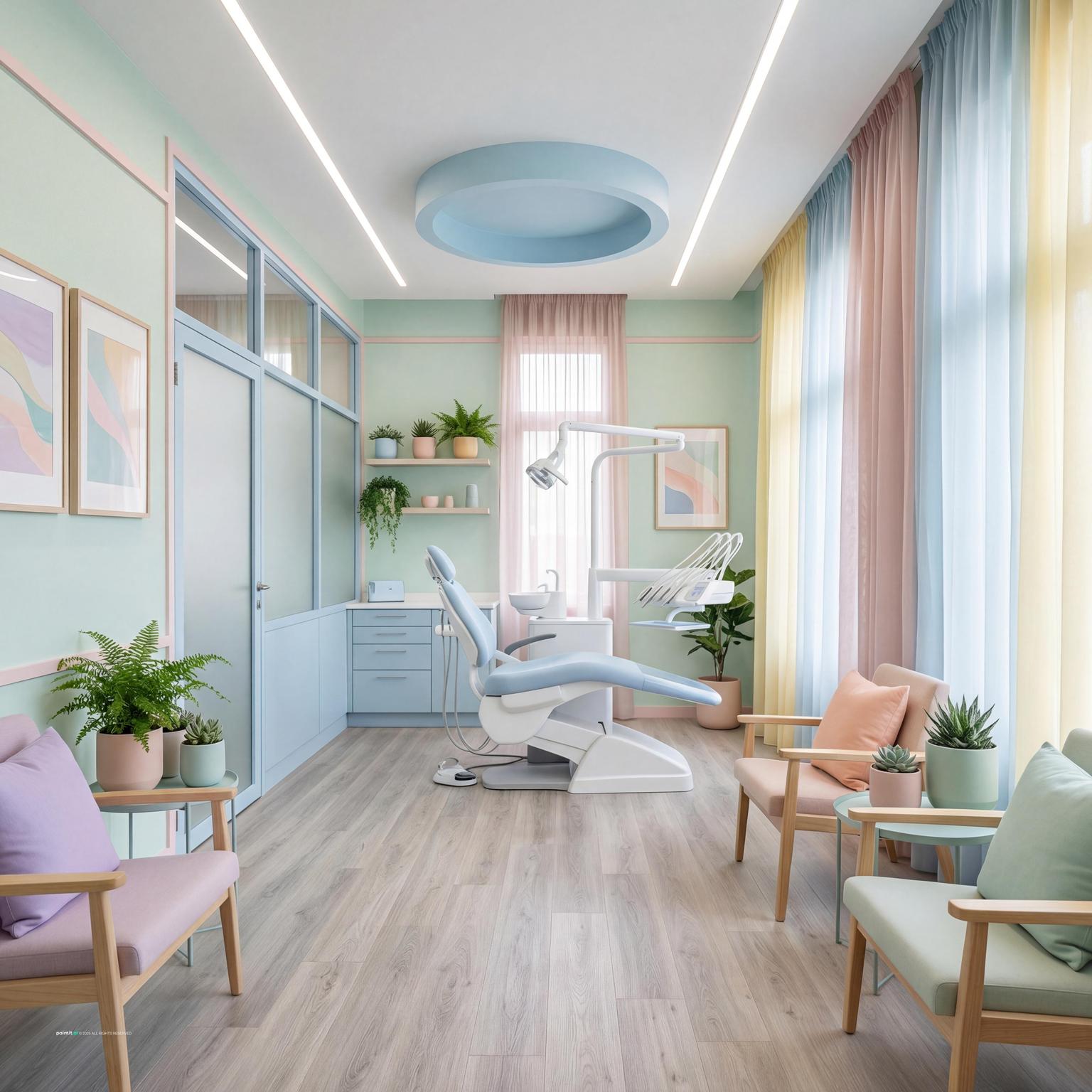
Instead of tucking consultations behind closed doors, try semi-private alcoves with acoustic panels for a balance between openness and confidentiality. This encourages approachability while retaining privacy.
-
Subtle signage using icons works better than clinical warnings for indicating their purpose.
-
Use movable shelving to easily refresh product assortments seasonally or as new trends arise. Modular systems offer flexibility, letting you highlight promotions without redesigning the entire floorplan.
-
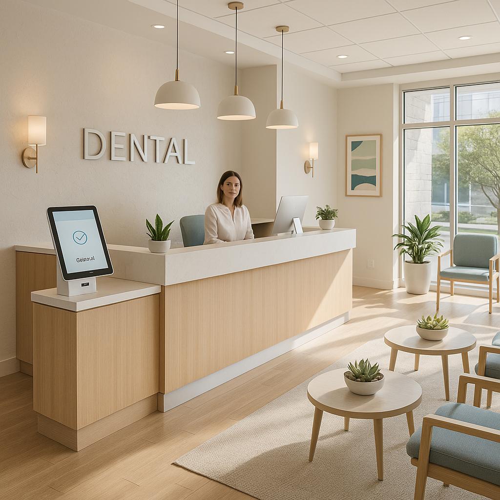
Incorporate touchscreen kiosks where customers can discreetly check prescriptions, refills, or browse health resources. Place them in visible, accessible yet semi-shielded nooks to keep information private.
-
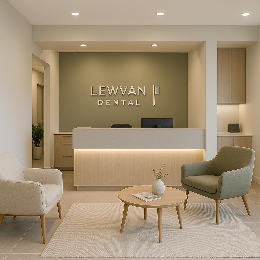
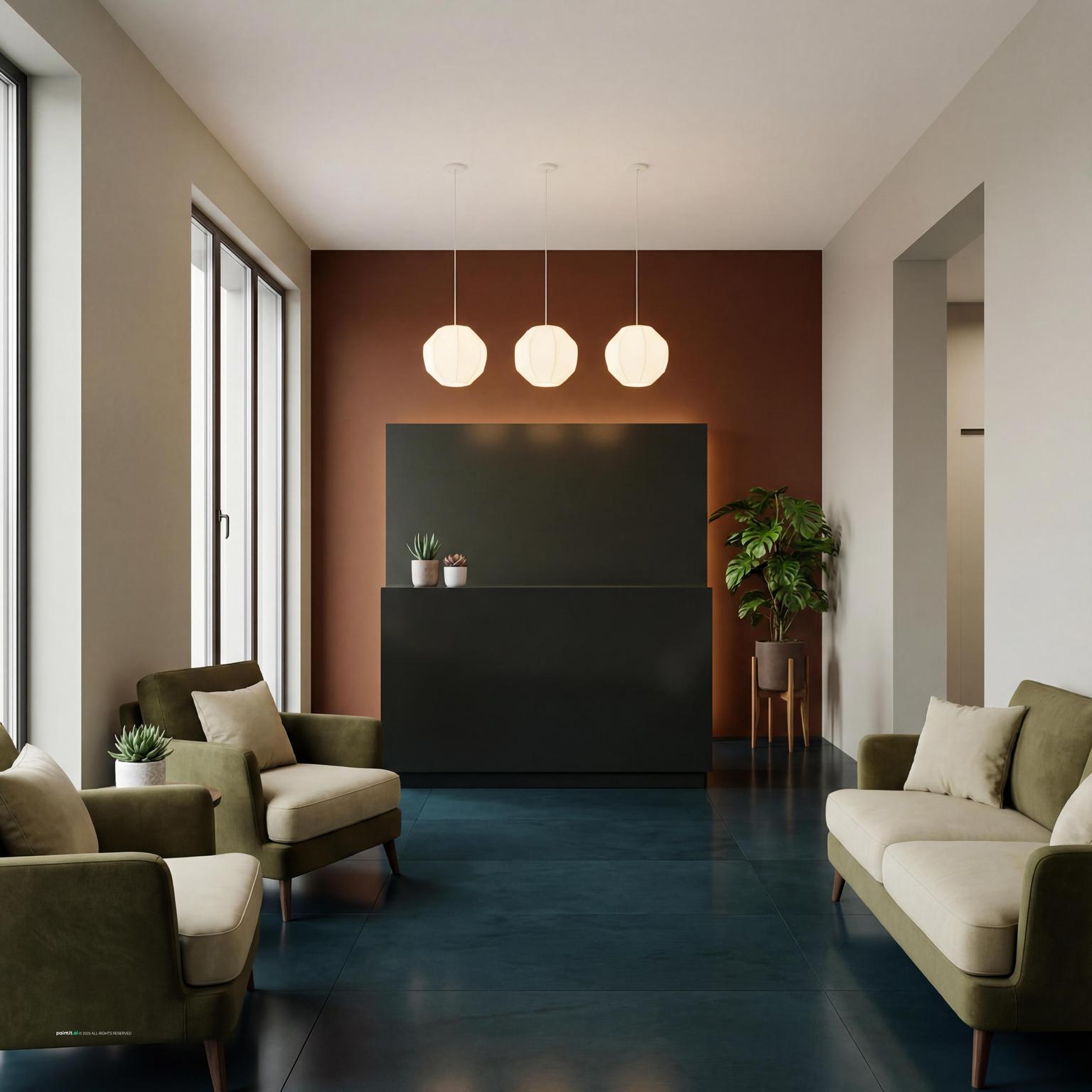
Favor rounded counters and shelving over harsh angles. Gentle curves guide traffic flow and soften the visual impression, reducing stress for patrons navigating the space.
-
Add depth by including a single wall with tactile surfaces—reclaimed wood, stone, or even pressed metal tiles. These focal points create warmth and can tie in with local themes.
-
Organize different sections with strategic color use, such as calm blues for waiting, fresh greens for supplements, or warm neutrals near prescriptions. Color psychology aids intuitive navigation and mood enhancement.
-
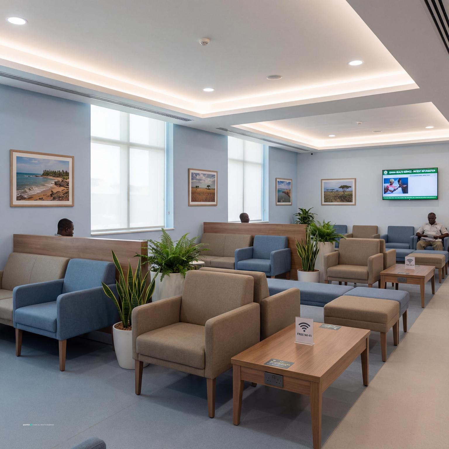
Widen walkways to at least 48 inches so mobility devices and strollers can easily pass. Adequate spacing also allows multiple shoppers to browse side by side without crowding.
-
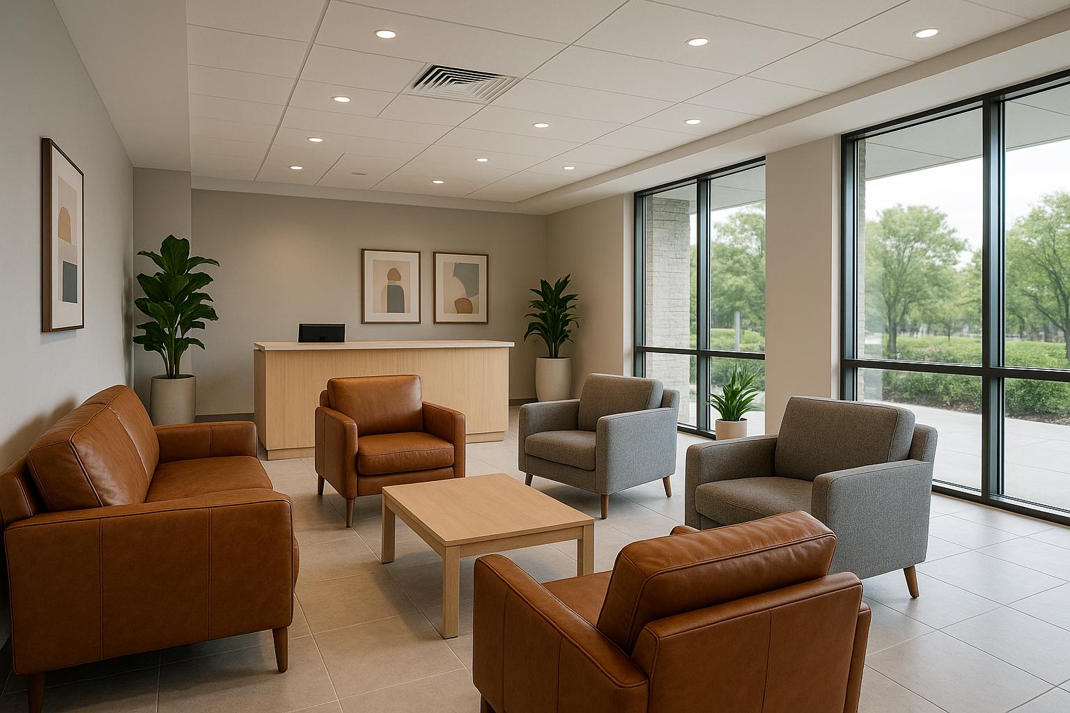
Incorporate real or high-quality artificial greenery for a calming effect that also helps purify air. Hanging planters or vertical gardens require little floor space but add instant vitality and a natural touch.
-
Keep checkout areas clutter-free with hidden storage and a simplifyd counter design. A clear workspace increases efficiency and reduces visual distraction for staff and customers.
-
Choose backlit or edge-lit signs for directions or promotional areas. Soft, diffuse light draws attention without overwhelming, helping customers quickly spot key services or departments.
-
Dampen background noise with ceiling panels designed to absorb sound, making the space quieter and more comfortable, especially during busy hours. This is particularly useful in pharmacies located in bustling retail centers.
-
Create a cozy nook for wellness items like vitamins and aromatherapy products. Use compact soft seating, warm lighting, and calm shelf styling to make the area feel inviting without blocking circulation.
-
Enhance safety without a clinical feel by choosing discreet, domed mirrors that blend with the decor. Place them strategically to keep aisles visible to staff and deter theft.
-
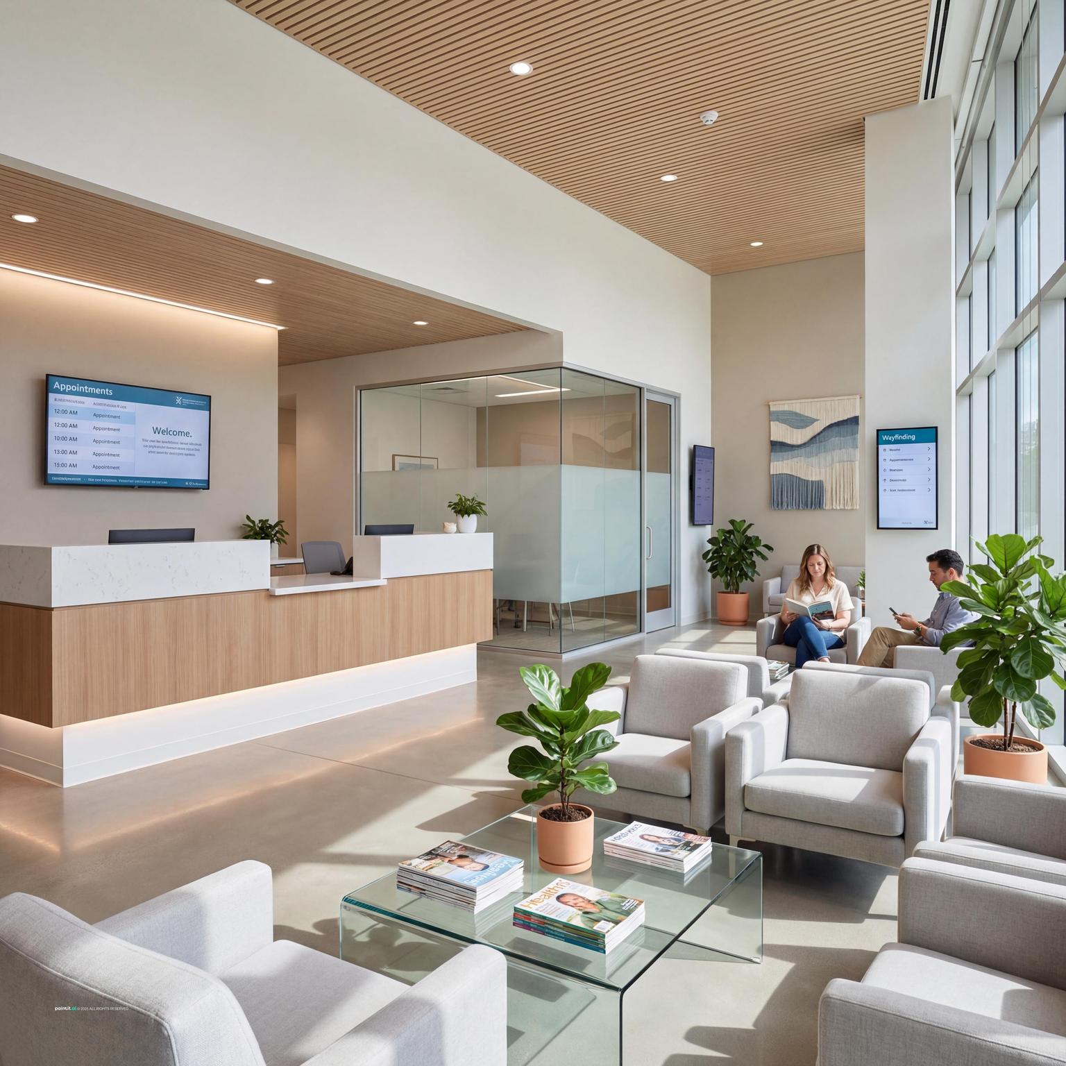
Replace static posters with digital displays for services, wait times, or seasonal offers. These screens can be updated in real-time and instantly modernize the environment.
-
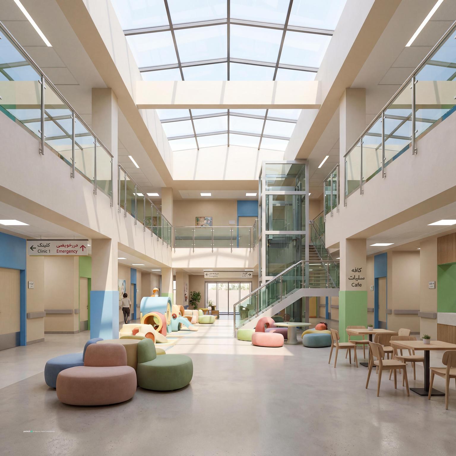
Add a compact area with soft seating, books, or tactile wall activities to keep children occupied while parents wait. Durable, wipeable finishes keep everything hygienic and low-maintenance.
-
Rotate artwork or photography by neighborhood artists to support a sense of community. This creates conversation starters and gives a unique character to the pharmacy’s aesthetic.
-
Consider themed exhibits tied to health and wellness, or seasonal shows that keep the interior dynamic throughout the year.
-
use layered lighting with dimmers (no fluorescents) to create a comfortable ambiance for sensory-sensitive clientele. Task and accent lights give you the extra brightness you need without glare.
-
Install glass-front, temperature-controlled cases for medications or wellness drinks. These cases let shoppers visually scan selections quickly while maintaining product integrity.
-
Choose counters, panels, and flooring made from rapidly renewable or recycled components. This not only looks stylish but also demonstrates commitment to sustainability, which resonates with eco-conscious customers.
-
Incorporate clean, at-a-glance wayfinding through vinyl decals or subtle floor markers. These guides help smooth out queue lines or direct guests toward key services, reducing confusion in high-traffic periods.
-
Design back-of-house and pickup counters for staff comfort, using adjustable-height worktops and anti-fatigue mats. Ergonomic details help prevent injuries and promote sustained, attentive service.
-
Cluster related items—like allergy remedies, tissues, and hand sanitizer—near each other for convenience. This approach invites customers to build solutions and increases the chance of multiple purchases.
-
Install flat, ceiling-mounted lights that mimic natural daylight to support circadian rhythms for both shoppers and staff. These reduce the fatigue associated with long hours under artificial lighting.
-
Offer a few sleek stools or benches for those awaiting a prescription, placed near pickup rather than just the entry. Compact seating helps avoid crowding at the counter.
-
Install smart air purification systems and use subtle, hypoallergenic scents, if any, to keep the environment fresh without overwhelming sensitive customers. Good airflow enhances comfort and supports wellness branding.
-
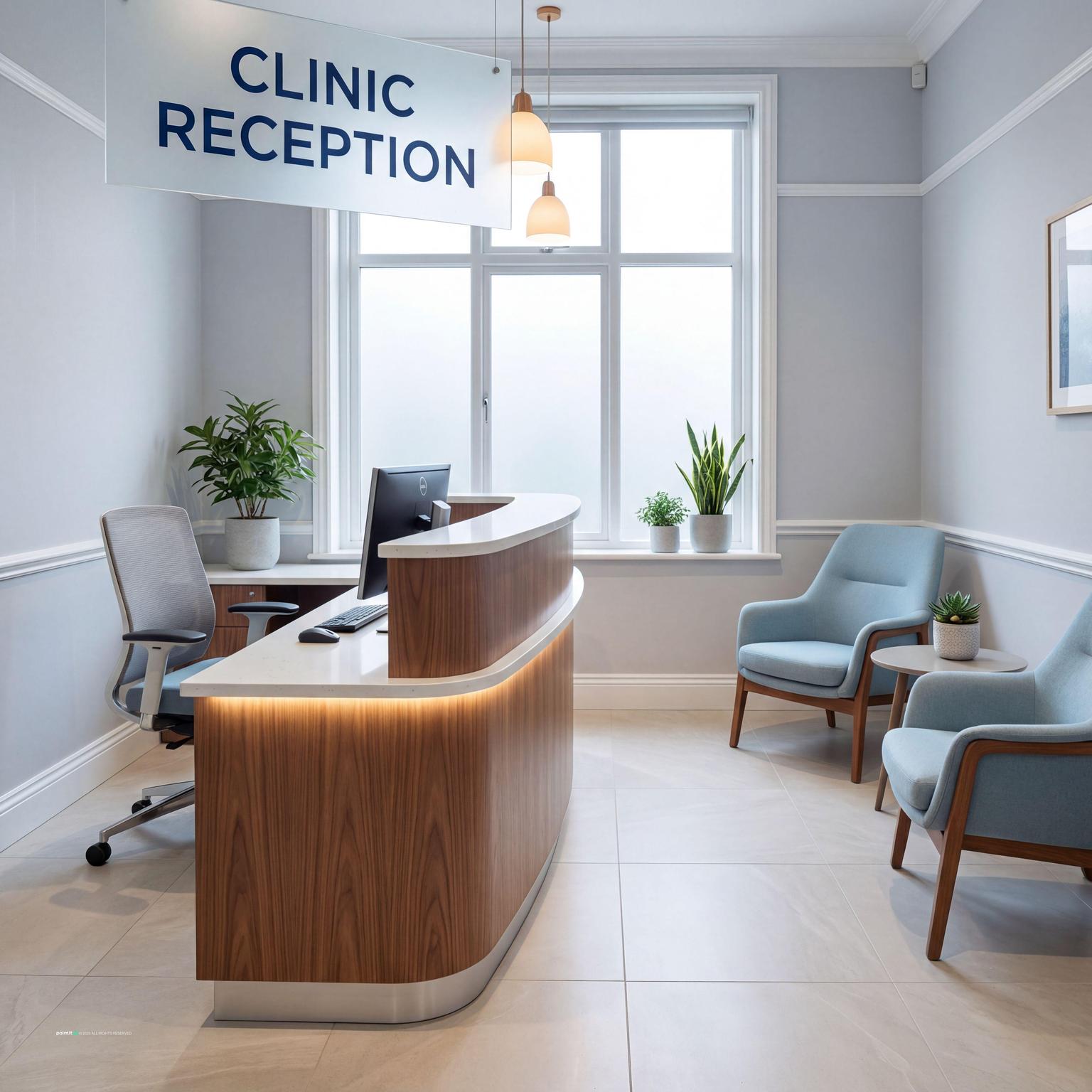
Design the prescription pickup area so staff can make eye contact and have a short, meaningful exchange. Use lower counters and a neutral backdrop to prioritize interpersonal connection and privacy.
-
Dedicate a spot for changing thematic displays on topics like immunization, nutrition, or mental health. Equip it with brochures or QR codes for deeper resources, showing commitment to holistic well-being.
-
Engaging visuals and bite-sized tips encourage passersby to pause and learn, distinguishing your space as a wellness destination.
Pharmacy layout: zones that serve different customer needs
-
Fast purchase zone: Keep high-frequency categories visible and easy to reach near the entrance. Customers buying basics should not need to cross consultation or prescription queues.
-
Prescription and consultation zone: The prescription counter should be visible, but conversations need acoustic and visual privacy. A semi-private consultation corner with soft panels, clear signage, and comfortable lighting helps customers ask sensitive questions.
-
Wellness and discovery zone: Vitamins, skincare, wellness products, and seasonal displays can sit along slower browsing paths. Use lower displays and clear category signs so customers can scan options without asking staff for every item.
-
Waiting and accessibility: Provide a small seating area where space allows, keep aisles clear for mobility aids, and avoid narrow pinch points near the counter. Lighting should feel clean without glare.
-
How Paintit.ai helps: Upload a photo of a pharmacy, consultation corner, counter area, or retail aisle to app.paintit.ai and test shelving, lighting, material, and layout directions in 1-2 minutes. Free to start.
Related design tools
Tools for pharmacy layouts, consultation zones, shelving concepts, and wellness retail planning.
FAQ
-
Customer flow, clear wayfinding, privacy for consultation, clean product display, counter visibility, comfortable lighting, and accessible shelving are the main priorities. The space should feel trustworthy, calm, and easy to navigate.
-
Place quick-purchase categories near the front, prescription and consultation areas deeper in the plan, and high-need products on clear routes. Keep the counter visible without making waiting customers block browsing aisles.
-
Soft whites, warm neutrals, pale greens, muted blues, and natural wood tones work well because they signal cleanliness without feeling harsh. Use color coding sparingly for wayfinding and product categories.
-
Yes. Upload a photo of a pharmacy, consultation corner, counter area, or retail aisle to app.paintit.ai and test shelving, lighting, material, and layout directions in 1-2 minutes. Free to start.