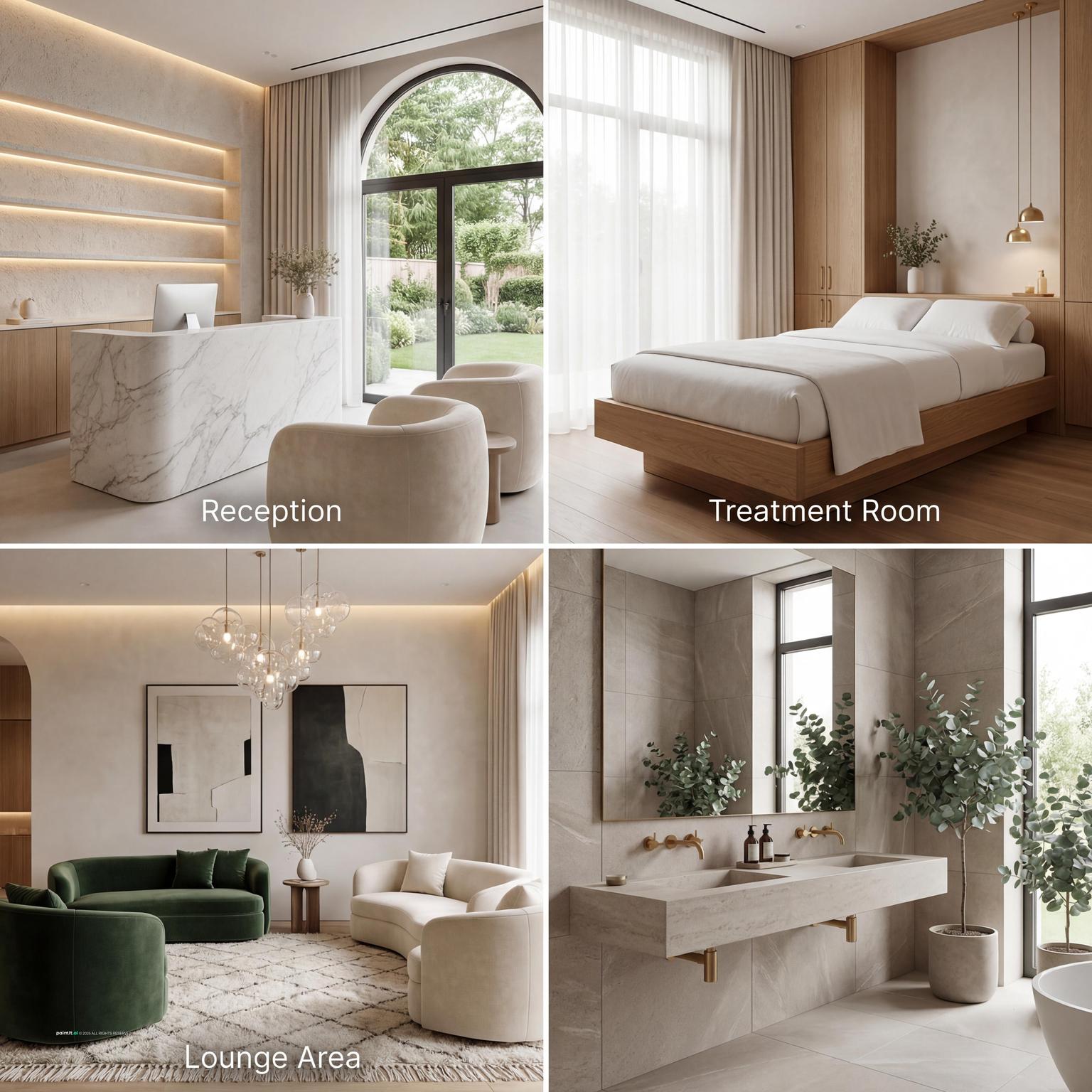
Med spa interior design ideas: reception, treatment rooms, and clinical hospitality
Stepping into a med spa should feel like an escape into tranquility. The right interior design can transform a regular spa visit into a rejuvenating experience. In this guide, you’ll find med spa interior design ideas that blend style and functionality to create a serene haven for your clients.
Key design decisions for a med spa interior
The most common mistake in med spa design is treating the entire space as a uniform spa. Each zone has a different functional brief and a different emotional register.
-
Color palette
Neutrals are the practical foundation for med spa interiors - warm whites, soft greige, cream, taupe, and stone tones. They signal cleanliness without feeling clinical, and they allow brand colors and materials to stand out rather than competing with the wall color.
Current direction: cream-on-cream is giving way to layered neutrals with depth - soft whites paired with olive, clay, or taupe accents. This reads as more considered than stark white while maintaining the calm register clients expect.
Avoid stark cool white in reception and waiting areas. Reserve it for treatment rooms where medical precision is expected. In reception, warm light over a neutral wall creates a very different impression than the same wall under fluorescent lighting.
-
Materials
Reception area: materials that signal quality at first contact - fluted timber, travertine, reeded glass, polished stone. A single showstopper, such as a sculptural reception desk, a designer pendant, or a feature wall, anchors the brand identity.
Treatment rooms: cleanability is the primary requirement. Minimal-seam surfaces for counters and floors, wipeable upholstery, and no porous materials near clinical work areas. Warmth comes from lighting temperature and soft textile accents rather than from the surface materials themselves.
Throughout: matching material language between spaces creates cohesion. If travertine appears in reception, echo it in bathroom surfaces. If timber wainscoting runs through the corridor, continue it into treatment room doors.
-
Furniture
Reception seating should be comfortable enough for a 15-20 minute wait, clean-lined enough to photograph well, and professional enough to support the brand aesthetic. Plush velvet chairs or structured upholstered benches work better than casual lounge furniture.
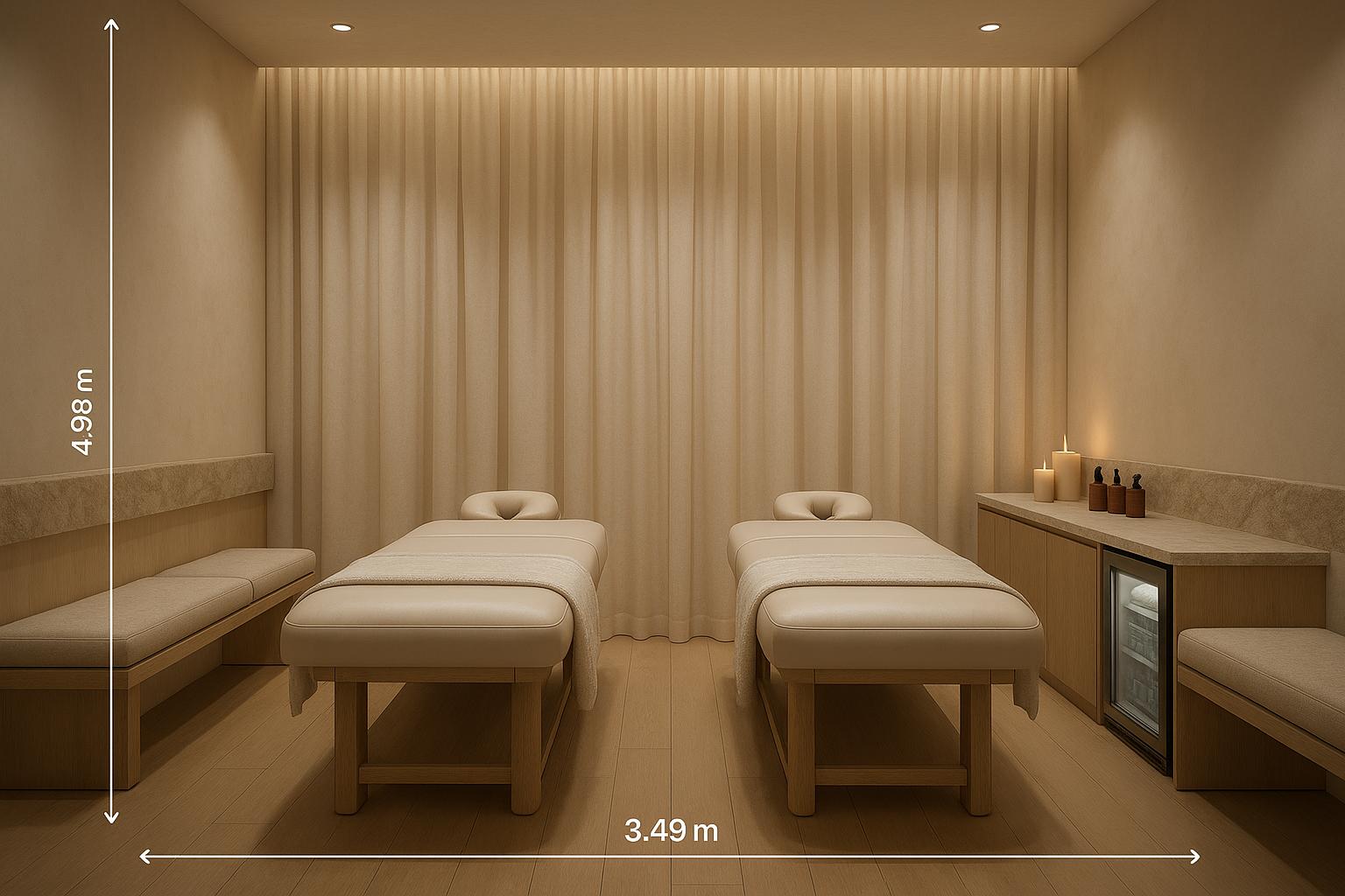
Treatment rooms: the treatment table is the primary furniture investment. It should be height-adjustable, with cleanable upholstery in a color that complements the room palette. Storage should be built-in or concealed so clinical supplies stay out of view.
Retail display: if the med spa retails products, dedicated display shelving near checkout - well-lit and organized by category - converts naturally from the service experience to product purchase.
-
Lighting - the zone-specific approach
Reception and waiting area: warm LED at 2700-3000K, soft and diffused. Clients should feel flattered by the lighting, not exposed by it. Wall sconces, pendant lights, and concealed cove lighting create depth without harsh shadows.
Treatment rooms: bright, cool lighting at 4000-5000K for clinical accuracy during procedures. Pair it with dimmable warm lighting before and after the treatment so the transition is not jarring.
Corridors: medium brightness, warm tone. Clients move through corridors between zones; the lighting should maintain the calm established in reception rather than switching abruptly to clinical brightness.
Stunning Examples of Key Design Elements for Med Spa Interior Design Ideas
-
Successful med spa design works as a sequence of spaces - each zone prepares the client for the next phase of the experience. Reception creates the first impression and establishes the brand identity. The corridor or transition zone maintains calm during movement. The treatment room delivers the experience itself. The recovery or checkout moment wraps the visit. These examples show how material, lighting, and layout choices work together across all four zones.
-
Spatial Layout
-
The arrangement of space in med spa interior design plays a crucial role. The design must support a coherent progression that guides clients from entry points to service zones while maintaining their privacy and comfort. Strategically placed partitions within open spaces enable the creation of personalized zones while maintaining an expansive atmosphere. Implement a strategic distribution of shared spaces alongside private treatment rooms to address diverse client requirements. Every space needs a definitive function which its design must articulate through a unified story, be it for consultation, waiting, or treatment purposes.
-
Patterns and Motifs
-
The integration of tranquility-evoking patterns and motifs stands as a fundamental requirement in med spa interior design. Complex soft patterns with organic shapes subtly affect mood states by providing calming and relaxing sensations. Earthy and muted colors are excellent choices, reflecting a connection with nature. To create an organic atmosphere in your space, integrate motifs featuring natural elements such as wood and stone. These design elements need to remain subtle while enhancing complexity, integrating visual appeal with cognitive relaxation principles.
-
Art and Accessories
-
Art and accessories serve as vital accents within med spa interior design, adding character and elegance. Artworks should reflect themes of serenity and health, encouraging introspection and comfort. Accessories, on the other hand, can include natural elements like plants or water features that introduce nature’s soothing qualities into the space. Thoughtfully chosen embellishments can transform a sterile environment into an engaging, serene oasis that reinforces the brand’s ethos.
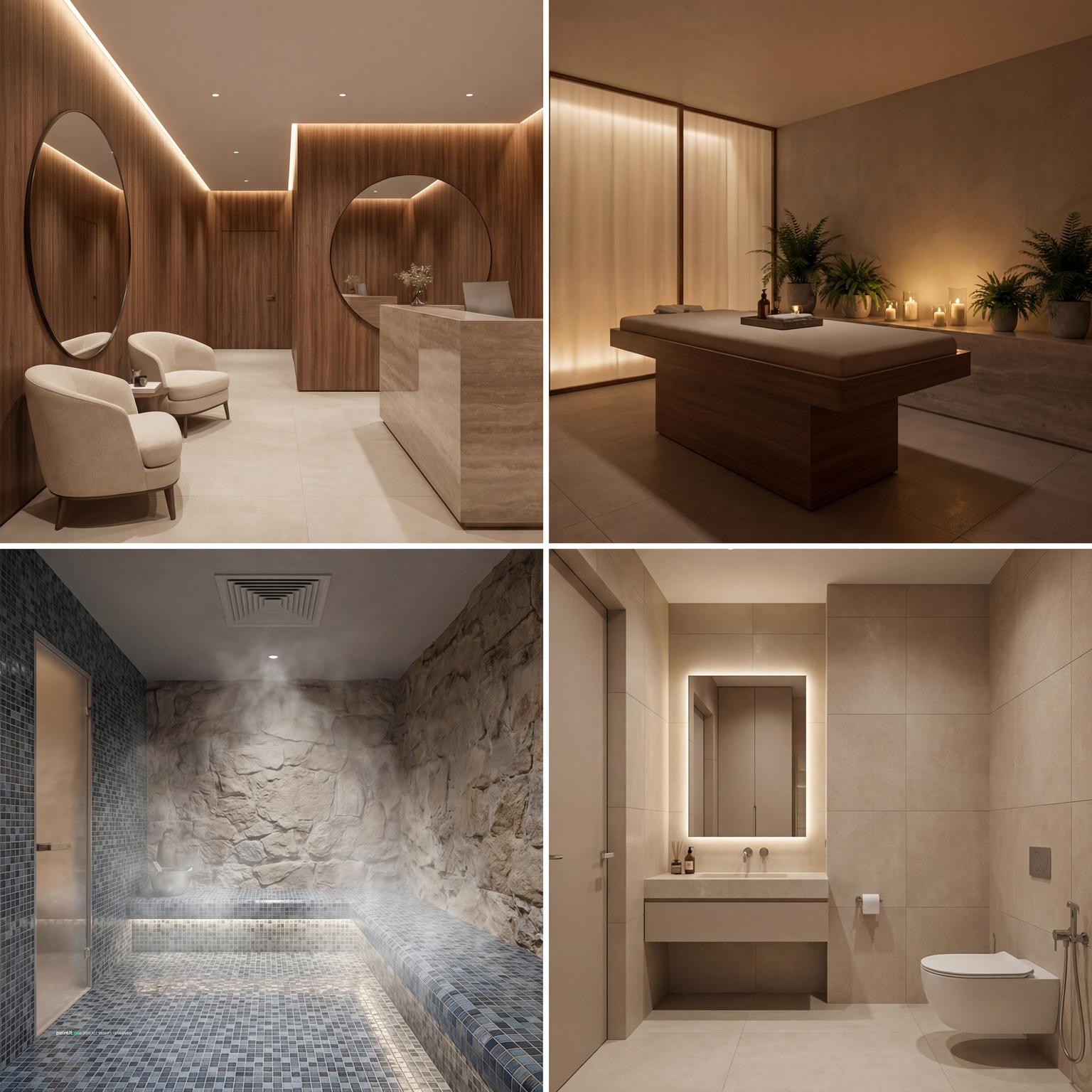
Med spa zone planning - the four-space sequence
Reception and lobby: first impression, brand identity, and emotional de-escalation. Goals: instant sense of calm, clear check-in process, comfortable seating without crowding, and one intentional statement piece.
Transition spaces: corridors and changing areas should continue the same material language as reception. This is where artwork, product signage, and small branded moments work well without competing with treatment rooms.
Treatment rooms: clinical function comes first: cleanable surfaces, adjustable lighting, adjustable table height, and adequate storage that keeps supplies out of view. Acoustic privacy is non-negotiable.
Checkout and retail: this zone should feel efficient without feeling abrupt. Well-lit retail display between the treatment corridor and the exit performs better than display near the waiting area.
Upload a photo of your reception or treatment room to app.paintit.ai and test different material combinations, color approaches, and lighting directions in 1-2 minutes. Free to start.
Related design tools
Tools for med spa concepts, reception planning, treatment rooms, and fast room visualization.
FAQ
-
Start with zone planning, not aesthetics. Map the four zones - reception, transition, treatment rooms, and checkout - and define the functional brief for each before choosing materials or colors. Treatment rooms need bright lighting, cleanable surfaces, and acoustic privacy; reception needs warmth and hospitality.
-
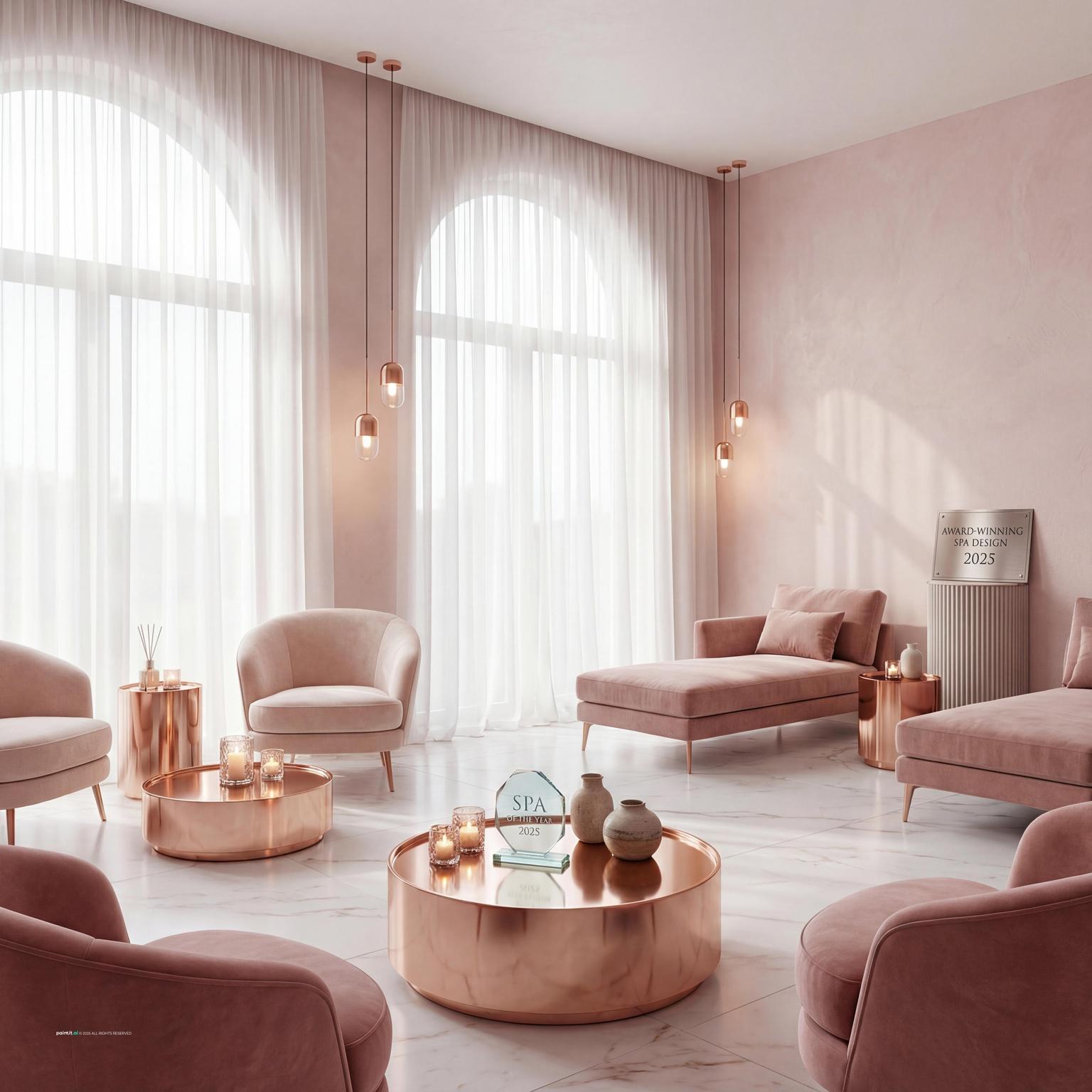
One strong identity signal at the first touchpoint does more than scattered decoration. A sculptural reception desk in fluted timber, travertine, or polished stone; a signature fragrance; or a single bold artwork creates immediate differentiation and trust.
-
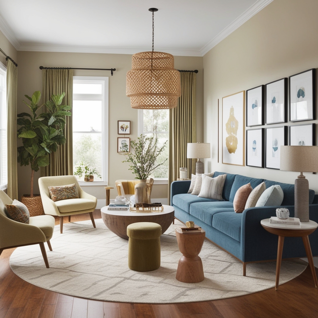
Warm neutrals - soft white, cream, warm greige, taupe, and stone - are the most reliable foundation. Add depth through texture rather than loud color. If you use color, keep it as one accent: sage green, dusty rose, warm terracotta, or deep teal.
-
Yes. Upload a photo of your reception area or treatment room to app.paintit.ai and test different material combinations, palette directions, and lighting approaches in 1-2 minutes. Free to start.