Liquor store interior design ideas: layout, display, and atmosphere
A liquor store has a dual design brief: make it easy to find what you came for, and make it easy to discover something you did not know you wanted. Both goals require deliberate layout decisions, not only attractive aesthetics.
The 17 ideas below cover the atmosphere and design elements that define compelling liquor store interiors. After the list, there is a practical layout guide covering shelving decisions that affect sales directly: product placement heights, premium display positioning, and aisle flow.
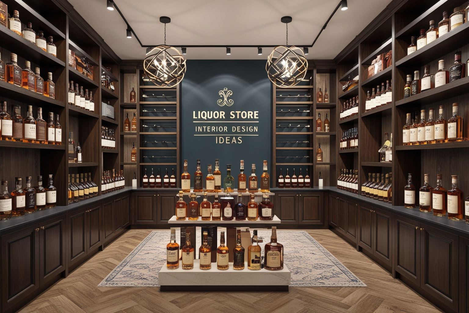
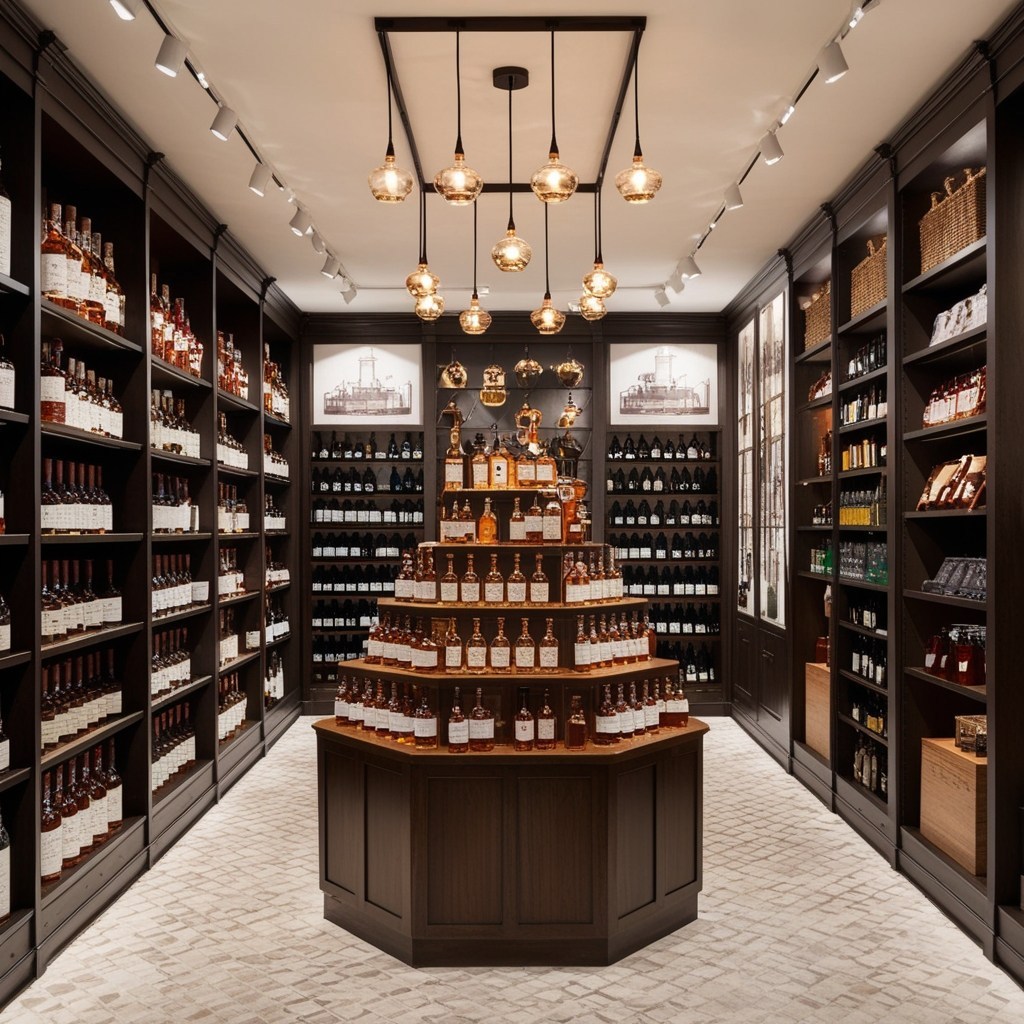
Essential Tips for Inviting Spaces: 17 Liquor Store Interior Design Ideas
-
1. Warm Wood Accents
Nothing calms quite like the grainy textures and sandy hues of natural wood. From honey-toned shelving to rustic wall cladding, integrating organic finishes encourages guests to slow down and appreciate the finer details. The old-world charm creates a homey, unpretentious vibe—much like that friend who always remembers your favorite drink. Have you noticed how a walnut counter can make even a Tuesday bottle feel like a celebration?
-
2. Statement Lighting Fixtures
Lighting is mood. Try soft pendants over tasting counters or LED strips tracing bottle-lined walls. Modern chandeliers can add playful drama; vintage bulbs evoke a secret speakeasy. Years ago, I spent an hour longer than planned in a tiny shop in Prague, partly due to the amber glow alone. Shape the journey with illumination, and customers will linger.
-
3. Feature Wall Murals
Dare to go bold with oversized graphics—think swirling vineyards, city skylines, or even abstract bottle silhouettes. Well-placed murals invite selfie moments and soften utilitarian layouts. Plus, they’re conversation starters. “Did you see the hand-painted whiskey barrel?” becomes tomorrow’s recommendation.
-
4. Flexible Modular Shelving
Bid farewell to identical row formations. Modular components enable display updates to showcase seasonal highlights and curated selections. Envision adaptable programming: today focuses on Spanish reds while tomorrow transforms into a gin festival featuring mini-bottle pyramids. Adaptable spaces generate curiosity which drives repeated visits.
-
5. Hidden Nooks for Tasting
It’s about discovery, not only purchase. Little alcoves or tucked-away counters beckon patrons to pause. Pour a sip; share a story. I remember stumbling upon a velvet-chaired corner at a neighborhood spot—my impromptu wine flight tasted better as a tiny adventure, not simply a sample.
-
6. Statement Entryways
First impressions set the tone. Bold doorways, custom signage, or even an eye-catching threshold mat can make that step inside feel intentional. What welcomes your customers—a brass handle, etched glass, hand-painted floor tiles? Sometimes joy starts as you arrive.
-
7. Artful Bottle Displays
Why not turn inventory into installation art? Suspended bottle racks, floating shelves, or color-gradient arrangements catch the eye before even reading a label. been drawn in by an ombré wall of riesling and rosé? That’s the magic of thoughtful display.
-
8. Cozy Lounge Corners
Invite guests to stay awhile. Soft seating, stacked with design books or curios, provides connection points for new favorites, tastings, or conversations with staff. Community builds between the shelves—not only at the register.
-
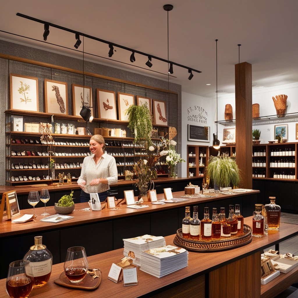
9. Spotlight on Producers
Feature dedicated spaces for local makers—chalkboards sharing stories, portraits, or digital screens looping short interviews. Shoppers engage differently when they know the faces and families behind the flavors. It’s about connection, not only consumption.
-
10. Digital Price Tags & Info Panels
A well-placed touchscreen or smart tag lets curious browsers dive deep without hunting for an employee. Display tasting notes. Suggest pairings. Trigger a tiny video (silent, on loop) showing the orchard where the apple brandy began life. Tech, with a personal touch.
-
11. Natural Greenery
Add real plants—potted olive trees, trailing vines between shelves, tiny cacti at checkout. Nature counterbalances the otherwise stacked and structured product lines. There’s something honestly relaxing about choosing your bottle surrounded by a little living green.
-
12. Tasteful Signage and Wayfinding
Guide, don’t overwhelm. Tastefully hand-lettered tags or subtle arrows help newbies find their way. Create branded wayfinding (“This way to the coolers!”) or fun category markers (“Belgian Abbey — Heaven in a Bottle”). Every small detail diminishes decision fatigue.
-
13. Sensory Experience Zones
Don’t underestimate the power of scent or touch. Sample aroma jars: citrus peels, toasted oak, wild herbs. Invite customers to explore textures—wax-sealed corks, metallic foils, the soft crinkle of a craft label. Shopping isn’t just visual.
-
14. Creative Use of Color
Break out of beige. Daring wall colors, jewel-toned ceilings, or even painted floors can guide traffic flow and create moods. A wash of emerald behind your sparkling selection, or blush pink for rosés—emotion on the walls can energize even the smallest space.
-
15. Personalized Chalkboards or Letter Boards
Daily specials? New arrivals? Quotes about the joys of a well-crafted nightcap? A rotating message board injects warmth and wit. The best ones become small rituals—people peeking round just to see today’s pick or playful pun.
-
16. Open-Concept Fridge Displays
Instead of hiding cans and chilled bottles behind frosted glass, bring them out front in see-through refrigerators or built-in alcoves. Accessible, visual, and easy to restock.
-
17. Artistic Point-of-Sale Counters
Make the checkout moment special, not an afterthought. Upcycled barrel staves, gemstone countertops, or mosaic tiles make even the most transactional part of the experience memorable. A well-designed counter says, “We care—right to the very end.”
17 liquor store interior design ideas
-
A well-designed liquor store guides customers through a discovery pattern: enter, orient, browse the everyday selection, notice premium displays, discover something unexpected, and make a more considered purchase than originally planned. These examples show how layout, lighting, and product display decisions create that pattern in practice.
-
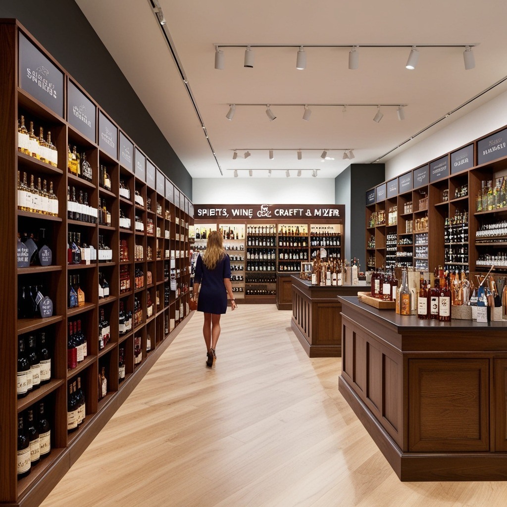
Smart Space Planning is the backbone of any effective layout. Start with your customer’s path: is it intuitive? Wide aisles (always wider than you think) create ample room for browsing without bumping elbows. Zones for spirits, wine, craft beer, and mixers guide both seasoned aficionados and curious newcomers alike. I've seen shops, big and small, use “island” shelving to anchor the main passageways—placing bestsellers and staff picks at eye level for easy access. Imagine where you’d pause for a closer look; that should be where your focal displays land.
-
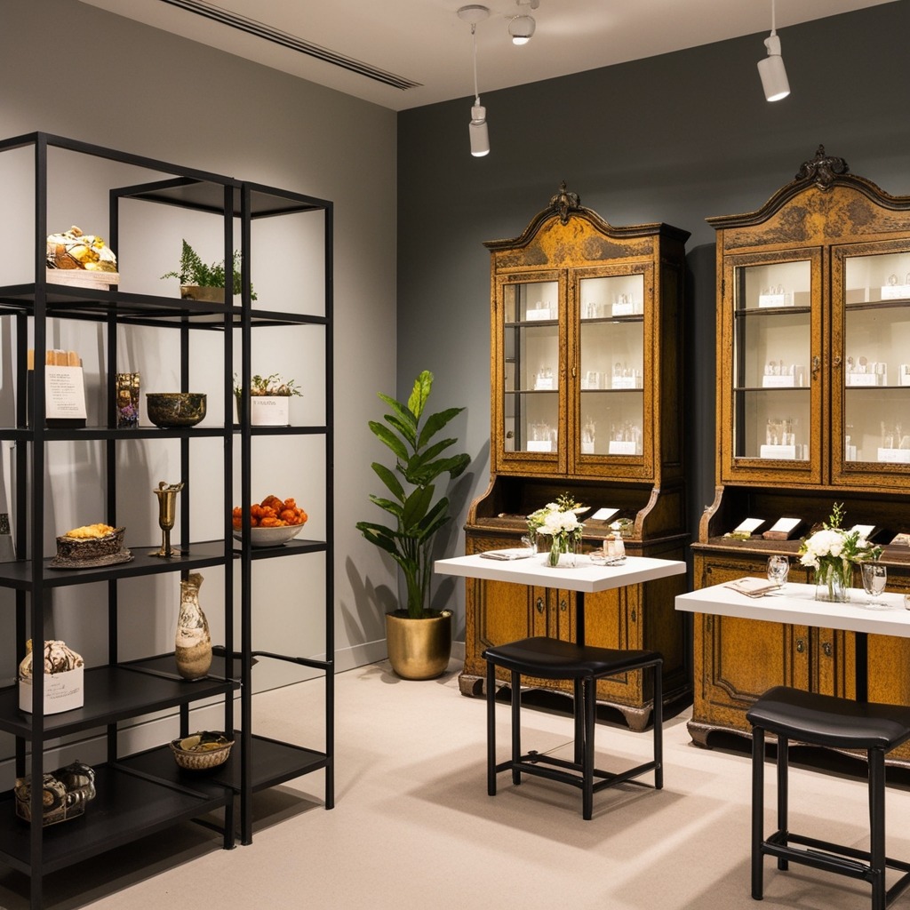
Multifunctional Furnishings earn their keep by blending form and utility. Consider modular shelving systems—easy to swap, restock, or expand as trends shift. Some shop owners I know repurposed antique cabinets as both display and tasting stations; guests lingered longer, drawn by that unexpected blend of nostalgia and function. Even simple stools or benches create pop-up spaces for quick chats or sampling events (plus they’re back-savers for tired staff).
-
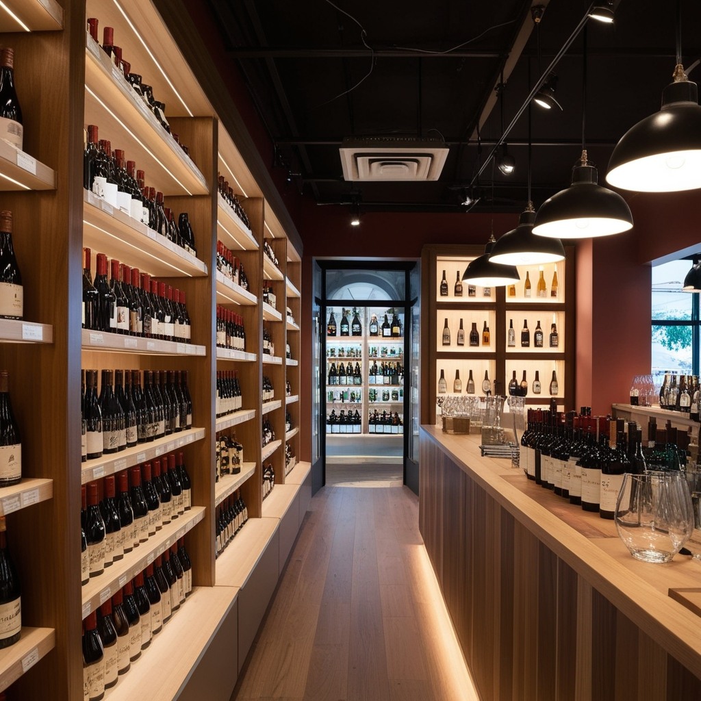
Layered Lighting does wonders. There’s real beauty in softly lit shelving, accent spots highlighting rare labels, and a warm, welcoming glow at entrances. Overhead fixtures can sometimes cast harsh shadows, so supplement with LED strips tucked beneath shelves or pendant lamps above tasting bars. Does your store’s lighting showcase the rainbow of bottles, or are gorgeous glass details hidden in the gloom?
-
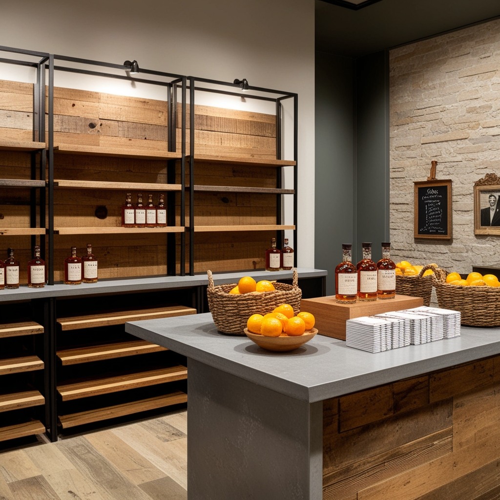
Texture and Contrast bring subtle luxury to retail spaces. I’m a fan of mixing materials: reclaimed wood, raw metal racks, polished stone counters. These tactile elements quietly echo the story of the spirits themselves—crafted, aged, and bottled with care. Even baskets of citrus or stacks of recipe cards invite touch and curiosity. Don’t be afraid to add a quirky vintage photo, or even a chalkboard for weekly staff picks. Visual and tactile interest keeps shoppers exploring longer.
-
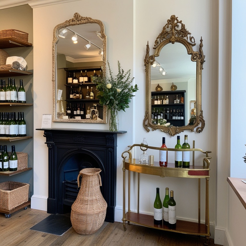
Smart Sourcing and Styling Rules keep things both personal and professional. Where do local shop owners find their fixtures? Often at flea markets, auctions, or architectural salvage (that patinated brass rail? It started as a fireplace insert). Mix old and new: clean-lined shelving alongside statement antique mirrors. Remember, a little restraint goes a long way—edit decor with the same care as curating bottles. Ask yourself, “Does this support the story I want to tell, or distract from it?”
-
Lastly: every store develops its own rhythm and soul. Whether you’re just sketching out ideas or hunting for that oddly perfect centerpiece, embrace the playfulness. Your vision matters here—and if you’re wondering whether your unique style will connect, trust that it can. After all, the best spaces are those that invite guests to linger, discover, and feel right at home. Let your imagination pour as generously as your favorite single malt.
Liquor store layout: the decisions that affect revenue
-
Aesthetics matter, but the layout decisions below have more direct impact on sales than any decor choice.
-
Eye level is buy level
The optimal product placement height is 47-62 inches from the floor. Reserve it for high-margin spirits, premium wines, and seasonal products. Lower shelves work for heavy bottles and value brands.
-
Premium display near checkout
High-price bottles near checkout, ideally in a locking display case with dedicated lighting, catch customers when their wallet is already out. This can support impulse sales in the $50-$200+ range.
-
Aisle width
Use 36 inches minimum for single-person aisles and 48 inches for comfortable two-way traffic. Wider aisles feel more premium but reduce total shelf capacity.
-
Tasting station placement
If regulations permit tasting, position the station near the store midpoint. It increases dwell time and exposes more customers to discovery products.
-
Backlit shelving
Warm LED backlighting or side-lighting makes bottle colors vivid and labels easier to read, especially for premium whiskey, gin, and tequila collections.
-
How Paintit.ai helps
Upload a store photo to app.paintit.ai and test lighting, colors, and shelving configurations in 1-2 minutes.
Related design tools
Tools for commercial store redesign, tasting areas, and store concept comparison.
FAQ
-
Strong layout fundamentals matter most: high-margin products at eye level, premium bottles near checkout with dedicated lighting, and clear category organization for regulars and first-timers. Tasting stations and local producer spotlights build loyalty.
-
Use clear signage, an attractive entry, and visible interior from the street. Inside, add memorable displays such as a bottle wall, mural, or tasting corner. Regular events generate repeat visits.
-
Organize by category first, then sub-category, then price point. Put everyday brands at accessible eye-level positions, premium products in spotlight displays, and chilled products in the cooler section.
-
Yes. Upload a photo of your store to app.paintit.ai and see lighting, color, and display directions in 1-2 minutes. Useful before renovation or shelving investment. Free to start.