10 min. reading
Yulii Cherevko
CEO paintit.ai
The difference between an average AI image and a believable interior concept usually comes down to realism control. In Paintit.ai, that means using stronger material language, better lighting logic, tighter constraints, cleaner furniture density, and more deliberate prompt structure. This guide shows how to make interiors look more grounded, more premium, and more usable.
Realism is not only about image quality. It is about whether the room still behaves like a real room.
A realistic interior usually feels believable because the design choices support the architecture, the furniture fits the space, the surfaces make sense together, and the lighting feels physically plausible. Many weak AI images fail not because they are ugly, but because they feel too random, too glossy, too cluttered, or too detached from the original room.
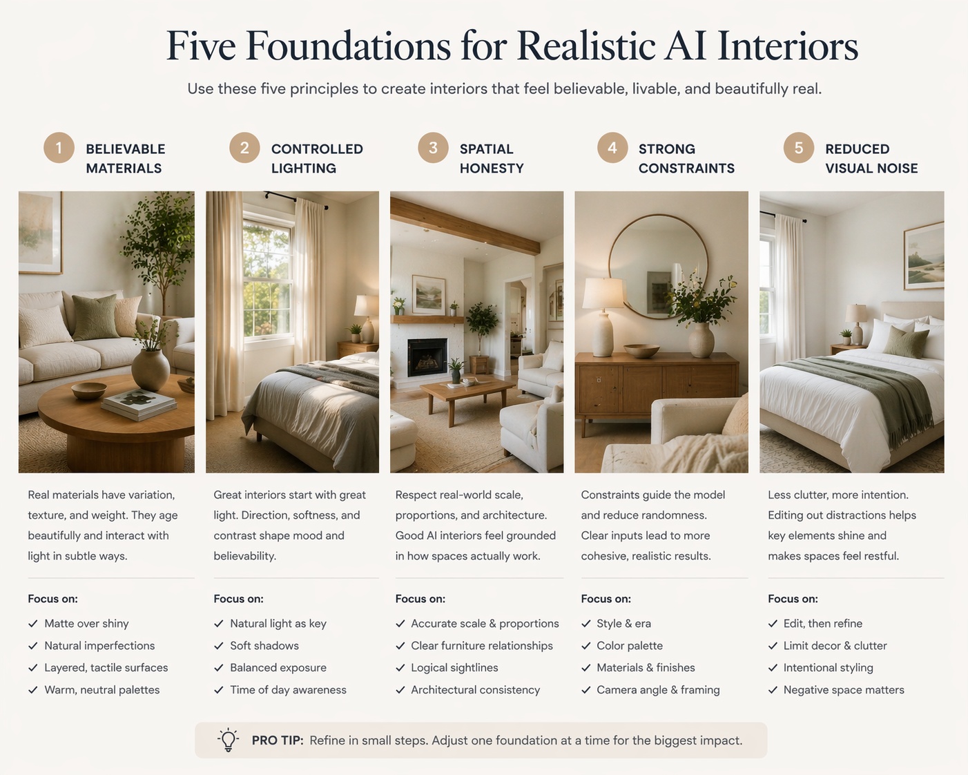
Believable material family — surfaces feel like they belong together.
Controlled lighting — the room has readable natural or artificial light logic.
Spatial honesty — furniture scale, layout, and circulation still make sense.
Constraint discipline — important room facts are preserved when needed.
Reduced visual noise — fewer random details and less accidental styling chaos.
If even two of these break badly, the result often starts to feel fake.
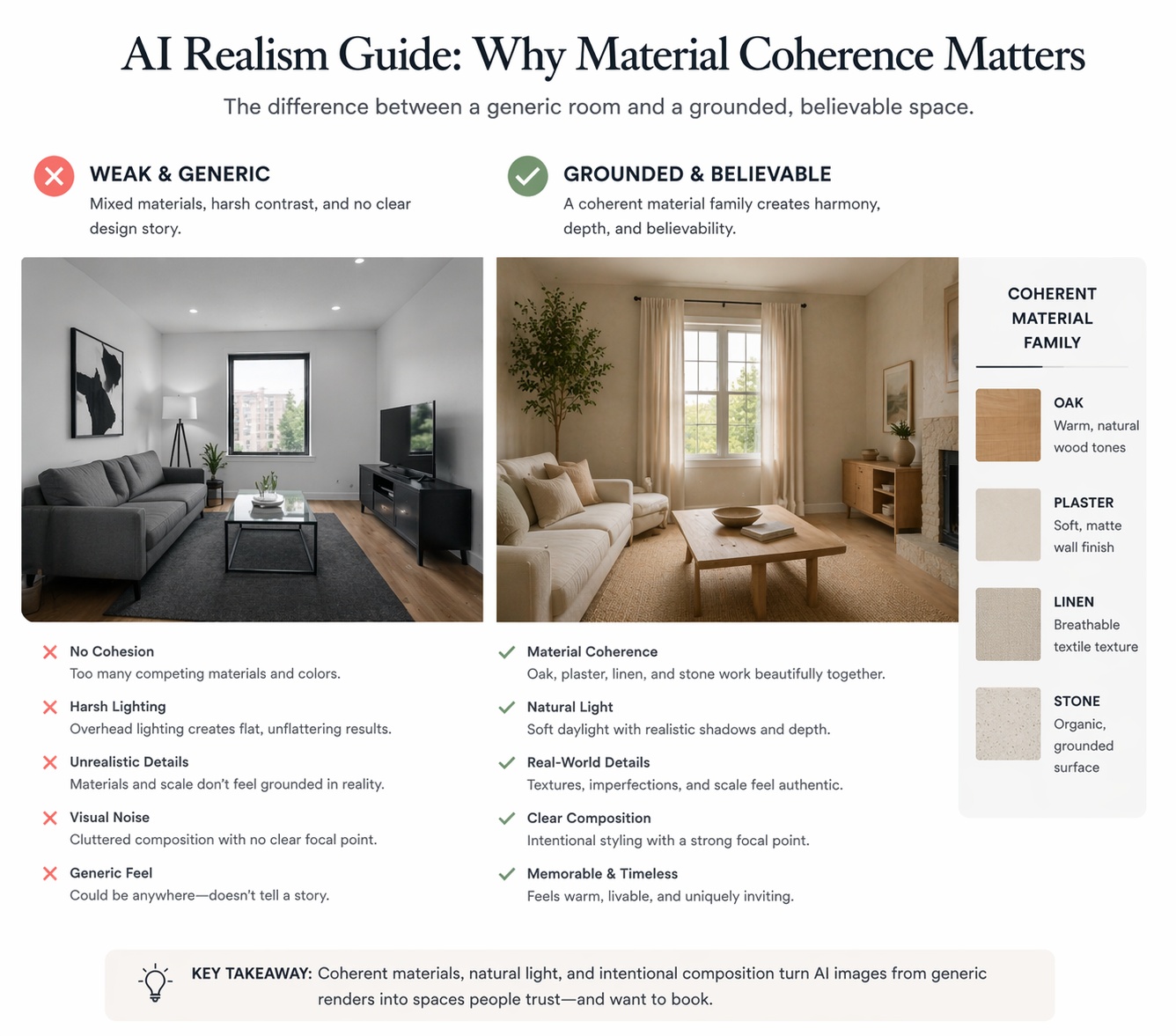
“Modern” is weak. “Warm oak, beige plaster, linen, and light stone” is much stronger.
One of the fastest ways to improve realism is to stop relying on vague style labels alone. Style words can help, but material language usually does much more of the realism work.
They control texture — matte plaster feels different from glossy marble.
They control tone — light oak, travertine, black metal, and linen create a more grounded system than “luxury modern.”
They reduce ambiguity — the model has clearer visual instructions.
They improve consistency — the room starts to feel designed as one material family instead of many random surfaces.
A useful rule is this: if the room still feels too AI-generated, strengthen the material system before adding more decor.
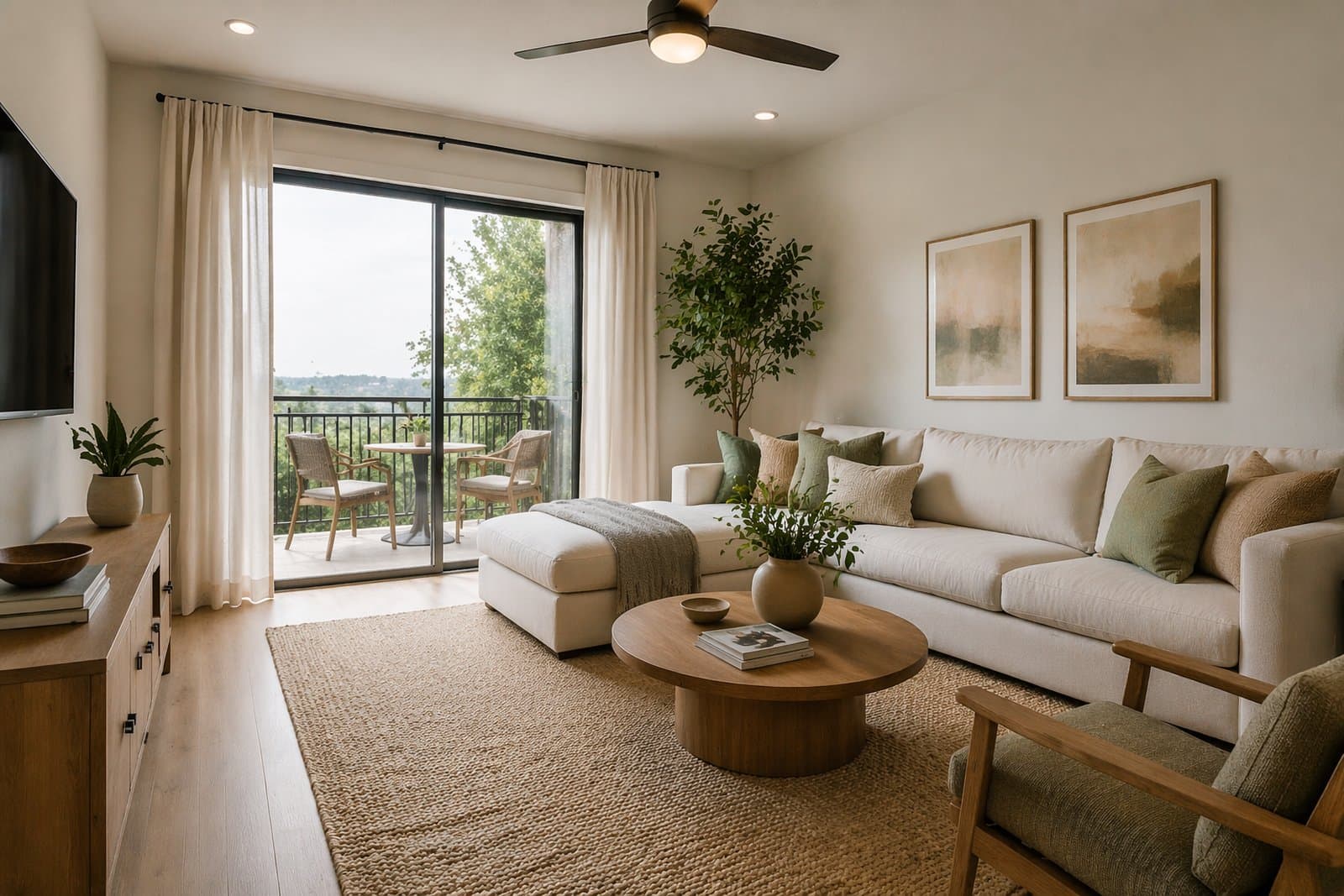
Light oak, warm walnut, soft beige plaster, brushed metal, linen, travertine, stone-look surfaces, matte finishes, restrained black accents, and calm textile layering usually produce more believable results than generic “luxury” wording.
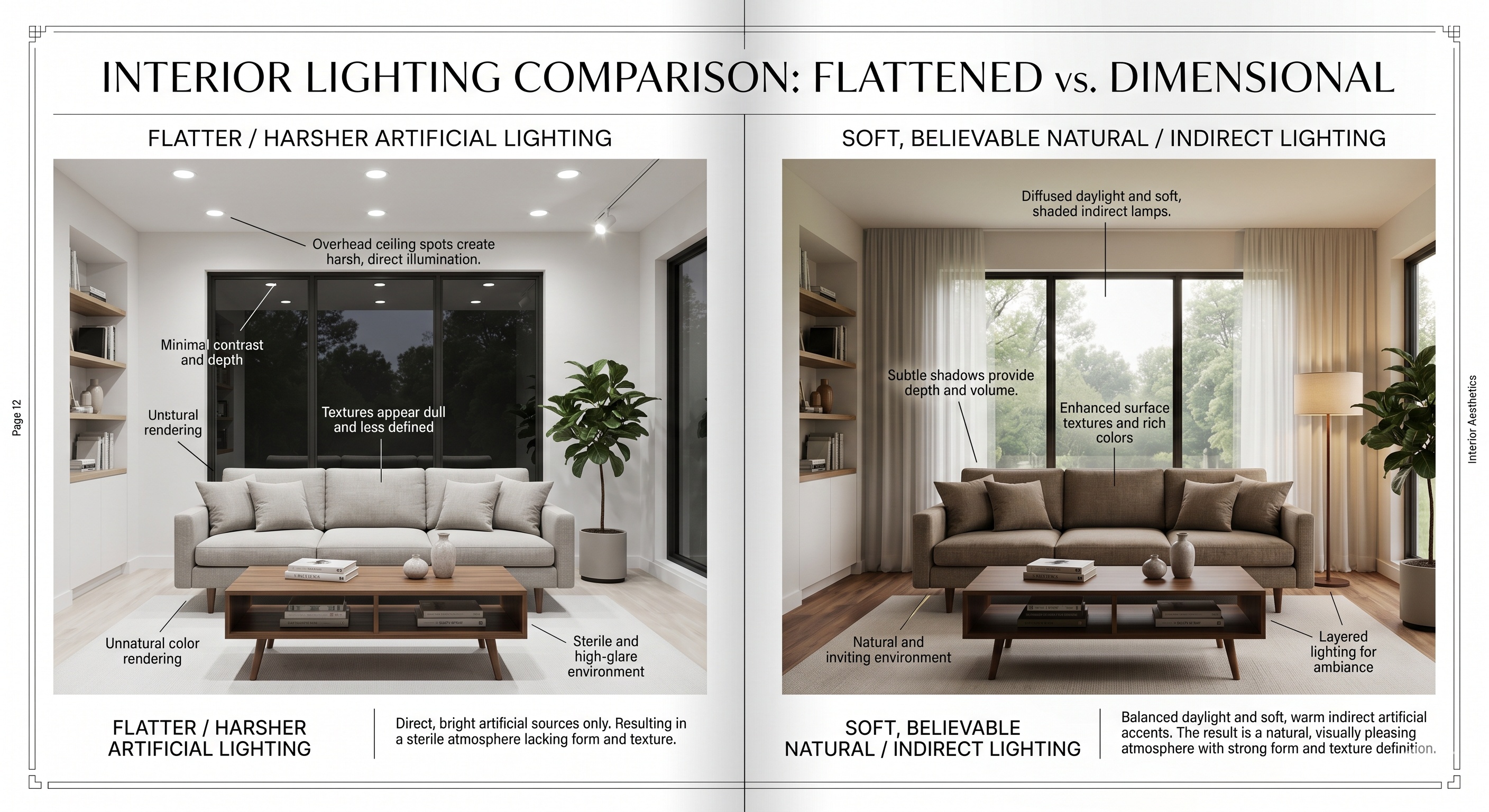
Lighting is one of the fastest ways to make a room feel either believable or artificial.
Many weak AI interiors fail because the lighting feels too generic, too sharp, too flat, or physically unclear. Paintit.ai usually responds better when the light is described as a real condition, not just as brightness.
Soft natural daylight — clean, believable, broadly useful.
Bright airy daylight — good for listings, rentals, and clearer room readability.
Warm diffused evening light — good for softer premium mood.
Soft indirect lighting — strong for bathrooms, bedrooms, and refined modern interiors.
Layered ambient lighting — useful when the room should feel more premium but still realistic.
Avoid overly theatrical light language unless the goal is editorial mood. For realism, subtle light logic usually wins.
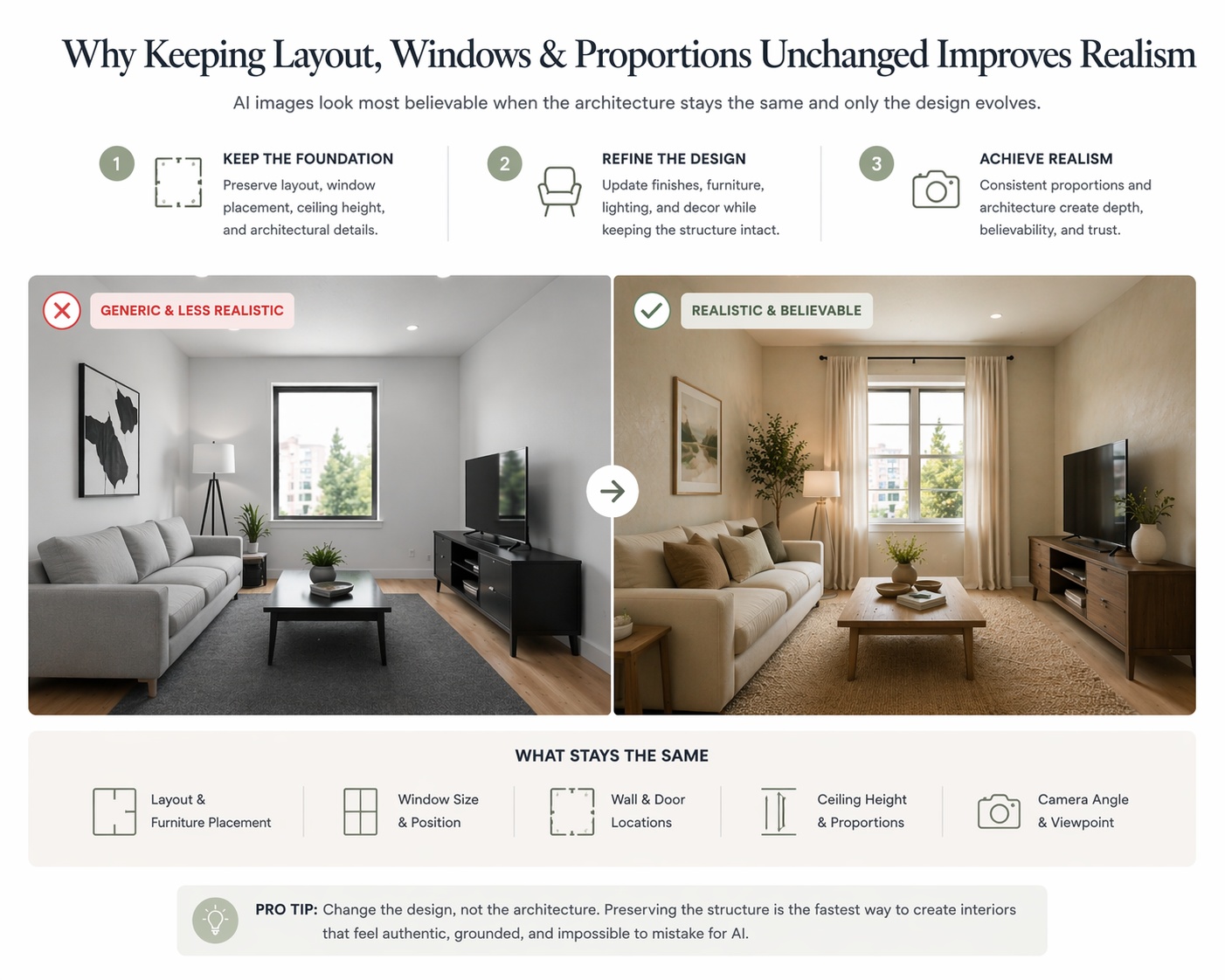
If realism matters, the model needs to know what it is not allowed to break.
Strong constraints are one of the most underrated tools in Paintit.ai. They help preserve the original room logic while still allowing style, material, and mood changes. Without constraints, even a good prompt may drift into less usable results.
Keep the room layout unchanged.
Preserve the architecture and proportions.
Keep windows and openings in their original positions.
Keep the wet-zone layout unchanged.
Do not change the structure of the room.
Constraints work especially well when you want to upgrade the room without making it feel like a different space.
The more the original room matters, the stronger the constraint language should be. This is especially important for real estate, rentals, renovations, and client-facing work.
Fake-looking results usually come from excess, not from lack.
When an image feels too AI-like, the problem is often too many small details, too many competing materials, too much decoration, too much shine, or too much change happening at once.
Material overload — too many finishes in one room weakens coherence.
Styling clutter — random decor often makes the image less believable.
Over-glossy surfaces — too much shine often reads as synthetic.
Mixed style language — conflicting furniture identities reduce realism.
Over-ambitious prompts — asking for too many changes in one pass often destabilizes the result.
A practical realism habit is to simplify first, then refine. Reduction usually improves believability faster than addition.
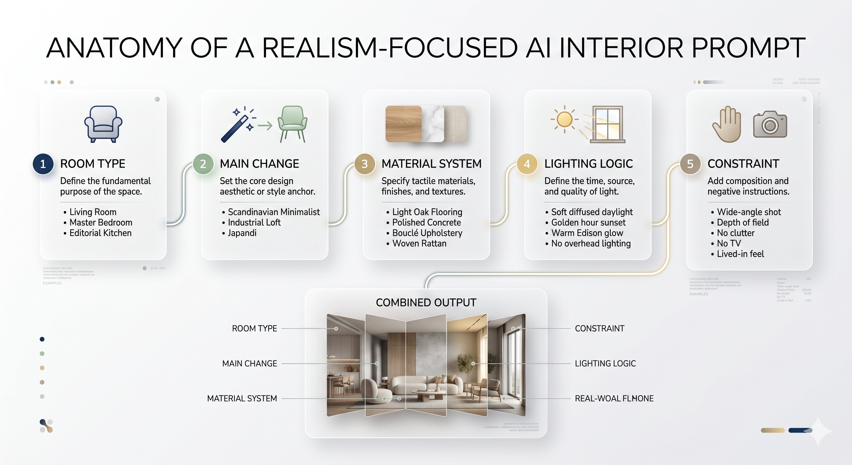
The strongest realism prompts define room type, material family, light behavior, and control in one system.
If the goal is a believable interior, the prompt should help Paintit.ai build a grounded material and lighting logic, not only a stylistic identity.
[Room type] + [Style direction] + [Main change] + [Material system] + [Lighting logic] + [Constraint]
Room type — living room, bedroom, bathroom, kitchen, office, exterior, commercial zone.
Main change — redesign, repaint, furnish, refine, refresh, clarify, soften.
Material system — choose 2 to 4 materials that feel coherent together.
Lighting logic — describe how the light behaves, not just how bright it is.
Constraint — define what should stay structurally true.
Example of a stronger realism prompt:
Transform this living room into a warm organic modern interior with a neutral sofa, soft beige plaster walls, light oak details, a textured stone coffee table, and diffused natural daylight. Keep the room layout, windows, and architecture unchanged.
This works because it builds a realistic system instead of only naming a style.
Use these as copy-ready starting points when realism and architectural honesty matter most.
Living room realism upgrade
Transform this living room into a calm warm interior with a neutral sofa, light oak details, soft beige plaster walls, restrained styling, and diffused natural daylight. Keep the room layout, windows, and proportions unchanged.
Bedroom realism upgrade
Redesign this bedroom with a centered bed, layered soft neutral textiles, warm wood accents, gentle natural light, and a calm believable atmosphere. Preserve the room structure, windows, and circulation.
Bathroom realism upgrade
Refine this bathroom with soft beige stone surfaces, frameless glass, restrained fixtures, indirect warm lighting, and a clean premium spa-like atmosphere. Keep the wet-zone layout and fixture positions unchanged.
Kitchen realism upgrade
Refine this kitchen with warm oak cabinetry, a light stone countertop, integrated appliance treatment, soft daylight, and a restrained premium material system. Keep the kitchen layout, sink position, and room structure unchanged.
Reference-led realism upgrade
Use this reference for the material palette, mood, and light softness only. Apply that realism to my room without copying the exact composition. Keep the room layout, windows, and architecture unchanged.
Best practice: if the room still feels too AI-generated, reduce clutter and strengthen the material-lighting system before changing the style again.
These are the small technical moves that often make AI interiors feel much more convincing.
Rooms usually feel more believable when the material family is tight and controlled.
If the room feels fake, it is often because the styling is too busy or too random.
Use phrases like soft natural daylight, diffused morning light, or warm indirect lighting instead of generic brightness.
Preserving layout, windows, and proportions usually makes the concept feel more trustworthy.
First get the material and light system right, then refine furniture or decor. Layered realism works better than one overloaded pass.
In most cases, realism improves when the room feels calmer, clearer, and more physically plausible.
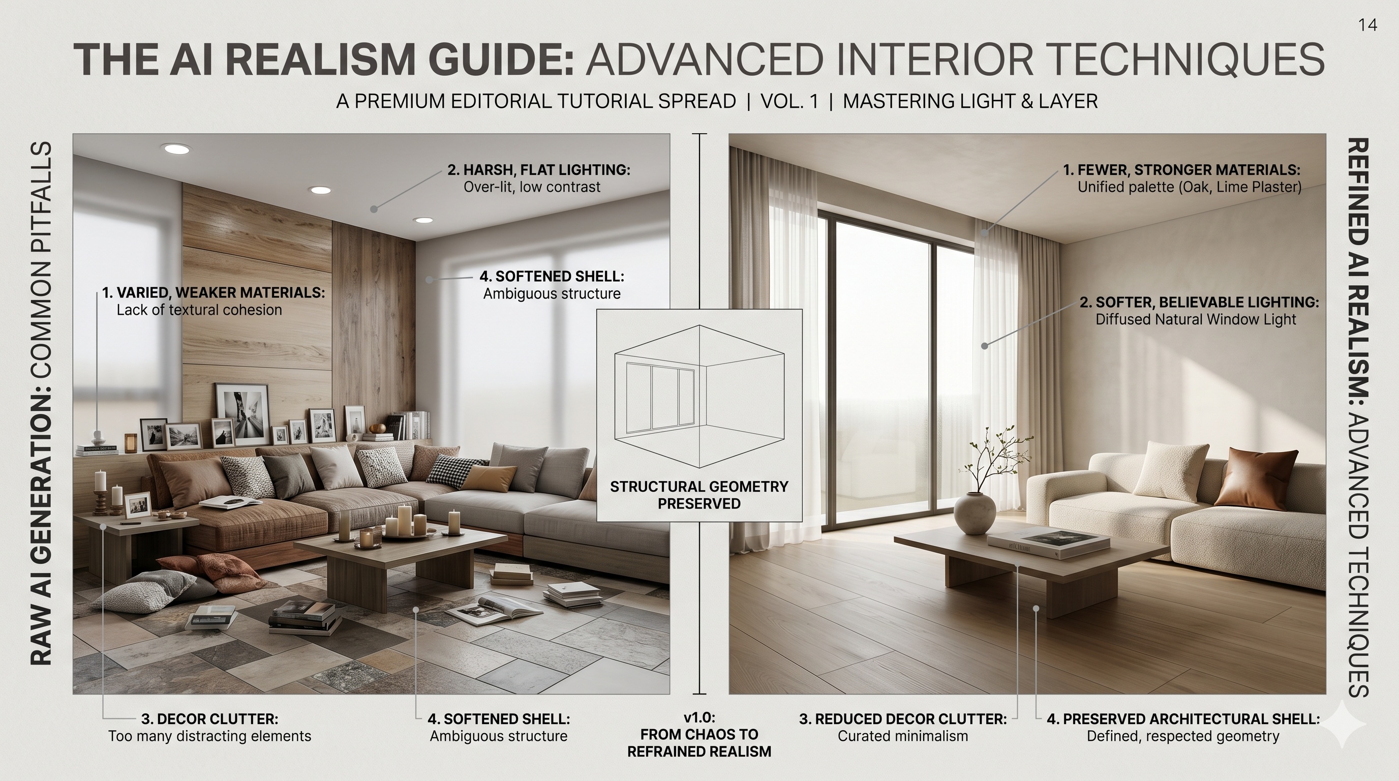
Use stronger material language, softer and more believable lighting logic, and tighter structural constraints.
Usually because they have too much visual noise, too many mixed materials, weak spatial control, or unrealistic lighting.
For realism, usually yes. Material language often grounds the image more effectively than generic style words alone.
If realism matters, very often yes. Preserving the shell usually makes the result feel more believable and usable.
Soft natural daylight, diffused light, warm indirect light, and layered ambient light usually work better than generic brightness language.
Trying to make the room more impressive by adding more visual information instead of making the room more coherent.
Use stronger materials, better light language, and cleaner constraints to make your Paintit.ai results feel more believable from the start.


