6 min. reading

Yulii Cherevko
CEO paintit.ai
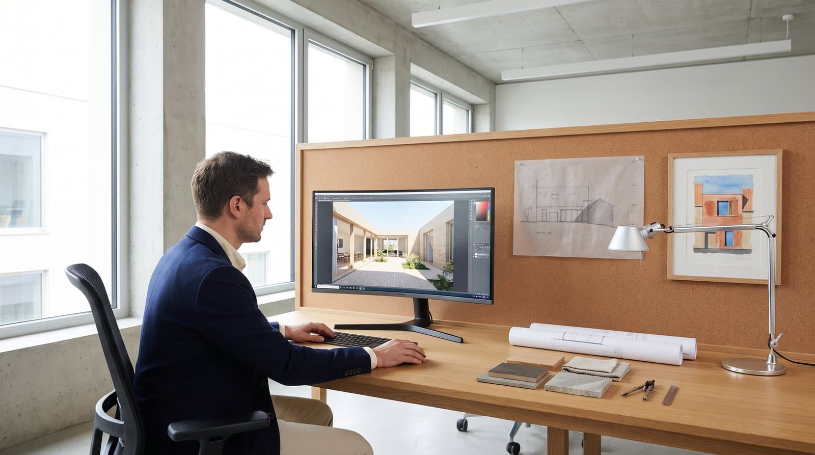
Architectural rendering styles are visual treatments used to communicate a proposed building or interior before it is built. Photorealistic images show materials and light as convincingly as possible. Clay renders isolate form. Sketches keep a concept visibly open to change. Watercolor, collage, and illustration can communicate atmosphere without pretending that every finish has been selected.
The best style is not automatically the most realistic one. It is the style that helps a particular audience make the next decision. A client reviewing massing needs a different image from a buyer comparing finished apartments, and a planning discussion may need a clear contextual view rather than a dramatic sunset scene.
The terms are often mixed together, but they answer different questions. A rendering type identifies what is delivered or how the project is viewed. Examples include an interior perspective, exterior perspective, aerial view, rendered plan, section, animation, panorama, or interactive walkthrough. A rendering style describes how that view looks: photorealistic, clay, sketch, watercolor, collage, or another visual treatment.
One image therefore has both a type and a style. You might commission a watercolor exterior perspective, a photorealistic interior still, or a clay axonometric. Keeping the two labels separate makes a brief more precise and prevents a conversation about visual mood from replacing the practical choice of view.
When people compare the types of architectural rendering, they may be asking about either axis. Terms such as interior, exterior, aerial, section, and animation identify the output. Terms such as photorealistic, sketch, clay, and watercolor identify its appearance.
No. Architecture render styles describe methods of representation. The phrase architecture rendering styles refers to the same visual treatments, not to the design language of the building. Modern, Georgian, Art Deco, Brutalist, and Mediterranean describe the building itself. A watercolor rendering can show a Brutalist museum, while a photorealistic rendering can show a Georgian house. Name the building language and the rendering treatment separately in a brief.
ArchDaily's overview of rendering techniques and styles shows how collage, sketch, hyperrealistic imagery, illustration, 3D model treatments, and mixed media can all represent architecture without serving the same communication goal.
| Style | Best Used For | What It Emphasizes | Main Risk |
|---|---|---|---|
| Photorealistic | Client approval, marketing, final presentations | Materials, light, landscaping, lived experience | Making unresolved choices appear final |
| Soft Photorealistic | Editorial presentations and residential concepts | Believable space with restrained contrast and detail | Looking washed out or generically styled |
| Clay or White Model | Massing, form, facade depth, early review | Geometry, proportion, shadow, openings | Flat lighting that hides the form |
| Hand-Drawn Sketch | Concept workshops and early options | Ideas, movement, hierarchy, openness to change | An artificial filter over a finished render |
| Watercolor | Atmosphere, landscape, community presentations | Color, softness, place, emotional tone | Losing edges and spatial clarity |
| Architectural Collage | Competitions, cultural projects, concept narratives | Use, context, graphic identity, storytelling | Mismatched scale and perspective |
| Flat Illustration | Web, diagrams, public-facing explanations | Clear shapes, hierarchy, approachable communication | Flattening important depth cues |
| Painterly | Hospitality, residential mood, portfolio imagery | Atmosphere, texture, an authored visual voice | Style overpowering the architecture |
| Diagrammatic | Circulation, program, environmental strategy | Systems and relationships | Too many colors or competing messages |
| Mixed Media | Distinctive presentation boards and narratives | Contrast between precise and expressive information | Inconsistent visual language |
The different architectural rendering styles below borrow visual cues from photography, physical models, drawing, painting, or graphic design. The same families also apply indoors. Effective interior architectural rendering styles still depend on the purpose of the image, the maturity of the design, and the details that the audience needs to evaluate.
Most digital architectural rendering styles can now be produced with conventional 3D software, image-editing tools, AI-assisted workflows, or a combination of them. The production method matters less to the viewer than whether the image communicates the intended level of resolution honestly.
Photorealistic rendering aims to make an unbuilt space read like a plausible architectural photograph. Accurate material scale, convincing reflections, soft shadow transitions, camera height, exposure, landscaping, and small signs of use all contribute. The result is useful when the team needs to review finishes or when a completed design must be communicated to buyers, investors, or the public.
Realism should not be confused with certainty. If the stone, furniture, planting, or neighboring context is provisional, label it as illustrative. A polished image can lead viewers to assume that every visible decision has been approved even when the model is still schematic.

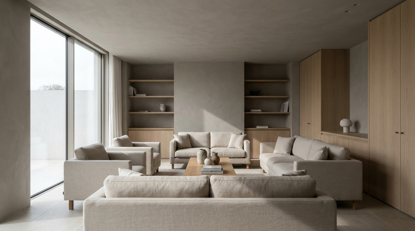
A soft photorealistic render remains believable but avoids the hard contrast, glossy surfaces, and cinematic drama associated with some marketing CGI. Diffuse daylight, restrained saturation, matte materials, and a small amount of depth haze produce a quieter image. This treatment is common in residential, hospitality, and editorial presentations where atmosphere matters but the architecture still needs to remain readable.
The weak version looks pale because the lighting has no direction. Soft does not mean flat. Window reveals, furniture edges, ceiling planes, and material junctions still need enough tonal separation to explain the room.
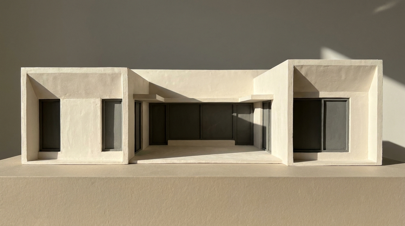
Clay and white model renders apply one neutral material across most of the scene so that form, proportion, openings, and shadow become the subject. They are useful for massing studies, facade development, interior volume, and early client review. A restrained ground plane or a second tone for glazing can improve legibility without turning the image into a material presentation.
The lighting carries most of the work. A clear directional source reveals depth at balconies, recesses, roof edges, and window openings. If ambient light fills every shadow equally, the model becomes a flat pale silhouette.
Sketch rendering communicates speed, exploration, and hierarchy. Loose line weight, selective hatching, and incomplete edges tell the viewer that the concept is still being tested. It suits design workshops, option reviews, early facade ideas, and conversations where a polished image could make temporary choices feel fixed.
A convincing digital sketch needs structural discipline underneath the looseness. Major edges should still agree with the perspective, and the darkest marks should guide attention toward the design idea. Applying a uniform pencil texture to a finished image usually produces noise rather than the logic of an actual drawing.
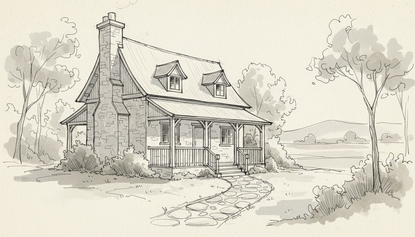
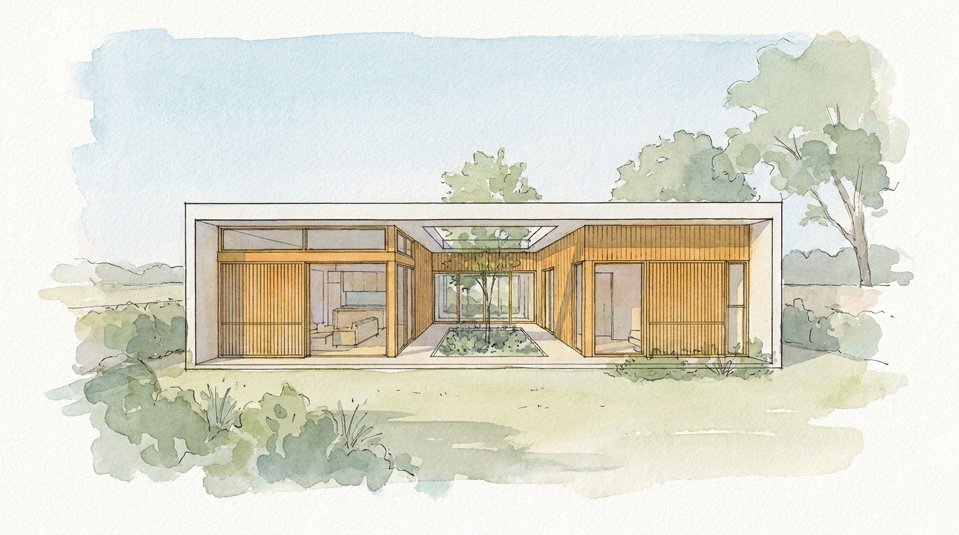
Watercolor uses translucent washes, softened edges, paper texture, and selective detail to describe atmosphere. It works especially well for landscape-led projects, small residential schemes, heritage settings, and public presentations where a gentler image can invite discussion. A few controlled edges around doors, roofs, or key sightlines keep the design legible.
The most common failure is making every surface equally wet, pale, and undefined. Reserve the lightest areas, build color in a limited palette, and keep one focal zone sharper than the rest. Trees and sky should support the building rather than dissolve it.
Architectural collage combines a modeled or drawn base with cut-out people, vegetation, textures, photographs, and graphic shapes. It can show occupation and social life without claiming photographic realism. The style is effective for competitions, cultural work, speculative proposals, and projects where the narrative matters as much as the facade.
Perspective, scale, light direction, and edge treatment still need rules. A figure with the wrong horizon line or a tree lit from the opposite direction can break the whole scene. Limit the number of texture families and decide which layer should feel precise: the architecture, the context, or the people.
Flat illustration reduces the scene to clean shapes, limited color, and controlled outlines. It can explain a proposal quickly on a website, presentation slide, public information board, or social post. It is also useful when a project needs a recognizable graphic identity across many images.
Depth must come from overlap, scale, value, and a few consistent shadows rather than detailed textures. Keep the palette small and reserve the strongest contrast for the area the viewer should notice first. If every object has an outline and a saturated color, the building loses hierarchy.
Painterly rendering uses visible brushwork, textured color, and controlled simplification. It can range from a restrained digital gouache treatment to a dramatic oil-painting look. The style suits hospitality, residential, cultural, and portfolio imagery when the goal is to communicate character rather than catalog every surface.
Architecture still needs to lead. Keep openings, floor levels, and important structural lines coherent, then allow sky, planting, reflections, and secondary surfaces to become more expressive. If brush texture covers everything equally, the image reads as an effect placed over a render.
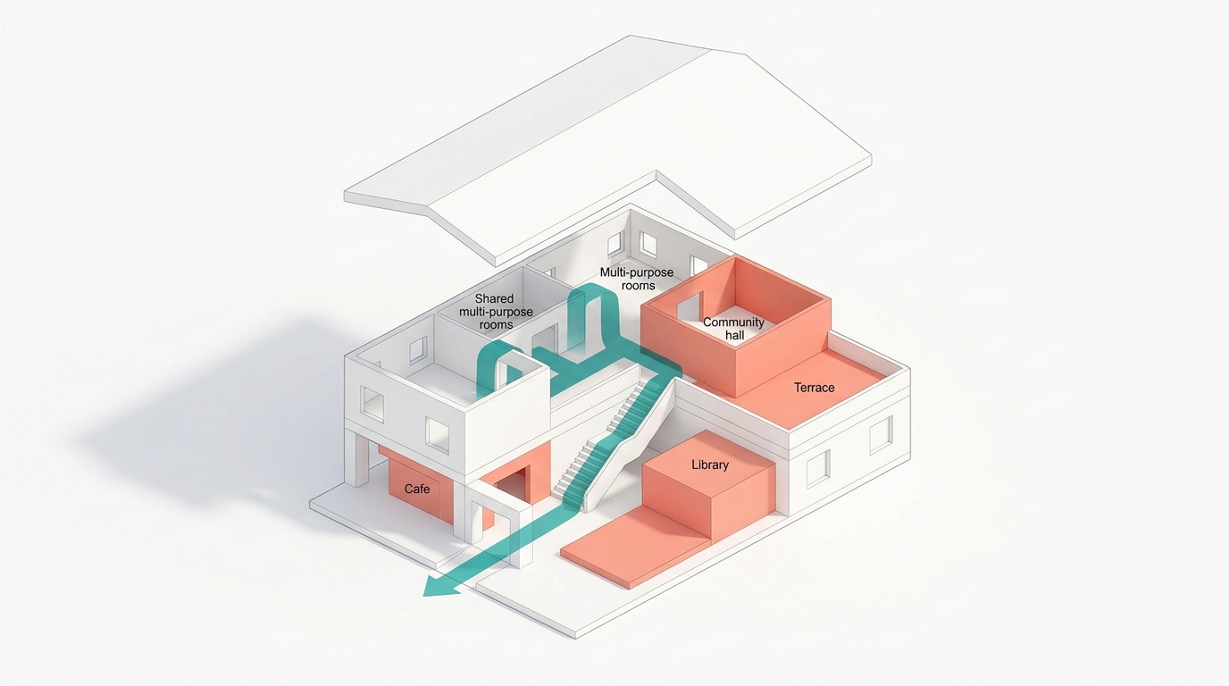
Diagrammatic rendering explains a system. Color, transparency, arrows, exploded layers, or simplified occupants can reveal circulation, zoning, daylight, program, structure, or environmental strategy. It is less concerned with what the final building will look like than with how one part relates to another.
One diagram should make one main point. A circulation diagram may include entrances and destinations, but it does not also need to explain structure, acoustics, water use, and every room finish. Use a restrained base model, one accent color family, and a short legend where the publishing format allows it.
Mixed media combines two or more visual languages intentionally. A precise line drawing may sit beneath watercolor planting, or a clay model may be placed into a photographic street context. This approach can distinguish proposed architecture from its surroundings or separate verified information from imaginative atmosphere.
Decide why the styles are being mixed before choosing them. The contrast should explain something, not simply make the image busier. Repeated edge quality, color grading, grain, and shadow direction help separate sources feel like one composition.
Start with the decision the image must support. Style follows that decision. A beautiful image that encourages feedback on the wrong issue can slow a project even if the rendering itself is accomplished.
| Project Stage | Useful Styles | What the Image Should Help Decide |
|---|---|---|
| Early Concept | Sketch, clay, collage, diagrammatic | Massing, program, circulation, design direction |
| Schematic Design | Clay, soft photorealistic, diagrammatic | Spatial relationships, facade depth, daylight approach |
| Design Development | Soft photorealistic, photorealistic, mixed media | Materials, furniture, landscape, key viewpoints |
| Planning or Community Review | Contextual photorealistic, watercolor, diagrammatic | Scale, site relationship, public use, access |
| Marketing and Sales | Photorealistic, soft photorealistic, painterly | Finished atmosphere, audience fit, lifestyle |
| Competition or Portfolio | Collage, mixed media, painterly, photorealistic | Narrative, identity, memorable project qualities |
Audience changes the choice as much as stage. A design team may read a clay axonometric immediately, while a homeowner may understand the same proposal faster through a softly realistic eye-level view. For an investor, the context, program, and likely user experience may matter more than experimental graphic language.
Time and source quality set practical limits. A photorealistic result is difficult to control when the only input is a rough massing screenshot and major materials are undecided. In that situation, a deliberate concept style is more honest and often more useful.
AI rendering can turn a model screenshot, sketch, or room photograph into several visual directions quickly. It is most useful for style exploration, mood studies, early options, and presentation development. It should not replace dimensional review or be treated as proof that a proposed detail can be built.
You can use the Paintit AI rendering tool to compare visual treatments from the same source image before committing to a longer production pass.
A fair style comparison uses the same source, camera, and crop. If one version adds larger windows, removes a column, or changes the roof, the team is no longer comparing presentation styles. It is evaluating several designs at once. Record the accepted geometry before generating alternatives and reject attractive images that quietly alter it.
For a more detailed realism workflow, the photorealistic architectural rendering guide covers source preparation, materials, lighting, iteration, and final checks.
A useful prompt names the subject and view before the visual style. It then describes materials, light, context, camera, and the elements that must remain unchanged. Avoid long strings of flattering adjectives. They provide less control than concrete visual instructions.
Practical prompt order: project and view, architectural facts, chosen style, material palette, lighting and weather, context, camera, composition, and exclusions.
Example: Exterior three-quarter view of a single-story courtyard house; preserve the flat roof, three window openings, central courtyard, and camera position; white clay architectural model style; matte warm-white surfaces and muted charcoal glazing; directional late-morning sun with readable shadows; simple ground plane; straight verticals; no people, text, added floors, changed windows, or fantasy landscaping.
Specific exclusions are useful when they protect the design. State that the output must not add windows, move doors, change the number of floors, alter the roofline, or replace fixed furniture. A request such as "make it stunning" does not provide the same constraint.
Detailed finishes encourage detailed feedback. If the team still needs agreement on volume or circulation, use clay, sketch, or diagrammatic views first. Move toward realism as decisions become more stable.
Watercolor is a rendering style. Mid-century modern is an interior or architectural design language. A prompt can combine them, but they control different things. Name both when both matter.
A daytime render and a dusk render are difficult to compare if the furniture, crop, planting, and facade materials also change. Keep the design fixed, then test light or treatment as a separate variable.
Fog, dramatic backlight, plants, and people can make an image feel complete while obscuring important edges. Review the clean model before adding entourage. If the building only works when half of it is hidden, the presentation needs another pass.
Generative images may change dimensions, structure, openings, furniture scale, or material behavior. Use them to communicate and explore, then check decisions against the coordinated model, drawings, product data, and project requirements.
Common architectural rendering styles include photorealistic, soft photorealistic, clay or white model, hand-drawn sketch, watercolor, collage, flat illustration, painterly, diagrammatic, and mixed media. Each can be applied to interior, exterior, aerial, plan, section, or axonometric views.
There is no single best style. Sketch, clay, and diagrammatic rendering are strong choices for early decisions. Photorealistic rendering is better when materials and context are resolved. Collage, watercolor, painterly, and mixed-media treatments suit projects that need a distinct narrative or gentler visual language.
Photorealistic rendering aims to resemble a believable photograph. Hyperrealistic rendering often pushes detail, sharpness, reflections, lighting, and atmosphere beyond an ordinary photograph for a more polished or dramatic result. In practice, the terms overlap, so a brief should describe the desired light, material finish, camera, and mood instead of relying on either label alone.
A soft rendering uses diffuse light, moderate contrast, restrained saturation, matte materials, and gentle depth transitions. It can remain realistic while feeling less commercial or dramatic than glossy marketing CGI.
Yes. A project may use clay studies for massing, diagrams for circulation, soft realistic images for client review, and polished photorealistic views for launch. Keep cameras and source geometry coordinated so the set still describes the same proposal.
AI tools can produce photorealistic, sketch, watercolor, clay, collage-inspired, and painterly treatments from a source image. Results still need review for geometry, scale, material behavior, and unintended changes. The source model or drawing remains the authority.
Start with the smallest set that answers the current questions. One exterior view may explain arrival, while an interior perspective and a section may be needed to understand the main space. Add views because they reveal new information, not because a presentation template has empty slots.
Architectural visualization works best when the treatment matches the project's level of resolution. Use loose styles to keep early questions open, analytical styles to explain relationships, and realistic styles when the audience needs to judge materials, light, context, or a finished atmosphere.
Before producing a full set, test two or three treatments on one controlled view. The comparison will show whether the team is responding to the architecture or merely to the mood of the image. Once the direction is agreed, carry the same camera logic, palette, and visual rules across the rest of the presentation.