9 min. reading
How to Visualize Commercial Spaces with Paintit.ai
Yulii Cherevko
CEO paintit.ai

Page Contents:
- 1. Why Commercial Spaces Need a Different Approach
- 2. What Makes a Strong Commercial Result
- 3. Zoning First, Brand Second
- 4. How to Build a Better Commercial Prompt
- 5. Commercial Prompt Cards
- 6. How to Compare Commercial Directions
- 7. Advanced Commercial Techniques
- 8. Frequently Asked Questions
- 9. Related articles
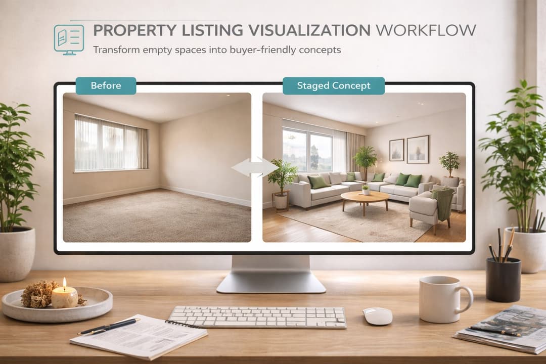
Commercial spaces are different from homes because design has to balance customer experience, brand identity, zoning logic, circulation, and operational realism. This guide shows how to create more believable office, retail, cafe, restaurant, showroom, and hospitality concepts in Paintit.ai.
Why Commercial Spaces Need a Different Approach
A commercial space is not judged only by beauty. It is judged by function, clarity, and business fit.
In residential rooms, the main question is often “Would I like to live here?” In commercial design, the question becomes more complex: “Does this space support the brand, the customer journey, the staff workflow, and the intended use case?”
What makes commercial design more technical
Zoning matters — entry, service, seating, product display, circulation, and waiting areas need a readable logic.
Brand fit matters — materials, colors, and atmosphere should support the business identity.
Capacity matters — furniture density and layout need to feel commercially plausible.
Operational realism matters — the space should look like it could really work for staff and customers.
This is why commercial prompts should be more purposeful than generic residential prompts. The space needs to communicate what it is for.
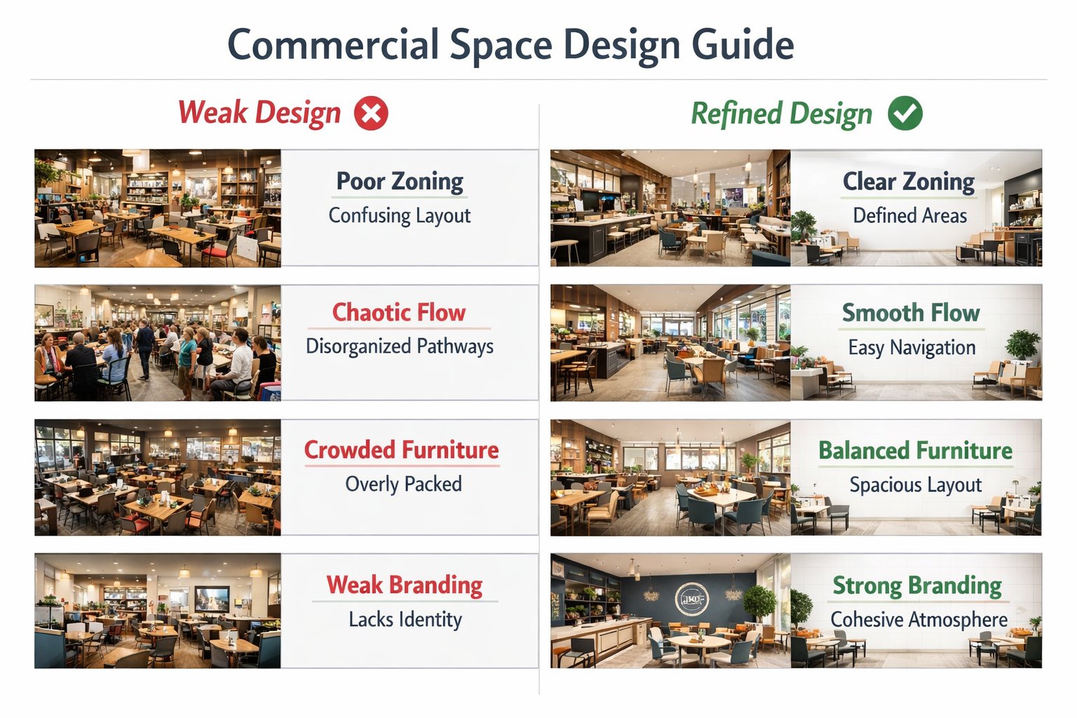
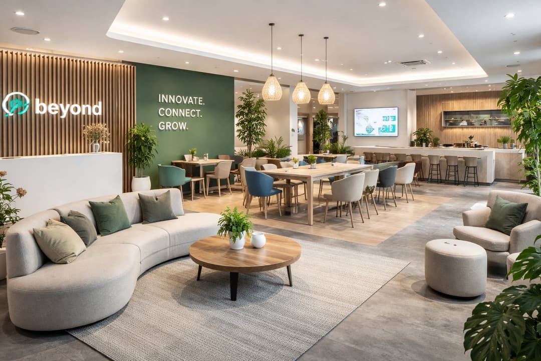
What Makes a Strong Commercial Result
The best commercial concepts feel branded, usable, and spatially organized.
A strong Paintit.ai commercial result should look like a real business environment, not just a beautiful room. People should be able to understand what happens there almost immediately.
A strong commercial result usually gets these things right
Clear space purpose — office, cafe, showroom, retail corner, restaurant, lounge, clinic reception, or hospitality zone.
Readable customer journey — you can intuit where people enter, sit, browse, order, work, or wait.
Believable furniture density — not too empty to feel fake, not too crowded to feel unusable.
Consistent brand atmosphere — materials, palette, and lighting feel aligned with the intended business identity.
Operational credibility — the design feels workable, not only decorative.
In commercial work, clarity is part of realism. If the room looks attractive but its purpose is unclear, the concept is usually weaker than it seems.
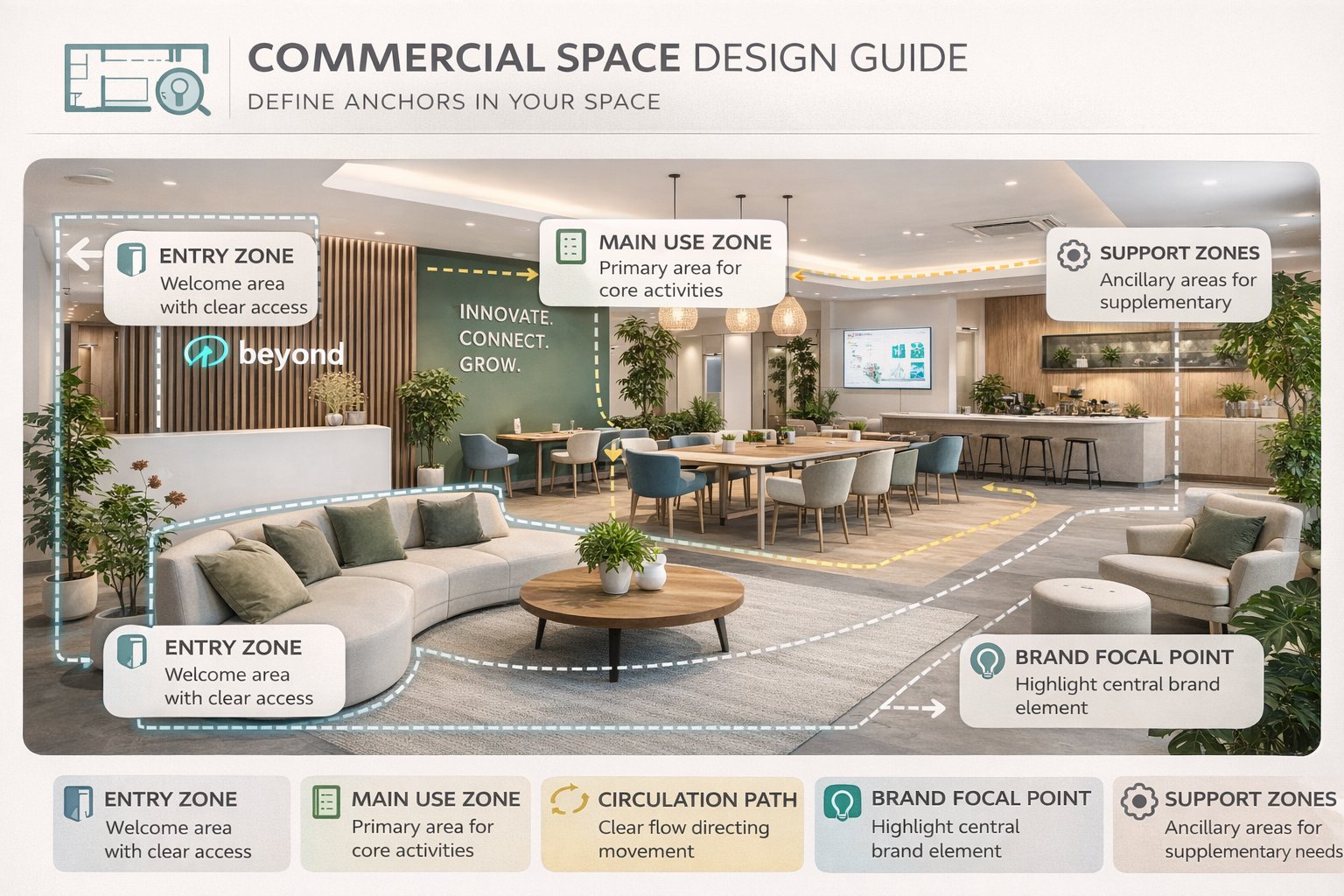
Zoning First, Brand Second
The most common commercial mistake is styling a space before organizing how it works.
Many users jump directly to tone of voice, colors, or materials. But for commercial spaces, the first question is usually: where does each activity happen? Once that is clear, the brand layer becomes much easier to control.
The 5 commercial anchors to think about first
Entry zone — where first impression and orientation happen.
Main use zone — seating area, product display area, workstations, service area, or consultation space.
Circulation path — how customers or staff move through the space.
Brand focal point — signage wall, hero product area, reception desk, or central visual anchor.
Secondary support zones — waiting, storage, counters, private corners, or transition areas.
If you define these anchors first, Paintit.ai is more likely to generate a space that feels commercially usable instead of just visually trendy.
Technical tip
In commercial work, it is usually smarter to describe the primary zone and brand mood first, then refine furniture density, display logic, and decorative layer later.
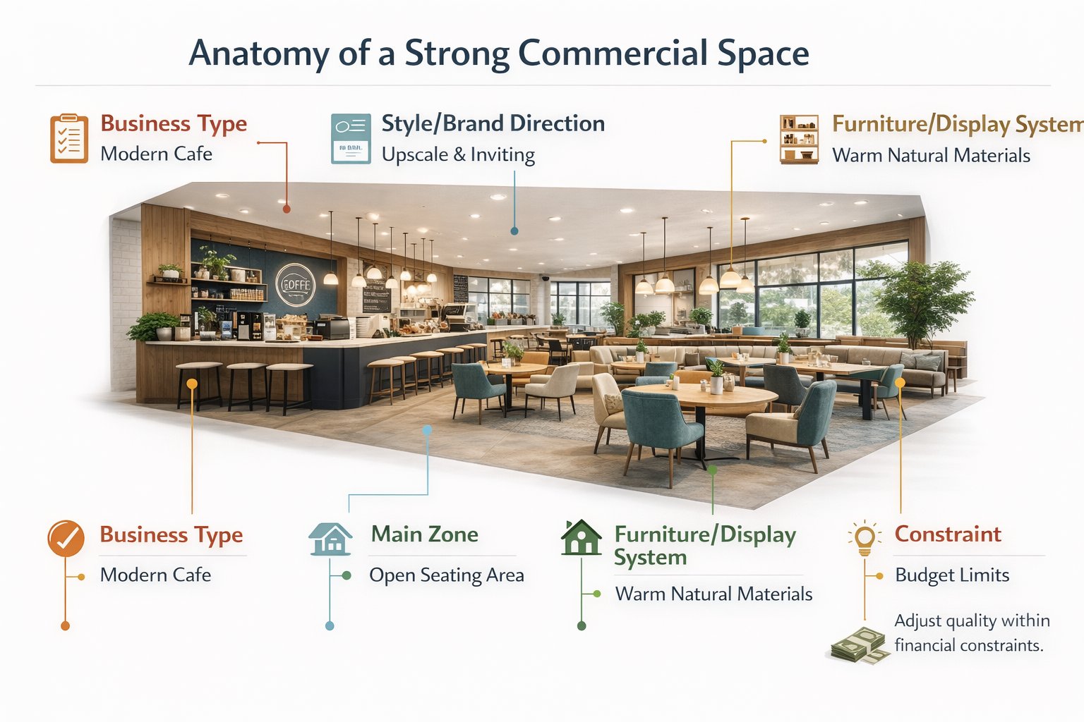
How to Build a Better Commercial Prompt
The strongest commercial prompts define business type, customer journey, design system, and control logic clearly.
A weak commercial prompt might say “make it modern and premium.” A stronger one explains what the business is, what zone should dominate, what brand atmosphere should appear, and what structural elements should remain stable.
A practical commercial prompt structure
[Business type] + [Style / brand direction] + [Main zone or focal point] + [Furniture / display system] + [Lighting mood] + [Constraint]
What to define more clearly
Business type — cafe, retail boutique, beauty studio, office lobby, co-working zone, clinic reception, showroom, restaurant.
Style or brand direction — warm contemporary, premium minimal, clean hospitality, soft luxury, industrial chic, lifestyle retail.
Main zone — counter, seating area, reception desk, display island, consultation area, product wall.
Furniture or display system — banquette seating, workstation clusters, product shelving, clean lounge seating, integrated storage.
Lighting mood — bright commercial daylight, warm hospitality lighting, editorial retail glow, soft premium ambience.
Constraint — keep room proportions, openings, service counter, or circulation structure unchanged when needed.
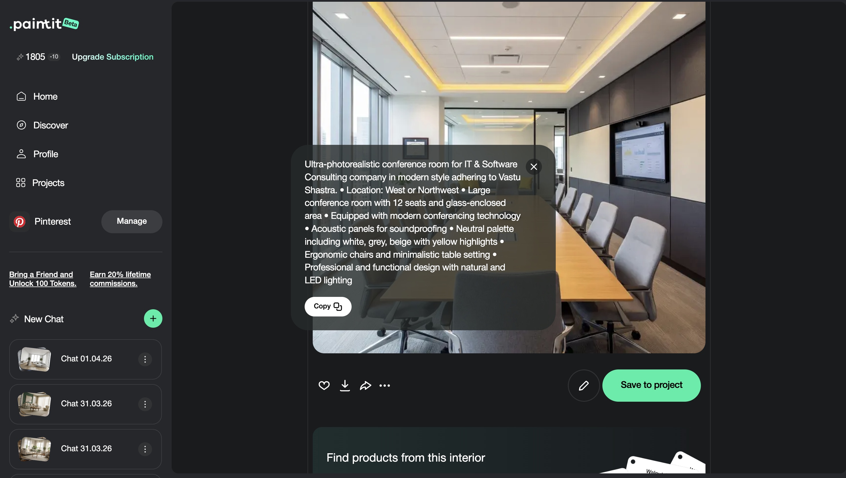
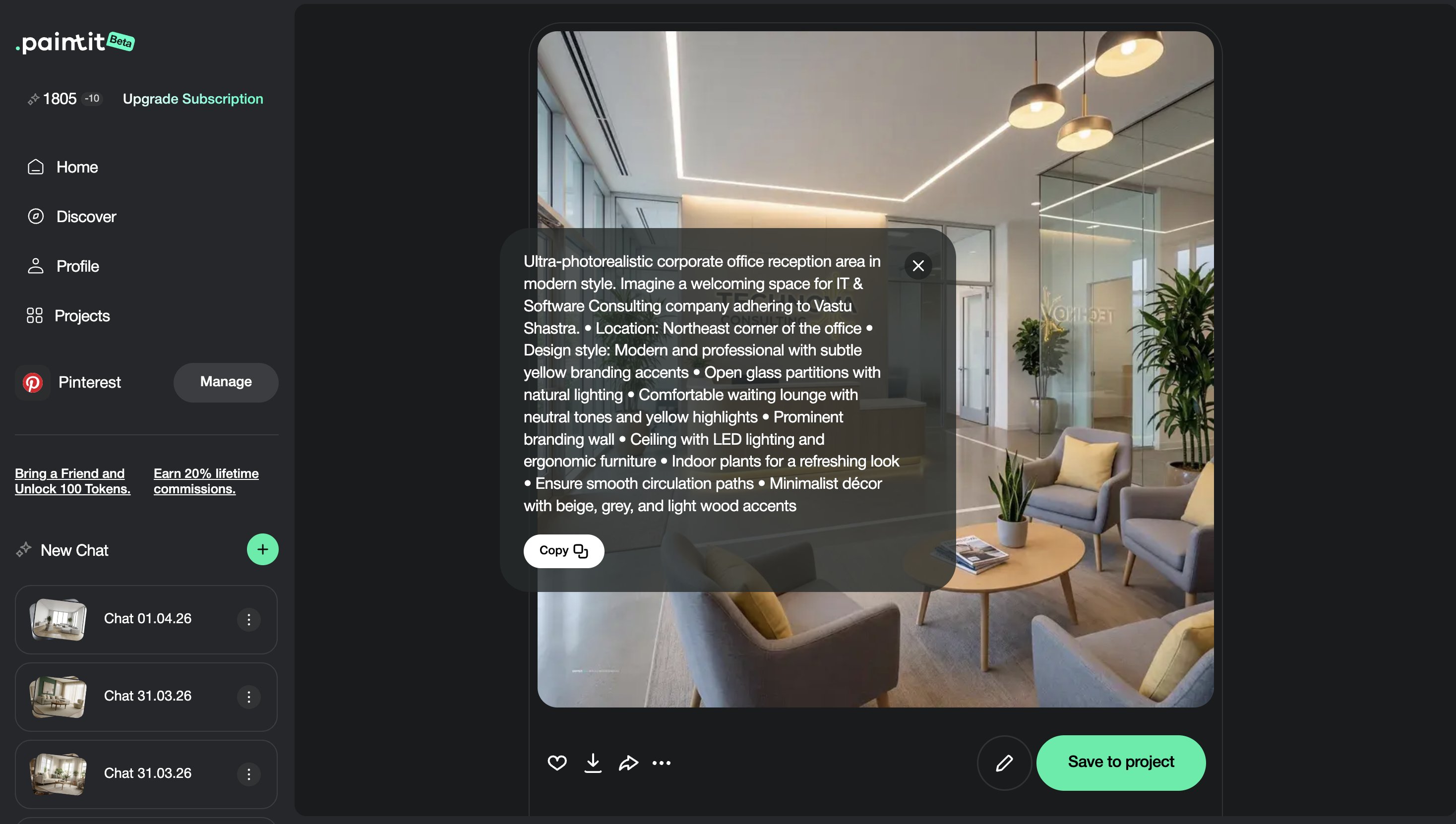
Example of a technically stronger commercial prompt:
Redesign this cafe interior as a warm contemporary commercial space with a clear service counter, oak finishes, integrated banquette seating, textured plaster walls, soft ambient lighting, and a welcoming premium atmosphere. Keep the room layout and circulation path unchanged.
This works better because it defines function, focal point, material language, and operational clarity together.
Commercial Prompt Cards
Use these as copy-ready starting points for the most useful commercial directions.
Core commercial prompt cards
Cafe interior
Redesign this cafe interior as a warm contemporary commercial space with a clear counter zone, oak finishes, banquette seating, textured plaster walls, soft ambient lighting, and a welcoming premium atmosphere. Keep the circulation and layout unchanged.
Retail boutique
Transform this retail space into a clean premium boutique with controlled product display walls, soft neutral materials, elegant lighting, clear circulation, and a branded editorial feel. Preserve the room proportions and main entry logic.
Office lobby
Redesign this office lobby as a refined modern reception space with a strong welcome desk, clean lounge seating, warm stone and wood accents, and a calm premium corporate atmosphere. Keep the room layout and openings unchanged.
Special-use commercial cards
Showroom concept
Redesign this space as a premium showroom with hero product zones, restrained backdrop materials, clear circulation, integrated lighting accents, and a clean display-first atmosphere. Keep the architectural structure unchanged.
Beauty or wellness reception
Transform this reception area into a soft luxury wellness space with a calm front desk, curved seating, textured neutral surfaces, warm indirect lighting, and a serene hospitality mood. Preserve the layout and entry logic.
Best practice: define the business function first, then the customer-facing focal point, then the material and mood system. That order usually produces much stronger commercial outputs.
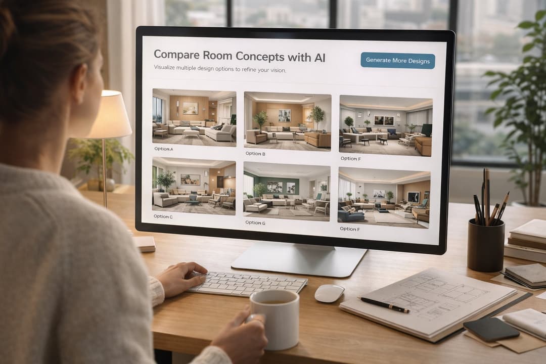
How to Compare Commercial Directions
Commercial comparison works best when the options differ by customer experience and brand mood, not random styling noise.
Because commercial spaces support business goals, comparison should focus on what each direction communicates: more premium, more approachable, more efficient, more lifestyle-driven, or more branded.
A useful comparison framework
Version 1 — clean and broadly commercial
Version 2 — warmer and more hospitality-driven
Version 3 — stronger premium brand identity
Version 4 — operationally balanced winner
This makes it easier to compare not just design taste, but actual business positioning.
Advanced Commercial Techniques
These small technical moves often turn a good-looking render into a more business-credible concept.
Technique 1 — Control furniture density
Commercial spaces often feel fake when seating or display density is either too sparse or unrealistically tight.
Technique 2 — Build one clear customer focal point
Reception desk, product wall, feature counter, or hero display should usually organize the room.
Technique 3 — Separate customer-facing and support logic
Even if back-of-house is not visible, the space should suggest operational order, not only styling.
Technique 4 — Use branding through material tone, not only logo thinking
Strong commercial identity often comes from palette, finish quality, and atmosphere more than obvious branding gestures.
Technique 5 — Keep circulation believable
A commercial space becomes more convincing when the customer path and staff movement still make sense.
Commercial visualization usually becomes more professional when the concept looks commercially operable, not only visually attractive.
Frequently Asked Questions
What is the most important part of a commercial space visualization?
Usually zoning clarity: people should understand what the space is for and how it works almost immediately.
How do I make a commercial space feel more premium?
Use fewer stronger materials, clearer brand mood, controlled furniture density, and one obvious customer focal point.
Should I keep the layout unchanged?
In many cases, yes at first. Preserving the shell and main circulation often makes the result more believable and easier to evaluate.
What is the biggest technical mistake in commercial prompts?
Describing style but not defining the business type, primary zone, customer path, or operational logic.
How do I make a commercial design feel more branded?
Use a consistent palette, finish language, and atmosphere that match the business identity instead of relying only on visible branding elements.
How many commercial directions should I compare?
Usually three to four strategically different directions are enough before refining the one that best fits the business goal.
Design a Commercial Space
Upload your space, define a clearer business mood and zoning system, and turn it into a more believable, branded, and commercially usable concept with Paintit.ai.
Related articles
Trending
Best Qbiq Alternatives for Layout Optimization & High-End Visualization
How Real Estate Agents and Stagers Can Use Paintit.ai
How Interior Designers Can Use Paintit.ai for Faster Client Concepts
How to Visualize Commercial Spaces with Paintit.ai
How to Redesign a Home Exterior with Paintit.ai
Related articles
7 min read
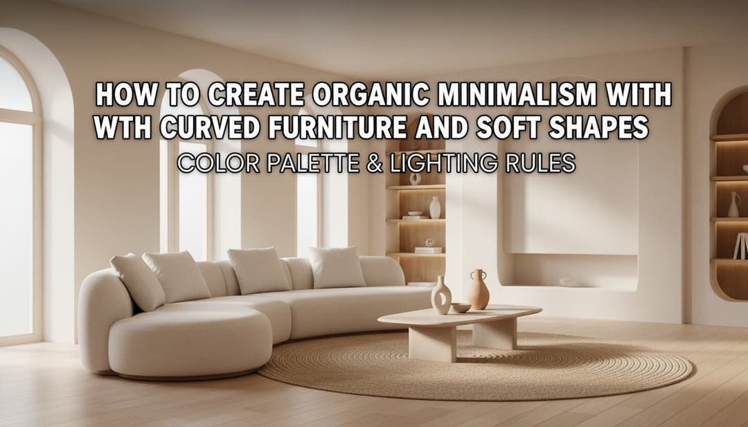
How to Create Organic Minimalism with Curved Furniture and Soft Shapes
Learn how to create organic minimalism with curved furniture, soft shapes, and natural textures. Explore palettes, materials, and visualize it with Paintit.ai.
Yulii Cherevko
CEO paintit.ai
9 min read
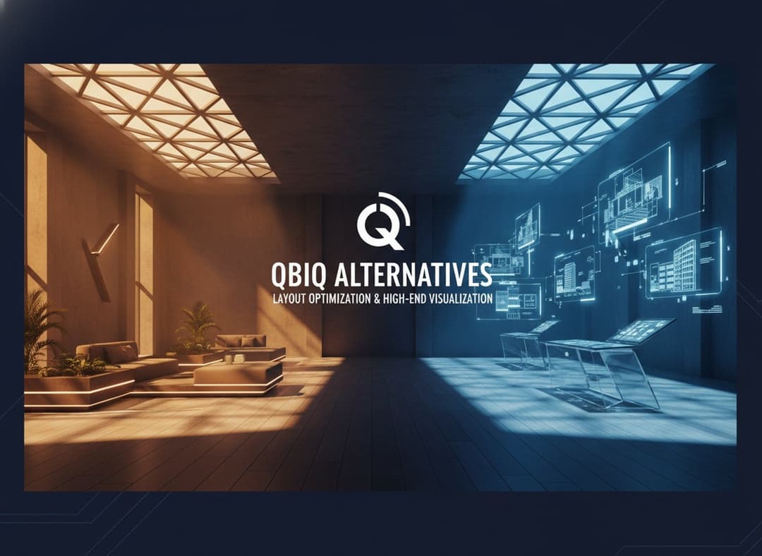
Best Qbiq Alternatives for Layout Optimization & High-End Visualization
Compare the best Qbiq alternatives for AI space planning and interior visualization in 2026. Find the right tool for architects, designers, and agents.
Yulii Cherevko
CEO paintit.ai
9 min read
How Real Estate Agents and Stagers Can Use Paintit.ai
Learn how real estate agents and stagers can use Paintit.ai to stage empty rooms, refresh dated listings, clarify room purpose, and create more believable buyer-friendly visuals faster
Yulii Cherevko
CEO paintit.ai
9 min read
How Interior Designers Can Use Paintit.ai for Faster Client Concepts
Learn how interior designers can use Paintit.ai to build faster concept directions, compare options, improve client communication, and structure revisions without losing design control
Yulii Cherevko
CEO paintit.ai
9 min read
How to Visualize Commercial Spaces with Paintit.ai
Learn how to visualize commercial spaces with Paintit.ai using better zoning logic, stronger brand alignment, realistic seating and circulation, and more believable retail, office, cafe, and hospitality concepts
Yulii Cherevko
CEO paintit.ai
9 min read
How to Redesign a Home Exterior with Paintit.ai
Learn how to redesign a home exterior with Paintit.ai using better facade logic, cleaner material systems, realistic curb-appeal upgrades, stronger prompt control, and more believable exterior concepts
Yulii Cherevko
CEO paintit.ai