9 min. reading
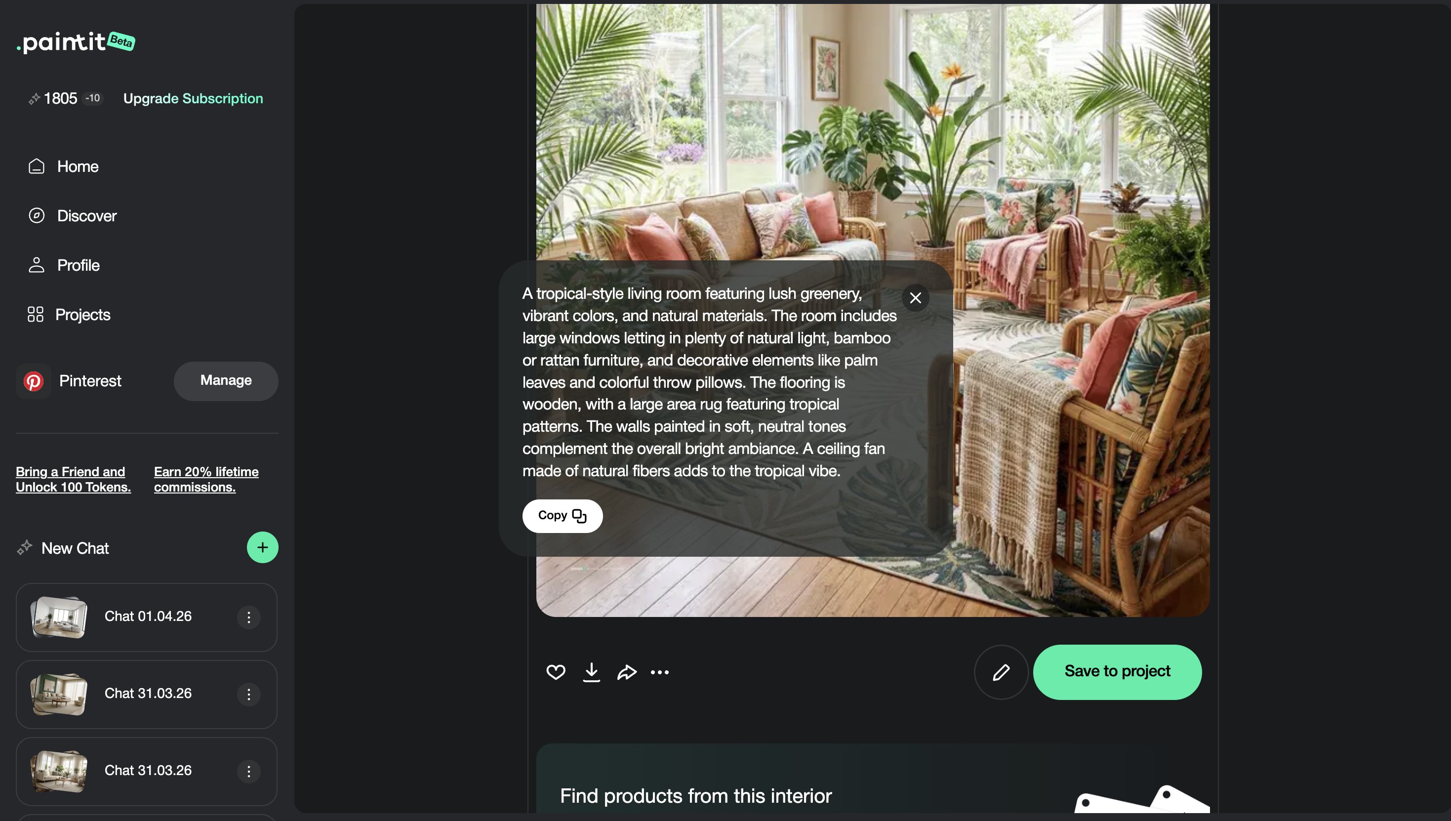
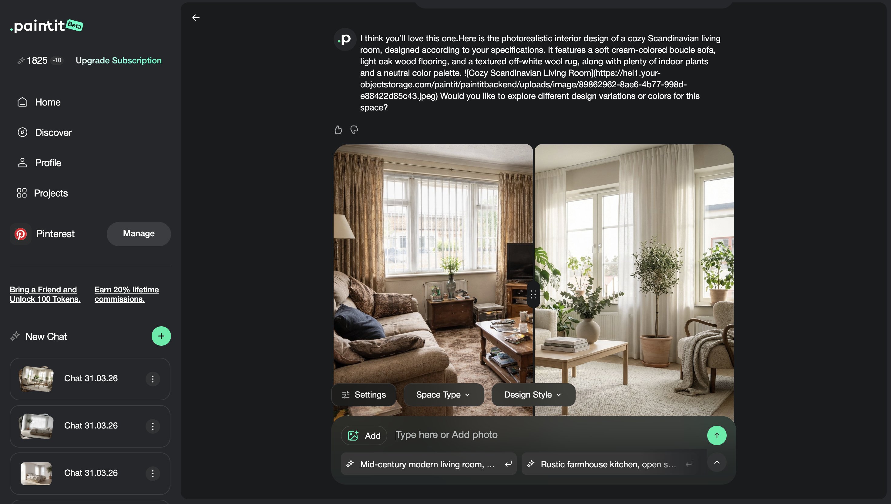
How to Use Pinterest Inspiration in Paintit.ai
Yulii Cherevko
CEO paintit.ai

Page Contents:
- 1. Why Pinterest Works So Well in Paintit.ai
- 2. What a Reference Should Actually Do
- 3. How to Pick Better Pinterest Images
- 4. A Practical Reference Stacking System
- 5. How to Write Better Reference-Based Prompts
- 6. How to Keep Control of the Original Space
- 7. Reference Prompt Cards
- 8. Advanced Techniques for Better Results
- 9. Frequently Asked Questions
- 10. Related articles
Pinterest can dramatically improve your results in Paintit.ai — but only if you use references correctly. This guide shows how to turn saved inspiration into cleaner, more controlled AI interiors, exteriors, and room concepts without losing the logic of your original space.
Why Pinterest Works So Well in Paintit.ai
Pinterest is useful because it gives Paintit.ai visual direction faster than text alone.
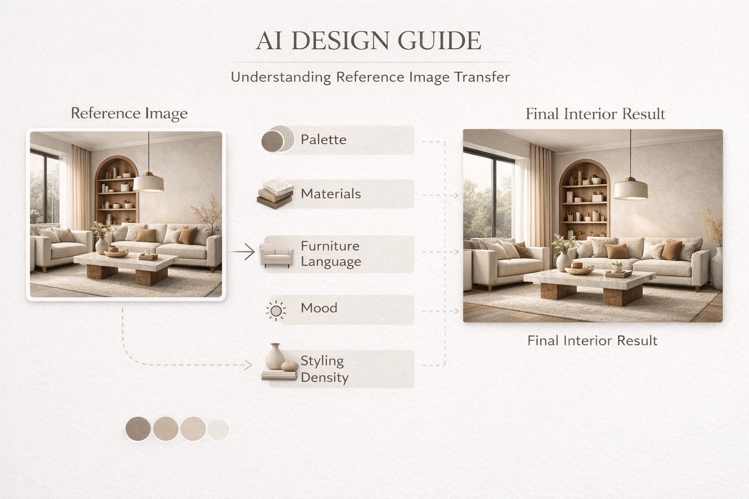
A strong reference image can communicate material language, furniture character, palette, mood, styling density, and overall design taste in one step. This makes Pinterest especially powerful when you know what you like visually but do not yet know how to describe it precisely.
What Pinterest references do best
Reduce ambiguity — the model sees the direction instead of guessing it from short text.
Improve style coherence — palette, materials, forms, and atmosphere become more aligned.
Speed up iteration — you can reach the right direction faster and then refine with prompts.
Improve taste-level accuracy — especially for users who think visually rather than verbally.
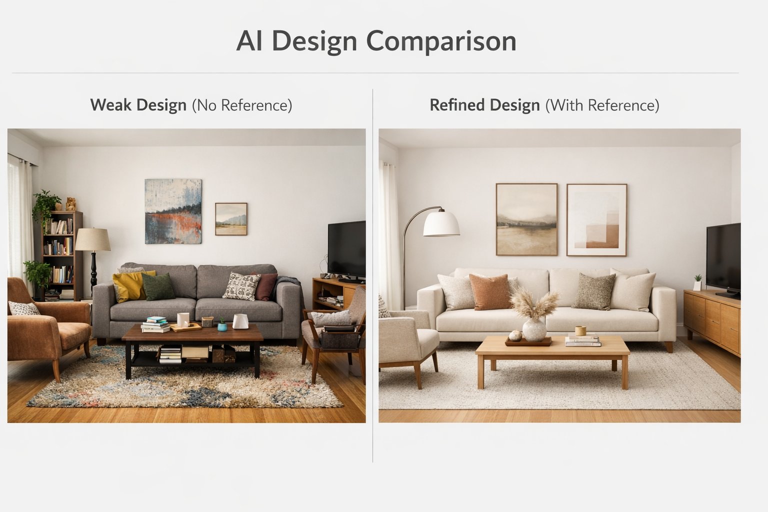
But references work best when they are used with intent. A beautiful Pinterest image is not automatically a good technical reference.
What a Reference Should Actually Do
A reference should guide the visual language, not replace the original room.
One of the biggest mistakes in reference-based design is treating the inspiration image like a blueprint. In practice, Paintit.ai works better when the reference is used to transfer selected qualities rather than the exact composition.
Use references for these elements
Palette — warm neutrals, earthy tones, soft contrast, dark drama, or bright airy whites.
Materials — limewash, oak, stone, plaster, linen, brushed metal, travertine, smoked glass.
Furniture language — soft curved forms, minimal clean lines, heavier sculptural pieces.
Atmosphere — calm spa-like, cozy lived-in, premium editorial, soft daylight, moody evening.
Styling density — minimal, balanced, layered, or more decorative.
Avoid using the reference to demand exact objects, exact room shape, or exact composition. That usually reduces realism and control.
How to Pick Better Pinterest Images
The quality of the reference often matters as much as the quality of the prompt.
Not every Pinterest save is useful as a technical reference. Some are good for mood only. Some are strong for materials. Some are weak because they are over-edited, over-staged, or visually inconsistent.
Choose references that are
Single-directional — one clear style is better than visually mixed inspiration.
Architecturally readable — the room should make visual sense, not feel like fantasy staging.
Material-rich — good references show real surfaces and textures clearly.
Close to your target room type — bedroom references for bedrooms, bathroom references for bathrooms, and so on.
Close to your intent level — if you want a realistic result, avoid surreal, over-processed, or overly cinematic references.
A useful rule is this: the more the reference matches the room function and level of realism you want, the easier it becomes to get believable outputs.
Technical selection tip
If you are choosing between a beautiful image and a readable image, choose the more readable one first. It usually transfers into AI workflows more cleanly.
A Practical Reference Stacking System
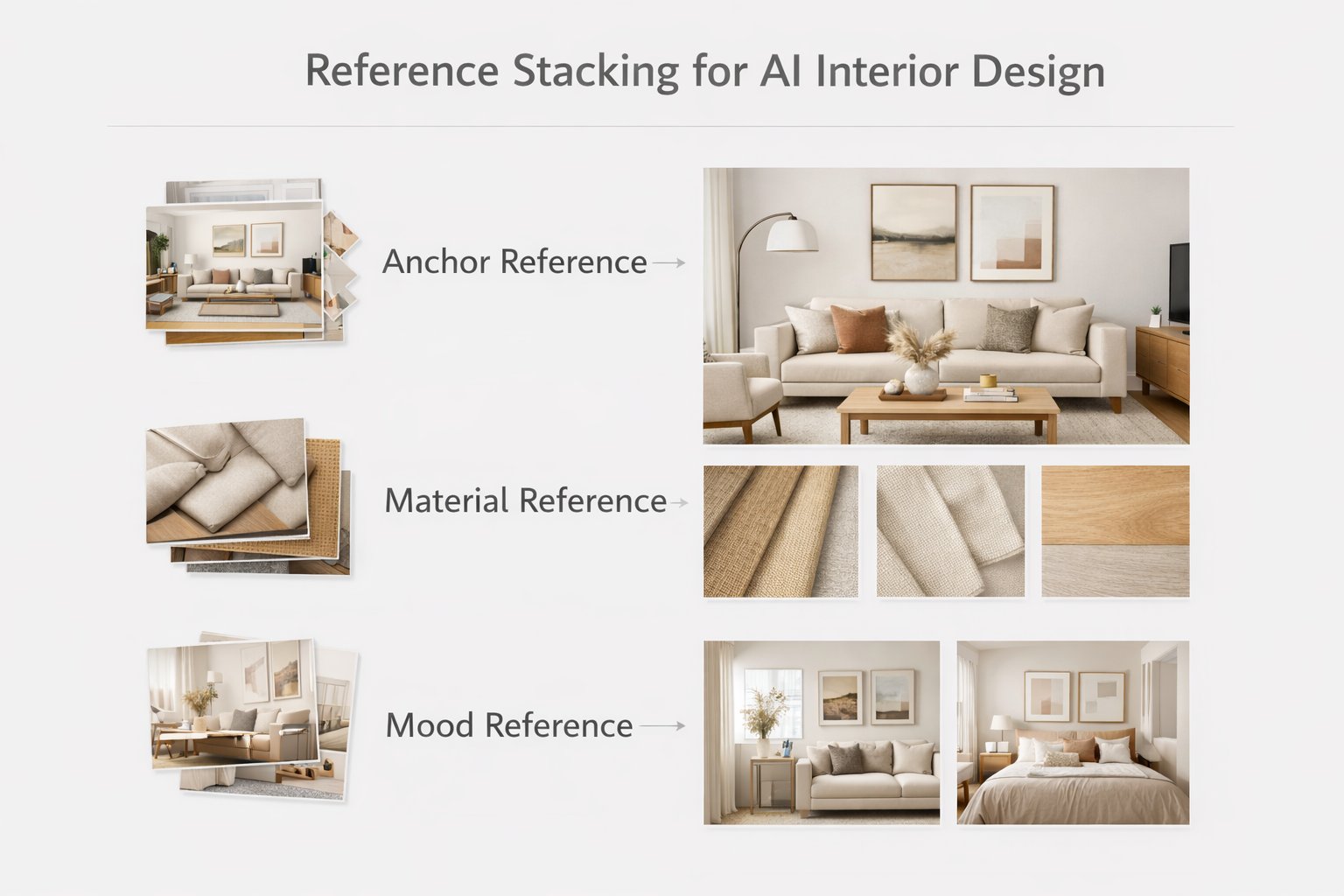
The most controlled results often come from separating references by job.
Instead of relying on one image to do everything, think about references as layers. This is one of the most useful advanced workflows for users who want more professional control.
A simple 3-part stacking model
Anchor reference — the main image that defines the overall style direction.
Material reference — an image chosen mainly for surfaces, finishes, or palette.
Mood reference — an image chosen for atmosphere, softness, styling density, or lighting character.
Even if you use only one visible Pinterest image in the workflow, you can still think this way internally. It helps you write much better prompts because you stop asking one reference to solve everything at once.
How to Write Better Reference-Based Prompts
The best reference prompt tells Paintit.ai what to transfer and what to ignore.
A good reference prompt does not simply say “make it like this.” It defines the transfer logic. That is what makes the output more controlled and less random.
A practical reference prompt structure
Use this reference for + style / palette / materials / mood
Apply it to + my room / facade / space
Do not copy + exact composition / exact objects / architecture
Preserve + layout / windows / proportions / structure
Example:
Use this reference for the overall style, material palette, and lighting mood. Redesign my living room in this direction, but do not copy the exact composition or recognizable furniture pieces. Keep my room layout and window positions unchanged.
This kind of prompt is usually stronger than a vague instruction because it separates inspiration from geometry.
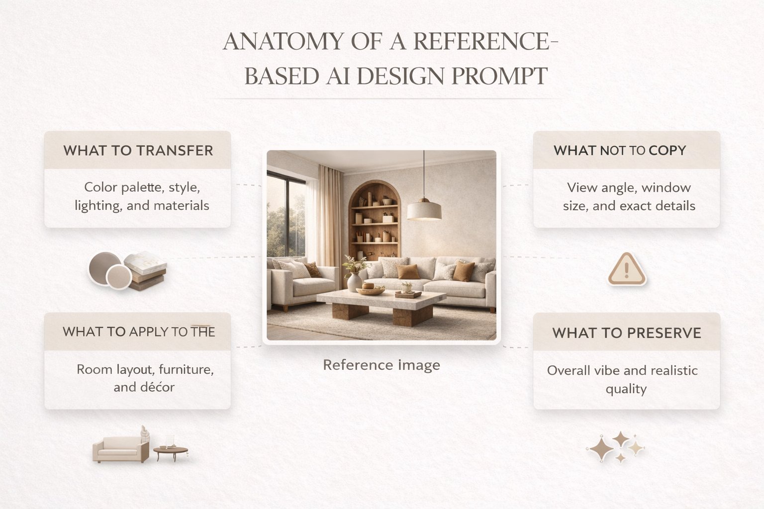
How to Keep Control of the Original Space
The goal is not to lose your room inside the reference. The goal is to transfer the right qualities.
The most common failure mode in Pinterest-driven design is when the reference overwhelms the original room. This usually happens when the prompt is too passive or when there are no constraints.
Use these control lines when needed
Keep my room layout unchanged.
Preserve the architecture and proportions.
Do not copy the exact composition from the reference.
Use the reference only for palette, materials, and mood.
Keep windows, walls, and openings in their original positions.
These constraints are especially important when your room and the Pinterest image are not physically similar. The bigger the mismatch, the more explicit your control language should be.
Reference Prompt Cards
Use these as copy-ready starting points for the most common Pinterest-driven workflows.
Interior reference cards
Living room — palette and materials transfer
Use this reference only for the color palette, materials, and overall mood. Redesign my living room in this direction, but keep my room layout and window positions unchanged. Do not copy the exact composition.
Bedroom — style language transfer
Use this Pinterest image as a style reference for a calm Japandi bedroom with warm neutrals, soft textures, and minimal furniture language. Apply this direction to my room, but preserve the original architecture and proportions.
Bathroom — mood and finish transfer
Use this reference for the spa-like atmosphere, beige stone finish, and soft indirect lighting. Update my bathroom in this direction, but do not copy the exact layout or fixtures. Keep the room geometry unchanged.
Exterior and advanced cards
Exterior — curb appeal transfer
Use this reference for facade palette, material contrast, and landscaping mood. Apply this direction to my exterior, but keep the building shape, windows, and overall structure unchanged.
Multi-reference — anchor plus material
Use the first reference for the overall style direction and the second reference for materials and color palette. Redesign my room using this combination, but preserve the original layout and proportions. Do not copy the exact composition from either image.
Advanced Techniques for Better Results
These small technical moves can make reference-based generations significantly more reliable.
Technique 1 — Crop noisy references
If the Pinterest image contains too much unrelated architecture, text overlay, collage framing, or distracting objects, crop it before use. Cleaner references transfer more cleanly.
Technique 2 — Separate style from room logic
Let the Pinterest image define taste, but let Paintit.ai controls define room type and structure.
Technique 3 — Keep the first iteration broad
First transfer palette, mood, and materials. Then refine furniture, decor density, or finishing details.
Technique 4 — Match reference realism to target realism
If you want believable outputs, use believable references. Editorial fantasy images often create less grounded results.
Technique 5 — Use comparison rounds
Run one version using only the anchor reference, then a second version with tighter material guidance. This is often more useful than trying to get the perfect result in one pass.
This kind of workflow is especially useful for designers, staging teams, and users who care about more controlled visual outcomes.
Frequently Asked Questions
Should I use one Pinterest image or several?
Start with one strong anchor reference first. Add extra reference logic only when you need more control over materials or mood.
Can I ask Paintit.ai to copy the exact Pinterest room?
It usually works better to transfer style, palette, materials, and mood rather than exact composition or architecture.
What is the best kind of Pinterest reference?
A clear, readable image with one strong style direction and believable materials that match your room goal.
How do I stop the reference from overpowering my room?
Use explicit control lines such as “Do not copy the exact composition” and “Keep my room layout unchanged.”
Is Pinterest useful for exteriors too?
Yes. It is very useful for facade palette, material contrast, landscaping mood, and curb-appeal direction.
What is the biggest technical mistake here?
Using a beautiful but unreadable reference and then giving Paintit.ai no clear transfer logic in the prompt.
Connect Pinterest and Try It
Bring in better references, transfer only the right visual qualities, and get cleaner AI design directions in Paintit.ai.
Related articles
Trending
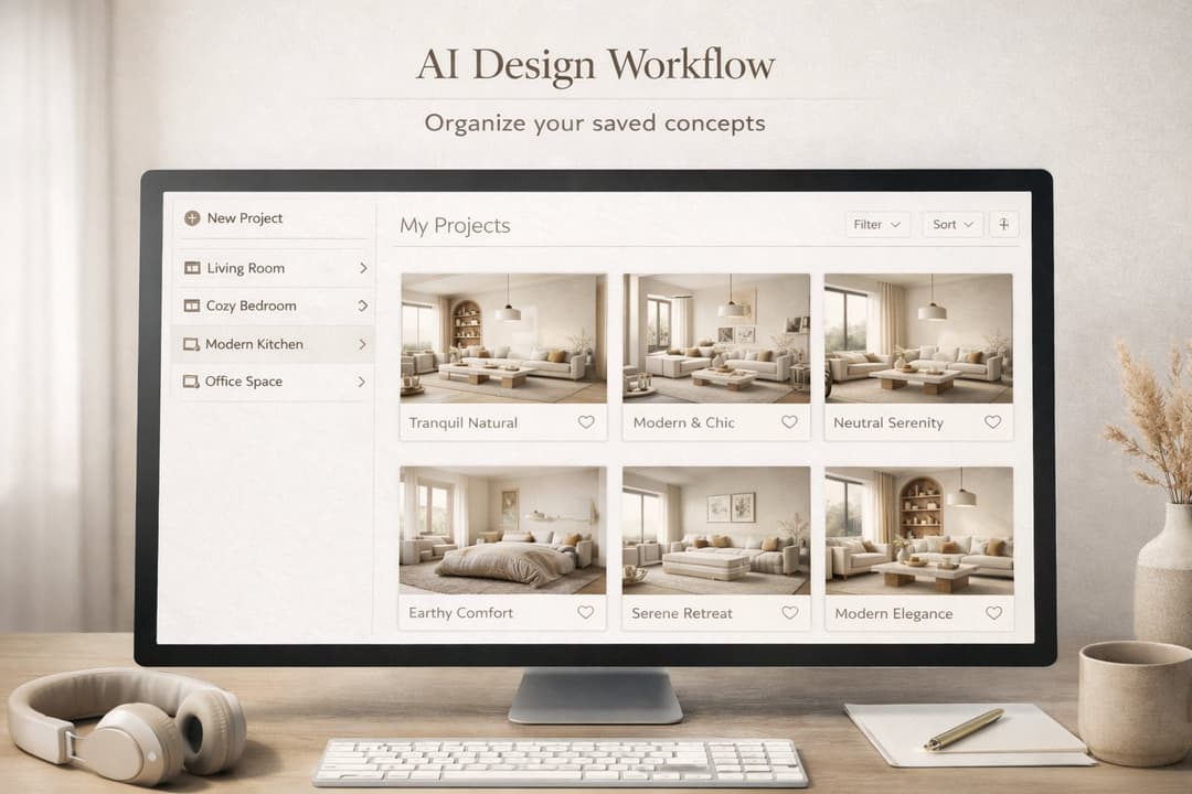
How to Save, Compare and Organize Designs in Paintit Projects
How to Use Pinterest Inspiration in Paintit.ai
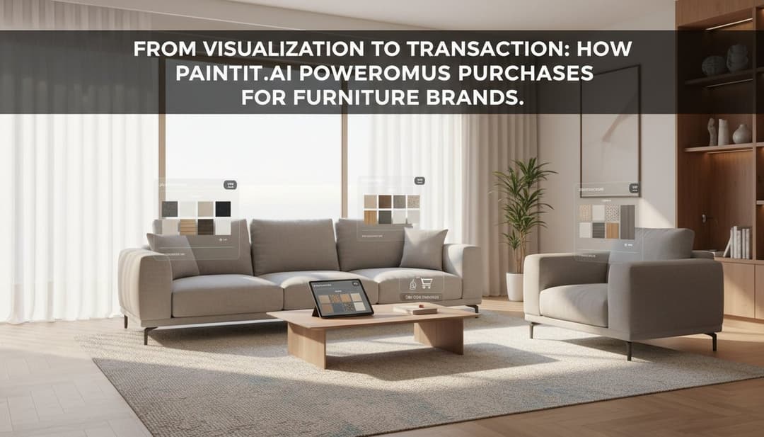
From Visualization to Transaction: How Paintit.ai Powers Autonomous Purchases for Furniture Brands
Stager AI Alternatives & Competitors in 2026: Full Review
How to Use Space Type and Design Style in Paintit.ai
Related articles
9 min read
How to Redesign a Living Room with Paintit.ai
Learn how to redesign a living room with Paintit.ai using better layout logic, stronger focal points, realistic furniture scale, cleaner prompts, and more professional comparison workflows
Yulii Cherevko
CEO paintit.ai
8 min read
How to Save, Compare and Organize Designs in Paintit Projects
Learn how to save, compare, and organize designs in Paintit Projects to manage versions better, structure multi-room work, review alternatives faster, and make clearer design decisions
Yulii Cherevko
CEO paintit.ai

9 min read
How to Use Pinterest Inspiration in Paintit.ai
Learn how to use Pinterest inspiration in Paintit.ai with better reference selection, stronger prompt control, cleaner style transfer, and more realistic interior and exterior design results
Yulii Cherevko
CEO paintit.ai
5 min read
From Visualization to Transaction: How Paintit.ai Powers Autonomous Purchases for Furniture Brands
Bridge the gap between browsing and buying. Learn how Paintit.ai uses Visual-to-transaction AI and photorealistic rendering to power autonomous furniture sales
Yulii Cherevko
CEO paintit.ai