
Primary school interior design ideas for creative, focused learning
Primary school classrooms shape how children experience learning for years. A well-designed space signals to children that their work matters, that focus is possible, and that the room itself is on their side.
The design decisions that achieve this are not complicated, but they do require thinking about children's actual scale, movement patterns, and attention spans - not just the visual aesthetic. These 9 ideas cover both the practical and the sensory: furniture height, zone logic, colour temperature, natural light, and the biophilic elements that consistently improve student wellbeing and performance.
Visualize design directions for your classroom in 1-2 minutes - upload a photo to app.paintit.ai. Free to start.
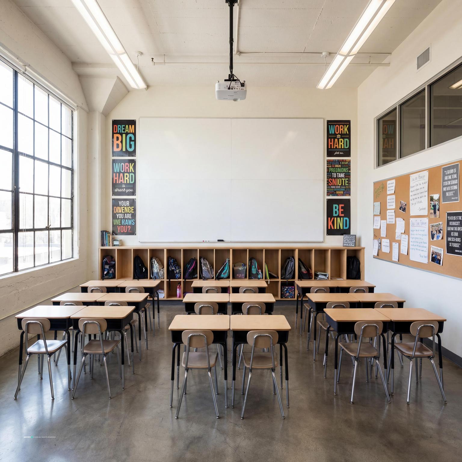
9 primary school interior design ideas
The research on classroom design keeps landing on the same finding: layout and light affect how well children learn, not just how the room photographs. Nine changes below, ordered from free (rearranging furniture) to a proper budget line (a full repaint or lighting retrofit).
-
Zone by activity, not by furniture type
Most classrooms default to rows facing a board, then bolt a reading corner onto whatever space is left. It works better the other way round: decide the zones first (focused desk work, floor-based group work, quiet reading) and let the furniture follow. A 2015 University of Salford study of 153 UK classrooms (the "Clever Classrooms" project, led by Peter Barrett) found that physical design factors accounted for about 16% of the variation in pupils' academic progress over a year - zoning and flexibility were among the strongest individual factors, ahead of colour choice on its own. Rugs or floor tape are enough to mark a zone boundary; you don't need walls.
-
Match furniture to age, not just "child-sized"
School furniture in the EU and UK is sized against EN 1729, which defines seven size marks by seat height - 26cm for ages 3-4 up to 38cm for ages 8-11, rising to 46cm for teenagers. Mixed-age classrooms need at least two adjacent size marks in the room, not one "average" size - a chair that's right for a 5-year-old leaves a 10-year-old with knees above the desk. Castored or stackable pieces cost more upfront but cut the time it takes to flip a room from rows to groups from a full break period down to a couple of minutes, which matters when the same room hosts three different lesson formats a day.
-
Use colour to mark zones, not to decorate
Yellow and orange work in active zones - PE corridors, art rooms - but full-saturation versions on every wall cause measurable overstimulation in younger children; the Salford research above found overly busy visual environments actively hurt progress, not just aesthetics. Blue and muted green lower arousal and suit reading corners. The mistake we see most often is one accent colour painted across an entire school, which cancels the zoning effect completely - save saturated colour for a single wall per zone and keep the rest a soft neutral so the accent still reads as a signal.
-
Hit 300 lux before adding more windows
UK school design guidance (Building Bulletin 101) sets a minimum of 300 lux on the working plane in teaching spaces, with a daylight factor target of at least 2% - meaning the room should still read as usably bright on an overcast day without switching on lights. Desks placed directly under skylights or facing unshaded south-facing windows often overshoot this and cause screen glare instead of solving the problem; the fix is usually a light-diffusing blind, not fewer windows. Where daylight genuinely falls short, warm-white LED (around 3000-4000K) at desk height closes the gap without the flicker older fluorescent tubes introduce.
-
Give technology a fixed address
Interactive whiteboards and tablets earn their space, but scattering screens through every zone removes the option of a low-distraction period entirely. Keep a defined technology corner or wall - with its own power and charging - separate from the reading and quiet-work zones, so a lesson that doesn't need screens isn't fighting them for attention.
-
Bring in real materials, not just plants
Biophilic design covers more than potted plants: wood grain, stone-look surfaces, and views of greenery all measurably lower stress markers in children, and the effect holds even with a handful of plants rather than a living wall. Real timber or timber-look laminate on a reading nook does more for the "calm corner" than paint colour alone - texture reads differently to a 6-year-old's hand than a flat painted surface does.
-
Keep reconfiguration under acoustic control
Furniture on castors and folding tables let one room serve as a large-group space in the morning and small-group project space after lunch - but flexible layouts also open up more hard, reflective surfaces, which raises noise. UK acoustic guidance for schools (Building Bulletin 93) targets a reverberation time around 0.6-0.8 seconds in a typical primary classroom and background noise at or below 35 dB. Felt display boards, a rug in the group-work zone, and soft seating all pull double duty here: they support collaboration and bring the room back under that noise target.
-
Rotate student work, don't just add more
Display boards fill up fast, and a wall crowded with six months of accumulated work stops reading as "current" to a child - it becomes wallpaper. Set a rotation (half-termly works well for most UK primary calendars) and keep a fixed portion of the wall for temporary project showcases so there's always visibly fresh work up, not just the oldest pieces still nailed to the same spot in September.
-
Design safety into every education space
Rounded-edge furniture and non-toxic, low-VOC paint (under roughly 30g/L, in line with EU Ecolabel wall-paint criteria) cover the basics, but accessibility is often the gap: door widths, ramp gradients, and clear turning space for a wheelchair at a classroom entrance need checking against building regulations before furniture layout is finalised, not after. Well-lit corridors and consistent, high-contrast signage help every pupil navigate the building independently, not just pupils with a visual impairment.
Examples of Primary School Interior Design Ideas in Action
-
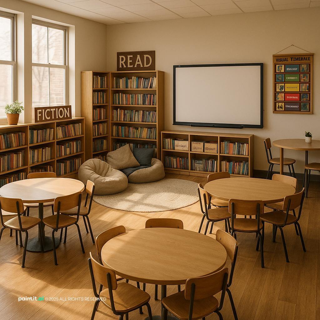
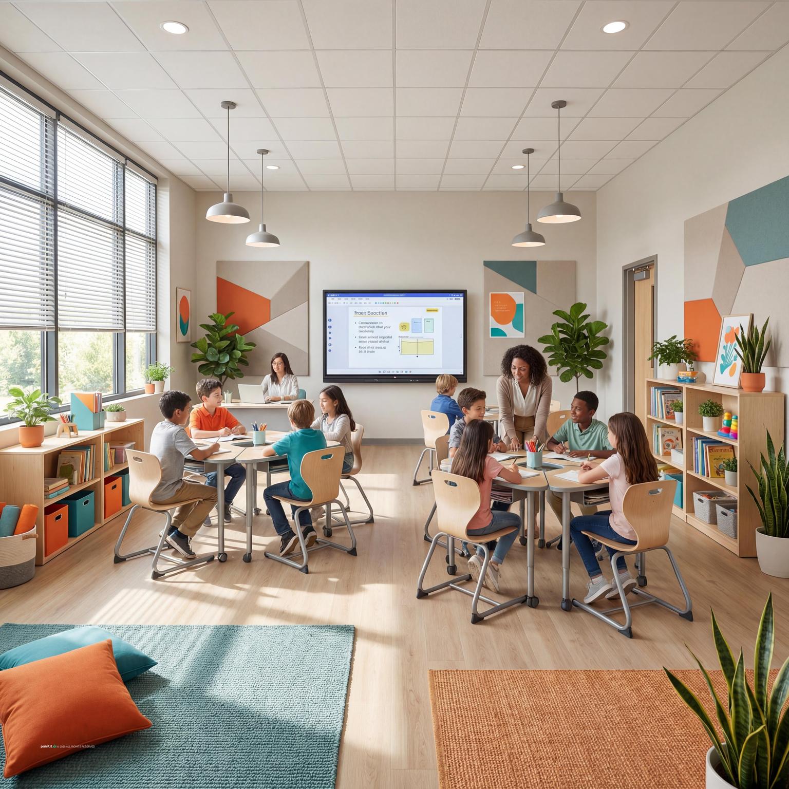
This layout separates a reading corner, a group-work table, and a whole-class teaching zone using rug boundaries alone - no partitions. Seating height varies across the room on purpose: floor cushions for reading, standard chairs for desk work. The accent wall behind the reading corner is the only fully saturated colour in the room; everything else stays neutral so it doesn't compete for attention.
-
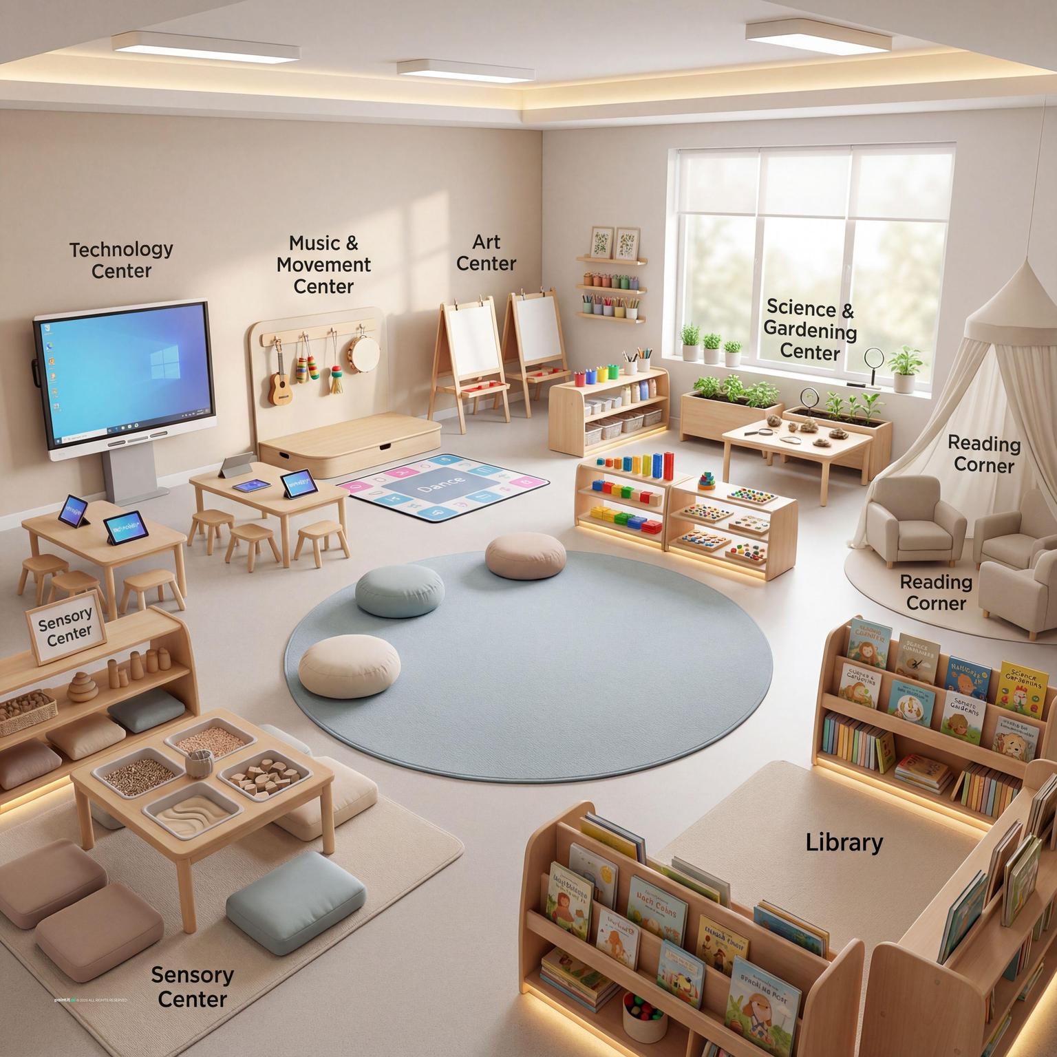
South-facing windows here run the width of the room, so desks sit at an angle to them rather than directly facing the glare. A narrow planter along the windowsill and two potted trees near the door are the only greenery - enough to bring the biophilic benefit without the maintenance load of a full living wall.
-
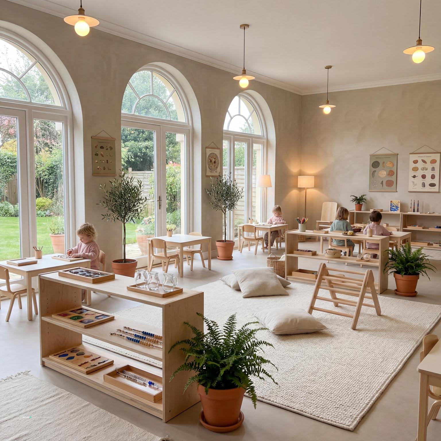
A themed room works when the theme is load-bearing, not decorative - here the space motif ties directly into the science curriculum on the wall (a scale model of the solar system doubles as a teaching aid). Writable wall paint on one full wall replaces a whiteboard and gives the whole class surface to work on at once.
-
The interactive whiteboard and charging station sit in a single corner rather than spread across the room, so the rest of the space stays screen-free by default. Desks face away from the technology corner during non-screen lessons - a small layout choice that removes a constant visual pull toward the boards.
Age-specific design: infant/KS1 vs KS2
Primary school runs from Reception (age 4-5) to Year 6 (age 10-11). The design brief changes across that range.
Reception and KS1 (ages 4-7)
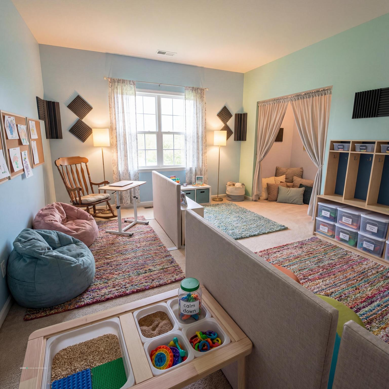
Gross motor development is still primary. More open floor space, lower furniture, robust materials. Sensory areas take dedicated space. Storage labels need picture symbols, not just text. Reading corners work best with lower, more enclosed structures.KS2 (ages 7-11)
Fine motor tasks increase - writing, cutting, craft, model-making. Furniture scale can move toward adult proportions. Literacy-rich environments matter: visible word walls, reference charts, and labelled collections. Technology integration becomes more significant. Social dynamics become more complex - the floor plan should support varied group sizes.What stays constant across all primary ages
Natural light, child-height furniture and storage, clearly defined zones, non-slip safe flooring in active areas, and acoustic consideration in spaces where extended instruction happens.
How Paintit.ai fits into school design
Upload a photo of your classroom or corridor to app.paintit.ai. Test different colour schemes, furniture configurations, and zone layouts in 1-2 minutes. Useful for presenting proposed changes to school leadership or governors before any procurement decisions. Free to start.
Related design tools
More classroom planning resources and AI tools.
FAQ
-
Rugs and floor tape mark a zone boundary without losing floor space to partitions. Storage benches with lids double as seating and cut down on furniture count. Wall-mounted shelving keeps floor space clear for movement - a common mistake in small classrooms is stacking storage on the floor, which blocks the exact open space the room needs for group work.
-
Yellow and orange work in active zones - they raise energy but overwhelm a room fast if used on every wall. Blue and muted green lower arousal and suit reading corners. The general rule: one saturated accent wall per zone, everything else neutral, so the accent still functions as a signal rather than becoming visual noise. For the paint itself, choose a washable, scuff-resistant finish (satin or eggshell rather than flat) and a low-VOC formula under roughly 30g/L - classroom walls take constant contact and need to survive regular cleaning without repainting every year.
-
In the EU and UK, school furniture is sized against EN 1729, which sets seat heights in bands - roughly 21-26cm for reception-age children up to 38-43cm for upper KS2. A mixed-age classroom needs at least two seat-height bands present, not one average size. Castored or stackable pieces cost more but cut room-reconfiguration time from a full break period to a couple of minutes.
-
UK school design guidance (Building Bulletin 101) targets a minimum of 300 lux on the working plane in teaching spaces and a daylight factor of at least 2%. Desks directly under skylights or facing unshaded south windows often overshoot this into glare - a diffusing blind usually fixes it faster than adding more windows. Where daylight falls short, warm-white LED around 3000-4000K at desk height closes the gap without the flicker older fluorescent tubes cause.
-
A 2015 University of Salford study of 153 UK classrooms found physical design factors accounted for about 16% of the variation in pupils' academic progress over a year, with flexibility and zoning among the strongest individual factors. That's pushing schools toward reconfigurable furniture on castors and clearly zoned rooms rather than fixed rows. Biophilic elements (real wood, plants, daylight) and dedicated but contained technology corners are the other two trends showing up most in recent school refurbishments.
-
A full-room repaint typically runs cheaper than replacing furniture or flooring, and it's the fastest way to establish zoning through colour alone. Budget for a washable, low-VOC finish rather than standard flat paint - it costs more per litre but survives years of contact instead of needing a repaint after one term. If the budget only stretches to one intervention, an accent wall per zone plus new blinds for glare control covers the two changes with the most documented impact for the least cost.
-
Reverberation time and background noise both climb when a room switches from soft-furnished rows to open, reconfigurable layouts with more hard surfaces. UK acoustic guidance for schools (Building Bulletin 93) targets roughly 0.6-0.8 seconds reverberation and background noise at or below 35 dB in a typical primary classroom. Felt display boards, a rug in the group-work zone, and soft seating pull double duty - they support flexible layouts and pull the room back toward that target without a full acoustic retrofit.