14 min. reading

Yulii Cherevko
CEO paintit.ai
Published: Updated:

A paint color visualizer helps you see whether a wall color belongs beside the things you already own. The useful comparison is not just blue versus green. It is blue versus green with the same sofa, flooring, curtains, and window light still in view.
The best AI paint visualizers for that job offer different kinds of control. Paintit combines a room-photo repaint workflow with colors from several manufacturers. Dehome offers generated paint concepts with surface selection. Sherwin-Williams, Behr, Benjamin Moore, and Dulux provide alternatives built around their own palettes. Some use AI, while others use photo overlays or live-camera visualization; those approaches should not be treated as interchangeable.
This 2027 edition uses published product information reviewed on November 4, 2026. It does not forecast 2027 prices or features. It is not a hands-on accuracy test, and the order is not a measured ranking. Paintit publishes this guide and is included in the comparison.
| Tool | Useful Starting Point | Color Selection | Access or Cost Caveat |
|---|---|---|---|
| Paintit.ai Repaint | Upload a room photo and request a focused paint change | Five manufacturer catalogs; name, code, or HEX search | Free credits after registration; generation costs and allowances vary |
| Dehome Paint Visualizer | Select a surface and generate a color concept | Preset colors and custom color input | Starter pack listed at $9.99 for 180 credits; model choice affects usage |
| Sherwin-Williams | Color Expert app or the separate web photo visualizer | Sherwin-Williams colors | Color Expert is listed as a free iPhone app; check device and regional support |
| Behr Color Visualizer | Sample rooms or Paint Your Place photo upload | Behr colors | Web workflow; check current account requirements when using your photo |
| Benjamin Moore Color Portfolio | Photo and video visualization in the app | Benjamin Moore colors and digital fan decks | iOS and Android app; optional color-reading hardware is separate |
| Dulux Visualizer | View color through a live camera and save ideas | Dulux palette in the relevant market | Free app advertised by Dulux UK; regional offerings differ |
A manufacturer's app makes sense when you already know which paint you will buy. A multi-brand tool is more useful when you are still comparing directions. Neither approach settles whether a specific coating is suitable for a bathroom, kitchen, or previously painted surface.
Decide what stays before uploading anything. If the floor and furniture are staying, they are constraints, not suggestions. A wall-only brief should not invite a different rug, new lighting, or a redesigned fireplace.
That distinction also shows up in our study of paint-and-finish choices: among 349 homeowner respondents who selected paint or finish choices, 177 selected that task alone and 172 selected another task as well. Those counts describe onboarding selections in the study, not completed projects, all homeowners, or the accuracy of any visualizer. They explain why a paint-only preview and a full room redesign answer different questions.
For a room you are keeping, start with one wall or all existing walls and leave everything else out of the brief. For a renovation, settle the floor or major cabinetry direction first. Otherwise, every new finish changes the context in which you judge the paint.
Paintit's AI paint color visualizer is useful when you want to compare a wall-color idea against your own room rather than a showroom scene. Repaint is the focused workflow for paint changes; a broader redesign is not necessary just to explore a different wall shade.
The color picker includes Behr, Benjamin Moore, Dulux, Nippon Paint, and Sherwin-Williams catalogs. You can filter by brand, search a name, code, or HEX value, and use Find similar color to explore nearby options. This is a practical way to keep a named shade attached to an idea, rather than ending up with an attractive image and no clue what to sample.
Use the room-photo workflow for comparing named paint shades when the existing furniture and flooring need to stay part of the decision. Ask for a limited change and inspect the result for unintended edits before comparing colors.
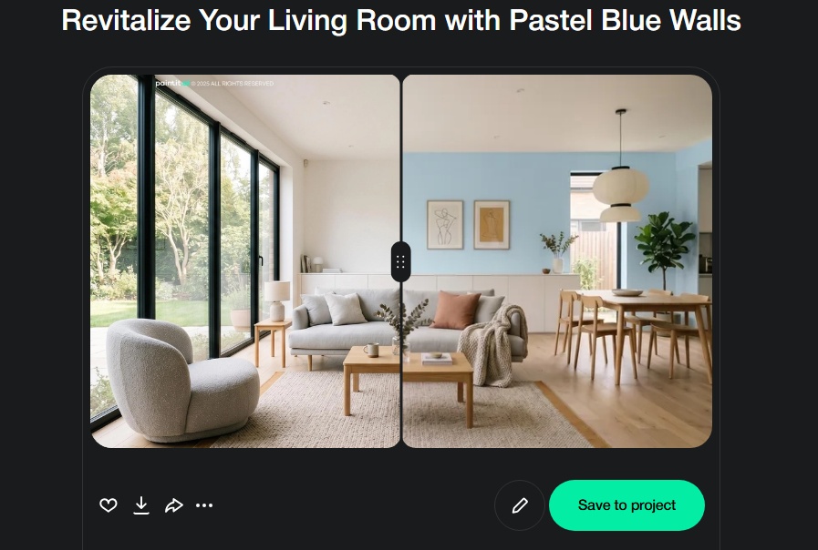
Free credits are available after registration. A catalog reference does not establish a manufacturer partnership, an exact physical match, or access under every plan. Check the current credit requirement before generating, then confirm your shortlisted color with a physical sample.
The Dehome paint visualizer lets you select a surface such as walls or ceiling, choose a preset color, and add custom requirements. Its public page also describes custom HEX input. That makes it an option for exploring a particular color direction without asking for a complete interior redesign.
Pay attention to the action beside the Generate button. The reviewed paint tool showed Pro at six credits per generation; Dehome lists a one-time $9.99 Starter purchase with 180 credits, not a monthly subscription. At that six-credit setting, 180 credits would fund 30 generations if spent only on that action. The pricing page also advertises up to 45 images using a different per-image assumption. Neither number guarantees how many useful paint comparisons you will keep.
Dehome's lighting variations are generated concepts. They do not prove how a physical coating will behave beside your window at a particular time. Keep the source photo and the requested surface consistent, and avoid treating a custom HEX value as a manufacturer tint formula.
Sherwin-Williams Color Expert uses AI to help recommend colors based on the space and supports photo visualization. Its US App Store listing describes a free iPhone app. For shoppers already considering Sherwin-Williams paint, keeping recommendations within that brand's palette can make the next sample order more straightforward.
Sherwin-Williams also lists ColorSnap Visualizer for Web, which accepts an uploaded photo or a sample room. This is separate from Color Expert: do not transfer features between the two just because they share a manufacturer. A preset lighting view is not a measured simulation of your uploaded room.
Use the web option if you prefer working at a computer. Check the app listing for your device and country before planning around mobile features or sample delivery.
Behr's public visualizer provides sample rooms and a Paint Your Place option for uploading your own photo. A sample kitchen is fine for an initial color idea, but your actual kitchen gives you a better basis for judging the relationship with the cabinet finish and countertop.
This is a sensible starting point when Behr is already on your shopping list. Keep a note of each shade's name and code as you compare. A color that looks good on the screen still needs a product and sheen appropriate to the surface; the visualizer is not a substitute for that specification.
Check upload and account requirements before starting a comparison. If you want to save projects or return to them on another device, confirm whether sign-in is needed before working through a long shortlist.
Benjamin Moore Color Portfolio combines photo and video visualization with digital color collections. It is worth considering when you want to explore Benjamin Moore shades while moving between an existing room, a fan deck, and a sample shortlist.
The app is offered for iOS and Android. Optional color-reading hardware is a separate product, not a requirement to describe every app workflow. Also distinguish capturing a color with a camera from measuring a physical sample: the photograph already contains the effects of the lighting and camera processing.
For an existing room, check the color beside fixed surfaces rather than in isolation. A gray that looks neutral beside white upholstery may read quite differently next to warm stone or a yellow-toned floor.
Dulux UK describes its Visualizer as a free app that uses augmented reality to show wall colors through the camera. It also supports saving and sharing ideas. This suits an early walk around the room when you want to see how a color direction relates to different walls.
Use the version offered in your market. Palette names, availability, and purchasing options should not be assumed to match across countries. A UK product page is not evidence that every Dulux app worldwide has identical features.
Once a direction looks promising, use physical testers. A live view can make a bold idea easier to imagine, but it does not remove the influence of screen settings, room lighting, or the actual painted surface.
Take the picture from a position that shows both the wall and the fixed finishes you need to coordinate. Include enough flooring, upholstery, and trim to judge the relationship. Avoid shooting directly into a bright window if it leaves the wall in deep shadow.
Turn off beauty filters and dramatic color effects. Use the same source image for each candidate. Comparing a cloudy-day photo with a sunlit one introduces another variable before any paint has changed.
Before uploading, remove identifying paperwork or private family photographs from view. Check the service's image-retention and account-deletion terms if you are sharing a client's room. A useful photo does not need to disclose the address or the people who live there.
A useful brief names the surface and what must remain unchanged. For example: "Change only the living room walls to a muted blue-green. Keep the white ceiling, oak floor, beige sofa, curtains, furniture positions, and existing light unchanged. Do not add objects."
When the tool supports a manufacturer selection, choose the catalog shade there rather than relying only on a typed name. If you are exploring a general color family, label the result as a direction, not an exact shade ready to order.

Inspect the result in this order:
A preview that changes the sofa is not a fair wall-color comparison, even if it looks beautiful. Return to the original image and narrow the request rather than building further decisions on an altered room.
For each finalist, write down the manufacturer, color name, color code, intended wall, and proposed finish. Keep those notes with the image. If the finish has not been chosen, leave it undecided rather than guessing from the apparent shine in a generated picture.
Add a short reason for keeping the shade: "less yellow beside the floor," "works with the dark cabinet," or "worth testing on the shaded wall." That note is more useful when buying samples than a folder full of nearly identical screenshots.
A paint color match suggested from a photograph is a starting point. RGB and HEX values describe digital colors; they are not universal mixing instructions for paint. Similar-looking shades from two manufacturers also need separate physical samples.

A visualizer can keep a color name attached to your shortlist, but it does not choose the coating. Write down the surface, whether it is inside or outside, the existing finish and the cleaning demands before shopping. A bathroom wall, a cabinet door and a walking surface can need different products even when the chosen color is identical.
For example, Behr specifies Premium Plus Interior Eggshell Enamel for properly prepared interior walls, trim and ceilings, with application conditions and preparation instructions on its product documentation. That is a product-specific scope, not permission to use any paint in the visualized shade on any surface. A floor selected in an image editor is not evidence that the same wall coating is suitable for foot traffic.
Before buying, use the exact product's current technical data sheet to check the substrate, preparation and primer requirements, application conditions, recoat interval and service limits. Do not substitute a safety data sheet for application guidance. Ask the manufacturer when the intended surface or exposure is outside the stated use. The preview helps choose which colors to sample; the specification determines what can actually be applied.
When comparing paint visualizer competitors, prefer the manufacturer's own app if you have settled on that brand and want a sample shortlist. Prefer a multi-brand workflow when the brand is still open. For a live walk around a room, consider the camera-based option available on your device. None of those choices removes the need to test the actual paint beside the surfaces and lighting that will stay.
It can help you judge color relationships, but it cannot certify the final wall color. Camera exposure, white balance, screen settings, surface texture, and room lighting all affect what you see. Generated images can also change the room while appearing to change only the paint.
There are two different lighting issues to watch. One sample can change appearance under different lights. Two samples can also appear to match under one light and separate under another, as Datacolor's explanation of metamerism describes. Neither effect is resolved by choosing a more attractive render.
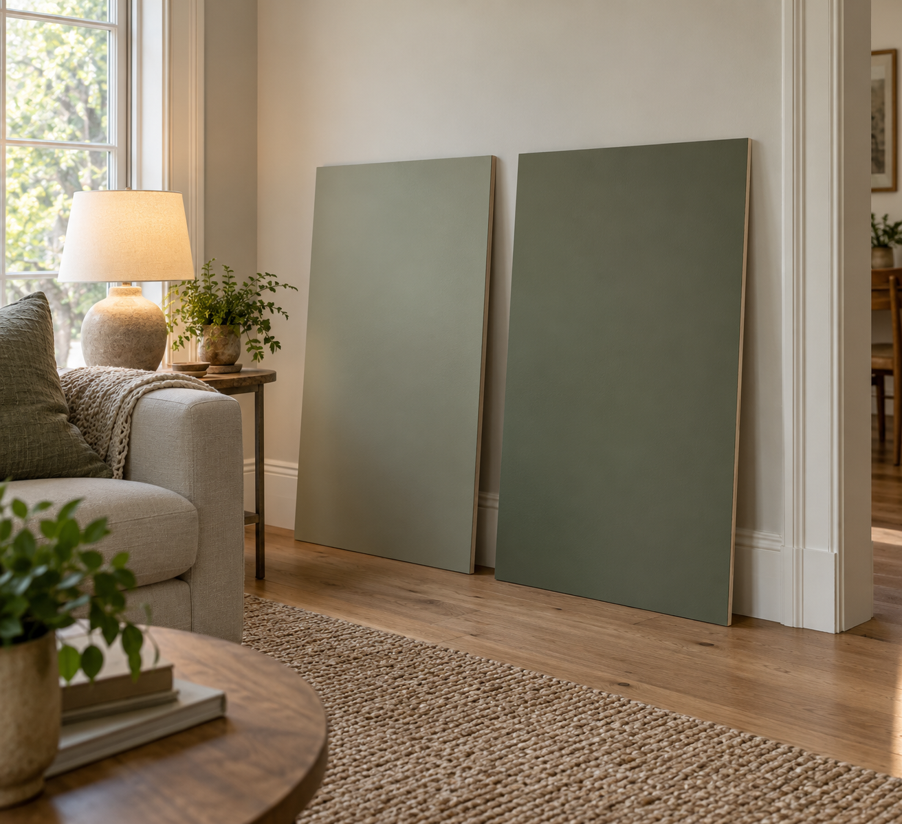
Test shortlisted paint according to the manufacturer's instructions. View it beside the finishes that will stay, both in daylight and under the lights you actually use. Let the sample dry as directed before making a decision. If two shades are close, check them on the same wall under the same conditions.
If you have already chosen a manufacturer, start with its own palette and visualization tool. If you are comparing brands, Paintit's five catalogs provide a way to explore named colors in one workflow. The best choice depends on your brand, device, and need for photo editing or live-camera viewing, not a universal accuracy score.
Dulux UK advertises a free Visualizer app, and Sherwin-Williams Color Expert is listed as free for iPhone. Physical samples and paint are separate purchases. Paintit offers free credits after registration, rather than unlimited free generation. Check current terms before assuming any tool's saving, exporting, or generation allowance is free.
Yes. Paintit and Dehome accept room images, and the Sherwin-Williams web visualizer and Behr Paint Your Place offer own-photo workflows. Benjamin Moore Color Portfolio includes photo visualization. Check the particular app or web tool rather than assuming that every product from one brand accepts the same input.
It should help you judge the wall beside your actual headboard, bedding, floor, and window treatments. Keep those elements visible and request a wall-only change. Then test the shortlist under the bedside lighting you use at night; a daytime preview cannot settle that part of the decision.
Some tools accept exterior photos, but the decision includes the roof, masonry, landscaping, and stronger daylight. Use a workflow intended for exterior repaint concepts rather than assuming an interior-wall preview answers the same question. Confirm the coating's exterior suitability separately.
Start with the palette and input method that suit your project. Compare a small shortlist against the same room, discard previews that change the surroundings, and keep a named color record. The best AI paint visualizers leave you with a clearer sample-shopping decision, not an image mistaken for a guarantee.