5 min. reading
Harmony vs. Unity in Interior Design: What Is the Difference?
Yulii Cherevko
CEO paintit.ai
Page Contents:
- 1. What Does Harmony Mean in Interior Design?
- 2. What is Unity in Interior Design?
- 3. Harmony vs. Unity: What's the Real Difference?
- 4. 3 Simple Examples of Unity in Design
- 5. How to Achieve Harmony: Examples Using Color, Texture, and Scale
- 6. The Final Ingredient: Why You Also Need Variety
- 7. Conclusion: From Blueprint to Beautiful Space
Key Takeaways
- The Simple Definitions: Harmony is the feeling (peace/calm). Unity is the structure (repetition/alignment).
- The Crucial Distinction: You can have unity without harmony (e.g., a chaotic all-neon room), but you cannot have a great design without both.
- Unity Tools: Use Repetition (colors, shapes), Proximity (grouping), and Alignment to build the framework.
- Harmony Tools: Use Color Theory, Texture Balance, and Proportion to make that framework feel right.
- The Secret Ingredient: Don't forget Variety. Too much unity leads to a boring "showroom" look.
- Visualize It: Use AI Room Design Generator to check if your room feels "harmonious" before you buy furniture.
In the world of interior design, we often talk about the core "principles"-balance, rhythm, emphasis, and contrast. But among them, the two principles that consistently cause the most confusion are harmony and unity.
They sound the same, and frankly, many definitions make them seem interchangeable. So, what is harmony in interior design? And how is it truly different from unity?
As a design-tech team, we love deconstructing complex ideas. The answer is simpler than you think: one is the blueprint, and the other is the beautiful result. This article will clear up the confusion and give you the practical tools to create truly cohesive spaces.
What Does Harmony Mean in Interior Design?

Harmony is the feeling you get when you walk into a well-designed room.
It's the subjective, emotional result of a successful design. Harmony is the sense of calm and peace that comes when all the separate elements-the furniture, colors, textures, and decor-look like they belong together.
It's that "ahhh" feeling when nothing is clashing, nothing feels out of place, and the entire space just feels right. It's the pleasant arrangement of parts that creates a sense of visual rest. If a room feels "off" or chaotic, it's likely lacking harmony.
What is Unity in Interior Design?
If harmony is the feeling, unity is the structure.
Unity is the set of tools and techniques used to physically tie the space together. It's the "glue" that creates a sense of "wholeness" or cohesion, ensuring all parts are meaningfully related.
While harmony is the subjective result, unity is the objective, measurable method you use to get there. It's the underlying blueprint that makes the design feel complete and interconnected.
Harmony vs. Unity: What's the Real Difference?
Here is the single most important takeaway: Unity is the technique you use. Harmony is the pleasing result you feel.
The critical distinction is that you can have unity without harmony.
Imagine a room where every single object-the sofa, the walls, the rug, the curtains-is a bright, neon-pink color. That room has powerful unity (achieved through the repetition of color), but is it harmonious? Absolutely not. It's jarring, chaotic, and overwhelming.
Harmony is what happens when unity is done well. It's the successful, aesthetically pleasing outcome of your unified design choices. You use the tools of unity to build a framework, and you use balance, scale, and color theory to make that framework harmonious.
3 Simple Examples of Unity in Design
Unity is the toolbox. In order to clarify this process, we review 3 simple examples of unity in design that can be drawn upon by designers for inspiration.
1. Repetition
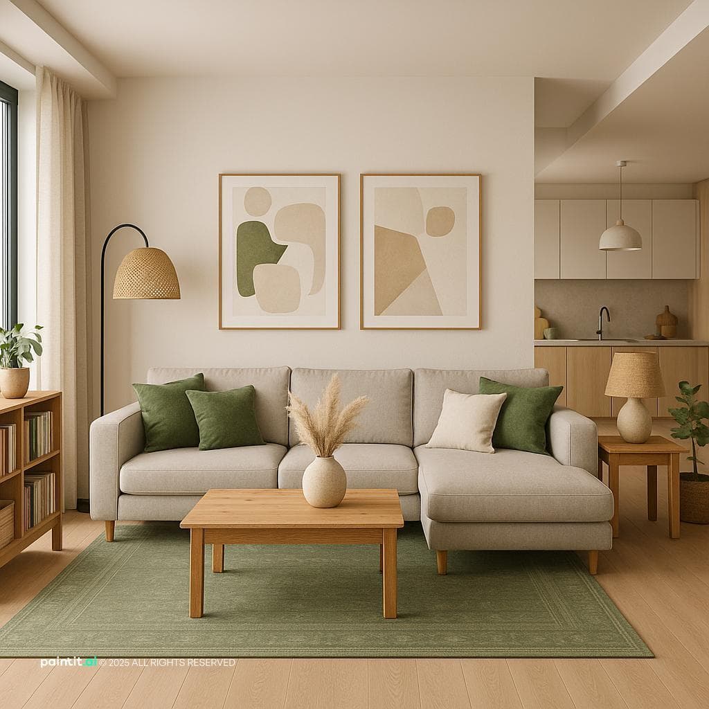
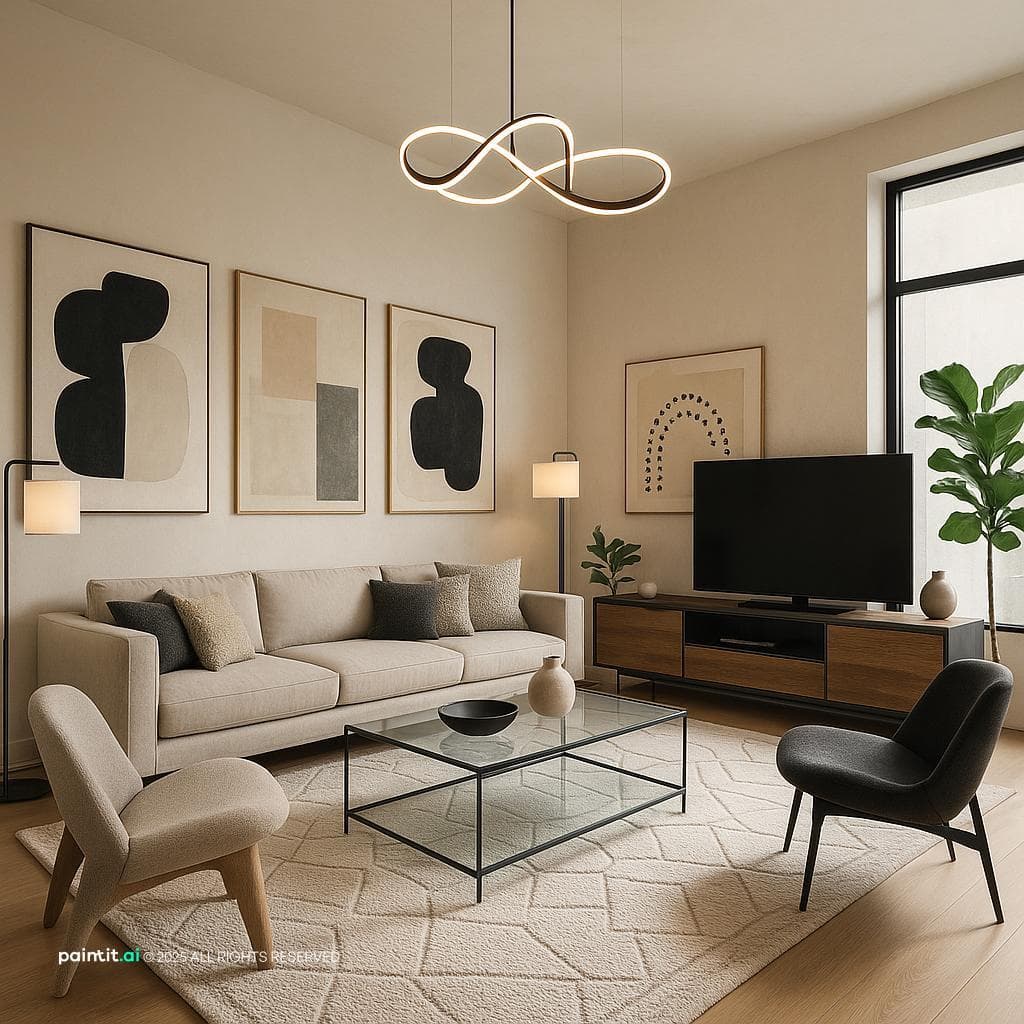
This is the most common and effective method for forging unity. It is the act of intentionally recurring things in order to produce a visual thread, connecting the pieces of a space together. You can repeat:
- Color: Using the same accent color (e.g., black) in picture frames, cabinet hardware, and light fixtures.
- Shape: Repeating a circular shape in a mirror, a rug pattern, and the curve of a chair.
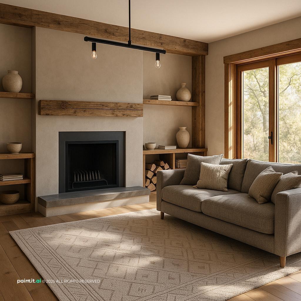
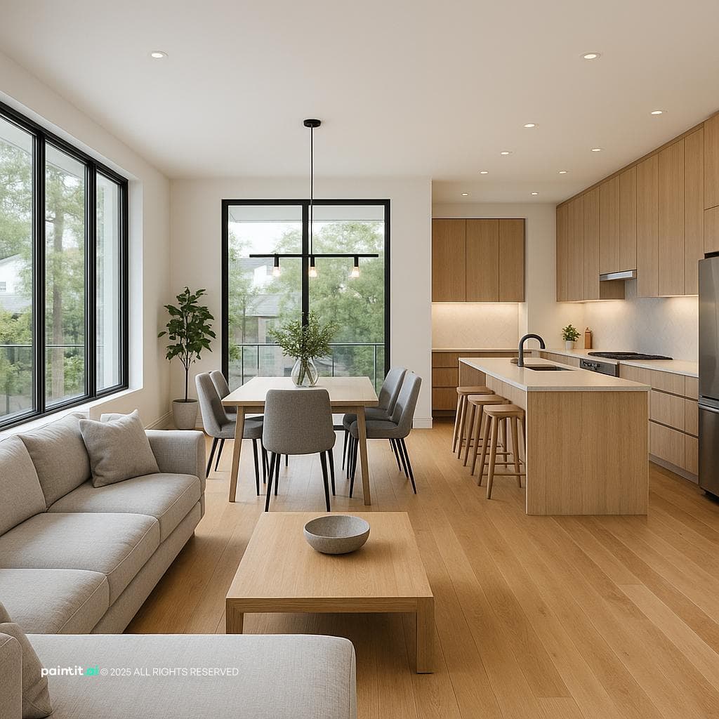
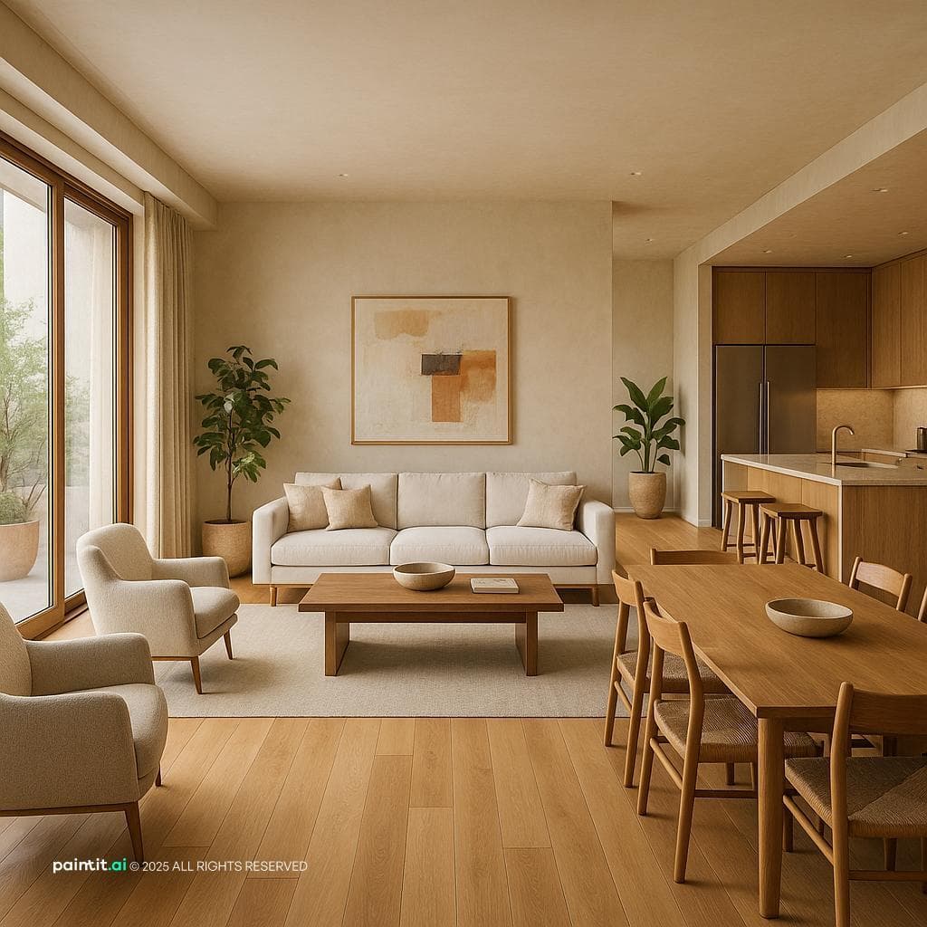
- Material or Texture: Same wood finish and/or metallic surface (brass or similar) used throughout the space.
2. Proximity
Proximity means simply putting similar items together. Our brains regard a sofa, a pair of chairs, and a coffee table grouped closely on a rug as the same, consistent “conversation zone,” and not just four separate items. This is the crux of best AI room design, , the intuition that this “zone” can exist as an integrated whole.
3. Alignment
Alignment - the practice of lining up elements along a common, invisible line. When the top of a picture frame, window, and bookshelf are aligned, it’s kind of a nice subtle, powerful feeling of order and connection. This method is clean, purposeful - it's an important aspect of unity.
How to Achieve Harmony: Examples Using Color, Texture, and Scale
So now that you have the tools for unity, how do you secure that the outcome is harmonious? Let’s review some examples of harmony in interior design.
Using Color Schemes
This is the biggest factor. Harmony is not just repeating a hue (that is unity); it is developing a pleasing palette. A shortcut to harmony is established color schemes.
- A monochromatic scheme (different shades and tints of one single color) is inherently calming and harmonious.
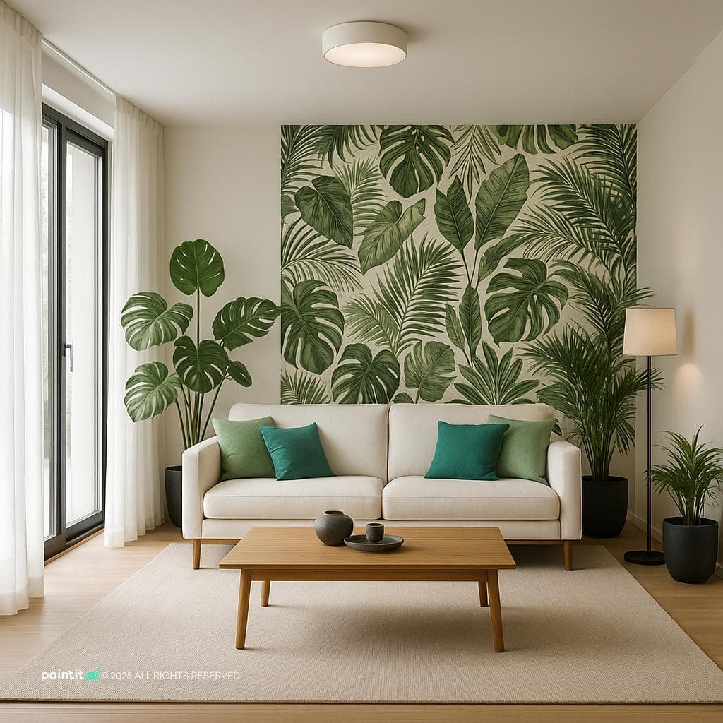
- An analogous scheme (colors that sit next to each other on the color wheel, like blue and green) also creates a low-conflict, restful feeling.
Balancing Textures
A room with smooth, hard surfaces (all wood, glass, and metal) or soft surfaces (all carpet, velvet, and fleece) is devoid of harmony. This harmony comes from a balance of these tactile elements: the roughness of a wooden table, the softness of a wool rug, the sleekness of a metal lamp, and the plushness of a velvet cushion.
Getting Scale & Proportion Right
This is the secret rule of harmony. A design can never be in harmony if its scale is wrong. If a massive, overstuffed sofa is crammed into one tiny room, it will feel “off,” cause disharmony, even if the colors and theme are the same. The pieces need to be proportioned toward each other and, crucially, with the room itself.
The Final Ingredient: Why You Also Need Variety
There's a danger in focusing too much on harmony and unity. You can create a space that is perfectly unified and technically harmonious... but also completely boring.
This is the classic "matchy-matchy" trap, where everything is from the same furniture set, and nothing stands out. This is where the principle of Variety comes in.
Variety is the controlled introduction of contrast or an "unexpected element." It's the one thing that "pops" and adds personality. It could be a bold piece of art, a brightly colored accent chair, or a unique light fixture.
By having a strong foundation of unity and harmony, you create the perfect backdrop for a single element of variety to shine, adding life and personality without creating chaos. Need help finding that perfect piece? Our AI Concept Generator can help you brainstorm ideas that fit your unified theme.
Conclusion: From Blueprint to Beautiful Space
Understanding the difference between harmony and unity is a true "level-up" moment in design.
Remember it this way:
- Unity is your structural blueprint (using tools like repetition and proximity).
- Harmony is the beautiful, calm feeling of the finished space.
- Variety is the sparkle that gives it personality.
By mastering how these three principles work together, you can move beyond just "decorating" a room and start truly designing it. And if you need help visualizing that final, harmonious space, our AI rendering tools are built to turn your blueprint into a beautiful reality.
FAQ
What is the main difference between harmony and unity?
Unity is objective; it's the technique of linking elements together (via repetition or alignment). Harmony is subjective; it's the pleasing aesthetic feeling that results from using unity correctly.
Can a room have unity but lack harmony?
Yes. A room with excessive repetition (e.g., everything is the same pattern) has high unity but feels chaotic or boring, lacking harmony.
How do I create harmony in a colorful room?
Use an analogous color scheme (colors next to each other on the wheel) or ensure all colors share a similar intensity/tone. Use neutral textures to ground the bright colors.
What is the principle of variety?
Variety is the opposite of unity. It involves adding different or contrasting elements (like a pop of color or a unique texture) to prevent the harmonious design from becoming boring.
Trending
Is There an App to Remodel My Bathroom with Just a Photo?
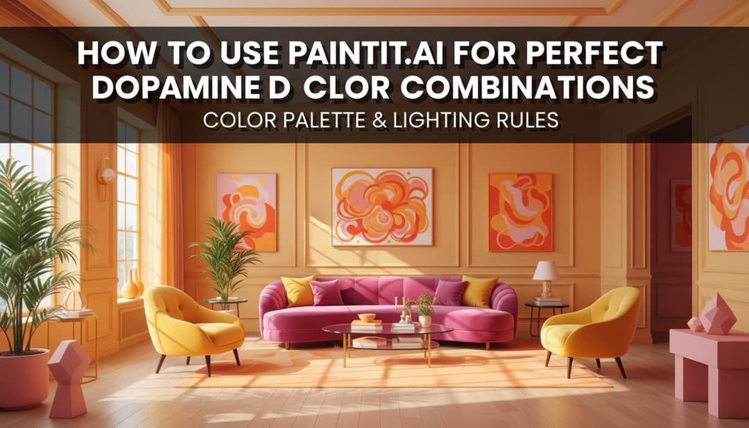
How to Use Paintit.ai for Perfect Dopamine Decor Color Combinations
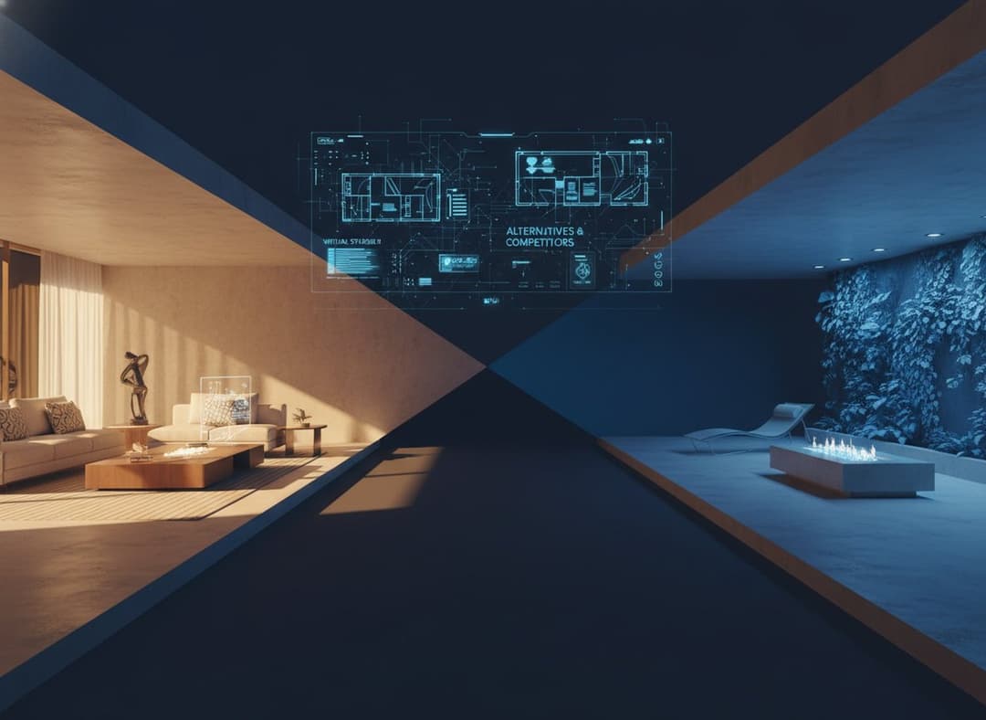
Virtual Staging AI: Top Alternatives & Competitors in 2026
How to Redesign a Living Room with Paintit.ai
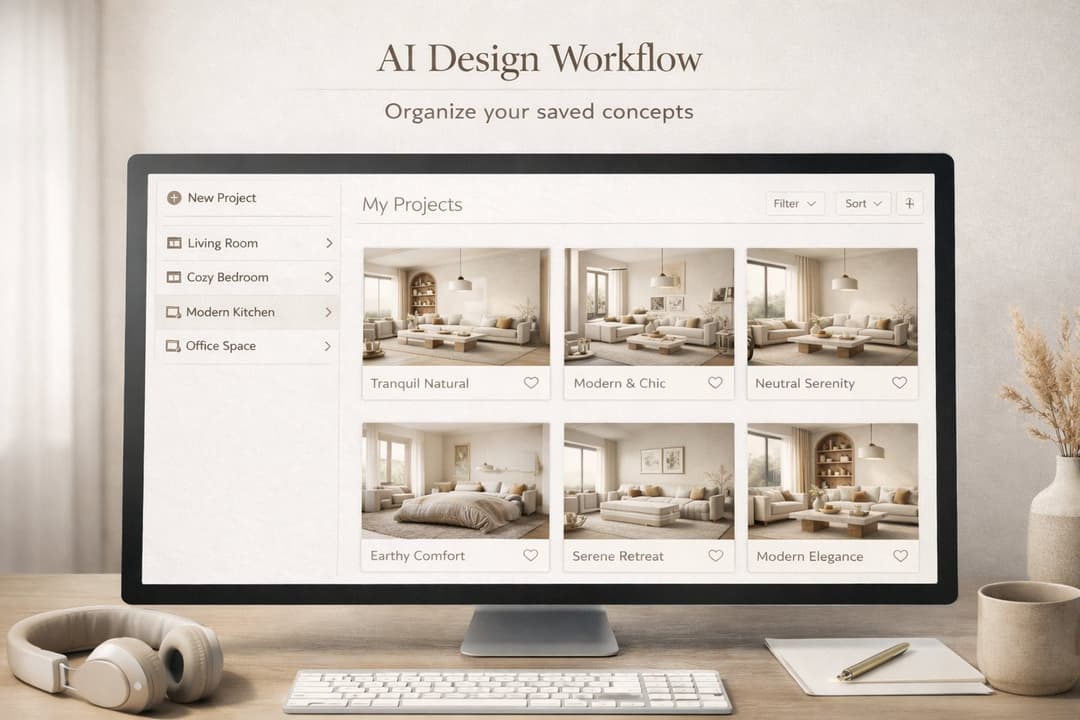
How to Save, Compare and Organize Designs in Paintit Projects
Related articles
7 min read
Neo Deco Paint Techniques: Creating Glamorous Geometric Walls
Learn Neo Deco paint techniques for glamorous geometric walls. Explore palettes, finishes, and room-by-room tips — then visualize it all with Paintit.ai.
Yulii Cherevko
CEO paintit.ai
6 min read
Is There an App to Remodel My Bathroom with Just a Photo?
Upload a photo of your bathroom and see it redesigned instantly. Discover how AI bathroom remodel apps work and explore styles with Paintit.ai.
Yulii Cherevko
CEO paintit.ai
7 min read
How to Use Paintit.ai for Perfect Dopamine Decor Color Combinations
Discover dopamine decor color combinations that boost your mood. Explore 4 curated palettes and visualize bold designs in your own room with Paintit.ai.
Yulii Cherevko
CEO paintit.ai
8 min read
Virtual Staging AI: Top Alternatives & Competitors in 2026
Compare top Virtual Staging AI alternatives in 2026: Paintit.ai, Collov.ai, ReimagineHome and more. Find the right tool for your budget and workflow.
Yulii Cherevko
CEO paintit.ai
9 min read
How to Redesign a Living Room with Paintit.ai
Learn how to redesign a living room with Paintit.ai using better layout logic, stronger focal points, realistic furniture scale, cleaner prompts, and more professional comparison workflows
Yulii Cherevko
CEO paintit.ai
8 min read
How to Save, Compare and Organize Designs in Paintit Projects
Learn how to save, compare, and organize designs in Paintit Projects to manage versions better, structure multi-room work, review alternatives faster, and make clearer design decisions
Yulii Cherevko
CEO paintit.ai