Usiamo cookie essenziali per far funzionare il sito. Con il tuo consenso, possiamo usare anche cookie non essenziali per migliorare l'esperienza, personalizzare i contenuti e analizzare il traffico. Per questi motivi, possiamo condividere i dati sull'uso del sito con i nostri partner di social media e analisi. Facendo clic su “Accetta”, acconsenti all'uso dei cookie del sito descritto nella nostra Informativa sui cookie. Puoi modificare le impostazioni dei cookie in qualsiasi momento nelle preferenze del browser.
  • Chi siamo
  • Prezzi
  • Blog
  • Contatti
AiEi

Prodotti

  • Per interior designer
  • Per l'e-commerce
  • Per il settore immobiliare

Strumenti

Generatore di architettura IA
Generatore di concept IA
Design di esterni con IA
Generatore di case IA
Simulatore di pittura della casa IA
Progettazione del paesaggio con IA
Rendering IA
Design di stanze con IA
Strumento di design degli esterni della casa
Home staging virtuale con IA
Ristrutturazione del bagno con IA
Generatore di planimetrie IA
Generatore di mobili IA
Disposizione dei mobili con IA
Ristrutturazione degli esterni della casa
Simulatore di colori per pitture IA
Ristrutturazione della cucina con IA
Simulatore di tappeti IA
Miglioramento delle foto immobiliari
Rendering d'interni con IA
Design di pareti con IA
Design di porte con IA
Rendering di planimetrie IA
Design di pavimenti con IA
Strumento di design di vialetti carrabili
Strumento di design di pavimentazioni
Progetti di ampliamento della casa
Dallo schizzo al rendering con IA
Dal prospetto al rendering
Design di mobili contenitori con IA
Design di terrazze con IA
Progettista di giardini IA
Ristrutturazione e interior design con IA
Simulatore di finestre IA
Simulatore di pittura dei mobili
Simulatore di piani di lavoro della cucina
Strumento di illuminazione paesaggistica
Simulatore di tende IA
Miglioramento dei rendering IA

Casi d'uso

Design di cucine con IA
Design di soggiorni con IA
Design di camere da letto con IA
Design di bagni con IA
Progettazione del paesaggio con IA
Design di cabine armadio con IA
Design di uffici con IA
Design di piscine con IA
Design di lavanderie con IA
Design di ristoranti con IA
Design di aule con IA
Design di seminterrati con IA
  • Termini di servizio
  • Informativa sulla privacy
  • Fiducia
  • Programma di affiliazione
Logo
Paintit.ai - Strumento gratuito di interior design con IA

© 2026

Al fianco dell'Ucraina
PAINTITAI LTD, 52 Leytonstone road, London, E15 1SQ, UK
  • English/
  • Español/
  • Português (Brasil)/
  • Deutsch/
  • Français/
  • Italiano/
  • Polski/
  • Bahasa Indonesia
Paintit.ai - design gratuito della casa con IA
  • Prezzi
  • Chi siamo
  • Blog
  • Contatti
/Blog/Harmony in Interior Design
AI interior design

7 min. reading

Harmony and unity in interior design: definitions and examples 

avatar-blog

Yulii Cherevko

CEO paintit.ai

Published: 7 November 2025
Share
  • ChatGPT
  • Perplexity
  • Claude
  • Grok
  • Google AI
Harmony and unity in interior design: definitions and examples

Page 
Contents: 

  • 1. What Does Harmony Mean in Interior Design?
  • 2. What is Unity in Interior Design?
  • 3. Harmony vs. unity in interior design
  • 4. Six examples of unity and harmony in interior design
  • 5. How to create harmony in a room
  • 6. Why a harmonious room still needs variety
  • 7. How to diagnose a room that feels disconnected
  • 8. Common mistakes
  • 9. Conclusion: From Blueprint to Beautiful Space
  • 10. FAQ

Harmony in interior design means that the colors, materials, forms, scale, and layout work comfortably together. Unity means the room reads as one composition rather than a collection of unrelated purchases. Designers often discuss the two principles together because both help create a cohesive interior, but they are not strict formulas and the terms sometimes overlap.

Key takeaways
  • Harmony describes compatible relationships among the room's parts.
  • Unity describes the sense that those parts belong to one overall design.
  • Repetition creates connection, while variety keeps the room from looking like a matching furniture set.
  • A harmonious room must still work: scale, circulation, lighting, and storage matter as much as color.

What Does Harmony Mean in Interior Design?

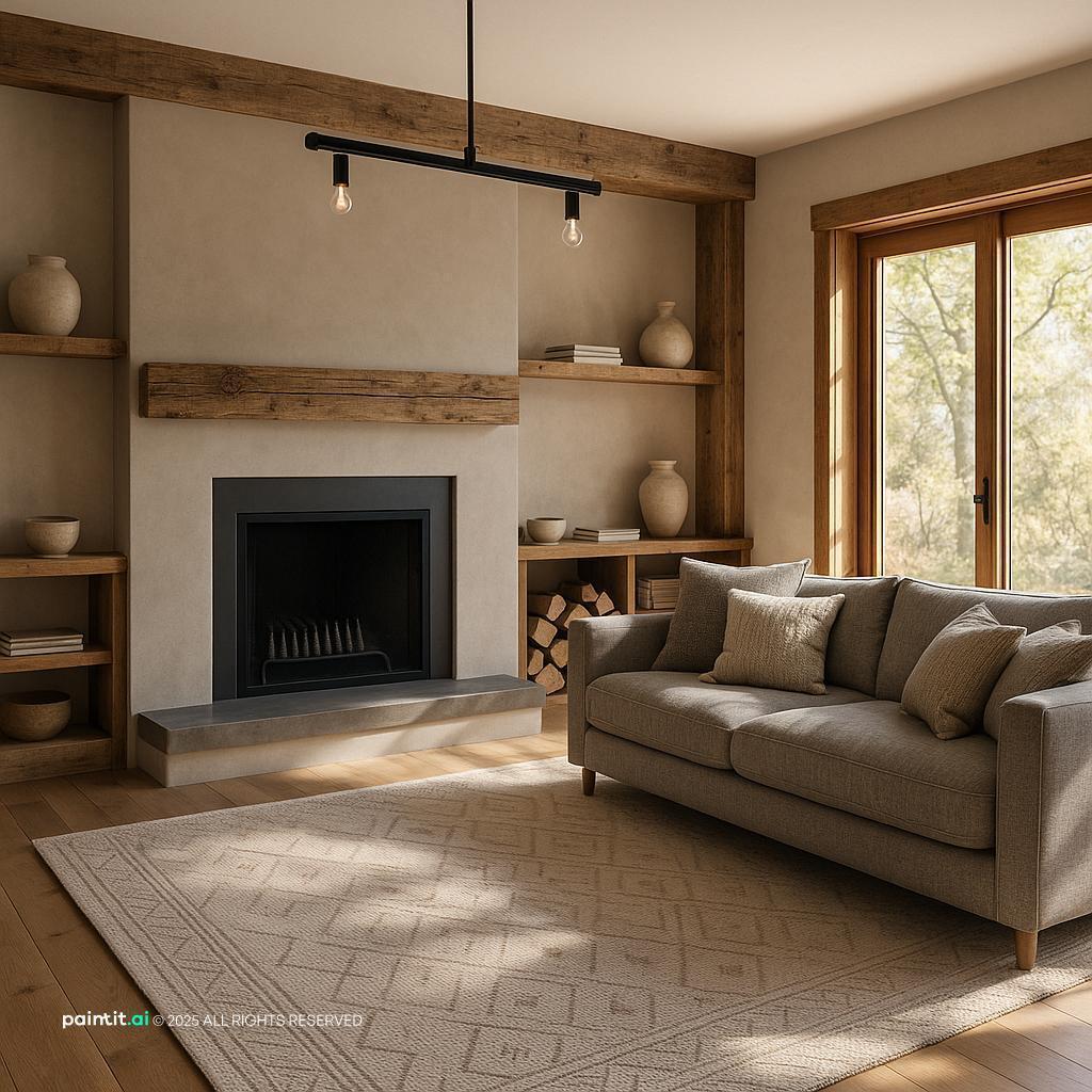
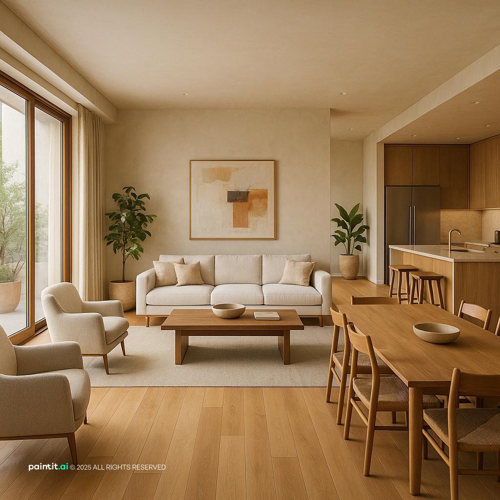
Harmonious living room with compatible colors, textures, and furniture proportions

Harmony is the pleasing relationship between design elements. The furniture does not need to match, but its proportions, colors, materials, and shapes should avoid accidental conflict. A walnut table, cream upholstery, black metal lamp, and patterned rug can be harmonious when their tones repeat and no single piece overwhelms the room.

Harmony does not always mean calm, neutral, or minimal. A colorful room can be harmonious when its hues share a clear relationship and repeat in controlled amounts. A dark, dramatic room can also work when the lighting, scale, and materials support the intended effect.
What is Unity in Interior Design?

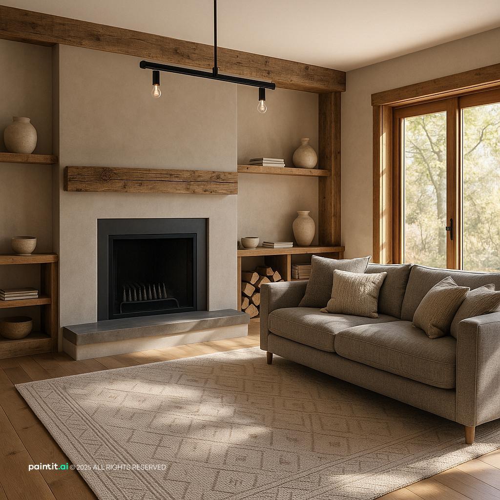
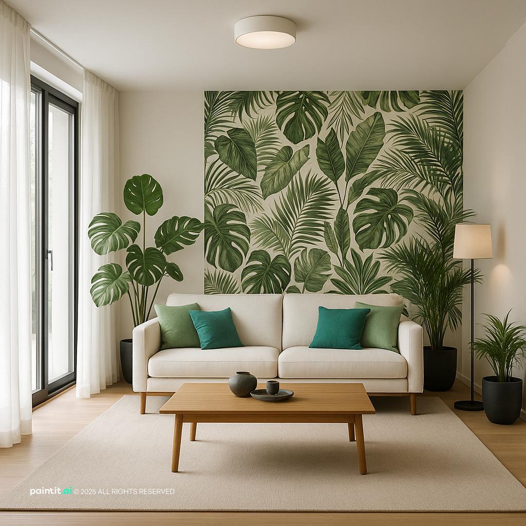
Unified interior using repeated wood tones, curved forms, and black accents

Unity in interior design is the sense that every major element belongs to the same composition. Repeating an oak finish, curved silhouette, black accent, or muted green across a room creates visual links. Consistent spacing and alignment can provide unity even when the furniture comes from different periods or brands.

Design terminology is not completely standardized. Iowa State University Extension's home-improvement design guide treats harmony as an umbrella principle and explains unity through the combination of color, texture, line, form, and space. This is why some sources use harmony and unity almost interchangeably.
Harmony vs. unity in interior design

Side-by-side comparison of harmony and unity in interior design

Question Harmony Unity
What does it assess? Whether individual elements relate comfortably Whether the whole room reads as one composition
How is it created? Compatible color, scale, texture, light, and function Repetition, alignment, proximity, and a consistent direction
What does failure look like? Colors, proportions, or materials feel awkward together Each piece may look good alone, but the room feels disconnected
Can it include contrast? Yes, when contrast is deliberate and balanced Yes, when contrasting pieces share another visual connection

A room normally needs both. Unity gives it a recognizable direction; harmony helps the pieces coexist within that direction. The distinction is useful for diagnosing a room, but it should not become a debate over labels.
Six examples of unity and harmony in interior design

Interior design examples using repetition, proximity, and alignment

1. Repeat one accent color in different amounts

Choose an accent from the rug or artwork and repeat it in two or three smaller places. A muted blue might appear in a large rug, one cushion, and a ceramic vase. The repeats connect the room without making every object blue.

2. Keep wood undertones related

Furniture does not need one identical wood finish. Warm oak, walnut, and stained rattan can work together because they share warm undertones. A very cool gray wood may look disconnected unless that cooler tone appears elsewhere.

3. Echo a shape across the room

A round coffee table can relate to an arched mirror, curved chair back, or circular lamp shade. The shapes should not be exact copies. Repeating a form at different scales is enough to create a visual thread.

4. Group furniture into a clear zone

A sofa, chairs, coffee table, and rug should read as one conversation area. Pulling every seat against a different wall breaks the relationship. A rug that touches at least the front legs of the main seats can connect the group.

5. Align important edges

Alignment can quietly organize a room. The top of a bookcase may line up with a window frame, while artwork follows the width of a console below. Avoid forcing every edge into a grid; one or two clear alignments are usually enough.

6. Carry one element between adjoining rooms

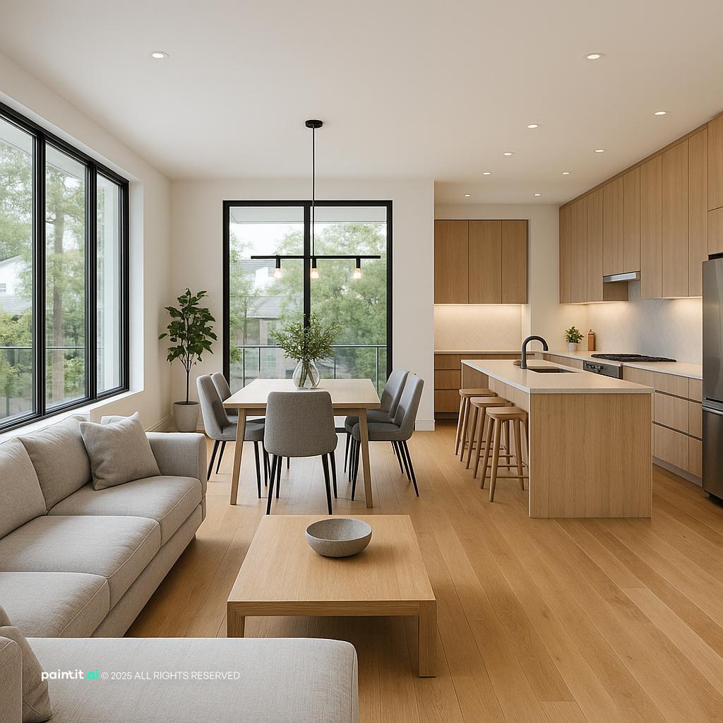
In an open plan, repeat a floor finish, metal, wall color, or wood tone across the connected areas. The living and dining zones can use different furniture while still belonging to the same home.
How to create harmony in a room

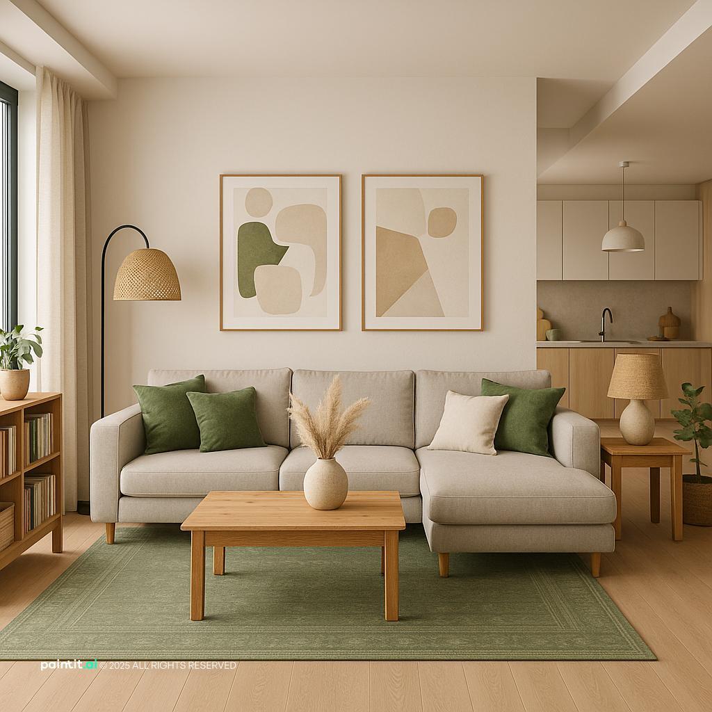
Room combining a controlled color palette, varied textures, and balanced furniture scale

Start with the fixed elements

List the floor, wall color, cabinetry, fireplace, and any furniture that must stay. These are the room's strongest constraints. A palette built around them is more useful than one copied from an inspiration image with different light and materials.

Write a one-sentence direction

Describe the room in plain language, such as "warm modern living room with oak, soft green, and black details." Use the sentence to judge new purchases. If an item introduces a new style, color, and material at once, it will need a strong reason to stay.

Limit dominant materials, not every material

Pick two or three materials to carry most of the room, then add smaller contrasting details. Oak, linen, and painted metal can form the base; glass or stone can appear once. This creates consistency without flattening the room.

Check scale before styling

A small rug under a large sectional or tiny artwork above a long sofa can make an otherwise coordinated room feel wrong. Measure the wall and floor area, mark proposed dimensions with painter's tape, and check the view from the doorway.

Balance rather than mirror

Harmony does not require matching objects on both sides of a room. One large chair can balance a smaller chair and floor lamp when their combined visual weight is similar. Our guide to asymmetrical balance in interior design explains how color, size, texture, and position affect that weight.

Test the room before purchasing

Photograph the space and compare a few controlled variations rather than changing everything at once. AI Room Design can help preview a palette or style direction, but verify furniture dimensions and real paint samples separately because an image preview is not a measured floor plan or an exact color standard.
Why a harmonious room still needs variety

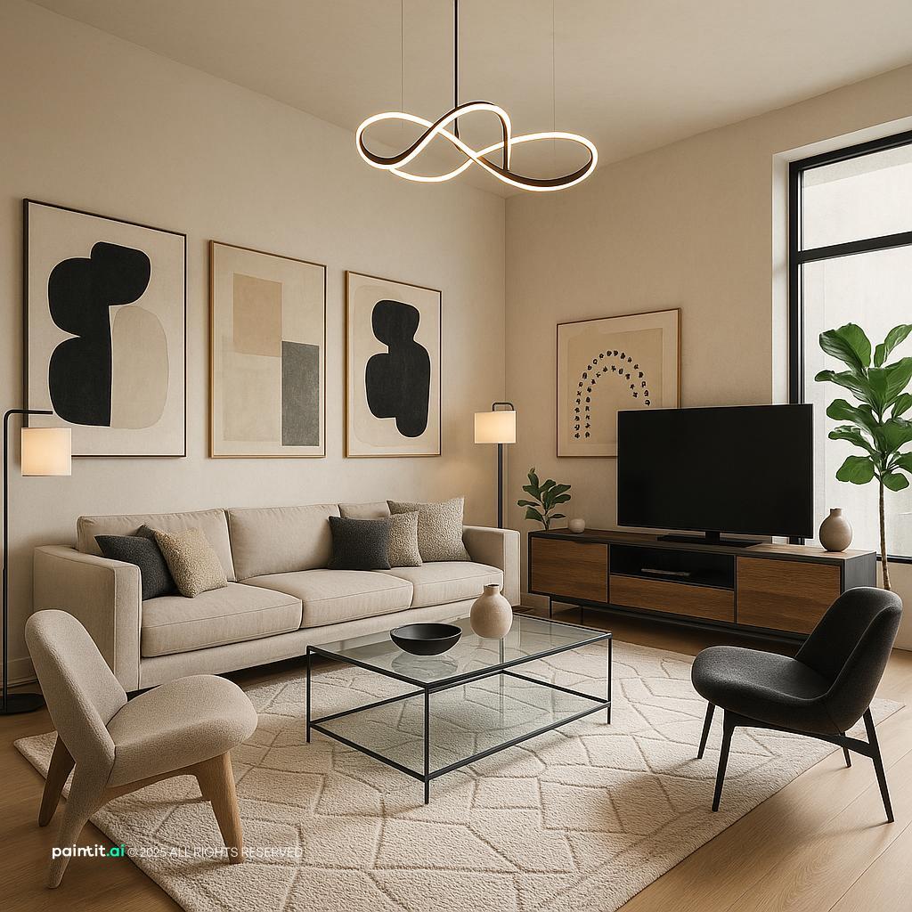
Cohesive room with one contrasting chair adding controlled variety

Too much repetition can make a room feel like a furniture showroom. Variety introduces a controlled difference: one vintage chair in a modern room, a rough ceramic lamp beside smooth cabinetry, or a saturated artwork within a muted palette.

The contrasting item should share at least one feature with the rest of the room. A red chair may repeat the warm undertone of the wood. A traditional rug may share colors with contemporary artwork. That connection allows the difference to look intentional.

How to diagnose a room that feels disconnected

  1. Photograph the room from the entrance. The image makes scattered colors and weak furniture groupings easier to see.
  2. Name the dominant direction. If you cannot describe the room in one sentence, it may have too many competing ideas.
  3. Find the isolated element. Look for a color, finish, pattern, or shape that appears only once without a clear purpose.
  4. Repeat or remove it. Add one small visual connection elsewhere, or take the isolated item out temporarily.
  5. Check proportion and circulation. A room can be visually coordinated and still feel uncomfortable because the rug, lighting, or furniture is the wrong size.

Common mistakes

  • Buying a complete matching furniture set and calling repetition harmony.
  • Using one accent color on every small accessory.
  • Mixing several wood tones without checking their warm or cool undertones.
  • Choosing decor before resolving furniture scale and walking routes.
  • Removing every contrasting element until the room has no focal point.

Conclusion: From Blueprint to Beautiful Space

Understanding the difference between harmony and unity is a true "level-up" moment in design.

Remember it this way:

  • Unity is your structural blueprint (using tools like repetition and proximity).
  • Harmony is the beautiful, calm feeling of the finished space.
  • Variety is the sparkle that gives it personality.

By mastering how these three principles work together, you can move beyond just "decorating" a room and start truly designing it. And if you need help visualizing that final, harmonious space, our AI rendering tools are built to turn your blueprint into a beautiful reality.

FAQ

What is harmony in interior design?

Harmony in interior design is the compatible relationship between a room's colors, materials, forms, scale, lighting, and layout. The elements do not need to match. They need enough shared qualities and balanced contrast to feel comfortable together.

What is unity in interior design?

Unity is the sense that a room or home reads as one composition. Designers create it through repeated colors and materials, related shapes, consistent spacing, alignment, and clear furniture groupings.

What is the difference between harmony and unity?

Harmony focuses on how individual elements relate, while unity describes the cohesion of the whole room. The concepts overlap, and some design guides group them together. The distinction is most useful when diagnosing why a room feels awkward or disconnected.

What is an example of harmony in interior design?

A living room with warm oak furniture, cream upholstery, a green rug, black lighting, and artwork that repeats those tones is one example. The pieces differ, but their undertones, proportions, and repeated colors connect them.

Can different interior styles still look harmonious?

Yes. A modern sofa, vintage side table, and traditional rug can work together when they share a color, material, line, or proportion. Keep the larger surfaces consistent and let one style act as the accent rather than giving every piece equal visual emphasis.

Trending 

Paintit.ai Guides
11 min read
Interior Design Proposal Template: Scope, Fees and Example
Paintit.ai Guides
13 min read
Interior Design Questionnaire: Free Template and Example
interior styles
11 min read
Japandi Interior Design: A Practical Guide for Real Homes
Ideas
11 min read
7 Warm White Paint Colors for Walls and Trim
Paintit.ai Guides
6 min read
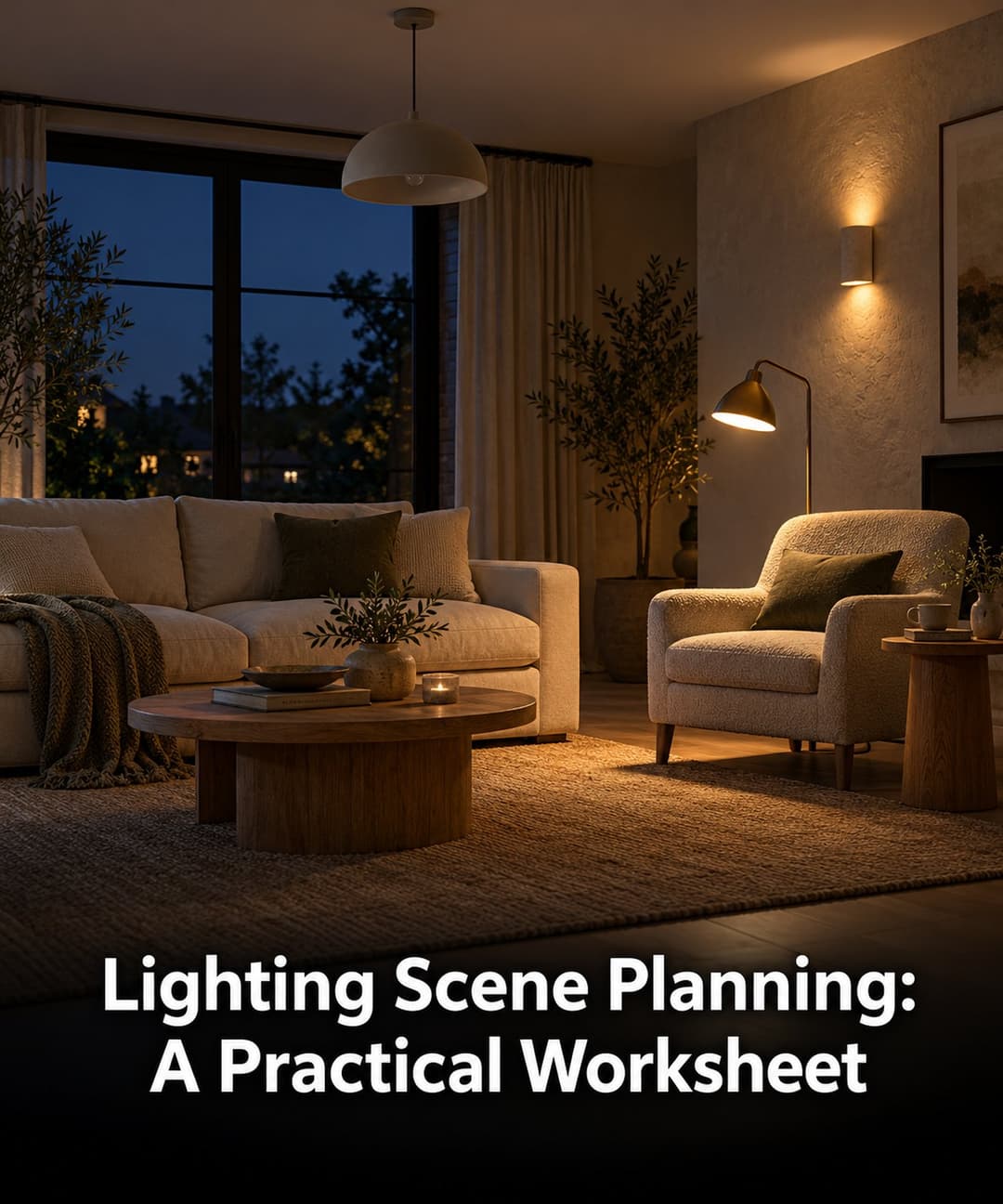
Lighting Scene Planning: A Practical Worksheet

Related articles 

Choosing Tile With AI: What 19 Design Chats Reveal
AI interior design
11 november 2026

6 min read

Choosing Tile With AI: What 19 Design Chats Reveal

What 19 design chats reveal about tile coverage, size and layout. Use the worked comparisons and printable decision card before ordering.

avatar-blog

Yulii Cherevko

CEO paintit.ai

Interior Design Proposal Template: Scope, Fees and Example
Paintit.ai Guides
9 november 2026

11 min read

Interior Design Proposal Template: Scope, Fees and Example

A fillable proposal worksheet and a worked home-office example, with defined deliverables, fees, revision limits and clearly labeled visual concepts.

avatar-blog

Yulii Cherevko

CEO paintit.ai

Interior Design Questionnaire: Free Template and Example
Paintit.ai Guides
9 november 2026

13 min read

Interior Design Questionnaire: Free Template and Example

A 32-question client template with a fillable PDF, a completed living-room example and a clear route from client answers to an early design brief.

avatar-blog

Yulii Cherevko

CEO paintit.ai

Japandi Interior Design: A Practical Guide for Real Homes
interior stylesIdeas
30 october 2026

11 min read

Japandi Interior Design: A Practical Guide for Real Homes

Bring Japanese and Scandinavian influences into a home you already live in, with practical choices for color, furniture, storage and everyday comfort.

avatar-blog

Yulii Cherevko

CEO paintit.ai

7 Warm White Paint Colors for Walls and Trim
Ideas
29 october 2026

11 min read

7 Warm White Paint Colors for Walls and Trim

Find a warm white that works with your floor, cabinets and trim. Compare seven named shades and learn which samples to test before buying paint.

avatar-blog

Yulii Cherevko

CEO paintit.ai

Lighting Scene Planning: A Practical Worksheet
Paintit.ai Guidesai room design
28 october 2026

6 min read

Lighting Scene Planning: A Practical Worksheet

Compare living room lighting scenes with a source-by-source worksheet. Separate fixture changes from on/off states and keep daylight and finishes fixed.

avatar-blog

Yulii Cherevko

CEO paintit.ai

  • English/
  • Español/
  • Português (Brasil)/
  • Deutsch/
  • Français/
  • Italiano/
  • Polski/
  • Bahasa Indonesia