
Award-Winning Modern Living Room Design
This award-winning modern living room design features a pristine white backdrop, beautifully enhanced with vibrant, colorful accents throughout the space.
A white living room with colorful accents offers a beautiful canvas for personal expression, yet sometimes the blank slate can feel overwhelming. You dream of a space that feels bright and airy, but also vibrant and uniquely yours, without looking cluttered or mismatched. How do you find that perfect balance between serene simplicity and playful pops of color?
As an interior design editor, I’ve observed a common challenge: many believe a neutral palette inherently lacks personality. a white living room with colorful accents offers unparalleled versatility and depth, transforming a blank canvas into a vibrant, inviting space. It’s not about overwhelming the eye; it’s about strategic placement and thoughtful curation.
We understand the desire for a bright, airy foundation that still feels uniquely yours. This approach allows for dynamic shifts in mood simply by changing out textiles like throw pillows, introducing bold abstract art, or selecting a statement accent chair. Most people forget that the magic lies in layering textures and introducing unexpected pops of color—think dusty terracotta ceramics or the rich sheen of emerald velvet.
In this guide, we will explore how to master this balance, covering essential principles of color theory, the art of selecting impactful accessories, and common pitfalls to avoid. You’ll gain practical insights to create a sophisticated, yet lively environment. And remember, Paintit.ai is here to help you visualize these transformations, bridging the gap between inspiration and your actual living space.
Before changing furniture or finishes, you can preview the direction with an AI living room design tool.
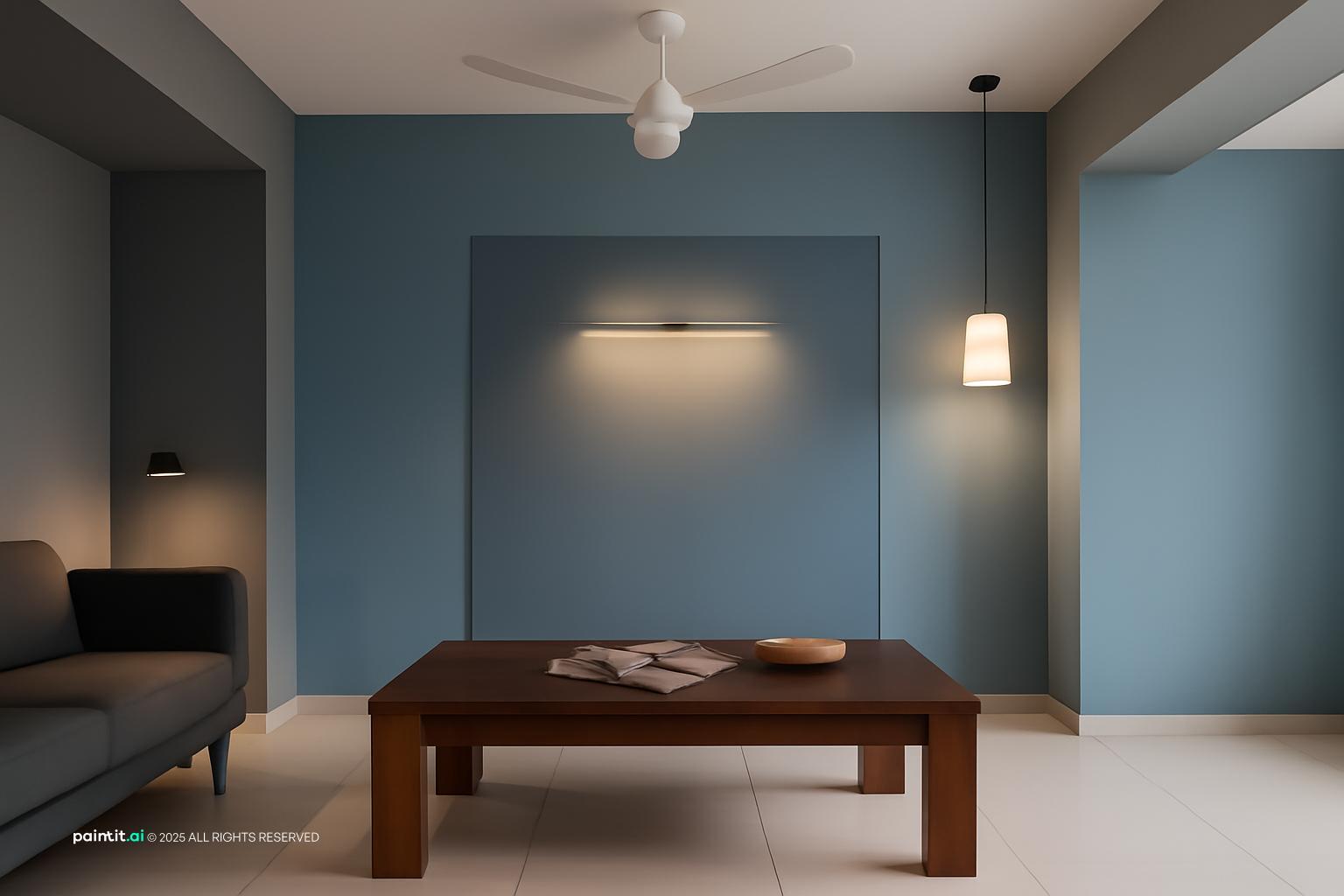
This gallery brings the abstract idea of white with colorful into something visible: open.
This award-winning modern living room design features a pristine white backdrop, beautifully enhanced with vibrant, colorful accents throughout the space.

Explore minimalist living room design ideas, where a serene white palette is brought to life with thoughtfully placed colorful accents.

Discover this modern minimalist living room design, embracing a crisp white foundation complemented by stylish and playful colorful accents.

This cozy Scandinavian open-plan kitchen and living room showcases a bright white base, perfectly warmed by charming colorful accents.

Experience this award-winning contemporary living room design, where a sophisticated white canvas is enlivened by bold and beautiful colorful accents.

Indulge in this luxury modern living room design, where a pristine white setting provides the perfect stage for elegant colorful accents.

This stylish minimalist living room design creates a serene white canvas, allowing carefully chosen colorful accents to pop with personality.

Behold this stunning minimalist living room design, where the purity of white is brilliantly contrasted with captivating colorful accents.

Embrace the tranquility of this calm neutral living room design, featuring a predominantly white palette subtly brought to life with colorful accents.

This modern open-concept living room and kitchen design beautifully combines a spacious white layout with cheerful and inviting colorful accents.

Stylish 2 BHK Flat Interior Design Inspiration brings together earthy tones for a more composed living room direction.

pop art-inspired living room, ultra-photorealistic. replace current furniture and decor with brings together daylight, rug, and lighting for a more composed living room direction.
Gentle infusions of soft pastels maintain the airy feel of a bright room while adding a whisper of color. This prevents the space from feeling sterile, offering a delicate warmth. It’s about creating an inviting atmosphere without overwhelming the senses.
Think blush pink, mint green, or sky blue on throw pillows, a delicate vase, or a small piece of artwork. Textures like linen or cashmere enhance the softness, making the room feel more luxurious. Consider a light-colored rug to tie the scheme together.
For a related take on the same room, explore small living room ideas with TV.
Strategic use of vibrant primary colors creates a striking contrast against a pristine backdrop. This approach injects energy and a modern edge, making a powerful statement. It’s about impact, pure and simple.
Introduce a single bright yellow armchair, a large piece of abstract art featuring red and blue, or a royal blue rug. Keep other decorative elements minimal to let these focal points truly shine. sometimes less is more when dealing with strong hues.
For a related take on the same room, explore emerald green sofa living room ideas.
Grounding a bright white space with warm, organic hues brings a sense of calm and connection to nature. This makes the room feel incredibly inviting and lived-in. I’ve seen this work best in homes seeking a cozy, authentic vibe.
Incorporate terracotta pots, a rust-colored throw, olive green cushions, or a jute rug. Combine these with natural wood furniture for added warmth and an organic feel. The interplay of textures is crucial here.
This is a sophisticated approach where one dominant color is introduced to an otherwise all-white scheme. It creates a powerful focal point and a sense of deliberate, high-end design. It might seem odd at first, but the simplicity is its strength.
Imagine a crisp white room with every accent, from a large area rug to a few decorative objects, in a deep emerald green or a rich navy. This singular focus is key to achieving a cohesive and impactful look. Here is what matters: consistency.
Injecting modern dynamism through bold shapes and artistic expression breaks the monotony of plain walls. Patterns add visual interest without overwhelming the space, making it feel current and curated.
Consider a rug with a striking geometric pattern, cushions featuring abstract designs, or a large canvas painting with vibrant, non-representational forms. These elements draw the eye and create movement within the room. It sounds simple, but the right pattern can transform everything.
Layering rich textures and patterns from around the world creates a cozy, well-traveled, and deeply personal atmosphere in a bright setting. Most people forget that a white canvas is perfect for this kind of expressive layering.
Think Moroccan poufs, Indian block print throws, woven baskets, and macrame wall hangings. Colors can range from jewel tones to earthy reds or deep blues. The key is a sense of collected history and comfort.
Evoking the serene feeling of the seaside, this palette brings a refreshing and calming energy to a white living room. It makes the space feel light, airy, and perpetually on vacation.
Use shades of ocean blue, seafoam green, and sandy beige. Think striped cushions, clear glass vases, driftwood accents, and linen fabrics. These elements combine to create a tranquil, breezy environment.
Infusing a playful, nostalgic charm with the distinctive color palette of the mid-20th century adds character and a sense of curated style. This look is both sophisticated and fun.
Look for furniture with clean lines and introduce colors like mustard yellow, avocado green, burnt orange, or teal. A vintage-inspired rug or artwork can complete the look, grounding the space in a specific era. It’s about a deliberate throwback.
Creating a luxurious and opulent feel with rich, saturated colors against a white backdrop makes these hues truly pop. This adds an undeniable touch of sophistication and drama.
Consider velvet cushions in sapphire blue, an amethyst purple throw, or an emerald green accent chair. Metallic accents like gold or brass will enhance the glamour, reflecting light and adding sparkle. This is about making a statement.
This refined take on color softens bright hues to maintain the calm and minimalist aesthetic of Scandinavian design. It's about subtle joy, not overwhelming vibrancy.
Think muted coral, dusty blue, or a soft sage green. Use these sparingly on a few cushions, a ceramic vase, or a simple throw. Natural wood and clean lines are essential to preserve the minimalist feel. It’s a gentle infusion.
Embracing bold, graphic, and often unexpected color combinations inspired by the pop art movement is for those who aren't afraid to make a statement. This is about pure, unadulterated fun.
Think bright fuchsia, electric blue, and lime green. Use these in large, graphic prints, sculptural objects, or even a single, oversized piece of furniture. The impact is immediate and undeniable. It’s a celebration of color.
Bringing the freshness of the outdoors inside uses natural greens and vibrant floral patterns to create a lively and refreshing atmosphere. This strategy truly breathes life into a white room.
Introduce abundant houseplants, botanical print cushions, or a large piece of artwork featuring lush foliage or colorful flowers. The varied shades of green from plants add incredible depth and texture. This is about natural vitality.
The second gallery leans into more specific directions through clean lines, helping compare different ways the same living room can feel at home.

Embrace the clean lines and bright aesthetic of Scandinavian style, creating a white living room with colorful accents that feels both fresh and inviting.

Transform your space with Scandinavian living room redesign ideas, building a serene white backdrop enhanced by thoughtfully placed colorful accents.

Discover a stylish Mid-Century Modern living room design, where a crisp white foundation beautifully showcases vibrant colorful accents and timeless pieces.

Experience tranquility in a modern minimalist living room with Japandi flair, where a white canvas is subtly brought to life with natural and colorful accents.

Achieve serene living with this minimalist living room design, offering a peaceful white environment punctuated by artfully selected colorful accents.

This modern living room design, rooted in soft neutrals, becomes a dynamic space when integrated with vibrant colorful accents throughout its elegant white scheme.

Channel the Aegean with a modern Greek-inspired living room design, where a pristine white base is beautifully contrasted by lively colorful accents, often in shades of blue.

Indulge in a luxury modern minimalist living room design, presenting a pristine white backdrop where exquisite colorful accents provide refined visual interest.

This Mid-Century Modern minimalist living room design perfectly blends a crisp white foundation with vibrant colorful accents, creating a timeless and inviting atmosphere.

Explore a stunning ultra-realistic modern living room design, where a brilliant white palette serves as the ideal foundation for expressive colorful accents.

White With Colorful Living Room design brings together warm lighting for a more composed living room direction.

Modern Semi-Private Bedroom & Living Room Design brings together lighting and sofa for a more composed living room direction.
selecting the right colorful accents for a white living room often feels like a high-stakes gamble. Will that vibrant sapphire blue truly pop, or will it clash with the subtle warmth of your cream sofa? Most people forget that a single wrong shade can disrupt the entire serene aesthetic. paintit.ai eliminates this costly guesswork. Instantly, you can experiment with dozens of accent hues – from a deep emerald velvet cushion to a sun-drenched terracotta throw – seeing precisely how each color interacts with your existing white canvas. It sounds simple, but this immediate visualization prevents expensive mistakes and ensures your chosen pops of color enhance, rather than overwhelm. Try it now; discover your perfect balance.
Before changing furniture or finishes, you can preview the direction with an interior design visualizer.
Start small. Think throw pillows in dusty rose or a vibrant emerald green vase. A single piece of art can carry a lot of weight. Layering textures in white prevents flatness.
Textiles are your friend: cushions, throws, or a patterned rug. Artwork offers bold statements. Consider ceramic planters with lush greenery, or a collection of colorful books. It might seem odd at first, but even a painted side table works.
Avoid too many disparate colors. Stick to a curated palette of two or three. Don't forget negative space; white is an accent too. Most people forget that clutter dilutes impact.
Absolutely. contrast adds depth. Pair a warm terracotta with a cool sapphire blue. Ensure one color dominates slightly, letting the other provide a subtle counterpoint. I’ve seen this work best in bohemian-inspired spaces.
Repeat colors in different forms. If you have a mustard yellow cushion, echo it with a small ceramic bowl or a book spine. Distribute accents throughout the room, creating a visual flow.